Color in Art – Exploring One of the Most Important Elements of Art
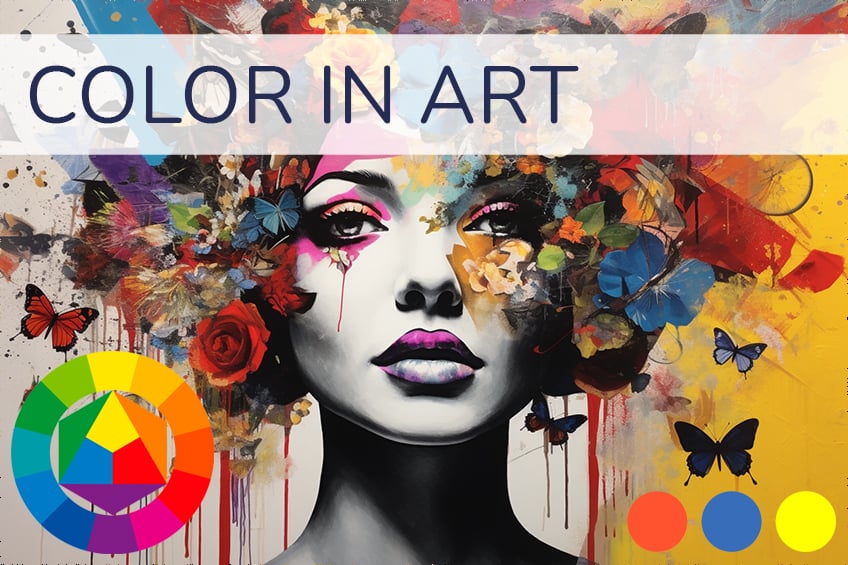
Color is all around us and in visual arts, it gives an artwork meaning and beauty – or ugliness. It can also evoke strong emotional reactions. In this article, we will discuss the definition of color in art, providing a brief overview of what it is and its role as one of the elements of art.
What Is Color in Art?
There are several key properties of color in art, which we will look at in more detail below, but before we discuss color in art, it is important to have a basic understanding of the art elements, of which color is one. The elements of art are commonly grouped as seven, but some art sources will explore them as more. They are mainly comprised of color, value, texture, space, line, form, and shape.
These are artistic tools that compose almost any type of artwork, from two-dimensional art like painting, drawing, or graphic arts to three-dimensional art like sculpture or architecture. The elements of art are almost like visual devices that provide a formal structure when producing an artistic composition. They also provide the means for art history scholars and lovers to analyze artworks more effectively.
Photoreceptors and Wavelengths
To determine the definition of color in art we need to look at what color is. This will include looking at how color is perceived through our physical vision, which will involve some color science. As we mentioned above, color is all around us, but how do we see color exactly? In the most basic explanation, color is a result of reflected or absorbed light, which occurs in wavelengths. This light reaches photoreceptors in our eyes called rods and cones, which then allows us to see the specific color.
These wavelengths of light, more accurately termed “visible light”, are part of the electromagnetic spectrum. It is called visible light because there are other forms of light on the electromagnetic spectrum that we cannot physically see. The “visible light” occurs as a color spectrum that is famously remembered by the acronym “ROYGBIV”, which stands for red, orange, yellow, green, blue, indigo, and violet. The specific frequency determines their color, which is measured in Terahertz (THz).
The Color Wheel and Color Hierarchy
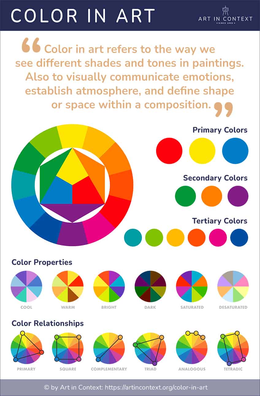
The color wheel was first invented in the 1600s by one of the most renowned scientists in western history, Sir Isaac Newton. It is an important part of color in art because it provides a visual color key so to say, of the different color categories and how they relate to one another.
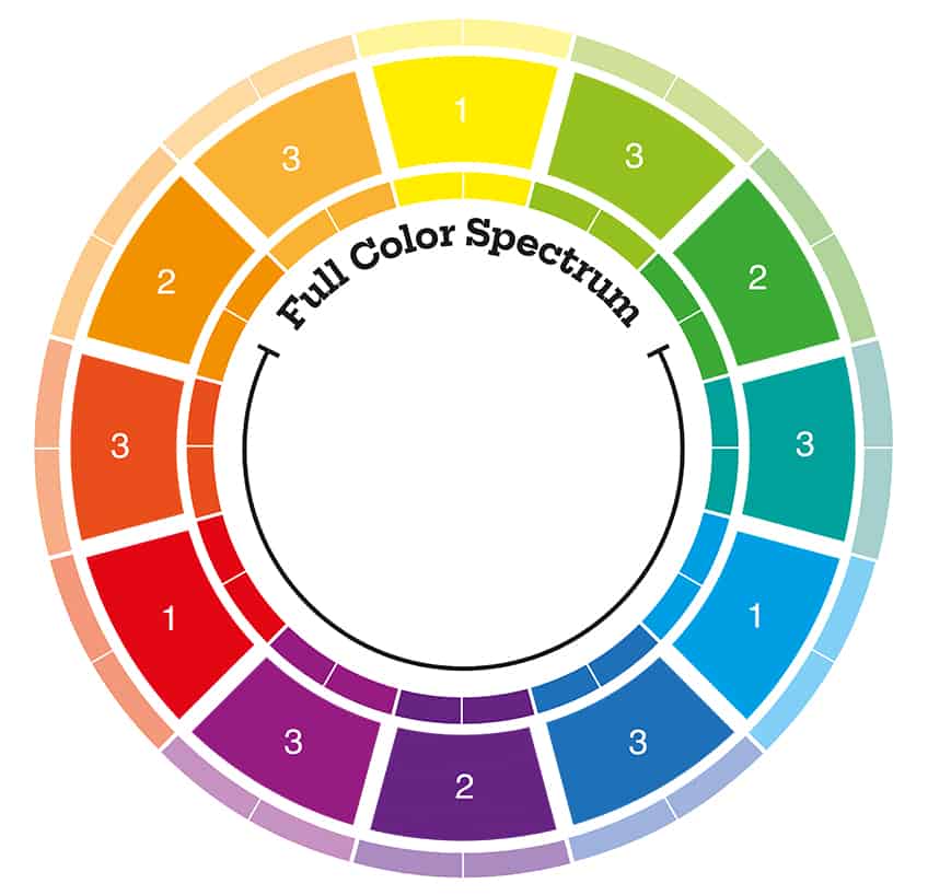
It is circular in shape, almost like a circular graph.
- Blue
- Red
- Yellow
- Green
- Orange
- Purple
- Red-orange
- Red-purple/violet
- Yellow-orange
- Yellow-green
- Blue-green
- Blue-purple/violet
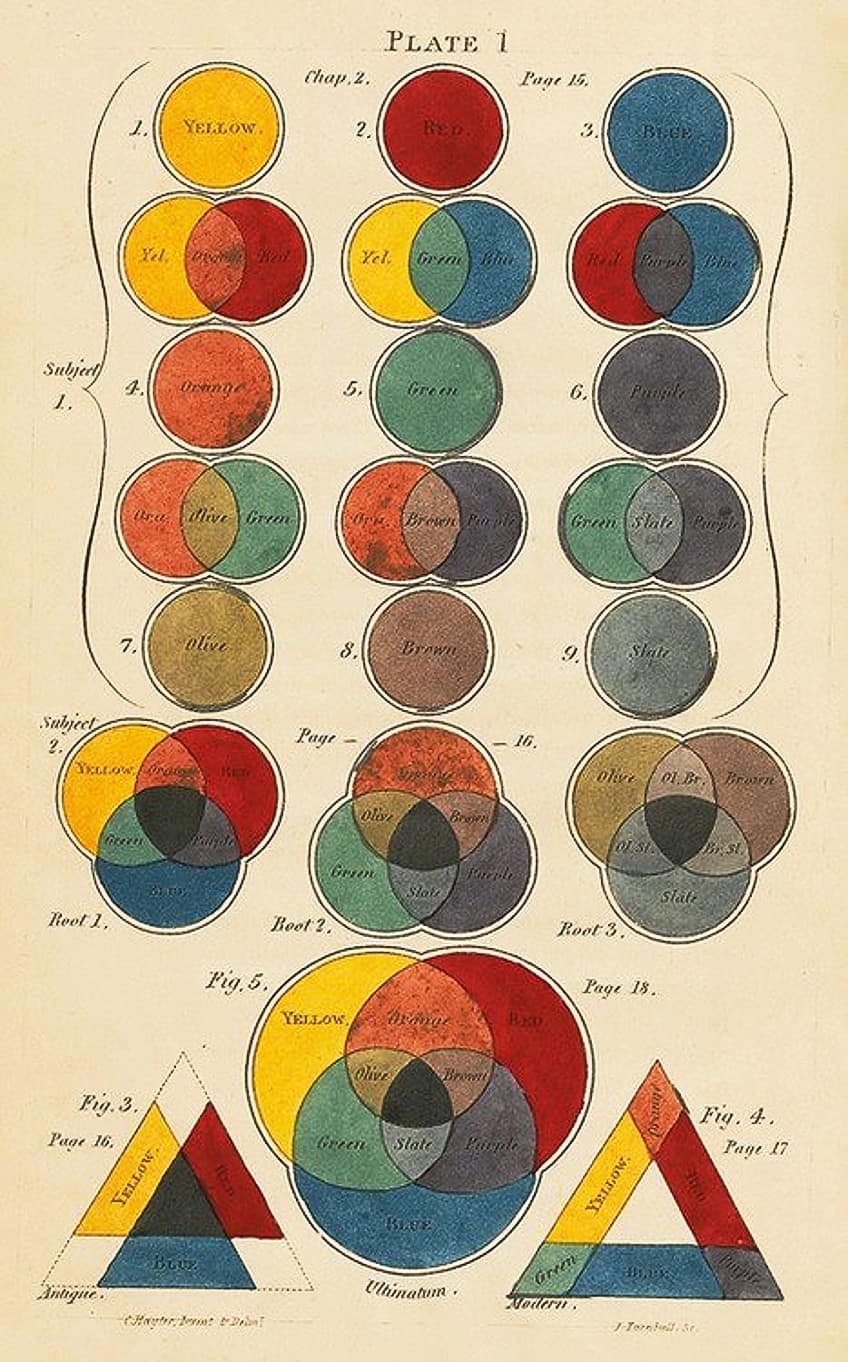
When primary colors are combined differently, they will form the other colors, which are the secondary colors, namely, green, orange, and purple, which is also referred to as violet.
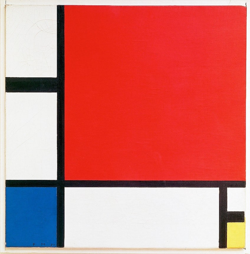
Traditionally, what we know as the primary, secondary, and tertiary colors are categorized on the color wheel. Starting with the primary colors, which are blue, red, and yellow. Artists like Piet Mondrian utilized primary colors in his abstract paintings, for example, in his Composition with Red, Blue, and Yellow (1930).
In more detail, blue and yellow will form green, red and yellow will form orange, and red and blue will form purple/violet. If you look at the color wheel you will notice that orange is between red and yellow, green is between blue and yellow, and purple or violet is between blue and red. The tertiary colors are placed in between or next to these colors and are formed when the primary and secondary colors are combined or mixed in equal parts.
This results in six tertiary colors altogether, starting with red, red-orange, and red-purple/violet, then yellow-orange and yellow-green, and lastly blue-green and blue-purple/violet.
Color Schemes
If we look at the color wheel again, several color schemes emerge from different color combinations. While complementary and analogous are two of the well-known color schemes, there are also split-complementary and triadic, and others like square and tetradic. Complementary colors are opposite or “across” one another.
For example, red and green, blue and orange, and yellow and purple. This also applies to all the tertiary colors that are also opposite/across each other. This is referred to as a color scheme and provides contrast in a visual composition due to their opposite placements.
An example of color in art that uses complementary colors is Vincent van Gogh’s The Night Café (1888). Here we see it in the red of the walls and the green of the ceiling. However, Van Gogh was popular for utilizing different color schemes in his paintings.

Another popular color scheme includes analogous colors, which are adjoining colors; just like opposites can be a pair, so too can colors that are side-by-side. For example, red, red-orange, red-purple/violet, or orange, yellow-orange, red-orange, and so on.
- Red, red-orange, and red-purple/violet
- Blue, blue-green, and blue-purple
- Yellow, yellow-green, and yellow-orange
- Green, yellow-green, and blue-green
- Purple/violet, red-purple/violet, and blue-purple/violet
- Orange, yellow-orange, and red-orange
- Yellow-orange, yellow, and orange
- Yellow-green, yellow, and green
- Blue-green, blue, and green
- Blue-purple/violet, blue, purple
- Red-purple, red, and purple
- Red-orange, red, and orange
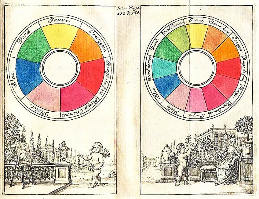
This type of color scheme is usually described as more “harmonious” in its effect because the contrast created, compared to the complementary color scheme, is not as strong or distinct. However, it does not exclude it from creating a visual impact.
We will see this in another example of color in art from Mark Rothko’s Color Field paintings like “Orange, Red, and Yellow” (1961). Here we see large areas of orange and a band of yellow at the top of the composition with a red background.
The split-complementary color scheme applies what is referred to as the “dominant” color, which can be the primary or secondary color and the two colors next to its opposite color. If we use red as an example, the two colors that are on either side of red’s complementary color, which is green, would be blue-green and yellow-green, respectively.
Split-Complementary Color Schemes
- Red, yellow-green, and blue-green
- Blue, yellow-orange, and red-orange
- Yellow, red-purple, and blue-purple
- Green, red-purple, and red-orange
- Purple, yellow-green, and yellow-orange
- Orange, blue-green, and blue-purple
- Yellow-orange, purple, and blue
- Yellow-green, purple, and red
- Blue-green, red, and orange
- Blue-purple/violet, orange, and yellow
- Red-purple, yellow, and green
- Red-orange, blue, and green
The triadic color scheme applies colors that are an even distance from one another. There are usually three spaces between each color. As an example, this could look like green, orange, and purple. Similarly, the combination of the primary colors will also make a triadic color scheme.
- Red, blue, and yellow
- Green, orange, and purple
- Yellow-green, red-orange, and blue-purple/violet
- Blue-green, yellow-orange, and red-purple/violet
Color Value
Color value refers to the level of light or darkness of a color. It is determined when looking at a black and white image. This can also be viewed on what is referred to as a gradient or a grayscale, which will show how colors go from lighter to darker, namely from white to black, including the transitionary colors in between.
There are different types of color values too, which are termed “low-key” and “high-key”.
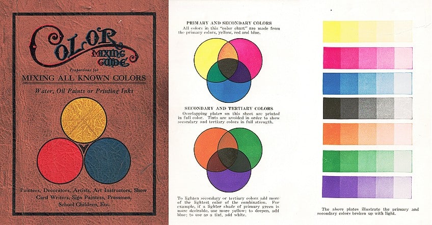
The simplest description is that a low-key color value means it is darker and created when more black is added to a color; a high-key color value means it is lighter and created when more white is added to a color. Color value in visual art is important because it is what creates the effect of depth or three-dimensionality.
It also adds emphasis and character to the subject matter instead of leaving it lifeless and two-dimensional.
Color Intensity
The intensity in color is also usually referred to as “saturation” or “chroma”. This is commonly described as the “brightness or dullness” of a color. When a color is unmixed it is known as being in its “pure” or more brilliant form. When it is mixed with other colors like neutral gray, white, or black, it will be more muted and less intense or brilliant.
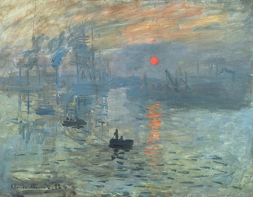
Color intensity can be applied when you need to create spatial depth or draw attention to a focal point. It is important to note here that color intensity is sometimes confused with color value, but the two are different aspects of color. An example of color in art that utilizes a high level of color saturation can be seen in Ernst Ludwig Kirchner’s Seated Girl (Fränzi Fehrmann) (1910). In Claude Monet’s Impression, Sunrise (1872), there is a lower color saturation, however, higher intensity is evident in the sun, which becomes the focal point of the composition.
Color Temperature
While color temperature is a vast topic, we will briefly introduce some of its main attributes as it relates to color in art. The temperature here refers to some colors like reds or yellows that appear warmer and others like blue or green that appear cooler.
Part of working with colors in art is the way color makes us feel and the mood or effect it creates in a visual composition.
Furthermore, some art sources also describe our association with each color temperature, for example, warmer colors like red, yellow, and orange could be linked to fire and cool colors like blue could be linked to water.
What image is evoked in your mind when you think of warm or cool colors?
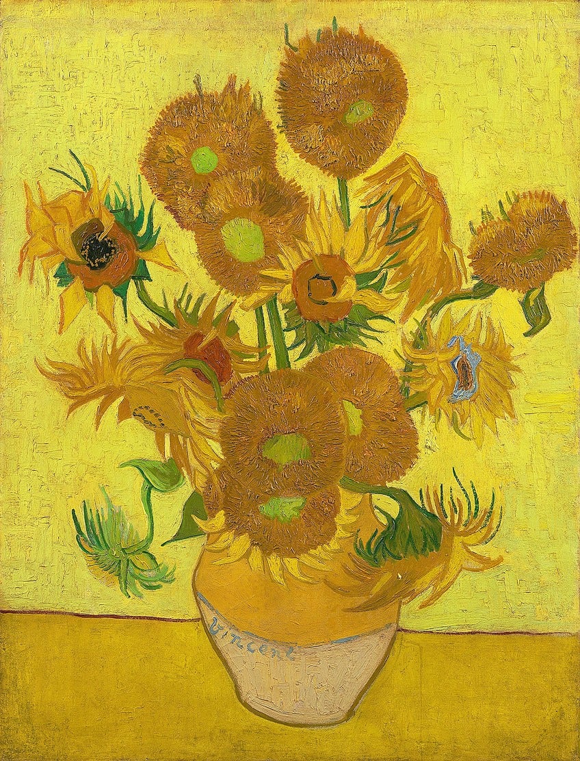
An example of color in art with warm colors includes the yellows in Vincent van Gogh’s Sunflowers (1888) painting, among many others. We will see cooler colors in Claude Monet’s Water Lilies (1906) housed at the Art Institute of Chicago in the United States.
Clearing Up Color Terminology
When you first start learning about color in art you will read about various terms like hue, tone, shade, and tint, and it can all seem quite confusing. Below we will provide a basic clarification of what each term means so that you will understand its context the next time you read or write about art.
| Hue | The term “hue” is utilized to refer to what is known as the “dominant” color of something. You will find that it is utilized throughout various art sources when referring to a color. For example, the blue hue of the blueberries or the bananas and lemons have a yellow hue, and so forth. The word hue can often be confused with the word color, but there is a slight difference in the concepts. The term “color” has a wider definition and can apply to various aspects of color in art. |
| Tone | Tones refer to colors where gray is combined with them. Gray is one of the neutral colors, which includes black and white. |
| Tint | Tints refer to colors where white is combined with them. |
| Shade | Shades refer to colors where black is combined with them. |
Finding Color Closure
In the article above, we discussed color in art and its central concepts and characteristics. Color is a versatile element of art, and it can be combined in numerous ways to achieve a variety of visual compositions.
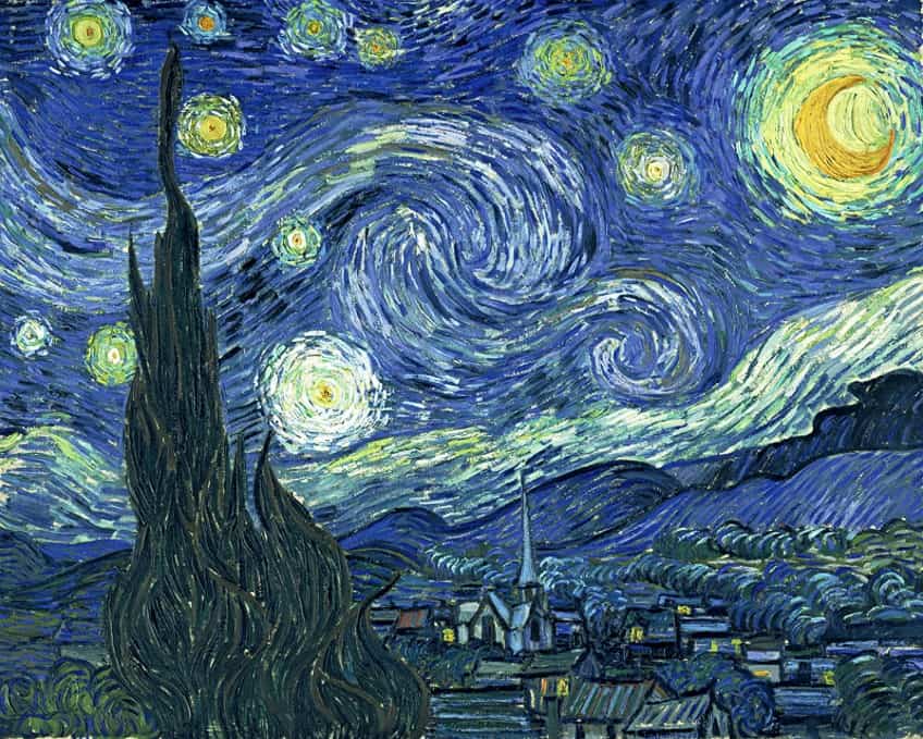
Color combinations can evoke feelings of joy or sadness. It can be utilized to create perspective or emphasis in paintings or graphic designs. Color can be bright or light or dark and gray – the possibilities are endless when it comes to color.
Learn everything about the Elements of Art
We have written a series about all the elements of art, if you would like to dive a bit deeper into the topic:
For all art enthusiasts or students, understanding these fundamental aspects of color in art will equip you with the necessary tools when you paint or analyze an artwork. It is also encouraged to research each characteristic we mentioned above in greater detail.
Take a look at our color definition in art webstory here!
Frequently Asked Questions
What Colors Are on the Color Wheel?
There are 12 colors on the traditional color wheel, namely red, blue, and yellow, which are the primary colors; green, purple/violet, and orange, which are the secondary colors, and lastly, the colors in between are named the tertiary colors because they are a combination of the primary and secondary colors. These are red-purple/violet, red-orange, yellow-orange, yellow-green, blue-green, and blue-purple/violet.
What Does ROYGBIV Stand For?
ROYGBIV is an acronym that stands for red, orange, yellow, green, blue, indigo, and violet. These are the colors on what is called the visible light spectrum, which is perceivable by us. These are often also referred to as the rainbow of colors.
What Is Color in Art?
Color in art includes all aspects like hues, tones, tints, shades, value, saturation, temperature, the color wheel, and various color combinations. Color is one of the elements of art and all these characteristics can be applied and utilized in different methods to create visually appealing artworks.
Alicia du Plessis is a multidisciplinary writer. She completed her Bachelor of Arts degree, majoring in Art History and Classical Civilization, as well as two Honors, namely, in Art History and Education and Development, at the University of KwaZulu-Natal, South Africa. For her main Honors project in Art History, she explored perceptions of the San Bushmen’s identity and the concept of the “Other”. She has also looked at the use of photography in art and how it has been used to portray people’s lives.
Alicia’s other areas of interest in Art History include the process of writing about Art History and how to analyze paintings. Some of her favorite art movements include Impressionism and German Expressionism. She is yet to complete her Masters in Art History (she would like to do this abroad in Europe) having given it some time to first develop more professional experience with the interest to one day lecture it too.
Alicia has been working for artincontext.com since 2021 as an author and art history expert. She has specialized in painting analysis and is covering most of our painting analysis.
Learn more about Alicia du Plessis and the Art in Context Team.
Cite this Article
Alicia, du Plessis, “Color in Art – Exploring One of the Most Important Elements of Art.” Art in Context. July 4, 2022. URL: https://artincontext.org/color-in-art/
du Plessis, A. (2022, 4 July). Color in Art – Exploring One of the Most Important Elements of Art. Art in Context. https://artincontext.org/color-in-art/
du Plessis, Alicia. “Color in Art – Exploring One of the Most Important Elements of Art.” Art in Context, July 4, 2022. https://artincontext.org/color-in-art/.




Good stuff, would love to read more!