Split Complementary Colors – What Is a Complementary Color Scheme?
Life without color would have no meaning! Color is everywhere we look – in nature, fashion, and art. People who work in the color industry will be the first to clarify that there is a science behind choosing which colors to use and how these colors complement one another. If you are looking for a color scheme for your home or design project, you will likely make use of a color wheel to help you choose a color palette. Have you heard of a split complementary color scheme before? What about a double complementary color scheme? In this article, we will explore the split complementary color palette and explain how it can be used.
Describing Split Complementary Colors
Learning the basic concepts of color theory is a tool that many designers will tell you that you will need to know about color pairing. It is an extremely logical concept and it teaches you how certain colors paired together positively complement each other, which in turn creates a positive feeling for the onlooker. The idea about how to calculate complementary colors using a color wheel is straightforward, and then simply add an extra color to create a split complementary color scheme.
But first, what is a complementary color scheme and how can you use it in art and design?
Complementary Color Schemes
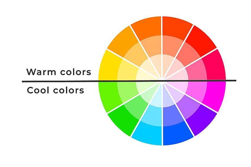
In order to understand what a split complementary color scheme is, we must first answer the question: “What is a complementary color scheme?” To help you understand, we will look at the basic color wheel. A color wheel has the primary colors which consist of blue, yellow, and red. It also contains secondary colors which are green, pink, violet, and orange. These colors are spread out to form a circle. T
o determine what your complementary color palette will be using a color wheel, decide on a dominant color for your project. For example, if you choose the color red, the opposite color to red on the color wheel will be green. These are complementary colors.
If you want to know what color complements orange or what color complements blue, simply look at the color on the opposite end of the color wheel!
These primary and secondary colors are often used in design because they are bright, enabling them to stand out and grab attention. Of course, you do not want to be overbearing or harsh by only using bright colors. This is why choosing your complementary color palette is so important. It is always best to use an accent color along with your brighter dominant color.
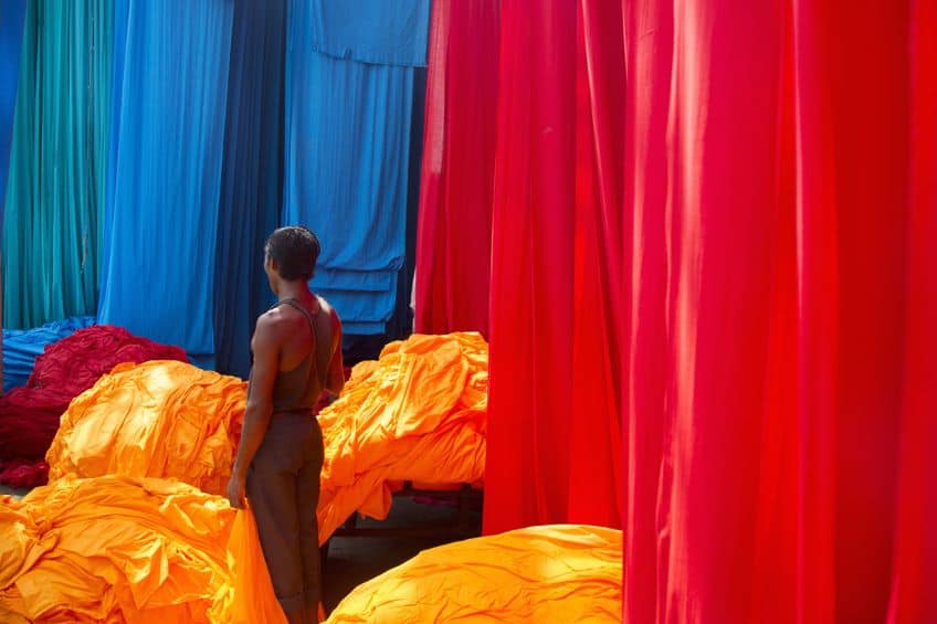
Color bias or color temperature is also important, and the complementary colors will be considered either cool or warm. Greens and blues, as most of us know, are cool colors, while reds and oranges are warm colors. Complementary colors do not need to be just two hues!
You can create a double complementary color scheme by using two colors that are beside one another on the color wheel with the two colors opposing them.
This results in four complementary colors or a double complementary color scheme. If you need a reference, a double complementary color scheme could be blue and orange, and blue-green and red-orange.
| Shade | Hex Code | CMYK Color Code (%) | RGB Color Code | Color |
| Orange | #ffa500 | 0, 35, 100, 0 | 255, 165, 0 | |
| Blue | #0000ff | 100, 100, 0, 0 | 0, 0, 255 | |
| Blue-Green | #0d98ba | 93, 18, 0, 27 | 13, 152, 186 | |
| Red-Orange | #ff5349 | 0, 67, 71, 0 | 255, 83, 73 |
Explaining Color Harmony
The term “color harmony is self-explanatory. Colors that suit one another and create a good color scheme are in harmony with one another. This means that your color scheme won’t be too harsh and will be pleasing to the eye. Before we discuss what split complementary colors are, let’s have a look at a few other color schemes and combinations.
- Triadic Color Scheme: Tri means three, and as implied by the name, these three colors on the color wheel are evenly spaced apart, forming a triangular shape.
- Analogous Color Scheme: This is the correct term for a collection of three colors that are beside one another on the color wheel.
- Tetradic Colors: These four colors are all evenly spaced apart from one another on the color wheel. Red, orange, green, and blue are good examples.
- Square Colors: Using the color wheel again, these four colors are determined using a square shape.
- Monochromatic Colors: Every shade or tone will have variations within the same color family and the word for this is monochromatic color.
Explaining Split Complementary Color Schemes
When creating a complementary color palette, you can also create a split complementary color scheme. The difference is that instead of having only two colors, you will have three. You will still require a primary color as your main color choice.
Looking at the color wheel, you can then select two opposite colors to complete your split complementary color scheme.
You are not limited to three colors, however – you could even use four or five if you wish. For example, what color complements blue? The right choice for your split complementary color scheme would then consist of adding orange, red-orange, and yellow-orange.
What Are the Split Complementary Colors?
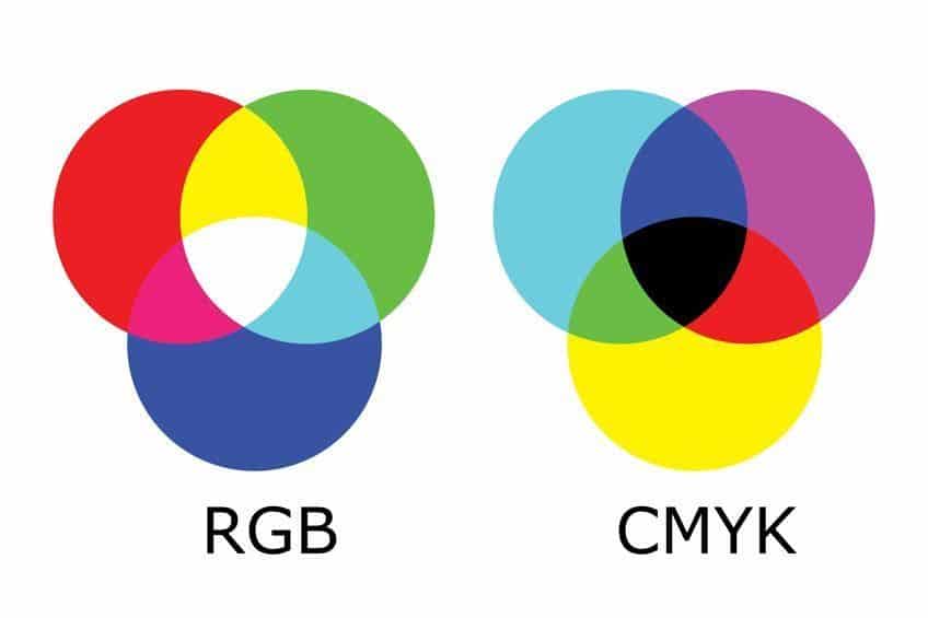
The traditional color wheel is recognized by most of us. However, there are various additional color theories we can use to determine split complementary colors. The three theories that are mostly used include the RYB or traditional color wheel, the CMYK model which is cyan, yellow, magenta, and black, and then the RGB model which is red, green, and blue. Here is what the RGB and CMYK color wheels look like:
The Red, Yellow, and Blue (RYB) Model
The RYB model is the model used by professional artists to create a multi-layered colorful piece. It is also called the subtractive color model because you can use the primary colors to make secondary colors. Let’s look at color combinations for the RYB model:
- What color complements red? You will find green opposite red on the color wheel. Therefore, blue-green and green-yellow are the split complementary colors of red.
- What color complements orange? You will find blue opposite the color orange on the color wheel. Therefore, blue-violet and blue-green are the split complementary colors for orange.
- What color complements blue? You will find orange opposite blue on the color wheel. Therefore, red-orange and yellow-orange are the split complementary color for blue.
- What color complements purple? You will find yellow opposite the color purple on the color wheel. Therefore, yellow-orange and yellow-green are the split complementary colors for purple.
| Shade | Hex Code | CMYK Color Code (%) | RGB Color Code | Color |
| Purple | #800080 | 0, 100, 0, 50 | 128, 0, 128 | |
| Yellow-Green | #9acd32 | 25, 0, 76, 20 | 154, 205, 50 | |
| Yellow-Orange | #ffae42 | 0, 32, 74, 0 | 255, 174, 66 | |
| Orange | #ffa500 | 0, 35, 100, 0 | 255, 165, 0 | |
| Blue-Green | #0d98ba | 93, 18, 0, 27 | 13, 152, 186 | |
| Blue-Purple | #8a2be2 | 39, 81, 0, 11 | 138, 43, 226 | |
| Blue | #0000ff | 100, 100, 0, 0 | 0, 0, 255 | |
| Yellow-Orange | #ffae42 | 0, 32, 74, 0 | 255, 174, 66 | |
| Red-orange | #ff5349 | 0, 67, 71, 0 | 255, 83, 73 | |
| Red | #ff0000 | 0, 100, 100, 0 | 255, 0, 0 | |
| Green-Yellow | #adff2f | 32, 0, 82, 0 | 173, 255, 47 | |
| Blue-Green | #0d98ba | 93, 18, 0, 27 | 13, 152, 186 |
The Red, Green, and Blue (RGB) Model
The additive or RGB model is specifically designed for on-screen viewing and it cannot be used for print media. The colors are influenced by light and the primary for the RGB model are red, green, and blue.
- What color complements green? The complementary color to green is Magenta. Therefore, the split complementary colors are rose and purple.
- What color complements red? The complementary color for red in this instance will be cyan. Therefore, the split complementary colors would be blue-cyan and green-cyan.

- What color complements yellow? The complementary color is blue. Therefore, the split complementary colors are orange and green-yellow.
- What color complements blue? The complementary color is orange. Therefore, the split complementary colors are purple and blue-cyan.
| Shade | Hex Code | CMYK Color Code (%) | RGB Color Code | Color |
| Red | #ff0000 | 0, 100, 100, 0 | 255, 0, 0 | |
| Green-Cyan | #0cbaa6 | 94, 0, 11, 27 | 12, 186, 166 | |
| Blue-Cyan | #0d98ba | 93, 18, 0, 27 | 13, 152, 186 | |
| Green | #008000 | 100, 0, 100, 50 | 0, 128, 0 | |
| Purple | #800080 | 0, 100, 0, 50 | 128, 0, 128 | |
| Rose | #ff007f | 0, 100, 50, 0 | 255, 0, 127 | |
| Yellow | #ffff00 | 0, 0, 100, 0 | 255, 255, 0 | |
| Green-Yellow | #adff2f | 32, 0, 82, 0 | 173, 255, 47 | |
| Orange | #ffa500 | 0, 35, 100, 0 | 255, 165, 0 | |
| Blue | #0000ff | 100, 100, 0, 0 | 0, 0, 255 | |
| Blue-Cyan | #0d98ba | 93, 18, 0, 27 | 13, 152, 186 | |
| Purple | #800080 | 0, 100, 0, 50 | 128, 0, 128 |
Using Split Complementary Color Schemes
The reason to choose a split complementary color palette is because of its versatility. The split complementary colors are not as bright, making them less likely to clash. There are also more cool and warm tones to use.
Although split complementary color schemes work well, they can be overwhelming when you add too many colors to the collection. To use the split complementary color scheme correctly, it is a good idea to choose the dominant color you want to start with, and then you can add the other colors as accents and additions. This way, you won’t create a chaotic mess of colors!
As you learn and begin to gain more experience with color schemes, you could start incorporating more colors.
When creating a space for interior design, using the concept of split complementary colors is extremely helpful. For example, you can use blue as your dominant color and look for which colors complement blue. The complementary colors will be yellow-orange and red-orange. The blue could be used as an accent wall, and then accessories could be done in the split complementary colors. Accessories could include items such as pillows, a vase, and lamp shades, the options are endless!
Split Complementary Color Palettes Used in Interior Design
When doing craft projects, you can be creative using a split complementary color scheme to help navigate what colors to use and where. You can use this color scheme for many types of projects such as quilting, crafting, mosaic, or even flower arrangements!
A split complementary color scheme could make your project stand out and have a beautiful feel to it.
For example, using split complementary colors for floral designs at a wedding, you would choose a dominant color as the focus color and have added colors as accents. Gone are the days of having one boring wedding color! This would make any wedding look stylish and appealing.

The main reason to follow color theory rules is to make it pleasing to look at, which is achieved when the chosen colors complement each other. Using a split complementary color palette with digital designing helps draw attention by using dominant colors and then using the complementary colors as accents, complementing the design.
Ideally, you want to use this approach to produce a harmonious space, but on some occasions, split complementary colors can be overbearing when paired incorrectly! If you are unsure, we suggest that you stick with the sentiment that your dominant color is your main theme color, and the split complementary colors are reserved for the accent pieces.
Do not divert attention away from the original theme!
Combining Split Complementary Colors With Patterns
We have discussed how to use the split complementary color theory to devise what works well together and how to choose a dominant base color. We have then learned how to choose additional colors to work as a support for the focus color. For example, you want to introduce a pattern to create texture in your color palette. When looking at a color scheme of yellow, green, and red-violet, the base color would be red-violet, and the green and yellow shades would be used as accent colors for patterned pillows or a patterned color throw.

| Shade | Hex Code | CMYK Color Code (%) | RGB Color Code | Color |
| Red-Violet | #a35776 | 0, 47, 28, 36 | 163, 87, 118 | |
| Muted Green | #96d294 | 29, 0, 30, 18 | 150, 210, 148 | |
| Light Yellow | #ffff4d | 0, 0, 70, 0 | 255, 255, 77 |
Split Complementary Color Palette: Red-Violet, Green, and Red Orange
To create a colorful children’s bedroom with vibrant and modern finishings, you can use bold colors for a split complementary color palette. For example, a red-violet headboard or drawing panels, adding a floral bedspread with red-orange and green on it.
Add a neutral color to the walls, with one wall painted in muted green, add some violet scatter pillows, and a soft orange floor mat!
| Shade | Hex Code | CMYK Color Code (%) | RGB Color Code | Color |
| Red-Orange | #ff5349 | 0, 67, 71, 0 | 255, 83, 73 | |
| Red-Violet | #c71585 | 0, 89, 33, 22 | 199, 21, 133 | |
| Light Green | #a6ff4d | 35, 0, 70, 0 | 166, 255, 77 |
Split Complementary Color Palette: Red, Orange, and Blue-Green
When thinking of the colors orange, blue-green, and red, they may seem a bit boring. But if we change the hue or tone of those colors, they may be a little less dull! For example, swap the blue for teal and the orange for a burnt orange! This changes the entire ensemble. Use one color as the dominant color in your split complementary color scheme, and then add the accent colors as accessories. The options are endless, so have fun!

| Shade | Hex Code | CMYK Color Code (%) | RGB Color Code | Color |
| Teal | #008080 | 100, 0, 0, 50 | 0, 128, 128 | |
| Orange | #fea02f | 0, 37, 81, 0 | 254, 160, 47 | |
| Crystal Pink | #eed2d2 | 0, 13, 8, 4 | 244, 212, 225 |
Split Complementary Color Palettes Used in Graphics
Graphic designers have a small trade secret to using the HSB model to adjust the hue, saturation, and lightness of a color. This digital tool allows you to change colors using a graphic program and helps alter a color for its optimal appearance. To do this, a designer will adjust the hue to change its color, the saturation to alter the vibrancy of the color, and lastly, change the brightness, which makes the colors seem lighter or darker.
All graphic colors can be found using identification hex or hexadecimal codes.
Did you know that you can make your colors on a graphic program using a color calculator? This is for advanced graphic designers, but essentially the combination would be to choose a base color and its code, for example, the color tan’s code is #d2b48c. Using the split complementary color scheme, the program will calculate the colors to compliment your project! In this case, your split complementary colors for tan would be desaturated blue and desaturated violet.
| Shade | Hex Code | CMYK Color Code (%) | RGB Color Code | Color |
| Tan | #d2b48c | 0, 14, 33, 18 | 210, 180, 140 | |
| Desaturated Blue | #8cbed2 | 33, 10, 0, 18 | 140, 190, 210 | |
| Desaturated Violet | #ba8cd2 | 11, 33, 0, 18 | 186, 140, 210 |
As a beginner, it is challenging to be able to calculate the correct color combinations, and this is why we suggest that you create an experimental page before diving in. Play around with what color complements orange or what color complements purple, this way you will be able to teach yourself how to develop a stunning complementary color palette.

Online options for website and graphic designs are growing, and the options available to assist people with graphic design are endless, especially the user-friendly site Canva. Building your graphics for social media or other projects has never been so simple!
We have covered all the basics of split complementary colors and how to calculate the various color options. We have also looked at which colors work best together and how to match them when designing and planning space. Choosing your complementary color palette can make or break your project, so we suggest experimenting!
Frequently Asked Questions
What Is a Split Complementary Color Palette?
A split complementary color scheme is simply a color theory method in which to calculate colors that will work well together using a color wheel. You begin to buy choosing your dominant color, in this case, we choose the color red. Our second color is across from red on the color wheel, green. When looking at the color green, on either side you will find yellow and blue. These become the split complementary colors of red.
Are There Lots of Split Complementary Colors?
Using a color wheel, you can calculate the specific amount of split complementary color schemes. There are 12 color blocks, and each color has a complementary partner. This partner has its neighbor. For example, starting with the dominant color blue, you can go around the twelve-block wheel to determine the split complementary colors. There are ay variations for each color on the color wheel so your options are endless!
How to Determine What Color Complements Purple?
When working with the color wheel, it is easy to determine what color complements purple. The purple block sits directly opposite the color yellow. This will be its ideal complementary color, but the split complementary color scheme will be purple with yellow-orange and yellow-green.
How to Describe a Double Complementary Color Scheme?
Depending on your design project, you may need to calculate more than one color scheme. The concept of a double complementary color scheme is straightforward. It is determined by having two colors and their complementary colors, this will result in four colors in total.
In 2005, Charlene completed her Wellness Diplomas in Therapeutic Aromatherapy and Reflexology from the International School of Reflexology and Meridian Therapy. She worked for a company offering corporate wellness programs for a couple of years, before opening up her own therapy practice. It was in 2015 that a friend, who was a digital marketer, asked her to join her company as a content creator, and this is where she found her excitement for writing.
Since joining the content writing world, she has gained a lot of experience over the years writing on a diverse selection of topics, from beauty, health, wellness, travel, and more. Due to various circumstances, she had to close her therapy practice and is now a full-time freelance writer. Being a creative person, she could not pass up the opportunity to contribute to the Art in Context team, where is was in her element, writing about a variety of art and craft topics. Contributing articles for over three years now, her knowledge in this area has grown, and she has gotten to explore her creativity and improve her research and writing skills.
Charlene Lewis has been working for artincontext.org since the relaunch in 2020. She is an experienced writer and mainly focuses on the topics of color theory, painting and drawing.
Learn more about Charlene Lewis and the Art in Context Team.
Cite this Article
Charlene, Lewis, “Split Complementary Colors – What Is a Complementary Color Scheme?.” Art in Context. June 29, 2022. URL: https://artincontext.org/split-complementary-colors/
Lewis, C. (2022, 29 June). Split Complementary Colors – What Is a Complementary Color Scheme?. Art in Context. https://artincontext.org/split-complementary-colors/
Lewis, Charlene. “Split Complementary Colors – What Is a Complementary Color Scheme?.” Art in Context, June 29, 2022. https://artincontext.org/split-complementary-colors/.


