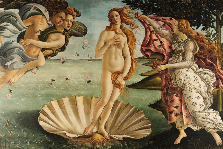


Texture in Art – Exploring the Element of Texture in Art

Texture in art is the actual or perceived quality of a surface: the polish of carved stone, the ridges of thick paint, the weave of fabric, or the convincing illusion of fur, glass, skin, and bark on a flat image. Artists use texture to identify materials, record the act of making, guide attention, create depth, and shape an artwork’s emotional and physical presence. This guide explains actual, implied, and invented texture, compares techniques across media, and provides practical methods for analyzing and creating convincing surfaces.
Defining Texture in Art
Texture is one of the elements of art. It describes how a surface actually feels or how it appears that it would feel. A surface may be smooth, rough, glossy, matte, soft-looking, hard-edged, ridged, pitted, woven, scratched, or polished. The definition therefore includes both the material surface of the artwork and the visual signs that make a represented object seem touchable.
That distinction matters. A painted passage of satin may be physically smooth while creating a strong illusion of slippery, reflective cloth. A sculpture may have a real polished surface that viewers can see from the way light moves across it, even when museum rules mean they cannot touch it. Texture is perceived through touch, sight, memory, and comparison rather than through touch alone.
In art, texture can belong to the artwork’s physical surface, to the subject represented, or to both at once.
Artists create texture through their choice of material, support, tools, and marks. Canvas weave, paper tooth, wood grain, hammered metal, carved stone, thick paint, collage, and stitched fabric all contribute actual surface qualities. Line, value, color, pattern, scale, focus, and highlights can make a flat image suggest textures that are not physically present.
Texture also interacts with other elements and principles of art. Strong changes from smooth to rough can create contrast or emphasis. Repeated marks can establish pattern and rhythm. Fine detail may make an object appear close, while softer or less distinct texture can help it recede. Surface sheen changes the behavior of light: a glossy surface produces concentrated reflections, while a matte surface diffuses reflected light.

Bernini’s marble demonstrates how texture can carry meaning. The sculpture is made from one hard material, yet polished flesh, curling hair, fabric, and the pressure of fingers against skin are differentiated through carving and finish. The viewer recognizes these contrasting qualities visually, while the stone’s actual surface catches light and creates small shadows. Texture helps turn material fact into a persuasive bodily illusion.
Texture does more than identify a material; it can make weight, pressure, softness, age, movement, and the artist’s process easier to perceive.
Different Types of Textures in Art
The broadest and most useful distinction is between actual texture, also called physical, real, or tactile texture, and implied texture, also called visual or illusionistic texture. These categories describe different evidence. Actual texture concerns the topography and material character of the artwork itself. Implied texture concerns what a flat or relatively smooth image leads the eye to imagine.
The two can coexist. A portrait painted with raised brushwork has actual ridges of paint, while its colors and tonal transitions may imply the softness of skin or the weave of clothing. A photograph can depict cracked bark in great detail even though the print’s own surface is smooth. Some teaching systems also identify invented texture: repeated marks or patterns that do not imitate one specific material but still create a strong textural effect. Invented texture remains a form of visual texture.
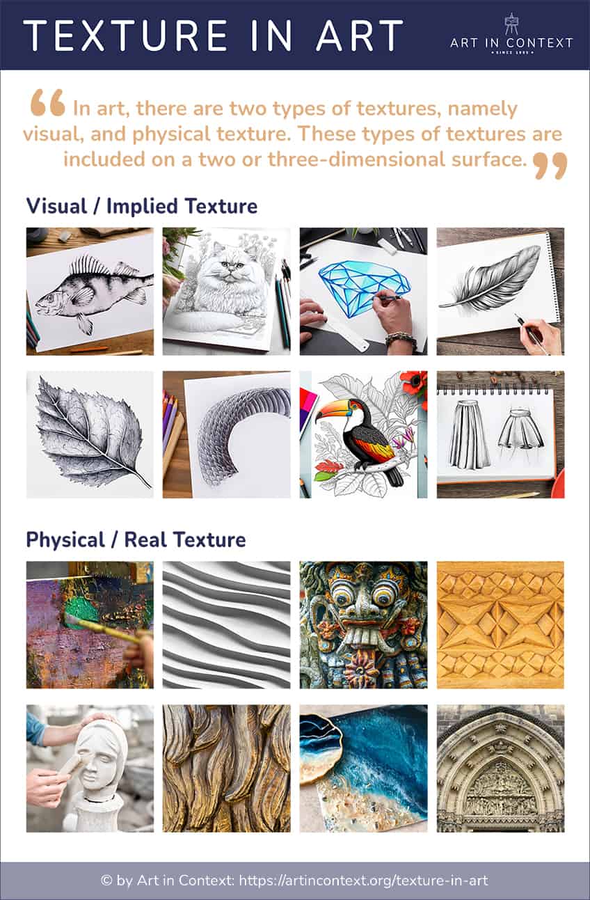
Ask two separate questions: What is the artwork’s surface actually like, and what textures does the image or form lead you to imagine?
Actual, Implied, and Invented Texture Compared
| Type | Where the Texture Exists | Example | Common Confusion |
|---|---|---|---|
| Actual texture | In the artwork’s real surface or material construction | Raised impasto, carved grooves, woven fibers, collage edges, polished steel | A smooth surface is still an actual texture; “actual” does not mean rough |
| Implied texture | In the visual illusion of a represented surface | Painted fur, photographed bark, drawn hair, digitally rendered metal | The image may look tactile while the support remains physically flat |
| Invented texture | In marks or patterns designed to feel textural without copying one material | Repeated dots, symbols, strokes, or digital motifs forming an abstract field | It may overlap with pattern, but its main effect is a perceived surface quality |
A single work can contain all three. A collage may have real paper edges, painted cloth that looks woven, and an abstract field of repeated marks that creates an invented texture.
Visual Texture
Visual texture is the appearance of a surface that the viewer cannot verify by touching the represented object. It is especially important in drawing, painting, printmaking, photography, and digital art, where line, shape, value, color, and detail can suggest fur, stone, water, metal, skin, or any other material on a flat support.
The artwork’s medium still matters. Watercolor can create transparent stains and broken edges; opaque acrylic or oil paint can cover, blend, drag, or hold a mark; graphite responds to the tooth of paper; and digital tools can repeat or vary marks without creating a physically raised surface on the screen. The medium does not determine one texture by itself. The effect depends on how the artist handles it and how the marks relate to the represented material.
Visual texture becomes convincing when marks describe the structure of a surface rather than merely filling it with random detail.
For example, bark may be suggested by irregular vertical cracks that wrap around the cylindrical form of a trunk. Hair may be built from grouped strands that follow the direction of growth instead of from identical lines. Reflective metal usually needs sharp value contrasts and controlled highlights, while velvet tends to appear through deep, light-absorbing darks and softened transitions. The placement, direction, density, and scale of marks are as important as the tool used to make them. Artists have adapted these visual strategies to different media and purposes throughout art history.

Jan van Eyck’s Arnolfini Portrait demonstrates implied texture through finely controlled differences. Fur trim, woven cloth, polished beads, wood, glass, skin, and metal remain paint on an oak panel, yet each appears to respond differently to light. These contrasts help identify objects, separate forms, and establish the room’s material richness without turning the painting into a list of decorative details.
Drawing creates visual texture through mark-making. Hatching uses parallel lines, while cross-hatching layers sets of lines at different angles. Stippling builds tone from dots. Scribbled, broken, scumbled, or contour-following marks can suggest irregular surfaces when their spacing and direction fit the form.

Line density also affects value: closely spaced hatching appears darker than widely spaced hatching. When lines follow the turning plane of a face, fold, or rounded object, they can communicate both form and texture. When every area receives the same mark, however, texture flattens rather than clarifies the subject.
Texture is strongest when mark, value, and form work together: the viewer should understand both what a surface is like and how it occupies space.
Sfumato offers a different kind of visual effect. It is not a method for building raised texture; it is a controlled graduation of tone that softens hard contours. Leonardo da Vinci used the technique to make forms appear to emerge gradually from light and shadow. In the Mona Lisa, delicate transitions around the face and hands contribute to the illusion of soft skin, while atmospheric transitions soften the distant landscape.

The sfumato technique gives gradual tonal transitions a smoky softness. It is most visible where an edge is suggested by a subtle change in light rather than by an outline. Sfumato can support implied texture, but it should not be confused with impasto, which refers to the material relief of paint on a surface.
Sfumato primarily changes the visibility of edges and tonal transitions; impasto changes the physical topography of the paint layer.
Leonardo’s London Virgin of the Rocks provides another useful example. The National Gallery dates this second version to about 1491/2-9 and 1506-8. The painting shows the Virgin Mary, the infant Jesus Christ, the infant Saint John the Baptist, and an angel in a rocky setting. Soft transitions model skin and gauze, while sharper value changes and broken contours make the grotto appear stony and uneven.

Other Renaissance artists used softened modeling to distinguish flesh, cloth, hair, and atmospheric space. Raphael’s The Sistine Madonna (1512/13) and Giorgione’s Boy with Arrow (c. 1505) show how subtle transitions can make skin appear soft while adjacent textiles retain different visual qualities.

The rendering of clothing, curtains, bedding, fur, metal, jewels, wood, and glass served as a demonstration of skill in Renaissance art. Different textures make figures and objects legible, but they also organize attention: a bright glint on metal can punctuate a composition, while a broad matte area can remain visually quiet.

Dutch still-life painters likewise made texture central to close looking. The Dutch Golden Age painter Pieter Claesz’s Still Life (c. 1625) differentiates a lemon, olives, sweetmeats, a lace-edged damask cloth, and reflective vessels through carefully varied edges, highlights, and tonal transitions. The illusion is convincing because each material behaves differently under the same light.
Claesz’s oil-on-panel painting demonstrates seventeenth-century illusionism: its textures are persuasive because light, value, and edge describe each material consistently.

Physical Texture
Physical texture describes the real material surface of an artwork. It may be raised, incised, polished, woven, modeled, cast, sanded, stitched, collaged, cracked, or otherwise shaped. Actual texture is not limited to sculpture: a painting can have ridges of impasto, a collage can contain paper and fabric, and a photograph can have a glossy, matte, pebbled, or fibrous paper surface.
The impasto technique creates actual texture by applying paint thickly enough to retain the movement of a brush or palette knife. The raised paint catches directional light and may cast tiny shadows. A thinly painted picture can still have actual texture from its canvas, panel, paper, ground, or varnish, even when the represented scene relies mainly on implied texture.
Actual texture is evidence of material and process; implied texture is evidence constructed for the eye.
Jeff Koons‘s Balloon Dog (1994-2000) creates a deliberate conflict between material and appearance. Its mirror-polished stainless steel with transparent color coating looks like a light, pliable balloon enlarged to monumental scale. The sculpture is actually hard, heavy, and exceptionally smooth. Reflections bend across its rounded segments, so the real polished surface strengthens the illusion of inflated skin.
In this studio interview, Jeff Koons discusses the origins and material construction of Balloon Dog (Orange), helping clarify the contrast between hard steel and the appearance of an inflated balloon:
Joan Eardley’s Seeded Grasses and Daisies, September (1960) combines oil paint with real grass stalks and seedheads on hardboard. The collaged plant material creates actual relief while also referring directly to the field depicted. Here, texture is not merely an imitation of the landscape; part of the landscape becomes part of the painting’s material surface.
Texture does not become important only in modern art. Carved stone, modeled clay, woven textiles, metalwork, mosaic, panel painting, and manuscript illumination all possess actual surfaces. What changed across modern painting was the degree to which many artists allowed brushwork, built-up material, and the support itself to remain visibly active rather than hiding every trace of the making process.
Many Impressionist painters and later Expressionist artists allowed the handling of paint to remain visibly active rather than disguising every mark. Claude Monet often worked en plein air, directly confronting changing outdoor light and weather. His Impression, Sunrise (1872) uses varied brushstrokes and thin veils of color to distinguish hazy atmosphere, water, boats, and the orange sun. The marks do not imitate every surface in detail. Instead, their direction, density, and contrast help the eye reconstruct shifting light and distance.

Vincent van Gogh made the handling of paint especially visible. In The Starry Night (1889), repeated directional strokes organize the sky, hills, cypress, and village into different zones. The viewer can read the scene and the paint simultaneously: blue and yellow marks describe a night landscape while their rhythm and material presence remain apparent on the canvas.
Visible brushwork can perform two tasks at once: it can represent a surface in the world and draw attention to paint as a physical material.

J. M. W. Turner used broken, dragged, layered, and softened paint to merge atmosphere with movement. In Rain, Steam, and Speed – The Great Western Railway (1844), the train’s sharper dark form pushes through sweeping passages of rain, steam, light, and landscape. The contrast between more definite and less definite marks makes speed perceptible without requiring every object to have a crisp boundary.

How Artists Create Texture Across Media
The material and tool change from one medium to another, but the same core questions remain: Is the surface physically changed, visually suggested, or both? Does texture describe a subject, reveal a process, or organize the composition?
| Medium | Common Methods | Main Texture Evidence | What to Watch |
|---|---|---|---|
| Drawing | Hatching, cross-hatching, stippling, contour marks, erasing, rubbing, and paper tooth | Mainly implied texture, with some actual paper and material grain | Marks should follow form, scale, and light rather than fill every area equally |
| Painting | Glazing, scumbling, dry brush, staining, dragging, palette knife, and impasto | Implied surfaces plus actual paint relief, canvas weave, ground, and varnish | Do not confuse soft edges such as sfumato with raised material texture |
| Printmaking | Etching, engraving, drypoint, woodcut, linocut, lithography, and screenprinting | Incised or raised matrices translated into line, grain, embossing, and ink deposits | The printed texture may differ from the texture of the plate or block |
| Sculpture and ceramics | Carving, modeling, casting, sanding, glazing, burnishing, scoring, and tool marks | Strong actual texture shaped by material, finish, and reflected light | Polish, roughness, seams, and patina can change how mass and weight are perceived |
| Collage, textiles, and mixed media | Tearing, layering, stitching, knotting, weaving, felting, attaching, and embedding | Actual fibers, edges, overlaps, thickness, and flexible surfaces | Material joins can be expressive evidence rather than flaws to hide |
| Photography and digital art | Lighting, focus, resolution, grain, noise, scanning, brushes, displacement, and simulation | Mostly implied texture on screen or print, plus the physical finish of the output | A convincing texture needs consistent scale, perspective, edge, and illumination |
Texture also changes with viewing distance. A thick ridge may dominate at arm’s length but merge into a color passage from across the room. A high-resolution photograph may reveal every crack in bark, while a small print suppresses that detail. Analysis should therefore consider scale, distance, lighting, and display conditions.
Describing Texture in Art
Useful texture descriptions name observable qualities rather than stopping at “interesting” or “realistic.” Begin with surface profile, then consider sheen, hardness, regularity, scale, and the apparent process. A surface can be smooth but matte, rough but reflective, soft-looking but physically hard, or sharply incised without appearing coarse.
The most accurate adjective depends on the evidence in front of you. “Glossy” describes the way a surface reflects light, while “smooth” describes a lack of noticeable bumps or ridges. “Carved,” “scratched,” and “woven” point toward processes or structures. “Velvety” and “stony” are comparisons that describe how a surface appears it might feel.
| Surface Profile | Sheen and Material Impression | Marks and Processes |
| Smooth, rough, fine, coarse, flat, raised, bumpy, ridged, pitted, wrinkled, porous. | Glossy, matte, reflective, lustrous, translucent, velvety, silky, leathery, furry, stony, metallic. | Brushed, dragged, dabbed, layered, woven, stitched, carved, incised, etched, scratched, chipped, polished. |
Strong formal analysis connects a descriptor to its cause and effect. Instead of writing, “The painting has a rough texture,” explain what produces that impression: “Closely packed, broken strokes and raised ridges of paint catch the light, making the field appear dry and windblown.” This identifies evidence, texture, and visual consequence in one statement.
Texture, Pattern, Form, and Value Compared
These terms often work together, but each describes a different part of the visual evidence:
| Term | Core Question | Example |
|---|---|---|
| Texture | What is the surface actually or apparently like? | Rough bark, polished steel, soft-looking fur, raised paint |
| Pattern | What unit repeats and how is it organized? | A grid, stripe, dot field, floral repeat, or woven motif |
| Form | How does a shape occupy or suggest three-dimensional space? | A rounded vessel, folded cloth, carved body, or geometric volume |
| Value | How light or dark is an area? | Sharp highlights on metal, deep shadows in velvet, pale haze in distance |
Pattern can create texture when its units are dense or irregular, but a perfectly repeated pattern may remain primarily decorative. Value can imply texture by showing how light hits a surface, yet value alone does not identify whether that surface is rough, glossy, soft, or porous. A strong description names the relationship among these elements.
How to Analyze Texture in an Artwork
Texture analysis becomes clearer when you separate observation from interpretation. The following method works for paintings, drawings, sculptures, photographs, prints, textiles, installations, and digital images.
- Identify the artwork’s materials and support. Note whether the work uses canvas, panel, paper, stone, metal, clay, fabric, photographic paper, found objects, or a screen. Material establishes what actual textures are possible.
- Look for physical surface evidence. Observe ridges, scratches, dents, seams, fibers, collage edges, polish, cracks, or tool marks. Directional or raking light often makes shallow relief easier to see. Do not touch an artwork unless the institution or artist explicitly invites it.
- Separate actual from implied texture. Ask whether a quality belongs to the artwork itself or to an object represented in it. Painted fur may look soft while the paint surface is smooth; polished metal may be physically smooth while reflecting a visually complex environment.
- Trace the visual tools that create the effect. Examine line direction, value contrast, color shifts, repeated shapes, focus, highlights, shadows, and mark density. Explain how these cues make the surface appear rough, wet, soft, hard, near, distant, heavy, or light.
- Explain texture’s role in the whole work. Decide whether it creates emphasis, contrast, rhythm, depth, realism, ambiguity, material presence, or evidence of process. Compare at least two areas: a textural difference is often more meaningful than one isolated description.
For example, an analysis of Koons’s Balloon Dog can distinguish the sculpture’s actual polished steel from the implied elasticity of a balloon, then explain how scale and reflection intensify that contradiction. An analysis of the Arnolfini Portrait can compare fur, glass, wood, skin, and fabric, then show how light and edge handling allow each material to remain legible on a painted panel.
A Five-Swatch Texture Exercise
This exercise develops control without requiring a finished picture:
- Choose five surface words. For example: polished, porous, fibrous, cracked, and velvety.
- Use one medium and one format. Keeping the materials constant makes the differences come from mark, value, edge, and density.
- Build each swatch from structure. Let marks follow the grain, weave, crack, pile, or reflective behavior of the chosen surface.
- Use one consistent light direction. Highlights and shadows should agree across every mark so the surface feels coherent.
- Label actual and implied effects. Note what the paper, paint, or collage really feels like and what the swatch merely makes the eye imagine.
Photograph the swatches from directly above and again with light from the side. The second image will reveal actual relief; the first will make it easier to judge the implied texture.
Common Texture Mistakes and Better Fixes
| Common Mistake | Why It Weakens the Effect | Better Fix |
|---|---|---|
| Adding random detail everywhere | The marks do not explain material, form, or focus | Use fewer marks and align them with the surface’s structure |
| Using the same mark for every material | Hair, metal, skin, bark, and cloth begin to look identical | Change edge, density, direction, value, and highlight behavior by material |
| Ignoring the light source | Highlights and shadows contradict one another | Choose one light direction before building texture |
| Rendering distant texture as sharply as foreground texture | Depth collapses and the whole surface becomes noisy | Reduce contrast, detail, and edge sharpness with distance |
| Using “smooth” and “glossy” as synonyms | Surface profile and sheen describe different qualities | Describe both: smooth and matte, rough and reflective, or polished and glossy |
| Touching an artwork to verify texture | Contact can damage surfaces and is normally prohibited | Use raking light, shadows, material records, and close visual observation unless touch is explicitly invited |
The following beginner-friendly overview provides a visual recap of actual and implied texture and demonstrates how marks and layered material can engage the sense of touch:
A Summary of Texture in Art
Texture is easiest to understand when the material surface and the represented surface are compared directly. The table below provides a compact framework for identifying each type and choosing the right evidence in an artwork.
| Type of Texture | What It Describes | How to Recognize It |
| Visual texture, also called implied or illusionistic texture | The way a represented surface appears it would feel, even when the artwork itself is flat or physically different. | Look for line, value, color, edge, pattern, scale, and highlight cues. Examples include the soft transitions of the Mona Lisa and the differentiated objects in Claesz’s Still Life. |
| Physical texture, also called actual, real, or tactile texture | The artwork’s real surface topography and material character, including smooth surfaces as well as rough or raised ones. | Look for ridges, incisions, fibers, collage, tool marks, polish, and shadows cast by relief. Examples include Balloon Dog, the marble Rape of Proserpina, and Eardley’s grass-filled paint surface. |
| Invented texture | A visual surface created from marks or patterns that do not imitate one specific real material. | Look for repeated dots, signs, lines, or digital motifs whose density and variation create a textural field. Explain whether the effect supports rhythm, emphasis, atmosphere, or abstraction. |
Texture operates across media, from drawing and painting to sculpture, photography, textiles, installation, and digital art. The key is to distinguish the artwork’s real surface from the surfaces it asks the viewer to imagine, then explain how those qualities support form, space, attention, process, and meaning.
Read also our texture art web story.
Learn More About the Elements of Art
Texture works with line, shape, form, color, value, and space rather than in isolation. Explore the related guides below to see how these elements combine in a composition:
Frequently Asked Questions
What Is Texture in Art?
Texture in art is the actual or perceived surface quality of an artwork. It includes physical features such as polished stone, woven fibers, incised lines, or raised paint, as well as visual illusions of materials such as fur, skin, glass, or bark. Artists create and describe texture through material, tool marks, line, value, color, pattern, focus, and the way light behaves across a surface.
What Are the Different Types of Texture in Art?
The two main types are actual texture and implied texture. Actual, physical, real, or tactile texture belongs to the artwork’s material surface and includes smooth surfaces as well as rough or raised ones. Implied, visual, or illusionistic texture is the appearance of a surface that is not physically present, such as painted velvet on a smooth panel. Invented patterns are often treated as a subtype of visual texture.
How Do Artists Create Texture on a Flat Surface?
Artists create visual texture on a flat surface by varying line direction, mark density, value, color, edge sharpness, highlights, shadows, focus, and repeated shapes. Hatching can suggest hair or grain, stippling can create porous or granular effects, and gradual tonal transitions can make skin appear soft. Artists can also create actual relief on a nominally flat work by using impasto, collage, fabric, sand, or other attached materials.
How Can You Analyze Texture Without Touching the Artwork?
Analyze texture by identifying the materials, observing how light reveals ridges or polish, and separating the artwork’s real surface from the surfaces represented in it. Then trace the visual evidence: marks, edges, value contrasts, patterns, highlights, and shadows. Compare two areas and explain what the contrast accomplishes, such as emphasis, depth, rhythm, realism, material presence, or a visible record of the artist’s process.
What Is Invented Texture in Art?
Invented texture is a visual texture made from marks or patterns that do not copy one specific real material. Repeated dots, symbols, strokes, or digital shapes can create a surface that feels dense, grainy, soft, energetic, or mechanical. It is usually treated as a subtype of visual texture because the sensation is created for the eye rather than through the artwork’s physical relief.
What Is the Difference Between Texture and Pattern?
Texture describes how a surface actually feels or appears it would feel, while pattern describes the organized repetition of a visual unit. A pattern can create a textural effect when its marks are dense or varied, but the concepts are not identical. Stripes may remain a clear pattern, for example, while irregular layered strokes may read primarily as a rough or fibrous texture.

Alicia du Plessis is a multidisciplinary writer. She completed her Bachelor of Arts degree, majoring in Art History and Classical Civilization, as well as two Honors, namely, in Art History and Education and Development, at the University of KwaZulu-Natal, South Africa. For her main Honors project in Art History, she explored perceptions of the San Bushmen’s identity and the concept of the “Other”. She has also looked at the use of photography in art and how it has been used to portray people’s lives.
Alicia’s other areas of interest in Art History include the process of writing about Art History and how to analyze paintings. Some of her favorite art movements include Impressionism and German Expressionism. She is yet to complete her Masters in Art History (she would like to do this abroad in Europe) having given it some time to first develop more professional experience with the interest to one day lecture it too.
Alicia has been working for artincontext.com since 2021 as an author and art history expert. She has specialized in painting analysis and is covering most of our painting analysis.
Learn more about Alicia du Plessis and the Art in Context Team.
Cite this Article
Alicia, du Plessis, “Texture in Art – Exploring the Element of Texture in Art.” Art in Context. March 17, 2022. URL: https://artincontext.org/texture-in-art/
du Plessis, A. (2022, 17 March). Texture in Art – Exploring the Element of Texture in Art. Art in Context. https://artincontext.org/texture-in-art/
du Plessis, Alicia. “Texture in Art – Exploring the Element of Texture in Art.” Art in Context, March 17, 2022. https://artincontext.org/texture-in-art/.