Secondary Colors – A Detailed Secondary Colors Definition
Understanding colors and color theory is a vital skill for all artists that enables them to create eye-catching and vibrant pieces. Secondary colors are important bridges between the primary colors and all other colors on the spectrum and can be used to create neutrals, change color temperature, and form part of striking color schemes. We have created this helpful guide with all you need to know about secondary colors as well as how to create them and use them effectively.
What Are Secondary Colors?
The first thing that we will explore is a secondary colors definition as well as some of their meanings. Traditionally, there are three secondary colors which are the colors green, violet, and orange. These colors feature prominently in nature from flower beds to bird plumes.
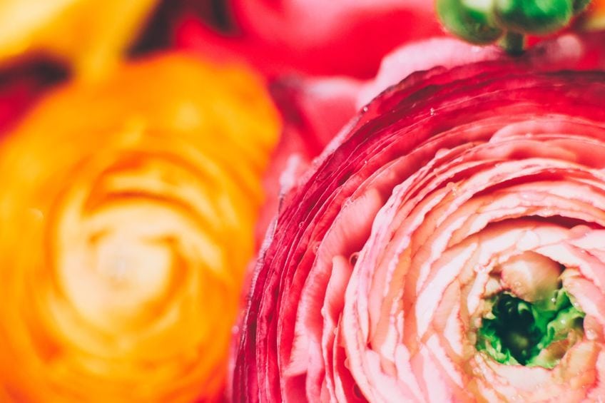
Green is most often associated with nature, reminding us of verdant fields and thick forests, but also symbolizes new beginnings and growth. This is why greens tend to make you feel calmer and more relaxed. Violet has been historically connected to nobility, royalty, and opulence, giving it feelings of grandeur, wisdom, as well as a little bit of magic and mystery. Violet, therefore, creates an energetic and mindful mood. Orange is the warmest and most vibrant of the traditional secondary colors. Reminiscent of flames, this color is a mix of passion and positivity and gives you feelings of happiness and youthfulness.
How Secondary Colors Are Created
Knowing how to create these colors can save you a lot of time and money because you do not need to buy the correct hue or spend hours searching for it every time you paint. Before understanding how to mix and use secondary colors, it is useful to understand some basic color theory.
Color theory is a set of guidelines that all artists use to mix colors as well as balance and contrast them in a way that is not dull or overwhelming.
Color Wheels
One of the fundamental parts of color theory is the color wheel. A basic color wheel is a circular model of all the colors in the visible spectrum and shows how they are related to one another. There are a variety of different color wheel models and the one that you use can slightly alter which hues are considered primary and secondary colors.
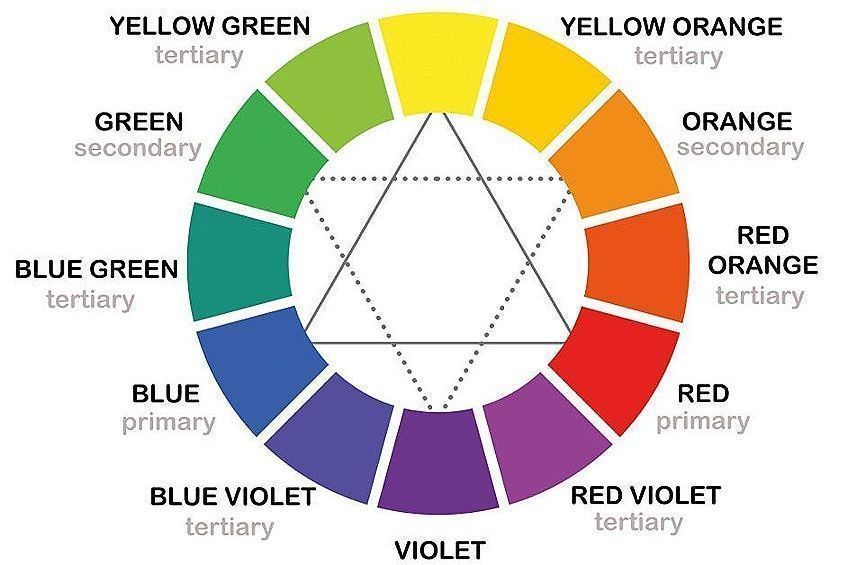
Irrespective of which color model you use, a primary color is a color that cannot be created by combining any other colors on the color wheel. Primary colors also combine together in various ways to create all the other colors on the color model. Secondary colors are so called because they are the first colors that are created by mixing two primary colors together. The three basic secondary hues are formed by combining equal parts of two primary colors.
The Traditional Color Wheel
The most well-known color model used in art is the red-yellow-blue (RYB) color wheel, which is also known as the traditional color wheel. The primary colors in this color wheel are red, yellow, and blue, as the name suggests. The traditional color wheel is what artists use when painting and is a subtractive color model. This is because you are subtracting colors from black to get your desired hue.
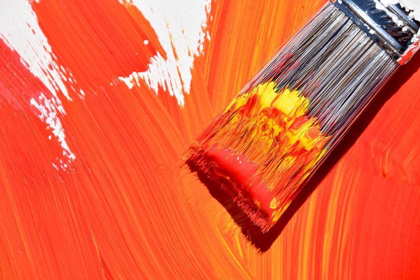
For example, omitting the color blue leaves you with red and yellow, so you end up with orange, which is a secondary color.
The other secondary colors in the traditional color wheel are green, which is a mix of blue and yellow, and violet, which is created by mixing blue and red. You can easily see which secondary color you will create by looking at the hue that lies between the two primary colors you are combining on the color wheel.
The Red-Green-Blue Color Wheel
As you can see, the traditional color wheel is a great tool for understanding how to mix secondary colors, however, you cannot use the same mixing method when working with light as when working with paint pigments. When you work with digital art, you mix together different wavelengths of light instead of paint pigments to create different colors. This means that the traditional color wheel will not work and you will need to use the RGB color wheel instead. The RGB color wheel is an additive color wheel that is based on adding light to black to create colors. Each color has a different wavelength, with violet being the shortest and red having the longest wavelength.
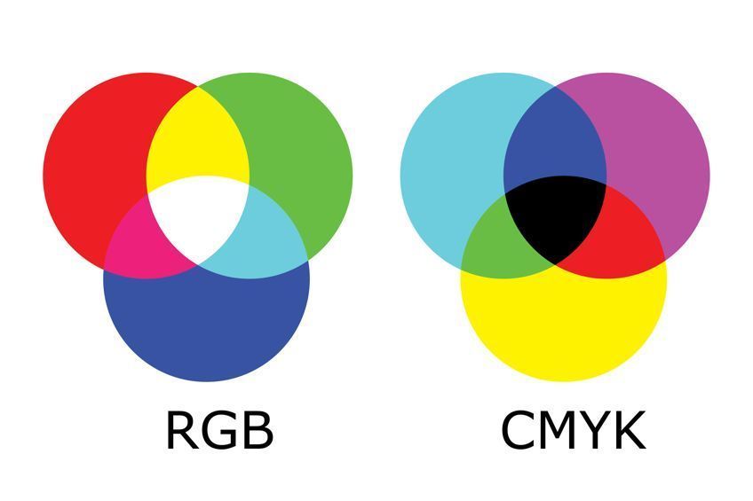
The primary colors in this model are instead red, green, and blue. The secondary colors in this model are cyan, which is blue mixed with green; magenta, made from mixing red and blue; and yellow, which is a combination of red and green. Like the traditional color wheel, the secondary colors of the RGB model are located in between the two primaries used to make it. We will be using the traditional RYB color wheel to demonstrate how the endless different versions of secondary colors can be made as well as how to use them.
An Introduction to Color Codes
Color codes are used to pinpoint the exact color among the infinite colors on the spectrum. This is especially useful in digital art, as it allows you to easily find colors again across works. However, color codes are also useful for artists that work with paint, as they can give you an idea of which primary colors and what proportions were used to create specific colors.
The most widely used color codes are the hex code and RGB codes.
Both codes are based on the RGB color model and show the proportion of those primary colors that are used to make up a specific. The RGB color code uses three values each from zero to 255, with zero meaning none of that color is used and 255 meaning that the color is at full strength. The hex color code is a kind of shorthand for the RGB code and uses three pairs of various combinations of numbers from zero to nine and letters from “a” to “f”. Once again, “00” would mean the hue contains none of that primary color, while “ff” indicates that the primary color is at full strength.
Exploring Different Secondary Colors
In the table below are the three basic secondary colors as well as their color codes. You can easily be able to see by the color codes that green is made of a combination of blue and yellow and contains no red. Likewise, you can see that orange is made of red and yellow but contains no blue, and violet is made of blue and red but no yellow or green were used to make it.
| Secondary Color Name | Secondary Color Hex Code | RGB Secondary Color Code | CMYK Secondary Color Code (%) | Shade |
| Green | #00FF00 | 0, 222, 0 | 100, 0, 100, 0 | |
| Orange | #FFA500 | 255, 165, 0 | 0, 35, 100, 0 | |
| Violet | #8F00FF | 143, 0, 255 | 44, 100, 0, 0 |
Mixing Tertiary Colors
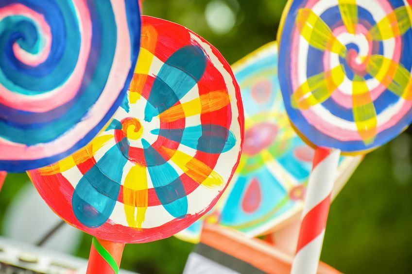
Secondary colors can also be mixed with other secondary colors as well as primary colors to produce a variety of tertiary colors. There are six of these tertiary colors in the RYB color model, and these are blue-green, yellow-green, yellow-orange, red-orange, red-violet, and blue-violet.
These colors are also called intermediate colors and their exact hue will depend on the proportions of the colors used to make them.
Mixing Warm and Cool Secondary Colors
Mixing two primaries in equal portions gives you the basic secondary color. However, you can also alter the exact hue that you get by changing the ratio of your primary colors. Violet with more blue will be a bluish-violet, while one with more red will be a reddish-violet. Color bias describes which color your hue leans towards on the color wheel. There are many different secondary hues available that are all subtly different and knowing how to mix them allows you to get the perfect color for your art. Mixing two primaries can unexpectedly lead to muddy brown if you do not understand color temperature and bias.
By altering the proportions of your primary colors, you can change the color temperature of your secondary colors, which can then be used to change the color temperature of your primary colors. Strictly speaking, warm colors consist of reds, yellows, and oranges whilst cool colors include the secondary colors green and violet as well as the primary color blue.
However, all colors are impacted by any other colors that surround them, and so their relative color temperature can be different from their actual color temperature. For example, the reddish-violet will be relatively warmer when compared to pure violet and the bluish-violet will be relatively cooler.
Both colors, however, will be cooler than pure red or warmer than pure blue.
When you mix two primary colors with a different color bias together, your colors can appear muddy because you are actually mixing together all the primary colors. If you ended up with a brown instead of the vivid green you expected to create, you may have mixed a warm yellow, which included some orange, with blue. To create vibrant colors, you should instead mix colors that lean towards the color you want to create. For example, using a cool yellow that leans towards the green with blue or a bluish green will create a vivid green.
Color bias is why many artists choose to have six primary hues on hand instead of the traditional three, with each pair having a strong bias to either cooler or warmer. These would consist of a bluish-red and an orangish-red, an orangish-yellow and greenish-yellow, as well as a greenish-blue and a reddish-blue.

A vibrant green like in our example can be created by mixing a greenish-blue with a greenish-yellow. If you want a duller green, mix together orangish-yellow and reddish-blue instead as both have red undertones and will give your green a brownish appearance. Mixing an orangish-red and a greenish-blue will give you a dark gray instead of violet, and mixing greenish-yellow with bluish-red can create a toasty burnt orange.
Warm and Cool Oranges
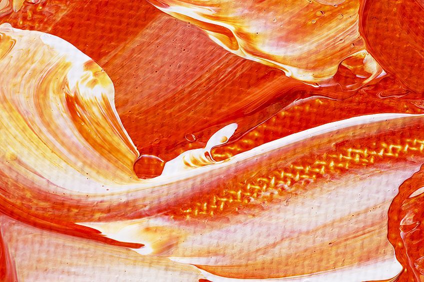
Warm oranges are more vibrant and intense than pure orange and are very reminiscent of fire. This secondary color can easily become overwhelming, so be careful if you are using it as your dominant color. Cool orange is a more subdued and muted color.
It contains more green than warm orange and so is perfect for creating pumpkins and squash in realism paintings.
| Secondary Color Name | Secondary Color Hex Code | RGB Secondary Color Code | CMYK Secondary Color Code (%) | Shade |
| Warm Orange | #FA6000 | 250, 96, 0 | 0, 62, 100, 2 | |
| Cool Orange | #FAA300 | 250, 163, 0 | 0, 35, 100, 2 |
Warm and Cool Greens
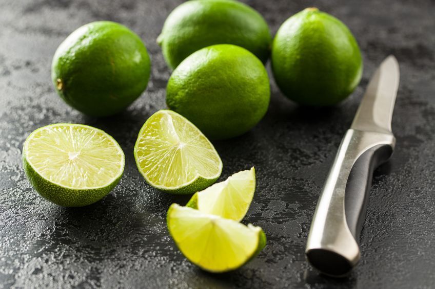
Warm greens appear more yellow compared to a pure green and are excellent for painting grassy fields or creating highlights for sunlight on plants. Cool greens appear bluer when used with pure and warm greens and are perfect for ocean landscapes and creating depth in water.
| Secondary Color Name | Secondary Color Hex Code | RGB Secondary Color Code | CMYK Secondary Color Code (%) | Shade |
| Warm Green | #A6AD3C | 166, 173, 60 | 4, 0, 65, 32 | |
| Cool Green | #3CAD65 | 60, 173, 101 | 65, 0, 42, 32 |
Warm and Cool Violets
Warm violet appears deeper and redder than pure violet and pairs perfectly with a warm green. A cool violet has more blue than pure violet.
It is great for creating shadows in distant landscapes as it creates the illusion of depth and distance.
| Secondary Color Name | Secondary Color Hex Code | RGB Secondary Color Code | CMYK Secondary Color Code (%) | Shade |
| Warm Violet | #700961 | 112, 9, 97 | 0, 92, 13, 56 | |
| Cool Violet | #560970 | 86, 9, 112 | 23, 92, 0, 56 |
Adding Neutrals to Secondary Colors
Changing the color bias of your hue is not the only way to change the look of your secondary color. Neutrals can also be used in different ways to change the saturation and brightness or values of your secondary colors. White, black, gray, and earth tones are all neutrals, however, they are not included on many color wheels and so their ability to change the look and feel of your colors is often overlooked.
White and black are not actually colors. White is the reflection of all the colors in the spectrum, which is why when we add all the wavelengths of colors together in the RGB additive model it appears white. In contrast, black is the absence or absorption of all colors in the spectrum, which is why subtracting a primary color gives you the complementary color in the RYB color wheel. Gray is usually a mixture of black and white, however, you can mix gray with warm or cool biases by mixing together all the primary colors.
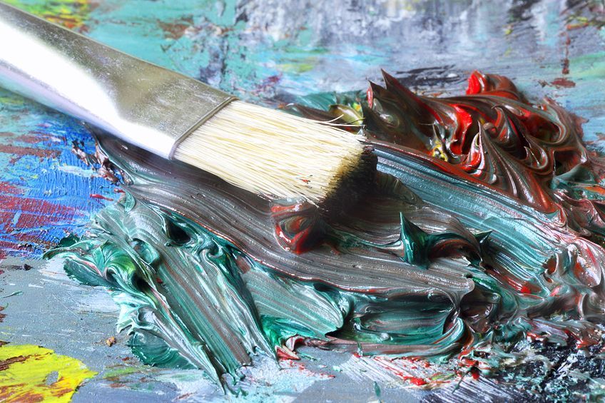
Creating a tint, shade, or a tone of a color involves adding a neutral to it. If you want to create a tint of your secondary color you add white to that color. Tints lighten your secondary color and are very useful if you feel that your orange, for example, is too vibrant or intense.
To create a shade of a secondary color you would add brown to it. This darkens it and makes it bolder and more dramatic, which is great for turning your violet into an eggplant color. This, however, is not the best way to darken colors as black paint usually has green or red undertones and will make your secondary color muddy if it does not have the same bias.
When you create a tone of a color, you are adding gray to it. This lowers the vibrancy or saturation of the color, which means that the resulting tone is a softer more muted color. Adding white tends to cool the color while adding black tends to warm it.
The final temperature of your secondary color, however, usually depends more on the temperature of the colors used to make it.
Green Tones and Tints
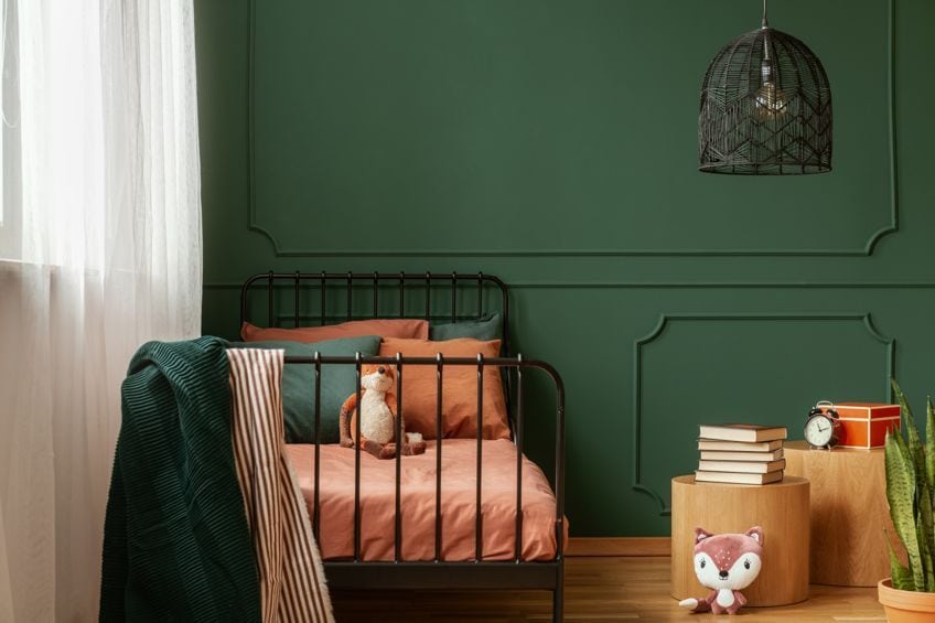
Adding white to green might result in a soft light mint color. This color is great for highlighting distant plants or trees. You can get a deep sage tone by adding gray to green, which is perfect for dark foliage in landscapes.
| Secondary Color Name | Secondary Color Hex Code | RGB Secondary Color Code | CMYK Secondary Color Code (%) | Shade |
| Mint | #99F299 | 153, 242, 153 | 37, 0, 37, 5 | |
| Sage | #639963 | 99, 153, 99 | 35, 0, 35, 40 |
Orange Tones and Tints
By tinting orange, you create a softer wheat color, which is good for creating highlights and soft contrast. Adding gray creates an almost brown cider color.
This tone is very toasty and is perfect for creating warm woods.
| Secondary Color Name | Secondary Color Hex Code | RGB Secondary Color Code | CMYK Secondary Color Code (%) | Shade |
| Wheat | #F5CB7F | 245, 203, 127 | 0, 17, 48, 4 | |
| Cider | #B56727 | 181, 103, 39 | 0, 43, 78, 29 |
Violet Tones and Tints
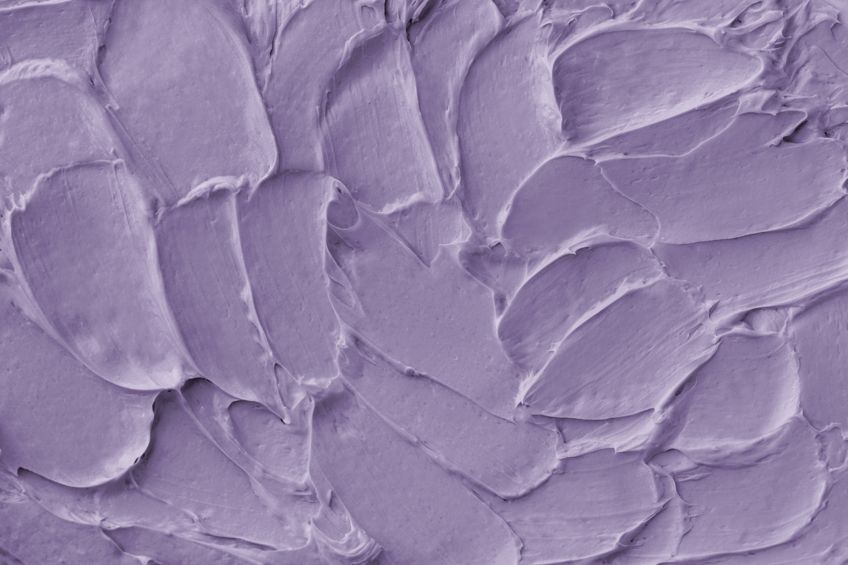
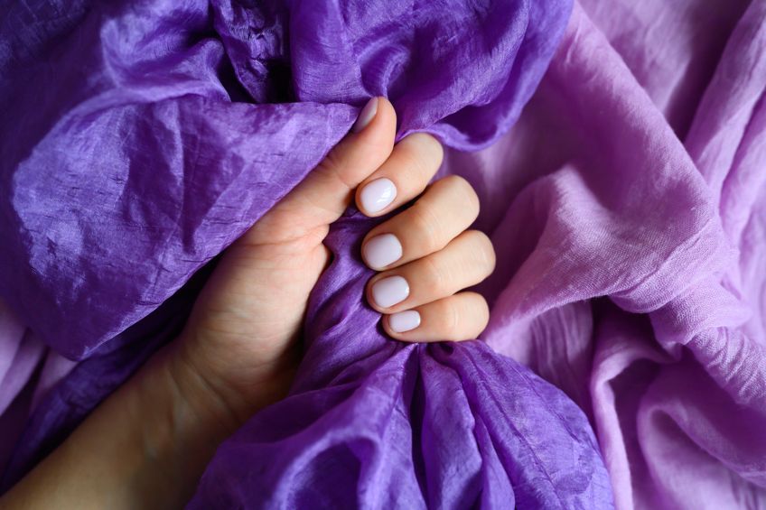
Adding white to violet produces a calming lavender tint, which can be used for distant mountains to create depth and highlights. Amethyst can be created when you add gray to violet. This tone is great for cooler pallets, especially when contrasted with a pale yellow.
| Secondary Color Name | Secondary Color Hex Code | RGB Secondary Color Code | CMYK Secondary Color Code (%) | Shade |
| Lavender | #C88DF7 | 200, 141, 247 | 19, 43, 0, 4 | |
| Amethyst | #7C519E | 124, 81, 158 | 22, 49, 0, 38 |
With all these different secondary hues, tints, tones, and shades, it is a good idea to keep a record of the proportions of paint used to create your colors. Do not forget to include a swatch of the color as well so it is easier the next time you need to mix up another batch.
What Are Secondary Colors Complements
The wide variety of secondary colors can make it difficult to find colors that work well together to create a balanced color palette; however, color theory and the color wheel can make this task much easier. There are many different color schemes, all with different guidelines to follow, however, the most popular one is the complementary color scheme.
Firstly, all hues lie opposite their complement on the color wheel.
Each secondary color has a complementary color that lies opposite it, and this color is always the other primary color that was not used in the creation of that secondary color. This makes it very easy to remember the different complementary colors to your secondary color. Orange’s complement is blue, green has red as its complement, and violet is complemented by the color yellow.
The complementary color scheme uses these two complementary colors, as well as their shades, tones, and tints, to create great contrast and makes both colors appear more vibrant. To prevent your color palette from becoming overwhelming you should choose one of the two colors as your main colors and use the other as an accent color. This is called color dominance and helps to keep your color scheme striking and balanced.
If you are looking for a more monochrome color scheme, then the analogous color scheme might be better for you. This color scheme heroes your secondary color by using the two colors that lay alongside your secondary color on the color wheel as accent colors that create soft contrast. If you use orange then it will be paired with red-orange and yellow-orange, green will be paired with blue-green and yellow-green, and violet will be paired with blue-violet and red-violet. Each of these color schemes may also use an additional color for more contrast, such as one of the primary colors used to make your dominant secondary color.
Secondary colors have an infinite number of various hues, tints, tones, and shades that can all be used to create impactful color schemes. Understanding how secondary colors are created will make it easier to mix your own and will save you time and money while using color temperature and neutrals can change your secondary colors in many ways and allow you to create the perfect hue to use in your art or even in your home.
Frequently Asked Questions
What Is a Good Secondary Colors Definition?
A secondary color is any color made by mixing together equal amounts of two primary colors. There are two main color models with slightly different secondary colors in each. The traditional color model has green, orange, and violet as secondary colors, whereas the RGB model lists cyan, magenta, and yellow as its secondary colors.
What Colors Go With Secondary Colors?
Secondary colors are created by mixing two primary colors so it is easy to find their complementary color. A secondary color’s complement is always the other primary color that was not included when making it. For example, the complementary color of orange, which is made of yellow and red, is blue. Green has red as its complement and violet has yellow. When complementary hues are used together, both colors appear more vibrant.
Is Brown a Secondary Color?
No, brown is considered a neutral color and is usually made by mixing a secondary color with its complementary color. A popular combination is to add small amounts of blue to a warm orange until you achieve your desired color.
In 2005, Charlene completed her Wellness Diplomas in Therapeutic Aromatherapy and Reflexology from the International School of Reflexology and Meridian Therapy. She worked for a company offering corporate wellness programs for a couple of years, before opening up her own therapy practice. It was in 2015 that a friend, who was a digital marketer, asked her to join her company as a content creator, and this is where she found her excitement for writing.
Since joining the content writing world, she has gained a lot of experience over the years writing on a diverse selection of topics, from beauty, health, wellness, travel, and more. Due to various circumstances, she had to close her therapy practice and is now a full-time freelance writer. Being a creative person, she could not pass up the opportunity to contribute to the Art in Context team, where is was in her element, writing about a variety of art and craft topics. Contributing articles for over three years now, her knowledge in this area has grown, and she has gotten to explore her creativity and improve her research and writing skills.
Charlene Lewis has been working for artincontext.org since the relaunch in 2020. She is an experienced writer and mainly focuses on the topics of color theory, painting and drawing.
Learn more about Charlene Lewis and the Art in Context Team.
Cite this Article
Charlene, Lewis, “Secondary Colors – A Detailed Secondary Colors Definition.” Art in Context. September 19, 2022. URL: https://artincontext.org/secondary-colors/
Lewis, C. (2022, 19 September). Secondary Colors – A Detailed Secondary Colors Definition. Art in Context. https://artincontext.org/secondary-colors/
Lewis, Charlene. “Secondary Colors – A Detailed Secondary Colors Definition.” Art in Context, September 19, 2022. https://artincontext.org/secondary-colors/.


