Color Combinations – Exploring the Best Color Combinations for Artists
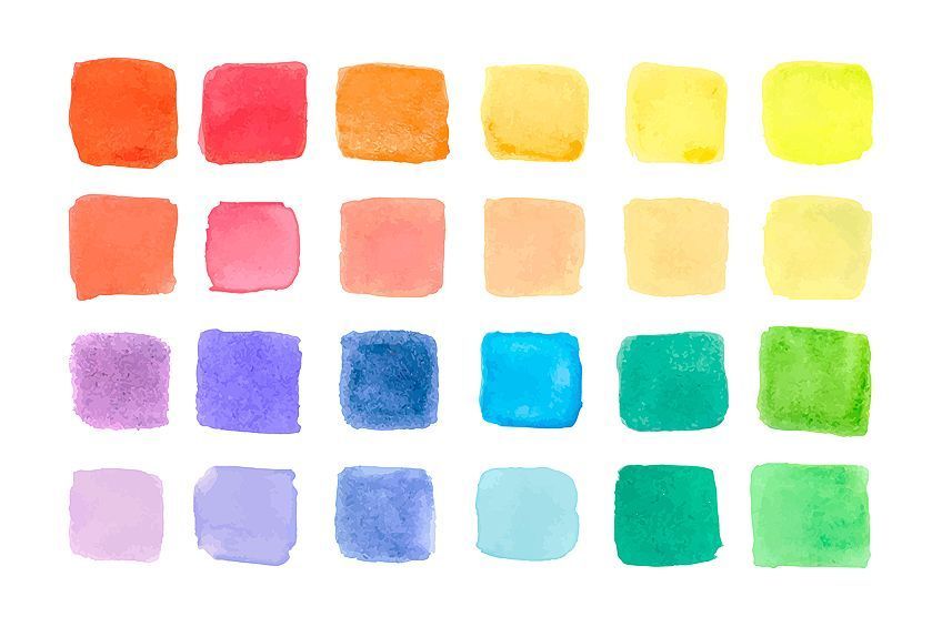
The significance of color will never be appreciated the same way by everyone because we all have our perceptions of this world that we are living in. Every day we are absorbing light and reflections, and those visuals are perceived and associated with whatever was happening at the time the information was obtained. Some might associate colors to be associated with a happy memory, whereas others will associate that same color with a sad one. This tutorial is all about what colors go together so you can make the best color combinations. We will include some examples, at least two good color combinations, and we will even talk about the three colors that go together, so keep reading to find out more about pairing colors.
Exploring Colors That Go Together
There could be one hundred million reasons for creating the best color combinations, from redecorating your new home that was left in a design catastrophe by the previous owner or putting together a fashionista ensemble fr your latest runway designs. Whatever your reasons, it is a good idea to learn some examples of some typical colors that go together before you try to make your own unique color combinations. In this next section, we will be discussing the color wheel and how to find the best color combinations for the project at hand.
Different Types of Color Combinations
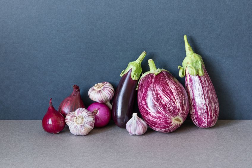
The primary colors are (if you did not know already) blue, red, and yellow. These colors are the first on the list, and they cannot be created from scratch. They are the basic pigments that create the colors that come after. If you combine red and blue, you will get purple, and red and yellow make orange, and blue and yellow make green. Purple, green, and orange are the secondary colors.
The next phase of colors is that of intermediate colors, which are made out of one primary and one secondary color.
The color bias is what we call the temperature of the colors on the color wheel. On one half, the color wheel you will find the cooler colors that are the blues, greens, and purples. These are usually used to portray calming and peaceful vibrations. In the other half, you will find the warmer colors that are the reds, oranges, and yellows. These are used to show warmth and vibrancy.
Complementary Colors
Complementary color stars are the colors that oppose the color in question on the color wheel. They will be directly opposite the color you wish to find the complement of. Two complimentary examples would be purple and yellow, and the complementary color for blue would be orange. They are great combinations of color but they might not be thought to match initially.
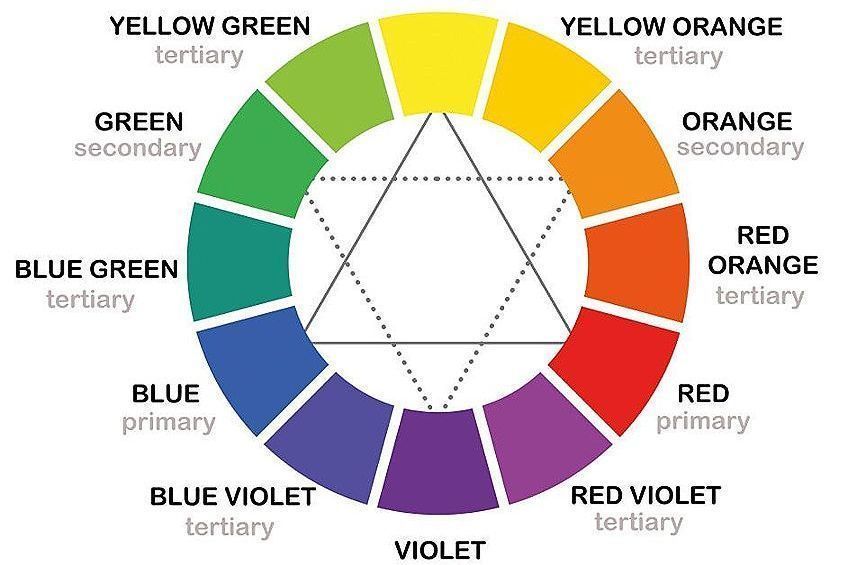
In marketing, graphic designers will use these combinations in their campaigns because they are the best contrast. They create an alluring effect with the opposing colors, and they can be used to make anyone see the boldness of the font if a complementary color was added behind it. Make sure you avoid using too many of the complementary colors and add in some neutral colors with this color scheme so that it is not as overwhelming.
Tetradic Color Combinations
Four different colors are involved, and they are all equally far apart from one another. In other words, none of them are dominant in any way. You will find one primary color, two complementary colors, and finally a contrasting color within this combination.
This is not your average run-of-the-mill color combination and its vibrancy makes it one of the most unique color combinations.
You might think that using equal parts of each color of the combination might produce a balanced and harmonious effect, but that is entirely wrong. The equal color parts are what throws the combination off balance. Using more of one of the colors is what creates the balance.
Triadic Colors
This type of color combination is created by choosing one color, and then three colors that sit equally distant from each other based on the initial color. Together they create a triangle because of their exact distance from each other. Regardless of the brightness of the combination, they are balanced and bring out a feeling of harmony.
Analogous Colors
This is a combination of colors that can be found near each other within the color wheel. Having up to five different colors within one combination, and they are beautifully harmonious.
If you wish for this to seem less intense for the viewer, then you might want to stick to neutral analogous color combinations.
Monochromatic Colors
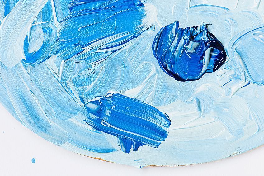
When it comes to thinking of color scheme examples, it might seem a tad monotonous to use only a single color. Essentially this combination is made from just one shade, but a few different shades of that one shade. This is beautiful for those neutral color schemes that are perfect for office spaces.
Color Terminology
You might have been a bit confused with all of these new terminologies that we have introduced. When you are learning how to work with the design programs it is ideal for you to be familiar with these new phrases and words because the combinations will come easier to you.
| Color Term | Description |
| Saturation | This term is used to describe the intensity of the color. How bright each shade is, but also how muted they are. |
| Hue | Hue is another word for color or the shades of different colors. |
| Shade | Shade is the term used to describe how light or dark a color is. More black in a color’s mixture will make it darker and white will make it lighter. |
| Chroma | This term is used to reference the purity of a color’s tone. |
| Value | Another term to reference the lightness or darkness of a hue |
| Tint | Tine is a shade of a color that is made by adding a small amount of white. |
| Tone | When you add gray to a color you can refine it, this is called “tone” |
Color Associations
It might be obvious to some, but others are not as aware of how colors affect our everyday lives in a psychological sense. Each color is associated with certain feelings and energies, and they can strike up emotions, feelings of hunger or thirst, and more.
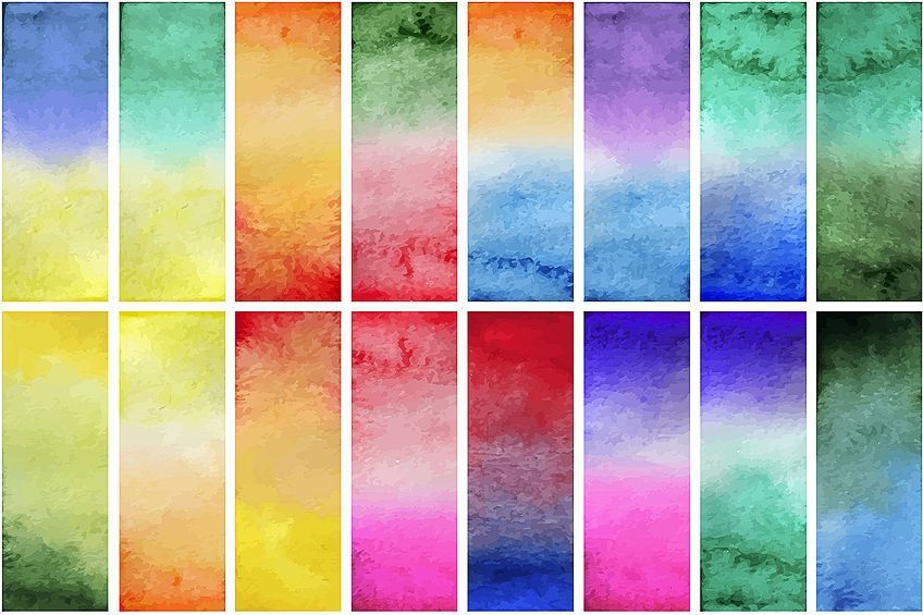
Some colors can instill a sense of calm in the room and others can promote vibrant energy or healing atmospheres. Here are some examples of colors and what they are associated with, along with their HEX codes for a more accurate understanding of what color we mean.
| Shade | Color Meaning | Hex Code | CMYK Color Code | RGB Color Code | Color |
| Red | Associated with energy and passion, as well as strength. | #ff0000 | 0, 100, 100, 0 | 255, 0, 0 | |
| Blue | Tranquility and calmness, as well as a sense of confidence. | #0000ff | 100, 100, 0, 0 | 0, 0, 255 | |
| Yellow | Yellow is associated with happiness, vibrance, and freshness. | #ffff00 | 0, 0, 100, 0 | 255, 255, 0 | |
| Green | Associated with healing and vitality, rejuvenation, wealth, and nature. | #00ff00 | 100, 0, 100, 0 | 0, 255, 0 | |
| Orange | Orange is associated with excitement, joy, and enthusiasm. | #ffa500 | 0, 35, 100, 0 | 255, 165, 0 | |
| Purple | Associated with royalty, prestige, or elegance. | #a020f0 | 33, 87, 0, 6 | 160, 32, 240 | |
| Pink | Pink is associated with love, softness, and femininity. | #ffc0cb | 0, 25, 20, 0 | 255, 192, 203 | |
| Gray | Associated with sophistication, moodiness, and elegance. | #808080 | 0, 0, 0, 50 | 128, 128, 128 | |
| White | White is associated with purity, cleanliness, and peace. | #ffffff | 0, 0, 0, 0 | 255, 255, 255 | |
| Black | Black is associated with mystery, sophistication and power. | #000000 | 0, 0, 0, 100 | 0, 0, 0 |
Ideas for Color Combinations
Colors have an impact on how we feel about things because we are exposed to them during our experiences. Have you ever noticed how the color green can make you feel happy, but at the same time the same color can trigger an uneasy or anxious feeling inside them. That could be for a number of psychological reasons that we are not getting into now, but the point is, that the color combinations you choose the color schemes are important so that the right message is conveyed through the marketing design or whatever you use colors for. Creating a brand is with the effort of carefully choosing the right color scheme for your logo.
It might seem a bit daunting to have to sit and find one or even two good color combinations, but we have listed a few already existing ones that you might appreciate. Enjoy the experience of experimenting with the various combinations, but make sure you are aware of what colors go together before you get yourself too frustrated. The combination must also match the vibe of what it is intended for. So green and beige for a hospital.
Two-Color Combinations
It is not likely that when you are creating a design for a marketing campaign, or an interior design idea that you will use only one color. There is much more diversity with designs that have more than one color. Instead of choosing every color on the color wheel for the design, you are busy with, start with a smaller amount of colors until you get comfortable with what colors go together. Two good color combinations with two colors might be pink and white, or gray and beige.
There are more intricate combinations that use two colors, and they are as follows.
Warm Sand and Turquoise
Turquoise is often the color used for tropical designs because it is so easily associated with the beautiful green and blue colors of the ocean in tropical paradises all over the world. The happy energy that this color gives off is accompanied by a sense of growth. Because this color has yellow in the mix, this brightness also gives this color another association of life and vibrancy.
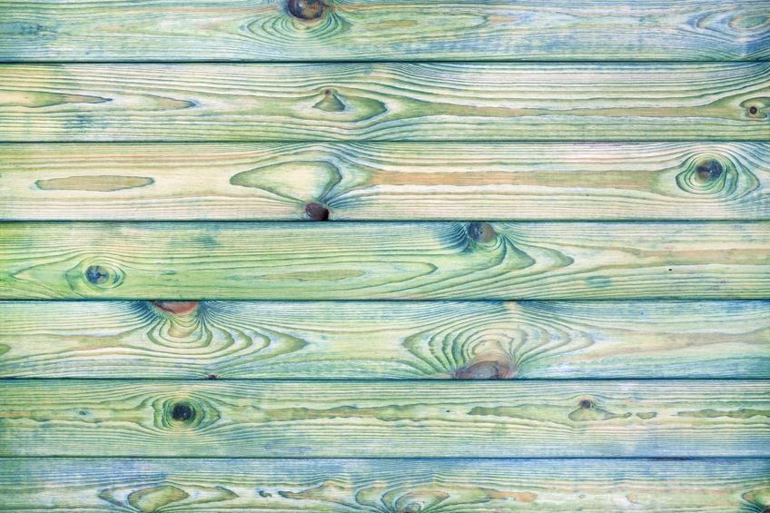
The natural and obvious combination for turquoise would be neutral colors. In particular, the best combination would be turquoise and warm sand. This works amazingly for sophisticated settings, but especially the beachy vibes. Imagine the beach with the turquoise ocean, along with the beige-colored sand.
| Shade | Hex Code | CMYK Color Code | RGB Color Code | Color |
| Warm Sand | #c5ae91 | 0, 12, 26, 23 | 197, 174, 145 | |
| Turquoise | #30d5c8 | 77, 0, 6, 16 | 48, 213, 200 |
Blooming Dahlia and Ultraviolet
Since its designation as Pantone’s color of the year for 2018, ultraviolet has become one of the most popular colors in the world. Since then, it has become quite evident how much of an influence this color has had on every aspect of design. Ultraviolet is a color that evokes the idea of ingenuity, boldness, originality, as well as clues to the mysteries and vastness of space.
Almost all shades of purple have an uplifting overtone in terms of creativity and luxury.
In the marketing world, the vibrant color of red is used as a marketing color. This is because it draws your attention and can be used with a variety of colors such as red, orange, and green. This color is combined with the blooming dahlia color for a more colorful appearance.
| Shade | Hex Code | CMYK Color Code | RGB Color Code | Color |
| Ultra Violet | #5f4b8b | 32, 46, 0, 45 | 95, 75, 139 | |
| Blooming Dahlia | #ec9688 | 0, 36, 42, 7 | 236, 150, 136 |
Moss Green and Forest Green
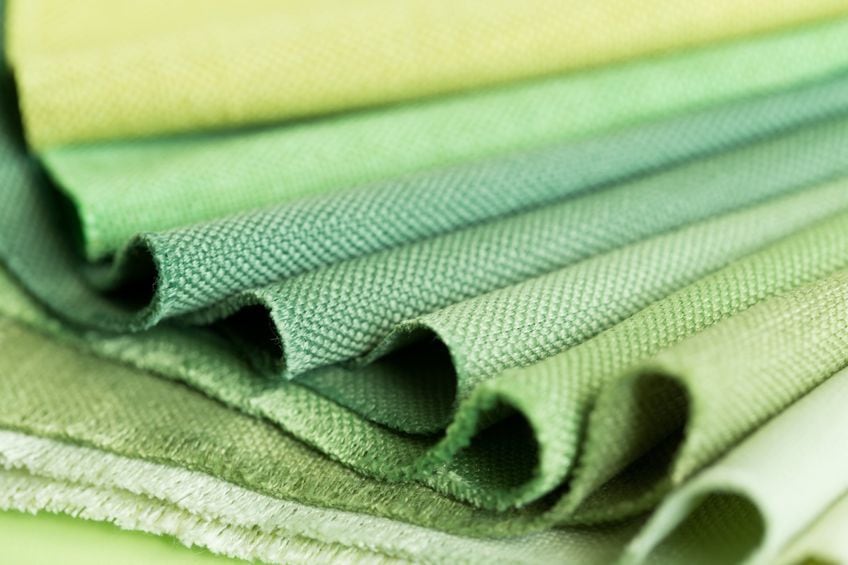
Moss green is a very muted and neutral green color. It is not quite a warm color like its olive green counterpart, but it could definitely be paired with one. When you pair moss green with forest green you have a monochromatic combination that makes one feel rejuvenated.
| Shade | Hex Code | CMYK Color Code | RGB Color Code | Color |
| Forest Green | #228b22 | 76, 0, 76, 45 | 34, 139, 34 | |
| Moss Green | #8a9a5b | 10, 0, 41, 40 | 138, 154, 91 |
Peach and Royal Blue
If you are familiar with royal blue, you will be aware of how vibrant the color is. It is a deep blue that is bright at the same time and the association for this color lies with trust and being reliable. The best color combination for this color would be with the colors pink or lilac.
Adding either of these colors will lighten the mood of any room when paired with royal blue.
| Shade | Hex Code | CMYK Color Code | RGB Color Code | Color |
| Peach | #ffe5b4 | 0, 10, 29, 0 | 255, 229, 180 | |
| Royal Blue | #4169e1 | 71, 53, 0, 12 | 65, 105, 225 |
Black and Mustard
For this combination, if the first living thing that comes to your mind is not a bumblebee, then we will be amazed. This color combination is great if you want to add some masculine energy to a room. Most people think it too bold, but it can add a flair of sophistication to any campaign.
| Shade | Hex Code | CMYK Color Code | RGB Color Code | Color |
| Mustard | #f3ca20 | 0, 17, 87, 5 | 243, 202, 32 | |
| Black | #000000 | 0, 0, 0, 100 | 0, 0, 0 |
Indigo and White
Color combinations such as this one are amazingly versatile and can be used across several fields of life from interior design to art, to marketing. This color is considered a beautiful choice for bedrooms that add warmth and friendliness.
Because the color indigo is a warmer color than blue, this combination provides a comfy feeling for the room it is used in or an inviting one for adverts.
| Shade | Hex Code | CMYK Color Code | RGB Color Code | Color |
| Indigo | #4b0082 | 42, 100, 0, 49 | 75, 0, 130 | |
| White | #ffffff | 0, 0, 0, 0 | 255, 255, 255 |
Three Colors That Go Together
If sophistication is your aim, then a color combination that uses two different colors is perfect. Thankfully for the sake of design, three is not a crowd. When you manage to get three or more to match perfectly, it can bring that extra element that you have been looking for. You can be grateful for the readily available color combinations that you can use to your heart’s desire.
Sapphire, Powder Blue, and Mauve
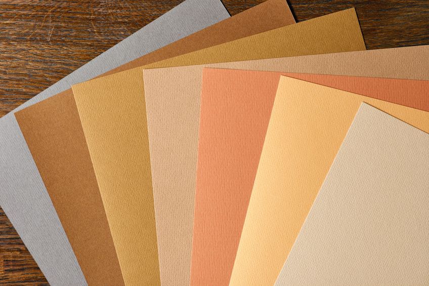
As a more saturated blue, sapphire is a very popular color. Many people associate this particular color with having patience and trust. A complementary color for the cream is Philippine gold, which is also paired with powder blue and mauve for a feminine aesthetic.
Combined with sapphire blue, you are left with an amazing color combination that offers a large amount of versatility.
| Shade | Hex Code | CMYK Color Code | RGB Color Code | Color |
| Sapphire | #0f52ba | 92, 56, 0, 27 | 15, 82, 186 | |
| Powder Blue | #b6d0e2 | 19, 8, 0, 11 | 182, 208, 226 | |
| Mauve | #e0b0ff | 12, 31, 0, 0 | 224, 176, 255 |
Forest Biome, Storm Gray, and Living Coral
Something is refreshing about the combination of dark gray and a living coral and forest biome that has a more vibrant appearance. A more contemporary look is provided by these colors, making them an ideal combination for a website. Their subtle color combination attracts attention to the website and is not difficult to read.
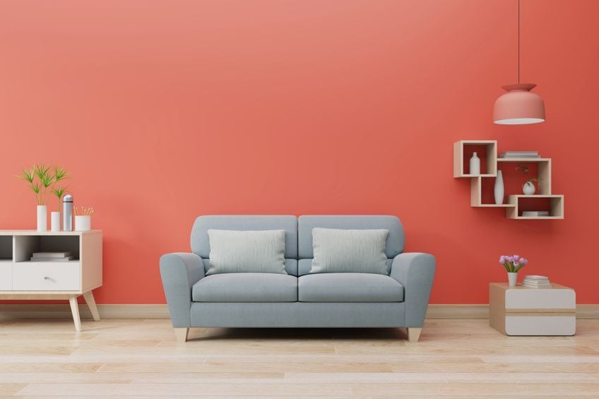
The living coral is a striking addition to the color combination. Its versatility makes it suitable for a wide variety of projects. Consider how colors can affect moods. If you replace living coral with a shade of green, you create a completely different look and feel.
| Shade | Hex Code | CMYK Color Code | RGB Color Code | Color |
| Forest Biome | #194b46 | 67, 0, 7, 71 | 25, 75, 70 | |
| Storm Gray | #6e6f75 | 6, 5, 0, 54 | 110, 111, 117 | |
| Living Coral | #fa7268 | 0, 54, 58, 2 | 250, 114, 104 |
Norse Blue, Light Green, and Red
Red is known to be a very eye-catching color, and not surprising because of how bright it is, even a bull cannot resist red’s depth. If you were to mix in a light green color that provides the healing energy, and possibly a Norse blue, you will be left with a good color combination with three colors that you might not have initially thought would be colors that go together.
This combination is what we call a triadic color combination.
| Shade | Hex Code | CMYK Color Code | RGB Color Code | Color |
| Norse Blue | #0083a9 | 100, 22, 0, 34 | 0, 131, 169 | |
| Light Green | #90ee90 | 39, 0, 39, 7 | 144, 238, 144 | |
| Red | #ff0000 | 0, 100, 100, 0 | 255, 0, 0 |
Navy, Salmon, and Seafoam
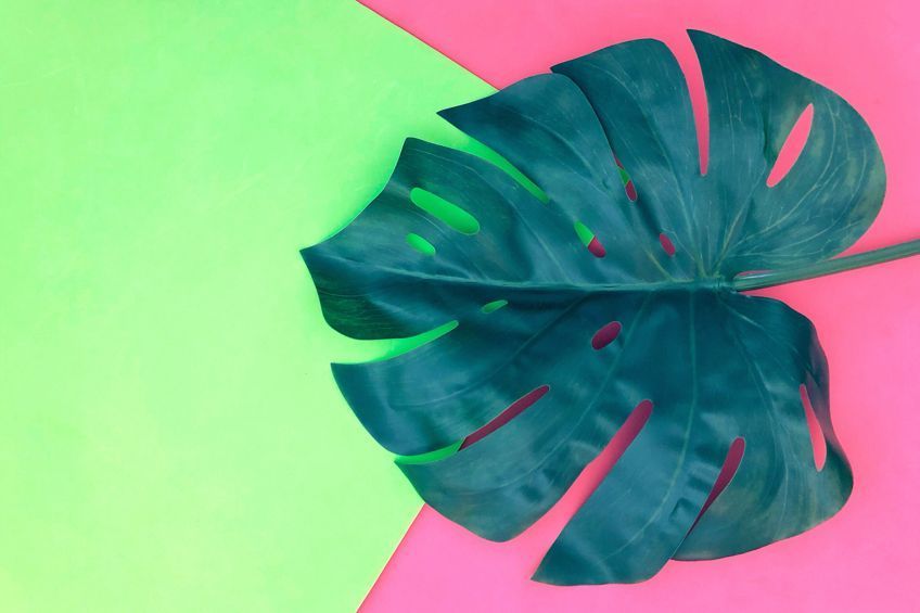
This combination can set you right back into your memories of beach vacations. The three colors in this combination are Salmon pink, seafoam blue, and navy blue, which could be used to paint a shell in your painting, or used for your sofa set’s scatter cushions in your beach vacation home.
| Shade | Hex Code | CMYK Color Code | RGB Color Code | Color |
| Navy | #000080 | 100, 100, 0, 50 | 0, 0, 128 | |
| Salmon | #fa8072 | 0, 49, 54, 2 | 250, 128, 114 | |
| Seafoam | #93e9be | 37, 0, 18, 9 | 147, 233, 190 |
Magenta, Green, and Rouge
Normally the only colors that get paired with the bright, bold, or vibrant colors are the usual black or white. If you are looking for a color that can instill harmony and balance, or boost your emotional state, then magenta is your hue. Pink and green are already amazing complementary colors, so this combination is off to a good start.
The final color is rouge, which is a muted pink color that tones down the whole ensemble
| Shade | Hex Code | CMYK Color Code | RGB Color Code | Color |
| Magenta | #ff00ff | 0, 100, 0, 0 | 255, 0, 255 | |
| Green | #00ff00 | 100, 0, 100, 0 | 0, 255, 0 | |
| Rouge | #d7707e | 0, 48, 41, 16 | 215, 112, 126 |
Clear Water, Lightest Sky, and Grass Green
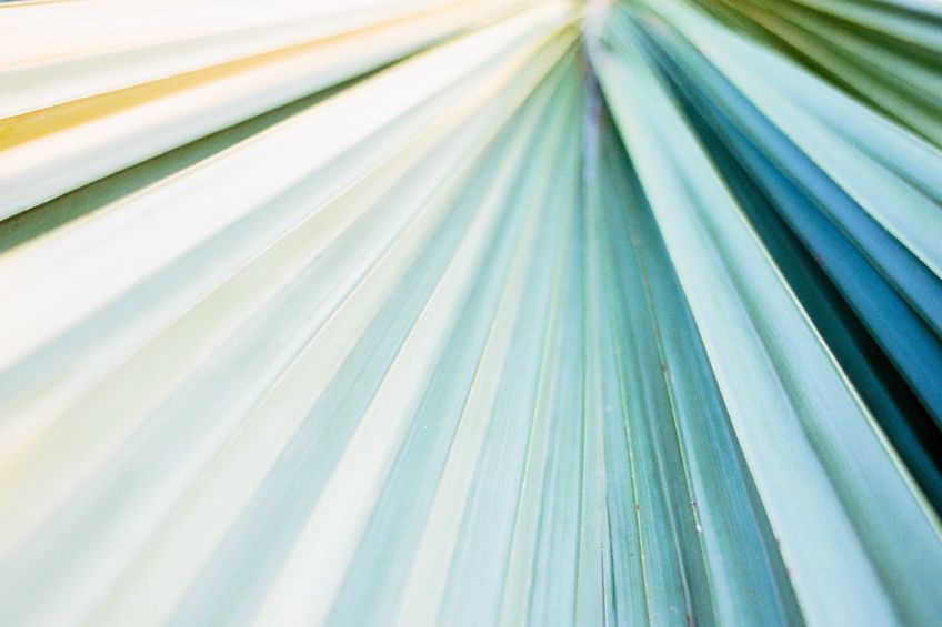
Using these soft colors offers a color combination that is both fresh and clean while giving the appearance of being easy on the eyes. If you choose to use this color combination for your interior design project, it can add a sense of calmness and warmth to the space, helping to create a more welcoming ambiance.
| Shade | Hex Code | CMYK Color Code | RGB Color Code | Color |
| Clear Water | #aad5db | 22, 3, 0, 14 | 170, 213, 219 | |
| Lightest Sky | #87cefa | 46, 18, 0, 2 | 135, 206, 250 | |
| Grass Green | #7db46c | 31, 0, 40, 29 | 125, 180, 108 |
Additional Color Scheme Ideas
Whether you want to decorate your friend’s 30th birthday party with balloons or get new decor for your apartment, there are so many different color combinations that we have not spoken about that you can make use of. There are some combinations that consist of three or more colors, and they can be just as harmonizing as with two colors.
Living Coral, Marigold, Bright Violet, and Vibrant Pink
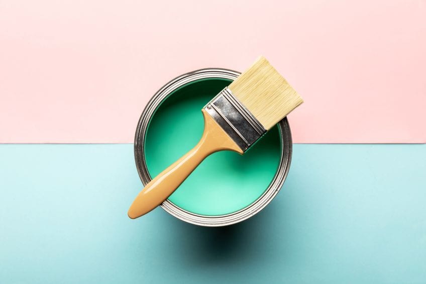
These are beautiful and vibrant colors that are warm and produce a sense of youthfulness. The living coral is a trendy color and adds to the playfulness of the color combinations.
The liveliness of this color scheme is just what you need for seizing attention, especially on social media platforms.
| Shade | Hex Code | CMYK Color Code | RGB Color Code | Color |
| Living Coral | #fa7268 | 0, 54, 58, 2 | 250, 114, 104 | |
| Marigold | #eba832 | 0, 29, 79, 8 | 235, 168, 50 | |
| Bright Violet | #ad0afd | 32, 96, 0, 1 | 173, 10, 253 | |
| Vibrant Pink | #ff007f | 0, 100, 50, 0 | 255, 0, 127 |
Fiery Coral, Atmosphere, White, and Delphinium Blue
This combination has a beachy feel to it, but it also feels sophisticated. It could be used in those beach houses built near a city that is more of a family home than a vacation spot. It has an air of minimalism to it, but not without some color.
| Shade | Hex Code | CMYK Color Code | RGB Color Code | Color |
| Fiery Coral | #e26058 | 0, 58, 61, 11 | 226, 96, 88 | |
| Atmosphere | #c0d8f8 | 23, 13, 0, 3 | 192, 216, 248 | |
| White | #ffffff | 0, 0, 0, 0 | 255, 255, 255 | |
| Delphinium Blue | #669db3 | 43, 12, 0, 30 | 102, 157, 179 |
Turquoise, Aquamarine, Pink Tulip, and Canary Yellow
A combination of turquoise and aquamarine is a very calming and happy color, which also brings harmony and brings a hint of spring through. If tranquility and happiness are what you are aiming to achieve in a room’s aesthetic, then this is the combo for you! In addition to providing a feminine touch to the color scheme, the pink tulip also adds to the overall playfulness of the colors used.
Adding a splash of yellow creates a fresh feeling similar to what you feel in the summer months that incites a feeling of renewal and revitalization.
| Shade | Hex Code | CMYK Color Code | RGB Color Code | Color |
| Turquoise | #30d5c8 | 77, 0, 6, 16 | 48, 213, 200 | |
| Aquamarine | #00ffbf | 100, 0, 25, 0 | 0, 255, 191 | |
| Pink Tulip | #ff878d | 0, 47, 45, 0 | 255, 135, 141 | |
| Canary Yellow | #ffed5f | 0, 7, 63, 0 | 255, 237, 95 |
Vermillion, Medium Champagne, Celadon, and Honey Yellow
Luxury is definitely inspired by the combination of these warm colors. The summery feel will accompany it, and you will feel inspired to go sit in a field of canola flowers. Try not to use too much of the yellow to avoid making it too overwhelming.
| Shade | Hex Code | CMYK Color Code | RGB Color Code | Color |
| Honey Yellow | #eba937 | 0, 28, 77, 8 | 235, 169, 55 | |
| Medium Champagne | #f3e5ab | 0, 6, 30, 5 | 243, 229, 171 | |
| Celadon | #ace1af | 24, 0, 22, 12 | 172, 225, 175 | |
| Vermilion | #e34234 | 0, 71, 77, 11 | 227, 66, 52 |
Unique Color Combinations of Yellows and Various Shades of Magenta
The citrus color in this combination is similar to a lemon that is not ripe yet, and the yellow-green is similar to a lime green color. Both are very bright and vibrant, but when combined with a lighter magenta shade than we previously spoke about, the whole feel changes.
The pink softens the color scheme that also feels fresher.
| Shade | Hex Code | CMYK Color Code | RGB Color Code | Color |
| Citrus | #93a806 | 13, 0, 96, 34 | 147, 168, 6 | |
| Yellow-Green | #bed905 | 12, 0, 98, 15 | 190, 217, 5 | |
| Shade of Magenta | #de8cf0 | 8, 42, 0, 6 | 222, 140, 240 | |
| Melanie | #dbb4da | 0, 18, 0, 14 | 219, 180, 218 | |
| Light Orchid | #daa2da | 0, 26, 0, 15 | 218, 162, 218 |
Color Combinations to Avoid
Color combinations do not come as easily to everyone as they do for some people. Some have a natural knack for making the best color combinations. What makes this whole saga interesting, is how we all perceive colors differently. So, even if you adore the new combination that you just combined is your best one yet, your friends might not agree because they might see it differently. Luckily for you, there are a few guidelines that you can keep to make the process easier. Let’s take a look at a few of them so you can improve your latest color scheme ideas.
Vibrating Colors
This is basically like an illusion. Can you recall those images on the internet with the words that look like they are shaking or vibrating? This effect is made possible with the combination of bright or bold colors and then a saturated color. The movement your eye sees is when the colors merge, they look like they are blurring. The table below is a great example of a vibrating color combination.
Interestingly enough, they should be avoided in marketing campaigns because the colors are difficult for people who are color blind to see.
| Shade | Hex Code | CMYK Color Code | RGB Color Code | Color |
| Green | #5fa41c | 42, 0, 83, 36 | 95, 164, 28 | |
| Razzle Dazzle Rose | #ff3ac6 | 0, 77, 22, 0 | 255, 58, 198 | |
| Shade of Purple | #4c0057 | 13, 100, 0, 66 | 76, 0, 87 |
Pairing with Neon Colors
Whether it is a vivid color that stands out or a bright color that grabs your attention, bright colors are bold and vibrant. In combination with each other, these colors can then become jarring or overwhelming. There are two ways to use these types of colors in a color scheme. It is almost as if they are citing for attention if you use them together. They are both so bright so it is not surprising. It also helps to highlight the brighter color, which can bring out the positive qualities of both colors when they are muted. There is no hard and fast rule here. However, this is a wise route to take when you are looking to create a color scheme that is generally more appealing.
| Shade | Hex Code | CMYK Color Code | RGB Color Code | Color |
| Bright Red | #ee4b2b | 0, 68, 82, 7 | 238, 75, 43 | |
| Electric Orange | #ff5e00 | 0, 63, 100, 0 | 255, 94, 0 | |
| Middle red | #ed8a68 | 0, 42, 56, 7 | 237, 138, 104 |
Reasons for Not Combining Dark Colors with Dark Colors
Whether it is a vivid color that stands out or a bright color that grabs your attention, bright colors are bold and vibrant. In combination with each other, these colors can then become jarring or overwhelming. There are two ways to use these types of colors in a color scheme. It is almost as if they are citing for attention if you use them together. They are both so bright so it is not surprising. It also helps to highlight the brighter color, which can bring out the positive qualities of both colors when they are muted.
There is no hard and fast rule here. However, this is a wise route to take when you are looking to create a color scheme that is generally more appealing.
| Shade | Hex Code | CMYK Color Code | RGB Color Code | Color |
| Hunter Green | #041a03 | 85, 0, 88, 90 | 4, 26, 3 | |
| Shades of Dark Red | #1c0000 | 0, 100, 100, 89 | 28, 0, 0 | |
| Desert Sand | #e3d4ad | 0, 7, 24, 11 | 227, 212, 173 | |
| Light Shade of Green | #aad688 | 21, 0, 36, 16 | 170, 214, 136 |
Harmonizing a Three-color Palette for Your Home
There can be a lot of excitement when it comes to deciding on a specific color scheme for your home. As you create a space for yourself and your family or housemates, you want to ensure that it is done well, and you want to do it right. It is completely up to you whether you wish to use more than one color, only three, or more. You can use three colors that go together or you can use two good color combinations for just about any color scheme ideas you might think of.
If you choose three colors to use, you can create a very intriguing and appealing look as long as the colors harmonize, so contemplate what you want to do before you begin painting. You should pick three colors that complement one another. One brilliant color scheme idea is to choose one color, and then three different shades of the same color. This adds some depth and diversity to the feel of the room and there is less of a risk of the colors clashing.
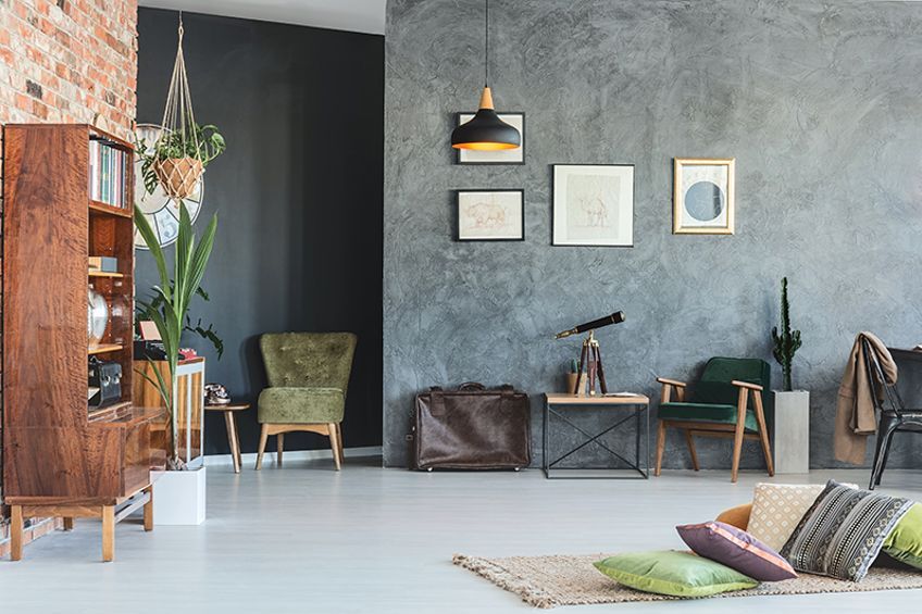
You can mix warm and cool colors as long as they are fairly balanced, which means you must use the right amount of both warm and cool colors. You should, however, always make sure the colors that you select are either warm or cool if you intend to combine them. The colors you decide on will also be influenced by the level of the light in the room, which is why it is so important to put a decent amount of thought into your color selection.
If you want to create an accent wall in your bedroom or your living room, we advise using the darkest of all the colors to do so. This way there is not too much of that color and the people who are in the room will not feel overwhelmed. The predominant color should be the lightest one in the combination. This will keep the room feeling light instead of draining and heavy.
As you can tell, color is a very important part of our lives, and thus, how we use it in our homes and spaces will determine how we feel. Selecting the right color scheme for your home or office is just as important as choosing clothing that we wear!
Frequently Asked Questions
What Are Ideas for Color Schemes?
A color scheme is the color combination of at least two colors but sometimes has up to four colors paired together. The essence of the feeling they give creates a theme or a scheme, and this defines the feel for the room.
What Are Good Color Combinations?
When you learn color theory you will start to grasp the basics of pairing colors together. With this, you will understand what the primary colors are, as well as the secondary and tertiary colors. From there, you can learn the color bias, and that is the best way to understand what colors go together. You just have to experiment with the various shades at first to come up with endless color combinations. For now, some examples of good color combinations are analogous colors or possibly monochromatic or triadic colors.
Which Colors Catch Your Attention?
There is no doubt that red is the color that draws in the most attention and that’s why it is considered to be a sign of danger. Businesses also use color as part of their marketing strategies due to its eye-catching nature. Take MacDonald’s, Coca-Cola, Netflix, or Levi’s as some examples.
How Does Color Affect Your Mood?
Colors can indeed affect your mood positively or negatively. On one side of the wheel, the cooler colors are more calming, and on the other side of the wheel, the warmer colors are exciting or passionate. Your mood is determined by the color you choose, according to the color bias. You can also use bright colors and muted colors to set a mood. This is one of the main reasons why marketers choose different color schemes for their advertisement campaigns. Furthermore, the combination of colors can also help create a certain atmosphere in your home’s design style.
In 2005, Charlene completed her Wellness Diplomas in Therapeutic Aromatherapy and Reflexology from the International School of Reflexology and Meridian Therapy. She worked for a company offering corporate wellness programs for a couple of years, before opening up her own therapy practice. It was in 2015 that a friend, who was a digital marketer, asked her to join her company as a content creator, and this is where she found her excitement for writing.
Since joining the content writing world, she has gained a lot of experience over the years writing on a diverse selection of topics, from beauty, health, wellness, travel, and more. Due to various circumstances, she had to close her therapy practice and is now a full-time freelance writer. Being a creative person, she could not pass up the opportunity to contribute to the Art in Context team, where is was in her element, writing about a variety of art and craft topics. Contributing articles for over three years now, her knowledge in this area has grown, and she has gotten to explore her creativity and improve her research and writing skills.
Charlene Lewis has been working for artincontext.org since the relaunch in 2020. She is an experienced writer and mainly focuses on the topics of color theory, painting and drawing.
Learn more about Charlene Lewis and the Art in Context Team.
Cite this Article
Charlene, Lewis, “Color Combinations – Exploring the Best Color Combinations for Artists.” Art in Context. January 10, 2021. URL: https://artincontext.org/color-combinations/
Lewis, C. (2021, 10 January). Color Combinations – Exploring the Best Color Combinations for Artists. Art in Context. https://artincontext.org/color-combinations/
Lewis, Charlene. “Color Combinations – Exploring the Best Color Combinations for Artists.” Art in Context, January 10, 2021. https://artincontext.org/color-combinations/.

