Neutral Colors – What They are and How to Use Them
What are neutral colors? When people think of colors, they tend to think of bright, vibrant colors like yellow, pink, green, or blue, but there are many colors that are not bright or vibrant. There are even colors that take this a step further and have hues that are absent of any true color. These colors are known as neutral colors. Neutral colors are important in art and interior design because they can be used to effortlessly tie an artwork or room together. This article is all about what neutral colors are, what they can be used for, how to mix neutral paint colors for art, and which neutral paint colors are most popular for interior design.
What are Neutral Colors?
Neutral colors aren’t commonly found on the color wheel, this is because they are defined as hues that seem to be without color. In line with this neutral colors definition, they are also known for being universal complements because they don’t compete with primary or secondary colors.
The most well-known neutrals are gray and brown. Gray and brown can be created by combining two complementary colors and can have shade or tone variations if a small amount of another color is added to it.
Is white a neutral color? Is black a neutral color? Yes, they are both neutral colors and they are known for being the boldest neutrals when in their pure state. White can be altered to become an “off-white” if a small amount of another color is added to it. Black, on the other hand, has no true shade or tone variations because any variation of black is considered a shade of gray instead.
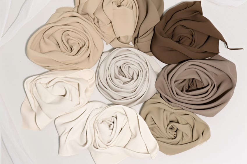
All variations of neutral shades outside of pure white, black, gray, or brown are not true neutrals. Any other neutral is considered a near-neutral because although they may appear to be without color, they still have hue undertones. Near-neutral tones include tans or other darker colors. Near-neutrals are created by mixing a color with a true or pure neutral. This causes the color to diffuse and desaturate into the neutral. This desaturation still allows the color to impart a slight hue or tint into the neutral color, even if it is very subtle. For example, plain brown and white are true neutral tones while beige and eggshell are near-neutral colors.
For the purposes of this article, we will refer to technically near-neutral tones as neutrals because, while the technical distinction is good to know, the distinction is not important in practical applications.
How Are Neutral Colors Used?
Neutral colors are commonly used in interior design because they appear to be without color and are universal complements of true colors. Neutral colors are great for backgrounds because they help someone’s eye travel from one focal point to another with ease. More colors than you may realize are considered neutral or near-neutral colors by interior designers. For example, olive green and navy blue are very popular near-neutral shades.
When a neutral color palette is made with brighter, more saturated colors they will make the hues of those colors appear more vibrant. This happens because of the contrast between a neutral color and a true color. Knowing how to use neutral colors is important because if artwork or a room has too many vibrant, saturated hues it can be overpowering and unpleasant.
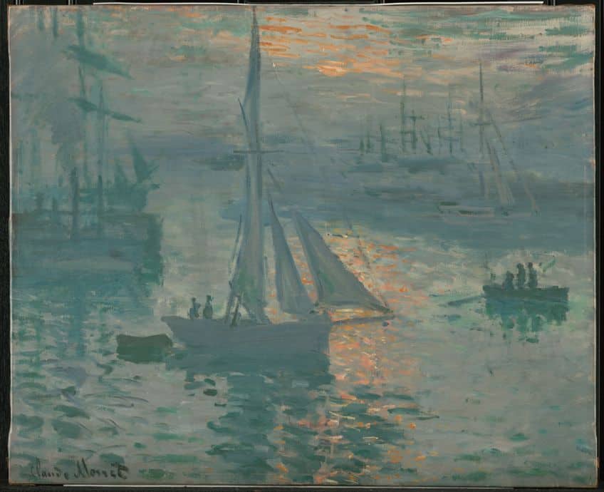
Rooms and artworks full of many different colors are more likely to have issues with clashing than a room that is balanced with use of neutrals. Neutral colors give people the opportunity to take a break from intense tones with high saturation by complementing and balancing any color it is paired with.
Using neutrals in various shades, tones or tints allows for the creation of effective shading in paintings and will impart realistic shading effects to your artwork. You can also make use of them when painting objects in the distance. Objects further away will be more desaturated than ones up close, so using neutral color tones on distant objects is a great way to create depth. It’s also a great way to create visual interest in a painting or space because it uses contrast in a simple, subtle way to help create variation and focal points.
The natural world is full of many more neutrals than you may think.
An example of this is how grasses that appear to be a simple green may actually be a neutral green created by adding tones of subtle red or purple. Adding a complement that is redder will warm up a color and neutralize it while adding a complement closer to blue or purple will create a cooler neutral. Finding the balance between neutral and saturated colors allows you to create compositions with more depth. Works with a greater sense of space and depth result in more visual interest for viewers.
The Pros and Cons using Neutral Colors
These are the reasons why you should use them:
- Complements Decorations: They blend well with other colors, allowing other elements to stand out, and add depth to a space.
- Timelessness: These colors remain stylish over time, avoiding the trap of becoming outdated like trendy colors.
- Reduces Overwhelm: They counteract the busyness of strong patterns and textures, making them more appreciable.
- Visually Restful: They are easy on the eyes and don’t overstimulate the brain, creating a peaceful atmosphere.
- Versatile Across Styles: They work with all decorating styles, preventing clashes and enhancing the overall aesthetic.
- Ease of Alteration: They provide a versatile foundation for future changes or redecorations.
- Balances Temperature: Theycan either add warmth or coolness to a space, depending on the chosen hue.
- Increases Resale Value: They are generally more appealing to a wider audience, enhancing the resale value of a property or item.
These are the drawbacks when using neutral color tones:
- Complexity in Shades: Choosing the right shade can be overwhelming, as slight variations can significantly impact the overall look.
- Perceived as Boring: Some find them too safe or mundane, lacking excitement or uniqueness.
- Pairing Challenges: Finding the right colors to complement neutral shades requires careful consideration to avoid a flat or uninteresting look.
- The Risk of Blandness: Without proper use of accent colors, designs can end up looking dull or uninspired.
Associations With Neutral Colors
All neutral colors are quite easy on the eyes since they don’t actually have any color. This quality of being easy to look at means that most neutral colors symbolize relaxation, tranquility, peace, or neutrality in some way. Below we go into some detail about some of the most common neutral tones and what they are most commonly associated with. Keep in mind that these associations are general guidelines and perceptions of color vary depending on their application or the opinion of the individual viewing the color.
How to Mix True Neutral and Near-Neutral Shades
Neutral tones are the primary contributor to creating depth and realism in painting and using neutrals properly is central to improving as an artist. The best way to use neutrals effectively is to understand how to mix and apply the right neutrals into your painting to achieve the right effects. In this part of the article, we cover how to mix various neutral tones of paint, so that you can begin mixing and applying a broad range of neutrals to your artworks.
The basic information you will need to begin mixing neutral tones is some familiarity with the complementary color pairs of the color wheel.
These color pairs are red and green, blue and orange, as well as purple and yellow. When you mix any of these color pairs it will result in a neutral brown or gray. Once you understand this basic rule of color theory, you are ready to start mixing various neutral tones with ease. When mixing paints and creating different shades of any color, you will find it helpful to create a record of what you are doing so you can repeat the process whenever you like. You can easily create reference palettes using scrap pieces of paper.
Popular Neutral Shades in Interior Design – Our Top 12
Neutral shades are important for tying together a room and are very popular in interior design. While some people may think of neutral colors as plain or boring, they are crucial to making living spaces consistent and pleasant to the eyes. Below we list some popular neutral colors used in interior design and suggest specific tones of those colors you can try out in your own home.
You can pair the colors below with other neutrals to create a neutral color palette or you can pair them with vibrant colors for something a little bolder!
Windham Cream
Windham Cream can be a tricky paint tone to describe. It is an off-white cream with subtle tinges of yellow in the undertone which makes it a warm and comforting paint. It is popular in interior design because it is so soothing and inviting. Cream neutrals in general are tried and true and remain popular in modern interiors. Creams show no sign of becoming antiquated any time soon, which makes them a reliable consideration for the walls of a living room, dining room, or guest bedroom.
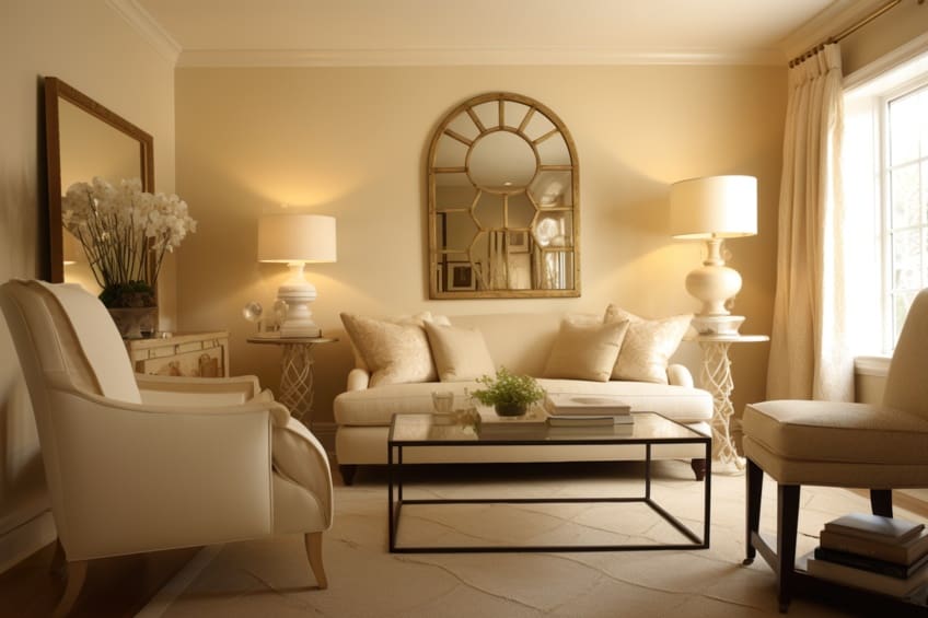
| Paint Name | Hex Code | RGB | Shade |
| Windham Cream | #F7E5C6 | 247, 229, 198 |
Revere Pewter
If you want a lovely greige (gray-beige) paint to use then you should be choosing Benjamin Moore’s Revere Pewter. This paint tone has been a favorite with interior designers for over a decade and is considered one of the best and most popular gray paint colors available. In fact, it has long been believed that if your home is painted with Revere Pewter it is guaranteed a fast sale. If you choose to use Revere Pewter or any other light colors, you must remember that the lighting, flooring, décor, and furniture will be a big contributor to how the paint itself will look.
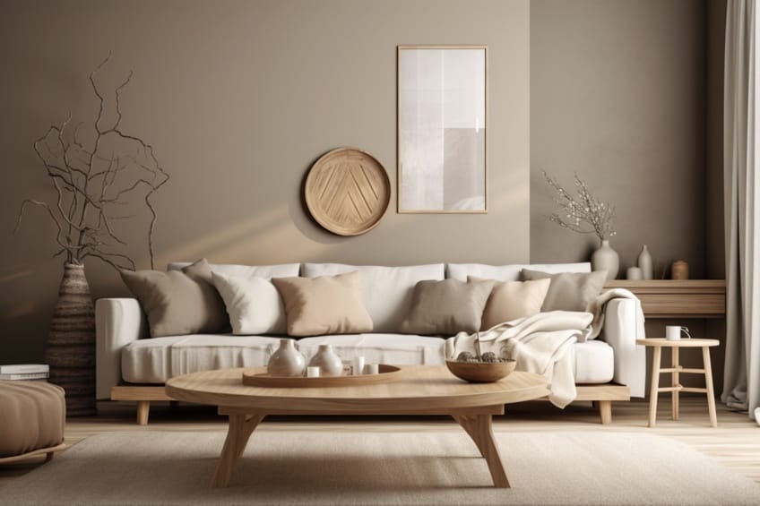
Light neutral colors can work well with bold colors or soothing colors, but you must still be careful to not overpower it with too many hues at once.
| Paint Name | Hex Code | RGB | Shade |
| Revere Pewter | #CBC6B8 | 203, 198, 184 |
High Park
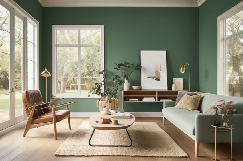
High Park Green is a soothing, natural green paint shade. It can easily be used to create a statement wall in a room without being too demanding or overpowering. You can pair High Park Green with various browns for a natural, homey look or even gold if you want something that looks a bit more modern.
| Paint Name | Hex Code | RGB | Shade |
| High Park | #8D9A86 | 141,154,134 |
Huntington White
Huntington White paint is considered a “chameleon color” by interior designers because it takes on subtle shade changes throughout the day. It also works well in both modern and traditional settings and is dead center between being warm and cool.
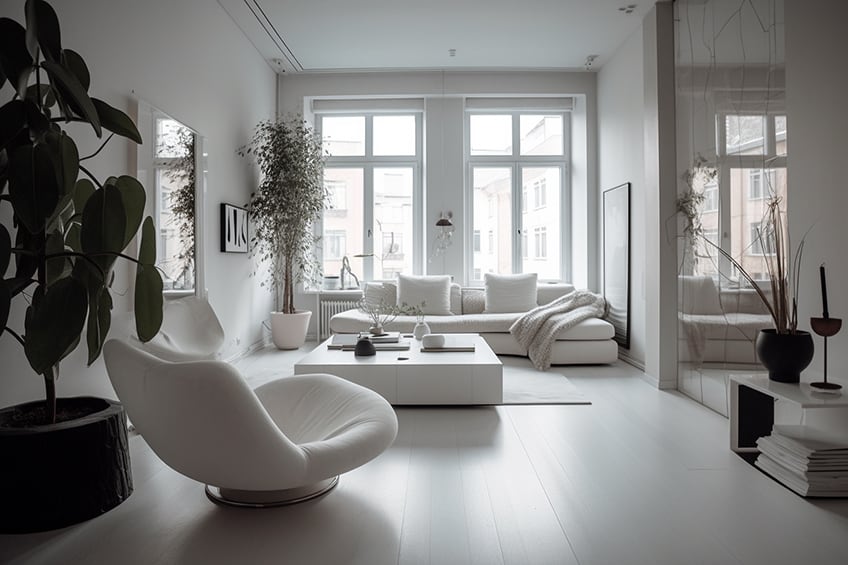
It’s the perfect neutral white since it is neither so stark that it appears too bright nor so dim that it shows as more of a light gray.
| Paint Name | Hex Code | RGB | Shade |
| Huntington White | #F1EDE2 | 241, 237, 226 |
Iron Mountain
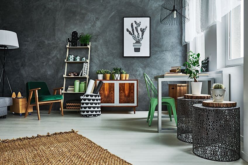
Iron Mountain paint is a brown-gray-black color that appears softer than a true black. It is dramatic without being too imposing, which makes it easy to appreciate in any living space. This gray paint is very similar to charcoal but reads as more earthy in its undertones. Using it in a matte finish can make it appear to be a smeared blackboard. It is great on cabinetry, statement walls, wall paneling, or interior doors where it is used as an accent color. Pairing a darker gray, such as Iron Mountain, with a crisp, clean white is a great way to achieve a strong but simple and modern look in any room.
| Paint Name | Hex Code | RGB | Shade |
| Iron Mountain | #585654 | 88, 86, 84 |
Mauve Mist
Mauve Mist is a lovely paint tone that could be considered a warm, comforting mauve. The color is peaceful, welcoming, and easily paired with any other color you can think of. We suggest pairing this shade with ivory or light gray if you want a seamless, soft, and comforting look to your room.
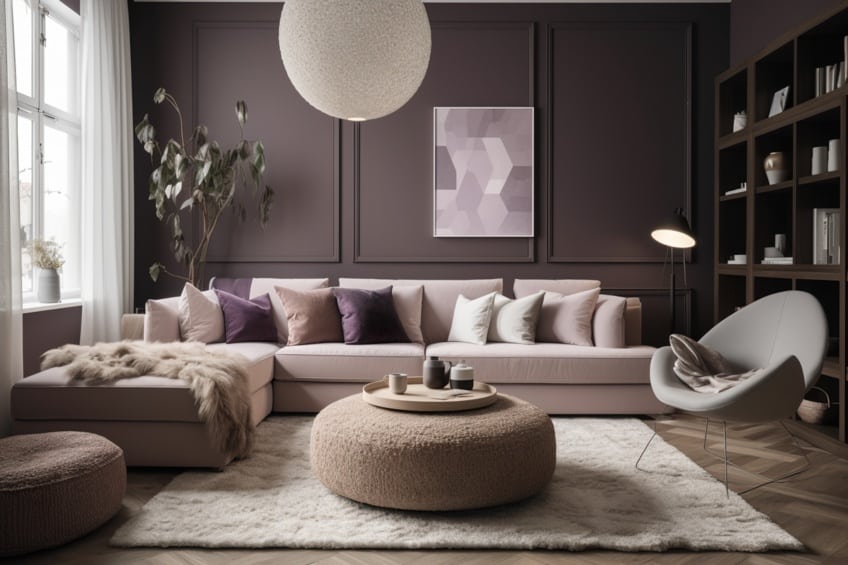
You could also pair this shade with eggplant or chocolate shades.
| Paint Name | Hex Code | RGB | Shade |
| Mauve Mist | #BE999A | 190, 153, 154 |
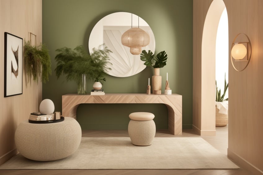
Shaker Beige
Shaker Beige is a warm, dependable beige that pairs amazingly with whites and deeper browns. Beige has been a backbone in interior design for a long while and Shaker Beige is a testament to how timeless beige is, and why it has stood its ground in the industry for so long. It is inviting and mid-toned, which allows it to change hues based on lighting conditions or time of day. The tone can easily warm an entryway or living room into a beachy haven, as the color is reminiscent of smooth sand and wave-polished driftwood.
| Paint Name | Hex Code | RGB | Shade |
| Shaker Beige | #D1C2A7 | 209, 194, 167 |
Spectra Blue
The blue we suggest is a tone called Spectra Blue. Spectra Blue is a neutral blue tone reminiscent of aqua in its undertones. This color is the perfect complement to creams, beiges, and greens. A great way to utilize this shade fully is to allow the space to feel wholly serene with Spectra Blue used on the walls, light beige flooring and furniture, white trims, and a few darker accents that can anchor the room.
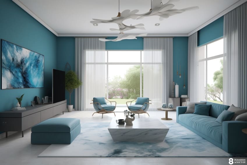
For the darker accents, you could use deeper navy or some medium to dark grays with great success.
| Paint Name | Hex Code | RGB | Shade |
| Spectra Blue | #98CED0 | 152, 206, 208 |
Tarpley Brown
If you enjoy looking to nature for inspiration or find that you are calmest when in the outdoors, then Tarpley Brown is the perfect paint for you to consider using in your home. While it might seem too dramatic to many people at first, when used to its full potential in a living space it creates a refuge from all the mental stresses of modern life.
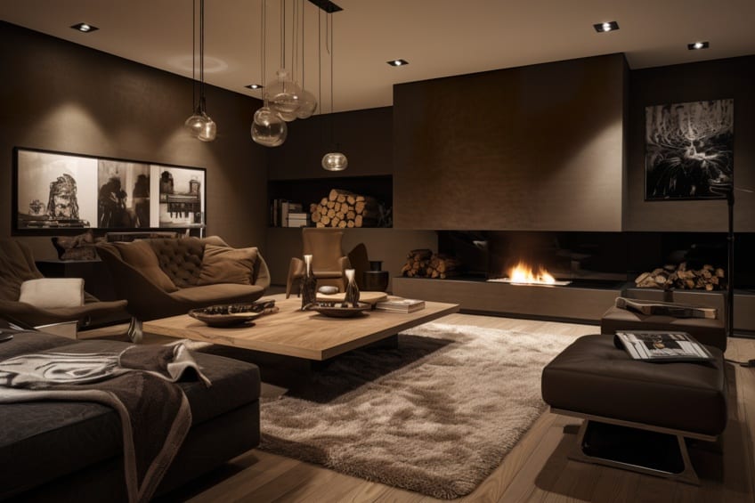
Tarpley Brown is a luscious brown reminiscent of fertile soil, melting pots of chocolate, and freshly brewed coffee and can be paired with various greens and off-whites for an earthy feeling. If you want a crisper look, you can use brighter whites for accents and trims, or you could opt for a moody tone using deep reds and purples if you don’t necessarily want a completely neutral color scheme.
| Paint Name | Hex Code | RGB | Shade |
| Tarpley brown | #4A3931 | 74, 57, 49 |
Whitewater Bay
Whitewater Bay is a fresh, warm ivory paint with undertones of orange. It is not a stark white at all, but it is definitely not a beige. It pairs well with bold and subtle colors because of its unassuming nature, so it can be readily used in any room without worry. If you are looking for something cooler than beige but still warm, Whitewater Bay is a great option.
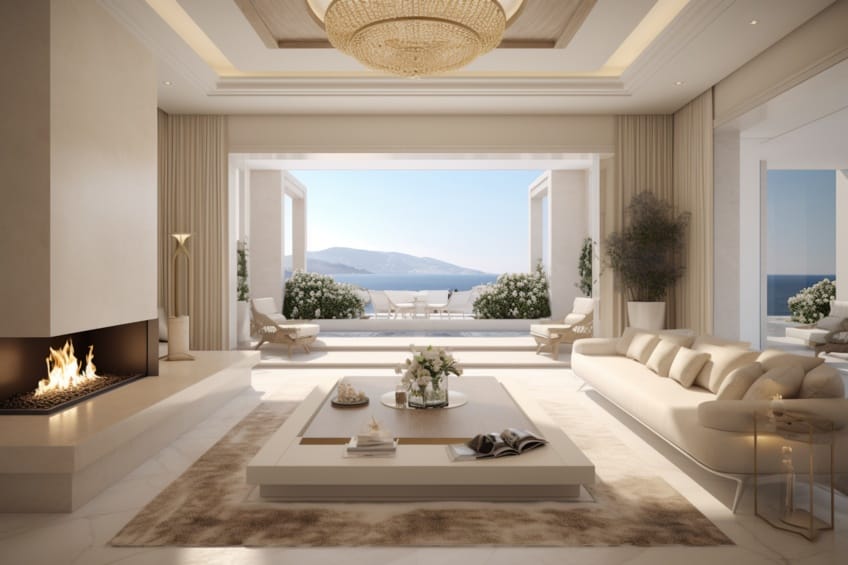
It is a paint reminiscent of sea foam and sun-bleached clam shells and works especially well with soft shades of light blue and light green.
| Paint Name | Hex Code | RGB | Shade |
| Whitewater Bay | #F4EFEA | 244, 240, 234 |
Elemental
This elemental paint tone is a green-tinted, neutral taupe-beige color that is exciting yet subtle. The undertone of green in the taupe gives it a refreshing but grounded feeling when used in a room. Used in a living room or entry hall, Elemental is welcoming and confident without being overpowering. It eases guests into a living space in a calm and measured way.
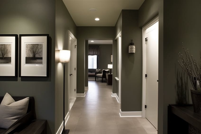
| Paint Name | Hex Code | RGB | Shade |
| Elemental | #B1AC8D | 177, 172, 141 |
Kendall Charcoal
Kendall Charcoal is a moody gray-blue that isn’t imposing. This is because it is a warm gray with a cozy and relaxing presence, especially when used in a master bedroom. It is dark and sophisticated but not morose in any way.
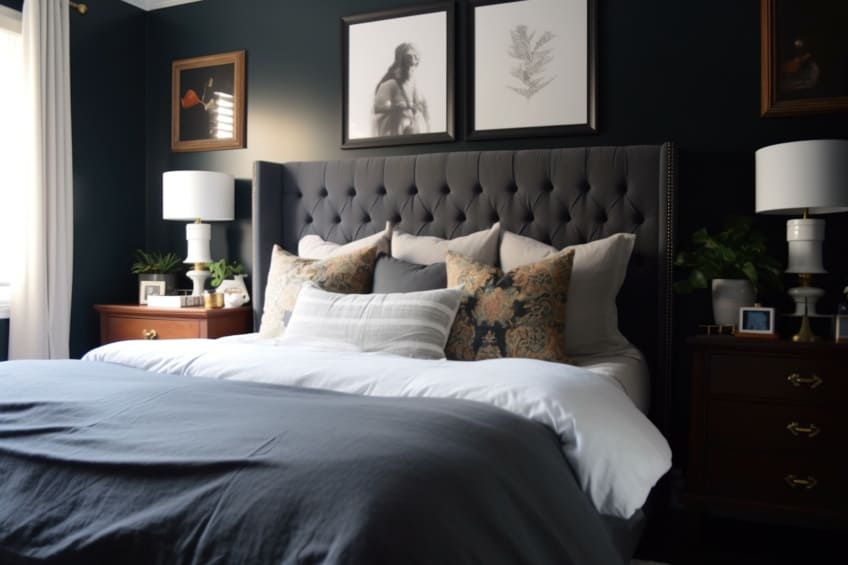
It could even be used with success in a living room and paired with some earthy colors to feel intimate and inviting, or with some metallics for more of a modern feel.
| Paint Name | Hex Code | RGB | Shade |
| Kendall Charcoal | #686763 | 104, 103, 99 |
Technical Table of Neutral Color Shades
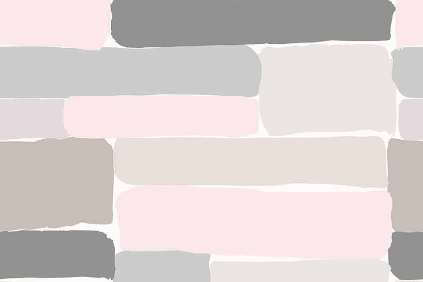
Now that we have discussed what neutral colors are, and how you can mix some of your own or which popular tones you could use in your home, we will also show you a few more shades of each neutral color along with their technical details. Below are tables including hex codes and RGB values for various browns, white, and gray. Try experimenting with a neutral color palette or two using the colors below as inspiration!
Gray Shades
Gray is a great option for people that want a very simple, classic neutral that is not as intense as black but with not as much hue undertone as many of the other neutrals that we have mentioned.
Below are 15 shades of gray that we have chosen that you can try out!
| Name | Hex Code | RGB | Shade |
| Gray | #808080 | 128,128,128 | |
| Gainsboro | #DCDCDC | 220,220,220 | |
| Light Gray | #D3D3D3 | 211,211,211 | |
| Light Slate Gray | #778899 | 119,136,153 | |
| Dim Gray | #696969 | 105,105,105 | |
| Pale Silver | #C9C0BB | 201,192,187 | |
| Platinum | #E5E4E2 | 229,228,226 | |
| Ash Gray | #B2BEB5 | 178,190,181 | |
| Cadet Gray | #91A3B0 | 145,163,176 | |
| Cinerous | #98817B | 152,129,123 | |
| Manatee | #979AAA | 151,154,170 | |
| Gray Blue | #8C92AC | 140,146,172 | |
| Rocket Metallic | #8A7F80 | 138,127,128 | |
| Trolley Gray | #808080 | 128,128,128 | |
| Umber | #635147 | 99,81,71 |
Brown Shades
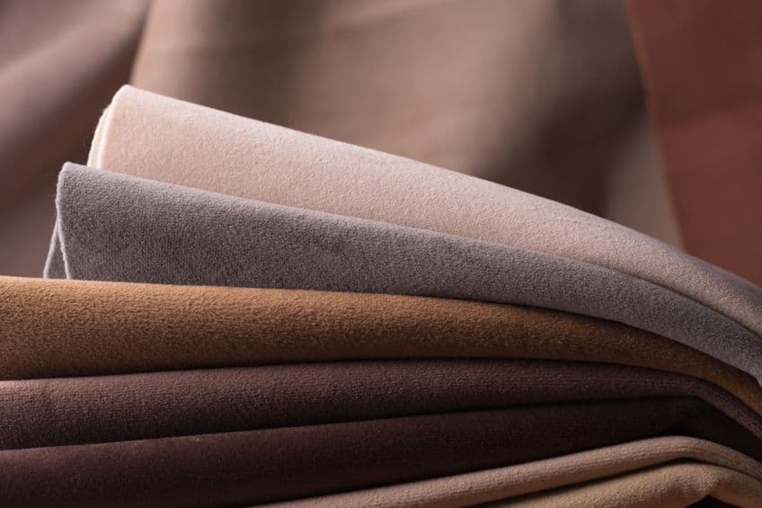
In the table below, we have presented some shades of brown that you can use in your next art or interior design project. The information offered includes hex codes and RGB values for those interested in the technicalities, while also showing the name and shade if you are just looking for some inspiration.
| Name | Hex Code | RGB | Shade |
| Bisque | #FFE4C4 | 255,228,196 | |
| Beige | #F5F5DC | 245,245,220 | |
| Saddle Brown | #8B4513 | 139,69,19 | |
| Sienna | #A0522D | 160,82,45 | |
| Tumbleweed | #DEAA88 | 222,170,136 | |
| Rosy Brown | #BC8F8F | 188,143,143 | |
| Wood Brown | #C19A6B | 193,154,107 | |
| Antique Brass | #CD9575 | 205,149,117 | |
| Deer | #BA8759 | 186,135,89 | |
| Beaver | #9F8170 | 159,129,112 | |
| Chamoisee | #A0785A | 160,120,90 | |
| Spanish Bistre | #80755A | 128,117,90 | |
| Raw Umber | #826644 | 130,102,68 | |
| Roast Coffee | #704241 | 112,66,65 | |
| Donkey Brown | #664C28 | 102,76,40 | |
| Traditional Chocolate | #7B3F00 | 123,36,0 | |
| Pastel Brown | #836953 | 131,105,83 | |
| Pale Brown | #987654 | 152,118,84 | |
| Wood Brown | #C19A6B | 93,154,107 | |
| Sand | #C2B280 | 194,178,128 |
White Shades
Below are some off-whites that you can readily use in your art or interior decorating. Off-whites are clean and soft in all the right ways while not coming off as stark, clinical, or prudish. There are a variety of warmer and colder whites listed in the table below and each shade has its unique character based on its temperature and underlying hue.
| Name | Hex Code | RGB | Shade |
| White | #FFFFFF | 255,255,255 | |
| Snow | #FFFAFA | 255,250,250 | |
| Mint Cream | #F5FFFA | 245,255,250 | |
| Azure | #F0FFFF | 240,255,255 | |
| Floral White | #FFFAF0 | 255,250,240 | |
| Ivory | #FFFFF0 | 255,255,240 | |
| Old Lace | #FDF5E6 | 253,245,230 | |
| Baby Powder | #FEFEFA | 254,254,250 | |
| Seashell | #FFF5EE | 255,245,238 | |
| Linen | #FAF0E6 | 250,240,230 | |
| White Smoke | #F5F5F5 | 245,245,245 | |
| Ghost White | #F8F8FF | 248,248,255 | |
| Milk | #FDFFF5 | 253,255,245 | |
| Anti-Flash White | #F2F3F4 | 242,243,244 |
While our eyes tend to be drawn to bright and saturated colors, the importance of using neutrals when making art or decorating a room cannot be understated. If an artist were to only use bright colors, the viewer wouldn’t know where to look because everything would demand attention at once. Colors can clash very easily and if there aren’t desaturated tones in an artwork it can severely lack the depth that is necessary to create a realistic painting. If you are painting a subject that is intended to look realistic but it lacks depth, you will instead create a very flat and unnatural painting. Being able to understand neutral colors will help you find them and appreciate them out in the world more often. It will also help you improve your art and decorating skills in a very crucial way.
Take a look at our “What are neutral colors?” webstory here!
Frequently Asked Questions
Are Neutral Colors on the Color Wheel?
No, there are not any neutral colors on the color wheel. Some popular neutral shades are taupe, black, white, brown, cream, and beige. Even though neutral colors are not on the color wheel they can be used to complement the colors found on the color wheel.
Is Lavender a Neutral Color?
Soft lavender shades are considered neutral colors by interior designers. This is because there isn’t a color that soft lavender doesn’t go with. Adding natural shades of brown or blue with lavender has a soothing effect while adding more vibrant colors like red or orange can be quite exciting and eye-catching.
How Do I Mix Gray Paint?
The simplest way to make gray paint is to mix black and white paint together in equal parts. Doing this creates a neutral gray color with very little effort. You can also make neutral gray shades by mixing any color on the color wheel with its complement. Adding small amounts of extra white or black will allow you to create even more gray shades.
Can I Mix Gray Without White Paint?
You can make neutral gray shades without white by mixing any color on the color wheel with its complement. For example, you could mix purple and yellow, orange and blue, or green and red to create gray paint. Keep in mind however that these grays may be too dark for your liking and you will still likely need to use white to lighten them.
Is Black a Neutral Color?
Black is the darkest of all neutral colors. Any variations of black are considered to be shades of gray since no shade appears darker than black does. In this way, black is the natural opposite of white.
Is White a Neutral Color?
White is the lightest of all light neutral colors. White can be tinted with other colors to create near-neutral shades called off-whites. Some examples of these white variations include eggshell, ivory, and milk.
What Are Neutral Colors?
Neutral colors are colors that aren’t commonly found on the color wheel. They are defined as hues that seem to be without color and are known for being universal complements. Neutral colors are important in art and interior design because of this, and any neutral color scheme is very calming and serene. The neutral colors are black, white, gray, and brown.
In 2005, Charlene completed her Wellness Diplomas in Therapeutic Aromatherapy and Reflexology from the International School of Reflexology and Meridian Therapy. She worked for a company offering corporate wellness programs for a couple of years, before opening up her own therapy practice. It was in 2015 that a friend, who was a digital marketer, asked her to join her company as a content creator, and this is where she found her excitement for writing.
Since joining the content writing world, she has gained a lot of experience over the years writing on a diverse selection of topics, from beauty, health, wellness, travel, and more. Due to various circumstances, she had to close her therapy practice and is now a full-time freelance writer. Being a creative person, she could not pass up the opportunity to contribute to the Art in Context team, where is was in her element, writing about a variety of art and craft topics. Contributing articles for over three years now, her knowledge in this area has grown, and she has gotten to explore her creativity and improve her research and writing skills.
Charlene Lewis has been working for artincontext.org since the relaunch in 2020. She is an experienced writer and mainly focuses on the topics of color theory, painting and drawing.
Learn more about Charlene Lewis and the Art in Context Team.
Cite this Article
Charlene, Lewis, “Neutral Colors – What They are and How to Use Them.” Art in Context. June 27, 2022. URL: https://artincontext.org/neutral-colors/
Lewis, C. (2022, 27 June). Neutral Colors – What They are and How to Use Them. Art in Context. https://artincontext.org/neutral-colors/
Lewis, Charlene. “Neutral Colors – What They are and How to Use Them.” Art in Context, June 27, 2022. https://artincontext.org/neutral-colors/.


Very helpful article, I personally love neutral colors and my favorite for interior design are all shades of pewter.
Excellent article. Very well explained. Thanks!
Thank you Elizabeth, you’re welcome :-).