Triadic Colors – A Guide to Understanding the Triadic Color Wheel
There are countless color schemes and color combinations you can use for your design project. A simple color scheme is ideal as you have more control over how the colors are used and look together. When it comes to triadic colors or three colors, it is also fairly simple. Choose your primary or main color and use the other two colors as your accents. However, to create a balanced color scheme, you need to have an understanding of what triadic colors are. Then you can implement it into your artwork, photography, interior design, or any other colorful design.
What Are Triadic Colors?
When working out a triadic color scheme, you should first have an understanding of color theory and a triadic color wheel. Triadic, or “tri,” means three, so you are going to be dealing with three colors. Now you have to determine which three colors they are going to be. Therefore, we must examine the color wheel. This is what you can refer to in order to find the colors you are looking for, as it is a circular representation of all the colors. A color wheel should contain your primary colors of blue, yellow, and red. These should be easy to locate. Then you have your secondary colors of green, orange, and purple or violet.

These are your blends of primary as well as secondary colors. For example, when you combine the colors red and yellow, you will get orange. Your intermediate colors come next, and these are all the colors found in between. When you have a color wheel in front of you, and you can see most of the colors as described, you can then determine the triadic colors. The basic definition is three colors that are equally set apart from one another. In other words, you use an equilateral triangle shape to identify the colors. When these colors are put alongside each other, they can form a nice contrast. Some triadic color examples are as follows.
- Orange, purple, and green
- Blue, red, and yellow
- Yellow-orange, blue-green, and red-violet
- Yellow-green, blue-violet, and red-orange
When using a triadic color scheme, you need to make sure you create a balance between the colors. Otherwise, the combination can become too much. For example, when decorating a room, choose one of the three colors as your main color, then use the other two colors as accents. By doing this, you will not have all three colors competing for your attention.
So, what does color scheme mean? This is simply a group of selected colors from the color wheel, which are then used in your paintings or designs.
What is a triadic color scheme? These are your three colors spaced equally from each other in a triangular form. So, a color scheme is developed according to how the colors are located on the color wheel. Besides triadic color schemes, you also get other options that could work for your designs.
- Analogous: When looking at a color wheel, these colors are placed alongside one another.
- Monochromatic: This uses a single color that changes saturation and value to get a variety of shades of color.
- Complementary: Colors that are placed on opposite sides of a color wheel. These colors offer great contrast.
- Split-Complementary: This is a chosen base color, with two secondary colors that are usually located alongside each side of the main complementary color.
- Tetradic or rectangular: As with the triadic colors, this is a rectangular form of colors. For example, purple, yellow, red-orange, and blue-green.
- Square: These are four colors that are evenly spaced in a square form. For example, violet, blue, yellow-green, and orange.
Most of these color schemes are easy to use, however, the more colors that contrast with each other can be a bit more challenging to work with. These colors can create energetic and strong colors, which is why they should be used carefully, otherwise, they can become too glaring to look at.
Why Use a Triadic Color Scheme?
Color is used in everything from paintings to how you design your house or create advertisements for products. Color has a profound effect on our emotions, meaning that it can help calm us or energize and excite us. When used incorrectly, they may even irritate and overwhelm. You can create a compelling and balanced color scheme by pairing the correct colors and using them in proper proportions.

So, what is a triadic color scheme? These are three selected colors, the main or dominant color you use will be the color that sets the scene or mood, while the other two colors are used more as accents of color. Some triadic color examples can be energizing or calming, for example, using red or blue as the dominant color.
- Red: The two accent colors would then be blue and yellow. This combination is more energizing due to the red color.
- Blue: In this case, blue takes over as your dominant color and the red and yellow colors are used as accents. This combination would create a more calming color scheme.
- Yellow: If you use yellow as your dominant color, it is warming and can provide a relaxing or more vibrant atmosphere, depending on what shade of yellow you choose.
Of course, changing the color value and saturation can also play a role in how you want your colors to look. This means adjusting how dark or light color can be, or how vibrant color is. When using paints, you can create your own palette by mixing colors and adding white to lighten and black or a complementary color to darken it. However, when creating websites or online designs, you usually have to work with a special software program for the best results.
There are also free programs or color calculators online that can help you choose a triadic color scheme.
Using Triadic Colors for Interior Design
Anybody can learn how to successfully use triadic colors for decorating their homes. We have already discussed how to balance a triadic color scheme by using a single color as your main choice, while the others form accent colors. You can remain with all three vibrant colors, or you can adjust the colors to create a more muted or pastel effect.
A child’s bedroom, for example, can be bold and bright, while you can choose more muted colors for the dining or living room. For example, if you choose red, blue, and yellow, consider a pastel softer shade of pink, a pastel blue, and soft yellow. Choose soft yellow for the walls but incorporate blue and red in the fabrics of the room or other accessories like pillows and vases.

A bedroom should naturally be relaxing, so using toned-down colors is the best way to go. For example, using the triadic color scheme of green, purple or violet, and orange. Consider using white paint with purple undertones for the walls, and bring in darker lavender bedding, with accents of light rustic orange. Maybe include greenery through a leafy plant or picture on the wall.
When using multiple colors, a triadic color scheme is perfect as adding additional colors can become more challenging to work with. This is especially true if you are designing a smaller room, as you do not want it to feel overcrowded with colors.
When using brighter accessories in a room, gray can act as the perfect background for these colors. However, you should take note of the gray undertone when choosing colors as this could affect your final look.
Take note, that when choosing a paint color, it can change in a room with artificial lighting. So, always make sure you check the paint color in the lighting before choosing and painting an entire room. Even if it seems there are rules and ways to use colors, you can take these to heart, but you should also be allowed to express yourself and experiment with colors.
Triadic Colors and Graphic Design
Triadic colors can be used in all kinds of graphic designs from building websites to using them in advertisements on social media or for printing and other marketing materials. Designing catchy logos is another way to use triadic colors.

Consider the Burger King or Firefox logo, which both use this color combination. We have already discussed how you can easily create a triadic color scheme by using a color palette generator, which makes it much easier to choose colors. Think carefully, as the colors you choose will depend on what type of message you want to send to the viewers.
Photography and Triadic Colors
Triadic colors and photography can be challenging, as you have to keep an eye out for the type of composition. You do not have the control you have when designing a room or a website, but after a little practice and experience, you should be able to find those perfect images. When you do find the perfect balance of colors, it will be a most beautiful picture.
However, when doing studio photography, you can control things a bit more. Again, a balance of color is what you are looking for, and to do this, you should practice a lot and look into other famous photographers’ work.
Even though you might find a great triadic color scheme, there is more to photography than this. You also need to consider lighting and things like composition, so you have to know all these things before you can take those perfect images you are looking for.
Painting with Triadic Colors
When learning to paint, you will need to learn all about color theory and how colors interact with each other. You must also learn how to mix colors and create different shades and tones of color. For example, you will need to understand that by mixing your complementary colors, you will get a toned-down or muted version of that color. Mixing even more of these colors will eventually lead to gray or brown paint color. The same goes for when mixing all your primary colors, it will form a neutral gray to back color. So, it is best to understand how colors work when mixing paints so that you do not land up with colors you do not want.

However, when using a triadic color scheme when painting, you can create some beautiful contrast in paintings. Again, choose a dominant color from the three colors for the composition. For example, a green background, with various purple shades and traces of orange. You can also get a variety of tints and shades by mixing in white, black, or complementary colors. This is where creating your own color palette and experimenting with the paint colors come in handy.
Within the same painting, you could also use several versions of the same color, you do not have to keep to only three colors.
A Few Tips When Exploring a Triadic Color Scheme
There may be some things you want to think about before you choose your triadic color scheme. The main thing is to figure out what you want to do, and what emotional response you are aiming for. Choose your colors with the results in mind. Here are more tips to consider.
- As this is important, we mention it again. Select a main or dominant color and apply the other colors as highlights or accents. This creates focus where you want it to be and is less overwhelming.
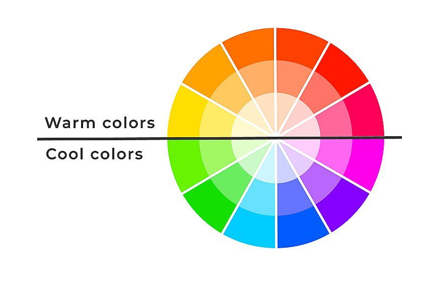
- Always consider the color temperature, for example, greens and blues are cool, while red, yellow, and orange are warm. Choose the prevailing color temperature and use the others as your accent colors.
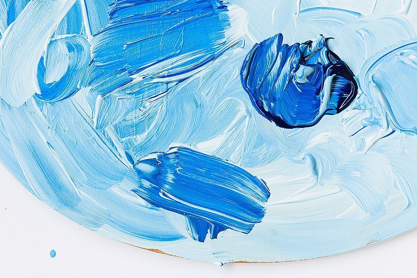
- Experiment with all the different tints and shades of colors.
- You can use a bold triadic color scheme, but to create a more balanced or calming effect, consider a main bold color with more muted tones.
When working with colors, it can seem a bit intimidating, especially if you are using triadic colors in a design or painting. We all have to start somewhere, but once you practice and gain experience, it can be very gratifying when you produce a beautiful triadic color scheme that works for whatever project you are busy on.
Frequently Asked Questions
What Are Triadic Colors?
When considering color theory, you must look at a triadic color wheel, which helps to represent the different colors. You will find triadic colors positioned equally from each other in a triangular form. Triadic colors examples include something like yellow, red, and blue.
What Does Color Scheme Mean?
You may also want to know, what is a triadic color scheme? Both these questions have the same answer. In general, a color scheme is a grouping of colors, and a triadic color scheme simply involves the colors within this specific color scheme.
Are Triadic Colors Difficult to Use?
Triadic colors are fairly simple to work with. You can use each color in equal amounts at the same intensity, however, this can become a little unpleasant to look at. The number one rule many follow in this case is to choose one dominant color and use the other two colors as accents or in smaller amounts.
Why Should You Use Triadic Colors?
These evenly spaced colors provide more of a contrast in color, and therefore, can bring more energy and vibrancy to a color scheme. When used correctly, and all the colors are nicely balanced, the colors are pleasant to look at.
In 2005, Charlene completed her Wellness Diplomas in Therapeutic Aromatherapy and Reflexology from the International School of Reflexology and Meridian Therapy. She worked for a company offering corporate wellness programs for a couple of years, before opening up her own therapy practice. It was in 2015 that a friend, who was a digital marketer, asked her to join her company as a content creator, and this is where she found her excitement for writing.
Since joining the content writing world, she has gained a lot of experience over the years writing on a diverse selection of topics, from beauty, health, wellness, travel, and more. Due to various circumstances, she had to close her therapy practice and is now a full-time freelance writer. Being a creative person, she could not pass up the opportunity to contribute to the Art in Context team, where is was in her element, writing about a variety of art and craft topics. Contributing articles for over three years now, her knowledge in this area has grown, and she has gotten to explore her creativity and improve her research and writing skills.
Charlene Lewis has been working for artincontext.org since the relaunch in 2020. She is an experienced writer and mainly focuses on the topics of color theory, painting and drawing.
Learn more about Charlene Lewis and the Art in Context Team.
Cite this Article
Charlene, Lewis, “Triadic Colors – A Guide to Understanding the Triadic Color Wheel.” Art in Context. April 15, 2022. URL: https://artincontext.org/triadic-colors/
Lewis, C. (2022, 15 April). Triadic Colors – A Guide to Understanding the Triadic Color Wheel. Art in Context. https://artincontext.org/triadic-colors/
Lewis, Charlene. “Triadic Colors – A Guide to Understanding the Triadic Color Wheel.” Art in Context, April 15, 2022. https://artincontext.org/triadic-colors/.


