Tertiary Colors – Discovering the Possibilities of Intermediate Colors
Imagine if the only colors that artists used were the primary ones – red, yellow, and blue. Art would be very uninteresting. Even the addition of secondary colors would not make much of an impact on your artwork. Fortunately, artists also have a choice of tertiary and intermediate colors at their fingertips that are sure to bring their creations to life. In this article, we are going to talk about the tertiary color wheel, and the intermediate color wheel, and the role they play in art.
Understanding the Color Wheel in Traditional Art
To understand what tertiary and intermediate colors are in traditional art you first need to understand the color wheel, and where primary and secondary colors fit into it. In this section, we will be discussing primary and secondary colors in traditional art (as opposed to digital art). The primary colors in traditional art are red, yellow, and blue, also known simply as RYB.
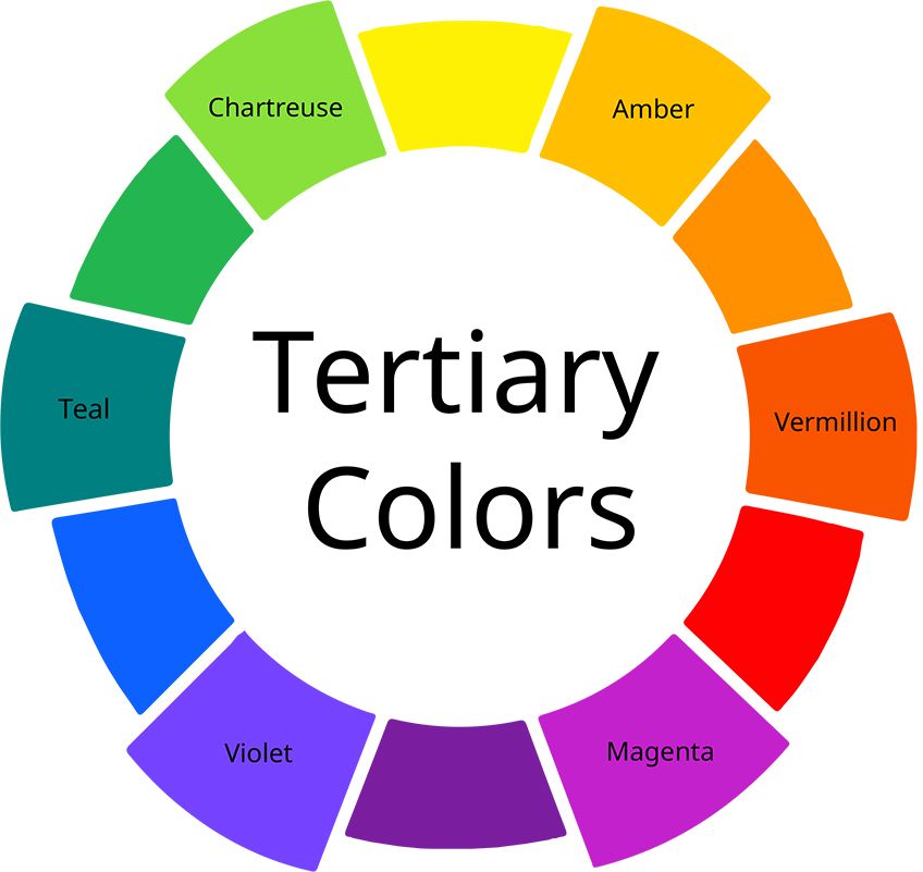
Secondary colors on the RYB color wheel are orange, green, and violet. They are made by mixing two primary colors in equal parts. So, to create orange you would mix red and yellow in equal parts. Green is made of a mix of yellow and blue, and violet is created by mixing red and blue. The illustration above shows the placement of primary and secondary colors on the color wheel.
Understanding Tertiary Colors
Now that we have a grasp of the placement of primary and secondary colors on the color wheel, let us look firstly at tertiary colors. In order to understand what tertiary colors are, we need to first understand what they are not.
What Are Tertiary Colors In Traditional Art?
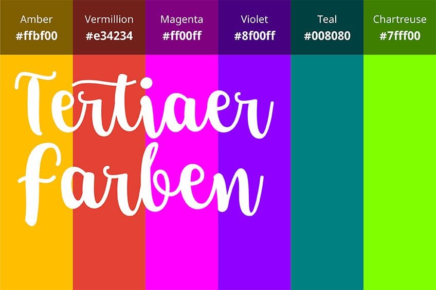
Contrary to what a number of sources may tell you, the definition of tertiary colors is not a mix of a primary and a secondary color. It is the mix of two secondary colors in a 1:1 ratio. Similarly, there seems to be some confusion in the art world about intermediate colors. They are not, as some say, the same as tertiary colors.
Instead, if you were to look at a color wheel you would find intermediate colors lie between the primary and secondary colors.
Even though some artists use the terms tertiary and intermediate colors interchangeably, there is a marked difference between the two. Unfortunately, misinformation about tertiary colors’ definition, as well as the definition of intermediate colors, is quite common. And if you were to apply these incorrect definitions you will not only create colors that are not proper tertiary or intermediate colors, but your art will not fully benefit from correct color theory. Thus it is important to grasp the proper definition of tertiary and intermediate colors from the outset otherwise your color palette will be incorrect.
Now that we have answered the question, “what are tertiary colors?”, let us look at the color differences between tertiary and intermediate colors. First, we will investigate tertiary colors. We know that tertiary colors are made by mixing two secondary colors – orange, green and purple – so let us see what colors we come up with after mixing them. The image below shows the colors that come from the mixes – blue-gray, olive green, and burnt sienna. One of the benefits of understanding the tertiary colors’ definition is being able to create a complex color like burnt sienna.
A particularly noticeable aspect about tertiary colors is that they are not very bright. They all have a gray-green hue to them. So, for example, if you were to mix purple and green, it will not make a pure blue. In summary, then, tertiary colors are blue-gray, olive green, and burnt sienna. These are the result of an equal mix of secondary colors, but there is no rule that stipulates that you have to keep to the ratio of 1:1. Depending on the ratio of the colors mixed, it will be either a green-gray that looks teal or a greyish purple that looks violet.
Put another way, the resultant color from a mix will always look more like a secondary color than a primary one.
How to Create Tertiary Colors in Digital Art
Some traditional artists might frown upon digital art because they believe that it is not “true” art. However, the RYB color wheel in traditional art has by and large been replaced by the RGB system of color which, in the digital system, means red, green, and blue. The replacement came about because the primary and secondary colors could be displayed more brightly and with more in-depth saturation.
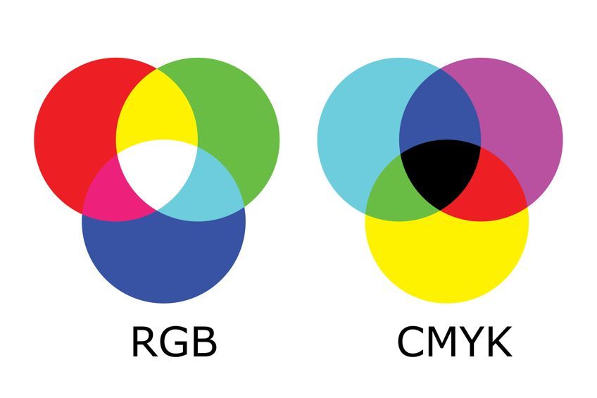
The primary colors are also known as the colors of light. Secondary colors on the RGB color wheel are also known as subtractive colors, meaning the primary colors of pigment. They are cyan, yellow, and magenta. As with traditional colors, in the digital art space, you would mix a primary and a secondary color to get a tertiary color.
Note the relationship of the colors to each other according to where they are positioned on the color wheel. You will see that the colors that are close together are in harmony with each other, and when mixed together they will create intense colors. In this arrangement they are also known as analogous colors, meaning comparable colors. The colors that sit farthest away from one another are contrasting and will produce less intense colors when combined.
Lastly, colors that sit opposite one another on the color wheel are known as complementary, or opposite, colors. These colors can be neutralized or desaturated by mixing them with their complementary colors.
For example, if you want to create a tertiary color using yellow, you would mix it with a color between yellow and red, which is orange. The resulting color would be yellow-orange. Similarly, if you wanted to make yellow-green, you would mix it with the color between blue and yellow, which is green. But if you wanted to tone down, or desaturate, the yellow-orange color, you would combine it with its opposite colors which are blue-purple. In order to desaturate the color yellow-green, you would mix it with red-purple, its opposite color.
That said, if you are working digitally you could take a “shortcut” by using the RGB and HEX codes to give you every color on the wheel above, primary, secondary, and tertiary colors. RGB simply means red, green, and blue and is a system that represents every color that can be used digitally. The three colors can be blended in any proportion to create all the colors on the visible spectrum. The levels of the three colors range in intensity from 0 percent to 100 percent. There are 256 levels of each color and every one of them is represented by the numbers 0 through 255. Thus the total number of colors that can be created is 256 ³ which equals 16,777,216 colors.
Similarly, HEX colors, meaning hexadecimal, is the system that uses a combination of numbers and letters in a seven-digit format.
How to Create Tertiary Colors Digitally
In the table below we have listed these codes for you alongside the respective colors. There are 12 colors in total.
| Color | Color Type | HEX Code | RGB Code | Shade |
| Red | Primary | #FF0000 | 255, 0, 0 | |
| Blue | Primary | #0000FF | 0, 0, 255 | |
| Green | Secondary | #00FF00 | 0, 255, 0 | |
| Yellow | Primary | #FFFF00 | 255, 255, 0 | |
| Magenta | Secondary | #FF00FF | 255, 0, 255 | |
| Cyan | Secondary | #00FFFF | 0, 255, 255 | |
| Rose | Tertiary | #FF007F | 255, 0, 127 | |
| Violet | Tertiary | #7F00FF | 127, 0, 255 | |
| Azure | Tertiary | #007FFF | 0, 127, 255 | |
| Spring green | Tertiary | #00FF7F | 0, 255, 127 | |
| Chartreuse | Tertiary | #DFFF00 | 233, 255, 0 | |
| Orange | Tertiary | #FFA500 | 255, 165, 0 |
Understanding Intermediate Colors
As we have mentioned, intermediate colors are the colors resulting from mixing in equal amounts a primary color with a secondary color. Some art experts say they are the colors that sit between the primary and secondary colors on the color wheel. Whatever the definition, the primary color is going to be the most important element in the mix.
What Are Intermediate Colors In Traditional Art?
Working on the premise that the primary color is the most important when creating an intermediate color, let us explore this a bit further. For example, if you were to mix yellow (primary) with orange (secondary), you would get yellow-orange. Or a mix between red and violet would be red-violet. As you can see, the names of the intermediate colors are made up of the primary color first (such as red) and the secondary color second (violet).
There are six intermediate colors, namely, blue-green, blue-violet, red-orange, red-violet, yellow-green, and yellow-orange.
With subtle application, these colors can be used to bring in a new dimension to your painting or to highlight a particular focal point. Intermediate colors are a particular favorite with abstract artists whose artworks are not bound by the same parameters and color theory as more traditional pieces may be. And if you want to improve your creative skills, why not experiment with color mixing by trial and error. You will be amazed by the different patterns of color that can be created. Insofar as color mixing goes, there are no hard and fast rules.
What Are Intermediate Colors In Digital Art?
Just as tertiary colors are found in traditional art, so too are intermediate colors. They can also be easily created using RGB and HEX codes. The table below shows the codes for all six intermediate colors.
| Color | Color Type | HEX Code | RGB Code | Shade |
| Blue-green | Intermediate | #0D98BA | 13, 152, 186 | |
| Blue-violet | Intermediate | #8A2BE2 | 138, 42, 226 | |
| Red-orange | Intermediate | #FF5349 | 255, 83, 73 | |
| Red-violet | Intermediate | #c71585 | 199, 21, 133 | |
| Yellow-green | Intermediate | #9ACD32 | 154, 205, 50 | |
| Yellow-orange | Intermediate | #FFAE42 | 255, 174, 66 |
Famous Paintings Using Tertiary and Intermediate Colors
Contrary to how it may seem in this digital age, the color wheel is not a modern invention. It has been around since the 18th century when Sir Isaac Newton discovered the visible spectrum of light as it passed through a prism. He noted the sequence of colors were precisely the same as those of a rainbow, namely, red, orange, yellow, green, blue, indigo and violet. Newton also discovered that the main colors were red, blue, and yellow and that all the other colors were derived from them. As you can imagine, this revolutionized the art world and literally filled it with color.
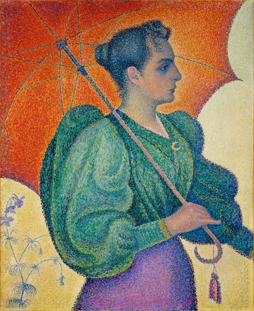
This painting by Paul Signac, the French Neo-Impressionist painter, is a fine example of the use of intermediate colors in a painting. This oil on canvas is called Woman With A Parasol and was painted in 1893. Signac did not mix colors for this painting; instead, he applied dabs of blue-green, red-orange, red, purple, and yellow to the canvas. When we look at it from a distance our eyes instinctively mix the colors and enable us to see the various tones, tints, and hues.
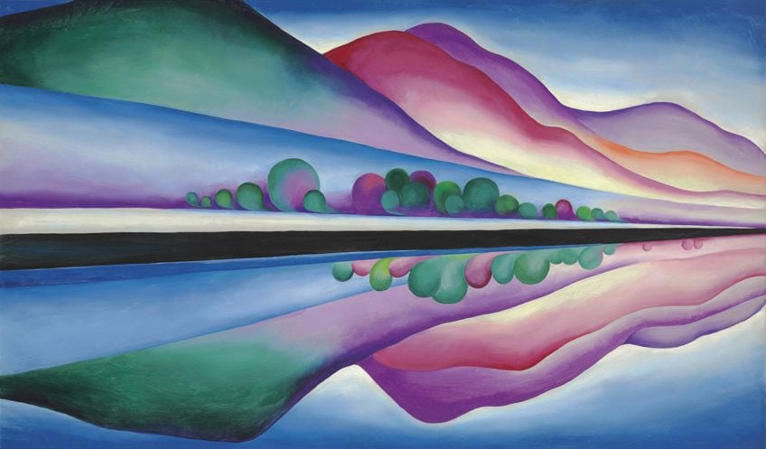
In 1922, American painter Georgia O’Keeffe painted one of her most well-known artworks, the dynamic Lake George Reflection. O’Keeffe, much like Vincent Van Gogh, was not afraid of color and used it liberally in many of her paintings. In Lake George Reflection she has used a number of tertiary colors, those being rose, violet, and orange. The blues and greens she has applied are primary colors.
The Role Of Neutral Colors In Art
No artist’s palette can be complete without the neutral colors, these being black, white, and gray, ivory, beige, and taupe. Neutral colors are considered not to be colors in and of themselves. And although you will not find them on the tertiary color wheel, or amongst the intermediate colors, neutral colors are equally as important as tertiaries and intermediates.
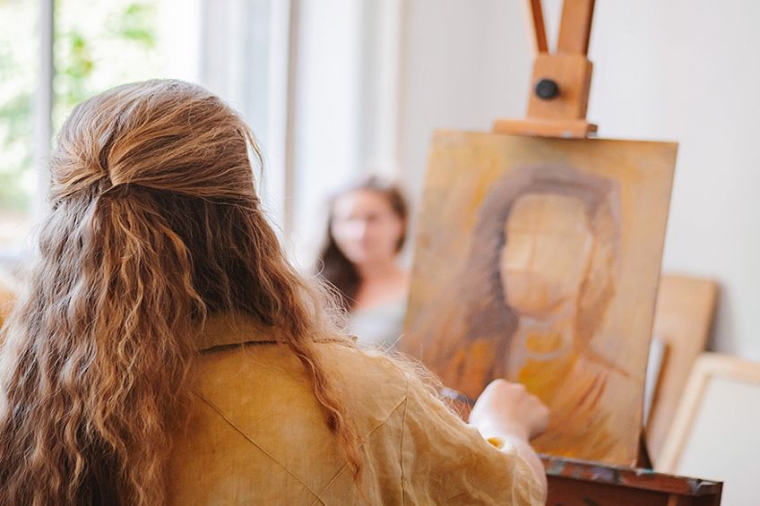
The color brown is also an integral part of an artist’s palette, although it is not a tertiary color, nor an intermediate or neutral color. Brown is in fact a composite color and is made by mixing the three primary colors – red, yellow, and blue – together. Needless to say, the resulting shades of brown will depend on the ratio of colors applied. Gray is a color that a lot of artists overlook, and this is to their detriment. It is an essential color because it draws attention to the colors around it. And although gray is considered a neutral color it is of course made by mixing black and white together, although that is not the only combination you can use.
The combination of yellow and purple creates a warm gray, while orange and blue mixed together results in a warm grey.
Another great example of the use of neutrals is a painting called Neutral 10. It was painted in acrylics by US-based modern abstract artist Jane Davies in 2015. Davies says of Neutral 10 that she wanted to explore layering techniques using neutral colors, then scratching through the layers to reveal the colors beneath. All of these neutral colors are available to traditional artists as pure colors, including brown and gray (although you can create your own browns and greys by mixing and experimenting with other colors). Fortunately, the colors are also obtainable digitally, and in the table below we have once again listed the RGB and HEX codes for each color.
As with oils, acrylics, and watercolors, the saturation of the digital colors can also be altered by changing the ratio of the colors mixed to create them.
| Color | Color Type | HEX Code | RBG Code | Shade |
| Black | Neutral | #000000 | 0, 0, 0 | |
| White | Neutral | #FFFFFF | 255, 255, 255 | |
| Middle Grey | Neutral | #8B8680 | 139, 134, 128 | |
| Ivory | Neutral | #FFFFF0 | 255, 255, 240 | |
| Beige | Neutral | #F5F5DC | 245, 245, 220 | |
| Taupe | Neutral | #483C32 | 72, 60, 50 | |
| Medium Brown | Neutral | #73533E | 115, 83, 62 |
Now that we have clarified the correct tertiary colors definition, as well as that of intermediate colors, you should have a better understanding of their relationship to each other, as well as the role they play in art. Remember, there is nothing preventing you from mixing tertiary colors together, or with intermediate colors, to create an entirely new palette for yourself. Why not experiment and see what interesting colors you come up with?
Frequently Asked Questions
What Is the Difference Between Tertiary and Intermediate Colors?
The colors on the tertiary color wheel are the result of a mix in equal parts of two secondary colors, those being orange, green, and violet. Intermediate colors are created by mixing a primary color, in other words, red, yellow, and blue, with a secondary color in a ratio of 1:1.
How Many Tertiary and Intermediate Colors Are There?
There are six colors in each category. Tertiary colors are rose, violet, azure, spring green, chartreuse, and orange. Intermediate colors are yellow-orange, red-orange, red-violet, blue-violet, blue-green, and yellow-green. The easiest way to remember these colors is to put the name of the primary color first, and the intermediate color second.
What Type Of Color Is Brown?
Brown does not fall into the category of tertiary, intermediate, or neutral. It is a composite color made by mixing the three primary colors – red, yellow, and blue – together. Some artists make brown by mixing orange with black, but if you decide to use this mix, you will need to be careful not to use too much black otherwise the resulting color will look black.
In 2005, Charlene completed her Wellness Diplomas in Therapeutic Aromatherapy and Reflexology from the International School of Reflexology and Meridian Therapy. She worked for a company offering corporate wellness programs for a couple of years, before opening up her own therapy practice. It was in 2015 that a friend, who was a digital marketer, asked her to join her company as a content creator, and this is where she found her excitement for writing.
Since joining the content writing world, she has gained a lot of experience over the years writing on a diverse selection of topics, from beauty, health, wellness, travel, and more. Due to various circumstances, she had to close her therapy practice and is now a full-time freelance writer. Being a creative person, she could not pass up the opportunity to contribute to the Art in Context team, where is was in her element, writing about a variety of art and craft topics. Contributing articles for over three years now, her knowledge in this area has grown, and she has gotten to explore her creativity and improve her research and writing skills.
Charlene Lewis has been working for artincontext.org since the relaunch in 2020. She is an experienced writer and mainly focuses on the topics of color theory, painting and drawing.
Learn more about Charlene Lewis and the Art in Context Team.
Cite this Article
Charlene, Lewis, “Tertiary Colors – Discovering the Possibilities of Intermediate Colors.” Art in Context. October 20, 2021. URL: https://artincontext.org/tertiary-colors/
Lewis, C. (2021, 20 October). Tertiary Colors – Discovering the Possibilities of Intermediate Colors. Art in Context. https://artincontext.org/tertiary-colors/
Lewis, Charlene. “Tertiary Colors – Discovering the Possibilities of Intermediate Colors.” Art in Context, October 20, 2021. https://artincontext.org/tertiary-colors/.


