Turquoise Blue Color – 59 Shades, Color Meaning and Guide
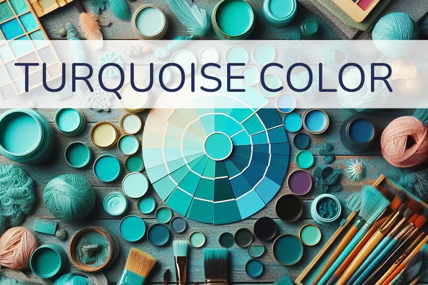
The color turquoise is a favorite among many, as it is a shade of blue that has a calming and friendly feeling. Not only that, but it also conjures images of beautiful beaches and clear blue ocean water. Interested in using the turquoise blue color? Stick around to find out about the 59 different shades of turquoise, all color codes, color meanings, mixing guide, and much.
What Color Is Turquoise Blue?
Is turquoise a shade of blue? Turquoise can be described as a bluish-green color that is positioned between green and blue on the color wheel. You can say that it is a shade of blue, but it is more accurate to say that it is a shade of cyan, as it is a mixture of blue as well as green. However, there are many varieties of this color, some will lean more toward green while others will contain more blue.
When looking online for the color turquoise, you might also find different options, each with its own hex code that identifies them as a separate color. The only difference is in the color composition, which can vary slightly. In the table below, you can see an example of turquoise as well as different turquoise-blue. Each color displays a hex code, as well as other color codes related to printing and web design respectively.
| Turquoise Blue Shade | Turquoise Blue Hex Code | CMYK Turquoise Blue Color Code (%) | RGB Turquoise Blue Color Code | Turquoise Blue Color |
| Turquoise | #30d5c8 | 77, 0, 6, 16 | 48, 213, 200 | |
| Turquoise Blue | #00ffef | 100, 0, 6, 0 | 0, 255, 239 |
All 59 Shades of Turquoise
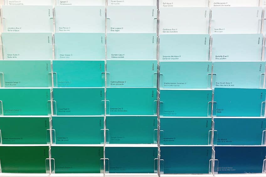
There are various shades and tints of turquoise blue, some predominantly bluer, while others lean towards predominantly green. Below are just a few examples of shades of turquoise blue, however, there are many more for you to choose from.
Turquoise
Turquoise is a captivating medium blue-green, reminiscent of the gemstone. It’s perfect for creating a serene, tropical feel in any space. Tip: Use it in bathrooms or spas for a calming, water-inspired ambiance.
| Hex: #40e0d0 RGB: 64, 224, 208 CMYK: 71, 0, 7, 12 |
Dark turquoise
Dark Turquoise is a deeper, more intense version of turquoise, offering richness and depth. Ideal for accent pieces or feature walls to add a bold yet soothing touch to interiors.
| Hex: #00CED1 RGB: 0, 206, 209 CMYK: 100, 1, 0, 18 |
Turquoise blue
Turquoise Blue is a bright, vibrant shade, leaning more towards blue. It’s great for energizing a space or as an eye-catching accent in accessories and artwork.
| Hex: #00FFEF RGB: 0, 255, 239 CMYK: 100, 0, 6, 0 |
Light turquoise
Light Turquoise is a softer, pastel version of the classic turquoise, offering a light, airy feel. Perfect for creating a tranquil, peaceful atmosphere in bedrooms or living areas.
| Hex: #AFEEEE RGB: 175, 238, 238 CMYK: 26, 0, 0, 7 |
Green Turquoise
Green Turquoise is a unique blend of green and turquoise, evoking the feel of tropical waters. It’s ideal for spaces that aim for a natural, refreshing look, like a sunroom or a garden-themed room.
| Hex: #a0d6b4 RGB: 160, 214, 180 CMYK: 25, 0, 16, 16 |
Teal
Teal is a deep, rich blue-green, sophisticated and versatile. It’s perfect for adding a touch of elegance to any space, from living rooms to office interiors. Tip: Pair with gold accents for a luxurious look.
| Hex: #008080 RGB: 0, 128, 128 CMYK: 100, 0, 0, 50 |
Aqua
Aqua is a bright, cheerful blue-green, reminiscent of clear, tropical waters. Great for creating a lively, refreshing ambiance, especially in bathrooms or children’s rooms.
| Hex: #00FFFF RGB: 0, 255, 255 CMYK: 100, 0, 0, 0 |
Blue Turquoise
Blue Turquoise is a turquoise shade that leans more towards blue, vibrant and refreshing. It’s ideal for accent walls or decor items in a coastal-themed room.
| Hex: #53b0ae RGB: 83, 176, 174 CMYK: 53, 0, 1, 31 |
Alpine Green
Alpine Green is a deep, dark green with a hint of turquoise, evoking the depth of mountain forests. Perfect for creating a grounding, nature-inspired feel in a space.
| Hex: #005c4c RGB: 0, 92, 76 CMYK: 100, 0, 17, 64 |
Aqua Frost
Aqua Frost is a light, frosted version of aqua, soft and soothing. It’s great for creating a serene, light-filled atmosphere, especially in spaces meant for relaxation or contemplation.
| Hex: #a9d1d7 RGB: 169, 209, 215 CMYK: 21, 3, 0, 16 |
Aqua Lake
Aqua Lake is a medium, blue-green shade, reminiscent of a serene lake. Ideal for creating a tranquil, peaceful ambiance in living spaces or bedrooms.
| Hex: #30949d RGB: 48, 148, 157 CMYK: 69, 6, 0, 38 |
Aqua Pearl
Aqua Pearl is a soft, pearl-like aqua, gentle and luminous. It’s perfect for adding a touch of subtle elegance to a space, especially in lighting or decorative accessories.
| Hex: #88d8c0 RGB: 136, 216, 192 CMYK: 37, 0, 11, 15 |
Fair Aqua
Fair Aqua is a pale, delicate aqua, offering a light, ethereal feel. Great for spaces that aim for a minimalist, airy feel, like a modern living room or a spa-like bathroom.
| Hex: #B8E2DC RGB: 184, 226, 220 CMYK: 19, 0, 3, 11 |
Aquamarine
Aquamarine is a bright, crystal-clear blue-green, resembling the gemstone. It’s ideal for adding a vibrant, refreshing touch to both fashion and interior design. Tip: Use in jewelry or as an accent color to bring a sense of calm and clarity.
| Hex: #7FFFD4 RGB: 127, 255, 212 CMYK: 50, 0, 17, 0 |
Bright turquoise
Bright Turquoise is an intensified, vivid version of turquoise, full of life and energy. Perfect for spaces that need a dynamic, uplifting touch, like a creative studio or a playful living area.
| Hex: #08E8DE RGB: 8, 232, 222 CMYK: 97, 0, 4, 9 |
Cadet Blue
Cadet Blue is a muted blue-green, sophisticated and understated. It’s great for creating a calm, composed atmosphere in a professional setting or a home office.
| Hex: #5F9EA0 RGB: 95, 158, 160 CMYK: 41, 1, 0, 37 |
Caribbean Turquoise
Caribbean Turquoise is a tropical, vibrant blue-green, evoking images of Caribbean waters. Ideal for bringing a touch of paradise into your home, especially in bathrooms or as poolside decor.
| Hex: #009d94 RGB: 0, 157, 148 CMYK: 100, 0, 6, 38 |
Celeste
Celeste is a soft, sky-like blue, gentle and dreamy. Perfect for creating a light, open feel in a space, especially in bedrooms or airy living areas.
| Hex: #b2ffff RGB: 178, 255, 255 CMYK: 30, 0, 0, 0 |
Lake Teal
Lake Teal is a deep, muted teal, offering a sense of tranquility and depth. It’s great for adding a touch of sophistication to a space, particularly in textiles or wall coverings.
| Hex: #649ea1 RGB: 100, 158, 161 CMYK: 38, 2, 0, 37 |
Pastel Jade
Pastel Jade is a soft, muted green with a hint of turquoise, serene and elegant. Ideal for creating a subtle, refined atmosphere in spaces like a formal living room or a luxury boutique.
| Hex: #d1f0e2 RGB: 209, 240, 226 CMYK: 13, 0, 6, 6 |
Copper Turquoise
Copper Turquoise is a unique blend of turquoise with warm copper tones, evoking a sense of earthy richness. It’s perfect for adding a touch of rustic elegance to a space, especially in metal accents or pottery. Tip: Pair with wood and leather for a cozy, natural look.
| Hex: #38887f RGB: 56, 136, 127 CMYK: 59, 0, 7, 47 |
Cornflower Blue
Cornflower Blue is a soft, dreamy blue with a hint of lilac, reminiscent of the cornflower. It’s ideal for creating a calm, soothing ambiance, perfect in bedrooms or restful lounge areas. Tip: Combine with soft yellows for a cheerful, spring-like feel.
| Hex: #6495ED RGB: 100, 149, 237 CMYK: 58, 37, 0, 7 |
Cyan
Cyan is a bright, electric blue-green, vibrant and modern. Great for adding a splash of color in contemporary designs, be it in digital graphics or modern interiors.
| Hex: #00FFFF RGB: 0, 255, 255 CMYK: 100, 0, 0, 0 |
Dark Cyan
Dark Cyan is a deeper, more muted version of cyan, sophisticated and versatile. It’s perfect for creating a sense of depth and richness in a space, especially in textiles or wall art.
| Hex: #008B8B RGB: 0, 139, 139 CMYK: 100, 0, 0, 45 |
Dark Jade
Dark Jade is a deep, rich green with a touch of turquoise, conveying elegance and mystery. Ideal for adding a luxurious touch to any space, such as in velvet drapes or plush cushions.
| Hex: #007A54 RGB: 0, 122, 84 CMYK: 100, 0, 31, 52 |
Dark Slate Gray
Dark Slate Gray is a dark, moody gray with a hint of blue-green, perfect for creating a dramatic, contemporary look. It works well as a grounding color in a modern color scheme. Tip: Use as a base color in a room with pops of bright colors for contrast.
| Hex: #2F4F4F RGB: 47, 79, 79 CMYK: 41, 0, 0, 69 |
Deep Aqua
Deep Aqua is a rich, deep blue-green, vibrant and captivating. It’s great for bringing a sense of the ocean into a space, especially in bathrooms or coastal-themed rooms.
| Hex: #08787F RGB: 8, 120, 127 CMYK: 94, 6, 0, 50 |
Deep Sky Blue
Deep Sky Blue is a vivid, intense blue, reminiscent of a cloudless sky. Perfect for creating a sense of openness and freedom, especially in high-ceilinged spaces or open-plan areas.
| Hex: #00BCBC RGB: 0, 188, 188 CMYK: 100, 0, 0, 26 |
Dull Turquoise
Dull Turquoise is a muted, understated version of turquoise, offering a sophisticated and earthy feel. It’s ideal for spaces that require a touch of color without overpowering, like a minimalist living room.
| Hex: #30d5c8 RGB: 48, 213, 200 CMYK: 77, 0, 6, 16 |
Fluorescent Turquoise
Fluorescent Turquoise is a bright, neon turquoise, full of energy and fun. Great for spaces that aim to be playful and vibrant, like a child’s bedroom or a creative studio. Tip: Use it in small accents to add a lively pop without overwhelming.
| Hex: #00fdff RGB: 0, 253, 255 CMYK: 100, 1, 0, 0 |
Fresh Turquoise
Fresh Turquoise is a bright, refreshing blue-green, reminiscent of clear, tropical waters. It’s perfect for creating a lively, rejuvenating atmosphere in a space, especially in spas or bathrooms.
| Hex: #40e0d0 RGB: 64, 224, 208 CMYK: 71, 0, 7, 12 |
Green Jade
Green Jade is a deep, rich green with a hint of turquoise, elegant and serene. Ideal for adding a touch of sophistication to a space, particularly in Asian-inspired decor or tranquil meditation areas.
| Hex: #00A36C RGB: 0, 163, 108 CMYK: 100, 0, 34, 36 |
Iridescent Turquoise
Iridescent Turquoise is a shimmering, dynamic shade of turquoise that changes under different lights. It’s great for statement pieces in fashion or for adding a magical touch to decor elements. Tip: Use in accessories or art pieces for a captivating effect.
| Hex: #7bfdc7 RGB: 123, 253, 199 CMYK: 51, 0, 21, 1 |
Light Blue
Light Blue is a pale, soothing blue, offering a sense of peace and tranquility. Perfect for creating a calm, serene space, such as in bedrooms or bathrooms. Tip: Combine with soft whites for a cloud-like, airy feel.
| Hex: #ADD8E6 RGB: 173, 216, 230 CMYK: 25, 6, 0, 10 |
Light Cyan
Light Cyan is a soft, pastel blue-green, gentle and refreshing. It’s ideal for creating a light, breezy atmosphere in a space, especially in spring and summer-themed decor.
| Hex: #E0FFFF RGB: 224, 255, 255 CMYK: 12, 0, 0, 0 |
Light Sea Green
Light Sea Green is a serene, medium blue-green, reminiscent of a calm sea. It’s perfect for creating a tranquil, soothing atmosphere in spaces like bathrooms or bedrooms. Tip: Pair it with sandy beige tones for a beach-inspired look.
| Hex: #20B2AA RGB: 32, 178, 170 CMYK: 82, 0, 4, 30 |
Medium Aquamarine
Medium Aquamarine is a soft, muted aqua, blending the freshness of green and the tranquility of blue. Ideal for creating a relaxed, serene space, especially in areas aimed at relaxation or meditation.
| Hex: #66ddaa RGB: 102, 221, 170 CMYK: 54, 0, 23, 13 |
Medium Blue
Medium Blue is a classic, true blue, versatile and timeless. Great for adding a reliable, calming presence in a room, whether in decor or wall color. Tip: Combine with crisp whites for a nautical or coastal theme.
| Hex: #0000CD RGB: 0, 0, 205 CMYK: 100, 100, 0, 20 |
Medium turquoise
Medium Turquoise strikes a balance between blue and green, vibrant yet soothing. It’s perfect for adding a touch of tropical elegance to a space, particularly in textiles or wall art.
| Hex: #48D1CC RGB: 72, 209, 204 CMYK: 66, 0, 2, 18 |
Navajo Turquoise
Navajo Turquoise is a deep, earthy turquoise with a hint of green, rich and cultural. Ideal for adding a rustic, natural touch to a space, especially in southwestern or Native American-inspired decor.
| Hex: #007c78 RGB: 0, 124, 120 CMYK: 100, 0, 3, 51 |
Neon Turquoise
Neon Turquoise is a bright, fluorescent version of turquoise, full of energy and vibrancy. Great for accent pieces in modern, youthful designs or as a playful touch in children’s rooms.
| Hex: #00ffef RGB: 0, 255, 239 CMYK: 100, 0, 6, 0 |
Pale Turquoise
Pale Turquoise is a soft, pastel blue-green, gentle and dreamy. Perfect for creating a light, airy feel in a space, especially in nurseries or spring-themed decor.
| Hex: #afeeee RGB: 175, 238, 238 CMYK: 26, 0, 0, 7 |
Powder Blue
Powder Blue is a pale, muted blue, offering a sense of softness and calm. It’s ideal for creating a serene, peaceful atmosphere in bedrooms or living areas. Tip: Works well in vintage or shabby chic decor themes.
| Hex: #B0E0E6 RGB: 176, 224, 230 CMYK: 23, 3, 0, 10 |
Retro Teal
Retro Teal is a muted teal shade, evoking a sense of nostalgia and vintage charm. Great for spaces that aim to have a retro feel, like a mid-century modern living room or a vintage-inspired kitchen.
| Hex: #3E8F92 RGB: 62, 143, 146 CMYK: 58, 2, 0, 43 |
Robin Egg Blue
Robin Egg Blue is a soft, muted turquoise, reminiscent of a robin’s egg. It’s perfect for adding a touch of natural elegance to a space, especially in delicate accents or wall colors.
| Hex: #96DED1 RGB: 150, 222, 209 CMYK: 32, 0, 6, 13 |
Sea Foam
Sea Foam is a light, greenish-blue, evoking the foamy edges of sea waves. Ideal for creating a fresh, breezy atmosphere in spaces like bathrooms or coastal-themed rooms. Tip: Combine with sandy tones for a complete beachy feel.
| Hex: #93E9BE RGB: 147, 233, 190 CMYK: 37, 0, 18, 9 |
Sea Spray
Sea Spray is a muted, grayish-blue-green, like the misty spray of the sea. It’s great for adding a touch of understated elegance to a space, particularly in minimalist or contemporary designs.
| Hex: #a5ced0 RGB: 165, 206, 208 CMYK: 21, 1, 0, 18 |
Sky Blue
Sky Blue is a bright, cheerful blue, reminiscent of a clear day’s sky. Perfect for creating an uplifting, open atmosphere in a space, especially in areas with ample natural light.
| Hex: #87CEEB RGB: 135, 206, 235 CMYK: 43, 12, 0, 8 |
Teal Blue
Teal Blue is a deeper, more intense version of teal, offering richness and depth. It’s ideal for creating a focal point in a room or as an accent color in textiles and decor.
| Hex: #367588 RGB: 54, 117, 136 CMYK: 60, 14, 0, 47 |
Soft Teal
Soft Teal is a gentle, muted version of teal, offering a sense of tranquility and softness. Great for creating a peaceful, calming environment, especially in bedrooms or quiet reading nooks. Tip: Combine with soft pinks or creams for a soothing color palette.
| Hex: #44A9AA RGB: 68, 169, 170 CMYK: 60, 1, 0, 33 |
Steel Blue
Steel Blue is a deep blue-grey, evoking the strength and reliability of steel. Perfect for a sophisticated, industrial look in modern or urban-themed interiors. Tip: Pair with warm wood tones for a balanced, contemporary feel.
| Hex: #4682B4 RGB: 70, 130, 180 CMYK: 61, 28, 0, 29 |
Tropical Teal
Tropical Teal is a vibrant, exotic blue-green, reminiscent of tropical waters. Ideal for energizing and vivacious spaces, like poolside areas or sunrooms.
| Hex: #008794 RGB: 0, 135, 148 CMYK: 100, 9, 0, 42 |
Turquoise Chalk
Turquoise Chalk is a soft, muted turquoise, offering a light, dusty feel. Great for vintage or shabby chic looks, especially in furniture or wall finishes.
| Hex: #6fe7db RGB: 111, 231, 219 CMYK: 52, 0, 5, 9 |
Turquoise Noir
Turquoise Noir is a deep, dark turquoise with an almost noir, mysterious undertone. This sophisticated and elegant color is perfect for creating a dramatic and luxurious atmosphere in spaces like upscale lounges or modern living rooms. Tip: Use it as an accent wall color or in velvet upholstery to add depth and richness to your decor.
| Hex: #045c5a RGB: 4, 92, 90 CMYK: 96, 0, 2, 64 |
Turquoise Sea
Turquoise Sea is a bright, lively blue-green, reminiscent of the vibrant colors of tropical seas. It’s ideal for bringing a sense of freshness and vitality to any space, especially in beach-themed decor or in areas that benefit from a refreshing color pop. Tip: Combine with sandy beige and coral accents for a full oceanic theme.
| Hex: #29D6E3 RGB: 41, 214, 227 CMYK: 82, 6, 0, 11 |
Tropical Turquoise
Tropical Turquoise is a sunny, energetic shade of turquoise, full of tropical charm and zest. Perfect for spaces that aim to be lively and vibrant, such as a child’s playroom, a creative workspace, or a casual dining area. Tip: Use this color in outdoor patio settings or pool areas to enhance the tropical vibe.
| Hex: #04cdff RGB: 4, 205, 255 CMYK: 98, 20, 0, 0 |
Vintage Aqua
Vintage Aqua is a soft, faded version of aqua, exuding a sense of nostalgia and timelessness. This color is perfect for creating a retro or vintage ambiance, especially in spaces like lounges, cafes, or vintage clothing stores. Tip: Pair it with pastel yellows and pinks for a charming, retro color palette that’s soothing and stylish.
| Hex: #6AB4C9 RGB: 106, 180, 201 CMYK: 47, 10, 0, 21 |
Keppel
This particular color leans more toward a green undertone and can be described as a calming darker cyan color. Keppel is associated with intellect and creativity, which makes it the perfect color for larger businesses and other establishments.
| Hex: #3ab09e RGB: 67, 0, 10, 31 CMYK: 58, 176, 158 |
Turquoise Blue Color: A Brief History
The color originally comes from a mineral with the same name. This mineral was first mined in Turkey and was then introduced to the European market in the 17th century. The mines were located in the Province of Iran, which was then Persia as well as Afghanistan. The word “turquoise” is French and means “Turkish”. The name turquoise was first used as a color name in English in 1573.
The mineral itself is a beautiful blue-green color and is a rare and valued gem, which has been used in jewelry pieces for thousands of years.
In many cultures, the stone is seen as a talisman that can bring prosperity as well as protection. There is evidence that turquoise stones were used in items that date back to Ancient Egypt. Certain cultures like the Ancient Persian Empire believed that the gemstone could protect from unnatural death. If the gemstone appeared to change color, it was an indication that something awful was about to occur. However, it has been discovered that color changes can be caused by things like skin acidity or chemicals from cosmetics.
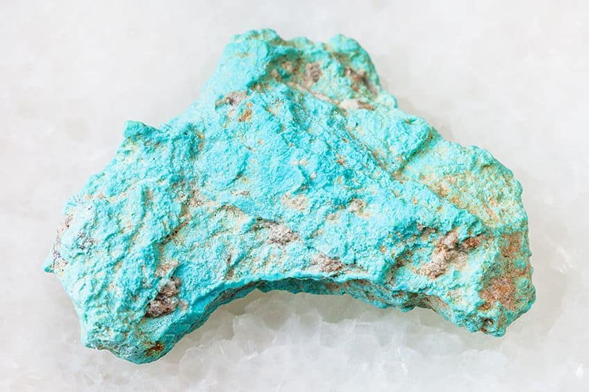
Today, wearing turquoise gemstones is also believed to have various benefits, such as helping to remove negative energy and improving emotions. The turquoise gemstone is also seen a lot in the interiors and domes of large mosques in Iran as well as Russia, and Central Asia. The turquoise-blue color remains popular in all areas of design from web designs to fashion and interior design.
Color Meaning of Turquoise
The color turquoise offers tranquility and has a calming effect and can help to improve emotional balance. Turquoise has a positive and uplifting energy and can help to lessen stress and feelings of loneliness. The turquoise blue color helps to calm the nervous system and can also help to improve concentration and builds confidence. The turquoise color is perfect if you wish to achieve clarity and open communication. However, too much turquoise can have a few negative effects.
Instead of creating a tranquil atmosphere, it can do the opposite and becomes overstimulating, which can cause stress.
How to Make Turquoise Color Acrylic Paint
A turquoise color paint can be achieved by mixing some blue and green paint. To this, you can add white or yellow to lighten and brighten the color. However, achieving the best turquoise color is not as simple as it sounds. This is because some blue and green paints can have a different bias, meaning you can get blues that have more of a green undertone, or they can have more of a red undertone.
Blue paint with a red bias will not produce the best turquoise, so you are looking for blue with a green bias.
Different paint manufacturers and paint colors are not the same, as each company has its own formulas. This is why you need to take note of paint labels when purchasing. This goes for all colors, which makes it quite possible for you to inadvertently mix all three primary colors, which will not give you the turquoise color you want. In color theory, mixing all primary colors will produce a muddy or brownish color.
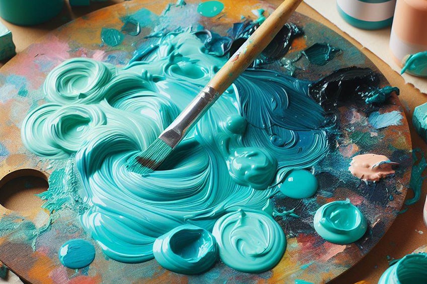
When mixing turquoise, you can also experiment with different proportions. This should provide different shades of turquoise. You can try starting with a ratio of two parts blue to one part green. Also, remember to create a color chart of the color you mix, so you can refer back to it. Below are some examples of blue and green color paint choices you can use.
| Shade | Hex Code | CMYK Color Code (%) | RGB Color Code | Color |
| Cerulean | #007ba7 | 100, 26, 0, 35 | 0, 123, 167 | |
| Cobalt | #0047ab | 100, 58, 0, 33 | 0, 71, 171 | |
| Phthalo Blue | #000f89 | 100, 89, 0, 46 | 0, 15, 137 | |
| Phthalo Green | #123524 | 66, 0, 32, 79 | 18, 53, 36 | |
| Viridian Green | #40826d | 51, 0, 16, 49 | 64, 130, 109 |
Turquoise Blue Interior Design Tips
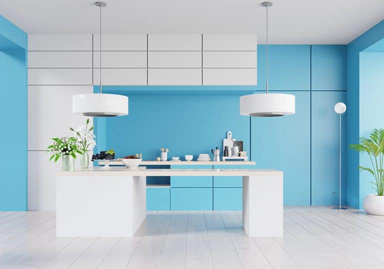
The turquoise color is a great choice to add pops of color to a neutral color scheme. The color can easily be added through accessories like cushions, throws, chairs, rugs, or art pieces. If you are thinking of painting the walls, consider paler shades of turquoise or patterned wallpaper so that it does not become overstimulating. You can also bring in other patterns and textures to create more interest and depth. For example, the rug can have a pattern with turquoise or a darker turquoise shade velvet headboard.
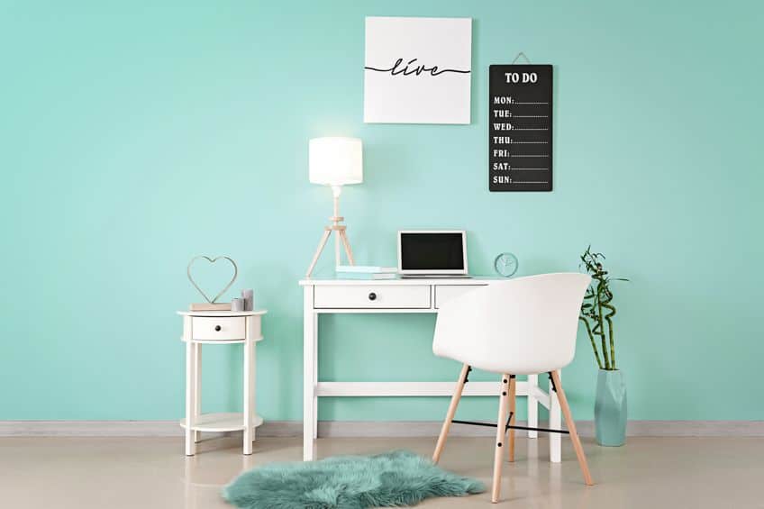
Turquoise can be incorporated into most rooms, but it can also be used in office spaces or playrooms, as it helps to encourage creativity. Turquoise is a nice calming and cool color that can work in a bedroom, however, consider using it as an accent color because it can become too energetic if used as the base color. The turquoise blue color can also add pops of color to outdoor seating or as a playful color to kitchen cabinets. Remember, turquoise pairs well with neutral colors like white, gray, cream, or beige, and back. You can also layer colors by trying darker and lighter shades of green and blue with turquoise.
The turquoise blue color is a fairly easy color to work with, and many colors will pair well with it. Whether you wish to paint an ocean paradise landscape or incorporate it into your interior design color palette, the color turquoise is a popular and fashionable choice to benefit from!
Frequently Asked Questions
What Color Is Turquoise Blue?
Is turquoise a shade of blue? The turquoise blue color can be defined as a blush-green hue that can be found somewhere between blue and green when looking at the color wheel. There are many different shades of turquoise, but most would consider it a shade of blue.
What Are the Best Color Combinations With Turquoise?
Turquoise is easy to work with and goes well with most colors. However, neutral colors like white, gray, and brown work exceptionally well. Other colors that go with turquoise include various shades of blue and green. To create contrast, different shades of yellow, red, and orange can also work well.
Is Aqua the Same As Turquoise?
These are two distinct colors that are very similar. These two colors fall in the same family and only have slight variations in composition. Aqua can be considered a lighter shade of turquoise and is bluer, while turquoise is darker and has more of a greenish undertone to it.
In 2005, Charlene completed her Wellness Diplomas in Therapeutic Aromatherapy and Reflexology from the International School of Reflexology and Meridian Therapy. She worked for a company offering corporate wellness programs for a couple of years, before opening up her own therapy practice. It was in 2015 that a friend, who was a digital marketer, asked her to join her company as a content creator, and this is where she found her excitement for writing.
Since joining the content writing world, she has gained a lot of experience over the years writing on a diverse selection of topics, from beauty, health, wellness, travel, and more. Due to various circumstances, she had to close her therapy practice and is now a full-time freelance writer. Being a creative person, she could not pass up the opportunity to contribute to the Art in Context team, where is was in her element, writing about a variety of art and craft topics. Contributing articles for over three years now, her knowledge in this area has grown, and she has gotten to explore her creativity and improve her research and writing skills.
Charlene Lewis has been working for artincontext.org since the relaunch in 2020. She is an experienced writer and mainly focuses on the topics of color theory, painting and drawing.
Learn more about Charlene Lewis and the Art in Context Team.
Cite this Article
Charlene, Lewis, “Turquoise Blue Color – 59 Shades, Color Meaning and Guide.” Art in Context. March 7, 2023. URL: https://artincontext.org/turquoise-blue-color/
Lewis, C. (2023, 7 March). Turquoise Blue Color – 59 Shades, Color Meaning and Guide. Art in Context. https://artincontext.org/turquoise-blue-color/
Lewis, Charlene. “Turquoise Blue Color – 59 Shades, Color Meaning and Guide.” Art in Context, March 7, 2023. https://artincontext.org/turquoise-blue-color/.


