Warm Colors – Difference Between Cool and Warm Colors
As artists, we will be familiar with the terms warm and cool colors. But what do they actually mean? In this article, we are going to explore both the warm color palette and the cool color palette in-depth to discover what the terms mean, and the role that warm and cool colors play in interior design and in art.
A Definition of Warm and Cool Colors
We can trace the meanings of warm and cool colors all the way back from the Renaissance and the Middle Ages to Classical Antiquity. At first, all colors – including black and white – were linked to the four elements of earth, water, fire, and air. But it was Sir Isaac Newton who, in 1704, discovered the color wheel and laid out the colors on the light spectrum – red, orange, yellow, green, blue, indigo, and violet – in a circle.
A few years later in 1758, chemist Robert Dossie published The Handmaid To the Arts in which he stated that the terms “warmth” and “coolness” were being used by painters. He explained that the terms referred to the colors on the wheel and the distinction between them in terms of the feeling they evoked.
In other words, some colors gave off the feeling of heat and others of cold. According to Dossie, red and yellow “incline towards warmth, while green and blue incline to coolness”.
So, what does it mean if a color is warm or cool? Well, modern theories regarding color have hardly changed in 300 years. They are also based on the six-point color wheel of primary and secondary colors, the primary colors being red, yellow, and blue, and the secondary colors green, orange, and purple. An imaginary dividing line running through the color wheel separates the colors into warm and cool. Red, orange, and yellow are warm colors, while blue, green, and purple are cool.
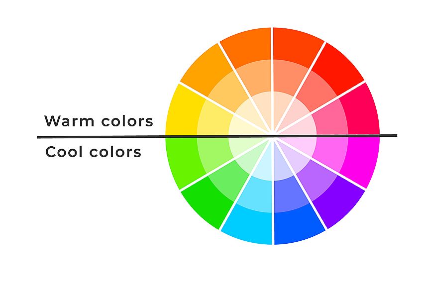
Although it is easy to identify the temperature of the colors that are opposite each other on the wheel, it is a bit more of a challenge when it comes to the colors that sit next to each other. The easiest way to do this is to look at what is known as the “bias” of each color, in other words, the color it leans towards on the primary or secondary wheel.
Let us look at red and purple which sit next to each other on the wheel. They are a primary and a secondary color, respectively. As you can see, purple is a bluish-red, thus a cool color, whereas red, which has a yellow bias, is warm. But what about green? Is green a warm or cool color? Look at the wheel. You will see that green is definitely a cool color, thus all colors that have a greenish hue will be cool as well.
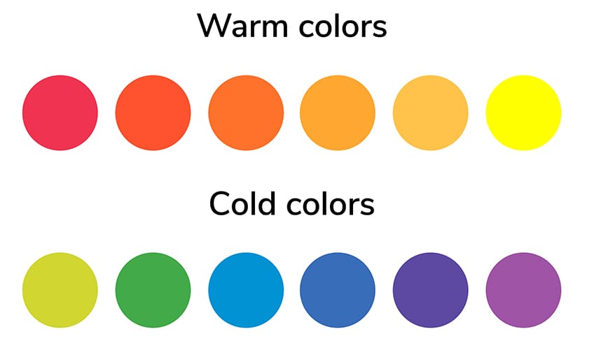
In a nutshell, yellows, reds, and oranges belong to the family of warm colors, while cool colors include purples, greens, and blues.
The Meanings Behind Warm and Cool Tones
Now that we have identified which colors are warm and cool, the question remains why? It is because of the feelings they evoke and the emotions with which we identify when looking at a particular color. Let us look now at the meanings of the primary and secondary colors.
| Shade | Color | Temperature of Color | Hex | RGB | CMYK | Meaning of Color |
| Red | Warm | #FF0000 | 255, 0, 0 | 0, 100, 100, 0 | When we look at the color red, we immediately think of love and passion, but at the same time, danger, and power. | |
| Yellow | Warm | #FFFF00 | 255, 255, 0 | 0, 0, 100, 0 | Yellow is a happy and joyful color, the color of sunshine. | |
| Blue | Cool | #0000FF | 0, 0, 255 | 100, 100, 0, 0 | Blue makes us think of the sky and water. It is both strong and peaceful. | |
| Green | Cool | #00FF00 | 0, 255, 0 | 100, 0, 100, 0 | Green is the color of cool grass and shady trees. It is reminiscent of our environment and the harmony of nature. | |
| Orange | Warm | #FFA500 | 255, 165, 0 | 0, 35, 100, 0 | Like red, orange is an energetic color that is symbolic of fire, warmth, and security. | |
| Purple | Cool | #A020F0 | 160, 32, 240 | 33, 87, 0, 6 | Purple does not often appear in nature, but it is the color most commonly associated with royalty and luxury. |
The Temperature of Neutral Colors
We have discussed at length where the primary and secondary colors fit into the categories of warm and cool colors, but what about neutral colors? Indeed, what about black and white? Before we can answer that question sufficiently, we first need to identify what neutral colors are. There are six main colors:
- Beige
- Black
- Brown
- Gray
- Ivory
- Taupe
- White
In addition to these neutrals, we should not forget gold and silver, and perhaps surprisingly, pink. You might be asking yourself, is pink a warm color? It depends entirely on the mix of red and white. Pink is, after all, a desaturated red, although you will not find it on any traditional color wheels.
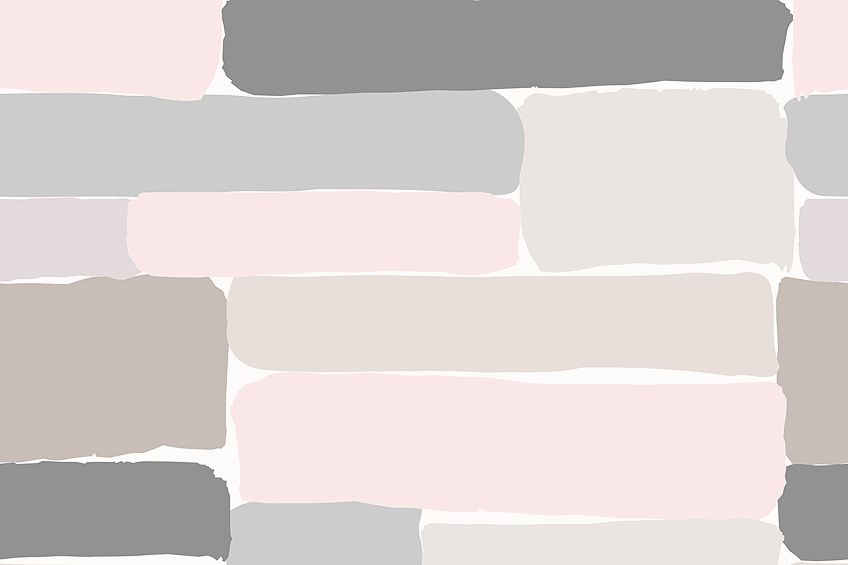
Because these colors are neutral, their individual temperatures depend largely on their surrounding colors. However, some artists argue that black and white, as well as gold and brown, are warm colors, while gray and silver, ivory and white are cool. Pink can be either temperature, depending on how saturated it is with red. At the same time, neutral colors are rarely if ever used in isolation. They are either utilized as accent colors or to highlight a color or colors that accompany them.
Nevertheless, neutral colors are equally important in their own right, and each one has a particular meaning.
| Shade | Color | HEX | RGB | CMYK | Meaning of Color |
| Beige | #D9BB9B | 217, 187, 155 | 15, 25, 40, 0 | Beige is a relaxing, sober color that some artists would also call a traditional color. | |
| Black | #000000 | 0, 0, 0 | 80, 70, 70, 100 | Black is sophisticated, but conservative and mysterious at the same time. | |
| Brown | #A65E18 | 166, 94, 24 | 10, 60, 100, 30 | Brown is earthy and wholesome, simple, and friendly. | |
| Gray | #939598 | 147, 149, 152 | 0, 0, 0, 50 | Like black, grey is conservative and elegant. | |
| Ivory | #FFFDE9 | 255, 253, 233 | 0, 0, 10, 0 | Ivory is a quiet and formal color, and more gentle than white. | |
| Pink | #FAD5E5 | 250, 213, 229 | 0, 20, 0, 0 | Pink is romantic and playful, a delicate color that mixes well with most of the neutrals. | |
| Taupe | #483C32 | 72, 60, 50 | 0, 17, 31, 72 | Taupe is between beige and grey and symbolizes intelligence and practicality. | |
| White | #FFFFFF | 255, 255, 255 | 0, 0, 0, 0 | White symbolizes purity and innocence, but it can be soft and sophisticated as well. | |
| Silver | #CAD5DA | 202, 213, 218 | 20, 10, 10, 0 | Although silver is similar in hue to gray, it is more of a rich, glamorous color. | |
| Gold | #D3BA34 | 211, 186, 52 | 10, 15, 90, 10 | Gold is extravagance, richness, and tradition. |
Just by looking at the color chart, we can see which colors work well together and which clash. But remember, neutrals are hardly ever used on their own or even in pairs, so you would need to take a holistic view of your paint selections to enable you to make an informed decision about the colors you will ultimately select.
The Importance of Color Temperature in Paint Mixing
This is where things get a bit tricky. When it comes to the endless range of paint colors, the same color can be both cool and warm. So although we have just learned that, for example, red, yellow, and orange are warm colors, where paint is concerned they can be cool colors too.
The trick is to compare your color to two others. For example, take two colors that you know are warm and cool such as a warm red (which will have a yellow bias, like light Cadmium red) and a cool red (which will have a blue bias, such as alizarin crimson).
| Shade | Color | Temperature of Color | Hex | RGB | CMYK |
| Lascaux Cadmium Red Light | Warm red with a yellow bias | #D82429 | 227, 0, 34 | 0, 100, 85, 11 | |
| Alizarin Crimson | Cool red with a blue bias | #E32636 | 65, 102, 245 | 73, 58, 0, 4 |
Compare your third color to them and you will see its particular bias, that is, whether it leans towards the yellowish-red (warm) or bluish-red (cool). Once you have identified the third color’s bias, you will be able to categorize its temperature as well and thus select the most appropriate color to mix it with.
| Shade | Color | Temperature of Color | Hex | RGB | CMYK |
| Ultramarine Blue | Warm blue with a yellow bias | #4166F5 | 65, 102, 245 | 73, 58, 0, 4 | |
| Cerulean Blue | Cool blue with a green bias | #2A52BE | 42, 82, 190 | 78, 57, 0, 25 |
Of course, there will always be exceptions to the rule because color temperature is not an exact science. It is perhaps by a stroke of luck that two warm colors, yellowish-red and reddish-yellow work well together. On the contrary, cool greenish-yellow works better with warm yellowish-green. (Remember, we asked earlier if green is a warm or cool color and we discovered that it was cool.) You can also try our online color mixer to test-mix your color combinations.
However, if you can identify the color’s dominant bias and thus its temperature, you will be able to select the best color to mix it with.
Introducing Color Into Your Home
While it’s true that not all of us are artists in the traditional sense, we still have a blank canvas on which to work: our homes. Now that we have learned a bit more about the theory and temperature of colors, it is time to bring them indoors.
Warm or Cool Colors?
At the outset, the most frequently asked question is, which are better, warm or cool colors? The answer is neither. Or both. It depends entirely on the look and feel you want to achieve in the room you are working on. Let us look at a quick snapshot of the benefits of both colors.
Warm Colors
- On the warm color palette, you should not make the mistake of thinking that the term warm also means hot, and thus uncomfortable.
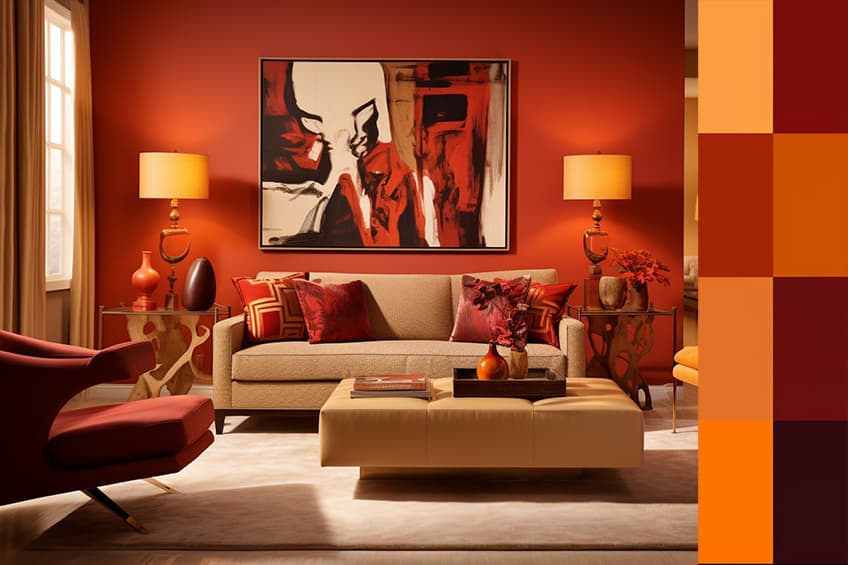
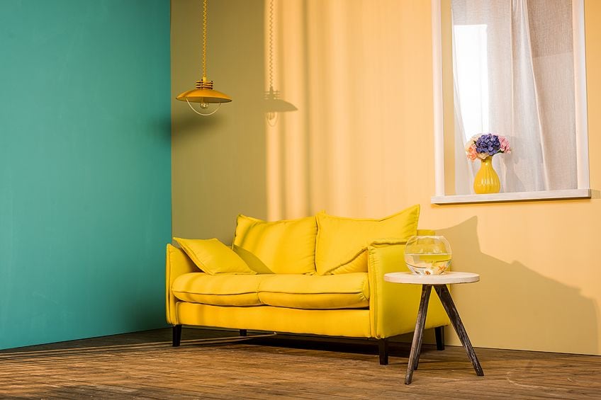
- By using warm colors in big spaces, they will make the space more inviting because warm colors are cozy and intimate.
- Warm colors also create a feeling of happiness and energy.
- They are often used in social rooms like living rooms, dining rooms, and kitchens.
- Warm colors are typically oranges, reds, and yellows, as well as off-white neutrals such as ivory, cream, and beige.
- If you live in a cold climate, warm colors would work well for your rooms.
Cool Colors
- Cool does not mean cold and clinical. On the contrary, it is sleek and sophisticated.
- Cool colors on the blue side of the color wheel have a calming and soothing effect, especially when accompanied by white.
- They are most often used in bedrooms and bathrooms, as well as the private places that are our sanctuaries.
- Cool colors in the bedroom are calming and promote rest and relaxation.
- If the climate you live in is hot all year long, cool colors are probably your best choice.
What About Warm and Cool Colors Together?
There is no rule in interior design that states that rooms must be designed solely with warm or cool colors. In fact, most people use them together, bearing in mind that the dominant color, regardless of temperature and the accompanying colors, will set the tone for the room.
The other trick you need to remember is that once you have decided on what you want the room’s temperature to be, you need to stick with it and stay consistent. In other words, you should not have the same number of warm and cool tones in the room unless you want it to feel a bit zany and unconventional.
Some designers believe that having a clash of temperatures effectively cancels out the colors and leaves the room without any personality or feeling at all.
So, for example, if you are decorating a cool green interior, do not make the mistake of laying a floor in a warm color such as terracotta, or have finishing touches in gold or brass, both of which are warm colors. Instead, go for a neutral color that will not draw attention to itself but instead will set off the green in the room.
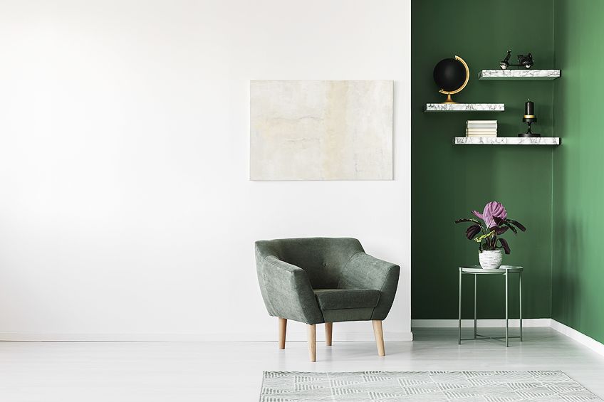
Similarly, if the furnishings and walls in your living room are warm colors such as soft brown and off white, you should not put down a carpet or rug in a cool color such as blue. Rather go for a warm red instead.
The rule of thumb in interior design is 80/20, in other words, neutral colors should make up 80% of the colors in the room, and strong colors the remaining 20%. That means that your dominant color will stand out amongst the neutral colors of the pillows on the sofas, the lampshades, carpets, and curtains.
The Role of Color Temperature in Art
Just as it is in interior design, in the world of art colors can be categorized as warm and cool, and sometimes both. Colors do not exist in isolation, so in order to identify their temperature, you have to compare one color to another. So for example, in order to identify a warm blue, you would have to compare it to a cool blue.
Of course, there are no hard and fast rules in art. If you wanted to categorize all reds as warm and all blues as cool, that would be entirely your own choice. However, if you were to do that you would limit the possibilities of bringing temperature into your painting and thus the subtle nuances and differences between warm and cool colors. But once you have become attuned to these differences, not only will you be able to create marked contrasts between colors such as reds and blues, you will also be able to highlight the differences within the colors themselves.
All great painters, past and present, have mastered the art of color relativity. And once you have trained your eye to notice the temperature of colors, you will be a master of color relativity too.

Controlling Color Temperature
A color’s temperature in a painting plays far more an important role than just making the viewer feel warm or cool. By controlling the temperature of your painting, the opportunities arise for added nuances such as:
- Presenting a specific mood or feeling
- Introducing additional dimensions to the subjects
- Integrating color and light into the painting
- Creating depth and dimension
- Defining the relationship between the objects in the painting
One of the most important areas of color control is that of landscape painting. Colors create the illusion of space and form, and in landscapes in particular warm colors advance towards the viewer while cool colors recede. This is a good tip to bear in mind when it comes to the space and form in your own painting. Sometimes the proportions can seem a little off even though the painting is technically correct.
All you need to do to adjust it is change the temperatures of your colors. In other words, the areas that seem too big should be cooled down, and those that seem too small should be warmed up.
Famous Paintings Using Warm, Cool, and Neutral Colors
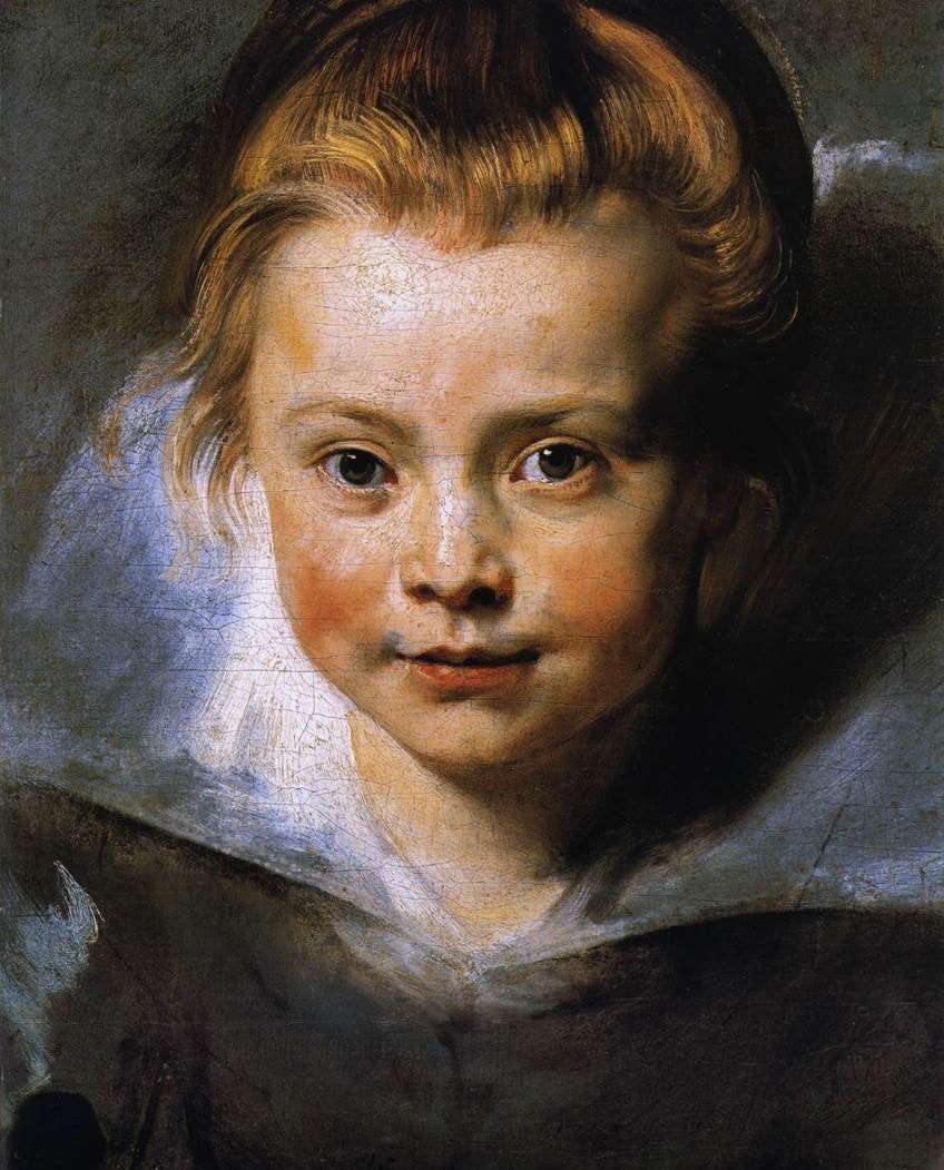
This is a wonderful example of the duality of warm and cool colors. In this Portrait of a Young Girl by Peter Paul Rubens, painted in 1616, the warm red and the reddish-orange of the girl’s cheeks, as well as her auburn hair, attract immediate attention. These colors are perfectly offset by the pink of her forehead, a cool yellowish pink. The neutral white of her collar serves to highlight these warm areas.
In stark contrast is Picasso’s The Old Guitarist, which he painted in 1903. The painting is made up primarily of cool blues but for the guitar which is a warm orange. This splash of warmth in an otherwise cool composition jumps out immediately and grabs the viewer’s attention. It is a lovely example of a complementary relationship between warm and cool colors.
Now that we have explained what warm and cool colors are, you will have a better idea of how to use them in your portrait and landscape paintings, and how to incorporate them into your home. And remember, you do not have to have cool paintings in cool rooms. The same can be said of warm colors. Why not bring a little more pizzazz into your cool room by hanging a painting composed of warm colors in it. The painting will bring in an extra dimension to the room and provide a point of visual interest.
Frequently Asked Questions
What Are Warm Colors?
On the color wheel of primary and secondary colors, the warm colors are red, yellow, and orange. Colors that have a red, yellow, and orange hue, will also be warm. On the contrary, green, purple, and blue are cool, thus colors that lean towards these tints will be cool too.
Can I Use Warm and Cool Colors in the Same Room?
Yes, you can. However, you need to decide beforehand if you want the room to feel warm or cool. Whatever your choice, your dominant color needs to reflect it otherwise your room may feel unbalanced.
Are Neutral Colors Warm or Cool?
Technically, neutral colors in and of themselves are neither warm nor cool. However, they are rarely applied in isolation but serve to either highlight or tone down other colors, regardless of whether in a painting or decorating a room. Neutrals also tend to take on the temperature of the colors that accompany them.
Is Pink a Warm Color?
Pink is an interesting color in that it is basically a mix of white, which is neutral, and red, which is warm. It could be argued that it is, therefore, a warm color, but again, it depends on the colors it appears with. Remember the yellowish pink in Rubens’ Portrait of a Young Girl? That pink is definitely a cool color.
In Art, Is Green a Warm or Cool Color?
Whether in art or interiors, green is definitely a cool color. Think of the shade from a leafy tree, or cool grass beneath your feet. Colors that are mixed with green, that have a definitive green hue, are also cool. Only if it is mixed with a warm color, and takes on the hue of that color, can it be considered warm.
In 2005, Charlene completed her Wellness Diplomas in Therapeutic Aromatherapy and Reflexology from the International School of Reflexology and Meridian Therapy. She worked for a company offering corporate wellness programs for a couple of years, before opening up her own therapy practice. It was in 2015 that a friend, who was a digital marketer, asked her to join her company as a content creator, and this is where she found her excitement for writing.
Since joining the content writing world, she has gained a lot of experience over the years writing on a diverse selection of topics, from beauty, health, wellness, travel, and more. Due to various circumstances, she had to close her therapy practice and is now a full-time freelance writer. Being a creative person, she could not pass up the opportunity to contribute to the Art in Context team, where is was in her element, writing about a variety of art and craft topics. Contributing articles for over three years now, her knowledge in this area has grown, and she has gotten to explore her creativity and improve her research and writing skills.
Charlene Lewis has been working for artincontext.org since the relaunch in 2020. She is an experienced writer and mainly focuses on the topics of color theory, painting and drawing.
Learn more about Charlene Lewis and the Art in Context Team.
Cite this Article
Charlene, Lewis, “Warm Colors – Difference Between Cool and Warm Colors.” Art in Context. September 22, 2021. URL: https://artincontext.org/warm-colors/
Lewis, C. (2021, 22 September). Warm Colors – Difference Between Cool and Warm Colors. Art in Context. https://artincontext.org/warm-colors/
Lewis, Charlene. “Warm Colors – Difference Between Cool and Warm Colors.” Art in Context, September 22, 2021. https://artincontext.org/warm-colors/.


