Basic Color Theory – Learn the Magic of Color and Its Uses
Color theory is a broad topic that encompasses a variety of concepts and applications. However, we hope to cover the basics of color theory in this article, so that you can better understand color and why it is used. This includes learning all about the color wheel, the various color compositions, different color combinations, and how to use color in design. Let us begin with the basic definition and general overview of color theory!
What Is Color Theory?
Since Ancient times, people have learned to create color pigments and have experimented with color combinations. However, it was only after the 18th century that color theory was truly explored. Since then, there have been numerous publications and books written on the subject. Color theory is the principles, techniques, and guidelines that you can use to choose the most appropriate colors for an art or graphic design project. To do this, you must understand how we perceive color and how each of these colors relates to one another.
In doing so, choosing the proper color combinations will help you to create a harmonious and pleasant color palette. Understanding color in art is also necessary so that you can mix accurate and appropriate colors.
We must recognize that we perceive colors in different ways, for example, there are different color models when we look at graphic designs that use light and when we look at a painting that uses pigments. Besides being slightly different, both ideas follow similar basic rules in color theory. We will explain more about this a little later in the article. The basics of color theory also involve how colors can communicate messages and how they can have physical and psychological effects on a person.
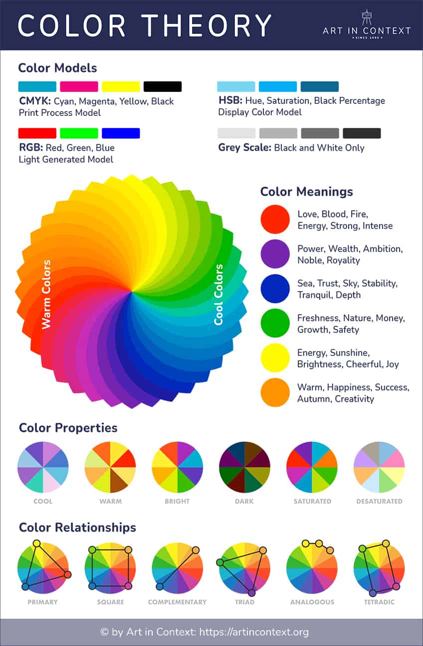
Have you ever wondered why a fire engine is red, or why you might feel a little happier when wearing yellow? Every color has a meaning; however, colors also have different associations in various cultures around the world. Ultimately, designers use all this information to choose the best colors for different projects.
To begin our journey on color theory basics, let us now look at the three basic elements colors can be divided into, which are hues, saturation, and value.
The Basics of Color: Saturation, Hue, and Value
Again, we come to the matter of how we perceive color. There is not just a single blue or red color, you have a range of colors that stem from your original hue. The relationship between these colors involves various values and saturation, which can then change our perception of color. The basic components of color include the following.
Color Saturation
Saturations, also known as chroma, can be defined as how strong or intense the color appears. If you increase the saturation of a color, it becomes more intense or pure. When decreasing the saturation, the colors appear paler or lighter.

Color Hue
When you see the word hue, it can usually be used interchangeably with the term “color”, as it simply means how a color appears. For example, the color or hue is green, red, blue, yellow, or orange.
Color Value
When talking about color value, it means that you are referring to how dark or light a color is. Light colors have a higher value, while darker colors have a lower value, and indicate the amount of light being reflected.
Tints, Tones, and Shades
These are just variations of the hues available on a color wheel. When we refer to pigments, a tint is a hue in which white has been included. For example, red and white, create pink. On the other hand, a shade is when black is added to a hue. For example, red and black create burgundy.
When it comes to color tone, it is where white and black or gray have been added to the original hue, creating a less intense hue.

The HSV Color Scale
If you are working online and dealing with colors, you will come across the HSV (hue, saturation, value) color scale. The scale illustrates the changes of a hue visually and is used by most digital color pickers, for example, Adobe software. A graphic designer needs to understand these concepts; however, digital artists also need this information, and is a major part of the art process.
The Color Wheel
The color wheel is where all the color theory magic happens. Color wheel theory encompasses all colors that are visually represented within a round, wheel form. This will include your primary colors, secondary colors, and intermediate or tertiary colors. The color wheel we all know and learned at school uses the basic primary colors of red, yellow, and blue. However, there are other formats out there, which have been discussed and debated to see what is best.
To keep it simple, we will be explaining from the traditional color wheel perspective, which means using the red, yellow, and blue primary colors (RYB).
These primary colors, which represent paint pigments, cannot be produced by blending any of the other colors. However, all other colors are created by a combination of these primary colors, which are your building blocks. This brings us to secondary colors, which are a combination of the primary colors and include the following.

- Red and yellow create orange
- Blue and red create purple
- Yellow and blue create green
Next, you get your intermediate or tertiary colors that are created by combining primary and secondary colors. You will notice that the names of these color combinations are hyphenated, which makes it easy to see what the color composition is. There are six tertiary colors.

- Yellow-green
- Blue-green
- Blue-purple
- Red-purple
- Red-orange
- Yellow-orange
There is also some debate on what tertiary colors are. Many believe the colors above are better named intermediate colors, and tertiary colors are those that are formed by mixing all three colors. Meaning, if you mix, for example, yellow and green, you are combining all three colors, hence the reference to tertiary. This creates another view on color combinations, as mixing all primary pigment colors will produce a muted muddy color.
You will more than likely come across this idea if you attend art classes, as the Internet is oversaturated with the more common idea of primary, secondary, and tertiary colors.
Color Mixing and Application
This is where the different color wheel theory formats come into play, it does not only involve the RYB color model we just discussed. As we have mentioned, color is perception. We see something, for example, the sky, and this information is sent to our eyes, which then is interpreted by our brains, and we see the color blue. If we look at different objects, each of them is reflecting different wavelengths of color, which is then interpreted by our brains as a specific hue.
So, color is technically the visual result of the color spectrum of light, which is reflected or absorbed off of a surface.

The colors of the spectrum of light were discovered by the well-known scientist Isaac Newton in the 1660s. The discoveries were made when he was busy with experiments involving light and prisms. He determined that the full spectrum of white light is made from seven visible colors. From this discovery, the subject has progressed to include different color mixing forms. These include forms of color for both art or painting, printings, and graphic designs, and have been used in a variety of fields throughout history. These color models as they are known include the RGB version and the CMYK version.
RGB Color Model
This is a color model widely used in graphic design as it brings into play light and color, as we perceive color as light waves. This is used on computer screens, television screens, and phone screens. Another way of describing this color model is as an additive color. First, you must know that the primary colors for this model are red, green, and blue. When you mix these colors, the added colors create other hues of various intensities.
If you combine all three primary colors, you will produce white light. If you search online for colors, you will be able to find the RGB color codes for each hue, which displays the various color compositions or percentages.
In this color model, you also have different secondary and tertiary colors. Below is a simple example of the color codes you will be able to find online. The hex code is simply how each color is identified. Again, your primary colors are red, green, and blue, so your secondary colors will be as follows:
- Blue and red make magenta
- Green and blue make cyan
- Red and green make yellow

| Shade | Hex Code | CMYK Color Code (%) | RGB Color Code | Color |
| Red | #ff0000 | 0, 100, 100, 0 | 255, 0, 0 | |
| Green | #008000 | 100, 0, 100, 50 | 0, 128, 0 | |
| Blue | #0000ff | 100, 100, 0, 0 | 0, 0, 255 |
CMYK Color Model
This color model is used when you deal with colored materials or pigments, such as paint or ink. This method uses a subtractive color mixing model, which means the colors you see are what reflect off the surface, while other colors are absorbed. You are subtracting light from the surface by adding colors. This color method is also what you more than likely learned in school; however, you might know it as an RYB (red, yellow, blue) color model.
These traditional colors are still used, but they have also been replaced by a more comprehensive color combination known as CMYK, which includes primary colors of cyan, magenta, and yellow as well as black.
This is used most often for printing purposes, where a wide range of color combinations can be created on paper. To take it further, the CMYK color model will also have different secondary colors when compared to the traditional RYB color model. This is because you will be mixing the primary colors of cyan, magenta, and yellow, which produces the following secondary colors.
- Yellow and cyan create green
- Magenta and yellow create red
- Cyan and magenta create blue

Color Harmony: Creating Pleasing Combinations
Color in designs, whatever your project, needs to be pleasing to the eye. You need to create a harmonious color combination or color harmony, something that creates a pleasant visual experience. When you look at something that is not in balance, it can seem either too dull or too chaotic and overwhelming that you cannot even look at it. To help you create these harmonious color combinations, you only need to grasp color theory basics.
So, we will be looking at the various color combinations, such as complementary colors, among others.

You can easily find these color combinations online, all you need to do is choose a color, find its hex code and any number of color websites can help you with the various information on the color. We will also be looking at color temperature and how this affects how we perceive art or a design.
Complementary Colors
This is an easy color combination that can be established by locating the color opposite to your chosen hue on the color wheel. For example, the complementary color for a basic pigment blue is orange, the complementary color for red is green, and the complementary color for yellow is purple. When these colors are placed next to each other, you will notice how they seem to pop out at you. This is because of the color contrast the combination offers. This is a great choice if you want an image to stand out, however, it should be used cautiously as overuse can become overwhelming or tiresome to look at.
Using complementary colors in a design, such as a logo, can help to provide an intense contrast that also gives a clear distinction between images. The vibrant and energetic colors also produce a focal point or pops of color when used in fashion or interior designs.

| Shade | Hex Code | CMYK Color Code (%) | RGB Color Code | Color |
| Blue | #0000ff | 100, 100, 0, 0 | 0, 0, 255 | |
| Yellow | #ffff00 | 0, 0, 100, 0 | 255, 255, 0 |
If you wish to include more colors, you can try split complementary colors. This color combination is quite versatile and also offers a balance between warm and cool colors and presents the same contrast that complementary colors do. To find split complementary colors, simply choose your color and find your opposite or complementary color. The split complementary colors are the hues positioned directly on both sides of the complementary color. Below, we are going to use the blue color from the RGB color model as an example.
Of course, numerous shades of blue will have slightly different complementary colors, each with its own hex code. In this case, it is an almost pure yellow hue.
Analogous Colors
Analogous colors are more pleasing to look at, as the colors all share some similar characteristics. To find this color combination, you simply have to look at colors that are positioned next to each other on the color wheel. For example, blue, green, purple, or violet, and the various shades in between can form an analogous color palette. To use these colors more effectively, it is best to choose your main base color, then use the second color as a supporting hue, while the third color will act as an accent. Let us take a look at what the direct analogous colors are for our chosen blue hue.
As you will notice, it is blue and violet. Of course, you can use any shade of blue or violet to create a color scheme.

| Shade | Hex Code | CMYK Color Code (%) | RGB Color Code | Color |
| Pure Blue | #0000ff | 100, 100, 0, 0 | 0, 0, 255 | |
| Blue | #0080ff | 100, 50, 0, 0 | 0, 128, 255 | |
| Violet | #8000ff | 50, 100, 0, 0 | 128, 0, 255 |
Monochromatic Colors
This color combination is simple to create, as you only use a single color. From this single color, you can then create variations that can go from lighter to darker versions of a particular color. Again, we are using our blue hue as an example. Below in the table, you will notice the darker blue and lighter blue version, which when applied in a design can help to produce a layered effect that offers more depth.
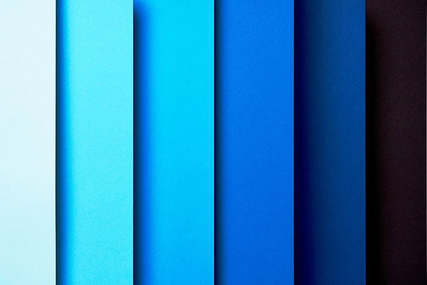
| Shade | Hex Code | CMYK Color Code (%) | RGB Color Code | Color |
| Blue | #0000ff | 100, 100, 0, 0 | 0, 0, 255 | |
| Dark Blue | #00004e | 100, 100, 0, 69 | 0, 0, 78 | |
| Light Blue | #d8d8ff | 15, 15, 0, 0 | 216, 216, 255 |
Triadic Colors
The more colors within a color scheme, the more challenging it is to create something balanced. Three colors are still fairly easy to work with, however, there are also square and rectangular color combinations that offer four colors. These shapes, as with the triadic colors, can be viewed on the color wheel. The triadic colors specifically form an equal-sided triangle. These colors create a vibrant and dynamic color combination that offers balance and contrast at the same time, and makes a design stand out. When looking at our blue color, the triadic colors include green, and red.
Combine these colors wisely to prevent the combination from becoming too overstimulating. So, again select your main color and use the others as your supporting and accent colors.
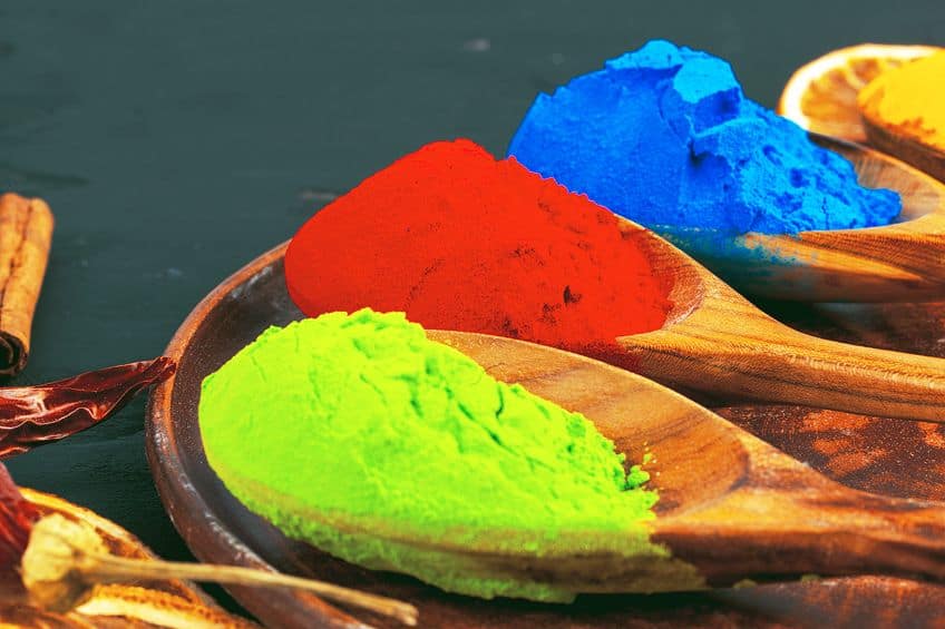
| Shade | Hex Code | CMYK Color Code (%) | RGB Color Code | Color |
| Blue | #0000ff | 100, 100, 0, 0 | 0, 0, 255 | |
| Green | #00ff00 | 100, 0, 100, 0 | 0, 255, 0 | |
| Red | #ff0000 | 0, 100, 100, 0 | 255, 0, 0 |
Color Temperature
The color temperature refers to how warm or cool a color is, which can play a role in affecting perception and emotion in an art piece or design element. When we go back to the color wheel, and we have all the primary, secondary, and intermediary or tertiary colors displayed, we can then divide the color wheel into cool and warm colors. This can be done by simply dividing the wheel in half, and you will find the cool colors on one side, while the warm colors are on the other side. Warm colors are the ones we associate with things like the sun, light, or fire, which include red, orange, and yellow.
Warm colors are also more energetic, happy, exciting, bright, and stimulating. They can be used to generate a sense of warmth. Cool colors, on the other hand, are those we associate with things like the sky, grass, or water, and include blue, green, and purple or violet.
These colors are calmer and are associated more with freshness, relaxation, and peace. Both warm and cool colors, when placed close to each other, will offer a nice contrast. When you understand that colors have a temperature, you will also learn that they can have an impact on the message you want to send your audience.
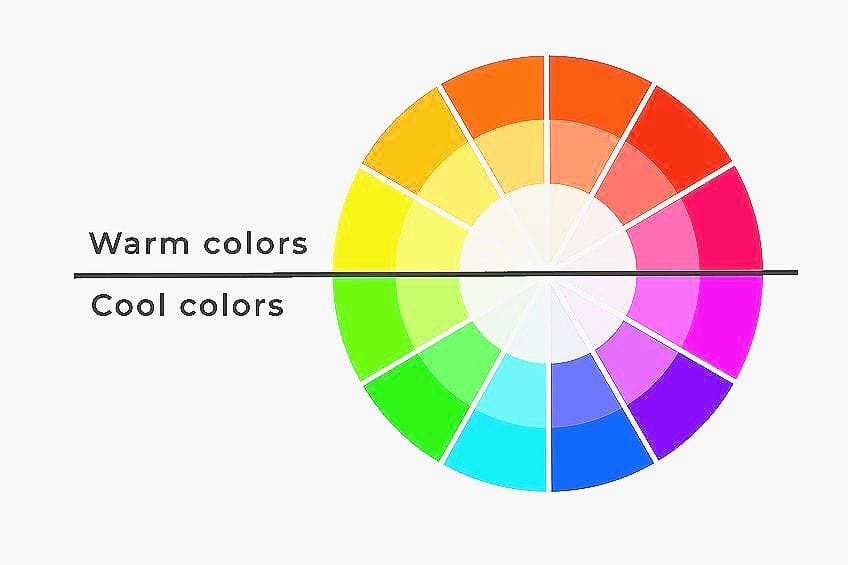
Color temperature as well as color harmony are significant features within a design, whether it is for a painting, a graphic design, or interior design. It is an important part of color psychology that can affect our emotions. By learning to understand how colors relate to one another, including the color temperature, you can create and promote different feelings, and ultimately, enhance the viewer’s experience of their environment.
Color Bias
Another aspect of color theory is color bias, which can become a little complicated to understand. This specifically happens when trying to mix paint colors. Maybe, you have tried mixing blue and yellow paint to make green, but it has somehow come out as a muddy color instead? This is where you should have a basic understanding of the different pigments found in paint colors, which can vary from one paint manufacturer to another. This means learning about color bias. In simple terms, color bias can also be called the undertone and is a certain characteristic in a non-pure hue, which indicates what color it leans towards.
For example, if you have a particular blue color that is not pure, understanding its color bias will tell you if the characteristic of the color has a touch of green or a touch of red to it. Mixing colors with a similar bias will look clearer and provide a color that is closer to a pure hue.
For example, if you want to mix a bright orange, it is best to mix a red and yellow that has an orange undertone or bias. If you take cyan as your color, and you have a look at the color wheel, the color bias is determined by how close it is positioned to a secondary color. So, you can have a cyan color that has either a green bias or a blue bias. For example, turquoise is a blend of green and blue. So, if you are mixing blue and green, make sure the blue you choose already has green pigments, which indicates a green bias.
However, you can also get blue colors with a red bias, meaning it is more of a purplish blue, you will not create the color you are looking for. Below in the table, you will notice when looking at the cyan RGB color code, the green and blue are the same, while the turquoise color has a bit more green than blue.
| Shade | Hex Code | CMYK Color Code (%) | RGB Color Code | Color |
| Cyan | #00ffff | 100, 0, 0, 0 | 0, 255, 255 | |
| Turquoise | #40e0d0 | 71, 0, 7, 12 | 64, 224, 208 |
Why is color bias important? This is most important when mixing paint colors that come out unexpectedly muddy. The color may also seem toned down, and this can mean that the colors you mixed have an unsuitable color bias. You can now anticipate what the color mixes will look like, helping you to take control of creating the best colors for your art projects.
Also, it teaches you how to tone down colors, if that is what you are looking for.
Color Context
It is sometimes amazing how you see colors, and how they can deceive your mind. This is how colors relate to each other and different shapes. For example, take a square shape with different color backgrounds, and place a smaller red square inside. One red square can seem larger or brighter than others, but they are all the same size red square. So, you get different impressions of an identical color. In the right circumstances or different contexts, even the same color can be perceived as four colors.
This is why learning about the value, saturation, and temperature, and how each color relates to one another is important, as this can have a noticeable effect on how you perceive colors.
Psychological Effects of Color
Colors have developed various meanings and symbolism in different cultures. You can find a great diversity of color associations between cultures. Over time, even within the same culture, you may find different color associations that have emerged. This is because today, color meanings might have their origins in culture, but it is also how an individual perceives color, and also the influence of color associations from around the world. For example, white is associated with purity in many countries, however, in countries like India, blue symbolizes purity.
A lot of influence on color symbolism has been associated with religion, such as the perception of purple, which has heavy religious connections. However, the perception of color is continually evolving.

Color Trends and Evolving Meanings
Colors have meanings that can be organic, for example, green is associated with grass and forests, while blue is associated with water and sky. Other associations develop through culture and being brought up in a certain environment. For example, orange has cultural significance in Japan and China and is associated with prosperity and happiness. Color associations and meanings can be quite broad, as it is an excellent form of non-verbal communication that is always changing. Many color meanings can be traced back to historical events and associations.
For example, green and its association with death and poison during the 18th century, when a certain green dye that was used contained arsenic. However, as we mentioned, color meanings can change, because today it is associated with freshens and being eco-friendly.
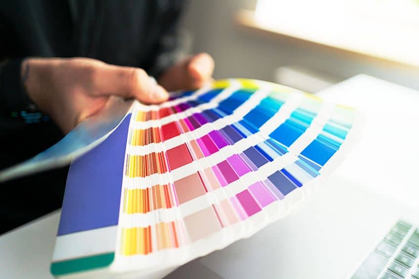
Color trends are formed by developing awareness of color preferences over time. The company Pantone has become a well-known source for predicting color trends, and each year they announce their color of the year, which influences fashion and the entire design industry. They do a lot of research over the years and also take into account any major current events that are happening before they decide on a color. Today, color is not only just something nice to look at or a standard symbolic meaning, but colors also have a purpose and can be used to change the world.
Color Preferences and Their Individual and Cultural Variations
Red might mean love and passion for you, but in other countries like Japan, love is associated with the color green. Red is also the color associated with purity in India, where the bride is often seen wearing a red wedding outfit. Red also symbolizes happiness and luck in countries like China, while it may still have negative connotations in Eastern European countries that associate it with communism. As you can see, perceptions can vary from place to place, and can even have contrasting associations.
There are many colors, each with a meaning, so let us take a brief look at a few of the meanings of blue and yellow colors around the world. These two are examples of both cool and warm colors.
Blue Color Meanings
Blue is your cool color. We will start in Western cultures, where blue indicates trust and safety and is often thought of as a masculine color that has some authority. Blue is also seen as a color associated with security and loyalty. This is why many police uniforms contain the color blue.
In many Eastern cultures, blue is the color of spirituality and immortality.

If you look into Hinduism, blue is associated with Krishna, who symbolizes divine joy and love. In countries that have a strong Catholic population, such as Latin America, blue is greatly associated with religion, and is a symbol of hope and health with its connection to the Virgin Mary.
Yellow Color Meanings
Red in Western cultures is a warm, happy, and bright color that is often associated with optimism, hope, creativity, joy, and enthusiasm. In certain African countries, yellow is a sign of wealth and status, while in Egypt and Middle Eastern countries, yellow is a symbol of mourning. In Japan, yellow is associated with prosperity and bravery, while in Thailand yellow is see as the color for luck.
In China, yellow has often been seen as a symbol of prosperity and power, however, it has also become the color that is often associated with pornography.
The Psychological Influence of Colors on Mood
Colors can be used to affect mood and can even be used to influence physiological changes. Colors can help to influence how memorable something is, can help to evoke emotions, and can influence performance. It does not matter what your color preferences are, the colors all around you can impact how you feel, and what you buy. It can also influence what you wear, and how you feel in a certain space.
Every color can evoke certain emotions, for example, blue is a calming and stable color, while red is passionate, green is refreshing and healing, yellow is optimistic, and orange is energetic.
However, colors have a definite effect on how we feel, but they can go even further and affect physiological processes. Red is believed to increase alertness, by helping to stimulate the heart rate and adrenaline. Blue is calming, so it helps to regulate respiration and lowers blood pressure. Food colors can also stimulate or reduce our appetite. The color orange is known to help stimulate the appetite, while blue can trigger a loss of appetite. There is even color therapy or chromotherapy, which is a holistic treatment alternative that uses colors to help heal the body. The following are examples of colors that are used in this form of therapy.

- Orange: Helps to improve energy levels and is used to help heal the lungs.
- Red: A stimulating color to both the body and mind and can be used to improve circulation.
- Yellow: This color also helps to stimulate the mind and body and can better your mood.
- Blue: A relaxing and soothing color that is often used to help reduce pain.
Color in Art and Design
Everywhere you go, there you will have color from blue skies and green trees to gray or brown buildings. Some of these colors you might even associate with touch, like a brick house or touching the grass. Color is so much more than simply seeing; it is feeling too. Professional artists and designers use this to influence how we feel about something. It is no coincidence that companies use various colors for their branding. Learning how colors can affect emotions can help you to create more memorable designs. Painters have known for years how colors can be used to create intriguing art pieces.
For example, impressionists used color to create a natural light effect, while post-impressionists often used artificial color palettes to depict their emotions and perceptions of the world around them.
There are so many iconic artworks out there that exemplify the principles of color theory, however, we will mention one that shows how you can use complementary colors to evoke a sense of coolness as well as warmth and contrast in a single image. In Vincent Van Gogh’s oil painting, Cafe Terrace at Night (1888), you will notice how he used the complementary colors blue and yellow to create the contrast of warm and cool colors.
Color in Marketing and Branding
Understanding color theory can help to market and build your brand, which in turn, helps you to make more sales. It has been proven that people decide whether they like or dislike a product in 90 seconds, and most of this depends exclusively on the color. So, you can see how important it is to select the finest colors for your brand. You should be aware of the basics of color theory and understand what emotions color can trigger. This will help you to choose the best colors for your logo and website design. You can make your brand stand out and appeal to your target market. Understanding color theory can help you to avoid choosing bad colors that can ultimately affect your sales.
The color you choose can be what encourages a customer to purchase your product. So, color helps to set expectations and can communicate the main characteristics of a product.
When it comes to packaging, color is among the most vital elements, where customers identify the brand packaging. We might not realize it, but our emotions play a large part in the choices we make every day. So, if you can tap into people’s emotions, you help to trigger the feelings you want that will help convert interest into sales. For example, red communicates a sense of urgency, while blue can help to draw out calm feelings. Below are some examples of well-known successful branding campaigns.

- Barbie and pink
- Coca-Cola and red
- Home Depot and orange
- Cat or caterpillar and yellow
- Tiffany and Tiffany blue
- Cadbury and purple
- Fanta blue and orange
- Netflix and red
- McDonald’s red and yellow
Color in Interior Design
Colors help to influence your perception of temperature, which means depending on your environment, colors can help you to feel warmer or cooler. Blue, which is associated with water, rain, and ice, is naturally a cool color. Warm colors like yellow, orange, or red have associations with fire, the sun, and summer. It becomes important to choose the proper colors for a space, as it can influence your mood and can help provide a certain ambiance. You should also understand that different rooms in the home do better with certain colors. For example, you do not want to paint your room bright red, as this is a stimulating color, it is not conducive to relaxation.
The best colors for a bedroom include calming hues, such as green and blue. Since orange is an appetite stimulant, you may want to incorporate it into areas like your dining room.
However, you can create a balanced color scheme by using color theory and the various color combinations available. The general rule is to choose your main color and use this in about 60 percent of the room. You can then choose other colors that play a more supporting role or act as accents. These colors are then added at 30 and 10 percent, making the 60,30,10 rule in design.

Color theory is most important to interior designers, who study and spend a lot of time learning how colors can work to their and your benefit. The perfect color scheme can be created if you expertly combine color in the proper context, thus producing a space that is comfortable and enjoyable to be in.
Color in Fashion and Clothing
We have learned that colors can evoke certain emotions, which can be used as an advantage with the clothes you wear. The first thing a person sees will be the color of your clothing. You might gravitate towards a certain color, which you wear more often, which is why you can sometimes identify someone’s nature by observing their clothing color choices. The right color choices for an outfit can also help to enhance certain features or complement skin color. The chosen colors can also communicate how a person is feeling. Fashion designers use colors to evoke different emotions to create certain styles and looks.
Colors also provide a way for designers to add more dimension and depth to an outfit. Fashion trends come and go, and often reflect the changing attitudes toward colors.
Fashion styles can be influenced by various things, such as current affairs. When a color fashion trend hits, you will notice celebrities wearing the colors, and fashion shows will be producing clothes in the color. You will even begin to see the colors pop up in your local retail clothing stores. However, just because a color is trending does not mean you have to go along with it, you can simply stick to the colors you prefer.
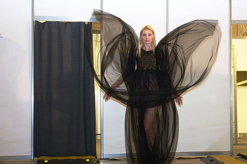
Choosing colors for outfits is also a way of expressing yourself and can help you to feel stylish and confident. For example, if you are going for a job interview, you want to portray confidence, so your color choices should then also be appropriate.
Color in Web and Graphic Design
As with any type of design, colors can affect our mood and can play a role in influencing our decisions. When it comes to graphic design, you will need to consider many things, from the actual design of a website to its applications, and branding. Graphic designers have to consider many concepts and how to appeal to their target audience before coming up with a striking design. Colors can make all the difference between an unappealing website and a website that stands out and gets its message across.
Understanding the role colors play in an effective design is paramount for success. Colors are also not used in isolation within a design, they need to be able to work cohesively to create an appealing look. Any mistake in using the wrong colors can have an undesirable effect on the audience.

Every aspect of a website should be taken into consideration, from the headings and background to the different tabs or buttons. For example, if there is a call-to-action button, you do not want it to blend into the background. The color you choose should be easily seen and should encourage the person to push it. So, the design should be accessible and easy to navigate. If you are looking to create a website, remember that the color choices will affect the user experience and overall website engagement.
What is color theory? This might seem like a short question, but the answer involves many aspects. Color theory basics might be difficult to understand, but it is essential to know as it plays a pivotal role in art and many forms of design. Who would have thought that colors, something that we find everywhere in our daily lives, can play such an important role in everything we do?
Frequently Asked Questions
What Is the Origin of Color Theory and Its Historical Significance?
Colors and pigments have been used since ancient times, and there have been brief references to color in the early 15th century. However, it is believed that the origins of color theory truly began a little later, when Sir Isaac Newton developed the theory during his experiments with light and prisms. Color theory is now the base for mixing colors in art and creating designs for various purposes.
How Can Color Theory Be Applied in Interior Decorating?
Color theory can help you grasp the relationship and psychology of colors. This helps designers figure out what colors work well together and how colors affect emotions so that they can create a space that is comfortable and tailored to suit its purpose.
What Are Some Practical Tips for Choosing Colors for Graphic Designs?
Firstly, consider what mood you want to create. Next, the most obvious tip is for you to use the color wheel, which can help you to create the best color combinations. You can focus on multiple variations of a single color to create a simple yet elegant design, or experiment with multiple color schemes to find one that fits your purpose.
In 2005, Charlene completed her Wellness Diplomas in Therapeutic Aromatherapy and Reflexology from the International School of Reflexology and Meridian Therapy. She worked for a company offering corporate wellness programs for a couple of years, before opening up her own therapy practice. It was in 2015 that a friend, who was a digital marketer, asked her to join her company as a content creator, and this is where she found her excitement for writing.
Since joining the content writing world, she has gained a lot of experience over the years writing on a diverse selection of topics, from beauty, health, wellness, travel, and more. Due to various circumstances, she had to close her therapy practice and is now a full-time freelance writer. Being a creative person, she could not pass up the opportunity to contribute to the Art in Context team, where is was in her element, writing about a variety of art and craft topics. Contributing articles for over three years now, her knowledge in this area has grown, and she has gotten to explore her creativity and improve her research and writing skills.
Charlene Lewis has been working for artincontext.org since the relaunch in 2020. She is an experienced writer and mainly focuses on the topics of color theory, painting and drawing.
Learn more about Charlene Lewis and the Art in Context Team.
Cite this Article
Charlene, Lewis, “Basic Color Theory – Learn the Magic of Color and Its Uses.” Art in Context. August 17, 2023. URL: https://artincontext.org/basic-color-theory/
Lewis, C. (2023, 17 August). Basic Color Theory – Learn the Magic of Color and Its Uses. Art in Context. https://artincontext.org/basic-color-theory/
Lewis, Charlene. “Basic Color Theory – Learn the Magic of Color and Its Uses.” Art in Context, August 17, 2023. https://artincontext.org/basic-color-theory/.


