


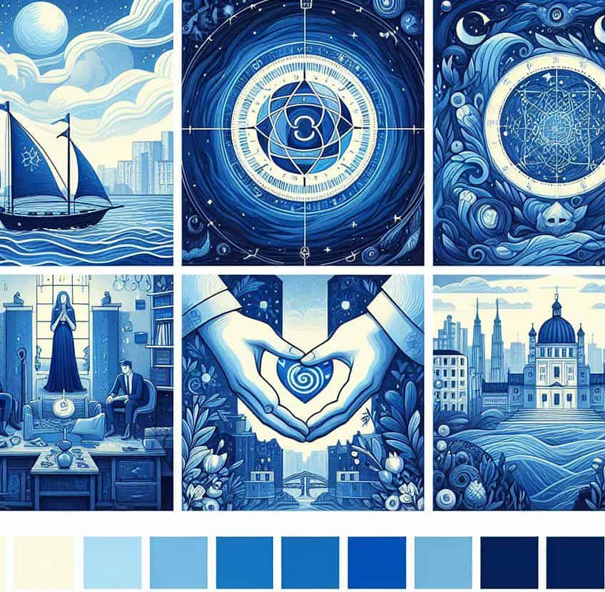
Shades of Blue – A Color-Mixing Guide on How to Make Blue
Blue is a widely loved color. So much of the world we live in is blue, from the oceans to the sky. Whether you are a graphic designer, interior designer or a painter, knowing how to make and use different shades of blue is essential. In this article, we go through the 100 Most Popular Shades of Blue, including descriptions, visuals and all color codes.
The Color Blue in a Nutshell
Blue is a color that has captivated humans throughout history, embodying a vast array of meanings and associations across cultures. One of the three primary colors in traditional color theory, blue has a wavelength range of approximately 450–495 nanometers and is one of the most prevalent colors in our natural environment, particularly evident in the sky and the sea.

In terms of psychological associations, blue is often considered calming and serene, reminiscent of the tranquility of the ocean and the sky. It is also associated with trust, loyalty, wisdom, confidence, and intelligence. These associations make blue a popular color in corporate identities, uniforms, and professional attire.
Culturally, blue can have varied meanings. In Western cultures, blue can represent sadness or depression, as in “feeling blue.” Meanwhile, in many Middle Eastern countries, blue is a protective color, warding off evil spirits.
Today, blue remains one of the most popular colors in various fields, from fashion to interior design, and continues to be a symbol of stability, serenity, and depth. Its rich history and versatile applications ensure that blue will continue to be an integral part of our visual and cultural landscape.
Shades of Blue Color
Absolute zero
Absolute zero is a deep, cool blue that resembles the frigid temperatures suggested by its name, evoking the icy reaches of outer space.
| Hex: #1F4AB8 RGB: 31, 74, 184 CMYK: 83, 60, 0, 28 HSL: 223, 71%, 42% |
Air superiority blue
Air superiority blue is a medium sky blue color, lighter than traditional azure, with a grayish tinge, often used in the livery of military aircraft.
| Hex: #72A0C1 RGB: 114, 160, 193 CMYK: 41, 17, 0, 24 HSL: 205, 38%, 60% |
Alice blue
Alice blue is a pale, delicate blue with a hint of gray, reminiscent of the clear, serene sky and often associated with the classic character Alice from “Alice in Wonderland.”
| Hex: #F0F8FF RGB: 240, 248, 255 CMYK: 6, 3, 0, 0 HSL: 208, 100%, 97% |
Aqua blue
Aqua blue is a vibrant, refreshing color that blends blue and green, resembling the clear waters of a tropical ocean.
| Hex: #00FFFF RGB: 0, 255, 255 CMYK: 100, 0, 0, 0 HSL: 180, 100%, 50% |
Azure
Azure is a bright, sky-blue color, often described as the color of a clear, unclouded sky at noon.
| Hex: #007FFF RGB: 0, 127, 255 CMYK: 100, 50, 0, 0 HSL: 210, 100%, 50% |
Baby blue
Baby blue is a soft, pastel blue that is gentle and soothing, often associated with newborns and nurseries.
| Hex: #89CFF0 RGB: 137, 207, 240 CMYK: 43, 14, 0, 6 HSL: 199, 77%, 73% |
Baby blue eyes
Baby blue eyes is similar to baby blue but with a touch of warmth, as if infused with a hint of the morning sky.
| Hex: #A1CAF1 RGB: 161, 202, 241 CMYK: 33, 16, 0, 5 HSL: 209, 74%, 78% |
Bdazzled blue
Bdazzled blue is a deep, shimmering blue with a touch of purple, suggesting a sense of enchantment and wonder.
| Hex: #2E5894 RGB: 46, 88, 148 CMYK: 69, 41, 0, 42 HSL: 215, 52%, 38% |
Beau blue
Beau blue is a light, airy blue with a hint of gray, similar to a pale blue sky on a crisp, early spring morning.
| Hex: #BCD4E6 RGB: 188, 212, 230 CMYK: 18, 8, 0, 10 HSL: 205, 45%, 81% |
Bleu de France
Bleu de France is a vivid, bright blue that is both deep and intense, embodying the historic national color of France.
| Hex: #388AD6 RGB: 209, 66, 53 CMYK: 74, 36, 0, 16 HSL: 5, 62%, 51% |
Blizzard blue
Blizzard blue is a very light, icy blue with a hint of gray, reminiscent of a snow-covered landscape glistening under the winter sun.
| Hex: #ACE5EE RGB: 172, 229, 238 CMYK: 28, 4, 0, 7 HSL: 188, 66%, 80% |
Blue Munsell
Blue Munsell is a balanced, true blue that is calibrated to be visually consistent within the Munsell color system.
| Hex: #0093AF RGB: 0, 147, 175 CMYK: 100, 16, 0, 31 HSL: 189, 100%, 34% |
Blue NCS
Blue NCS is a shade specified in the Natural Color System, which is a scientifically standardized color system, and it’s a medium blue with a slight hint of green.
| Hex: #008ECC RGB: 0, 142, 204 CMYK: 100, 30, 0, 20 HSL: 198, 100%, 40% |
Blue RYB
Blue RYB is a traditional blue in the red-yellow-blue color model used by artists, with a deep, rich tone reminiscent of lapis lazuli.
| Hex: #4D4DFF RGB: 77, 77, 255 CMYK: 70, 70, 0, 0 HSL: 240, 100%, 65% |
Blue gray
Blue gray is a muted, sophisticated blend of blue with a touch of gray, suggesting the color of a stormy sea or a heavy sky before rain.
| Hex: #6699CC RGB: 102, 153, 204 CMYK: 50, 25, 0, 20 HSL: 210, 50%, 60% |
Blue green
Blue green is a color that straddles the line between blue and green, reminiscent of the deep, verdant waters of a mountain lake.
| Hex: #0D98BA RGB: 13, 152, 186 CMYK: 93, 18, 0, 27 HSL: 191, 86%, 39% |
Blue jeans
Blue jeans is a casual, comfortable medium blue, much like the well-worn fabric of denim jeans.
| Hex: #5DADEC RGB: 93, 173, 236 CMYK: 61, 27, 0, 7 HSL: 206, 79%, 64% |
Blue sapphire
Blue sapphire is a deep, gemstone blue with a touch of both brightness and depth, akin to the precious stone it’s named after, conveying a sense of luxury and elegance.
| Hex: #126180 RGB: 18, 97, 128 CMYK: 86, 24, 0, 50 HSL: 196, 75%, 28% |
Bright turquoise
Bright turquoise is a radiant and vivid blue-green, similar to the color of a high-grade turquoise gemstone basking in bright sunlight.
| Hex: #08E8DE RGB: 8, 232, 222 CMYK: 97, 0, 4, 9 HSL: 177, 93%, 47% |
Cadet blue
Cadet blue is a muted shade of blue with a hint of green and gray, reminiscent of the uniform of cadets and suggesting a certain understated formality.
| Hex: #4F97A3 RGB: 79, 151, 1 63 CMYK: 52, 7, 0, 36 HSL: 0, 0%, 50% |
Capri blue
Capri blue is a deep sky blue, evocative of the color of the waters surrounding the Italian island of Capri on a sunny day.
| Hex: #00BFFF RGB: 0, 191, 255 CMYK: 100, 25, 0, 0 HSL: 195, 100%, 50% |
Carolina blue
Carolina blue is a light, soft blue with a hint of warmth, associated with the University of North Carolina and representing a cheerful, inviting hue.
| Hex: #4B9CD3 RGB: 75, 156, 211 CMYK: 64, 26, 0, 17 HSL: 204, 60%, 56% |
Celadon blue
Celadon blue is a pale blue-green shade that has a subtle, soothing quality, much like the ceramic glazes from which the name is derived.
| Hex: #007BA7 RGB: 0, 123, 167 CMYK: 100, 26, 0, 35 HSL: 195, 100%, 32% |
Celeste
Celeste is a sky blue that is soft and clear, often associated with the blue of the Italian sky or the color used on Bianchi bicycles.
| Hex: #B2FFFF RGB: 178, 255, 255 CMYK: 30, 0, 0, 0 HSL: 180, 100%, 84% |
Cerulean blue
Cerulean blue is a bright, azure blue with a calming, cool presence, reminiscent of a perfect day with clear blue skies.
| Hex: #2A52BE RGB: 42, 82, 190 CMYK: 78, 57, 0, 25 HSL: 223, 63%, 45% |
Cerulean crayola
Cerulean crayola is a shade of blue from the Crayola crayon palette, having a softer and slightly brighter touch than traditional cerulean.
| Hex: #1DACD6 RGB: 29, 172, 214 CMYK: 86, 20, 0, 16 HSL: 193, 76%, 47% |
Cerulean frost
Cerulean frost is a muted version of cerulean, with a cooler, more subdued appearance that suggests a frosty morning sky.
| Hex: #6D9BC3 RGB: 109, 155, 195 CMYK: 44, 21, 0, 24 HSL: 207, 41%, 59% |
Cobalt blue
Cobalt blue is a rich, intense blue with a slight hint of violet, akin to the color of cobalt salts used in fine artist’s paints and glassware.
| Hex: #0047AB RGB: 0, 71, 171 CMYK: 100, 58, 0, 33 HSL: 215, 100%, 33% |
Columbia blue
Columbia blue is a soft, airy blue with a dreamy quality, often associated with the official color of Columbia University.
| Hex: #D1EAF0 RGB: 209, 234, 240 CMYK: 13, 3, 0, 6 HSL: 191, 50%, 88% |
Cornflower blue
Cornflower blue is a medium light blue with a touch of warmth, reminiscent of the flowers of the cornflower plant.
| Hex: #6495ED RGB: 100, 149, 237 CMYK: 58, 37, 0 ,7 HSL: 218, 79%, 66% |
Curious
Curious is a bright, lively blue that suggests inquisitiveness and a sense of exploration, often vibrant and engaging.
| Hex: #18A8D8 RGB: 24, 168, 216 CMYK: 89, 22, 0, 15 HSL: 195, 80%, 47% |
Dark electric blue
Dark electric blue is a richer and more saturated version of electric blue, conveying a sense of power and intensity.
| Hex: #536878 RGB: 83, 104, 120 CMYK: 31, 13, 0, 53 HSL: 205, 18%, 39% |
Dark sapphire
Dark sapphire is a deep blue that borders on black, similar to the color of a sapphire gemstone in low light, exuding sophistication and depth.
| Hex: #082567 RGB: 8, 37, 103 CMYK: 92, 64, 0, 60 HSL: 221, 85%, 21% |
Dark turquoise
Dark turquoise is a rich blue-green, deeper and less vibrant than bright turquoise, suggesting the depths of a forested lagoon.
| Hex: #00CED1 RGB: 0, 206, 209 CMYK: 100, 1, 0, 18 HSL: 180, 100%, 40% |
Denim blue
Denim blue is a classic, versatile blue with a slightly worn-in feel, much like your favorite pair of jeans.
| Hex: #1560BD RGB: 21, 96, 189 CMYK: 89, 49, 0, 26 HSL: 213, 80%, 41% |
Dodger blue
Dodger blue is a bright and vibrant medium blue, named after the Los Angeles Dodgers baseball team, and is characterized by its energetic and lively hue.
| Hex: #1E90FF RGB: 30, 144, 255 CMYK: 88, 44, 0, 0 HSL: 209, 100%, 55% |
Egyptian blue
Egyptian blue is a historical pigment blue with a slight greenish tint, reminiscent of the ancient blue faience pottery and art of Egypt.
| Hex: #1034A6 RGB: 16, 52, 166 CMYK: 90, 69, 0, 35 HSL: 225, 82%, 35% |
Electric blue
Electric blue is a bright, intense blue that is highly saturated, giving it a neon-like quality that is bold and eye-catching.
| Hex: #7DF9FF RGB: 125, 249, 255 CMYK: 51, 2, 0, 0 HSL: 182, 100%, 74% |
Fluorescent blue
Fluorescent blue is an extremely bright, glowing blue, resembling the vividness of blue fluorescent lights or the radiance of daylight fluorescence.
| Hex: #15F4EE RGB: 21, 244, 2 38 CMYK: 91, 0, 2, 4 HSL: 0, 0%, 50% |
French blue
French blue is a rich, deep blue with a hint of brightness, often associated with the color of the French flag and classic French fashion.
| Hex: #0077C0 RGB: 0, 119, 192 CMYK: 100, 38, 0, 25 HSL: 202, 100%, 37% |
Glaucous blue
Glaucous blue is a powdery or frosted blue with hints of gray or green, evoking the appearance of certain plants and insects with a bluish waxy or powdery coating.
| Hex: #324AB2 RGB: 215, 48, 56 CMYK: 72, 58, 0, 30 HSL: 357, 67%, 51% |
Han blue
Han blue is an ancient Chinese pigment that is a medium blue with a slight purple tone, reminiscent of the Han dynasty pottery artifacts.
| Hex: #446CCF RGB: 68, 108, 207 CMYK: 67, 48, 0, 19 HSL: 222, 59%, 53% |
Honolulu blue
Honolulu blue is a medium to dark shade of blue with a grayish tinge, associated with the color of the National Football League’s Detroit Lions.
| Hex: #006DB0 RGB: 0, 109, 176 CMYK: 100, 38, 0, 31 HSL: 202, 100%, 34% |
Imperial blue
Imperial blue is a very dark shade of blue, conveying a sense of regality and importance, often associated with the concept of empire and authority.
| Hex: #005A92 RGB: 0, 90, 146 CMYK: 100, 38, 0, 43 HSL: 203, 100%, 28% |
Independence blue
Independence blue is a deep, grayish blue that is subdued and sophisticated, suggesting the solemnity of historical American independence.
| Hex: #4C516D RGB: 76, 81, 109 CMYK: 30, 26, 0, 57 HSL: 230, 17%, 36% |
Indigo dye
Indigo dye is a deep blue with a violet edge, resembling the traditional color of indigo fabric dye derived from the indigo plant.
| Hex: #00416A RGB: 0, 65, 106 CMYK: 100, 39, 0, 58 HSL: 203, 100%, 20% |
International klein blue
International Klein Blue (IKB) is a deep, ultramarine blue, developed by artist Yves Klein, that is rich and highly saturated, with a unique luminosity.
| Hex: #002fA7 RGB: 0, 47, 167 CMYK: 100, 72, 0, 35 HSL: 223, 100%, 32% |
Lavender blue
Lavender blue is a soft, pale blue with a hint of lavender purple, creating a gentle and dreamy quality reminiscent of floral fields.
| Hex: #CCCCFF RGB: 204, 204, 255 CMYK: 20, 20, 0, 0 HSL: 240, 100%, 90% |
Light cyan
Light cyan is a pale, greenish-blue that is soft and calming, resembling the lighter shades of the cyan spectrum.
| Hex: #E0FFFF RGB: 224, 255, 255 CMYK: 12, 0, 0, 0 HSL: 180, 100%, 93% |
Light turquoise
Light turquoise is a light, vibrant blue-green, more delicate and pale than the typical shades of turquoise, evoking the gentle shallows of a tropical sea.
| Hex: #AFEEEE RGB: 175, 238, 238 CMYK: 26, 0, 0, 7 HSL: 180, 64%, 80% |
Little boy blue
Little boy blue is a medium shade of azure, named after the nursery rhyme character, conveying a youthful and playful energy.
| Hex: #6CA0DC RGB: 108, 160, 220 CMYK: 51, 27, 0, 14 HSL: 212, 61%, 64% |
Maximum blue
Maximum blue is a bright and deep blue that is both lively and engaging, with a hint of green, giving it a vibrant, modern feel.
| Hex: #47ABCC RGB: 71, 171, 204 CMYK: 65, 16, 0, 20 HSL: 194, 56%, 53% |
Maya blue
Maya blue is a unique shade of bright azure, historically used in the pre-Columbian Americas, particularly by the Maya civilization, known for its resistance to weathering and its vivid, slightly greenish-blue hue.
| Hex: #73C2FB RGB: 115, 194, 251 CMYK: 54, 23, 0, 2 HSL: 205, 94%, 71% |
Medium sapphire
Medium sapphire is a balanced, medium-dark blue that strikes a middle ground between the brightness of a sapphire gemstone and the subtlety of a more muted blue.
| Hex: #2D5DA1 RGB: 45, 93, 161 CMYK: 72, 42, 0, 37 HSL: 215, 56%, 40% |
Medium turquoise
Medium turquoise is a soothing blue-green color, less vibrant than bright turquoise but more intense than light turquoise, reminiscent of a serene, sunlit sea.
| Hex: #48D1CC RGB: 72, 209, 204 CMYK: 66, 0, 2, 18 HSL: 177, 59%, 55% |
Midnight blue
Midnight blue is a dark, almost black shade of blue, suggestive of the sky at midnight, offering a deep and contemplative feel.
| Hex: #191970 RGB: 25, 25, 112 CMYK: 78, 78, 0, 56 HSL: 240, 63%, 26% |
Morning blue
Morning blue is a calm, muted blue with a grayish tinge, evoking the tranquility of early dawn skies.
| Hex: #84AEAC RGB: 141, 163, 1 53 CMYK: 24, 0, 1, 32 HSL: 0, 0%, 50% |
Navy blue (dark blue)
Navy blue (dark blue) is a very dark shade of blue that is almost black, associated with naval uniforms and conveying a sense of formality and authority.
| Hex: #000080 RGB: 0, 0, 128 CMYK: 100, 100, 0, 50 HSL: 240, 100%, 25% |
Ocean blue
Ocean blue is a rich, deep blue that captures the essence of the vast and mysterious ocean, with a hint of green, reflecting the color of deep seawater.
| Hex: #3C41CD RGB: 238, 59, 52 CMYK: 71, 68, 0, 20 HSL: 2, 84%, 56% |
Oxford blue
Oxford blue is a dark, inky blue with a sophisticated and academic feel, associated with the traditional attire of Oxford University.
| Hex: #002147 RGB: 0, 33, 71 CMYK: 100, 54, 0, 72 HSL: 212, 100%, 13% |
Pacific blue
Pacific blue is a bright, refreshing blue with a touch of green, reminiscent of the clear, expansive waters of the Pacific Ocean.
| Hex: #1CA9C9 RGB: 28, 169, 201 CMYK: 86, 16, 0, 21 HSL: 191, 75%, 44% |
Pale cerulean
Pale cerulean is a light, soft blue with a hint of green, evoking the gentle expansiveness of the early morning sky.
| Hex: #9BC4E2 RGB: 155, 196, 226 CMYK: 31, 13, 0, 11 HSL: 205, 55%, 74% |
Persian blue
Persian blue is a strong, medium to dark blue with a slightly purplish tinge, associated with Persian art and culture, conveying a sense of luxury and tradition.
| Hex: #1C39BB RGB: 28, 57, 187 CMYK: 85, 70, 0, 27 HSL: 229, 73%, 42% |
Pewter blue
Pewter blue is a muted, grayish-blue that has an aged, vintage feel, similar to the patina that forms on pewter ware.
| Hex: #8BA8B7 RGB: 139, 168, 183 CMYK: 24, 8, 0, 28 HSL: 200, 23%, 63% |
Phthalo blue
Phthalo blue is a synthetic pigment that is intensely blue with a greenish cast, known for its high tinting strength and vividness in art.
| Hex: #000F89 RGB: 0, 15, 137 CMYK: 100, 89, 0, 46 HSL: 233, 100%, 26% |
Picotee blue
Picotee blue is a flower-inspired hue that features a gradient of blue with edges that may be tinged with a lighter or different color, much like the petal edges of a picotee flower.
| Hex: #2E2787 RGB: 46, 39, 135 CMYK: 66, 71, 0, 47 HSL: 244, 55%, 34% |
Powder blue
Powder blue is a very pale blue with soft, muted tones, reminiscent of powdered blue pigments or the delicate blue of a baby’s nursery.
| Hex: #B0E0E6 RGB: 176, 224, 230 CMYK: 23, 3, 0, 10 HSL: 186, 51%, 79% |
Prussian blue
Prussian blue is a deep, dark blue with a greenish undertone, historically used as a pigment in paints, and known for its richness and depth.
| Hex: #003153 RGB: 0, 49, 83 CMYK: 100, 41, 0, 67 HSL: 204, 100%, 16% |
Queen blue
Queen blue is a medium shade of blue that leans slightly towards the teal end of the spectrum. It has a regal and refined quality, as suggested by its name.
| Hex: #436B95 RGB: 67, 107, 149 CMYK: 55, 28, 0, 42 HSL: 210, 37%, 42% |
Resolution blue
Resolution blue is a deep, vivid blue with a certain degree of brightness, suggesting determination and clarity of purpose.
| Hex: #002387 RGB: 0, 35, 135 CMYK: 100, 74, 0, 47 HSL: 224, 100%, 26% |
Robbin’s egg
Robbin’s egg blue is a pale, greenish-blue that is soft and calming, reminiscent of the color of the eggs laid by the American robin, symbolizing renewal and spring.
| Hex: #00D8D8 RGB: 0, 216, 216 CMYK: 100, 0, 0, 15 HSL: 180, 100%, 42% |
Royal Air Force blue
Royal Air Force blue is a subdued shade of blue-gray, used in the uniforms of the Royal Air Force, conveying a sense of professionalism and reliability.
| Hex: #5D8AA8 RGB: 93, 138, 168 CMYK: 45, 18, 0, 34 HSL: 204, 30%, 51% |
Royal blue
Royal blue is a rich and bright shade of blue, slightly lighter than navy blue, often associated with superiority and distinction.
| Hex: #002366 RGB: 0, 35, 102 CMYK: 100, 66, 0, 60 HSL: 219, 100%, 20% |
Royal blue dark
Royal blue dark is deeper than royal blue, more intense and closer to navy, offering a more formal and profound aesthetic.
| Hex: #002D72 RGB: 0, 45, 114 CMYK: 100, 61, 0, 55 HSL: 216, 100%, 22% |
Ruddy blue
Ruddy blue is a muted blue with hints of gray and a touch of red, giving it a somewhat weathered and worn appearance.
| Hex: #76ABDF RGB: 118, 171, 223 CMYK: 47, 23, 0, 13 HSL: 209, 62%, 66% |
Sapphire blue
Sapphire blue is a bright, deep blue that is both regal and classic, reminiscent of the precious sapphire gemstone.
| Hex: #0F52BA RGB: 15, 82, 186 CMYK: 92, 56, 0, 27 HSL: 216, 85%, 39% |
Shadow blue
Shadow blue is a grayish-blue that is soft and subtle, similar to the color of a shadow under the soft light, conveying a sense of tranquility and understatement.
| Hex: #7285A5 RGB: 114, 133, 165 CMYK: 31, 19, 0, 35 HSL: 217, 22%, 54% |
Sky blue
Sky blue is a light to medium blue with a clear, bright quality, like the color of the daytime sky when it’s free of clouds.
| Hex: #ADD8E6 RGB: 173, 216, 230 CMYK: 25, 6, 0, 10 HSL: 194, 53%, 79% |
Slate blue
Slate blue is a medium-dark blue with hints of gray, resembling natural slate rock, and has a somewhat dusty and solid feel.
| Hex: #6A5ACD RGB: 106, 90, 205 CMYK: 48, 56, 0, 20 HSL: 248, 53%, 57% |
Space cadet
Space cadet is a dark blue that is nearly black, with a slight purple undertone, suggesting the vastness and mystery of outer space.
| Hex: #1D2951 RGB: 29, 41, 8 1 CMYK: 64, 49, 0, 68 HSL: 0, 0%, 50% |
Spanish blue
Spanish blue is a vibrant, true blue that is both bright and deep, reflecting the traditional use of blue in Spanish culture.
| Hex: #0070BB RGB: 0, 112, 187 CMYK: 100, 40, 0, 27 HSL: 204, 100%, 36% |
St Patrick’s Blue
St Patrick’s Blue is a traditional name for various shades of blue associated with St. Patrick and Ireland, often a deep, muted blue with a hint of green.
| Hex: #23297A RGB: 35, 41, 122 CMYK: 71, 66, 0, 52 HSL: 235, 55%, 30% |
Star command blue
Star command blue is a bright, futuristic blue, reminiscent of uniforms from sci-fi media, symbolizing exploration and command.
| Hex: #007BB8 RGB: 0, 123, 184 CMYK: 100, 33, 0, 28 HSL: 199, 100%, 36% |
Steel blue
Steel blue is a shade of blue-gray, similar to the color of blued steel, with a tough, resilient quality.
| Hex: #4682B4 RGB: 70, 130, 180 CMYK: 61, 28, 0, 29 HSL: 207, 44%, 49% |
Teal
Teal is a medium to dark blue-green color, resembling the color of the plumage of the common teal bird, blending the calming properties of blue with the renewal qualities of green.
| Hex: #008080 RGB: 0, 128, 12 8 CMYK: 100, 0, 0, 50 HSL: 0, 0%, 50% |
Tiffany blue
Tiffany blue is a trademarked robin’s egg blue color associated with Tiffany & Co., the luxury jewelry retailer, representing elegance and exclusivity.
| Hex: #81D8D0 RGB: 129, 216, 208 CMYK: 40, 0, 4, 15 HSL: 174, 52%, 67% |
True blue
True blue is a shade of medium to light blue that is considered a quintessential blue, often associated with loyalty and faithfulness.
| Hex: #2D68C4 RGB: 45, 104, 196 CMYK: 77, 47, 0, 23 HSL: 216, 62%, 47% |
Trypan blue
Trypan blue is a deep, rich blue with a hint of violet, reminiscent of the colorant used in biology to selectively color dead tissues or cells. It’s a saturated, dark blue that conveys a sense of precision and scientific inquiry.
| Hex: #1C05B3 RGB: 28, 5, 179 CMYK: 84, 97, 0, 30 HSL: 247, 94%, 36% |
Tufts blue
Tufts blue is a medium shade of blue that is both warm and inviting, representing the academic spirit and pride of Tufts University. It strikes a balance between being bright enough to stand out yet subdued enough to maintain a sense of decorum.
| Hex: #3E8EDE RGB: 62, 142, 222 CMYK: 72, 36, 0, 13 HSL: 210, 70%, 55% |
Turquoise blue
Turquoise blue is a vibrant, medium blue-green that mimics the precious turquoise gemstone. It’s a refreshing and inviting color that evokes images of tropical waters and clear summer skies.
| Hex: #00FFEF RGB: 0, 255, 239 CMYK: 100, 0, 6, 0 HSL: 176, 100%, 50% |
US Air Force Academy blue
US Air Force Academy blue is a muted shade of medium blue that embodies the discipline and integrity of the United States Air Force Academy. It’s a dignified color that carries with it a sense of duty and tradition.
| Hex: #004F98 RGB: 0, 79, 152 CMYK: 100, 48, 0, 40 HSL: 208, 100%, 29% |
Ultramarine
Ultramarine is a brilliant, deep blue with a subtle purplish undertone, originally derived from the lapis lazuli stone. It has a rich history in art, providing a striking and majestic presence that has adorned many masterpieces throughout the centuries.
| Hex: #3F00FF RGB: 63, 0, 255 CMYK: 75, 100, 0, 0 HSL: 254, 100%, 50% |
United States Air Force blue
United States Air Force blue is a medium shade of blue-gray that symbolizes the strength and resilience of the Air Force. It’s a color that reflects the honor and commitment of the service members who protect the skies.
| Hex: #00308F RGB: 0, 48, 143 CMYK: 100, 66, 0, 44 HSL: 219, 100%, 28% |
Uranian blue
Uranian blue is a pale, icy blue with a subtle hint of green, suggesting the ethereal and otherworldly beauty of the planet Uranus. It’s a color that captures the imagination and speaks of exploration and the unknown.
| Hex: #AFDBF5 RGB: 175, 219, 245 CMYK: 29, 11, 0, 4 HSL: 202, 77%, 82% |
Violet blue
Violet blue is a rich, deep color that straddles the line between blue and violet. It is reminiscent of the last moments of twilight, offering a sense of mystery and depth.
| Hex: #324AB2 RGB: 50, 74, 178 CMYK: 72, 58, 0, 30 HSL: 228, 56%, 44% |
Vivid blue sky
Vivid blue sky is an intense, electric blue that mirrors the unblemished blue of the daytime sky at its most striking. It’s a color that radiates optimism and boundless potential.
| Hex: #00CCFF RGB: 0, 204, 255 CMYK: 100, 20, 0, 0 HSL: 192, 100%, 50% |
Y In Mn blue
YInMn blue, also known as Oregon blue, is a bright, vibrant blue that was discovered accidentally by chemists at Oregon
| Hex: #224C98 RGB: 34, 76, 152 CMYK: 78, 50, 0, 40 HSL: 218, 63%, 36% |
Yale blue
Yale blue is a dark, almost grayish blue, associated with Yale University and known for its elegance and deep heritage.
| Hex: #00356B RGB: 0, 53, 107 CMYK: 100, 50, 0, 58 HSL: 210, 100%, 20% |
Blue Shades in Fashion
Shades of magenta are a bold fashion statement, offering a versatile range that can add a pop of color or create a sophisticated ensemble. In the ever-evolving landscape of fashion, magenta finds its place as a hue that can be both playful and elegant. Here are six chic color combinations that harness the power of magenta:
- Magenta and crisp white for a fresh and clean contrast.
- Magenta and deep charcoal for a grounded yet vibrant pairing.
- Magenta and soft blush for a harmonious, feminine look.
- Magenta and mint green for a refreshing and modern twist.
- Magenta and rich gold for an opulent and luxurious feel.
- Magenta and navy blue for a classic and timeless combination.

Shades of Blue in Interior Design
In interior design, magenta is a striking choice that infuses spaces with personality and depth. Its versatility allows it to adapt from accent features to bold statement pieces, catering to a myriad of aesthetic preferences. Here are six stylish color combinations that showcase the adaptability of magenta within interior spaces:
- Magenta and soft gray for a contemporary balance of boldness and subtlety.
- Magenta and teal for a vibrant, energetic contrast.
- Magenta and warm beige for a cozy, inviting atmosphere.
- Magenta and emerald green for a lush, jewel-toned elegance.
- Magenta and mustard yellow for a playful, eclectic vibe.
- Magenta and matte black for an edgy, modern sophistication.

Color Meaning of Blue Shades
Blue is often associated with a sense of calm and tranquility, reminiscent of the serene sky above or the vast and peaceful ocean. My personal associations with blue are deeply rooted in its ability to soothe and provide comfort. It’s a color that encourages relaxation and contemplation, often used in spaces designed for rest or meditation. The various shades of blue, from the palest baby blue to the deepest navy, can evoke different emotions, with lighter blues being airy and freeing, while darker blues are more authoritative and strong.
Symbolically, blue represents loyalty, stability, and trustworthiness. It’s a color that people often turn to when they want to inspire confidence and security, which is why it’s a prevalent choice in corporate identities and uniforms.
How to Mix Different Shades of Blue Technically
So far, we have spoken about which colors to use to make different values of blue hues. There is a more technical side to color mixing, and we are providing the necessary information for various shades of blue below. This information includes the blue hex codes and the RBG values for each shade.
| Type of Blue | Blue Shade | Blue Hex Number | RBG | Uses |
| Turquoise | #40e0d0 | 64,224,208 | Turquoise is a very versatile color. It has a very soothing effect, making us feel calm. Very often, turquoise can also make us think of luxury and good fortune. You can use a light pink shade alongside turquoise to create a light and playful effect in your paintings and designs. | |
| Navy Blue | #000080 | 0,0,128 | Navy blue is very popular in fashion because it flatters dark and light complexions and can communicate a sense of luxury and wealth. Navy blue is also a commanding color, often making us feel a sense of integrity, authority, and dignity. Navy blue is often associated with royalty because it is such a rich and vibrant shade. | |
| Baby Blue | #89CFF0 | 137,207,240 | Baby blue is a very light and soft color. You can use baby blue in your designs and paintings to create a soothing atmosphere. Baby blue can be used alongside other monotone colors to create an accent and break up the bolder shade. | |
| Cerulean Blue | #2a52be | 42,82,190 | If you are looking for an invigorating, vibrant shade of blue, you can try cerulean. Cerulean blue is a warmer shade of blue that can boost productivity because it reduces the sense of visual space. You can create a sense of sophistication by using cerulean blue in your designs. Out of all the many shades of blue, cerulean is one of the most popular worldwide. | |
| Egyptian Blue | #1034a6 | 16,52,166 | Egyptian blue has its name because it was popular amongst the royal Pharaohs in ancient Egypt. As such, you can use Egyptian blue to create a feeling of royalty and power in a design. The Egyptian blue pigment is very rich and vibrant. You can use Egyptian blue as a stand-alone shade, or you can use it with lighter shades to create a cooler palette. | |
| True Blue | #0073cf | 0,115,207 | True blue is the most common shade of blue in design and paintings. When artists paint the sky or the ocean, it is typically in a shade of true blue. True blue can communicate feelings of loyalty, innovation, trustworthiness, independence, and dependability. | |
| Azure Blue | #007FFF | 0,127,255 | Azure blue is often used extensively in advertising because it is quite fashionable. This light and bright shade of blue appeals to our emotions. Adverts that use this shade of blue make us think of cleanliness, positivity, and freshness. The ancient Romans used a lot of azure blue in their clothing and paintings. The Romans believed that this shade of blue communicated nobility and power. Azure blue works very well alongside very light colors like white. | |
| Pacific Blue | #1ca9c9 | 28,169,201 | Pacific blue is a very attractive shade of blue. It is not as bright and vibrant as some other light blue hues, and as a result, it can make us feel calm and relaxed. As is suggested by its name, many artists use this blue hue when painting crashing ocean waves and sea spray. | |
| Cornflower Blue | #6495ed | 100,149,237 | Cornflower blue is one of the more gentle and sweet blue shades. The color is named after a beautiful blue flower that grows in fields of corn. Cornflower blue is a beautiful addition to any design because it makes us feel calm and warm. |

In 2005, Charlene completed her Wellness Diplomas in Therapeutic Aromatherapy and Reflexology from the International School of Reflexology and Meridian Therapy. She worked for a company offering corporate wellness programs for a couple of years, before opening up her own therapy practice. It was in 2015 that a friend, who was a digital marketer, asked her to join her company as a content creator, and this is where she found her excitement for writing.
Since joining the content writing world, she has gained a lot of experience over the years writing on a diverse selection of topics, from beauty, health, wellness, travel, and more. Due to various circumstances, she had to close her therapy practice and is now a full-time freelance writer. Being a creative person, she could not pass up the opportunity to contribute to the Art in Context team, where is was in her element, writing about a variety of art and craft topics. Contributing articles for over three years now, her knowledge in this area has grown, and she has gotten to explore her creativity and improve her research and writing skills.
Charlene Lewis has been working for artincontext.org since the relaunch in 2020. She is an experienced writer and mainly focuses on the topics of color theory, painting and drawing.
Learn more about Charlene Lewis and the Art in Context Team.
Cite this Article
Charlene, Lewis, “Shades of Blue – A Color-Mixing Guide on How to Make Blue.” Art in Context. April 19, 2021. URL: https://artincontext.org/shades-of-blue/
Lewis, C. (2021, 19 April). Shades of Blue – A Color-Mixing Guide on How to Make Blue. Art in Context. https://artincontext.org/shades-of-blue/
Lewis, Charlene. “Shades of Blue – A Color-Mixing Guide on How to Make Blue.” Art in Context, April 19, 2021. https://artincontext.org/shades-of-blue/.


