Pink Color – Understanding the Different Pink Color Undertones
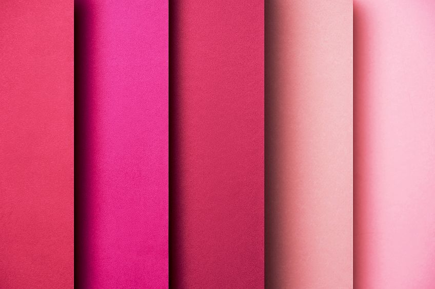
Pink is a popular color that can also be found in nature. Since there are so many shades of pink, the pink color has also found its way into fashion, graphic design, and interior design. But why is pink seen as a feminine color, and has it always been this way? To answer this question and to discover more about the pink color, read on!
What Is Pink?
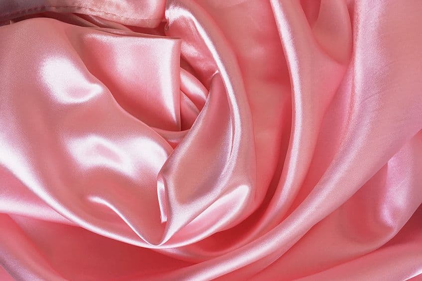
Most of us would say that pink can be described as a shade of red, you only need to add a bit of white to create a pale tint of red. There are many shades of pink, each one can be recognized by a pink hex code. So, below in the table, is a version of pink we will be using throughout the article. You will also find two pink color codes, each one representing the composition of graphic colors and a code for printing. These would be for the RGB (red, green, blue) color code and CMYK (cyan, magenta, yellow, black) color codes respectively.
You can easily find various pink hex codes and enter them into a color-finding website, which should display all the relative information about a specific color.
| Shade | Hex Code | CMYK Color Code (%) | RGB Color Code | Color |
| Pink | #ffc0cb | 0, 25, 20, 0 | 255, 192, 203 |
Pink Color: A Brief History
The pink color, as a name, was first used in the 17th century when referring to a common pink flower known as Dianthus plumarius, which comes from the family Caryophyllaceae. The flower is also commonly known by different names including wild pink, garden pink, and common pink. The term was also made popular by a Greek botanist, describing the frilly edges of flowers. However, the term pink may also be mentioned in Homer’s Odyssey, which was written about 800 BC. The words “rosy-fingered dawn” are used. But why does this refer to pink?
The word Roseus in Latin means pink, rose, or rosy. Also, during the 14th century, it is believed that the term “to pink” was used and referred to the perforated punch patterns of certain decorations.
This is still used today, and many may recognize the hand-held scissors, known as pinking shears, that produce a zig-zag type pattern when used. During this period, also known as the Middle Ages, up to the Renaissance period, the pink color was mostly used in religious forms of art. For example, Madonna of the Pinks (1506-1507) by Raphael, depicts the Christ child giving the Virgin Mary a pink flower, which is a symbol of the unity of mother and child. Many of the early Renaissance religious paintings often show the Christ child wearing pink, which is a symbol of the blood of Christ.
Pink was used mainly in paintings for the hands and faces, or it formed part of the flesh colors. The common pigment used was known as light cinabrese (Venetian red), which was a combination of sinopia, a reddish earth pigment, and Bianco Di San Giovanni, a lime white pigment. During the 17th to 18th centuries, the pink color became quite popular among European aristocrats and was a symbol of luxury. This came about because of King Louis XV’s (1710-1774) mistress, Madame de Pompadour. She loved the color, and over time, the color even became well-known as “Rose Pompadour”. Since she also loved porcelain, this color was named after her by the famous Sevres porcelain manufacturer in 1757.
There was no real perception or link of the color pink to a specific gender during the 19th century. A lighter shade of pink was even worn by boys as it was linked to the military and had a more masculine meaning.
Most children, however, wore white during this time, as any color would wash out very easily. Slowly, over the next few years, Western women began to wear lighter or pastel colors, while the men donned darker or more neutral colors. So, pink became seen as a more feminine color. The creation of lingerie also helped to provide a more sensual association with the color pink. Pink dresses also became quite popular, especially due to certain famous female icons. Mamie Eisenhower, for no other reason than loving the color pink, wore a pink dress in 1953 to the inauguration of Dwight D. Eisenhower, her husband, who became the 34th President of the United States of America.
During the Second World War, many of those who were branded homosexuals in concentration camps had to display a pink triangle.
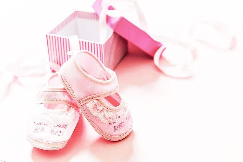
Later, this eventually became the symbol for the LGBT community as a protest against homophobia and became an emblem of gay rights. There was also a post-war effort to go back to traditional gender roles, where the women were homemakers. Many advertisements displayed women wearing colorful and pastel colors including pink, while men wore more neutral clothing. The color pink built up a strong association with all things feminine, and eventually, in the 1980s, this also became evident in baby’s clothing. This is when the first ultrasound came out, and the parents could then shop by gender.
This has remained popular, as you will notice in any gender reveal video online. However, this trend has slowed down, with pink becoming slightly more gender-neutral. This association of pink with femininity is mostly found in Western cultures. If you consider the world, pink has different meanings in other cultures. For example, many men in India wear a shade of pink turbans or clothing. In Japan, the pink color represents a warrior.
In the Western world, ideas are changing, and pink is now also being used in other areas like graphic design and interior design.
Color Meaning of Pink
The more common associations with the pink color include charm, sensitivity, femininity, love, calmness, optimism, romance, sweetness, politeness, and childhood. Pink paired with white is associated with innocence and chastity, while pink and black are associated more with sensuality and seduction. Black can also add depth and drama if used properly in a design. There are many shades of pink, which can include softer, more gentle, and soothing pastels that are associated more with compassion and kindness, while brighter pinks are more energetic and playful.
So, pink can have a split personality from representing innocence to becoming more immodest or lustful.

Even though pink can be vibrant, it does not have the aggression that red can produce. There has been research done, where the holding cells for violent prisoners have been painted pink. The color was proven to tone down the aggression of these individuals. So, pink can be used as a mood regulator. However, too much and it can become a physically draining color. Instead of simply reminding you of childhood, it can also be a color that represents childishness and can be immature. Many might also see pink as an emotional, timid, or weak color.
Shades of Pink
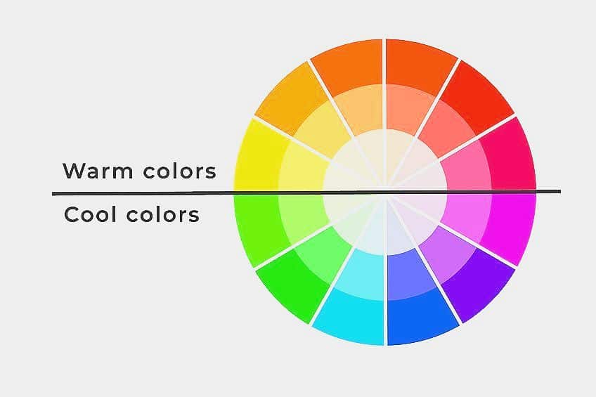
There are many types of pink and pink color names, many having different color undertones. For example, some may have bluish undertones, while others are orange-based, or gray undertones. Color temperature is something you will learn when dealing with color theory. All colors can be divided into warm and color on the color wheel. Warm colors are red, yellow, and orange, while cool colors are blue and green hues.
Since pink is a shade of red, it will naturally be considered a warm color, however, depending on where it sits on the color wheel, it can also have undertones.
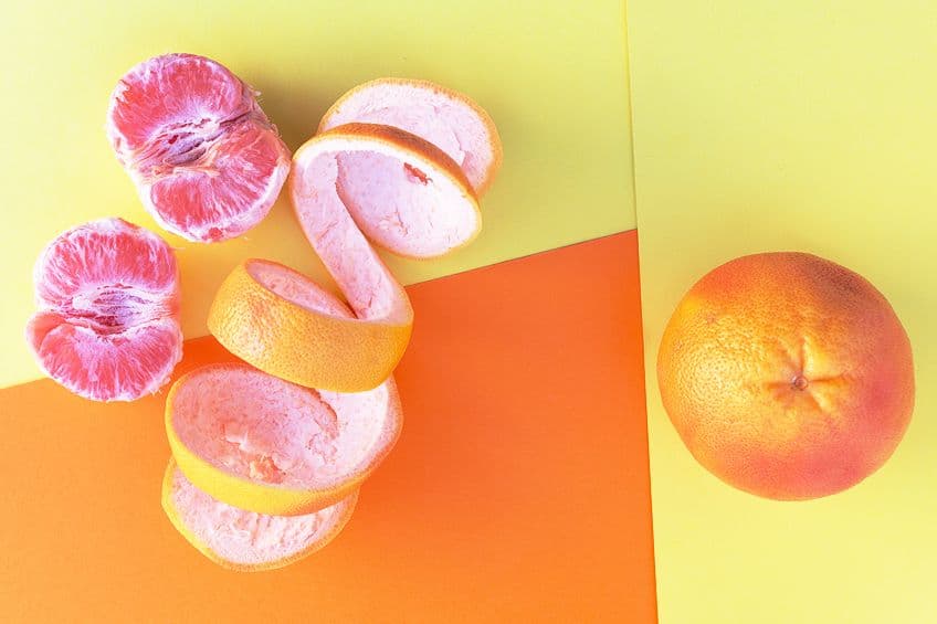
This means you can get warmer and cooler pinks. Let us have a look at some shades of pink that come from both these categories. You will notice we have provided the pink color codes, which include the pink hex codes for each of the colors we are about to discuss. How many shades of pink are there? There are numerous shades of pink, so we will only be dealing with a few of the more popular shades.
Hot Pink
One of the popular pink names is hot pink, a bright color that has very subtle cool undertones. The hot pink color has lots of energy, is bold, and stands out from the rest. The color is also vibrant, youthful, and stimulating. You will often see hot pink paired with black to produce a nice contrast. Hot pink also works well with shades of blue-green, yellow, white, and other lighter shades of pink.
A shade of hot pink named Viva Magenta was selected to be the 2023 color of the year by Pantone.

| Shade | Hex Code | CMYK Color Code (%) | RGB Color Code | Color |
| Pink | #ffc0cb | 0, 25, 20, 0 | 255, 192, 203 | |
| Hot Pink | #ff69b4 | 0, 59, 29, 0 | 255, 105, 180 | |
| Viva Magenta | #be3455 | 0, 73, 55, 25 | 190, 52, 85 |
Rose Pink
This color can be described as being a lighter reddish-purple, so it has subtle cool tones to it. The color is great to use as text on a black or dark background for graphic designs. It also offers some energy but is a little less vibrant than your hot pink.
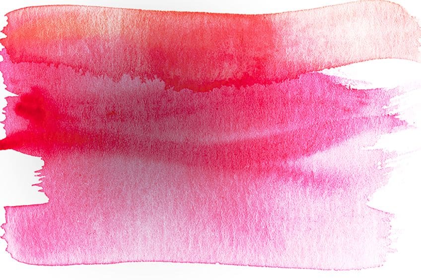
| Shade | Hex Code | CMYK Color Code (%) | RGB Color Code | Color |
| Pink | #ffc0cb | 0, 25, 20, 0 | 255, 192, 203 | |
| Rose Pink | #ff66cc | 0, 60, 20, 0 | 255, 102, 204 |
Coral Pink
Coral pink can also be described as a soft red, while the popular coral color is more of a pinkish orange. Both colors are fresh and have a softer feminine appeal. Since they have red and orange coming through, they are both considered warm tones of pink.

| Shade | Hex Code | CMYK Color Code (%) | RGB Color Code | Color |
| Pink | #ffc0cb | 0, 25, 20, 0 | 255, 192, 203 | |
| Coral Pink | #f88379 | 0, 47, 51, 3 | 248, 131, 121 | |
| Coral | #ff7f50 | 0, 50, 69, 0 | 255, 127, 80 |
Salmon Pink
The color of the flesh of the wild salmon is what you are getting with salmon pink, similar to the sushi you eat. The actual flesh color does consist of a range of pinkish-orange and light pink tones and can be seen as a lighter version of coral, making it a warm color as well. Salmon pink is considered a happy color and a sign of good health.
Some colors that work in contrast with salmon pink include various shades of green and blue-green.
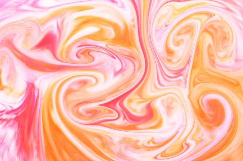
| Shade | Hex Code | CMYK Color Code (%) | RGB Color Code | Color |
| Pink | #ffc0cb | 0, 25, 20, 0 | 255, 192, 203 | |
| Salmon Pink | #fa8072 | 0, 49, 54, 2 | 250, 128, 114 |
Watermelon
On those hot summer days, some watermelon is a welcome treat. So, you will understand where the watermelon pink color comes from. It is also referred to as being a medium to dark pink that is on the warmer side. The color is also often referred to as simply a soft red.

| Shade | Hex Code | CMYK Color Code (%) | RGB Color Code | Color |
| Pink | #ffc0cb | 0, 25, 20, 0 | 255, 192, 203 | |
| Watermelon | #fc6c85 | 0, 57, 47, 1 | 252, 108, 133 |
Pastel Pink
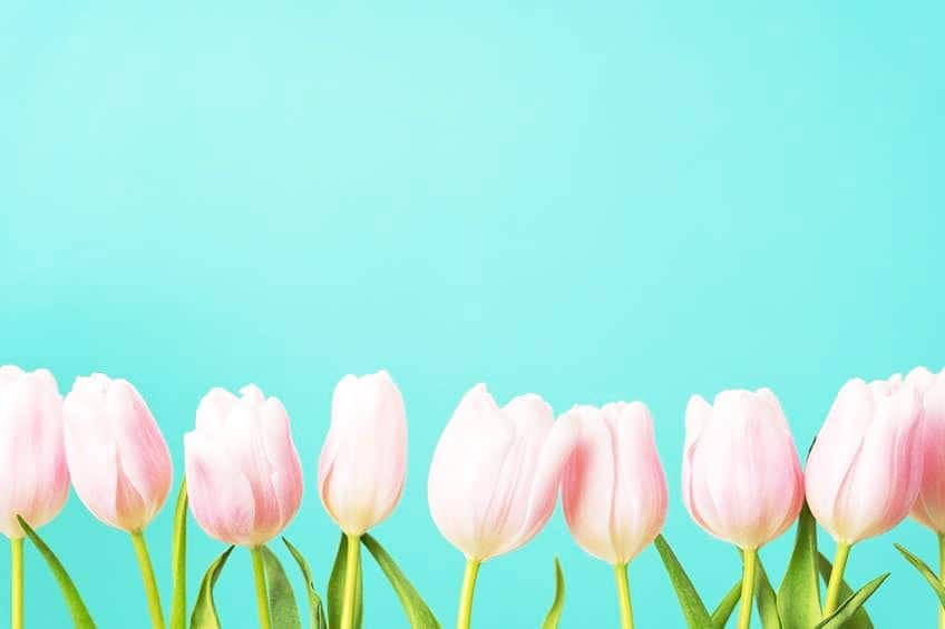
When choosing from the different types of pink, the pastel pink color is at the top of the list for the color that is associated with girls and all things girly, sweet, and calming. It is also often associated with Easter and is considered a lighter version of baby pink and light pink. Pastel pink is soft and a cool shade of pink. Light pink is also classified as a little girl’s color but is slightly darker and warmer than pastel pink.
Baby pink, which is also called tea rose, is a very soft red and falls between light pink and pastel pink. This particular shade of pink is also traditionally suited for baby girls.
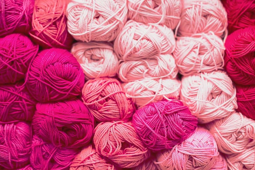
| Shade | Hex Code | CMYK Color Code (%) | RGB Color Code | Color |
| Pink | #ffc0cb | 0, 25, 20, 0 | 255, 192, 203 | |
| Pastel Pink | #ffd1dc | 0, 18, 14, 0 | 255, 209, 220 | |
| Light Pink | #ffb6c1 | 0, 29, 24, 0 | 255, 182, 193 | |
| Baby Pink | #f4c2c2 | 0, 20, 20, 4 | 244, 194, 194 |
Blush Pink
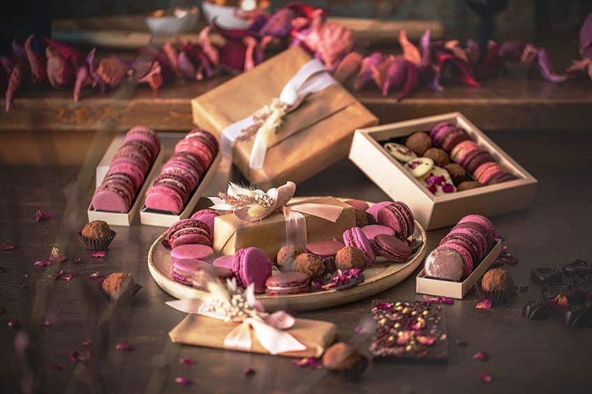
The blush pink color has become a very popular interior design color, as it has a certain earthy appeal and can work wonderfully with any neutral color. Blush pink also looks amazing paired with other rich colors like navy blue and shades of green. Looking for a more fun combination, try a selection of oranges and reds to create an inviting and warm space.
| Shade | Hex Code | CMYK Color Code (%) | RGB Color Code | Color |
| Pink | #ffc0cb | 0, 25, 20, 0 | 255, 192, 203 | |
| Blush Pink | #de5d83 | 0, 58, 41, 13 | 222, 93, 131 |
Best Pink Color Combinations
Pink is considered a shade of red, so should be able to pull off similar color combinations. Pink pairs great with neutral colors, such as white and gray as well as black. When observing the color wheel, you can determine a few color combinations. This can also easily be done by numerous online websites, where you simply paste in the color hex code and all the information and color combinations automatically come up. However, to understand how the program gets to these colors, let us have a look at the main color combinations.
Complementary Pink Colors
If you type in the word “color wheel” in a search engine online, you will get a variety of options. When choosing one, search for the color you want, for example, pink, and observe the color directly opposite. This color will be the complementary color. The split complementary colors are also found directly on either side of the main complementary color.
When you place your chosen color and its complementary colors alongside each other, you will notice they seem to stand out.
This means the colors are contrasting. The complementary color for our pink is a pale cyan color. However, pink can also work with various shades of blue, green, and blue-green, such as turquoise. This is a bold combination, so consider using paler shades of both, or choose one as your main color and use the other as an accent.
| Shade | Hex Code | CMYK Color Code (%) | RGB Color Code | Color |
| Pink | #ffc0cb | 0, 25, 20, 0 | 255, 192, 203 | |
| Pale cyan | #c0fff4 | 25, 0, 4, 0 | 192, 255, 244 | |
| Turquoise | #30d5c8 | 77, 0, 6, 16 | 48, 213, 200 |
Analogous Pink Colors
You will find pink, red, yellow, and orange on the same side of the color wheel. Analogous colors are combinations with neighboring colors in the color wheel. This creates a less contrasting color scheme and uses a more uniform color combination, with similar colors. However, some combinations might appear to clash, for example, pink and orange.
But by using the correct amount of each color and the proper tone, as well as bringing in more neutral tones, you can make it work beautifully.
The combination can add warmth and a sense of playfulness to a design. Our pink has pale pink and orange as analogous colors. However, you can also try more vibrant pinks and oranges, such as fuchsia, coral, and burnt orange.
| Shade | Hex Code | CMYK Color Code (%) | RGB Color Code | Color |
| Pink | #ffc0cb | 0, 25, 20, 0 | 255, 192, 203 | |
| Pale Pink | #ffc0eb | 0, 25, 8, 0 | 255, 192, 235 | |
| Pale Orange | #ffd5c0 | 0, 16, 25, 0 | 255, 213, 192 | |
| Fuchsia | #ff00ff | 0, 100, 0, 0 | 255, 0, 255 | |
| Coral | #ff7f50 | 0, 50, 69, 0 | 255, 127, 80 | |
| Burnt Orange | #cc5500 | 0, 58, 100, 20 | 204, 85, 0 |
Monochromatic Pink Colors
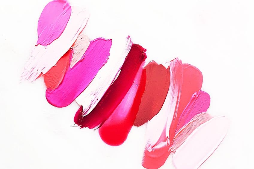
Monochromatic color schemes are simple and easy to accomplish, as it works by using the different shades and tints of one color like pink. So, you can use darker pinks and lighter pinks to create a color scheme with more depth and harmony. The dark pink has cooler undertones and warmer overtones, making it ideal to use in all cases.
| Shade | Hex Code | CMYK Color Code (%) | RGB Color Code | Color |
| Pink | #ffc0cb | 0, 25, 20, 0 | 255, 192, 203 | |
| Dark Pink | #e75480 | 0, 64, 45, 9 | 231, 84, 128 | |
| Light Pink | #ffb6c1 | 0, 29, 24, 0 | 255, 182, 193 |
Triadic Pink Colors
Triadic colors are as the name implies, three colors that can be found on the color wheel and represent an equal-sided triangular form. This type of color scheme also forms a contrast and must be used prudently. The best way is to choose your main color and use the others as accent colors to create a balanced look. Pink helps to soften the green and warms up the green tone, while the green brings in an earthy grounded look. To create a luxurious appeal, you can use blue with pink, the blue adds calmness and is cooling, while the pink warms up the blue.
Darker blues can also be used to tone down more vibrant shades of pink.
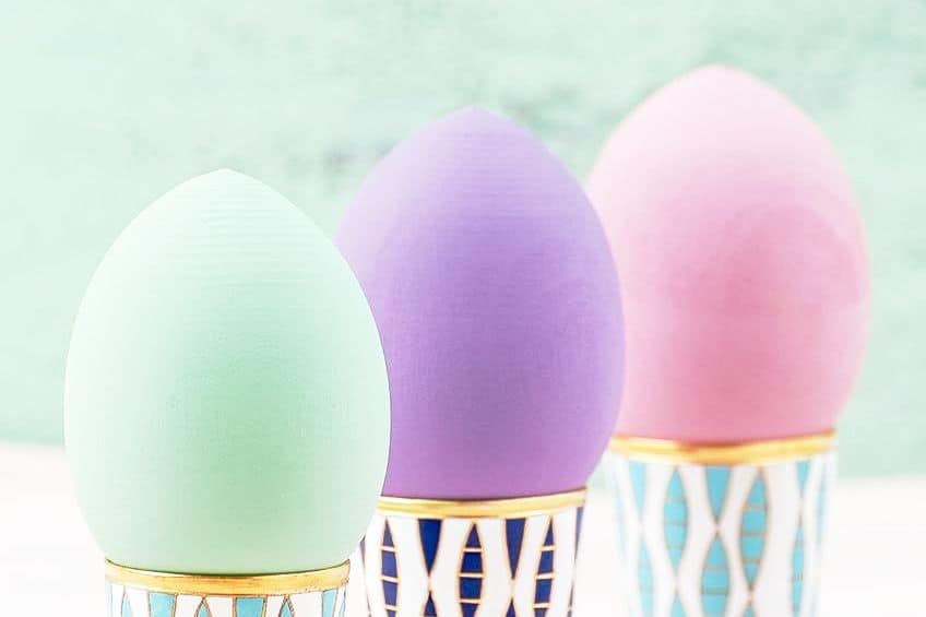
Our pink has a pale lime green and pale blue forming its three-color combination. Again, you can use different shades of pink, blue, and green. Consider olive green and navy blue with pink. Olive green and pink is a captivating and balanced combination and is a classic pairing that seems to be popular with interior designers who want to create a modern look. Navy blue and pink is another classic and sophisticated pairing that works harmoniously and is a popular wedding color combination.
| Shade | Hex Code | CMYK Color Code (%) | RGB Color Code | Color |
| Pink | #ffc0cb | 0, 25, 20, 0 | 255, 192, 203 | |
| Pale Lime Green | #cbffc0 | 20, 0, 25, 0 | 203, 255, 192 | |
| Pale Blue | #c0cbff | 25, 20, 0, 0 | 192, 203, 255 | |
| Olive Green | #bab86c | 0, 1, 42, 27 | 186, 184, 108 | |
| Navy Blue | #000080 | 100, 100, 0, 50 | 0, 0, 128 |
Mixing Pink Color Acrylic Paints
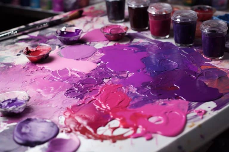
The simple answer to this is to blend red and white to create a shade of pink. However, there are some things you need to consider. First, you can purchase a ready-made tube of pink paint, but many artists prefer to mix their own paint. By doing this, you can also guarantee you get the shade of pink you need. Looking at paints, many have different undertones, so mixing a certain color can easily go wrong by using the wrong types of pink.
Deciding on the type of pink will determine if the colors are going to appear cooler or warmer. Hot pink colors can be mixed by using Quinacridone red or magenta, mixed with zinc white.
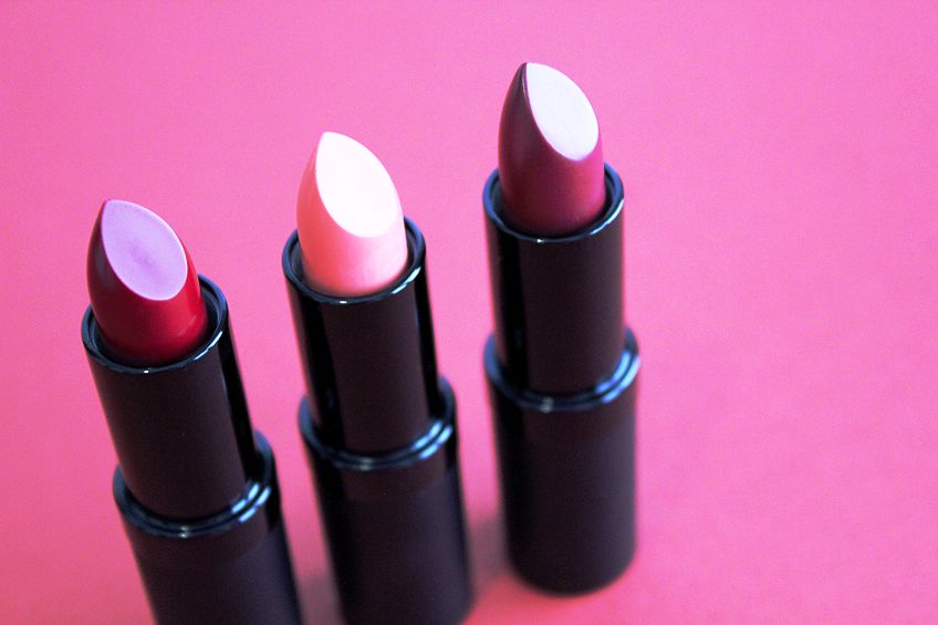
Pinks with more of a peach or orange undertone will work best with Titanium White and an orange-red like Naphthol Light Red. Cadmium red paints have an earthy appeal and create more desaturated pinks when mixed with white. Cadmium medium red also produces a pink with an orange undertone, while cadmium dark red will produce a pink with a subtle blue undertone. The next few steps should help you with mixing pink colors.
Step One
Prepare your work area and make sure you have all your paints and brushes and other tools ready. When experimenting with creating various shades of pink, always create a color chart for easy future reference.
Step Two
Place a little red and white paint of your choice onto your palette. Begin by always adding red to white to create pink. Add small amounts of red until you reach the desired pink color. Experiment with the various shades of red to see what type of pink you can make. Do not add white to red, as this will use up more paint and take up more time.

Step Three
If you have added too much red, you can always lighten and brighten it by adding more white. If you wish to darken the pink color, consider adding in small amounts of its complementary color, which can be a dark green or blue instead of black.
The Pink Color in Fashion and Interior Design
Today, all types of pink can be seen in graphic designs, advertising, fashion, and interior design. Not only is it a color solely for women, but men are also now jumping in on wearing the color. To help stimulate some creative thoughts, let us have a look at a few pink fashion and interior design ideas.
Pink Color Fashion Ideas
Pink can be worn by anyone if you select the correct tone and shade. The pink color also offers more warmth than traditional neutral colors like white or beige. Pink can be worn quite successfully, however, too bright, and too much can become part of the Barbie family. So, below you will discover a few tips on how to wear pink.
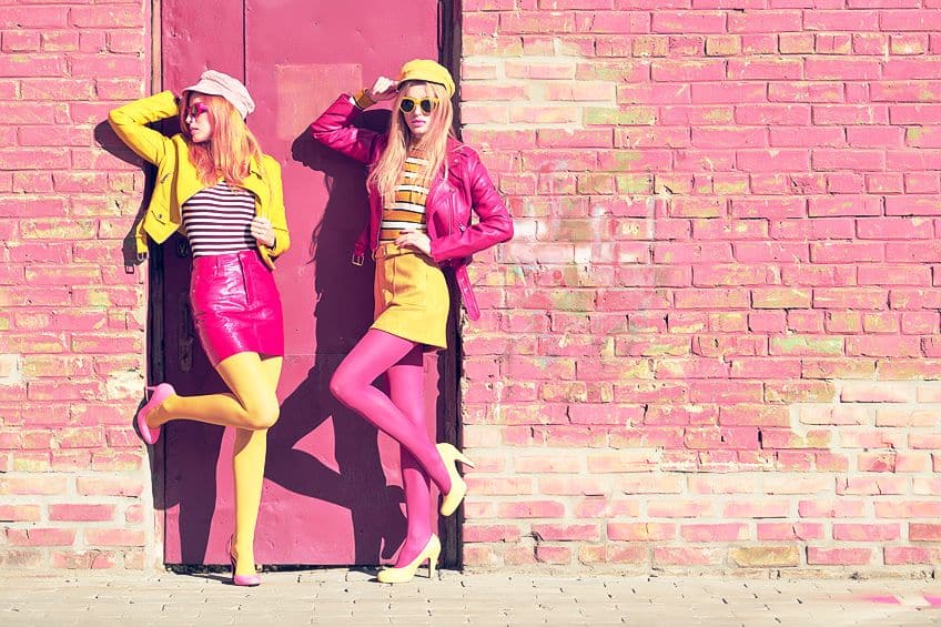
- Pink can work with many colors, but some can also clash. Try pairing pink with dark tones, such as navy to produce a sophisticated look. Pair with cobalt blue to stand out.
- If you want to add energy, pair it with orange or red. Remember to choose proper proportions, so it does not clash too much.
- To tone down pink and create a more elegant look, pair pink with gray.
- You can also soften pink when it is paired with beige, which also produces a more professional look.
- Various shades of green can also add a more natural look.
- Simply pair it with traditional white for a fresh and confident look.
- Add gold or silver accessories to enhance a more elegant outfit.
- Find patterned clothing with pink to wear with a solid color.
- You do not have to go for an entire outfit in pink, begin using it as an accent color. For example, a pink handbag or jacket, all of which still makes a statement. It can also be a simple pair of earrings.
- Try layering different shades of pink, for example, a pale pink with paired with a more vibrant fuchsia. You can also try a monochromatic look.
- Understand what shade of pink goes with your skin tone. Warm pinks for those with warm or golden undertones, and cool shades for skin that has cooler bluish undertones.
Pink Color Interior Design Ideas
You might think that pink should be relegated to girls’ bedrooms, but it has gained more popularity over the years and is now a popular color for most rooms in the home. When used properly it can create an elegant and warm environment, which is great for areas like the living room. Pink is also good at lifting the mood, even if only used as a statement piece. Pink and white are again a classic pair, which is simple and bold at the same time. Depending on the shade of pink used, you can keep it neutral or go bold and with something like a Fuschia-colored rug.
Lighter or much paler shades of pink are generally used on walls, as it does not overpower a space.
The pale pink is also a little more interesting, different, and warmer than the usual beige, taupe, or white. Keep it neutral by adding beige, shades of gray, and white, or even a little black. To keep the look balanced, you can also consider layering different pink shades. If you are looking for a bit more color, try pairing the lighter pinks with the darker navy blue or other jewel tones. If pink seems too much all over the walls in any shade, it can easily be brought in as a fun accent color. Think of pink cushions, throws, rugs, art pieces, curtains, or even a couch.

You could even add only a touch of pink by using flowers. Bring in patterns, such as wallpaper with pink or a patterned headboard for the bedroom. The pink shade chosen for a room depends on a few things. For example, where is the room situated, what time of the day do you use the room, and is there natural or artificial lighting in the room? Soft pinks, with peachy undertones, are great for north-facing rooms, to help warm things up. When choosing a shade of pink for your room, it is a good idea to test out different tones of pink. Make sure to observe what it looks like during different times of the day. This can only help you to select the perfect shade of pink.
The pink color can create both a classic and contemporary look, depending on the shade of pink chosen and the color combinations used. Pink can be a calming and energizing color, and as we have learned, quite a versatile color. Today, pink is not something that is only for painting a baby girl’s room; there is a lot more to the color than that!
Frequently Asked Questions
How Many Shades of Pink Are There?
There are numerous pink color names and shades of pink to pick out. Some pink names include pink coral and salmon pink, which have warmer undertones, and hot pink or rose pink, which are considered cooler pink shades. The general definition of pink is that it is a lighter shade of red.
What Is the Color Meaning of Pink?
In general, pink is playful, nurturing, calming, romantic, feminine, and sensitive. Pink can have dual meanings, depending on the shade of pink chosen. Lighter pinks are more calming and soothing, while brighter pinks are more energetic and playful.
What Colors Work Well With Pink?
Many colors go well with pink, especially neutrals like white, black, and gray. To add contrast, shades of blue and green work wonderfully. You can also pair pink with shades of orange and yellow for a more energetic and playful combination.
In 2005, Charlene completed her Wellness Diplomas in Therapeutic Aromatherapy and Reflexology from the International School of Reflexology and Meridian Therapy. She worked for a company offering corporate wellness programs for a couple of years, before opening up her own therapy practice. It was in 2015 that a friend, who was a digital marketer, asked her to join her company as a content creator, and this is where she found her excitement for writing.
Since joining the content writing world, she has gained a lot of experience over the years writing on a diverse selection of topics, from beauty, health, wellness, travel, and more. Due to various circumstances, she had to close her therapy practice and is now a full-time freelance writer. Being a creative person, she could not pass up the opportunity to contribute to the Art in Context team, where is was in her element, writing about a variety of art and craft topics. Contributing articles for over three years now, her knowledge in this area has grown, and she has gotten to explore her creativity and improve her research and writing skills.
Charlene Lewis has been working for artincontext.org since the relaunch in 2020. She is an experienced writer and mainly focuses on the topics of color theory, painting and drawing.
Learn more about Charlene Lewis and the Art in Context Team.
Cite this Article
Charlene, Lewis, “Pink Color – Understanding the Different Pink Color Undertones.” Art in Context. May 31, 2023. URL: https://artincontext.org/pink-color/
Lewis, C. (2023, 31 May). Pink Color – Understanding the Different Pink Color Undertones. Art in Context. https://artincontext.org/pink-color/
Lewis, Charlene. “Pink Color – Understanding the Different Pink Color Undertones.” Art in Context, May 31, 2023. https://artincontext.org/pink-color/.


