Persimmon Color – Explore the Adventurous Shades of Orange
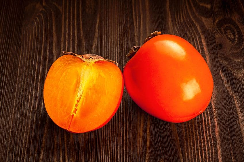
If you go shopping at your local fresh food market, you might have come across something that resembles a tomato but is just not the right color. This would be a persimmon. Persimmon is not a tomato but a fruit that produces its own distinctive color that helps you identify it. So, what color is persimmon, and where can you use the color? Read further to discover all about this appealing and invigorating color!
What Color Is Persimmon?
The persimmon color can be described as a vibrant reddish-orange. The colors below are examples of different shades of persimmon, one more vibrant, while the other is a much softer version of persimmon. In a design, you can use these to form a monochromatic color palette. The persimmon color is identified using the hex code #ec5800, which will display a vivid orange with a high saturation level.
| Shade | Hex Code | CMYK Color Code (%) | RGB Color Code | Color |
| Persimmon | #ec5800 | 0, 63, 100, 7 | 236, 88, 0 | |
| Soft Persimmon | #d9987c | 0, 30, 43, 15 | 217, 152, 124 |
Persimmon Color: A Brief History
The persimmon fruit, which grows on a tree is native to certain areas of India and China. The fruit is said to be juicy, and sweet, with a slight acidic flavor. What color is a persimmon? The persimmon color is said to resemble the flesh of the fruit and can be anything from a more vibrant to a softer shade of orange.
The color was first recorded in English in 1922, in the Maerz and Paul Dictionary of Color.
Meaning of the Persimmon Color
The persimmon color is a shade of orange, so shares similar meanings. So, persimmon is associated with warmth, happiness, excitement, energy, and good health. The color is also seen as an adventurous color that helps to encourage and uplift. Softer or darker shades of persimmon can also be more inviting and calming and are not as overpowering as a more vibrant orange. Persimmon can also be associated with creativity and spontaneity, but if used too much, can become domineering.
Other negative associations can include impatience and being superficial.

Similar Shades of Persimmon
Persimmon is an orange that is named after the fruit and is not the only similar color in the orange family. Other similar colors that also have links to nature and food include some of the following, for example, pumpkin, saffron, tangerine, and orange peel.

| Shade | Hex Code | CMYK Color Code (%) | RGB Color Code | Color |
| Persimmon | #ec5800 | 0, 63, 100, 7 | 236, 88, 0 | |
| Pumpkin | #ff7518 | 0, 54, 91, 0 | 255, 117, 24 | |
| Saffron | #f4c430 | 0, 20, 80, 4 | 244, 196, 48 | |
| Tangerine | #f28500 | 0, 45, 100, 5 | 242, 133, 0 | |
| Orange Peel | #ff9f00 | 0, 38, 100, 0 | 255, 159, 0 |
What Colors Go With Persimmon?
There are a few shades of persimmon you can play around with, depending on the look you wish to achieve. You can go for the more vibrant option if you want to add bold colors or choose a lighter or softer version to create a more calming and inviting look. Most colors also work well with neutral colors, such as black, white, beige, brown, and gray. Whatever you choose, you can use the various color combinations available to help you out, as seen in some of the more popular combinations below.
Complementary Colors
When you deal with color theory and the color wheel, you can find complementary colors very easily. Simply choose your color or hue and then locate the color sitting opposite it. When these colors are paired, they form contrasting colors. For persimmon, you can use various shades of blue and blue-green like turquoise.
| Shade | Hex Code | CMYK Color Code (%) | RGB Color Code | Color |
| Persimmon | #ec5800 | 0, 63, 100, 7 | 236, 88, 0 | |
| Blue | #0094ec | 100, 37, 0, 7 | 0, 148, 236 | |
| Navy | #000080 | 100, 100, 0, 50 | 0, 0, 128 | |
| Turquoise | #00ced1 | 100, 1, 0, 18 | 0, 206, 209 |
Analogous Colors
Analogous colors form a more harmonious color combination, as the colors share certain characteristics. So, if you take persimmon and you search for colors that are positioned next to it, you can use various shades of red and yellow. For example, since this particular persimmon color is quite bold, consider softer or pastel shades of red and yellow.
| Shade | Hex Code | CMYK Color Code (%) | RGB Color Code | Color |
| Persimmon | #ec5800 | 0, 63, 100, 7 | 236, 88, 0 | |
| Pastel Red | #ff6961 | 0, 59, 62, 0 | 255, 105, 97 | |
| Pastel Yellow | #fdfd96 | 0, 0, 41, 1 | 253, 253, 150 |
Triadic Colors
Triadic colors are also contrasting in nature and should be used carefully. Choose your main color, such as persimmon and the other two colors form an equal-sided triangle shape when all of them are connected on the color wheel. This and other color combinations can easily be created by various online color tools, all you usually need is the color hex code.
For the persimmon color, consider options like lavender and mint green.

| Shade | Hex Code | CMYK Color Code (%) | RGB Color Code | Color |
| Persimmon | #ec5800 | 0, 63, 100, 7 | 236, 88, 0 | |
| Lavender | #b093bf | 8, 23, 0, 25 | 176, 147, 191 | |
| Mint Green | #98ff98 | 40, 0, 40, 0 | 152, 255, 152 |
Persimmon Interior Color Schemes
When using persimmon in the home, remember that you can opt for a variety of tones and shades. You can choose a softer or more neutral color to paint the walls with or go for a more vibrant choice with an accent wall. You can also consider wallpaper that features the persimmon color. This can provide you with a warm color, without it being too overwhelming. If you love the persimmon color but do not wish to go all out with it, you can also bring in simple touches of persimmon color through various accessories.
This means you can add persimmon color to any room. Create a more subtle look with warm touches of color through cushions, furniture, art pieces, lamps, rugs, and throws, among other items. You can even add color to door frames, which provides a pop of color and does not overpower the room.
Being a shade of orange, persimmon can work nicely with natural elements, such as green plants and wood furnishings, or even wicker. This helps introduce different textures, making the rooms overall look more interesting. You can also play with a range of different fabrics for the upholstery to add more texture. The persimmon color, again, being a shade of orange, aids in stimulating the appetite. So, it is the perfect color for the kitchen or dining areas.

Consider kitchen cabinets or simply bring in the color through kitchen accessories, for example, kettles, mixers, and mugs. You can also use the persimmon color in the bedroom, creating a warm and inviting feel. However, it is quite an energizing color, so it is best used as a softer tone or brought in as an accent color. Using a brighter color on the walls might seem like a good idea at the time, but it will most likely begin to irritate or become uncomfortable in a space where you are looking for relaxation.
If you love the summer look, the persimmon color is the perfect choice. However, it is also an ideal warm color for those cold winter months, making the persimmon color quite versatile depending on how you use it. Persimmon is a happy color that can easily bring warmth and a little joy to any room in the home!
Frequently Asked Questions
What Color Is Persimmon?
What color is a persimmon? The persimmon is where the color name originated from, as the color is the same as the flesh of the persimmon fruit. The color can be described as a reddish-orange.
What Colors Go With Persimmon?
Persimmon is a shade of orange and will always go well with neutral colors like white, gray, brown, and beige. For contrast, you can use orange with different shades of blue and green. It can also go with similar tones like yellow, red, and pink if used properly.
How Can You Use the Persimmon Color?
Depending on what message or feeling you wish to create, the persimmon color can be used in a wide range of applications. This includes interior designs, but it can also be used in fashion outfits, website designs, and other advertising campaigns.
In 2005, Charlene completed her Wellness Diplomas in Therapeutic Aromatherapy and Reflexology from the International School of Reflexology and Meridian Therapy. She worked for a company offering corporate wellness programs for a couple of years, before opening up her own therapy practice. It was in 2015 that a friend, who was a digital marketer, asked her to join her company as a content creator, and this is where she found her excitement for writing.
Since joining the content writing world, she has gained a lot of experience over the years writing on a diverse selection of topics, from beauty, health, wellness, travel, and more. Due to various circumstances, she had to close her therapy practice and is now a full-time freelance writer. Being a creative person, she could not pass up the opportunity to contribute to the Art in Context team, where is was in her element, writing about a variety of art and craft topics. Contributing articles for over three years now, her knowledge in this area has grown, and she has gotten to explore her creativity and improve her research and writing skills.
Charlene Lewis has been working for artincontext.org since the relaunch in 2020. She is an experienced writer and mainly focuses on the topics of color theory, painting and drawing.
Learn more about Charlene Lewis and the Art in Context Team.
Cite this Article
Charlene, Lewis, “Persimmon Color – Explore the Adventurous Shades of Orange.” Art in Context. September 28, 2023. URL: https://artincontext.org/persimmon-color/
Lewis, C. (2023, 28 September). Persimmon Color – Explore the Adventurous Shades of Orange. Art in Context. https://artincontext.org/persimmon-color/
Lewis, Charlene. “Persimmon Color – Explore the Adventurous Shades of Orange.” Art in Context, September 28, 2023. https://artincontext.org/persimmon-color/.


