Aesthetic Color Palettes – Most Harmonious Color Combinations
When using the word aesthetic, we are trying to describe something beautiful, pleasing, or appealing in appearance. So, this is exactly what aesthetic color palettes are, a combination of colors that is pleasing to the eye. But how do you find these aesthetic colors? In this article, we will be finding out how you can create the best aesthetic color schemes.
How to Create Aesthetic Color Schemes
No matter what you are designing, whether it is a logo, a website, or even a room, the nature of a design is created by the colors you choose. By understanding color theory and how to create the best color combinations, you can showcase your personality and affect how people feel about your product, service, or space.
Color Theory
We begin with color theory, as this is the foundation from which everything stems. Once you have grasped the basics, you can experiment and try all kinds of color combinations. Color theory helps determine what colors work well together. The main tool for this to work, is the color wheel, a circular representation of colors from your primary to your secondary and tertiary colors. There are also various tints, shades, hues, and tones for each color.
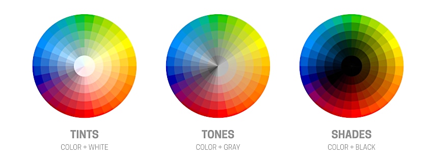
- Tint: A tint is the addition of white, making the color lighter, but not necessarily brighter.
- Shade: This is the addition of black to a color, which creates a darker and more intense color.
- Hue: The hue is the actual pure color that contains no shades or tints. By adding, for example, a tint, this is a variation of your original hue or color.
- Tone: Take a hue and add in some gray to create a tone.
You get different types of color wheels. The basic, RGB model is based on pigment colors, while the CYMK color model is based on the behavior of light.
- RGB: This uses additive colors, with red, green, and blue, being the primary hues. This is used for television screens, computer, and mobile phone screens.
- CMYK: This is a subtractive color model in which cyan, magenta, yellow, and black are the primary colors. This is used for printing purposes.
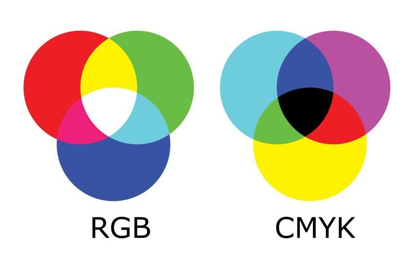
Next, you come to the various terms describing how to create color harmony. Color combinations create either a pleasing contrast or are colors that are easy to look at and relate to each other. If you use too many colors or they do not go well together, then the outcome will appear chaotic and hard to look at. Also, when creating aesthetic color palettes, using two to three colors is easier than having four or more colors, which can become more challenging to use.
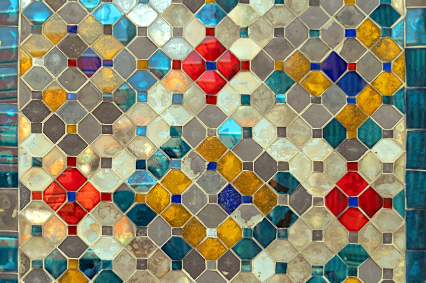
The one rule many designers use is the 60:30:10 rule, where you choose a dominant color, which will be your main color, and two accent colors that are used less.
Below are the recommended color combinations available. These combinations are located on a color wheel, where you have your primary, secondary, tertiary, and other color variations in-between.
- Complementary color combinations: First, choose your main color and then find the color opposite on the color wheel, this is the complementary color. You can also get split complementary color
- Triadic color combinations: These colors form an even triangular form on the color wheel. Similar to this, is the square and tetradic color combinations, which involve four colors.
- Analogous color combinations: Colors that are found close to or next to one other.
- Monochromatic color combinations: Take a single color and create variations of this same color.
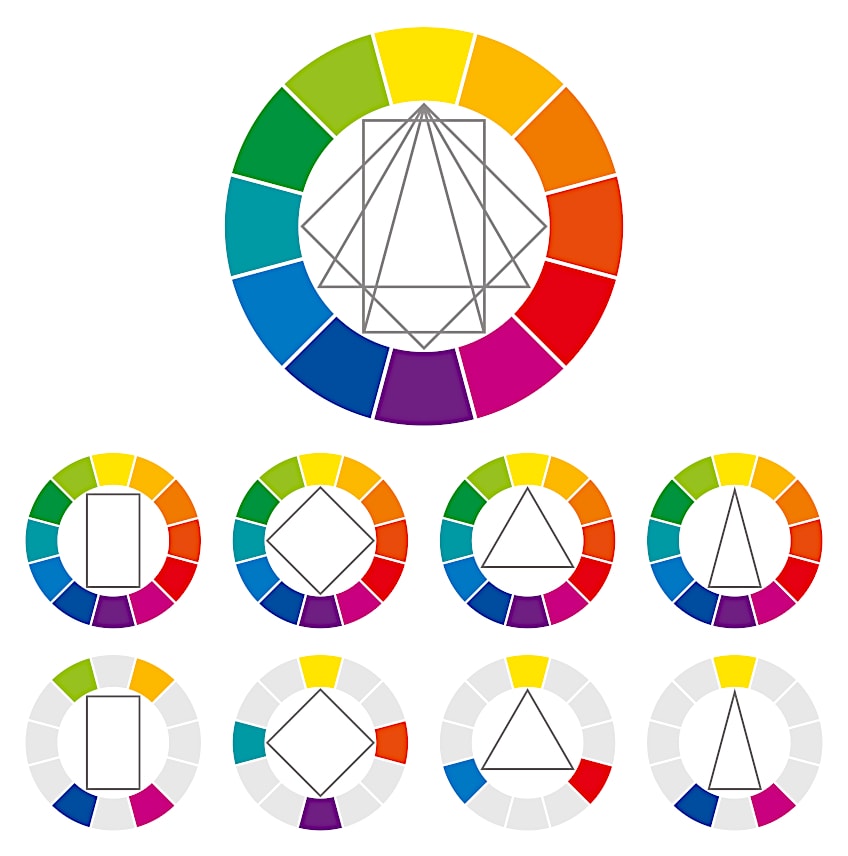
Complementary colors and triadic color combinations create contrasts in color, while the similarities in analogous and monochromatic combinations are easier on the eye.
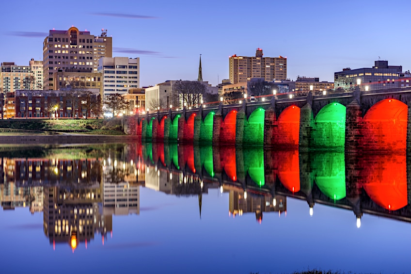
Color Psychology
There is also more than meets the eye when choosing colors. We might not even know it, but colors can affect how we feel. This can be due to the general associations of each color, but there are also cultural and personal meanings and preferences. So, if you are trying to develop brand colors, it can be a slightly challenging process.

Color psychology involves studying colors and how they affect behavior. We try to discover and explain why certain colors affect emotions, decisions, behaviors, and sometimes colors can even have physiological effects. For example, some colors can help to stimulate appetite. Everyone may also interpret color differently, depending on culture, age, gender, and individual experiences among others. Colors are used as a way of communication, so understanding color theory and reading up on the various meanings that colors have can go a long way in helping you determine the best colors for your project.
It is also good to remember that colors have good as well as bad associations. For example, blue can be both relaxing and depressing.
Color Temperature
Another element of color theory includes color temperatures. Each color can be categorized as having a color bias or temperature, which can also affect how a color feels. We can all determine these color temperatures quite easily. Cool colors are your blues, greens, as well as purples, while warmer colors are your reds, oranges, and yellows.
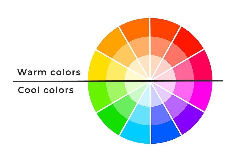
The cooler colors are mostly seen as calming and soothing and are associated with things like water, sky, and forests. When using these colors, they tend to recede. The warmer colors are more vibrant and stimulating, and they attract your attention and can become overpowering if overly used. Warm colors are associated with things like the sun, light, and heat. Sometimes, things are not always cut and dry as you can also get what appears to be a warm color, which has a cool undertone, and vice versa.

Reactions to Different Colors
Some colors are inherently soothing, like blues and greens. However, other colors like pink or yellow muted or pastel colors can also have a calming effect. Brighter pinks, on the other hand, are not calming and are more energizing. Brighter and lighter colors tend to be happier and more fun colors, which can include the usual orange and yellow colors, but certain shades of green and blue can also be uplifting. Darker colors and muted colors may lean more towards being gloomy, for example, a dark gray.
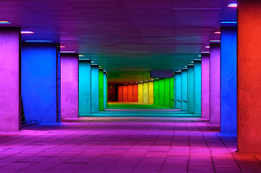
However, some blue or green shades can also have this kind of effect. As mentioned, in many cases, the reaction to color can depend on the culture. For example, some view black as being a color of mourning, however, other cultures see white as the color of mourning.
This is a whole other dimension to color with a pivotal role in how people will respond design. You need to choose wisely to achieve your desired effect.
Generating Color Palettes
You can do your homework and create aesthetic color palettes from scratch by experimenting and playing around with different color combinations. However, there is an easier way to create color palettes. There are numerous color palette generators online. All you have to do is place your main theme color in and the program will come up with various color combination options for you. Below are a few recommendations.
Popular Aesthetic Color Palettes
Now that we have dealt with some of the technical issues of creating aesthetic colors, let us now explore a few of the more popular aesthetic color palettes. These can be simple color combinations of only two colors and more complex color combinations of up to five different colors.
Two- and Three-Color Combinations
Designs, be it for a clothing line, a website, or painting your bedroom, is all a personal decision. However, there is a bigger difference between interior home designs and marketing materials. One is mainly for personal use, and you can go a bit wild in your choices, while the other needs closer attention, as it is done more to attract others to your business. So, the best route to follow would be not to go overboard. In most cases, less is more.
Green and Blue
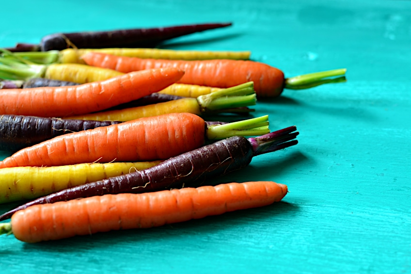
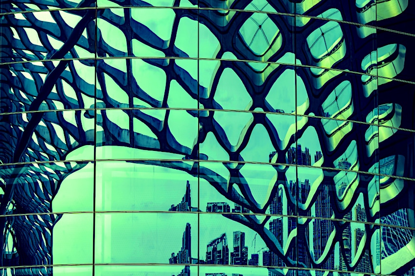
Green is a refreshing color that is mostly associated with renewal and growth, while blue is calming and a popular color that people tend to trust. There are numerous varieties of each color, so you should look for ones that suit your needs. The color combination below is mint green and navy blue, a bold, refreshing, and sophisticated pairing. The navy blue stands out, while the mint green adds a toned-down touch, and helps to highlight the blue more. Any other lighter shades or pastels colors like yellow or pink would also go well with the navy blue.
| Shade | Hex Code | CMYK Color Code (%) | RGB Color Code | Color |
| Mint Green | #98ff98 | 40, 0, 40, 0 | 152, 255, 152 | |
| Navy Blue | #000080 | 100, 100, 0, 50 | 0, 0, 128 |
Yellow and Violet
These are opposite on the color wheel and provide a beautiful contrast, a color combination that is quite striking. Yellow and violet are both colors associated with optimism as well as confidence, and both are uplifting and motivating. There are many companies as well as sporting teams that use this color combination to great effect.
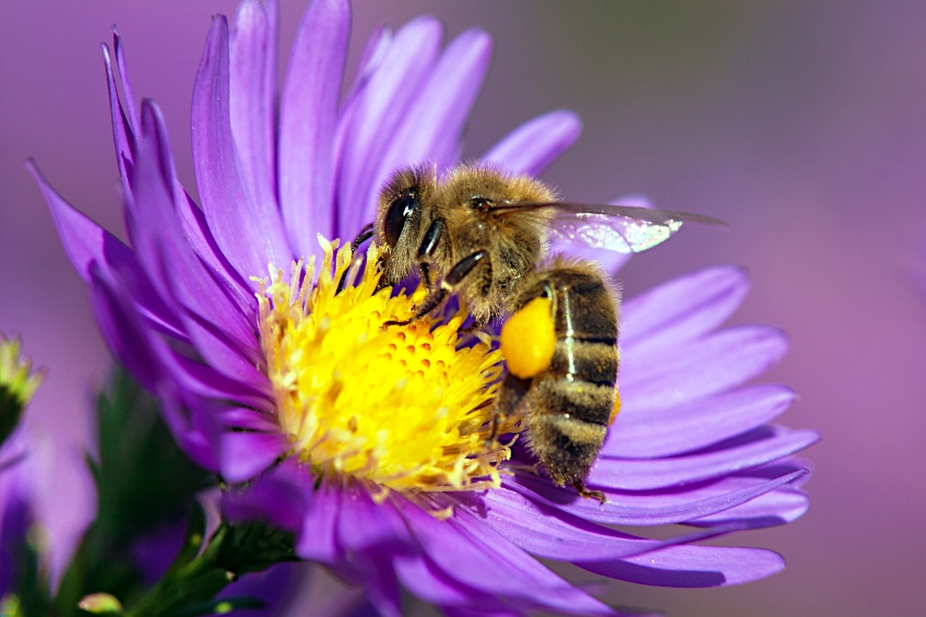
| Shade | Hex Code | CMYK Color Code (%) | RGB Color Code | Color |
| Yellow | #ffff33 | 0, 0, 80, 0 | 255, 255, 51 | |
| Violet | #9933ff | 40, 80, 0, 0 | 153, 51, 255 |
Lavender and Indigo
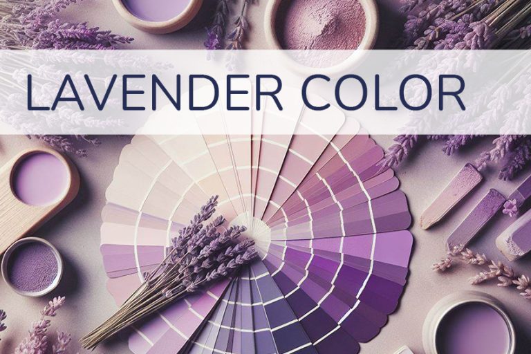
These colors are quite similar and may even be mistaken for each other on occasion. However, lavender has more of a purple undertone, while indigo leans towards blue. Lavender provides a sense of purity and calm, while indigo brings in more of a creative and bold flair. This color combination is quite popular as part of wedding color themes.
| Shade | Hex Code | CMYK Color Code (%) | RGB Color Code | Color |
| Lavender | #9873ac | 12, 33, 0, 33 | 152, 115, 172 | |
| Indigo | #4b0082 | 42, 100, 0, 49 | 75, 0, 130 |

Yellow, Red, and Blue
A combination of all the primary colors can make a striking appearance. They work well and create a wonderful contrast. Red is the color that attracts your attention, yellow is inspirational and encouraging, and blue is calming. The pure primary colors can work well in something like a logo but might be a bit more challenging when it comes to interior design. For this, you can try using one vibrant dominant color, and then tone down the other two.
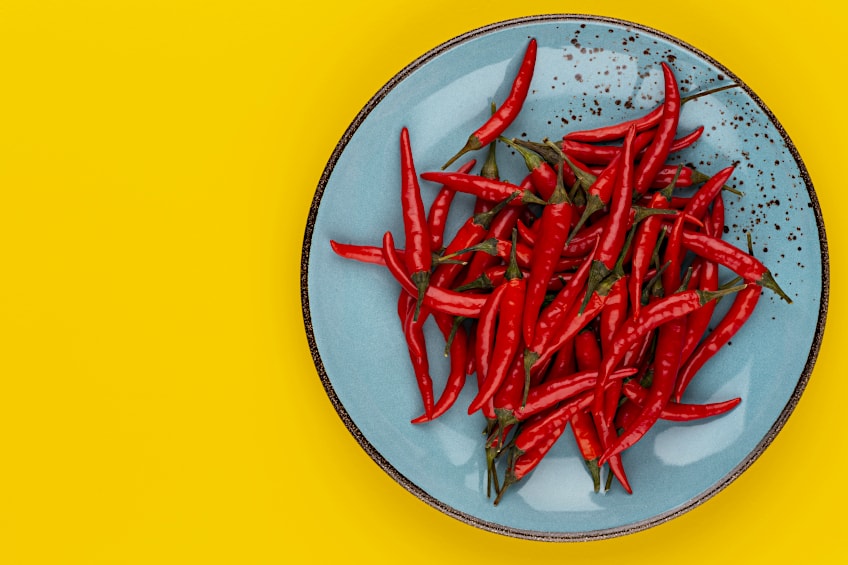
| Shade | Hex Code | CMYK Color Code (%) | RGB Color Code | Color |
| Yellow | #ffff4d | 0, 0, 70, 0 | 255, 255, 77 | |
| Red | #ff4d4d | 0, 70, 70, 0 | 255, 77, 77 | |
| Blue | #4d4dff | 70, 70, 0, 0 | 77, 77, 255 |
Purple, Green, and Orange
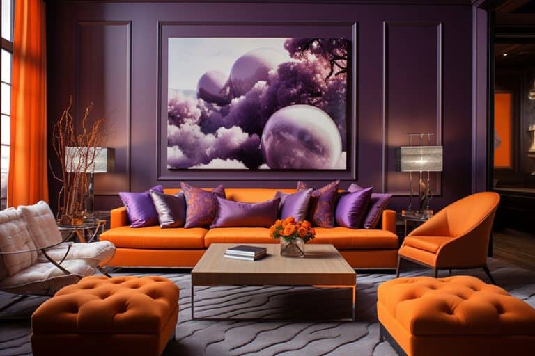
This aesthetic color combination works well and creates a balance as well as a nice contrast. Again, we suggest using the main color, with two accent colors. This is to prevent all these vibrant colors from becoming too much. Whatever design you create, you want to invite people in, and not make them uncomfortable.
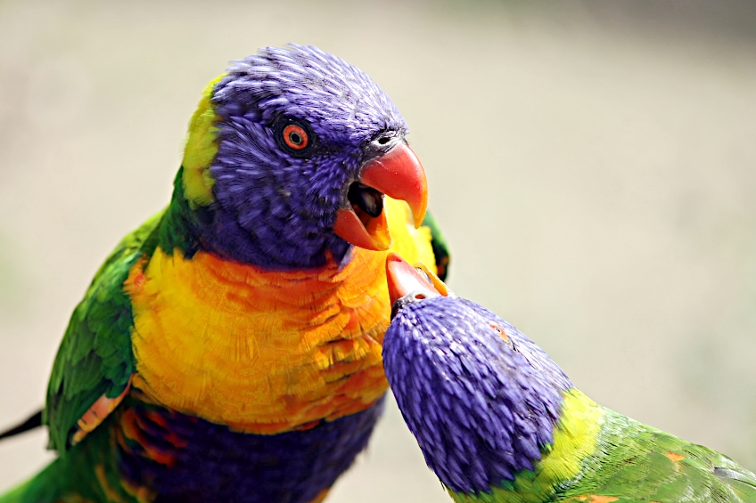
| Shade | Hex Code | CMYK Color Code (%) | RGB Color Code | Color |
| Purple | #733381 | 11, 60, 0, 49 | 115, 51, 129 | |
| Munsell Green | #00a878 | 100, 0, 29, 34 | 0, 168, 120 | |
| Chinese Orange | #f37042 | 0, 54, 73, 5 | 243, 112, 66 |
Seafoam Green, Viola, and Plum Purple
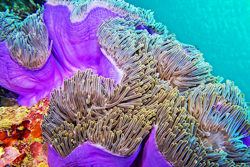
This combination uses a combination of a more vibrant purple with a more toned-down version of purple. To add some color, then seafoam green provides a nice gentle contrast. This color combination can easily work wonderfully for spas and wellness centers as it is relaxing and brings in a bit of fun and creativity. Lighter shades of purple are also popular as they are said to help reduce stress.
| Shade | Hex Code | CMYK Color Code (%) | RGB Color Code | Color |
| Seafoam Green | #93e9be | 37, 0, 18, 9 | 147, 233, 190 | |
| Viola | #966ebd | 21, 42, 0, 26 | 150, 110, 189 | |
| Plum Purple | #9C50B6 | 14, 56, 0, 29 | 156, 80, 182 |
More Color Combinations
You can easily create an amazing aesthetic color palette by just using two to three colors. However, if you feel more adventurous and are willing to experiment with more colors, you can include four or even more colors within a color palette.
Different Shades of Pink
Pink is feminine and it is also luxurious, modern, and youthful. When combining various shades of pink, it provides more dimension to the overall look of the design. The brown is there to help add some contrast and also brings in a bit more of an intense look that tones down the playfulness of all the pink.
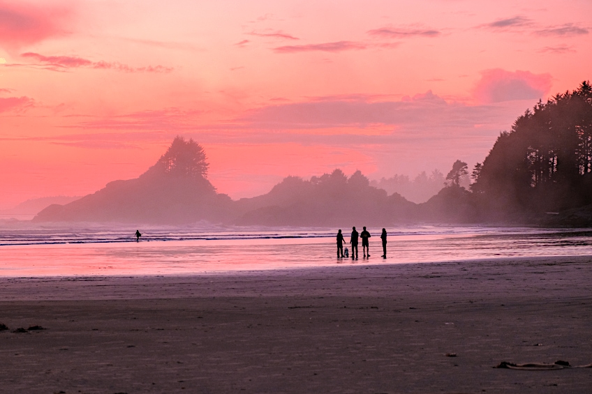
| Shade | Hex Code | CMYK Color Code (%) | RGB Color Code | Color |
| Dark Pink | #e75874 | 0, 62, 50, 9 | 231, 88, 116 | |
| Strong Pink | #be1558 | 0, 89, 54, 25 | 190, 21, 88 | |
| Light Pink | #fbcbc9 | 0, 19, 20, 2 | 251, 203, 201 | |
| Dark Brown | #322514 | 0, 26, 60, 80 | 50, 37, 20 |
Coral, Teal, Gray, and Turquoise
Coral and teal are always a good combination that provides a beautiful contrast. In this color palette, you have green and blue colors that are calming, while the coral adds a nice pop of color. To round it off, the gray helps to balance everything out.
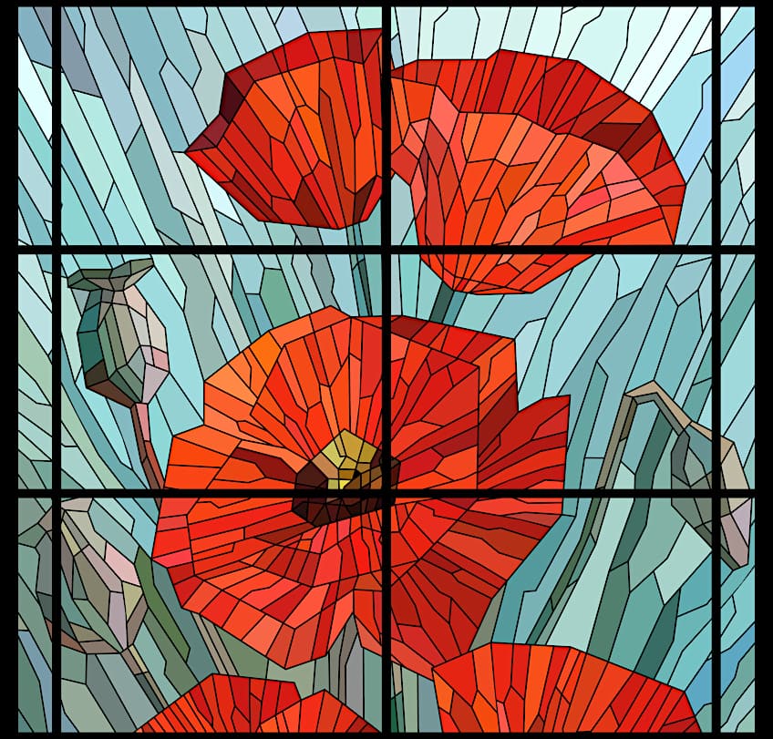
| Shade | Hex Code | CMYK Color Code (%) | RGB Color Code | Color |
| Coral | #f47a60 | 0, 50, 61, 4 | 244, 122, 96 | |
| Teal | #316879 | 60, 14, 0, 53 | 49, 104, 121 | |
| Gray | #ced7d8 | 5, 0, 0, 15 | 206, 215, 216 | |
| Turquoise | #7fe7dc | 45, 0, 5, 9 | 127, 231, 220 |
80s Aesthetic Color Palette
Bright colors were the favorite in the 80s, from neon colors to vibrant orange, green, and pinks. These colors were popular fashion color palettes as well as make-up and even interior designs came in bold colors.
| Shade | Hex Code | CMYK Color Code (%) | RGB Color Code | Color |
| Vibrant Blue | #3968cb | 72, 49, 0, 20 | 57, 104, 203 | |
| Magenta | #ca7cd8 | 6, 43, 0, 15 | 202, 124, 216 | |
| Blue | #64cff7 | 60, 16, 0, 3 | 100, 207, 247 | |
| Pink | #ff68a8 | 0, 59, 34, 0 | 255, 104, 168 |

Cottagecore Color Palette
Cottagecore is an aesthetic movement that is inspired by the simple life and characterized by a more old-fashioned and rustic appeal. This is a movement away from the busy, loud, and rushed lifestyle and moves towards a calmer and relaxed influence.
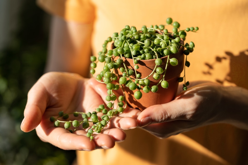
The concept became popular during the pandemic and also translated over into a variety of color palettes, which became known as the cottagecore color palette, which is inspired by natural and earth tones. Below we have one example of this type of color palette.
| Shade | Hex Code | CMYK Color Code (%) | RGB Color Code | Color |
| Dark Gray Green | #596854 | 14, 0, 19, 59 | 89, 104, 84 | |
| Dark Moderate Yellow | #7f803e | 1, 0, 52, 50 | 127, 128, 62 | |
| Moderate Orange | #cc9a52 | 0, 25, 60, 20 | 204, 154, 82 | |
| Soft Orange | #fce4b4 | 0, 10, 29, 1 | 252, 228, 180 |
Cyberpunk Aesthetic Color Schemes
Cyberpunk can be defined as being a speculative type of fiction that is mainly based on a futuristic dystopian background. You can also categorize it as a branch of science fiction that plays out in a more technologically advanced world.
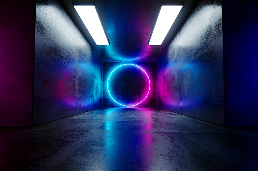
The genre became popular during the 60s as well as the 70s. The cyberpunk color palette can range from a variety of bright neon colors to purple and black. The style has become popular with graphic designers, for its unconventional style. There are many cyberpunk palettes available, however, here is one example.
| Shade | Hex Code | CMYK Color Code (%) | RGB Color Code | Color |
| Dark Violet | #711c91 | 22, 81, 0, 43 | 113, 28, 145 | |
| Pure Magenta | #ea00d9 | 0, 100, 7, 8 | 234, 0, 217 | |
| Strong Cyan | #0abdc6 | 95, 5, 0, 22 | 10, 189, 198 | |
| Dark Blue | #133e7c | 85, 50, 0, 51 | 19, 62, 124 | |
| Very Dark Blue | #091833 | 82, 53, 0, 80 | 9, 24, 51 |
Pastel Aesthetic Colors
Those of you who are not quite into bold and vibrant colors may want to look for a more subdued and calming color palette like the one below. Pastel colors are usually soft colors that appear light and are generally calming. This color palette lends a clean, light, and airy feeling to a design.
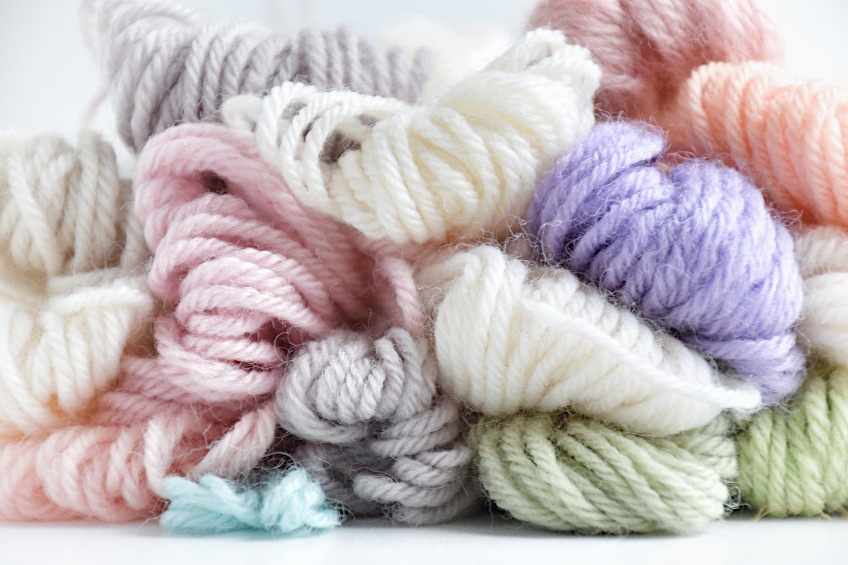
| Shade | Hex Code | CMYK Color Code (%) | RGB Color Code | Color |
| Mauve | #e2bef1 | 6, 21, 0, 5 | 226, 190, 241 | |
| Classic Rose | #f5cdde | 0, 16, 9, 4 | 245, 205, 222 | |
| Pale Pink | #f9ded7 | 0, 11, 14, 2 | 249, 222, 215 | |
| Aero Blue | #c6f8e5 | 20, 0, 8, 3 | 198, 248, 229 | |
| Azureish White | #cce1f2 | 16, 7, 0, 5 | 204, 225, 242 |
If you want to create an appealing design that attracts attention, or makes you feel energized or relaxed, then you need to consider aesthetic color schemes. The colors need to work well together to create a balanced and pleasing look, whether you use the aesthetic colors for web designs, fashion, and interior designs, or even for artwork.
Frequently Asked Questions
What Are Aesthetic Colors?
These colors are combinations of colors that go together and create a balanced and harmonious look. Aesthetic color palettes are easy to look at and depending on what you want to achieve, the colors should have a certain appeal.
What Is Considered the Most Aesthetic Color?
Everyone has a favorite color or colors, and these are all different. So, it is very difficult to determine what the most popular color is. However, someone did come up with the best or most aesthetic color, which is YInMn blue.
How to Select Aesthetic Color Palettes?
The best way to choose a good color palette is to understand a bit about color theory and how colors interact with each other. There are also various aesthetic color codes, like the hex color code, which can help you create color palettes online.
In 2005, Charlene completed her Wellness Diplomas in Therapeutic Aromatherapy and Reflexology from the International School of Reflexology and Meridian Therapy. She worked for a company offering corporate wellness programs for a couple of years, before opening up her own therapy practice. It was in 2015 that a friend, who was a digital marketer, asked her to join her company as a content creator, and this is where she found her excitement for writing.
Since joining the content writing world, she has gained a lot of experience over the years writing on a diverse selection of topics, from beauty, health, wellness, travel, and more. Due to various circumstances, she had to close her therapy practice and is now a full-time freelance writer. Being a creative person, she could not pass up the opportunity to contribute to the Art in Context team, where is was in her element, writing about a variety of art and craft topics. Contributing articles for over three years now, her knowledge in this area has grown, and she has gotten to explore her creativity and improve her research and writing skills.
Charlene Lewis has been working for artincontext.org since the relaunch in 2020. She is an experienced writer and mainly focuses on the topics of color theory, painting and drawing.
Learn more about Charlene Lewis and the Art in Context Team.
Cite this Article
Charlene, Lewis, “Aesthetic Color Palettes – Most Harmonious Color Combinations.” Art in Context. August 21, 2022. URL: https://artincontext.org/aesthetic-color-palettes/
Lewis, C. (2022, 21 August). Aesthetic Color Palettes – Most Harmonious Color Combinations. Art in Context. https://artincontext.org/aesthetic-color-palettes/
Lewis, Charlene. “Aesthetic Color Palettes – Most Harmonious Color Combinations.” Art in Context, August 21, 2022. https://artincontext.org/aesthetic-color-palettes/.

