Pastel Yellow – A Deep Dive Into Pastel Yellow Color Theory
If you love warm, happy colors, then pastel yellow is a great option. The color reminds you of sunflowers and beautiful days filled with sunshine. Brighter yellow colors can become overstimulating, so pastel yellow is the perfect alternative. If pastels are your thing, then read on to find out a little more about pastel yellow!
What Is Pastel Yellow?
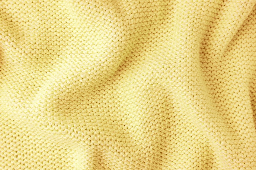
Yellow is considered a primary color, along with blue and red in the RYB color system that is widely used when painting. Pale yellow is a shade of yellow that can be described as soft, delicate, or muted. Pastel colors, in general, are lighter or higher in value and have low saturation. So, pastel yellow tends to lean more towards gray when compared to its pure and vibrant yellow form. In the table, you can see the web version of pastel yellow, along with its identifying hex code and other relevant color codes for printing and web design.
| Yellow Shade | Yellow Hex Code | CMYK Color Code (%) | RGB Color Code | Yellow Color |
| Pastel Yellow | #fdfd96 | 0, 0, 41, 1 | 253, 253, 150 | |
| Yellow | #ffff00 | 0, 0, 100, 0 | 255, 255, 0 |
Pastel Yellow: A Brief History
Yellow as a color has a long history, and yellow ochre pigments can be traced back to cave paintings during the Stone Age. You could call pastel yellow a pale or soft color, however, pastels come from an art medium that consisted of powdered pigments and produced softer colors. The term “pastel” can be traced as far back as 1662, but the medium became well-known and used by artists during the 18th century.
Later, pastel yellow and yellow retro interior design color palettes became popular during the 1950s. Pastel colors also set a trend during the 1980s, which was thanks to some popular television shows like Miami Vice. Today, the various shades of yellow are not as popular as other colors like blue, however, there is still a place
Meaning of the Pastel Yellow Color
All pastel colors have a calming and soft appearance and are often seen as more feminine, delicate, and romantic colors. Yellow pastel is warm, and uplifting and provides a sense of optimism, reminding us of sunflowers, spring, and sunshine. The pastel yellow color can be seen as gender-neutral and is a popular color for baby clothes and painting nurseries. Most shades of yellow can become overstimulating and can produce feelings of aggression. However, pastel yellow is softer and is less likely to produce these types of feelings.
Pastel Yellow Tones
There is a diverse amount of colors, all of which have been given names. Sometimes, colors can be mistaken for others, as each color can be very similar in appearance. This is where hex codes come in handy to identify each color.
In the table, you will see a few light yellow pastel tones or shades, all of which have their own hex code and vary slightly in composition. The variations you will notice in each color code provided. The RGB color code provides a reference to how much red, green, and blue are needed to make each color for web designs, while the CMYK color code shows how much cyan, magenta, yellow, and black are needed to produce a color for printing.
Lemon Chiffon
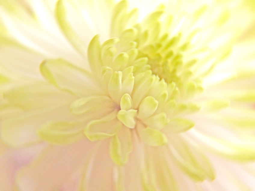
Lemon chiffon, also defined as a pale yellow, was part of the first web colors introduced in 1987, which became known as the X11 web colors. The color displayed in the table below is described as a very pale yellow.
| Pastel Yellow Shade | Pastel Yellow Hex Code | CMYK Color Code (%) | RGB Color Code | Pastel Yellow Color |
| Pastel Yellow | #fdfd96 | 0, 0, 41, 1 | 253, 253, 150 | |
| Lemon Chiffon | #fffacd | 0, 2, 20, 0 | 255, 250, 205 |
Macaroon
Macaroon is a soft yellow that is reminiscent of the tasty French sweet treats that usually come in a variety of pastel colors. This particular shade of pastel yellow is a little brighter than the lemon chiffon, and is described as a soft yellow.
| Pastel Yellow Shade | Pastel Yellow Hex Code | CMYK Color Code (%) | RGB Color Code | Pastel Yellow Color |
| Pastel Yellow | #fdfd96 | 0, 0, 41, 1 | 253, 253, 150 | |
| Macaroon | #f9e076 | 0, 10, 53, 2 | 249, 224, 118 |
Parmesan
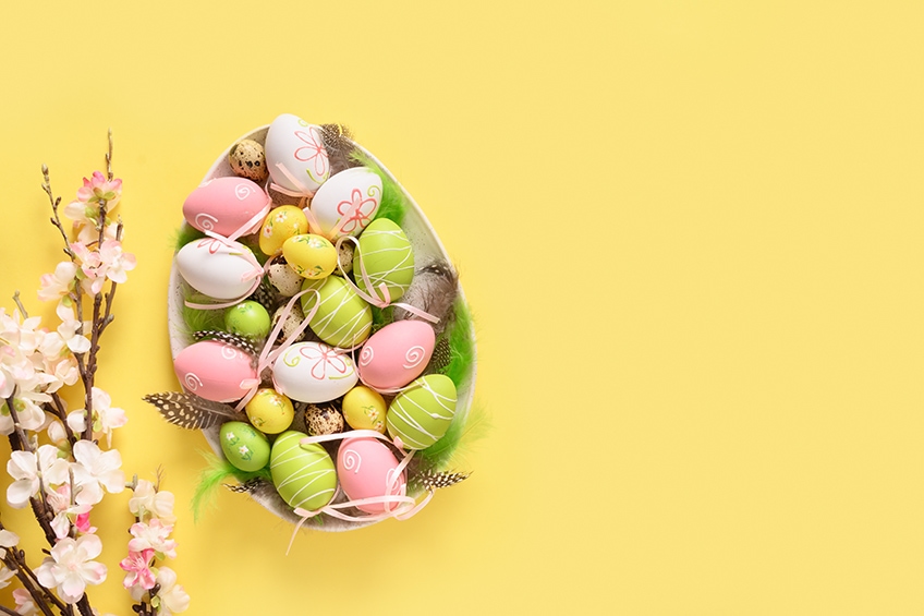
Parmesan is another light yellow pastel shade and refers to the Italian hard cheese that is obtained from cow’s milk. This color is very similar to the macaroon, however, it is described as being a softer color in comparison.
| Pastel Yellow Shade | Pastel Yellow Hex Code | CMYK Color Code (%) | RGB Color Code | Pastel Yellow Color |
| Pastel Yellow | #fdfd96 | 0, 0, 41, 1 | 253, 253, 150 | |
| Parmesan | #fde992 | 0, 8, 42, 1 | 253, 233, 146 |
Colors That Go With Pastel Yellow
Pastel yellow can go with many colors including white and even black. Color theory as well as using the color wheel can help to determine good color combinations. You can easily find these color combinations on a color wheel, or simply use one of the many online tools or websites available.
Complementary Pastel Yellow Colors
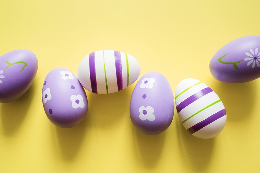
When you want to create a color palette that pops and has contrasting colors, you will go for complementary colors. When you look at the color wheel, these colors are directly on opposite ends. So, if you take pastel yellow, the complementary colors will be soft blue. However, you can also try using shades of purple, such as lilac. You can also try experimenting with other shades of blue like navy
| Shade | Hex Code | CMYK Color Code (%) | RGB Color Code | Color |
| Pastel Yellow | #fdfd96 | 0, 0, 41, 1 | 253, 253, 150 | |
| Soft Blue | #9696fd | 41, 41, 0, 1 | 150, 150, 253 |
Analogous Pastel Yellow Colors
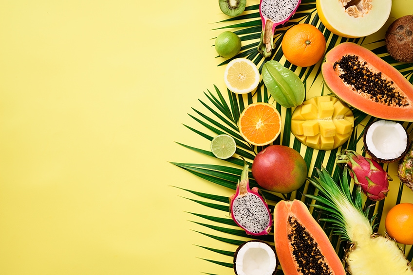
Colors that are beside each other or close to one another can form an analogous color palette. Yellow can be found between orange and green, so these colors are what form the color combination. These colors together are also more pleasant or easy to look at, unlike the complementary colors that form a visual contrast.
| Shade | Hex Code | CMYK Color Code (%) | RGB Color Code | Color |
| Pastel Yellow | #fdfd96 | 0, 0, 41, 1 | 253, 253, 150 | |
| Soft Orange | #fdca96 | 0, 20, 41, 1 | 253, 202, 150 | |
| Soft Green | #cafd96 | 20, 0, 41, 1 | 202, 253, 150 |
Monochromatic Pastel Colors
This color combination is also easy to view and is a simple combination that helps to create more of a harmonious and layered look in designs. There is no clash of colors and is soothing to the eyes and can promote a sense of calm.
| Shade | Hex Code | CMYK Color Code (%) | RGB Color Code | Color |
| Pastel Yellow | #fdfd96 | 0, 0, 41, 1 | 253, 253, 150 | |
| Bright Yellow | #fcfc4b | 0, 0, 70, 1 | 252, 252, 75 | |
| Light Yellow | #fefee1 | 0, 0, 11, 0 | 254, 254, 225 |
Triadic Pastel Yellow Colors
To produce a more energetic color combination, these three colors form a triangle shape when viewed on the color wheel and provide contrasting colors. In design, there is usually a focus on one main color, while the other colors are used as accent colors. This is to help prevent all the colors from fighting each other for attention and becoming too overwhelming.
| Shade | Hex Code | CMYK Color Code (%) | RGB Color Code | Color |
| Pastel Yellow | #fdfd96 | 0, 0, 41, 1 | 253, 253, 150 | |
| Soft Magenta | #fd96fd | 0, 41, 0, 1 | 253, 150, 253 | |
| Soft Cyan | #96fdfd | 41, 0, 0, 1 | 150, 253, 253 |
Working With Pastel Yellow Colors
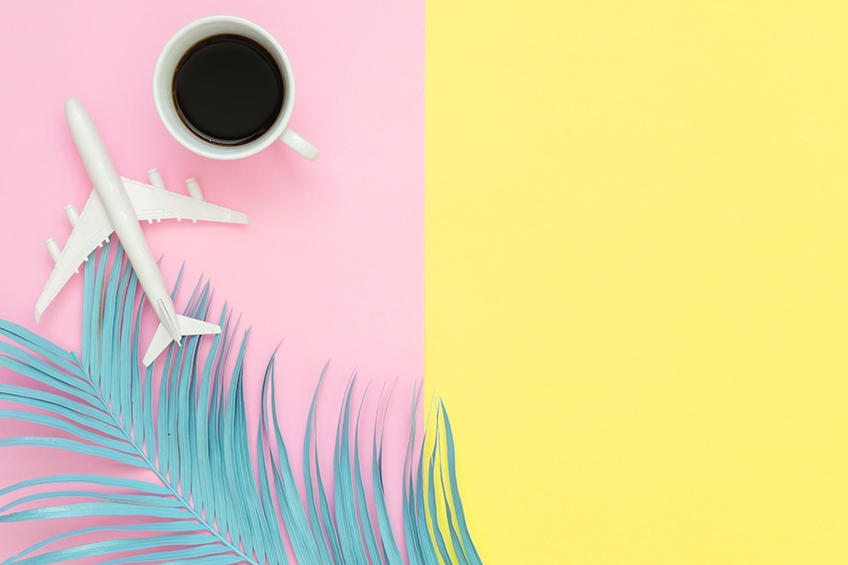
Pastel yellow can be used in all kinds of paintings, often representing happiness and positivity. The pastel yellow color is not as popular in fashion, however, yellow has been setting trends more recently, especially since the Pantone color of the year, Illuminating, and Ultimate Gray were unveiled for 2021. Pastel yellow is also an ideal color for the home if you are looking for a warm and cheery color. Let us now discover the best way to mix pastel yellow paints and look at a few tips for adding the pastel yellow color to your home interior.
Mixing Pastel Yellow Paints
Yellow is a primary color, and there are many different types of yellow you can purchase from lemon yellow to cadmium yellow, but you can use whatever you have on hand. You can simply mix in some white to lighten the yellow, however, for pastels, you need to desaturate the color and then lighten the value.
To help desaturate yellow, you can take a color that is on the other side, facing your primary color. This would be a purple color for yellow, which will then create a duller or muted color. Instead of the complementary color, you can also use gray paint. Always add extremely small amounts to the yellow paint, as you do not want to land up with a dark, muddy color.
To increase the color value, you can then mix in some white paint until you are satisfied you have achieved a pastel yellow. You should also always keep a color chart that has all your mixing experiments documented so that you can refer back to see what proportions you used. Of course, you can simply just purchase an already-made tube of pastel yellow at the store.
Pastels Yellow Interior Design Ideas
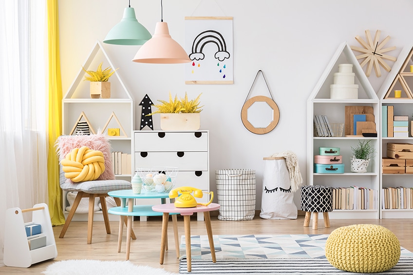
Patel yellow is a softer shade, and sometimes, a better alternative to more vibrant yellow colors that can be overwhelming in larger amounts. As mentioned before, pastel yellow is quite popular as a neutral-gender color for nurseries, but it can also be used in other rooms in the home. Pastel yellow works wonderfully with many other colors, especially neutral colors like white and brown. Lighter shades of pastel yellow can easily be used wall-to-wall. When using bolder pastel yellows as accents, choose two different shades, combine with a darker neutral, and include white to create a balanced color palette.
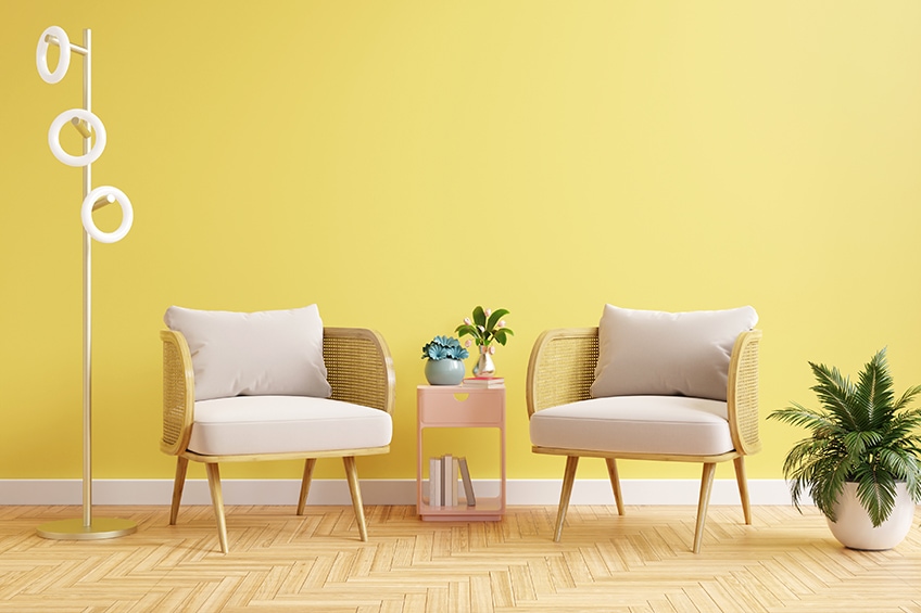
Pastel yellow colors can include curtains, cushions, throws, couches, chairs, or an accent wall if you want to subtly bring in some color. For a bright and sunny kitchen, try pastel yellow cabinets with white. In the bedroom, choose a more subtle pastel yellow so as not to overstimulate the senses, and consider combining it with gray and white. Otherwise, using pastel yellow as an accent color in the bedroom can be an alternative idea. Below are a few more ideas to incorporate this shade of yellow into your home.
- Instead of painting the walls a pastel yellow, use patterned wallpaper for a more subtle effect.
- Use pastel yellow as a more eye-catching color when combined with a darker color scheme.
- Pair pastel yellow with gray, black, and brown to create a more masculine feel.
- Natural wood elements can also work well with all shades of yellow.

Pastel yellow is the perfect color if you are looking for a happy and uplifting hue that is more subtle and not too bright. Unlike the more vibrant and strong yellows, pastel yellow can offer you more of a sense of balance and calmness.
Frequently Asked Questions
What Are the Most Popular Colors That Go With Pastel Yellow?
Pastel yellow can go with neutral colors like white, brown, gray, and black. Contrasting colors like shades of blue and purple can also go with pastel yellow. Other colors that go with pastel yellow include green, lilac, orange, and dusty rose.
Is Pastel Yellow a Warm Color?
In color theory, all colors have a color temperature that is either cold or warm. Cold colors are naturally your greens and blues, while red, orange, and yellow are your warm colors. So, pastel yellow will then also naturally be a warm color.
Is Pastel Yellow a Neutral Color?
Technically, pastel yellow is not a neutral color, however, it can be used as a neutral color because of its subtle effects. So, you can choose a light pastel yellow to paint a room with without it becoming too overstimulating. This is because pastel yellow can have calming and soothing effects.
In 2005, Charlene completed her Wellness Diplomas in Therapeutic Aromatherapy and Reflexology from the International School of Reflexology and Meridian Therapy. She worked for a company offering corporate wellness programs for a couple of years, before opening up her own therapy practice. It was in 2015 that a friend, who was a digital marketer, asked her to join her company as a content creator, and this is where she found her excitement for writing.
Since joining the content writing world, she has gained a lot of experience over the years writing on a diverse selection of topics, from beauty, health, wellness, travel, and more. Due to various circumstances, she had to close her therapy practice and is now a full-time freelance writer. Being a creative person, she could not pass up the opportunity to contribute to the Art in Context team, where is was in her element, writing about a variety of art and craft topics. Contributing articles for over three years now, her knowledge in this area has grown, and she has gotten to explore her creativity and improve her research and writing skills.
Charlene Lewis has been working for artincontext.org since the relaunch in 2020. She is an experienced writer and mainly focuses on the topics of color theory, painting and drawing.
Learn more about Charlene Lewis and the Art in Context Team.
Cite this Article
Charlene, Lewis, “Pastel Yellow – A Deep Dive Into Pastel Yellow Color Theory.” Art in Context. January 23, 2023. URL: https://artincontext.org/pastel-yellow/
Lewis, C. (2023, 23 January). Pastel Yellow – A Deep Dive Into Pastel Yellow Color Theory. Art in Context. https://artincontext.org/pastel-yellow/
Lewis, Charlene. “Pastel Yellow – A Deep Dive Into Pastel Yellow Color Theory.” Art in Context, January 23, 2023. https://artincontext.org/pastel-yellow/.
