Monochromatic Colors – Make Color Combinations from One Color
There is a lot more to working with colors than simply picking a color you like. To create a harmonious look, whether it is for a painting, website design, or interior design, you need to choose the best color combination. Monochromatic colors are said to be easier to work with than other options. To see if this is true, read further to find out a bit more about monotone colors, and how to incorporate them into various designs and applications.
What Are Monochromatic Colors?
Monotone colors are part of a group of color combinations that is determined by the color wheel and color theory. We all know the traditional color wheel, a visual description of all the various colors. On the wheel, you have your primary, secondary, and intermediate colors. Color harmony, or how well colors work together, can be determined by how all these colors relate to one another.
Colors also have a temperature or color bias, which can also be seen on the color wheel. On one side, you have your cool colors, such as blue and green, while warmer colors are grouped on the other side.
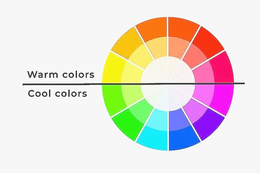
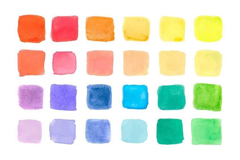
Some of the color combinations you can create from this include your monochromatic colors as well as complementary colors, analogous colors, and triadic colors, among others. If you break down the word monochromatic, which has Greek origins, it will include “monos” and “khroma”. These two words mean “one color”, which is what you use to create the color combinations. You choose one color, and from this, you then create many variations of this color. This will include different shades, tints, and tones of the single color.
- Shades: These are darker colors that usually include black.
- Tints: Opposite to shades, tints are lighter colors that contain more white.
- Tones: When you include gray and tone a color down, also known as a desaturated color, or becomes duller.
You might also come across the word “hue”, which is another term for a specific color. So, you can choose a single hue, like red, and from this, you can choose lighter versions or tints, such as pink. You can also get darker versions, or shades, such as maroon. When working online with graphics, most programs will let you change the brightness and saturation of a hue. The saturation of a color deals with the intensity of a color and by increasing saturation, the color becomes more pure or vivid.
The brightness, also referred to as value or intensity, is also relative to darkness and lightness of a hue.

| Shade | Hex Code | CMYK Color Code (%) | RGB Color Code | Color |
| Red | #ff0000 | 0, 100, 100, 0 | 255, 0, 0 | |
| Pink | #ffc0cb | 0, 25, 20, 0 | 255, 192, 203 | |
| Maroon | #800000 | 0, 100, 100, 50 | 128, 0, 0 |
Exploring Monochromatic Colors
So, why should you try a monochrome color palette? Many designers would say that monochromatic colors are easy to work with and include many benefits. In addition, it is quite a versatile color palette that can provide interest and depth to a design. Other benefits include:
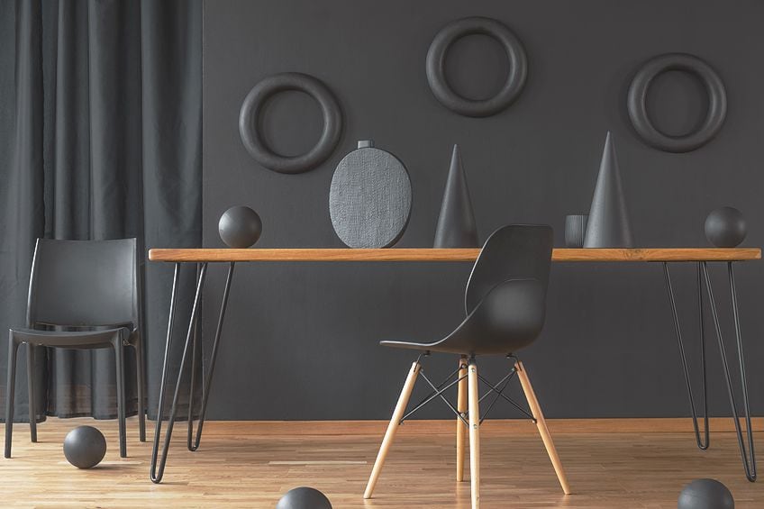
- When working with monotone colors, the variations of color provide a balanced and cohesive look. It provides a more professional look.
- There is less worry over whether the colors are going to go together, so working with the colors is faster and easier.
- Monochromatic color palettes can work with most interior design styles.
- The overall look does not draw attention to itself but can help to highlight other design aspects.
- Monochrome colors provide a simple and minimalistic appearance.
- The combination of colors creates an appealing look that is more calming than other options. However, they can also be dramatic and bold, depending on the colors used.
- When developing a brand, monotone colors can work to create something familiar that customers recognize.
You can also add some color accents to a monochromatic color scheme, which can create more contrast. To add more interest, you can also include different patterns or textures. A monochromatic color palette by itself can produce some contrast, however, it is not as vibrant a contrast, as say a complementary scheme would have.
If used incorrectly, it can even become boring and monotonous.
Psychological Impact of Monochromatic Colors
All colors, including black and white have certain meanings and are associated with different feelings and ideas. These color associations are determined by many factors, such as age, gender, and personal preferences, and have a lot to do with different cultural backgrounds. So, not all colors produce the same feelings or meaning for everyone. However, there are a few universal meanings that most people associate with. For example, blue is a cool and calming color, while red is more energetic and stimulating.
So, if you are creating a brand, make sure you understand the meaning of color and your target audience, before choosing your color scheme.

A monochromatic color scheme can convey different messages and feelings, depending on the color chosen. However, in general, monochrome colors do offer a sense of simplicity and a minimalistic look due to the more subtle use of color. It can communicate a clean and orderly appearance and also provides a sense of sophistication. The cohesive look of monochromatic colors provides a sense of harmony, consistency, and maturity. This consistency can also be calming and can provide a peaceful atmosphere, especially when using lighter shades or pastels.
How to Create Monochrome Color Palettes
The first step in creating a monochrome color palette is to choose your base or main color for the design. How can you do this? Well, it all depends on what you want to achieve with a design, whether it is for a company website or a specific room in your home. As we have mentioned above, all colors can influence the mind and emotions. For example, warmer colors like red can be energizing, while cooler colors like blue have a more calming effect.
However, there are many other meanings to each color, so consider what feelings you want to evoke when choosing your monochromatic color scheme.

In certain instances, such as interior design, you also need to take lighting into account, as colors can look slightly different in various settings. A monochrome color palette can consist of two, up to several variations, from darker to lighter shades of the original color. The color you choose can be anything, including a primary, secondary, or tertiary hue. You can also choose neutrals as your main color base, and this includes options like white, black, gray, and beige.
HSB Color System
When working with colors online, there are tools and systems you can use to help create a color scheme. When it comes to monochromatic color examples, there is the HSB color system, which stands for hue, saturation, and brightness. These are all aspects you can find in the RGB color model, which has red, green, and blue as the primary colors. Once you have a color, you can then adjust the hue, which means changing the color. The saturation can also be adjusted, creating a more vibrant or muted tone.
However, when dealing with monotone colors, adjusting the brightness is what you are looking for.
Generating Tints and Shades
Adjusting the brightness also means creating lighter and darker versions of a color. For example, we will be using a strong teal color to illustrate this. Next, you can take this hue and adjust the brightness by a value of say 10. This number can be different, and you can experiment with it. Create 10 versions of your main color doing this and place them side-by-side, which makes it easier to compare. Next, from these variations, you are going to choose your monochrome color palette.
Three colors are the easiest to work with, however, you can choose several variations if you want.
Below, we have selected three colors, each with a distinctive brightness value that provides a suitable contrast when placed next to each other. In other applications, such as painting, the method is different, and you will have to experiment with the mixing of your various paint colors. To create shades, black is often used, while white paint is used to create tints.
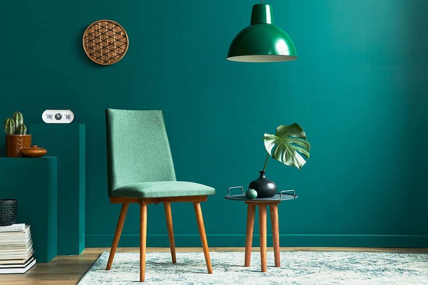
| Shade | Hex Code | CMYK Color Code (%) | RGB Color Code | Color |
| Teal | #008080 | 100, 0, 0, 50 | 0, 128, 128 | |
| Teal 1 | #00cdcd | 100, 0, 0, 20 | 0, 205, 205 | |
| Teal 2 | #003434 | 100, 0, 0, 80 | 0, 52, 52 |
Now that you have your monochrome color palette, when applying it, the colors should provide a harmonious and pleasant combination. When working with any type of design color scheme, to create a balanced look, it is advisable to use the 60, 30, 10 rule. Choose your main color and use the other two as supporting and accent hues. You should use the color scheme strategically, to draw attention to certain elements and to create a design that does not overwhelm the viewer.
You can stick to monochrome colors, however, there is no rule stating that you cannot use other colors within a monochromatic color scheme.
You can often use a strong contrasting color to create a focal point or highlight parts of a design. For example, consider a black monochromatic color palette, with lighter gray tones. Consider adding a shade of green to add a pop of color. However, it is important to use the extra colors carefully and sparingly, making deliberate choices when using them.
Incorporating Neutrals for Balance
Neutral colors are always great to use, as they easily create a more balanced look when combined with other colors and can add more interest and depth to a design. The main neutral colors are black, white, and gray; however, you can also use colors like beige, tan, or cream, which are also considered neutrals. When using neutrals together with your chosen monochrome colors, they can act as a nice backdrop that helps to showcase any other colors.
Neutrals can also be added as accents to help emphasize the main color scheme. The neutral colors also prevent a color scheme from becoming overwhelming and create a more harmonious and cohesive look.
Monochromatic Color Examples
There are many monochromatic color examples, each one providing a different look and feel. Just to get a better understanding of monotone colors, we have provided a few basic examples that range from vibrant to muted.
Vibrant and Bold
You can go as vibrant as you want, the benefit of a monochromatic palette is that there are darker and lighter shades included. So, you can produce a bold statement without the color scheme being too overwhelming. The variety of shades, tints, and tones provides a more balanced appearance. The lime is vibrant and bold; however, the darker shades help to tone it down. Remember, to combine the colors strategically, using the vibrant hue more as an accent color. We have also included another pop of orange color to show you how you can add another color element to the color scheme.

| Shade | Hex Code | CMYK Color Code (%) | RGB Color Code | Color |
| Dark Yellow | #858a30 | 4, 0, 65, 46 | 133, 138, 48 | |
| Olive | #a2ab2a | 5, 0, 75, 33 | 162, 171, 42 | |
| Lime | #cbc912 | 0, 1, 91, 20 | 203, 201, 18 | |
| Orange | #f7840f | 0, 47, 94, 3 | 247, 132, 15 |
Calming and Muted
Maybe you want a calmer, more relaxed look that is more sophisticated. Muted colors provide a calmer look, even if it is warmer colors. Muted colors are also seen as more modern and efficient. Blue itself is soothing and also provides a sense of power and confidence.
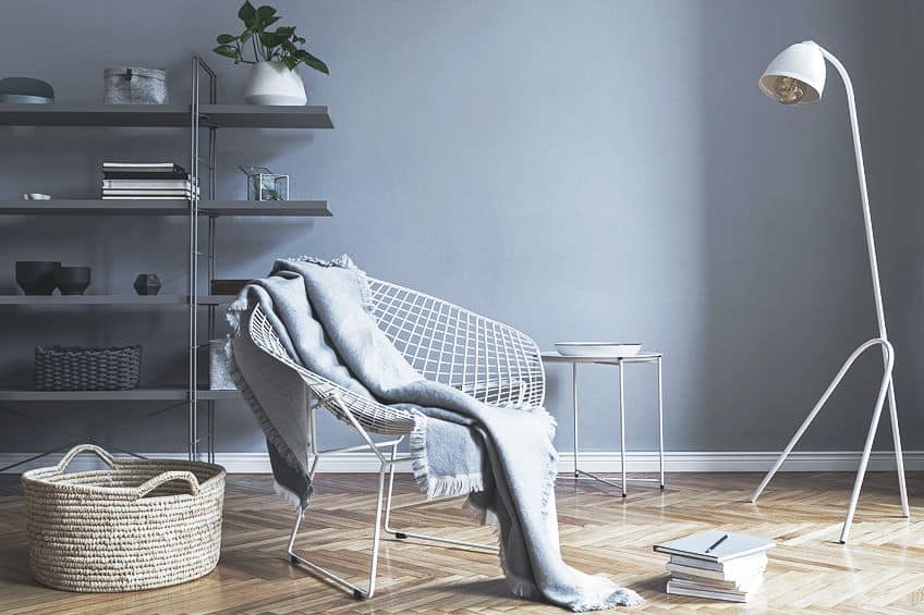
| Shade | Hex Code | CMYK Color Code (%) | RGB Color Code | Color |
| Dark Grayish Blue 1 | #696b82 | 19, 18, 0, 49 | 105, 107, 130 | |
| Dark Grayish Blue 2 | #798198 | 20, 15, 0, 40 | 121, 129, 152 | |
| Grayish Blue 1 | #a2aec4 | 17, 11, 0, 23 | 162, 174, 196 | |
| Grayish Blue 2 | #b9bfcd | 10, 7, 0, 20 | 185, 191, 205 |
Adding a Pop of Color
This is an example of a monochromatic color scheme, which also includes an accent color that instantly attracts your eye, similar to the orange in our first example. However, the color scheme as a whole is not overwhelming and still provides a sense of balance, warmth, and cleanliness.
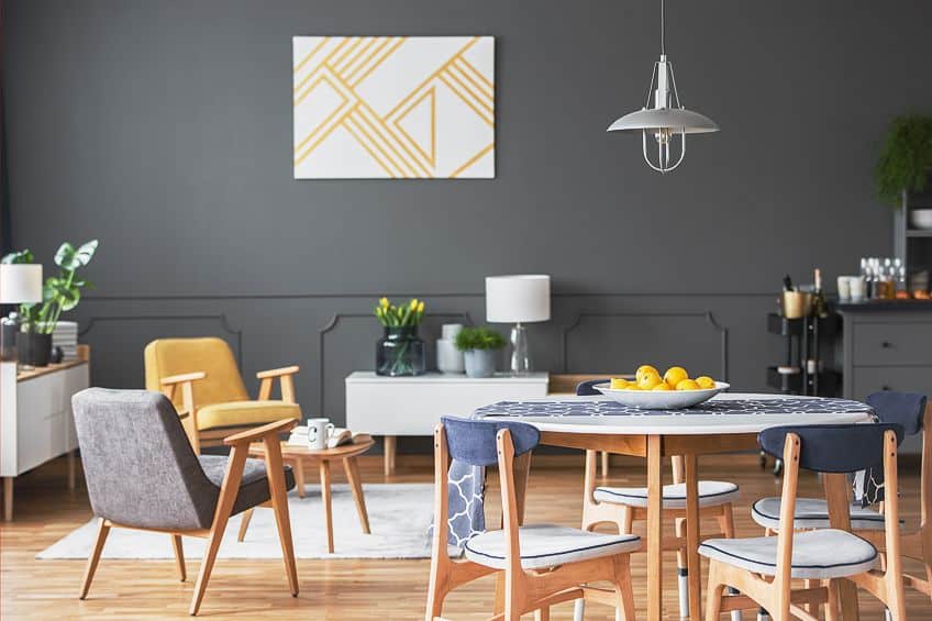
| Shade | Hex Code | CMYK Color Code (%) | RGB Color Code | Color |
| Light Grayish Orange | #eae2d6 | 0, 3, 9, 8 | 234, 226, 214 | |
| Grayish Orange | #d5c3aa | 0, 8, 20, 16 | 213, 195, 170 | |
| Dark Grayish Orange | #867666 | 0, 12, 24, 47 | 134, 118, 102 | |
| Vibrant Yellow | #e1b80d | 0, 18, 94, 12 | 225, 184, 13 |
Monochromatic Color Schemes in Design
Monochromatic colors can be applied to all kinds of designs, from interior and graphic designs to fashion. There are also many other applications, including things like packaging, paintings, and photography. So, to create a color scheme that provides simplicity with sophistication, consider choosing a monochrome color palette. Below, we will briefly look into a few of these design applications.
Interior Design and Home Décor
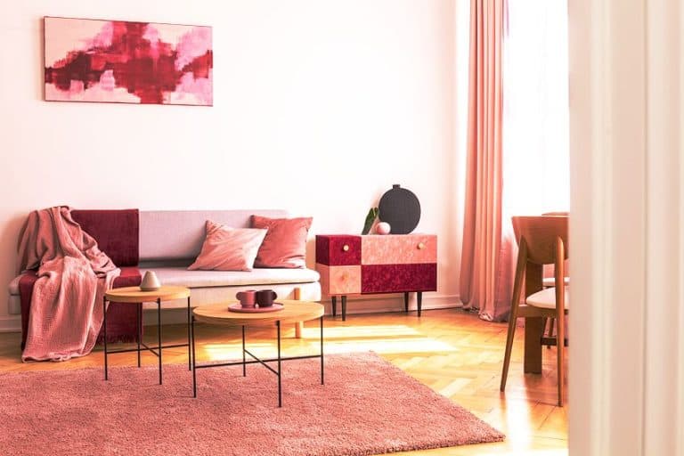
When deciding on an interior color scheme, it will depend on a few things. For example, the type of room can decide what colors work best. A bedroom will likely have calmer and cooler colors while living areas can have warmer and more lively colors. The color you choose also depends on the lighting and the size of the room. Again, you can start with a base color, which will become the foundation of your color scheme. You can then explore the various shades, tints, and tones that will help to create more depth to a design.
To create more interest, you can incorporate different shades of color through different elements, for example, through furniture, or accessories like cushions, drapes, or rugs.
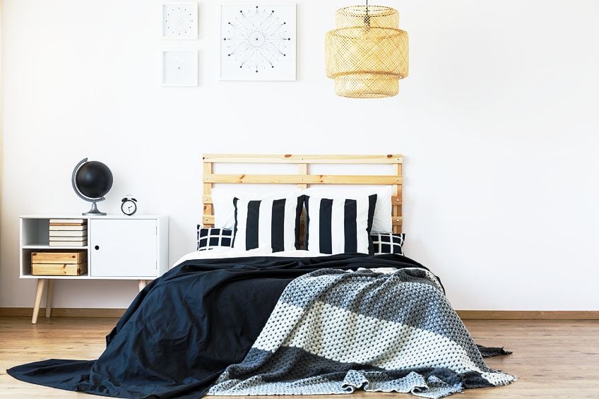
Make sure to use different textures and patterns to create a more diverse look. You can also experiment with accent colors, which is where you can bring in neutrals like black or white. You can also consider a complementary or contrasting color to create a focal point.
Graphic Design and Visual Communication
Color provides a way of non-verbal communication, and by utilizing this, you can send a certain message and create a brand that stands out. You can use monochromatic colors to create a simple, yet elegant design that feels clean and organized. In website design, monochrome colors can be used to create blocks of color to help divide the page into sections. This helps to create a simple and organized look that is simple to navigate.
Instead of adding color, you can also experiment with grayscale. This is also known as an achromatic color scheme, where color is absent.
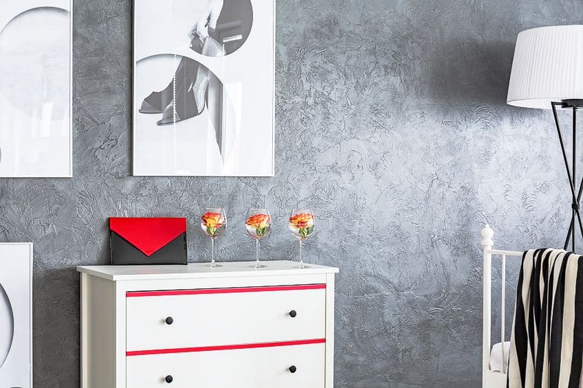
This takes the minimalistic look a step further and also provides a calming look. You can also use this idea to create a visual statement, by inserting a pop of color to add more contrast. Just remember, you should do this in small quantities. Add texture and shapes to improve the overall look.
Fashion and Clothing
Creating an outfit with a monochromatic look is an easy and safe way to produce a look that is elegant and timeless. The outfit appears visually put together, and you do not have to worry about colors clashing. You can easily add a layered look with different shades of color. This can be done by using accessories like handbags and shoes. Add to these different shades of clothing, such as lighter and darker shades of slacks, a shirt, and a coat. To help accentuate an area, use lighter shades, and darker shades to camouflage a specific area. Monochrome colors in an outfit create an unbroken line of color, which helps to elongate the look, making you seem taller.
Dressing in monochromatic colors uses a single hue, which can be used to emphasize the power of a certain color.
Tips for Using Monochromatic Colors Effectively
Using a monochromatic color palette is quite easy, however, there are some things you need to consider making the design even better. Remember that the color you choose should align with what you want to accomplish with your design. Consider what mood you want to create. Failing to achieve balance is one of the main mistakes made with monochrome colors. So, below are some basic tips to remember for creating an effective monochromatic color palette.
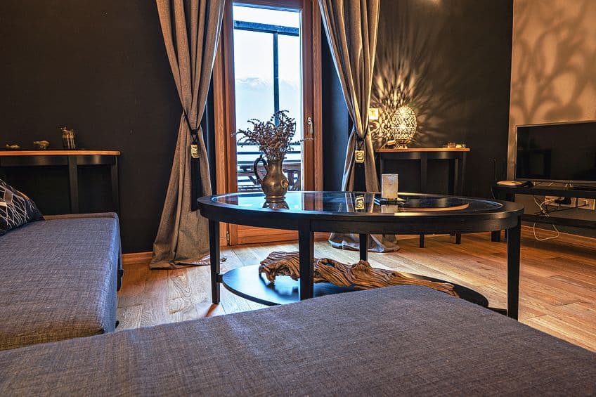
- To form more depth and dimension, always use different shades, tints, and tones to create more interest.
- You can use the different shades to create contrast, which can be used to create a focal point to emphasize elements.
- In designs, to add more interest, incorporate patterns and different textures. You want to avoid a lack of contrast and visual interest.
- Include neutral colors to create a more harmonious look or use black and white to create more contrast with your chosen monochromatic colors.
- You do not have to only use a single monochromatic color. To add more contrast, consider including an accent hue to add that pop of color.
- If you do want to include an accent color, consider sticking to the color bias. For example, if your color scheme has a warm orange base, try pairing it with another warm color, such as yellow.
One of the main ideas for creating monochromatic colors that work together is to choose a color that fits in with your design goals. This could be anything from a vibrant shade to a muted color, or it can even be a neutral hue. This means that there are numerous options to choose from, which allows you to easily express your style through monotone colors.
Frequently Asked Questions
What Are Monochromatic Colors?
Monotone colors are created by using a single hue. This hue is then adjusted to create many variations of darker and lighter colors. The main benefit of this color combination is to create flow and balance within a design.
Are Monochromatic Colors Boring?
If used incorrectly, monochromatic colors can be dull. However, when using the many variations, you can easily create a dynamic and interesting color scheme. You can also include texture, patterns, and contrast to form an even more appealing design.
What Tools Can You Use to Create a Monochromatic Design?
There are many design tools that you can use online to produce a monochromatic color palette. The more popular design software includes Adobe Illustrator and Photoshop. There are also a few free options available if you search online. These programs allow you to adjust the tints, shades, and tones of your selected color.
What Is the Best Way to Choose a Base Color?
The color you choose has to be something you like; however, the main idea is to select a color that conveys the message or emotions you want. So, always consider the psychological effect of your chosen color. If you are selecting a color for business purposes, you should also take into account the cultural aspects of the color, as well as the age and gender of your target market, among other factors.
In 2005, Charlene completed her Wellness Diplomas in Therapeutic Aromatherapy and Reflexology from the International School of Reflexology and Meridian Therapy. She worked for a company offering corporate wellness programs for a couple of years, before opening up her own therapy practice. It was in 2015 that a friend, who was a digital marketer, asked her to join her company as a content creator, and this is where she found her excitement for writing.
Since joining the content writing world, she has gained a lot of experience over the years writing on a diverse selection of topics, from beauty, health, wellness, travel, and more. Due to various circumstances, she had to close her therapy practice and is now a full-time freelance writer. Being a creative person, she could not pass up the opportunity to contribute to the Art in Context team, where is was in her element, writing about a variety of art and craft topics. Contributing articles for over three years now, her knowledge in this area has grown, and she has gotten to explore her creativity and improve her research and writing skills.
Charlene Lewis has been working for artincontext.org since the relaunch in 2020. She is an experienced writer and mainly focuses on the topics of color theory, painting and drawing.
Learn more about Charlene Lewis and the Art in Context Team.
Cite this Article
Charlene, Lewis, “Monochromatic Colors – Make Color Combinations from One Color.” Art in Context. September 19, 2023. URL: https://artincontext.org/monochromatic-colors/
Lewis, C. (2023, 19 September). Monochromatic Colors – Make Color Combinations from One Color. Art in Context. https://artincontext.org/monochromatic-colors/
Lewis, Charlene. “Monochromatic Colors – Make Color Combinations from One Color.” Art in Context, September 19, 2023. https://artincontext.org/monochromatic-colors/.


