Muted Colors – Your Guide to Making and Using a Muted Color Palette
Color is an integral part of our lives. From our own skin and hair and eye colors to nature’s palette of blue sky and green grass to white snow and the myriad fall colors that enchant us every year, color is everywhere. Yet now more than ever we are living in a digital world where muted colors play a primary role, but they are anything but dull. On the contrary, a muted, or desaturated color palette is one that conveys moods and feelings that bring a painting alive to the viewer. In this article, we will explore the world of muted colors and their meanings in art.
The Definition of Muted Colors
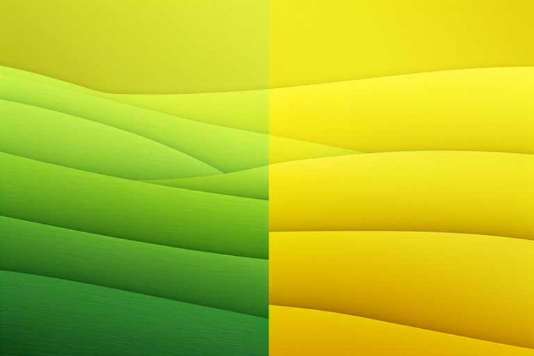
So what is a muted color? When we think of the term “muted” we think quiet and unassuming. This is true insofar as a muted palette is one of desaturated and dulled colors. Color saturation means the brightness and intensity of a color, thus the less intense the color the more muted it is. In art, a desaturated color is one that is subdued or grayed. Think about the colors of a rainy or snowy day compared to those of a summer or fall day. They are all very different from each other, but you should not make the mistake of thinking that the muted colors of a rainy day should take a back seat to the brighter colors of a summer’s day, particularly when it comes to art.
The Psychology of Color
Around 5,000 years ago it was the ancient Egyptians who first studied the effect that colors have on mood. Fast forward a few thousand years to the late 1660s when Sir Isaac Newton discovered the color spectrum and how it is composed. But it was the psychologist Carl Jung who is acknowledged to be the pioneer of color psychology. He was particularly interested in the meanings and properties of color, as well as the potential of art for psychotherapy.
In color psychology, the primary colors are red, yellow, and blue. They represent the mind, body, and emotions, as well as the harmony and interdependence between the three elements.
Furthermore, it is from these three colors that every other color imaginable can be created, yet they cannot be created by mixing other colors together. And whether it be in their purest, saturated form or in gentler, muted tones, all colors are said to have symbolic meanings.
The Symbolism of Color
When it comes to art, one of the most powerful tools we have at our disposal is to create a picture using symbolic colors. As artists, we are able to bring about certain responses in viewers to particular colors, and at the same time send a message to viewers based on the colors’ symbolism. This message may be positive or negative, depending upon the colors we use.
Do not be fooled into thinking that it is only the primary colors that have particular meanings, or that there is only symbolism in colors that are saturated and vivid. A desaturated color palette is able to evoke just as many powerful emotions as bright colors are. At the same time it would be unwise to think that because desaturated colors are quieter and muted, they will only generate an introspective, melancholic mood in viewers.
Black
The color black is an important one in a desaturated color palette, even though it is more often than not associated with sadness, morbidity, and grief. It is also mysterious and secretive, but at the same time, it is evocative of dignity and sophistication. In art, black is also considered to be a masculine color.
It should be used carefully otherwise it will overshadow the other colors in the composition.
Blue
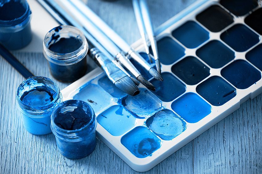
Blue is without question the world’s most popular color. It is the color of the sky and the sea so it is considered to symbolize openness and honesty. In art, as well as in daily life, the color blue represents trust, wisdom, and good character. But blue has a flip side to it, one of melancholy and despondency, hence the term “having the blues”. The darker the blue, the moodier the painting can become, thus it plays a vital part in a desaturated color palette as it can evoke a feeling of brooding despondency.
Brown
When we think of muted colors, most of us will probably immediately think of brown. It is an earth tone, reminiscent of trees and soil, and is one of the most restful of colors on the spectrum. If the painting’s composition is primarily made up of dull colors, brown creates a feeling of warm earthiness. In a brighter palette, it comes across as a cool color. Brown was a color used widely by the old masters such as Rembrandt, Rubens, and Titian.
Van Gogh also used it in his famous painting “The Potato Eaters” (1885), which is a composition primarily of browns and greens. “Something like the color of a really dusty potato, unpeeled of course”, was how Van Gogh described it.
Gray
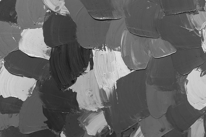
Next to brown, gray is the other color that comes to mind when the question of what is a color palette is raised, since muted colors are also known as “grayed” colors. Gray creates a sense of peace and is at the same time symbolic of restraint and caution. Different shades of gray can be made by mixing two complementary colors (a primary and secondary color), such as blue and orange, purple and yellow, green and red.
Green
Green symbolizes growth and new creation; it is the color of nature. There are myriad tones of green, the more muted of which have a calming effect on viewers. It is a gentle and peaceful color, particularly the paler, desaturated greens.
An olive green such as the one seen in Vincent van Gogh’s “The Potato Eaters” (1885) is a classic muted color that is peaceful but moody at the same time.
Orange
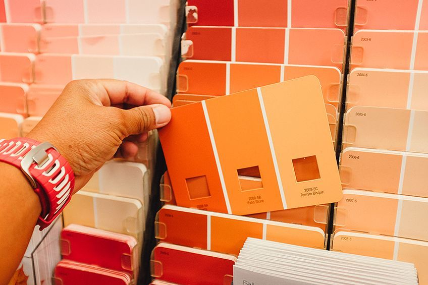
This is a lively color that is associated with spontaneity and youthful fearlessness. It invigorates the brain and stimulates positive mental activity. Conversely, the darker and more desaturated the orange, the more aggressive and dominant it becomes, so care must be taken when using it in a composition that is composed mainly of muted colors.
White
There is an argument in artistic circles that white can either be considered a color in itself, or the absence of color. For our purposes, we deem white a color and one that is associated with purity and freshness. In art, white can be used to tone down and lighten other colors. When we think about the color white we immediately think of snow and ice, but when painting a snowy landscape, for example, white should be used sparingly as it can give the painting a clinical feeling.
It can also make other colors in a composition seem lifeless. And remember, in some cultures, it is white, not black, that is the color of death, grief, and unhappiness.
Purple
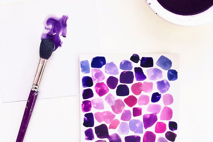
Purple is created by mixing the two primary colors red and blue together. It is a regal, luxurious color, particularly the darker shades. It should be used carefully, however, because it can engender feelings of sadness and despondency, particularly if the color black is used in the same painting. In a dull color palette, the lighter and more muted shades of purple such as lavender, mauve, and lilac are more forgiving on the eyes and work well with grays and whites.
Yellow
Yellow is one of the three primary colors and represents sunshine, light, and warmth, and creates feelings of happiness and hope in viewers. It is an optimistic, summery color that gives the feeling that everything is right in the world. Yellow cannot be made by mixing other colors together, but it can be mixed successfully to create more earthy tones.
Landscape painters of old used desaturated yellows to depict romantic and melodramatic moods in their paintings.
Red
Red is a dynamic color that is symbolic of many positive emotions such as love, excitement, strength, and power. Conversely, red is also the color of danger so it should be used frugally. It is a color that flatters the skin, thus making it a popular color in portrait painting. Light reds and pinks give the feeling of peace and warmth, whereas deeper reds are evocative of opulence and power. But, like the color orange, muted reds must be applied with care in a composition otherwise there is the danger of it overpowering the other colors, particularly if they too are muted.

Using a Muted Color Palette
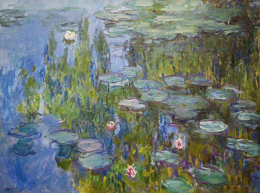
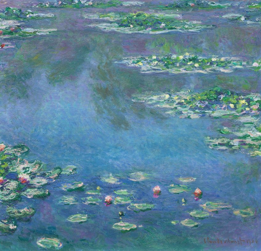
Claude Monet, the father of impressionism, once said, “Color is my day-long obsession, joy, and torment.” And when you look at his paintings you see that many of them are painted with muted tones. Of course, some are composed of bright colors but they have been offset by duller colors.
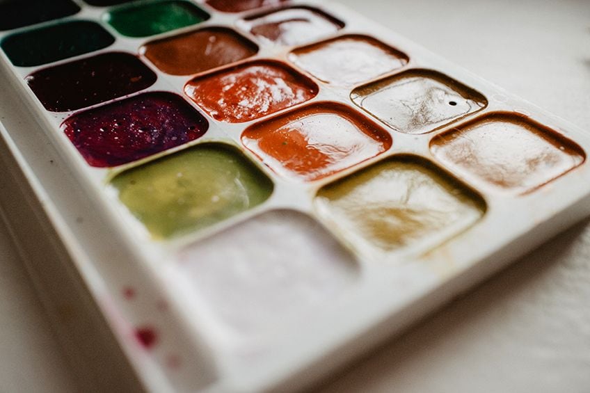
Monet knew then – as do modern artists today – that if your entire painting has been done using a vivid, highly saturated color scheme there will be no focal point to the picture. The focal point will seem as if it has been overshadowed by the surrounding colors as each color fights to stand out more than the others. Not only will viewers of the painting have difficulty in knowing where to look, but the competing colors will also be jarring to the eye.
Conversely, if your base colors comprise a dull color palette you will have more control over your focal point and where you direct the eye to look.
This is because your focal point, being composed primarily of unsaturated colors, might be surrounded by brighter, saturated colors thus making the focal point stand out more. It is therefore much more effective to use brighter tones occasionally combined with muted, desaturated tones. So what makes a desaturated color palette?
Creating a Muted Palette
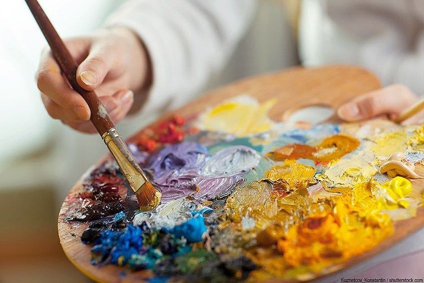
Muted colors, also known as dull colors, consist of a desaturated color palette. Thus, as the name suggests, when you want to create a muted color you would tone it down by mixing it with gray. You could also use black, which would darken the color you are mixing it with, or white, which would lighten the color.
A number of artists create a desaturated color palette by mixing a color with its complementary, or opposite, color, for example, red and green, or orange and blue. When looked at side by side, the two complementary colors create the strongest contrast to each other, but when they are mixed, they create a grayscale color, thus canceling each other out.
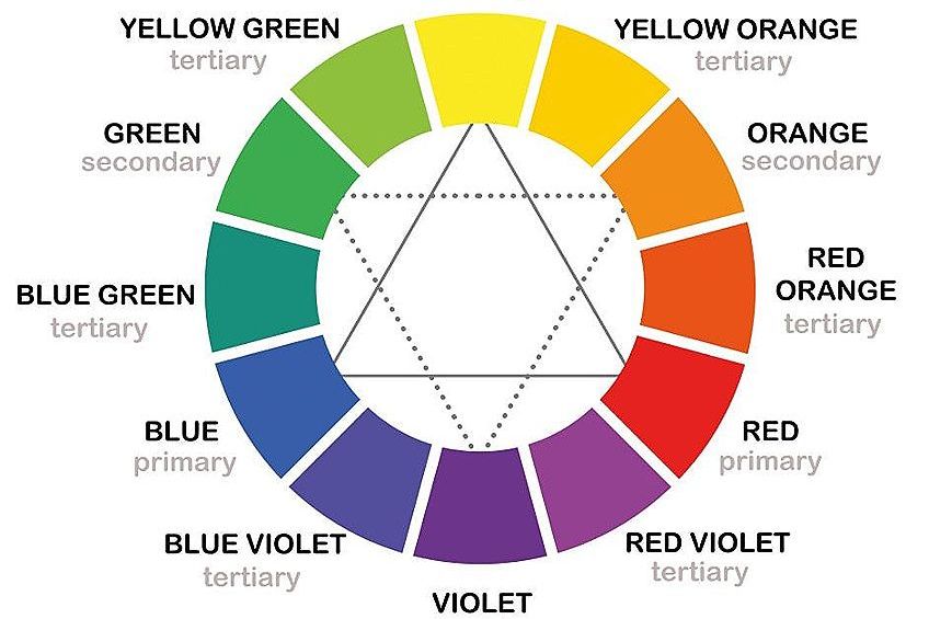
Earth tones can also be used to create a muted palette. Basically, an earth tone is one that contains some brown, like the color of the soil. The term also refers to natural colors such as stormy gray sky, crisp green leaves, rich brown soil, and the bright red of the sun. A muted color palette could also include a dull purple or a dark slate blue.
A warm or cool gray is also considered a muted color, and in fact “Ultimate Gray” is one of Pantone’s Colours of the Year for 2021. It is a color that one associates with minimalism and cleanliness, and is calming and soothing to the eye at the same time.
Unless you are mixing colors digitally, creating a muted color palette is not an exact science. For every two colors mixed there will be a different result, depending on the ratio of colors mixed, and the saturation of each color. And for every painting you do, there will be different requirements of color. Therefore, the best way to achieve the results you want is to experiment with ratios and saturations of color until you achieve the color palette you want.
Analog vs Digital
If analog arts and crafts supplies still play a role in your life, for example, if you are one of thousands of analog journalers out there – which is to say that you use pen and paper to record your thoughts rather than a digital device – you will know that supplies such as notebooks, pens, and pencils come in myriad colors, many of which are bright and eye-catching. More often than not, journalers choose colored ink over black ink as it is more visually appealing to them. From a psychological point of view, bright colors are uplifting and energizing, and, on paper, not hard on the eyes.
Conversely, digital devices come in muted colors such as black, white, and silver or gray. And whether you use an Apple Mac or a Windows application on your laptop, the screen colors are quiet and muted, soft blues and greys and dull whites that will not tire out the eyes and cause screen fatigue. As muted colors grow in popularity, they also influence other spheres of society such as fashion, music, marketing, and advertising. A muted color scheme has an emotional effect on people because they are very much in the now, that is to say, modern and contemporary.
On the contrary, brighter colors in the digital world are now considered to be archaic and ineffective, and ill-suited to devices because of the strain they put on your eyes.
Since digital devices are an essential part of our daily lives, even more so now with online education and Zoom meetings from home offices, most of us will have come across these terms for color types: CMYK, RGB, HEX, and PMS. When it comes to creating digital color palettes, there are two types: onscreen and print. RGB and HEX are onscreen palettes while PMS and CMYK are print palettes. With these palettes at our disposal, we can create digital art with as many varieties of muted tones as we have in oils, alkyds, and watercolors.
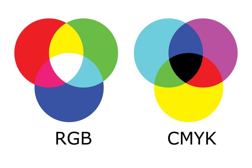
In the table below we have provided the RGB and HEX codes for the most commonly used muted colors. They can also be used to create other muted colors. In fact, any color on the color spectrum can be muted by mixing them with the colors in the following table.
| Color | RGB Code | Hex Code | Shade |
| White | 255, 255, 255 | #FFFFFF | |
| Black | 0, 0, 0 | #000000 | |
| Light Gray | 231, 230, 230 | #E7E6E6 | |
| Dark Gray | 165, 165, 165 | #A5A5A5 | |
| Light Brown | 153, 102, 51 | #996633 | |
| Dark Brown | 102, 51, 0 | #663300 | |
| Light Green | 51, 204, 51 | #33CC33 | |
| Dark Green | 0, 51, 0 | #003300 |
Famous Paintings With a Muted Color Palette
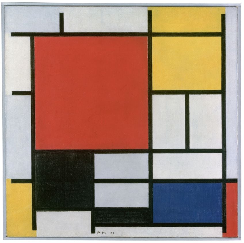
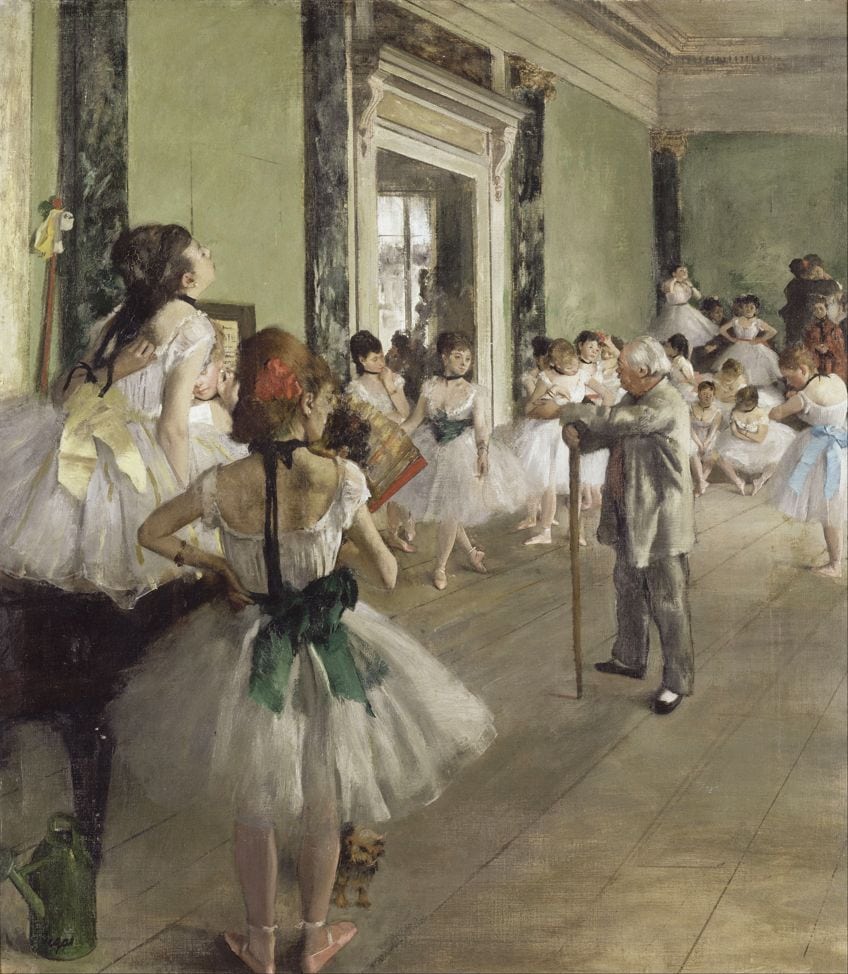
It would be impossible to discuss all the artists and artworks in which the artists have used either bright colors or muted, but there are two artists who come to mind when thinking about vivid and subdued tones: Piet Mondrian (1872 to 1944) and Edward Degas (1834 to 1917), respectively.
Among Mondrian’s best-known works is his Composition in Red, Blue, and Yellow (1929). It is a series of bright geometric figures in the primary colors red, blue and yellow, with white squares and black borders that make the colors stand out more. This is an excellent example of the use of highly saturated, bright colors.
On the opposite end of the spectrum is Edgar Degas’ The Ballet Class (1871) which is a study in muted, gentle tones, from the soft green of the room’s walls and the white of the dancers’ dresses, to the restrained browns of the floorboards. The overall impression of the painting is peacefulness and quiet gentility.
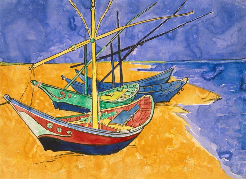
Two other contrasting paintings are Van Gogh’s Fishing Boats on the Beach at Saintes Maries de la Mer (1888) and James Abbott McNeill Whistler’s Whistler’s Mother (1871). In Van Gogh’s painting, the dominant colors are orange and blue with a touch of lime green. He said, “There is no blue without yellow and without orange.” There were very few of Van Gogh’s contemporaries who were able to successfully paint with bright colors the way he did, and Fishing Boats is no exception.
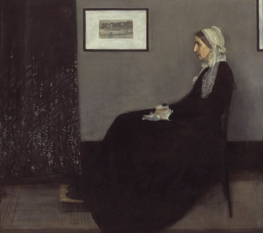
By contrast, Whistler’s Mother is made up almost entirely of black and gray, with a splash of white in the painting that is hanging on the wall, and a touch of muted yellow for her face and hands. Even so, the subject of the painting – who is portrayed mostly in black – stands out from the gray and black background. The feeling it evokes is of stillness and brooding melancholy.
In this article, we have attempted to debunk the myth that a muted color palette is a dull one. On the contrary, there are countless different colors that can be used on their own or mixed with other colors to bring emotion to your paintings, both for the artist and the viewer. Do not be afraid to experiment with your color palette and see how many interesting muted colors you can create yourself.
Take a look at our muted color palette webstory here!
Frequently Asked Questions
What Is the Definition of a Muted Color?
A muted color is one that is not as saturated as a bright color. It has been dulled or greyed by mixing it with colors such as black, white or grey, and brown or green. However, regardless of the medium in which you are working, some colors in the palette will already be muted versions, but that is not to say you can desaturate them farther if you wish.
What Are the Most Commonly Used Muted Colors?
Technically speaking, any color on the spectrum can be muted by mixing them with the colors mentioned above. However, the most common muted colors are the earth tones, such as grey, green and brown. Black and white are also used frequently, black to darken the mix and white to lighten it.
Can I Use Both Muted Colors and Bright Colors in My Paintings?
Yes, you can. There are no rules when it comes to the colors used, but when using a combination of muted and vivid colors, try to use muted colors in the focal piece of the composition and surround them with brighter colors. This way the viewer’s eye will be immediately directed to the focal point because the surrounding bright colors will have made it stand out.
In 2005, Charlene completed her Wellness Diplomas in Therapeutic Aromatherapy and Reflexology from the International School of Reflexology and Meridian Therapy. She worked for a company offering corporate wellness programs for a couple of years, before opening up her own therapy practice. It was in 2015 that a friend, who was a digital marketer, asked her to join her company as a content creator, and this is where she found her excitement for writing.
Since joining the content writing world, she has gained a lot of experience over the years writing on a diverse selection of topics, from beauty, health, wellness, travel, and more. Due to various circumstances, she had to close her therapy practice and is now a full-time freelance writer. Being a creative person, she could not pass up the opportunity to contribute to the Art in Context team, where is was in her element, writing about a variety of art and craft topics. Contributing articles for over three years now, her knowledge in this area has grown, and she has gotten to explore her creativity and improve her research and writing skills.
Charlene Lewis has been working for artincontext.org since the relaunch in 2020. She is an experienced writer and mainly focuses on the topics of color theory, painting and drawing.
Learn more about Charlene Lewis and the Art in Context Team.
Cite this Article
Charlene, Lewis, “Muted Colors – Your Guide to Making and Using a Muted Color Palette.” Art in Context. October 19, 2021. URL: https://artincontext.org/muted-colors/
Lewis, C. (2021, 19 October). Muted Colors – Your Guide to Making and Using a Muted Color Palette. Art in Context. https://artincontext.org/muted-colors/
Lewis, Charlene. “Muted Colors – Your Guide to Making and Using a Muted Color Palette.” Art in Context, October 19, 2021. https://artincontext.org/muted-colors/.


