


Color Harmony – Learn to Balance Tints, Shades, and Color Tones
You can use colors in many ways to create art and any design project, such as websites or even interior designs. However, creating color harmony might be challenging, especially if you do not know anything about color theory. In the article below, we are going to take a look at what color harmony is, and by the time you have finished the article, you should understand color harmony and have enough confidence to create your own beautiful and cohesive designs. Let’s get started!
What Is Color Harmony?
Color harmony is exactly what the word implies, creating an appealing combination of colors that work together. It is the base of every design as well as artwork, using color relationships to create a balanced and harmonious look or feel to a design or space. When studying further into colors, it might at first seem overwhelming, but if you follow the guidelines, it should be a fun and rewarding experience. The color wheel and the ideas behind it began many years ago, with Sir Isaac Newton, who while experimenting with the light spectrum and prisms.
The colors discovered were the seven colors of the rainbow, which eventually developed into 12 different hues, which include your primary, secondary, and tertiary or intermediate colors. The color wheel is the circular visual representation of these colors.
When talking about color harmony, you are dealing with color theory and the color wheel, which provides all the guidelines you will need to create the best grouping of colors. If you consider this, color harmony is the aesthetically pleasing and balanced combination of colors, which are based on the color wheel and its geometric associations.

These associated shapes help to produce eye-pleasing contrasts as well as harmonious pairings. The color combinations, represented as shapes on the color wheel can also be adjusted to create different saturation levels, values, shades, and tints, so there are numerous options to choose from when creating a design.
The Basics of Color Theory
We have already established that the color wheel and the associated geometric shapes are what form color harmony. Each color is not placed randomly on the color wheel, there is a set placement for each color. Each color placement and the relationship to other colors on the color wheel is what is used to create the color combinations.
Traditional Color Method
However, today, there are different color wheels available that play a role for various purposes. We all know the RYB color method that is used to mix paints and is often used as the more common way to create different color combinations. The primary hues for this model include red, yellow, and blue, while the secondary hues are orange, green, and purple (violet). The tertiary hues are a blend of your primary and secondary hues and include the below.

- Yellow-green
- Blue-green
- Red-orange
- Yellow-orange
- Blue-purple
- Red-purple
The traditional method remains the most popular, however, there is also the modern color wheel, which is based on the CMYK model. This system is mainly used for printing purposes, but many artists prefer this method to the traditional one. The letters stand for cyan, magenta, and yellow, with the “K” that represents the black ink. These are the primary colors for this model.
Color Model Used in Graphic Designs
This color model is used by graphic designers, and instead of mixing paints, this system mixes light and acts slightly differently to pigments. This can also be seen on your television and computer screens. In this model, the primary hues differ and are red, green, and blue (RGB). The secondary hues are magenta, cyan, and yellow, and the tertiary colors are as follows.

- Blue-green
- Yellow-green
- Red-violet
- Blue-violet
- Yellow-orange
- Red-orange
When looking for colors online, you can search for specific colors if you have the hex code, which identifies each color. This code always begins with a hashtag followed by letters and numbers, as you can see below in the example table for the color green. Many websites provide you with all the relevant color information, from the hex codes to the different color codes and more. There are also many tools you can use to determine the various color combinations, making it very easy to do. We have our own color wheel and tool for you to use.

| Shade | Hex Code | CMYK Color Code (%) | RGB Color Code | Color |
| Green | #00ff00 | 100, 0, 100, 0 | 0, 255, 0 |
Color Properties
When dealing with colors, each color has three primary properties including hue, saturation, and brightness. Hue is easy to describe, as it is the actual color you are dealing with, and many use hue and color interchangeably. Saturation is also known as chroma, and this measures how pure a color is. For example, a color that contains no white or black is much more vibrant and purer. Brightness is also known as “value” or “luminance” and is how dark or light a color appears.
When working with colors, you can adjust the saturation and brightness levels to help with creating harmony within a color combination.
The Role of Color Emotions
It has been studied and proven that colors can affect us both emotionally and physically. What is color harmony when considering emotions? Colors that are pleasing to look at and produce a positive response are colors that work in harmony. However, the subject of color harmony and emotions is a complex one as there are so many factors that contribute to how an individual views a color. Not everyone is influenced the same when it comes to colors.
How each person is affected mentally and emotionally depends on individual differences in gender, personal preferences, and age.
It also heavily relies on which part of the world you come from and the different cultures. So, you can get multiple associations for a single color. Many of the cultural influences produce conditioned and learned responses to various colors. Color context also plays a role in how you see color and the responses it elicits a response. This means observing how colors react to each other. How we react to colors also depends on the changing trends and other outside influences.

We may not realize it, but colors can influence our reactions and evoke strong emotions. Companies rely on this influence to sell their services and products. Colors can have a physical effect, they can soothe or irritate, color can even change our heart and breathing rates, or suppress appetite. Colors can improve energy levels, or they can help to relax you. Emotionally, colors can help to improve depression or help to improve concentration. As a tool for communication, colors are pretty important in our lives.
If you are an artist or designer, it is important to learn the language of colors, so that you can create color harmony, and get your message across clearly.
Color Schemes Explained
Once you grasp the basics of the color wheel, you can then move on to discovering the different types of color harmony. Since we now understand that colors can influence us on many levels, you should decide what you want your chosen colors to arouse. What feeling do you want to produce with the colors? This means familiarizing yourself with color psychology and determining the meaning of each color.
Once you know what your purpose is with the colors, you can then choose a key color. This is the hue you are going to base your entire design on. This can be any primary, secondary, or tertiary hue.
You need this color, which will determine the color harmony, and it acts as your starting point. To create color harmony, you should also consider the temperature of the colors, as a combination can become too garish. Warm colors are positioned on one side of the color wheel and include red, yellow, and orange. These colors are warm, energizing, and intense. Cool colors are grouped on the opposite side of the color wheel and include green, blue, and purple. These colors are calming and relaxing.

Remember, when creating color harmony, do not forget about the tints, shades, and different color tones, which allow for a more layered and balanced look. Now we will be examining the different color combinations and types of color harmony. We will keep using the color green as our example throughout this section.
Monochromatic Color Scheme
This type of color combination uses a single-color hue, and from this, all the other colors within the scheme are then created, forming different shades or tints, darker or lighter colors. The slightly different colors work very well together and can add depth to a design. Also, when considering this combination, to add more interest, bring in different textures and patterns. Below is one of the monochromatic color scheme examples, using the color green.

| Shade | Hex Code | CMYK Color Code (%) | RGB Color Code | Color |
| Green | #00ff00 | 100, 0, 100, 0 | 0, 255, 0 | |
| Dark Green | #009d00 | 100, 0, 100, 38 | 0, 157, 0 | |
| Pale Green | #9dff9d | 38, 0, 38, 0 | 157, 255, 157 |
Analogous Color Scheme
This type of color harmony combination usually consists of three hues, which are all on the same side of the color wheel and next to each other. The best way to use them is to choose your key color and use this as your majority hue, while the others play a more supporting role. This is a popular color scheme in design, as it is both easy to work with and easy on the eyes.
It has color harmony without being too intense or too dull.
You should also try to stick to warm or cool colors throughout the color palette, as this provides even more color harmony. Have a look at the table, where you can find one of the basic color harmony examples, again using green. Remember, you can also experiment with the different tints and shades of each hue.

| Shade | Hex Code | CMYK Color Code (%) | RGB Color Code | Color |
| Green | #00ff00 | 100, 0, 100, 0 | 0, 255, 0 | |
| Pale Green | #ceff9d | 19, 0, 38, 0 | 206, 255, 157 | |
| Strong Cyan | #00c462 | 100, 0, 50, 23 | 0, 196, 98 |
Complementary Color Scheme
This is one of the more popular color harmony examples and is used to create contrast as well as interest. When you look at a color wheel and find your key color, the hue that sits directly opposite is the complementary color. When paired, these colors create high contrast and stand out. If used properly, it creates beautiful and eye-catching designs, but the colors can begin to clash and become uncomfortable to look at. For example, if you have complementary colors as both your background and text on a website page, it will be quite difficult to read the text.
So, you should always consider your background and other elements. Below, you can see how green contrasts with magenta, its complementary color.

| Shade | Hex Code | CMYK Color Code (%) | RGB Color Code | Color |
| Green | #00ff00 | 100, 0, 100, 0 | 0, 255, 0 | |
| Magenta | #ff00ff | 0, 100, 0, 0 | 255, 0, 255 |
Split-Complementary Color Scheme
Sticking with contrasting colors, there is also the split complementary color scheme. This is similar to the above, but it uses the two colors that you find next to your complementary color. Again, you choose your key color and look directly opposite to the complementary color. However, you do not use this, but you do use two colors that are sitting next to it.
So, you have three colors this time to work with. Have a look at the basic split complementary color scheme examples below that go with green.

| Shade | Hex Code | CMYK Color Code (%) | RGB Color Code | Color |
| Green | #00ff00 | 100, 0, 100, 0 | 0, 255, 0 | |
| Pink | #ff0080 | 0, 100, 50, 0 | 255, 0, 128 | |
| Violet | #8000ff | 50, 100, 0, 0 | 128, 0, 255 |
Triadic Color Scheme
The triadic color scheme uses three colors to create a vibrant, interesting, and contrasting color palette. This is where the geometric shape is more apparent, as it forms an equal-sided triangle if you had to draw lines between the colors on a color wheel. When choosing your color theme, select one to be your key color, while the others can act as accents. This way, the overall effect does not become too overwhelming.
You can see the basic triadic color scheme below for the color green. Again, remember, there are many variations of green, red, and blue you can experiment with.

| Shade | Hex Code | CMYK Color Code (%) | RGB Color Code | Color |
| Green | #00ff00 | 100, 0, 100, 0 | 0, 255, 0 | |
| Red | #ff0000 | 0, 100, 100, 0 | 255, 0, 0 | |
| Blue | #0000ff | 100, 100, 0, 0 | 0, 0, 255 |
There are more color scheme combinations, for example, the tetradic color scheme that uses four colors. However, these are more difficult to work with, and instead of color harmony, they might end up being chaotic and overwhelming. However, if you have gained experience and feel comfortable with working with so many colors, it can create an intense and eye-catching color harmony.
Achieving Balance With Color Harmony
To achieve balance within a space, the even distribution of visual components is important, which can include colors, textures, space, and objects. Any composition can feel unbalanced if there is too much visual emphasis on a single side. When it comes to colors, you can include smaller areas of more vibrant colors to balance out the larger areas that consist of more neutral colors.
You can also include various elements, such as varying shapes, textures, or patterns. For example, a repeated pattern can help to create a sense of order.
Using contrast is a great way to form balance and produce a focal point. You can use cool and warm colors, for example, a dominant main warm color and an accent cool color can attract attention. You can also use contrasting colors like a neutral background with more saturated vibrant colors as accents. This will make the accents pop against the neutral background.

Color harmony is created when the surrounding colors either contrast or share similarities. If you are looking for high contrast, it will produce an eye-catching and dramatic effect. However, you can also choose low-contrast color combinations or colors that share similarities, which produce calmer and more pleasing combinations to the eyes.
Color Harmony in Art
We need some logical structure for us to understand what we see, and color harmony plays a vital role in this. Color harmony, therefore, not only provides something pleasing to look at, it also helps us to better understand the composition. In painting, it provides the completeness of the composition, which helps us make sense of the whole. Below are color harmony examples from two of the most eminent artists in history.
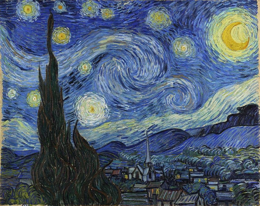
The Starry Night (1889) by Vincent van Gogh
| Artist | Vincent van Gogh (1853 – 1890) |
| Title | The Starry Night |
| Date Completed | 1889 |
| Medium | Oil paint on canvas |
| Size (cm) | 74 x 92 |
| Location | The Museum of Modern Art, New York City, United States |
This is a very popular and well-known art piece by Vincent van Gogh. The painting is also a great example of color harmony with the use of the color blue being used throughout the painting, from the sky to the land. Blue and yellow are also contrasting colors that draw your eyes.
The patterns and painting effects provide a sense of movement as your eyes shift around the image.
Bridge Over a Pond of Water Lilies (1899) by Oscar-Claude Monet
| Artist | Oscar-Claude Monet (1840 – 1926) |
| Title | Bridge Over a Pond of Water Lilies |
| Date Completed | 1899 |
| Medium | Oil paint on canvas |
| Size (cm) | 93 x 74 |
| Location | The Metropolitan Museum of Art, New York City, United States |
The painting is a work of impressionist art, which is what he is famous for. The painting is part of a series, which depicts a lily pond, a bridge, and lush foliage in the background. You will notice the dominance of greens and blues, which are cool and relaxing colors and work very well together and make it appealing to look at.
The whole painting works in harmony to create a tranquil atmosphere.
When using color harmony correctly, it can help to draw attention, evoke emotions, and can make a statement or convey a message. Color harmony is a very powerful design element that you can use to create striking pieces of art and designs. Whatever method you choose, the harmony of colors will help to make your work stand out from the rest!
Frequently Asked Questions
Is There a Connection Between Mood and Color?
Yes, color can evoke certain emotions and is a tool that can be used to convey non-verbal messages. Colors can be used to influence the decisions people make. However, our response to color varies and is affected by certain factors like culture and personal preferences.
How Can You Choose Harmonious Colors for Projects?
The best way to do this is to understand color theory so you can use the color wheel to create the various color combinations you will need. By following the guidelines and using color combinations, such as complementary colors or analogous colors, you can create beautiful color harmonies.
What Is the Easiest Color Combination to Work With?
Many would say that the monochromatic color combination is the easiest to work with, as you only use your key color and its various tints, shades, and tones. Because of this, you do not have to worry if a color is going to clash, as they all work together in harmony.

In 2005, Charlene completed her Wellness Diplomas in Therapeutic Aromatherapy and Reflexology from the International School of Reflexology and Meridian Therapy. She worked for a company offering corporate wellness programs for a couple of years, before opening up her own therapy practice. It was in 2015 that a friend, who was a digital marketer, asked her to join her company as a content creator, and this is where she found her excitement for writing.
Since joining the content writing world, she has gained a lot of experience over the years writing on a diverse selection of topics, from beauty, health, wellness, travel, and more. Due to various circumstances, she had to close her therapy practice and is now a full-time freelance writer. Being a creative person, she could not pass up the opportunity to contribute to the Art in Context team, where is was in her element, writing about a variety of art and craft topics. Contributing articles for over three years now, her knowledge in this area has grown, and she has gotten to explore her creativity and improve her research and writing skills.
Charlene Lewis has been working for artincontext.org since the relaunch in 2020. She is an experienced writer and mainly focuses on the topics of color theory, painting and drawing.
Learn more about Charlene Lewis and the Art in Context Team.
Cite this Article
Charlene, Lewis, “Color Harmony – Learn to Balance Tints, Shades, and Color Tones.” Art in Context. September 11, 2023. URL: https://artincontext.org/color-harmony/
Lewis, C. (2023, 11 September). Color Harmony – Learn to Balance Tints, Shades, and Color Tones. Art in Context. https://artincontext.org/color-harmony/
Lewis, Charlene. “Color Harmony – Learn to Balance Tints, Shades, and Color Tones.” Art in Context, September 11, 2023. https://artincontext.org/color-harmony/.


