What Color Goes With Cream? – 26 Best Combinations to Know
Cream is quite a popular color in all forms of design, including fashion and interior design. Cream is a safe color that provides a certain warmth and does not overpower a look, but rather remains happily in the background. However, to prevent a look from becoming too bland, what color goes with cream to create a more interesting design? To find out, read further to discover what matches with cream!
What Color Is Cream?
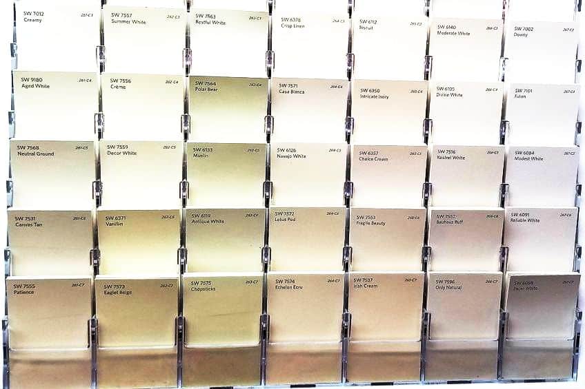
The cream color can be described as being an off-white that has a yellowish undertone. However, there are numerous shades of cream you can choose from. Some have more yellow, while others can almost be mistaken for white. You can also say that it is a yellowish-white or a very light pastel shade of yellow that can be quite bright but has a low intensity.
Cream is also seen as neutral because it can work wonderfully with most other colors.
You can create an aesthetically pleasing and harmonious color scheme with cream and one or even two other appropriate hues. The pairing all depends on what you wish to achieve, so as we continue, we will be discovering what color goes with cream.
| Shade | Hex Code | CMYK Color Code (%) | RGB Color Code | Color |
| Cream | #fffdd0 | 0, 1, 18, 0 | 255, 253, 208 |
Our Curated 26 Colors That Go With Cream
Coral
This combination brings together the softness of cream with the lively energy of coral. It’s excellent for creating spaces that are inviting and cheerful, perfect for social areas like living rooms and dining spaces. Coral, being a standout color, adds a touch of playfulness to the neutral backdrop of cream, making the space feel warm and vibrant.

| Cream | #FFFDD0 | 0, 0, 14, 0 | 255, 253, 208 | |
| Coral | #FF7F50 | 0, 50, 69, 0 | 255, 127, 80 |
Olive Green
Olive green and cream create a harmonious, nature-inspired palette, ideal for spaces that aim to evoke calmness and tranquility. The olive green adds depth and a touch of sophistication to cream, making this combination well-suited for bedrooms, home offices, or any space where a serene and focused ambiance is desired.

| Cream | #FFFDD0 | 0, 0, 14, 0 | 255, 253, 208 | |
| Olive Green | #808000 | 0, 0, 100, 50 | 128, 128, 0 |
Magenta
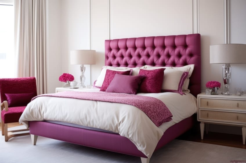
The boldness of magenta offers a striking contrast to the subtlety of cream. This pairing is perfect for injecting vibrant energy into a space. It works exceptionally well in areas where you want to make a statement, like an accent wall in a living room or in accessories and fabrics in a bedroom. Magenta brings a modern and youthful vibe that can brighten up and energize a neutral cream setting.
| Cream | #FFFDD0 | 0, 0, 14, 0 | 255, 253, 208 | |
| Magenta | #FF00FF | 0, 100, 0, 0 | 255, 0, 255 |
Turquoise
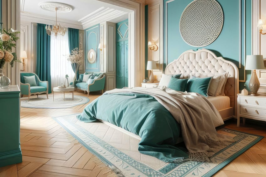
Combining cream with turquoise creates a refreshing and serene atmosphere. This pairing is reminiscent of the beach and sky, making it ideal for bathrooms, bedrooms, or spaces that aim to be a relaxing retreat. Turquoise, being a vivid color, adds a splash of joy and creativity to the soothing base of cream.

| Cream | #FFFDD0 | 0, 0, 14, 0 | 255, 253, 208 | |
| Turquoise | #40E0D0 | 69, 0, 18, 12 | 64, 224, 208 |
Gold
The elegance of gold paired with the softness of cream creates a luxurious and sophisticated ambiance. This combination is particularly suited for formal areas like dining rooms or living rooms, where you want to add a touch of opulence and grandeur. Gold accents, whether in lighting fixtures, decorative items, or fabrics, can elevate the richness of cream, bringing a timeless elegance to the space.

| Cream | #FFFDD0 | 0, 0, 14, 0 | 255, 253, 208 | |
| Gold | #FFD700 | 0, 16, 100, 0 | 255, 215, 0 |
Silver
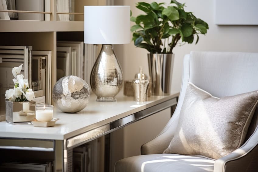
Silver adds a contemporary and sleek touch to cream’s warmth. This combination is perfect for modern and minimalist spaces, where the goal is to create a chic and sophisticated look. Silver accents in a cream room can provide a sense of modernity and freshness, ideal for living rooms or kitchens.
| Cream | #FFFDD0 | 0, 0, 14, 0 | 255, 253, 208 | |
| Silver | #C0C0C0 | 0, 0, 0, 25 | 192, 192, 192 |
Lavender
Lavender adds a soft, romantic feel to the neutral base of cream. This combination is excellent for creating a peaceful and soothing space, such as bedrooms or spas. Lavender’s calming properties, combined with cream’s versatility, make for a tranquil and elegant setting.

| Cream | #FFFDD0 | 0, 0, 14, 0 | 255, 253, 208 | |
| Lavender | #E6E6FA | 9, 9, 0, 2 | 230, 230, 250 |
Mint Green
Mint green and cream together create a light, airy, and refreshing ambiance. This color combination is perfect for kitchens, bathrooms, or any space where you want to evoke freshness and vitality. Mint green adds a pop of subtle color to the neutral cream, making the space feel lively yet balanced.

| Cream | #FFFDD0 | 0, 0, 14, 0 | 255, 253, 208 | |
| Mint Green | #98FF98 | 39, 0, 39, 0 | 152, 255, 152 |
Rust
The combination of rust and cream offers a warm, earthy feel. It’s great for creating a cozy and inviting atmosphere, making it ideal for living rooms, libraries, or bedrooms. Rust adds a rich, autumnal tone to the softness of cream, creating a comforting and enveloping feeling in the space.

| Cream | #FFFDD0 | 0, 0, 14, 0 | 255, 253, 208 | |
| Rust | #B7410E | 0, 61, 87, 28 | 183, 65, 14 |
Plum
Plum brings depth and luxury to the softness of cream. This combination is excellent for adding a touch of drama and sophistication, making it perfect for formal living areas or master bedrooms. Plum’s rich, deep tone provides a stunning contrast to cream, creating an elegant and refined space.

| Cream | #FFFDD0 | 0, 0, 14, 0 | 255, 253, 208 | |
| Plum | #8E4585 | 0, 47, 0, 45 | 142, 69, 133 |
Salmon Pink
Salmon pink, when paired with cream, offers a gentle yet refreshing ambiance. It’s perfect for creating a nurturing and soft environment, suitable for bedrooms or bathrooms. The warmth of salmon pink brings a comforting yet cheerful vibe to the neutral cream, ideal for spaces that need a touch of femininity and warmth.

| Cream | #FFFDD0 | 0, 0, 14, 0 | 255, 253, 208 | |
| Salmon Pink | #FF91A4 | 0, 43, 36, 0 | 255, 145, 164 |
Sky Blue
Sky blue adds a sense of calm and openness to cream’s understated elegance. This pairing is great for creating a light and airy atmosphere, especially suitable for bedrooms and nurseries. The sky blue evokes a feeling of serenity and spaciousness, making it ideal for rooms where relaxation is key.

| Cream | #FFFDD0 | 0, 0, 14, 0 | 255, 253, 208 | |
| Sky Blue | #87CEEB | 45, 13, 0, 8 | 135, 206, 235 |
Mustard Yellow
Mustard, with its bold and vibrant nature, adds a lively contrast to the soothing cream. This combination is perfect for energizing a space, such as a home office or kitchen. Mustard brings a sense of cheerfulness and creativity, making it a great accent color against the backdrop of cream.

| Cream | #FFFDD0 | 0, 0, 14, 0 | 255, 253, 208 | |
| Mustard | #FFDB58 | 0, 13, 64, 0 | 255, 219, 88 |
Teal
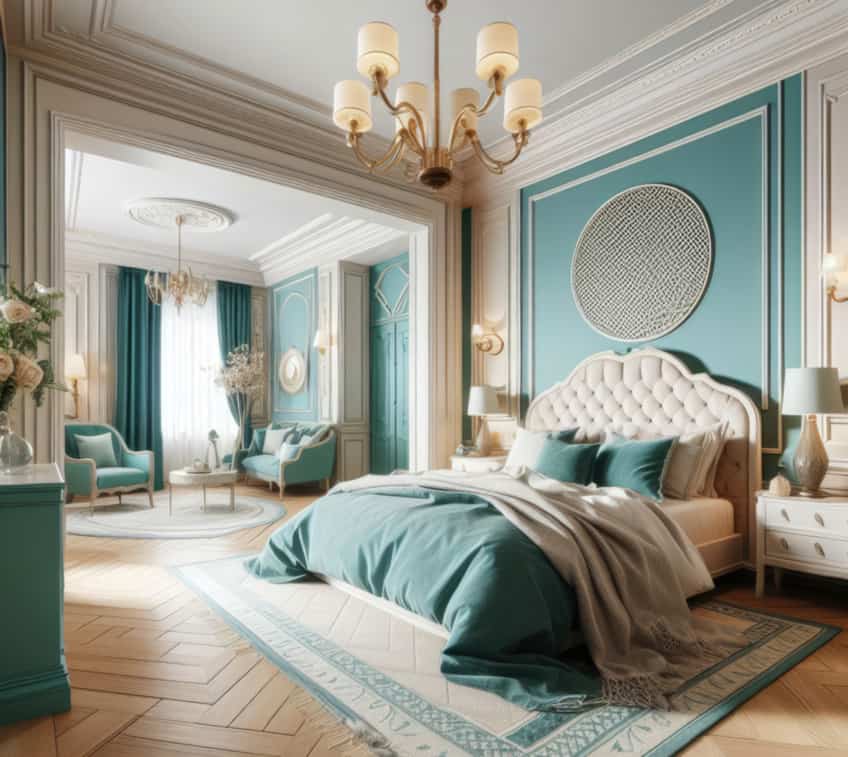
Teal offers a rich and sophisticated contrast to cream. This combination can create a balanced and harmonious look, suitable for living rooms or dining areas. Teal’s depth pairs well with cream’s softness, offering a stylish and contemporary feel.
| Cream | #FFFDD0 | 0, 0, 14, 0 | 255, 253, 208 | |
| Teal | #008080 | 100, 0, 0, 50 | 0, 128, 128 |
Charcoal Grey
Charcoal grey provides a strong, modern contrast to the softness of cream. Ideal for contemporary and minimalist spaces, this pairing offers a chic and sophisticated look. Charcoal grey adds a sense of depth and strength, making it a great choice for living areas or bedrooms where a touch of modern elegance is desired.

| Cream | #FFFDD0 | 0, 0, 14, 0 | 255, 253, 208 | |
| Charcoal Grey | #36454F | 43, 22, 0, 69 | 54, 69, 79 |
White
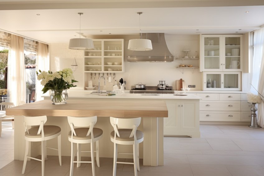
White is an extremely easy and safe color to work with, as it goes with all colors and styles. To help enhance the subtle warmth of cream, pair it with white. You will be able to observe the slight differences in shade. It is a sophisticated and stylish combination that can be used in both fashion as well as interior design. Layering cream and white clothing items can help to add more interest and depth to a look.
When deciding on an interior design, consider cream-painted walls and white moldings, and then include more shades of white and cream throughout to create what is known as a monochromatic look.
| Shade | Hex Code | CMYK Color Code (%) | RGB Color Code | Color |
| Cream | #fffdd0 | 0, 1, 18, 0 | 255, 253, 208 | |
| White | #ffffff | 0, 0, 0, 0 | 255, 255, 255 |
Gray
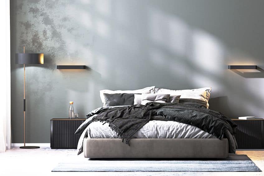
Paler or more mid-tone gray shades provide a more calming effect, while darker shades could clash. Although, when used for interior designs, darker grays, and cream can provide a nice contrast when used in ideal proportions. Gray is known to be more of a cooler color, and cream can help to add some warmth. Cool grays usually have undertones of blue, green, or purple. These provide a cleaner, more crisp, and modern look. Warmer grays have red or yellow undertones and offer a cozier effect.
These are easier to pair with cream, as you do not have to consider if the colors will go or not. You will get a smoother look that is comfortable and inviting.
| Shade | Hex Code | CMYK Color Code (%) | RGB Color Code | Color |
| Cream | #fffdd0 | 0, 1, 18, 0 | 255, 253, 208 | |
| Light Gray | #d3d3d3 | 0, 0, 0, 17 | 211, 211, 211 | |
| Gray | #808080 | 0, 0, 0, 50 | 128, 128, 128 | |
| Charcoal | #36454f | 32, 13, 0, 69 | 54, 69, 79 |
Black
Black and cream is a sophisticated and popular combination. In fashion, it is a luxurious and chic look that is easy to put together. You can also combine it with beige or tan and gold to create an even more fashionable ensemble. Cream, black, and gold also create a popular color scheme when it comes to weddings. The cream and black combination is an indispensable pairing for interior designs and is easy to work with.
You can use these two colors as your foundation neutral hues, which should also go nicely with most other colors.

| Shade | Hex Code | CMYK Color Code (%) | RGB Color Code | Color |
| Cream | #fffdd0 | 0, 1, 18, 0 | 255, 253, 208 | |
| Black | #000000 | 0, 0, 0, 100 | 0, 0, 0 |
Brown
Brown is another neutral color that works fantastically with cream and most other colors for all kinds of design projects. There are numerous shades of brown you can select for a design. Lighter or darker versions as well as browns that have more of an orange undertone and others that have a reddish undertone.

| Shade | Hex Code | CMYK Color Code (%) | RGB Color Code | Color |
| Cream | #fffdd0 | 0, 1, 18, 0 | 255, 253, 208 | |
| Brown | #603f19 | 0, 34, 74, 62 | 96, 63, 25 |
Beige, Tan, and Taupe
All three of these neutral colors have warm undertones of either yellow or reddish-brown. There are also numerous different tints and shades for each. Cream can be categorized as a shade of beige, which also has a yellow undertone but can be much darker than cream and can lean more toward a yellow-brown shade. To create a layered look that provides more depth, consider pairing cream, beige, and taupe. Beige is also similar to a tan color but is lighter, while tan is a little darker and closer to brown.
Taupe is a lot darker than all of the above and is closer to a grayish-brown and is an ideal color to pair with cream.

| Shade | Hex Code | CMYK Color Code (%) | RGB Color Code | Color |
| Cream | #fffdd0 | 0, 1, 18, 0 | 255, 253, 208 | |
| Beige | #eaeab4 | 0, 0, 23, 8 | 234, 234, 180 | |
| Tan | #d2b48c | 0, 14, 33, 18 | 210, 180, 140 | |
| Taupe | #483c32 | 0, 17, 31, 72 | 72, 60, 50 |
Orange
There are many different shades of orange you can use to pair with cream from light orange to peach or a more bold burnt orange. Create a fun and beachy feel or go for something more sophisticated. In either case, it produces a warmth that is evident when putting together outfits or designing interiors.

| Shade | Hex Code | CMYK Color Code (%) | RGB Color Code | Color |
| Cream | #fffdd0 | 0, 1, 18, 0 | 255, 253, 208 | |
| Light Orange | #ffa483 | 0, 36, 49, 0 | 255, 164, 131 | |
| Peach | #ffe5b4 | 0, 10, 29, 0 | 255, 229, 180 | |
| Burnt Orange | #cc5500 | 0, 58, 100, 20 | 204, 85, 0 |
Yellow
A cream and yellow color combination creates a welcoming and warm space. There are also many yellow shades to choose from and use so that you can add more depth to a space. This combination offers a monochromatic color scheme that is easy to work with and offers more dimension to a design. Metallic golds also work wonderfully with cream, for example, gold jewelry accessories for an outfit, or gold light fittings that can be used in a room.
Cream will also help to make brighter shades of yellow stand out more.

| Shade | Hex Code | CMYK Color Code (%) | RGB Color Code | Color |
| Cream | #fffdd0 | 0, 1, 18, 0 | 255, 253, 208 | |
| Gold | #ffd700 | 0, 16, 100, 0 | 255, 215, 0 | |
| Light Yellow | #ffe54f | 0, 10, 69, 0 | 255, 229, 79 |
Red
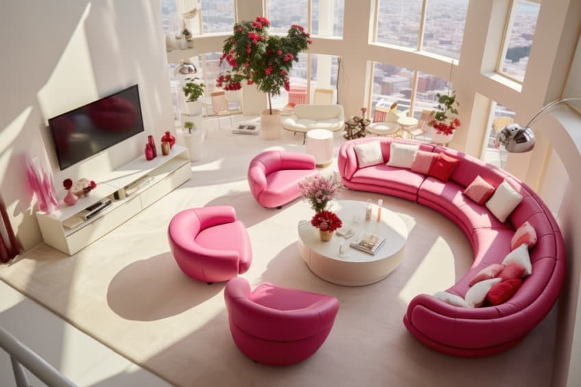
Cream and red are a bold combination, as red is vibrant and will stand out against cream. Consider using a burgundy red instead of a too-bright option. This combination still makes a statement and has good contrast, but with more balance and without being too garish. For a softer and more feminine look, cream and shades of pink can also work well together. However, use it as an accent color with cream to create a more appealing look.
You can go for softer reds or pinks like cherry blossoms, or you can even consider a bolder pink like fuchsia.
| Shade | Hex Code | CMYK Color Code (%) | RGB Color Code | Color |
| Cream | #fffdd0 | 0, 1, 18, 0 | 255, 253, 208 | |
| Burgundy | #800020 | 0, 100, 75, 50 | 128, 0, 32 | |
| Cherry Blossom | #ffb7c5 | 0, 28, 23, 0 | 255, 183, 197 | |
| Fuchsia | #ff00ff | 0, 100, 0, 0 | 255, 0, 255 |
Blue
In general, blue is a calming color and both lighter, brighter, and darker blues can work with cream. A cream complementary color can be steel blue, which is more of a moderate shade of blue. Combining blue, cream, and tan, you can create a nice seaside feel to a color scheme. Cream pairs perfectly with darker shades of blue like navy and blue greens, such as teal.
You can also go bold with colors like turquoise, which will create a relaxing, yet elegant combination.

| Shade | Hex Code | CMYK Color Code (%) | RGB Color Code | Color |
| Cream | #fffdd0 | 0, 1, 18, 0 | 255, 253, 208 | |
| Steel Blue | #4682b4 | 61, 28, 0, 29 | 70, 130, 180 | |
| Baby Blue | #89cff0 | 43, 14, 0, 6 | 137, 207, 240 | |
| Navy Blue | #000080 | 100, 100, 0, 50 | 0, 0, 128 | |
| Teal | #008080 | 100, 0, 0, 50 | 0, 128, 128 | |
| Turquoise | #40e0d0 | 71, 0, 7, 12 | 64, 224, 208 |
Green
Green also provides a soothing element, and selecting darker greens like forest green can make cream stand out. When designing a room, you can simply add some leafy green plants to do this. Seafoam green is a softer green, and like all greens, will work well with neutral colors like cream. If you want to consider a bolder option, you can try emerald green or even chartreuse.

| Shade | Hex Code | CMYK Color Code (%) | RGB Color Code | Color |
| Cream | #fffdd0 | 0, 1, 18, 0 | 255, 253, 208 | |
| Forest Green | #014431 | 99, 0, 28, 73 | 1, 68, 49 | |
| Seafoam Green | #93e9be | 37, 0, 18, 9 | 147, 233, 190 | |
| Emerald Green | #50c878 | 60, 0, 40, 22 | 80, 200, 120 | |
| Chartreuse | #7fff00 | 50, 0, 100, 0 | 127, 255, 0 |
Purple
Another cream complementary color is lavender, which can come in a variety of darker and lighter shades. The combination is very popular and provides a fresh and tranquil look that also offers a strong contrast. The cream helps to balance the rich tones of lavender or any shade of purple. When using these colors, the cream hue should play the backdrop to pops of purple color.
You can also try bolder versions of purple like orchid.

| Shade | Hex Code | CMYK Color Code (%) | RGB Color Code | Color |
| Cream | #fffdd0 | 0, 1, 18, 0 | 255, 253, 208 | |
| Lavender | #b09cc8 | 12, 22, 0, 22 | 176, 156, 200 | |
| Orchid | #da70d6 | 0, 49, 2, 15 | 218, 112, 214 | |
| Royal Purple | #7851a9 | 29, 52, 0, 34 | 120, 81, 169 |
Tips for Choosing Colors That Go With Cream Walls
Since cream belongs to the neutral family of colors, it is easy to work with and goes with most other colors. However, some specific colors that work best with cream include gray, brown, white, and shades of blue. The color cream can be used to paint walls in any room of the home, its soft and unassuming hue is soothing and produces a cozy feeling. Shades of cream also offer a brighter feeling, without being too clinical like white can be. Here are some tips on how to use cream paint on walls.
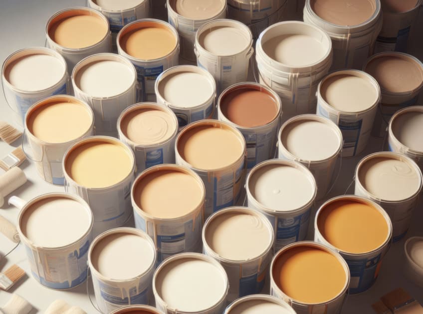
- A creamy and glossy cream will help to reflect the surrounding colors.
- Consider what mood you want to create, something more feminine and cozy with softer oranges and pinks, or do you want a beach-type to feel with cream and shades of blue?
- Include different tones and shades of cream, which provides more depth to a space.
- Choose a vibrant combination of textures and materials to use with cream. This can include rugs, cushions, throws, drapes, or upholstery.
- To add diversity, consider differently shaped furniture in a creamy room.
- For creating real depth in a room, think about pairing cream with dark blue, black, or dark green accessories.
What Colors Go With Cream Clothes?
Cream is a classic look for clothing, regardless of what shade it is. You can get all kinds of different apparel that come in a cream color. Some examples include cream pants, jackets, blouses, T-shirts, skirts, sweaters, and even lingerie. When it comes to skin tone, cool skin undertones work better with white, while warmer skin undertones work great with cream. If you look better in gold than silver jewelry, then cream is perfect for you.
What colors go with cream clothes? If you were to wear a cream dress, and you are going for a sophisticated look that is for evening wear, consider pairing it with deeper colors like navy or burgundy.

For a more romantic or softer look, consider lavender or a softer red or pink. You can also wear cream as an accessory item, for example, to bring out the yellow in a dress, consider wearing a cream coat. Again, various combinations of cream and brown, black, white, and blue are popular.
The color cream is an old favorite for many because it acts as a neutral and can go with many different colors. However, these color combinations can be a bit challenging on occasion. We hope after reading this that you can now confidently pair cream with any color you decide to choose for your design.
Take a look at our “what color goes with cream” webstory here!
Frequently Asked Questions
What Color Goes With Cream?
Cream is a versatile and neutral color that works great with most colors. Having a yellowish undertone, cream is a warm color that will go well with other warm hues, such as yellow or orange. All other neutrals also work brilliantly with cream and if used properly, shades of blue and green are also great choices.
Are Cream and Ivory the Same Color?
Ivory and cream are both neutral and warm colors but can have slightly different undertones. Ivory can have a slightly yellowish or beige undertone, while cream has a stronger yellow undertone that is a bit more noticeable.
What Darker Colors Go With Cream?
Some of the darker colors that will work with cream include black and navy blue. You can also try using a deeper red like burgundy with cream, which is a popular color for weddings. Lighter gray shades work best with cream, but you can also consider a darker gray or charcoal.
In 2005, Charlene completed her Wellness Diplomas in Therapeutic Aromatherapy and Reflexology from the International School of Reflexology and Meridian Therapy. She worked for a company offering corporate wellness programs for a couple of years, before opening up her own therapy practice. It was in 2015 that a friend, who was a digital marketer, asked her to join her company as a content creator, and this is where she found her excitement for writing.
Since joining the content writing world, she has gained a lot of experience over the years writing on a diverse selection of topics, from beauty, health, wellness, travel, and more. Due to various circumstances, she had to close her therapy practice and is now a full-time freelance writer. Being a creative person, she could not pass up the opportunity to contribute to the Art in Context team, where is was in her element, writing about a variety of art and craft topics. Contributing articles for over three years now, her knowledge in this area has grown, and she has gotten to explore her creativity and improve her research and writing skills.
Charlene Lewis has been working for artincontext.org since the relaunch in 2020. She is an experienced writer and mainly focuses on the topics of color theory, painting and drawing.
Learn more about Charlene Lewis and the Art in Context Team.
Cite this Article
Charlene, Lewis, “What Color Goes With Cream? – 26 Best Combinations to Know.” Art in Context. July 10, 2023. URL: https://artincontext.org/what-color-goes-with-cream/
Lewis, C. (2023, 10 July). What Color Goes With Cream? – 26 Best Combinations to Know. Art in Context. https://artincontext.org/what-color-goes-with-cream/
Lewis, Charlene. “What Color Goes With Cream? – 26 Best Combinations to Know.” Art in Context, July 10, 2023. https://artincontext.org/what-color-goes-with-cream/.


