Shades of Orange – 100 Tones Including All Color Codes
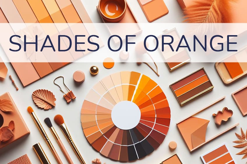
Orange is possibly the most vibrant secondary color on the spectrum. A combination of various ratios of red and yellow, orange is warm and inviting. Orange can stimulate oxygen saturation in the brain which can enhance critical thinking and creativity. Typically, this secondary shade can invoke happiness and positivity, but its vibrancy is also used in times of emergency. We have curated 100 oranges shades with visuals, a description and all color codes for you.
The Meaning of Orange Shades
Orange has many different meanings, depending largely on the exact shade. From abundance and fertility to amusement, warmth, and excitement, orange is versatile and can be used in art, fashion, and interior design.
Orange first came into Western artistic use after the first synthetic pigment was produced in 1809.
Chrome orange, as this first pigment was known, was widely used by Impressionist and pre-Raphaelite painters. These artists loved the orange pigment for capturing the effects of natural light. Other artists, like Renoir, Monet, and Gauguin used orange shades to invoke feelings of amusement, warmth, and excitement.
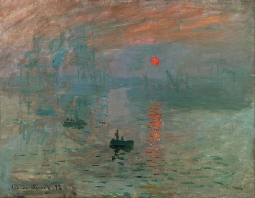
Impression, Sunrise (1872) by Claude Monet; Claude Monet, Public domain, via Wikimedia Commons
Monet, an Impressionist, often used orange in his paintings of sunsets. We cannot, however, put any other artist above Vincent van Gogh in his use of orange shades. In particular, Van Gogh used orange shades in conjunction with purples and blues to create depth and contrast.
Today, orange is still a popular shade that can be used to elicit a range of different feelings and occasions. Dark pumpkin orange shades are synonymous with Halloween and the changing shades of autumn. Lighter orange shades tend to be associated with warm summery days and feelings of freshness. These light and bright orange shades can become a little overwhelming when used incorrectly, so the key to success lies in choosing the right shade and using it in the correct way.
Thanks to its vibrancy, orange has also become the top color for safety uniforms and equipment. Since the U.S Navy first used the shade for their life jackets in the second World War, orange is often used for items of safety thanks to its eye-catching nature.
Prison jumpsuits use orange for this exact reason so that they can be easily spotted if they escape.
Exploring Different Shades of Orange Color
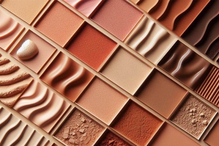
Now that we have explored the history and meaning of the color orange a little, it is time to explore some of the most exciting shades that orange has to offer. We begin with the warmest shades of orange and move towards those that are cooler. In other words, we start with oranges that are redder and then finish with those that are more yellow. We will look at all of these types of orange colors in depth. You will notice that many of the color names feature natural things that share their color. Ginger orange, sunrise orange, even mango tango, these names can tell you exactly what to expect from the color. Not only have we given you an idea of what each shade of orange looks like, we also give you the color codes, including the CMYK codes, so that you can mix these colors perfectly.

Alloy Orange
A metallic, deep orange that gives a feeling of strength and endurance. It’s reminiscent of industrial materials, often used in bold and dynamic designs.
| Hex: #C35214 RGB: 195, 82, 20 CMYK: 0, 58, 90, 24 |
Amber Sae/ece
A standardized amber color used in automotive lighting. It’s bright and attention-grabbing, signifying caution and visibility.
| Hex: #FF7E00 RGB: 255, 126, 0 CMYK: 0, 51, 100, 0 |
Antique Brass
A muted, deep orange with a hint of brown, resembling aged brass. It exudes a vintage charm and sophistication.
| Hex: #CD9575 RGB: 205, 149, 117 CMYK: 0, 27, 43, 20 |
Apricot
A soft, pale orange that’s warm and inviting. It’s reminiscent of the fruit, conveying a sense of freshness and sweetness.
| Hex: #FBCEB1 RGB: 251, 206, 177 CMYK: 0, 18, 29, 2 |
Atomic Tangerine
Tangerine is a bright, citrusy orange, full of energy and freshness. It’s a lively color that stimulates and invigorates.
A vibrant, neon-like orange that’s bold and eye-catching. It’s playful and modern, often used in youthful and energetic designs.
| Hex: #FF9966 RGB: 255, 153, 102 CMYK: 0, 40, 60, 0 |
Basketball Orange
A rich, vivid orange akin to the color of a basketball. It’s energetic and sportive, capturing the essence of the game.
| Hex: #E76E1D RGB: 231, 110, 29 CMYK: 0, 52, 87, 9 |
Beer Orange
A deep, golden orange reminiscent of amber beer. It’s warm, inviting, and associated with relaxation and leisure.
| Hex: #F28F1C RGB: 242, 143, 28 CMYK: 0, 41, 88, 5 |
Bittersweet
A strong, reddish-orange that’s both striking and a bit melancholic. It’s often used in designs that need a touch of drama and intensity.
| Hex: #FE6F5E RGB: 254, 111, 94 CMYK: 0, 56, 63, 0 |
Bronze
A brownish-orange that resembles the metal bronze. It’s associated with third-place achievements and has a timeless, classic appeal.
| Hex: #CD7F32 RGB: 205, 127, 50 CMYK: 0, 38, 76, 20 |
Brown Sugar
A warm, deep orange-brown, similar to the color of brown sugar. It’s sweet and comforting, often used in cozy and welcoming designs.
| Hex: #AF6E4D RGB: 175, 110, 77 CMYK: 0, 37, 56, 31 |
Burlywood
A soft, sandy shade of orange. It’s subtle and natural, reminiscent of untreated wood or a sandy beach.
| Hex: #DEB887 RGB: 222, 184, 135 CMYK: 0, 17, 39, 13 |
Burnt Sienna
A rich, earthy orange-red, inspired by the pigment of the same name. It’s warm and rustic, commonly used in art and design.
| Hex: #E97451 RGB: 233, 116, 81 CMYK: 0, 50, 65, 9 |
Burnt Orange
A deep, vibrant orange with a hint of red, like the color of autumn leaves. It’s warm and inviting, often associated with the fall season.
| Hex: #CC5500 RGB: 204, 85, 0 CMYK: 0, 58, 100, 20 |
Burnt Umber
A dark, reddish-orange, similar to the earthy pigment. It’s rich and warm, evoking a sense of groundedness and stability.
| Hex: #8A3324 RGB: 138, 51, 36 CMYK: 0, 63, 74, 46 |
Cadmium Orange
A bright, pure orange named after the pigment. It’s vivid and energetic, often used in art for its high impact.
| Hex: #E6812F RGB: 230, 129, 47 CMYK: 0, 44, 80, 10 |
Candlelight Orange
Light Orange is a soft, pastel orange, offering a gentle and soothing presence. It’s a subtle, understated shade, ideal for a delicate touch in designs.
A soft, warm orange that resembles the glow of candlelight. It’s romantic and comforting, creating a cozy and intimate atmosphere.
| Hex: #FBB031 RGB: 251, 176, 49 CMYK: 0, 30, 80, 2 |
Carrot Orange
A bright, cheerful orange similar to the color of a carrot. It’s fresh and lively, often used in designs promoting health and vitality.
| Hex: #ED9121 RGB: 237, 145, 33 CMYK: 0, 39, 86, 7 |
Cedar Chest
A deep, reddish-orange that reminds one of the warm, woody tones of a cedar chest. It’s nostalgic and comforting.
| Hex: #C95A49 RGB: 201, 90, 73 CMYK: 0, 55, 64, 21 |
Chinese Orange
A traditional orange in Chinese art, vibrant and deep. It symbolizes good fortune and happiness in Chinese culture.
| Hex: #EB6841 RGB: 235, 104, 65 CMYK: 0, 56, 72, 8 |
Clay
A natural, earthy orange, like the color of clay soil. It’s grounded and organic, often used in designs that emphasize natural elements.
| Hex: #9F5400 RGB: 159, 84, 0 CMYK: 0, 47, 100, 38 |
Copper Crayola
A metallic, reddish-orange inspired by the color of copper metal. It’s warm and lustrous, evoking a sense of luxury and warmth.
| Hex: #DA8A67 RGB: 218, 138, 103 CMYK: 0, 37, 53, 15 |
Copper Red
A deep, rich orange-red, similar to oxidized copper. It’s vibrant and dynamic, often used in designs that want to make a bold statement.
| Hex: #D97448 RGB: 217, 116, 72 CMYK: 0, 47, 67, 15 |
Coral
A soft, pinkish-orange, like the color of coral reefs. It’s delicate and lively, commonly used in fashion and decor for a gentle splash of color.
| Hex: #FF7F50 RGB: 255, 127, 80 CMYK: 0, 50, 69, 0 |
Creamsicle Orange
A pale, creamy orange reminiscent of a Creamsicle ice cream. It’s sweet and playful, perfect for light-hearted and fun designs.
| Hex: #F19360 RGB: 241, 147, 96 CMYK: 0, 39, 60, 5 |
Dark Coral
A deeper, more intense version of coral. It’s rich and sophisticated, suitable for elegant and refined designs.
| Hex: #D75341 RGB: 215, 83, 65 CMYK: 0, 61, 70, 16 |
Dark Orange
A deep, vivid orange that’s bold and impactful. It’s striking and assertive, often used in designs that need a strong visual presence.
| Hex: #FF8C00 RGB: 255, 140, 0 CMYK: 0, 45, 100, 0 |
Dark Pastel Red
A soft, muted red with hints of orange. It’s subtle and subdued, suitable for designs that require a touch of warmth without being overpowering.
| Hex: #C34723 RGB: 195, 71, 35 CMYK: 0, 64, 82, 24 |
Dark Salmon
Dark Salmon is a rich, pinkish-orange hue that evokes the depths of a salmon’s coloration at dusk. It blends the warmth of orange with a subtle, dusky pink undertone.
| Hex: #E9967A RGB: 233, 150, 122 CMYK: 0, 36, 48, 9 |
Deep Saffron
Deep Saffron is a vivid, golden-yellow shade reminiscent of the exotic spice. It exudes luxury and warmth, offering a bold statement in any creative design.
| Hex: #FFA52C RGB: 255, 165, 44 CMYK: 0, 35, 83, 0 |
Fawn
Fawn is a muted, pale yellow-brown, similar to the color of a young deer’s coat. It’s a natural, earthy shade that brings a sense of calm and subtlety.
| Hex: #E5AA70 RGB: 229, 170, 112 CMYK: 0, 26, 51, 10 |
Flame
Flame is a fiery, intense red-orange, embodying the lively flickers of an open fire. This color is dynamic and energetic, perfect for capturing attention.
| Hex: #E34A27 RGB: 227, 74, 39 CMYK: 0, 67, 83, 11 |
Fulvous
Fulvous is a dull, brownish-yellow, similar to a withered autumn leaf. It’s a subdued, natural shade that evokes a sense of age and timelessness.
| Hex: #E68000 RGB: 230, 128, 0 CMYK: 0, 44, 100, 10 |
Gamboge
Gamboge is a bright yellow-orange, reminiscent of tropical fruits. It’s a vibrant and eye-catching color, often used to energize and enliven a palette.
| Hex: #E89611 RGB: 232, 150, 17 CMYK: 0, 35, 93, 9 |
Ginger Orange
Ginger Orange is a warm, spicy shade of orange with a hint of brown, much like the root it’s named after. It’s inviting and cozy, perfect for intimate spaces.
| Hex: #F7954A RGB: 247, 149, 74 CMYK: 0, 40, 70, 3 |
Goldfish Orange
Goldfish Orange is a vivid, translucent orange, mirroring the lively coloration of a goldfish. It’s playful and bold, ideal for adding a splash of cheerfulness.
| Hex: #F37C20 RGB: 243, 124, 32 CMYK: 0, 49, 87, 5 |
Halloween Orange
Halloween Orange is a classic, bright orange, associated with pumpkins and fall festivities. It’s a fun, vibrant color that captures the spirit of Halloween.
| Hex: #EE5921 RGB: 238, 89, 33 CMYK: 0, 63, 86, 7 |
Heat Wave
Heat Wave is a scorching, bright red with a hint of orange, mimicking the intensity of a summer heat wave. It’s a bold and energizing color.
| Hex: #FF7A00 RGB: 255, 122, 0 CMYK: 0, 52, 100, 0 |
Indian Sunset
Indian Sunset is a deep, terracotta orange, reminiscent of a dramatic evening sky. It’s a warm, inviting color that captures the essence of a serene sunset.
| Hex: #E3A857 RGB: 227, 168, 87 CMYK: 0, 26, 62, 11 |
International Orange
International Orange is a deep, bright orange, often used for high-visibility purposes. It’s a bold, assertive color that stands out strikingly.
| Hex: #FF4F00 RGB: 255, 79, 0 CMYK: 0, 69, 100, 0 |
Jasper Orange
Jasper Orange is a rich, reddish-orange, similar to the semiprecious stone. It’s a warm, earthy hue that exudes elegance and sophistication.
| Hex: #E89149 RGB: 232, 145, 73 CMYK: 0, 38, 69, 9 |
Light Orange
| Hex: #FED8B1 RGB: 254, 216, 177 CMYK: 0, 15, 30, 0 |
Light Salmon
Light Salmon is a pale, soft pinkish-orange, reminiscent of salmon flesh. It’s a light, airy color, perfect for creating a sense of softness and ease.
| Hex: #FFA07A RGB: 255, 160, 122 CMYK: 0, 37, 52, 0 |
Macaroni And Cheese
Macaroni and Cheese is a creamy, yellow-orange shade, much like the comfort food it’s named after. It’s a playful, inviting color that evokes warmth and coziness.
| Hex: #FFBD88 RGB: 255, 189, 136 CMYK: 0, 26, 47, 0 |
Mahogany
Mahogany is a deep, reddish-brown, resembling the rich, luxurious wood. It’s a sophisticated and classic color, often used to convey elegance and strength.
| Hex: #C04000 RGB: 192, 64, 0 CMYK: 0, 67, 100, 25 |
Mandarin
Mandarin is a bright, zesty orange, similar to the fruit. It’s a lively and invigorating color, perfect for adding a burst of energy to any design.
| Hex: #F37A48 RGB: 243, 122, 72 CMYK: 0, 50, 70, 5 |
Mango Tango
Mango Tango is a vibrant, tropical orange with a hint of red. It’s a fun, energetic color that evokes the lively spirit of a tropical paradise.
| Hex: #FB8842 RGB: 251, 136, 66 CMYK: 0, 46, 74, 2 |
Marigold
Marigold is a bright, golden-orange, reminiscent of the flower. It’s a sunny, cheerful color that brings a sense of joy and optimism.
| Hex: #EDA012 RGB: 237, 160, 18 CMYK: 0, 32, 92, 7 |
Medium Vermilion
A brilliant red-orange, Vermilion is a classic pigment known for its vivid and striking hue, used extensively in art and decoration.
Medium Vermilion is a balanced, medium red-orange. It’s a classic and versatile shade, embodying both the warmth of red and the brightness of orange.
| Hex: #CF5B2E RGB: 207, 91, 46 CMYK: 0, 56, 78, 19 |
Mellow Apricot
Mellow Apricot is a soft, warm hue that brings to mind the gentle sweetness of ripe apricots. It’s a comforting color, ideal for creating a cozy and inviting atmosphere.
| Hex: #FDBD7C RGB: 253, 189, 124 CMYK: 0, 25, 51, 1 |
Melon
This color resembles the fresh, juicy flesh of a summer melon. It’s a vibrant, yet soothing shade that evokes feelings of warmth and relaxation.
| Hex: #FEBAAD RGB: 254, 186, 173 CMYK: 0, 27, 32, 0 |
Metallic Orange
A futuristic and bold shade, Metallic Orange combines the traditional warmth of orange with a shimmering metallic finish, perfect for modern and dynamic designs.
| Hex: #E26310 RGB: 226, 99, 16 CMYK: 0, 56, 93, 11 |
Monarch Orange
Reminiscent of the regal and striking Monarch butterfly, this shade is vibrant and full of life, symbolizing energy and transformation.
| Hex: #F68326 RGB: 246, 131, 38 CMYK: 0, 47, 85, 4 |
Ocher
Ocher is a natural, earthy pigment, ranging from yellow to deep orange or brown. It’s a timeless color, often used in historic and artistic contexts.
| Hex: #CC7722 RGB: 204, 119, 34 CMYK: 0, 42, 83, 20 |
Orange Egg
This color captures the essence of a bright, fresh egg yolk, blending yellow and orange tones for a cheerful and inviting hue.
| Hex: #EE9B17 RGB: 238, 155, 23 CMYK: 0, 35, 90, 7 |
Orange Pantone
A standardized shade in the Pantone color system, this orange is a benchmark for vibrant, consistent color in design and branding.
| Hex: #FF5500 RGB: 255, 85, 0 CMYK: 0, 67, 100, 0 |
Orange Peel
Orange Peel is a vivid, zestful color that resembles the bright outer skin of an orange. It’s a lively shade that brings energy and enthusiasm to any space.
| Hex: #FF9F00 RGB: 255, 159, 0 CMYK: 0, 38, 100, 0 |
Orange Red
A fiery mix of red and orange, this color is intense and passionate, evoking feelings of warmth and dynamism.
| Hex: #FF691F RGB: 255, 105, 31 CMYK: 0, 59, 88, 0 |
Orange Soda
This color is reminiscent of bubbly, sweet orange soda. It’s a playful and nostalgic shade, ideal for fun and youthful designs.
| Hex: #FA5B3D RGB: 250, 91, 61 CMYK: 0, 64, 76, 2 |
Orange-red
A blend of deep red and bright orange, this color is bold and striking, offering a sense of excitement and adventure.
| Hex: #FF4500 RGB: 255, 69, 0 CMYK: 0, 73, 100, 0 |
Orangutan Orange
Inspired by the distinct fur of orangutans, this shade is a rich, deep orange, full of warmth and natural earthiness.
| Hex: #E26E1B RGB: 226, 110, 27 CMYK: 0, 51, 88, 11 |
Orioles Orange
A bright and bold shade, reminiscent of the Baltimore Orioles baseball team. It’s a color that symbolizes energy and sporting spirit.
| Hex: #FB4F14 RGB: 251, 79, 20 CMYK: 0, 69, 92, 2 |
Papaya Orange
This color mimics the vibrant, tropical hue of ripe papaya, offering a sense of exotic freshness and vitality.
| Hex: #F37835 RGB: 243, 120, 53 CMYK: 0, 51, 78, 5 |
Papaya Whip
A light, creamy orange, Papaya Whip is soothing and delicate, providing a subtle hint of tropical warmth.
| Hex: #FFF1D7 RGB: 255, 241, 215 CMYK: 0, 5, 16, 0 |
Pastel Orange
Soft and subdued, this pastel shade offers a gentle touch of orange, perfect for creating a light and airy feel in any space.
| Hex: #FEBA4F RGB: 254, 186, 79 CMYK: 0, 27, 69, 0 |
Peach
Peach is a soft, blush-like hue that combines the warmth of orange with the gentleness of pink, evoking a sense of sweetness and charm.
| Hex: #FFE5B4 RGB: 255, 229, 180 CMYK: 0, 10, 29, 0 |
Persian Orange
This is a rich, warm hue inspired by traditional Persian art and culture. It’s an inviting and opulent shade of orange.
| Hex: #D99058 RGB: 217, 144, 88 CMYK: 0, 34, 59, 15 |
Persimmon
Named after the fruit, Persimmon is a bold, fiery orange that’s both invigorating and comforting, perfect for making a strong statement.
| Hex: #EC5800 RGB: 236, 88, 0 CMYK: 0, 63, 100, 7 |
Philippine Orange
A vivid, tropical shade used in the Philippine flag, representing courage and patriotism. It’s a lively and spirited color.
| Hex: #F26E01 RGB: 242, 110, 1 CMYK: 0, 55, 100, 5 |
Portland Orange
A deep, vibrant shade often seen in public transportation and urban design in Portland. It’s a shade that stands out for its visibility and boldness.
| Hex: #FA5B3D RGB: 250, 91, 61 CMYK: 0, 64, 76, 2 |
Princeton Orange
An academic and traditional hue, associated with Princeton University. It’s a dignified and respected shade of orange.
| Hex: #FF8F00 RGB: 255, 143, 0 CMYK: 0, 44, 100, 0 |
Rajah
Rajah is a soft, golden orange, reminiscent of a majestic sunset. It’s an elegant and serene color, perfect for creating a soothing ambiance.
| Hex: #FABA5F RGB: 250, 186, 95 CMYK: 0, 26, 62, 2 |
Raw Sienna
This natural earth color has a reddish-brown tone, often used in art for its rich, warm quality, reminiscent of the Italian soil where it was first sourced.
| Hex: #D68A59 RGB: 214, 138, 89 CMYK: 0, 36, 58, 16 |
Royal Orange
A regal and vivid shade, Royal Orange exudes luxury and opulence, making a bold statement in any design.
| Hex: #FF9944 RGB: 255, 153, 68 CMYK: 0, 40, 73, 0 |
Rust
Rust is a deep, red-orange reminiscent of oxidized iron. It’s a color of natural aging and vintage charm.
| Hex: #B7410E RGB: 183, 65, 14 CMYK: 0, 64, 92, 28 |
Safety Orange
A bright, fluorescent orange, commonly used in safety equipment and high-visibility clothing to attract immediate attention.
| Hex: #FF7800 RGB: 255, 120, 0 CMYK: 0, 53, 100, 0 |
Salamander Orange
This is a deep, fiery orange that captures the vibrant skin tone of a salamander. It’s a bold and energetic shade.
| Hex: #EF5D22 RGB: 239, 93, 34 CMYK: 0, 61, 86, 6 |
Sandy Brown
Sandy Brown is a muted, earthy orange, reminiscent of sandy beaches. It’s a warm, natural color that evokes a sense of stability and comfort.
| Hex: #F4A460 RGB: 244, 164, 96 CMYK: 0, 33, 61, 4 |
Sherbert Orange
A playful, pastel orange that brings to mind the sweet, cool taste of orange sherbert. It’s a fun and whimsical color, perfect for light-hearted designs.
| Hex: #F99E58 RGB: 249, 158, 88 CMYK: 0, 37, 65, 2 |
Sinopia
Sinopia is a rich, deep orange-red, named after the clay pigment used in classic fresco paintings. It’s a historic and artistic shade.
| Hex: #CB410B RGB: 203, 65, 11 CMYK: 0, 68, 95, 20 |
Smashed Pumpkin
A bold and vivid orange, Smashed Pumpkin is as striking and attention-grabbing as its namesake, perfect for a bold and festive look.
| Hex: #FD673A RGB: 253, 103, 58 CMYK: 0, 59, 77, 1 |
Soap Orange
This is a pale, almost pastel orange, reminiscent of the gentle hues often found in artisanal soaps. It’s a soft and clean shade.
| Hex: #F7A08C RGB: 247, 160, 140 CMYK: 0, 35, 43, 3 |
Spanish Orange
A rich, deep orange, Spanish Orange is reminiscent of traditional Spanish art and culture, exuding warmth and vibrancy.
| Hex: #F06105 RGB: 240, 97, 5 CMYK: 0, 60, 98, 6 |
Starfish Orange
This shade captures the unique color of a starfish, blending orange with hints of pink and yellow for a delicate and exotic look.
| Hex: #F5866B RGB: 245, 134, 107 CMYK: 0, 45, 56, 4 |
Sunray
Sunray is a bright, golden orange that mimics the radiant beams of the sun. It’s a hopeful and energizing color.
| Hex: #E3AB57 RGB: 227, 171, 87 CMYK: 0, 25, 62, 11 |
Sunrise Orange
Reminiscent of the first light of dawn, Sunrise Orange is a blend of red and orange, offering a sense of new beginnings and optimism.
| Hex: #FAA632 RGB: 250, 166, 50 CMYK: 0, 34, 80, 2 |
Tangelo
A hybrid of tangerine and pomelo, this color is a juicy, vibrant orange, full of life and zest.
| Hex: #FC4C02 RGB: 252, 76, 2 CMYK: 0, 70, 99, 1 |
Tangerine
| Hex: #F28500 RGB: 242, 133, 0 CMYK: 0, 45, 100, 5 |
Tart Orange
A zesty, bright orange with a hint of sharpness, Tart Orange is lively and invigorating, perfect for adding a punch of color.
| Hex: #FB4D46 RGB: 251, 77, 70 CMYK: 0, 69, 72, 2 |
Tenne Tawny
Tenne (or Tawny) is a deep, earthy orange, often associated with heraldry and historical symbolism. It’s a dignified and timeless shade.
| Hex: #CD5700 RGB: 205, 87, 0 CMYK: 0, 58, 100, 20 |
Terracotta
Inspired by baked clay, Terracotta is a warm, earthy orange-brown, reminiscent of traditional pottery and natural landscapes.
| Hex: #E2725B RGB: 226, 114, 91 CMYK: 0, 50, 60, 11 |
Tumbleweed
Tumbleweed is a soft, muted orange, evoking images of the wild, rustic American West. It’s a color that’s both nostalgic and comforting.
| Hex: #DEAA88 RGB: 222, 170, 136 CMYK: 0, 23, 39, 13 |
University Of Tennessee Orange
A vibrant and spirited shade, it represents the energy and enthusiasm of the University of Tennessee, making a bold statement.
| Hex: #F77F00 RGB: 247, 127, 0 CMYK: 0, 49, 100, 3 |
Vermilion
| Hex: #D74826 RGB: 215, 72, 38 CMYK: 0, 67, 82, 16 |
Vivid Orange
As the name suggests, this is an intensely bright and lively shade of orange, perfect for making a vibrant and energetic statement.
| Hex: #FF5E0E RGB: 255, 94, 14 CMYK: 0, 63, 95, 0 |
Vivid Tangelo
A more intense version of Tangelo, this color is exceptionally vibrant and full of life, perfect for drawing attention and adding excitement.
| Hex: #EC7625 RGB: 236, 118, 37 CMYK: 0, 50, 84, 7 |
Vivid Tangerine
An even more vivid and striking version of Tangerine, this color is bursting with energy and vibrancy, ideal for dynamic and lively designs.
| Hex: #FFA089 RGB: 255, 160, 137 CMYK: 0, 37, 46, 0 |
Windsor Tan
A sophisticated, muted shade of orange-brown, Windsor Tan exudes elegance and a timeless appeal, perfect for classic and refined looks.
| Hex: #B65307 RGB: 182, 83, 7 CMYK: 0, 54, 96, 29 |
Yellow-Orange
A bright and cheerful blend of yellow and orange, this color is sunny and uplifting, ideal for creating a happy and energetic atmosphere.
| Hex: #FFAE42 RGB: 255, 174, 66 CMYK: 0, 32, 74, 0 |
Orange Shades in Fashion
In the world of fashion, orange tends to create quite a statement. As the exception rather than the rule, the strength of orange can make it a little difficult to wear. The designer, Raf Simons was one of the first to explore the possibilities of orange in women’s fashion in his 2009 winter collection. In this collection, Simons paired a bright orange shade with neutral greys, blacks, and whites, to create memorable statement pieces.

Modern-day designers do not shy away from this bold shade, instead, they use orange as a powerful tool to create luxurious items that celebrate the body of the women who wear the clothes. More neutral orange shades can work wonderfully on their own, while brighter shades are fantastic when subtly paired with neutral colors.
Orange Shades in Interior Design
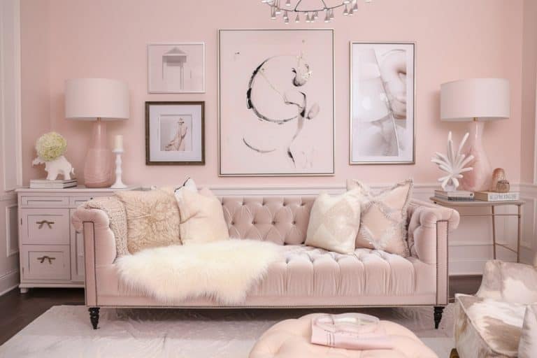
With all of its strength and vibrancy, orange can be a wonderful addition to your interior. Sometimes a bright pop of color is all that you need to spice up your home, and orange is a fantastic color for this job. Children, in particular, can benefit from rooms imbued with bright colors like orange.
Using orange in your rooms can increase your sense of adventure, independence, and creativity.

Here are a few great reasons why you should consider orange in your interior decor.
- Your mood will instantly be boosted.
- Orange draws an emotional balance between the cheerfulness of yellow and the fiery nature of red.
- You may feel inspired to act confidently and with independence.
- Orange gives you a refreshing twist on normal interior decor.
Orange is a wonderfully bright and diverse color. Used properly, you can breathe life and vibrancy into a painting or a room. When using very bold shades of orange, it is always important to tread carefully, as too much can become overwhelming very quickly! We hope that you are inspired to explore the color orange in new and exciting ways.
Take a look at our orange shades webstory here!
Frequently Asked Questions
What Are the Different Orange Shades?
There are an endless number of orange shades in the world around us, and many of the colors on our list come from nature. Colors like apricot, papaya whip, and grapefruit orange are bright and juicy shades that accurately reflect the wonders of the natural world.
What Is the Most Vibrant Orange Color?
Orange is a naturally strong and vibrant color, so there are many choices for the most vibrant orange shade. Our top picks are safety orange, tangelo orange, and pumpkin orange. These are all fairly warm shades of orange and they are firey and impactful.
In 2005, Charlene completed her Wellness Diplomas in Therapeutic Aromatherapy and Reflexology from the International School of Reflexology and Meridian Therapy. She worked for a company offering corporate wellness programs for a couple of years, before opening up her own therapy practice. It was in 2015 that a friend, who was a digital marketer, asked her to join her company as a content creator, and this is where she found her excitement for writing.
Since joining the content writing world, she has gained a lot of experience over the years writing on a diverse selection of topics, from beauty, health, wellness, travel, and more. Due to various circumstances, she had to close her therapy practice and is now a full-time freelance writer. Being a creative person, she could not pass up the opportunity to contribute to the Art in Context team, where is was in her element, writing about a variety of art and craft topics. Contributing articles for over three years now, her knowledge in this area has grown, and she has gotten to explore her creativity and improve her research and writing skills.
Charlene Lewis has been working for artincontext.org since the relaunch in 2020. She is an experienced writer and mainly focuses on the topics of color theory, painting and drawing.
Learn more about Charlene Lewis and the Art in Context Team.
Cite this Article
Charlene, Lewis, “Shades of Orange – 100 Tones Including All Color Codes.” Art in Context. June 18, 2022. URL: https://artincontext.org/shades-of-orange/
Lewis, C. (2022, 18 June). Shades of Orange – 100 Tones Including All Color Codes. Art in Context. https://artincontext.org/shades-of-orange/
Lewis, Charlene. “Shades of Orange – 100 Tones Including All Color Codes.” Art in Context, June 18, 2022. https://artincontext.org/shades-of-orange/.


