Calming Colors – The Effects of Cool Tones and Shades
Colors have many meanings, but they can also have emotional, psychological, and even physical effects on us. You can use colors to help stimulate the body and mind, but you can also use colors for relaxation. There are so many colors out there that you might be wondering what color is calming, and if there is more than one calming color. Read further to discover the most relaxing colors and how you can use them to calm your mind!
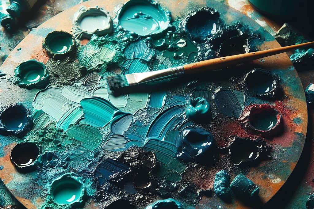
What Are Calming Colors?
Before we get into all the calming colors, how can you incorporate color into your everyday life? One of the most obvious ways is to wear your favorite color. You can also choose to wear jewelry and apply makeup in a particular color. Another popular way of using color is as wall paint colors or other décor items and accessories in the home or at work. Another great way is to paint or draw with colors, which also has many other benefits. There is also color therapy that uses colored lights to treat mental and physical health issues. These are just a few ideas for incorporating color into your life. Most colors can be found on the color wheel, and in color theory, can be associated with warmth or they can be cool. Most warm colors are considered stimulating and energetic, such as red, yellow, and orange. If you use too much of these bright colors, it could even begin to make you feel anxious.
What color is calming? If you want colors for relaxation, you should look for cool colors. The most relaxing colors usually involve blue, green, and purple. However, in certain instances, some of the warmer colors can also be calming if a different tint and shade is used.
For example, all pastel or muted hues are considered calming colors. Research also indicates that cool colors like blue and green have shorter wavelengths, and due to the way that we see these colors, they are easy to look at and relaxing to the eyes. When creating a calming color palette, the outcome can also be influenced by what color combinations you select. Using different adjacent hues can change how you see a single color. It is also about creating balance and producing the look and feel that you want in a design. For example, if you want to create a calming look, you can use blue and yellow for contrast. However, you might not want to go for a bright yellow, which might be too energetic, rather opt for a more subdued pale yellow.

If you wish to create a more harmonious and even look, then consider choosing similar colors or shades. For example, navy blue paired with pastel or more muted shades of blue. These are popular color combinations like complementary colors and monochromatic colors. You can learn to create a calming color palette by understanding how these color combinations work. Next, let us look at the different calming colors in more detail.
Blue
Blue is the color that you would likely think of first when considering calming colors. Blue reminds us of the ocean, water, and the open sky. Blue is the perfect color to calm the mind and is often used in the bedroom to create a soothing atmosphere. However, strong blues can also help to clear the mind, and some can even be stimulating. Darker blues can sometimes appear unemotional or cold. However, when paired with other colors it can take on the same effect.
Some studies have also been done that say dark blues like navy blue are some of the most relaxing colors you can get.
Deep blue colors are associated with intellect and are often used in offices or libraries but can work just as well in bedrooms. Lighter blues are the best choice if you want a calming color for anxiety and stress. Since blue has a calming effect, it can help to reduce blood pressure and slow down your heartbeat. You will see in the table, an example of a soft blue, known as sky blue.

| Shade | Hex Code | CMYK Color Code (%) | RGB Color Code | Color |
| Deep Blue | #072a6c | 94, 61, 0, 58 | 7, 42, 108 | |
| Sky Blue | #87ceeb | 43, 12, 0, 8 | 135, 206, 235 |
Green
Green is another cool and calming color that also provides a fresh and inviting feel. Being associated with nature, green invites harmony and is great as a calming color for anxiety, depression, and nervousness. Green also represents health and balance and can be both calming and refreshing. Again, you have many different tones and shades to choose from. Brighter and more vibrant greens provide more energy and vitality, so these might not be the best choice if you are looking for calming colors.
Deeper and darker greens are comforting and soothing, while softer and lighter greens also provide a calming effect but are a little bit more playful and refreshing.
Since blue and green are seen as the most relaxing colors, we are also going to mention colors that combine green and blue, such as teal, which provides the effects of both colors. It is both calming and communicates feelings of relaxation and peace. Teal is also a color that represents harmony and balance.

| Shade | Hex Code | CMYK Color Code (%) | RGB Color Code | Color |
| Dark Green | #006242 | 100, 0, 33, 62 | 0, 98, 66 | |
| Soft Green | #bfe3b4 | 16, 0, 21, 11 | 191, 227, 180 | |
| Teal | #008080 | 100, 0, 0, 50 | 0, 128, 128 |
Purple
As a spectral color that appears on the visible spectrum, purple is referred to as violet, while purple is a mixture of red and blue. These colors represent peace, wisdom, and strength. It is also a spiritual color that can help to uplift the mood. Purple is calming to the mind and can help to stimulate and encourage.
Purple is a mixture of red and blue, so various shades of purple or violet can be both calming and stimulating, depending on how you use it and what colors you pair with it.
Lighter shades are seen as more romantic and feminine, while darker shades are richer and more luxurious. Violet or purple is also related to the crown chakra, making it the perfect color for improving meditation. Below you will find a few shades of purple ranging from dark to lighter versions that can be used to create a calming color palette.

| Shade | Hex Code | CMYK Color Code (%) | RGB Color Code | Color |
| Deep Purple | #3a243b | 2, 39, 0, 77 | 58, 36, 59 | |
| Mauve | #baa3a9 | 0, 12, 9, 27 | 186, 163, 169 | |
| Lavender | #bdacd1 | 10, 18, 0, 18 | 189, 172, 209 | |
| Lilac | #c8a2c8 | 0, 19, 0, 22 | 200, 162, 200 |
White
White is the color for purity and cleanliness and can provide a sense of freshness and clarity of mind. Stark white can appear too clinical, but if paired with other colors it can reflect them, providing a soothing effect. White spaces are said to provide a sense of airiness and restfulness, providing a calm and peaceful look and feel.
In a white-based color palette in a room or design, to prevent it from becoming too sterile, it is best to add different textures, accessories, and suitable accent colors to soften the look.
There are also white colors that have an undertone. This means it is not a neutral white, but subtly displays another color, which could be any hue. Below you will find a few examples of warm and inviting white as well as cooler and more calming whites.

| Shade | Hex Code | CMYK Color Code (%) | RGB Color Code | Color |
| Atrium White | #f2eee7 | 0, 2, 5, 5 | 242, 238, 231 | |
| Healing Aloe | #d5dbd2 | 3, 0, 4, 14 | 213, 219, 210 | |
| Polar Drift | #ccd5da | 6, 2, 0, 15 | 204, 213, 218 |
Black and Gray
Black and gray are neutral colors like white and are technically not colors at all. Neutrals are especially versatile and can work with most colors very easily. Black is associated with power and has a certain mystery to it, but it can also be classed as a calming color. Black has a grounding effect, and if used properly, it can help to absorb negative energy. However, too much can produce a heaviness and appear depressing. Going lighter and adding white can produce many shades of gray.
Gray might be seen as boring or dull, but it is quite versatile. However, the right shade can be soothing, and it is the best neutral color to add to practically any color palette.

| Shade | Hex Code | CMYK Color Code (%) | RGB Color Code | Color |
| Black | #000000 | 0, 0, 0, 100 | 0, 0, 0 | |
| Charcoal | #36454f | 32, 13, 0, 69 | 54, 69, 79 | |
| Light Gray | #d3d3d3 | 0, 0, 0, 17 | 211, 211, 211 |
Soft Neutrals
There are also a few other near-neutral colors that may also be used as colors for relaxation. These are colors like tan, beige, cream, and brown. These neutral colors are great if you are looking for a subtle look that helps to highlight other colors. Most of these colors are warm, inviting, and relaxing. These colors are also easy on the eyes and can pair wonderfully with blue, green, or purple colors.
In many cases, these neutrals help to tone down other more vibrant colors.

| Shade | Hex Code | CMYK Color Code (%) | RGB Color Code | Color |
| Tan | #d2b48c | 0, 14, 33, 18 | 210, 180, 140 | |
| Beige | #f5f5dc | 0, 0, 10, 4 | 245, 245, 220 | |
| Cream | #fffdd0 | 0, 1, 18, 0 | 255, 253, 208 | |
| Light Brown | #c4a484 | 0, 16, 33, 23 | 196, 164, 132 |
Pastels
Pastels are desaturated or muted colors that offer a soft look. Pastels come in all the different colors, both warm and cool, that are subtle and gentle on the eyes. Pastels inspire a calming, clean, peaceful, delicate, and soothing look. Pastel colors also convey a more youthful and fun look. You can look at colors like soft peach, pastel pink, or cooler pastel greens and blues.

| Shade | Hex Code | CMYK Color Code (%) | RGB Color Code | Color |
| Soft Peach | #ffe5b4 | 0, 10, 29, 0 | 255, 229, 180 | |
| Pastel Pink | #ffd1dc | 0, 18, 14, 0 | 255, 209, 220 | |
| Pastel Green | #c5f1c5 | 18, 0, 18, 5 | 197, 241, 197 | |
| Pastel Blue | #aec6cf | 16, 4, 0, 19 | 174, 198, 207 |
A Few Calming Color Palette Ideas
When using colors in a design, whether it is for a website or an interior design, the chances are you will be considering many different colors. You can create some amazing calm color palettes when combining the different hues. We have provided a few of these color combinations examples below.
Teal and Pale Pink
Teal is a combination of blue and green, so it offers a wonderful calming look. Paired with pink, which brings in a little subtle warmth, this calming color combination has a peaceful and inviting appeal. This just goes to show that by combining colors properly, you can produce a beautiful calming color palette that contains both warm and cool colors.

| Shade | Hex Code | CMYK Color Code (%) | RGB Color Code | Color |
| Twilight | #dac4d0 | 0, 10, 5, 15 | 218, 196, 208 | |
| Soft Pink | #e0829d | 0, 42, 30, 12 | 224, 130, 157 | |
| Plum | #8f5774 | 0, 39, 19, 44 | 143, 87, 116 | |
| Teal | #008080 | 100, 0, 0, 50 | 0, 128, 128 | |
| Dark Teal | #11302a | 65, 0, 13, 81 | 17, 48, 42 |
Shades of Blue
There are many shades and tints of blue that you can use to create a cool and calming color palette. You also do not have to worry about colors clashing, so the combination is pretty easy to create. Below is an example of a monochromatic color palette that includes a cool off-white blue and goes darker until it reaches an almost blue-black.

| Shade | Hex Code | CMYK Color Code (%) | RGB Color Code | Color |
| Very Light Blue | #eef3f9 | 4, 2, 0, 2 | 238, 243, 249 | |
| Pale Blue | #b3cde4 | 21, 10, 0, 11 | 179, 205, 228 | |
| Dark Blue | #537692 | 43, 19, 0, 43 | 83, 118, 146 | |
| Very Dark Blue | #1d3f58 | 67, 28, 0, 65 | 29, 63, 88 | |
| Blue Black | #001b2e | 100, 41, 0, 82 | 0, 27, 46 |
Calming Neutrals
Looking for something a little warmer and calming? Try this soft and neutral combination that is both soothing and inviting. It may even bring to mind images of the seashore with its sandy colors. It starts with a light gray neutral, and moves on to a light gray-blue, and then gets warmer with a grayish orange and moves on to warm darker shades of gray.

| Shade | Hex Code | CMYK Color Code (%) | RGB Color Code | Color |
| Light Gray | #ebebeb | 0, 0, 0, 8 | 235, 235, 235 | |
| Platinum | #e1e2e6 | 2, 2, 0, 10 | 225, 226, 230 | |
| Grayish Orange | #c4b3a9 | 0, 9, 14, 23 | 196, 179, 169 | |
| Trout Gray | #97978f | 0, 0, 5, 41 | 151, 151, 143 | |
| Dove Gray | #787775 | 0, 1, 3, 53 | 120, 119, 117 |
Calming Wall Paint Colors
There are a few popular paint manufacturers that produce calming wall paint colors. Using these wall paint colors can create a tranquil and calming environment in any room. You will also notice that most of these paint colors are soft and subtle, so they will not overwhelm a space and can easily be paired with other colors.
In the majority of the examples below, some of the most relaxing colors like blue and green are used as undertones. Of course, the colors below might not look exactly like the paint colors, but they are a close match.
We start with the first wall paint color, which is called “sterling”, manufactured by Benjamin Moore, which has calming blue-green undertones. The second is a beautiful cornflower blue that is soothing and comforting. The last two are from Sherwin Williams, and we think the paint color names speak for themselves.

| Shade | Hex Code | CMYK Color Code (%) | RGB Color Code | Color |
| Sterling (Benjamin Moore) | #ced2ce | 2, 0, 2, 18 | 206, 210, 206 | |
| Northern Air (Benjamin Moore) | #a0bece | 22, 8, 0, 19 | 160, 190, 206 | |
| Rainwashed (Sherwin Williams) | #c2cdc5 | 5, 0, 4, 20 | 194, 205, 197 | |
| Escape Gray (Sherwin Williams) | #abac9f | 1, 0, 8, 33 | 171, 172, 159 |
It is truly amazing how different colors can play such a pivotal role in our everyday lives. This has been used to great effect by businesses and advertisers, where colors can influence how people perceive products and services. However, calming colors can also be used in a more personal way that helps to relieve stress and anxiety, such as using calming wall paint colors in your bedroom. We hope that this article has inspired you to create your own combination of calming colors!
Take a look at our calm colors webstory here!
Frequently Asked Questions
What Are Calming Colors?
The most common calming colors are all cool hues and include blue, green, and purple. These colors are usually easy on the eyes and can produce certain emotional and physical effects. The calming colors are great for helping to ease anxiety and stress and are the favorite colors to use in the bedroom.
What Is the Most Relaxing Color?
The color that stands at the top of the list of most relaxing colors is blue. Simply gazing at the color blue can help to produce a calming effect. Green is also a cool color like blue and follows closely behind blue as being one of the most calming colors.
Is Red a Calming Color?
In general, red is a stimulating color, along with other warm colors like orange and yellow. However, pastel shades of these colors can be calming. So, soft pinks, yellows, and colors like peach can be used within a calming color palette.

In 2005, Charlene completed her Wellness Diplomas in Therapeutic Aromatherapy and Reflexology from the International School of Reflexology and Meridian Therapy. She worked for a company offering corporate wellness programs for a couple of years, before opening up her own therapy practice. It was in 2015 that a friend, who was a digital marketer, asked her to join her company as a content creator, and this is where she found her excitement for writing.
Since joining the content writing world, she has gained a lot of experience over the years writing on a diverse selection of topics, from beauty, health, wellness, travel, and more. Due to various circumstances, she had to close her therapy practice and is now a full-time freelance writer. Being a creative person, she could not pass up the opportunity to contribute to the Art in Context team, where is was in her element, writing about a variety of art and craft topics. Contributing articles for over three years now, her knowledge in this area has grown, and she has gotten to explore her creativity and improve her research and writing skills.
Charlene Lewis has been working for artincontext.org since the relaunch in 2020. She is an experienced writer and mainly focuses on the topics of color theory, painting and drawing.
Learn more about Charlene Lewis and the Art in Context Team.
Cite this Article
Charlene, Lewis, “Calming Colors – The Effects of Cool Tones and Shades.” Art in Context. October 26, 2023. URL: https://artincontext.org/calming-colors/
Lewis, C. (2023, 26 October). Calming Colors – The Effects of Cool Tones and Shades. Art in Context. https://artincontext.org/calming-colors/
Lewis, Charlene. “Calming Colors – The Effects of Cool Tones and Shades.” Art in Context, October 26, 2023. https://artincontext.org/calming-colors/.