Burgundy Color – How to Make and Use Different Shades of Burgundy Red
What does a burgundy color make you think of? Maybe an old school uniform, or the color of aged red wine? Burgundy red has not been as popular as some colors in the past, but today it has found its place in the fashion and interior design world. To gain more appreciation for the color, let us dig a bit deeper into the burgundy color.
What Color Is Burgundy?
Is burgundy red? The answer to this question is yes, as it can be described as a deep reddish-brown color that has more of a purplish undertone. The color is achieved by blending red with a little blue. The bright red color is toned down by the use of the cooler blue.
In many cases, burgundy is often mistaken for maroon, however, these two colors may be in the same color family, but they are very different colors. Whereas the burgundy red color has more purplish undertones, the maroon color is a combination of red and brown and is less vibrant than burgundy.
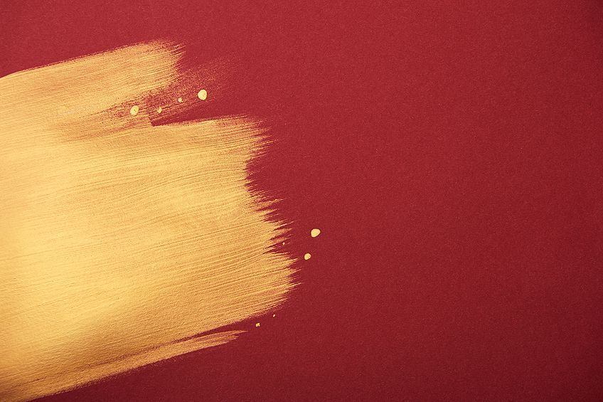
In color theory, colors can also be warm or cool. When looking at a color wheel, these two different color temperatures can be found on either side of the color wheel. The red, yellow, as well as orange colors, are located on one side, and the blue, as well as green colors, are all on the other half. When it comes to burgundy, it is considered more of a cool burgundy red color because of the added blue, while maroon is a warmer color.
| Shade | Hex Code | CMYK Color Code (%) | RGB Color Code | Color |
| Burgundy | #800020 | 0, 100, 75, 50 | 128, 0, 32 | |
| Maroon | #800000 | 0, 100, 100, 50 | 128, 0, 0 |
Burgundy: A Brief History
The color name comes from the Burgundy wine that was created in a region of France, also known as Burgundy. The region itself was named after the Burgundians, a Germanic tribe that first resided in the area. This region became one of the largest wine-producing areas in France, which has a rather bloody history because of all the fighting over the land.
In some areas, the burgundy color is also referred to as “Bordeaux”, which is another type of wine that is found in another region in France.
This wine also has the same deep red color, with its purplish undertones. The color name “burgundy” was first documented and used in the year 1881. The burgundy color has also been used for many years as the color for European Union-issued passports.
Over the years, red and purple individually have played more of a starring role in history, however, burgundy has become more popular in recent years. During the 90s, the color became a well-liked color for lipstick and was a favorite color for those who became part of what was known as the goth culture.
The color moved more into the spotlight when Pantone chose the color of the year for 2015 and named it Marsala. This color can also be called wine red or burgundy and was seen as a grounding color that represented conservatism. Today burgundy is a popular color in the fashion industry and the dark burgundy color is a favorite hair color, which is trending this year.
Meaning of Burgundy Colors
Since burgundy does contain red and purple, it shares some of the qualities of both. However, it is more subdued than red but remains bold, and comes across as more sophisticated, elegant, and refined. The rich, deep color can also represent passion, but can also come over as being a bit moody or too serious.
Just like red it does tend to help improve the appetite and it can be an overall stimulating color. The color also grabs your attention like red does and is more of a unique color when compared to other more common choices.

When one thinks of burgundy, it brings up images of wine, luxury, wealth, power as well as ambition. The rich color can also be associated with strength and can come across as intimidating to some. Since it can become so intense, it is best used in moderation when it comes to burgundy design color schemes. Some of its negative emotional traits can include pride, unfriendliness or malice, and lust. Even though burgundy has some negative associations, the positive attributes far outweigh anything negative.
Shades of Burgundy
When it comes to colors today, you can easily find and identify them online by using their color hex codes. Other color codes you can use, especially for web design and printing can also be found by referring to the RGB or CMYK color codes respectively.
These will show you how much of each color is used to create any color. There are two well-known shades of burgundy, old burgundy, and vivid burgundy, which you can find below. The others are more variations of the color burgundy.

Vivid Burgundy
This color is lighter than the old burgundy, but can also be described as being a dark shade of red. This particular shade of burgundy has become a popular shade for coloring hair.
As the name suggests, it is a brighter shade of the burgundy color, containing more red.
| Burgundy Shade | Burgundy Hex Code | CMYK Burgundy Color Code (%) | RGB Burgundy Color Code | Burgundy Color |
| Vivid Burgundy | #9f1d35 | 0, 82, 67, 38 | 159, 29, 53 | |
| Burgundy | #800020 | 0, 100, 75, 50 | 128, 0, 32 |
Old Burgundy
This is a darker version of burgundy and can be considered a darker shade of red that can also be part of the brown family of colors. The color was first recorded as a color in 1926. Old burgundy’s complementary color is Japanese indigo.
| Burgundy Shade | Burgundy Hex Code | CMYK Burgundy Color Code (%) | RGB Burgundy Color Code | Burgundy Color |
| Old Burgundy | #43302e | 0, 28, 31, 74 | 67, 48, 46 | |
| Japanese Indigo | #2e4143 | 31, 3, 0, 74 | 46, 65, 67 |
Bruised Burgundy
This shade of burgundy can be described as a dark grayish-pink and is a paint color produced by the popular paint company Dulux.
The color can work nicely in the bedroom and other more formal spaces.
| Burgundy Shade | Burgundy Hex Code | CMYK Burgundy Color Code (%) | RGB Burgundy Color Code | Burgundy Color |
| Bruised Burgundy | #5b4148 | 0, 29, 21, 64 | 91, 65, 72 |
Schauss Pink
This color is moving more into a lighter tint of burgundy, which means it is moving towards a lighter shade of red. The color is also known as Bake-Miller pink or drunk-tank pink and is said to help reduce the feelings of aggressiveness and hostility. The color was named after an institute where the directors were Baker and Miller. Alexander Schauss did his research at the institute on how colors can affect emotions.
| Burgundy Shade | Burgundy Hex Code | CMYK Burgundy Color Code (%) | RGB Burgundy Color Code | Burgundy Color |
| Schauss Pink | #ff94ae | 0, 42, 32, 0 | 255, 148, 174 |
Vulcan Burgundy
This is a warmer version of burgundy and is a combination of pink as well as red, or it can be described more accurately as a darker grayish red.
This is another name for a Dulux paint color that can provide warmth and extra energy to a room.
| Burgundy Shade | Burgundy Hex Code | CMYK Burgundy Color Code (%) | RGB Burgundy Color Code | Burgundy Color |
| Vulcan Burgundy | #5f3e42 | 0, 35, 31, 63 | 95, 62, 66 |
What Colors Work Well With Burgundy?
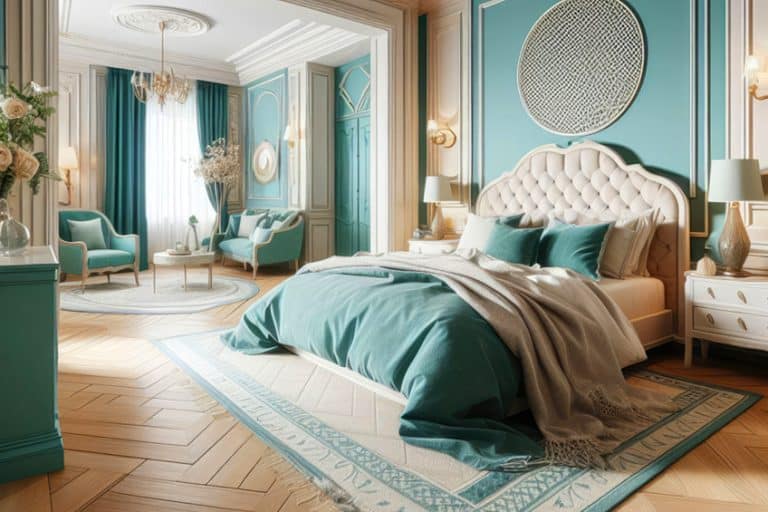
The best color combination that works with burgundy is various shades of gray. However, it can also be used with more vibrant colors like golden yellow, navy blue, turquoise, teal, forest, or olive green, rose or dusty pinks, and other neutral colors like black, white, and beige.
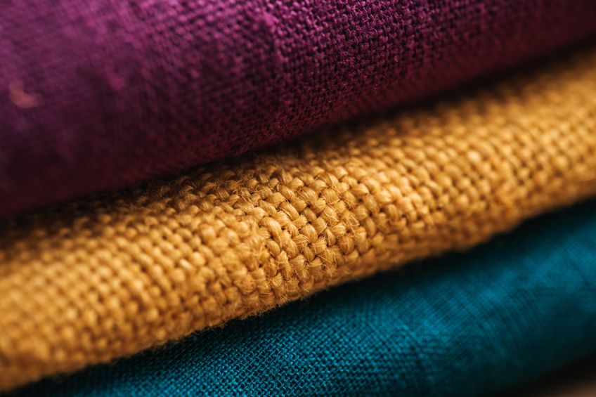
If you are not sure which colors go with burgundy, then you should go back to the color wheel. Using your knowledge of color theory and the color wheel, you can come up with a variety of burgundy color schemes. Below are a few examples of burgundy color blends that correspond to the color wheel.
Complementary Burgundy Colors
A color wheel is mostly shown as a circle, hence the term color wheel. On this wheel, you will find all the colors from your primary to secondary, and everything in-between. When you locate burgundy on the color wheel, the complementary color is the dark cyan, which is found on the exact opposite end of the color wheel.
These colors play off each other and create a color contrast. When working with design elements, it is never a good idea to combine too many or too many of these contrasting colors as they can become overpowering and maybe even aggravating to look at.
However, a balance can be created between colors if used in proper proportions. If you are comfortable with working with colors, then you can also consider using a split-complementary color combination. This involves three colors and includes the burgundy color and two colors that sit on either side of your complementary color, creating even more of a contrast.
| Burgundy Shade | Burgundy Hex Code | CMYK Burgundy Color Code (%) | RGB Burgundy Color Code | Burgundy Color |
| Dark Cyan | #008060 | 100, 0, 25, 50 | 0, 128, 96 | |
| Burgundy | #800020 | 0, 100, 75, 50 | 128, 0, 32 |
Analogous Burgundy Colors
Next are your analogous colors, which are located alongside each other on the color wheel and on both sides of the burgundy color. In this case, it will be a dark pink, which is leaning toward red-violet colors, and a dark red which is leaning more toward your red-orange colors.
| Burgundy Shade | Burgundy Hex Code | CMYK Burgundy Color Code (%) | RGB Burgundy Color Code | Burgundy Color |
| Dark Pink | #800060 | 0, 100, 25, 50 | 128, 0, 96 | |
| Burgundy | #800020 | 0, 100, 75, 50 | 128, 0, 32 | |
| Dark Red | #802000 | 0, 75, 100, 50 | 128, 32, 0 |
Triadic Burgundy Colors
Another color combination you can look into is triadic colors, which also form a contrasting color mixture. Once you have your burgundy color, the two other colors are of equal distance from each other in a triangle form. When taking the below burgundy color, the other triadic colors include dark blue and dark green.
You can take it a step further and try the square or tetradic color combinations, which both consist of four colors.
The square colors are also spaced evenly from each other, while the tetradic combination involved a double complementary pair of colors. You can also go for five or more colors for a burgundy color scheme, but the more colors you involve, the more difficult it becomes to create a balance between all the colors.
| Burgundy Shade | Burgundy Hex Code | CMYK Burgundy Color Code (%) | RGB Burgundy Color Code | Burgundy Color |
| Dark Blue | #002080 | 100, 75, 0, 50 | 0, 32, 128 | |
| Burgundy | #800020 | 0, 100, 75, 50 | 128, 0, 32 | |
| Dark Green | #208000 | 75, 0, 100, 50 | 32, 128, 0 |
Monochromatic Burgundy Colors
These colors should always work well with one another, as they originate from the color. Monochromatic colors are simply variations of the original burgundy color. In the table below, you can see a darker and then a lighter version of the burgundy color.
| Burgundy Shade | Burgundy Hex Code | CMYK Burgundy Color Code (%) | RGB Burgundy Color Code | Burgundy Color |
| Very Dark Red | #34000d | 0, 100, 75, 80 | 52, 0, 13 | |
| Burgundy | #800020 | 0, 100, 75, 50 | 128, 0, 32 | |
| Strong Red | #cd0033 | 0, 100, 75, 20 | 205, 0, 51 |
What Colors Make Burgundy Paint?
As described, burgundy is a deep reddish-brown, which can be achieved by blending two parts red and one part blue, or you can use a brown and then add more red and small amounts of blue. The purple undertone that comes with the color is due to the red and blue combination. Warm blues and reds will work better, as cooler colors will make more of a shade of purple.
You could also try mixing red and green together, which should give you a color close to burgundy.
Always add very small amounts of green to the red until you have your color. You can try various amounts of brown, red, and blue, but there is generally more red and less blue to get a burgundy color. To make a better brown base color, you could also combine orange and green or blue.
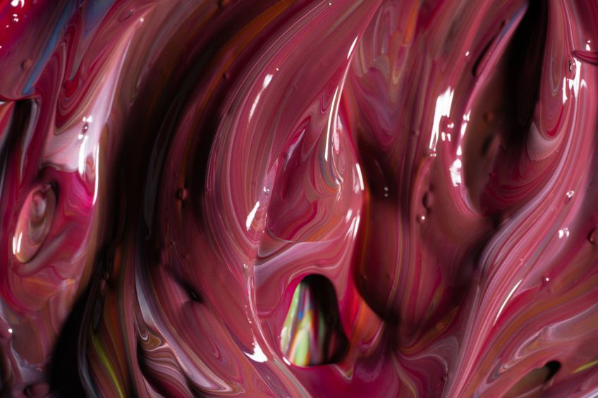
When creating burgundy paint colors, you should make sure to create a burgundy color palette, where you record all our color experiments and combinations. Below are a few steps for creating burgundy using ultramarine blue, cadmium red, and pure black. Mixing paints with a palette knife makes it easier, as it can scoop up the paint better and mixes more thoroughly.
Blending Burgundy Paint
To begin, get all your paints, a palette knife, and a painting palette ready to use. Squeeze some of the paint onto the palette in separate areas. You will be using about four parts red, one part blue, and a small amount of black.
Place some of the blues into the red and mix thoroughly.
You can add in less or more of the blue, depending on what shade of burgundy you are going for. To darken the color, take a very small amount the black and mix it in. Add only extremely small amounts, as you cannot take it back if the color becomes too dark.
Burgundy Colors in Home Design
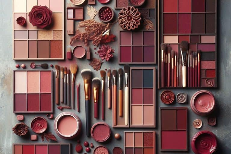
Burgundy is used in all kinds of design ideas from fashion and clothing to makeup like lipsticks and hair dye to wall paints and linens. When used in home design, it is a color of power and is a deeper shade of red that provides more of a sophisticated and calming effect than a vibrant red. However, it is a bold, unique, and dramatic color that can become a bit intense if over-used.
The safest path to follow would be to keep to the 60:30:10 rule. For example, if you choose burgundy as your main color and paint the walls, you can include another two colors that are lighter and brighter like white, ivory, beige, or lighter tones of gray. You can add more depth to a burgundy color scheme by using various shades of burgundy in the accessories. Muted shades work better with burgundy than more vibrant primary colors.
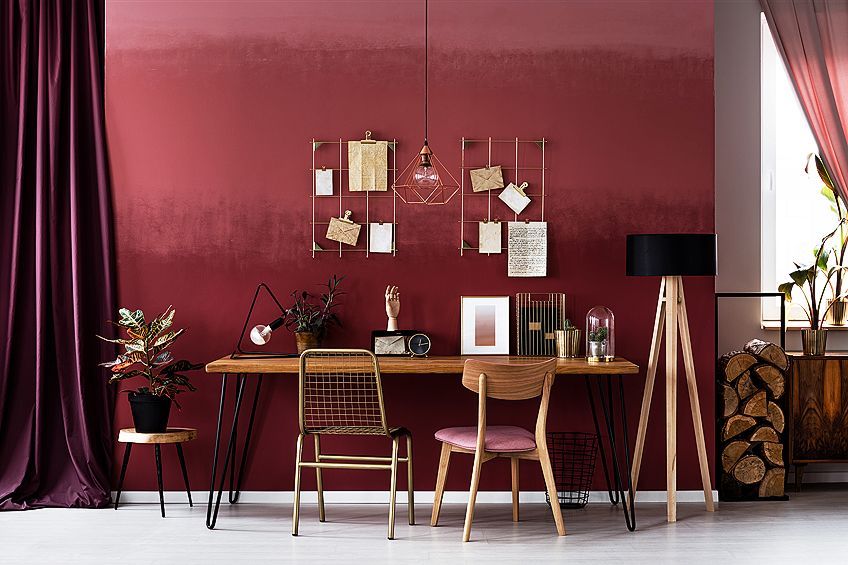
A popular combination of colors that include burgundy involves using pastel colors, for example, pastel pinks, greens, and blue colors can help to create a look that is more well-balanced yet provides enough contrast without it becoming too oppressive.
Since burgundy is more reserved, it is a color that can also help bring about feelings of comfort, which makes it a great color for bedrooms. The color can also work in living areas and the kitchen. Adding burgundy to a kitchen color palette can bring in some drama, energy, and color. Since it can help to stimulate the appetite, it is the perfect color.
Remember to use it with other more neutral colors like white for a more balanced look.
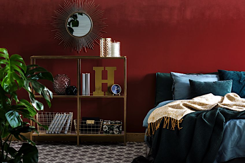
Pairing burgundy with gold and yellow shades can make a room even more elegant and sophisticated. Other warm neutrals will always go well with the burgundy color. You can bring in yellow accessories or furnishings or consider wooden flooring that is lighter in color to bring in some brightness.
Another way to bring in more brightness is to make sure there is sufficient lighting like lampshades. Lighter paintings or wall art will stand out beautifully against a burgundy background. You can also use mirrors to help bring in more light from windows and other light sources. White curtains can also work well with burgundy walls to bring in more light. To create a more masculine or earthy appeal, you can bring in more wooden furnishings and leather couches.
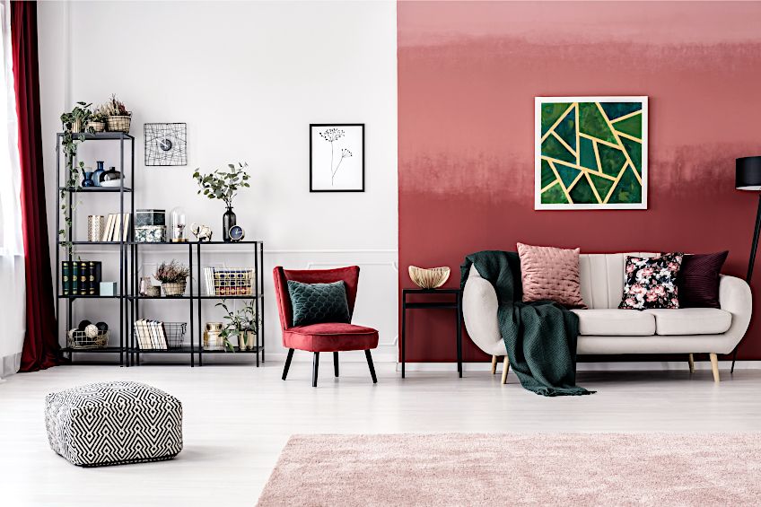
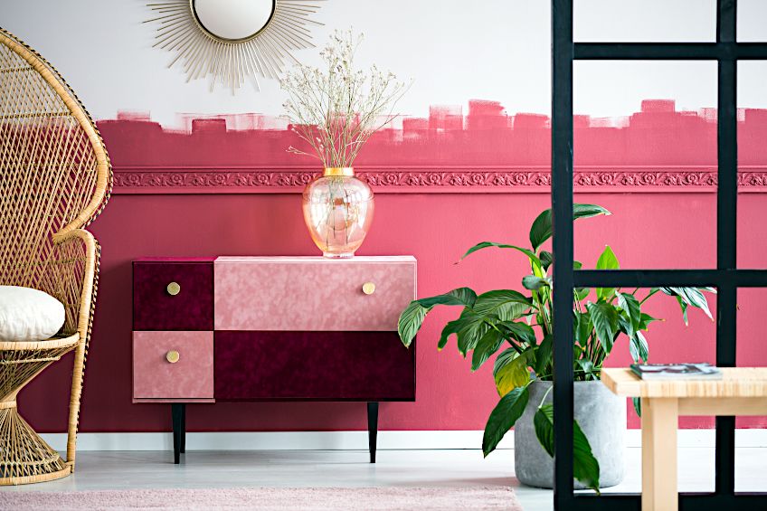
Instead of using burgundy as your main color choice, you can bring in the color by various means. For example, Persian rugs usually have a shade of burgundy within their patterns. You could use this as your main feature, and then create a color scheme to fit. You could also consider burgundy furnishings, chairs, or couches. Pillows and throws also make excellent accent color features in a room.
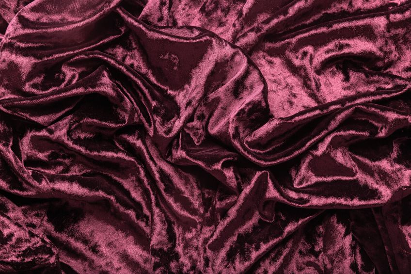
When using this color in fabrics and accessories, like cushions and chairs, it is also important to decide on the types of fabrics used. To add more of a refined look, think about using velvet or brocade fabrics. You can also add wool and cotton fabrics for rougher textures.
Whatever you want to use the burgundy color for, be it clothing, as a lipstick, or on the walls of your home, burgundy is a dramatic, unique, and delightful color to choose. Not only does it bring with it a sense of sophistication, but it also has a certain mystery to it that seems to welcome and draw you in.
Take a look at our burgundy red webstory here!
Frequently Asked Questions
Is Burgundy Red?
What color is burgundy? Burgundy can be considered a shade of red or brown and can be described as a deep reddish-brown color that has a purplish undertone. When it comes to what colors make burgundy, we are looking at different proportions of red and blue, with red being a much higher percentage than blue.
Are There Colors Close to Burgundy?
There are quite a few colors that can be mistaken for burgundy; however, they are all different colors but come from the same family of colors. For example, maroon is the main color mistaken for burgundy, but it has more of a warm brown undertone. Other colors close to burgundy include oxblood, cranberry, and cordovan.
Is Burgundy a Warm or Cool Color?
Since burgundy has more of a purplish undertone, it has a cooler red color tone. Unlike maroon, which has a warmer brown undertone. The color can be feminine, but it can also be a masculine color when paired with taupe and gray tones, and items like leather as it is associated with strength and power.
What Colors Work Well With Burgundy?
Burgundy is quite a versatile color, but it works best with shades of gray and other lighter neutrals like white, warm browns, beige, taupe, and ivory. The color can also work well with shades of green, pinks, dark reds, golden yellow, navy blue, teal, and turquoise.
In 2005, Charlene completed her Wellness Diplomas in Therapeutic Aromatherapy and Reflexology from the International School of Reflexology and Meridian Therapy. She worked for a company offering corporate wellness programs for a couple of years, before opening up her own therapy practice. It was in 2015 that a friend, who was a digital marketer, asked her to join her company as a content creator, and this is where she found her excitement for writing.
Since joining the content writing world, she has gained a lot of experience over the years writing on a diverse selection of topics, from beauty, health, wellness, travel, and more. Due to various circumstances, she had to close her therapy practice and is now a full-time freelance writer. Being a creative person, she could not pass up the opportunity to contribute to the Art in Context team, where is was in her element, writing about a variety of art and craft topics. Contributing articles for over three years now, her knowledge in this area has grown, and she has gotten to explore her creativity and improve her research and writing skills.
Charlene Lewis has been working for artincontext.org since the relaunch in 2020. She is an experienced writer and mainly focuses on the topics of color theory, painting and drawing.
Learn more about Charlene Lewis and the Art in Context Team.
Cite this Article
Charlene, Lewis, “Burgundy Color – How to Make and Use Different Shades of Burgundy Red.” Art in Context. June 16, 2022. URL: https://artincontext.org/burgundy-color/
Lewis, C. (2022, 16 June). Burgundy Color – How to Make and Use Different Shades of Burgundy Red. Art in Context. https://artincontext.org/burgundy-color/
Lewis, Charlene. “Burgundy Color – How to Make and Use Different Shades of Burgundy Red.” Art in Context, June 16, 2022. https://artincontext.org/burgundy-color/.


