Burnt Orange Color – Exploring Burnt Orange Shades for Art
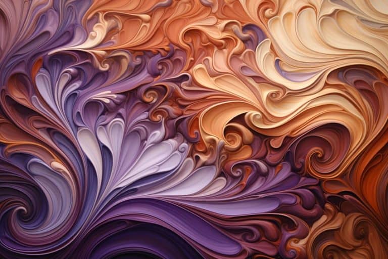
Ask anyone to describe what color is burnt orange and you will get answers ranging from a deep paper bag brown to a reddish-orange or somewhere in between. Burnt orange gives feelings of warmth, comfort, and even pride and, depending on the hue, can conjure images of fall leaves, fire, or Halloween. Burnt orange is a flexible color that is easy to mix and great to use on your canvas or in decorating your home.
What Color Is Burnt Orange?
The most common description of the color burnt orange is that it is a medium to dark orange color with a deep reddish undertone. It often also includes some dark brown tones. The exact shade of orange that is considered burnt orange is still largely contested, the most common (argument) is whether any blue is added to it to create this warm color or not. This difference can more easily be seen when comparing the burnt orange color code of different hues that all claim to be the basic burnt orange color.
The History of Burnt Orange
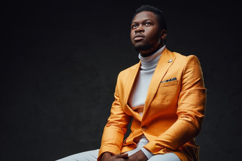
Burnt orange has been a popular color throughout history and was officially named in 1915. One of the most influential uses of burnt orange, that really elevated its popularity, is its use as the official color of the University of Texas and their American football team the Texas Longhorns.
In 1966, the university even trademarked its own particular hue of the burnt orange color named Pantone, in response to the variety of orange hues that were worn and to unify them under one color.
Later in the 1970s, burnt orange would become a particularly popular color to use in interior design and fashion. Burnt orange has also left its mark more recently. In 2019 burnt orange was named one of Etsy’s top color trends for that year, beating the rusty orange color that was prominent in previous years. Burnt orange added some much-needed vibrancy and fun to fall and winter pallets.
Psychology and Symbolism of Burnt Orange Color
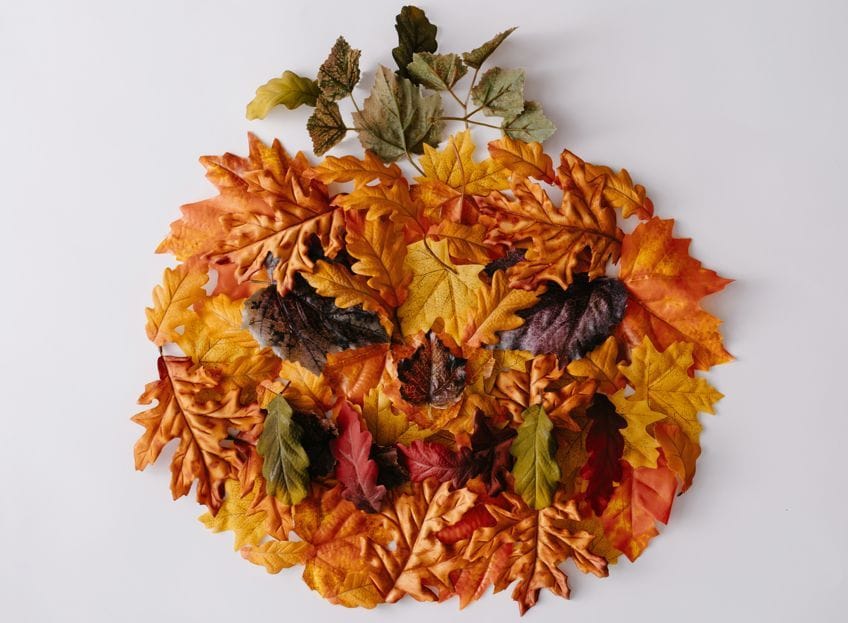
Like all warm tones, burnt orange is a stimulating and invigorating color, however, the subtle blue tones in burnt orange also make it comforting. Burnt orange is often associated with childishness, headstrongness, pride, and aggression, however, it also has positive connotations such as warmth, solace, and togetherness. Burnt orange hues are also synonymous with fall and fall holidays, with dark burnt orange colors being used in Halloween and Thanksgiving decorations particularly.
How to Make Burnt Orange Color
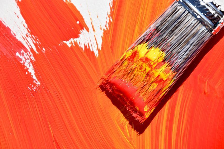
Burnt orange is such a versatile color that you might be wondering how to create it to use in your artwork or home. To understand how to mix burnt orange hues yourself, you must first know how to create the basic orange color and how to use other colors and neutrals to alter it slowly into the perfect shade.

Basic Color Theory
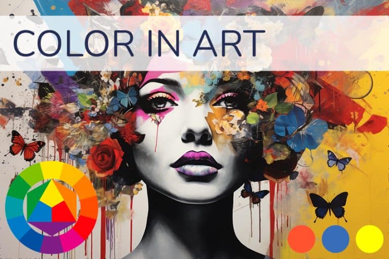
Before we show you how you can create your own signature burnt orange hues, it is helpful to know some of the basics of color theory. Red, blue, and yellow are the three primary colors. By using a color wheel, you can easily see how these three primary colors relate to one another and mix together to create the secondary colors, green, violet, and finally orange. The basic orange hue is created by combining the primary colors red and yellow, in equal parts.
This orange shade can be made to be deeper by increasing the amount of red in the mix, or lighter by increasing the amount of yellow.
Whilst not on the color wheel, neutrals are also important to understand in the creation of the burnt orange color. Black and white are not true colors but can be used to change the tint and shade of burnt orange hues. Add white to tint it into a light burnt orange color or add black to create a darker burnt orange hue.

Adding gray to burnt orange will create a more muted tone of the original shade which is helpful if you want it to be less overpowering such as when it is used in small rooms. Brown and earth tones are also considered neutral and are created by mixing all the primary colors together which is a vital feature for the making of the burnt orange color.
How Can You Mix Burnt Orange Color Tones Yourself?
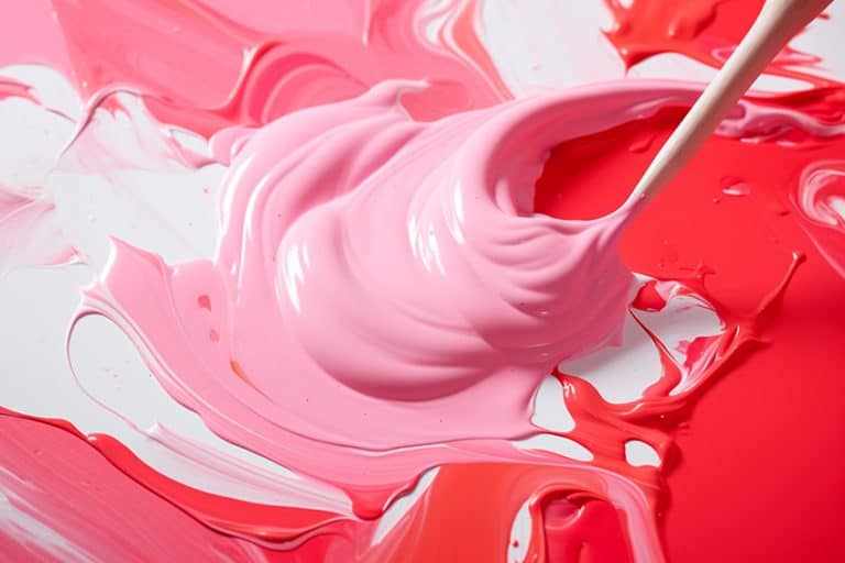
If you would like to make burnt orange, start with a deep reddish-orange color, and then add a small amount of blue. Because orange is made up of red and yellow, adding blue, which is a complementary color, will give it a brown tone resulting in that well-known burnt look. If you do not have deep orange, simply add small amounts of red pigment to an orange color to create on. To create a light burnt orange color, add less blue or a little bit of white to tint it, if a dark burnt orange shade is what you are after then add more blue or black.
Be careful not to add too much blue as this will turn your burnt orange into a dark murky brown instead of its signature warm and toasty vibrancy.
Different Shades of Burnt Orange
Like with any color, burnt orange comes in an array of tones, shades, and tints depending on the proportions of colors and neutrals used when it is mixed. Color codes, such as hex codes, are very useful if you want to find a very specific color or get an idea of the proportions of other hues used to make it.
Different Hues of Burnt Orange
It only takes one look at both of these supposedly burnt orange hues to see that the exact color is still very contested. While hue #CC5500 is considered the more traditional burnt orange color code, both colors are considered to be basic burnt orange hues.
They are made of different proportions of colors and have slightly different hues and if you were to look at each of these colors individually you would find that both fit the description of burnt orange. However, comparing them side by side shows the subtle differences between them. Hue #CB6015 is cooler as it contains bluer, as you can see by the hex code. This additional blue also makes it appear browner when compared to the first burnt orange.
Pantone is the chosen color of The University of Texas and the Texas Longhorns American football team. This is not the exact burnt orange color that they use, which is named Pantone 159. That color has been trademarked and the color codes are a closely guarded secret.
| Color Name | Color Hex Code | RGB Color Code | CMYK Color Code (%) | Shade |
| Burnt Orange | #CC5500 | 204, 85, 0 | 0, 58, 100, 20 | |
| Burnt Orange | #CB6015 | 203, 96, 21 | 0, 68, 100, 7 | |
| Pantone | #FF5800 | 255, 88, 0 | 0, 65, 100, 0 |
Burnt Orange Shades, Tints, and Tones
Neutral colors can be used to give burnt orange many different shades and tints without the need to add any more colors. Burnt orange is closely related to autumn and the dark burnt orange color, in particular, is often associated with Halloween. These shades can be created by adding black or blue and the resulting dark burnt orange color is great in cooler pallets that regular burnt orange hues would overpower. On the other side of the spectrum, lighter orange hues, approaching peach tones, are better for warmer pallets. You can add gray to produce a more muted burnt orange tone for a gentler look.
| Color Name | Color Hex Code | RGB Color Code | CMYK Color Code (%) | Shade |
| Dark Burnt Orange | #B85814 | 181, 88, 20 | 0, 52, 89, 28 | |
| Light Burnt Orange | #CF814A | 207, 129, 74 | 0, 38, 64, 19 | |
| Muted Burnt Orange | #AB5F29 | 171, 95, 41 | 0, 44, 76, 33 |
Rusty Orange
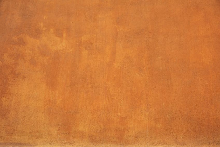
Many tend to confuse the rusty orange color with dark burnt orange, however, burnt orange has much less of a brown undertone to it. Rust orange is a popular color, especially for the fall and winter months, and its deep color is often associated with passion and experience. Some rusty oranges could almost be mistaken for brown if not for the subtle warmth of orange shining through.
The best way to identify what color is burnt orange is to look at the color code and compare them to a known burnt orange color code to see if they are made up of similar color proportions.
| Color Name | Color Hex Code | RGB Color Code | CMYK Color Code (%) | Shade |
| Rusty Burnt Orange | #B73E0E | 183, 62, 14 | 0, 66, 92, 28 |
Using Burnt Orange
There are many ways to use burnt orange effectively within your art and your home. Pairing burnt orange with peaches and warm earth tones gives you a bold monochromatic look that invites you in. Deep blues are complementary colors that go with burnt orange and, when used together, create harmony and depth.
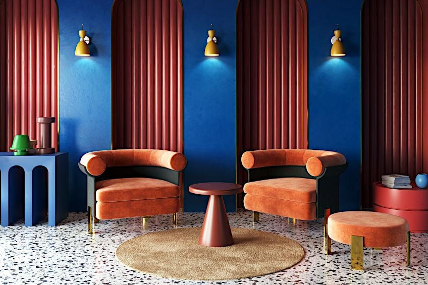
Incorporating gray into either color pallet enhances the burnt orange hues without the need to add and balance more colors. To tone down burnt orange you can make use of a mint blue or mint green color as the dominant hue and use burnt orange as an accent color for contrast.
Burnt orange shades and tints are also useful for creating subtle shadows and highlights in warm paintings.
Famous Art Using Burnt Orange
Many artists make use of burnt orange, and colors that go with burnt orange, in their palettes but none may be quite as famous for it as Vincent van Gogh. His 1889 oil painting, Self Portrait, shows off his use of burnt orange and other orange hues and how he contrasted them with blue. It also highlights just how little burnt orange is needed to make a huge impact in a cool pallet and how the burnt orange itself can be used to contrast other, lighter, or more yellow oranges.

Edgar Degas also makes use of deep burnt orange in his 1878 oil painting, L’Étoile, to contrast a cool palette of peaches, pinks, and dusty blues. Edgar, however, uses burnt oranges to not only create contrasting colors but also contrasting moods within his painting. Colonial Cubism (1954) is an abstract painting by Stuart Davis that also stars burnt orange.
The dominant burnt orange creates an inviting feel which is enhanced by his use of neutrals and balanced with blue tones.
Burnt Orange in Design
While burnt orange hit its peak popularity in interior design in the 1970s, it can still be used to create beautiful modern and traditional spaces today. Where other reds and oranges can be very overwhelming, burnt orange creates a welcoming, vibrant, and energetic environment without overpowering the space.

Reds and oranges are known to stimulate appetite and inject vigor into a room, therefore, the best rooms to use deep burnt orange colors are the living and dining rooms as well as the kitchen. Burnt orange can also be used in cool tone rooms as orange accents in blue and green pallets help to lift the room and prevent it from feeling drab.
Burnt orange is a warm and versatile color that is easy to incorporate into your art and within your space. Knowing how to mix and alter different burnt orange hues, as well as which colors contrast and compliment them, you will be able to use them to add warmth and energy to your piece and your life.
Frequently Ask Questions
What Color Is Burnt Orange?
The true shade of burnt orange remains contested, but it is generally described as a medium to dark reddish-orange with a brown, toasty undertone.
What Color Goes Best With Burnt Orange?
Deep blues and navy blues are complementary colors to burnt orange and so create balance when used together. Gray also goes well with burnt orange and enhances its color. Adding burnt orange accents to mint and peach pallets adds contrast and vibrancy.
Is Burnt Orange a Warm or Cool Color?
Burnt orange, like all orange hues, is technically a warm color, however, relatively cooler variations exist with more prominent blue undertones.
In 2005, Charlene completed her Wellness Diplomas in Therapeutic Aromatherapy and Reflexology from the International School of Reflexology and Meridian Therapy. She worked for a company offering corporate wellness programs for a couple of years, before opening up her own therapy practice. It was in 2015 that a friend, who was a digital marketer, asked her to join her company as a content creator, and this is where she found her excitement for writing.
Since joining the content writing world, she has gained a lot of experience over the years writing on a diverse selection of topics, from beauty, health, wellness, travel, and more. Due to various circumstances, she had to close her therapy practice and is now a full-time freelance writer. Being a creative person, she could not pass up the opportunity to contribute to the Art in Context team, where is was in her element, writing about a variety of art and craft topics. Contributing articles for over three years now, her knowledge in this area has grown, and she has gotten to explore her creativity and improve her research and writing skills.
Charlene Lewis has been working for artincontext.org since the relaunch in 2020. She is an experienced writer and mainly focuses on the topics of color theory, painting and drawing.
Learn more about Charlene Lewis and the Art in Context Team.
Cite this Article
Charlene, Lewis, “Burnt Orange Color – Exploring Burnt Orange Shades for Art.” Art in Context. August 1, 2022. URL: https://artincontext.org/burnt-orange-color/
Lewis, C. (2022, 1 August). Burnt Orange Color – Exploring Burnt Orange Shades for Art. Art in Context. https://artincontext.org/burnt-orange-color/
Lewis, Charlene. “Burnt Orange Color – Exploring Burnt Orange Shades for Art.” Art in Context, August 1, 2022. https://artincontext.org/burnt-orange-color/.


