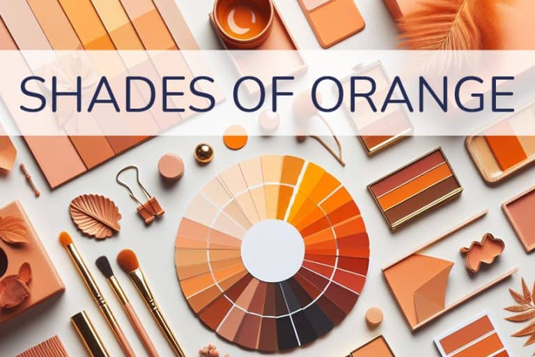
Earth Tone Color Palette – Creating and Using Earthy Colors
An earth tone color palette is quite a popular choice for those looking for a more natural interior design for their homes. However, earth tones are also important when creating a beautiful painting, or earth colors might even be someone’s first choice when it comes to nail polish. Earthy colors are all around us and are more than simply shades of brown. So, to gain a better understanding, let us discuss further what earth tones are and how you can use them.
What Are Earth Tone Colors?
The first color one thinks of when mentioning earth colors, are shades of brown. Brown can be found almost everywhere in nature from different kinds of food, and trees to the soil or earth they are planted in. In the modern world, brown can also be found in fashion, cosmetics, as an earth tone color scheme for the home, or even various skin tones.

Earth tones can also be associated with natural colors, and this means more than simply brow, it includes green leaves, blue or gray skies as well as oranges, yellows, and reds, and think beautiful sunset. This type of color palette is generally warm, inviting, and nature orientated. However, many of the specific earth tones come from clay earth pigments, for example, umber, sienna, and ochre.
| Shade | Hex Code | CMYK Color Code (%) | RGB Color Code | Color |
| Umber | #635147 | 0, 18, 28, 61 | 99, 81, 71 | |
| Sienna | #882d17 | 0, 67, 83, 47 | 136, 45, 23 | |
| Ochre | #cc7722 | 0, 42, 83, 20 | 204, 119, 34 | |
| Brown | #a52a2a | 0, 75, 75, 35 | 165, 42, 42 |
Earth tones can also fall under the term “neutral colors”, which include black, white, brown, tan, beige, taupe, gray, and cream. Ultimately, an earth tone color palette is anything inspired by all things natural in nature. All colors found naturally outside can be considered a part of an earth tone color palette.
Earth Tone Color Palettes for the Home
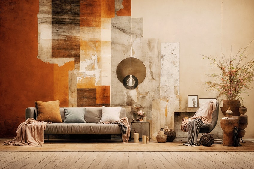
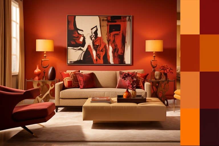
In interior design, utilizing a range of earth tones from terra cotta to shades of brown, gray, blue, and green is best enhanced by incorporating varied textures and contrasts for a modern and elegant look.
Earth tones are particularly suited for living spaces due to their timeless appeal and ability to create a warm, inviting atmosphere. They are also a safe choice for exterior design, harmonizing with natural surroundings.
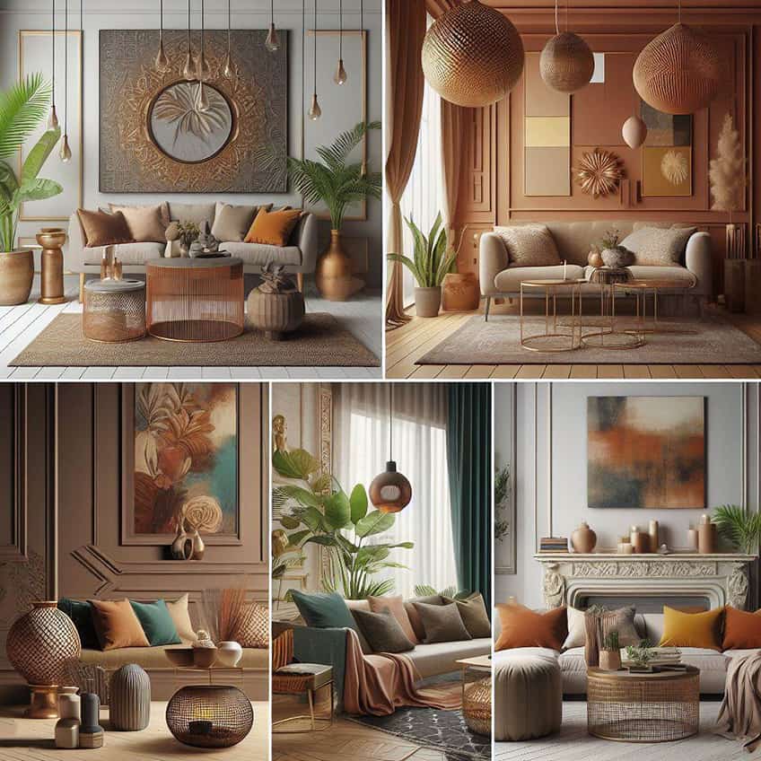
For a cozy ambiance, different shades of brown, from chocolate to almond, can be employed, maintaining consistent undertones for a layered effect. Adding hints of green or blue can increase contrast.
Alternatively, for those who prefer cooler tones, muted blues with grayish undertones or cool gray-greens are calming options. When decorating, select a primary color complemented by accent hues to build your palette.
Cool Blue + Beige + Brown
This palette brings the tranquility of the ocean into your space, balanced by the warmth and stability of beige and brown. Cool blue evokes a serene and calming atmosphere, perfect for bedrooms or bathrooms. Expert Tip: Use cool blue as an accent wall color, complemented by beige furniture and brown decorative elements to create a balanced and inviting room.
| Shade | Hex Code | CMYK Color Code (%) | RGB Color Code | Color |
| Cool Blue | #00B2EE | 100, 18, 0, 7 | 0, 178, 238 | |
| Beige | #F5F5DC | 0, 0, 20, 4 | 245, 245, 220 | |
| Brown | #A52A2A | 0, 75, 75, 35 | 165, 42, 42 |
Sea Blue + Oak
The combination of sea blue and oak creates a refreshing yet grounded ambiance. Sea blue, reminiscent of clear skies, pairs beautifully with the natural, warm tones of oak wood. Expert Tip: Incorporate sea blue through soft furnishings and art, while using oak for flooring or furniture to achieve an organic, cohesive look.
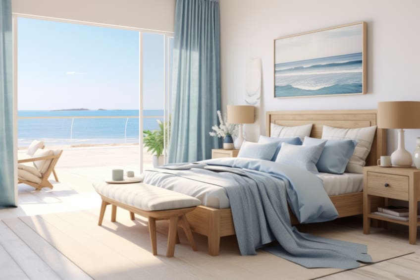
| Shade | Hex Code | CMYK Color Code (%) | RGB Color Code | Color |
| Sea Blue | #006994 | 100, 25, 0, 42 | 0, 105, 148 | |
| Oak | #C19A6B | 0, 17, 42, 24 | 193, 154, 107 |
Dusty Rose + Olive Green
A sophisticated and contemporary pairing, dusty rose and olive green balance each other perfectly. Dusty rose adds a soft, romantic touch, while olive green brings depth and earthiness. Expert Tip: Use olive green as the primary color in living areas, with dusty rose accents in cushions or curtains for a chic, modern feel.
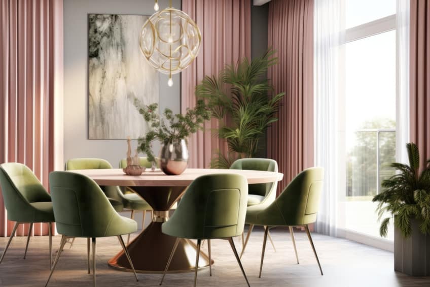
| Shade | Hex Code | CMYK Color Code (%) | RGB Color Code | Color |
| Dusty Rose | #DCAE96 | 0, 15, 25, 14 | 220, 174, 150 | |
| Olive Green | #808000 | 20, 0, 100, 50 | 128, 128, 0 |
Gold + Beige
This elegant combination exudes luxury and warmth. Gold accents bring a touch of opulence to the calming and neutral backdrop of beige. Expert Tip: Opt for gold lighting fixtures or picture frames against beige walls to add a sophisticated sparkle to your space.
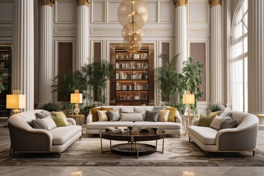
| Shade | Hex Code | CMYK Color Code (%) | RGB Color Code | Color |
| Gold | #FFD700 | 0, 16, 100, 0 | 255, 215, 0 | |
| Beige | #F5F5DC | 0, 0, 14, 4 | 245, 245, 220 |
Dark Charcoal + Rich Wood
This bold pairing creates a striking, sophisticated interior. Dark charcoal offers a dramatic contrast to the warmth of rich wood tones. Expert Tip: Use dark charcoal in textiles or wall paint, and balance it with rich wooden furniture or flooring for a luxurious, modern look.
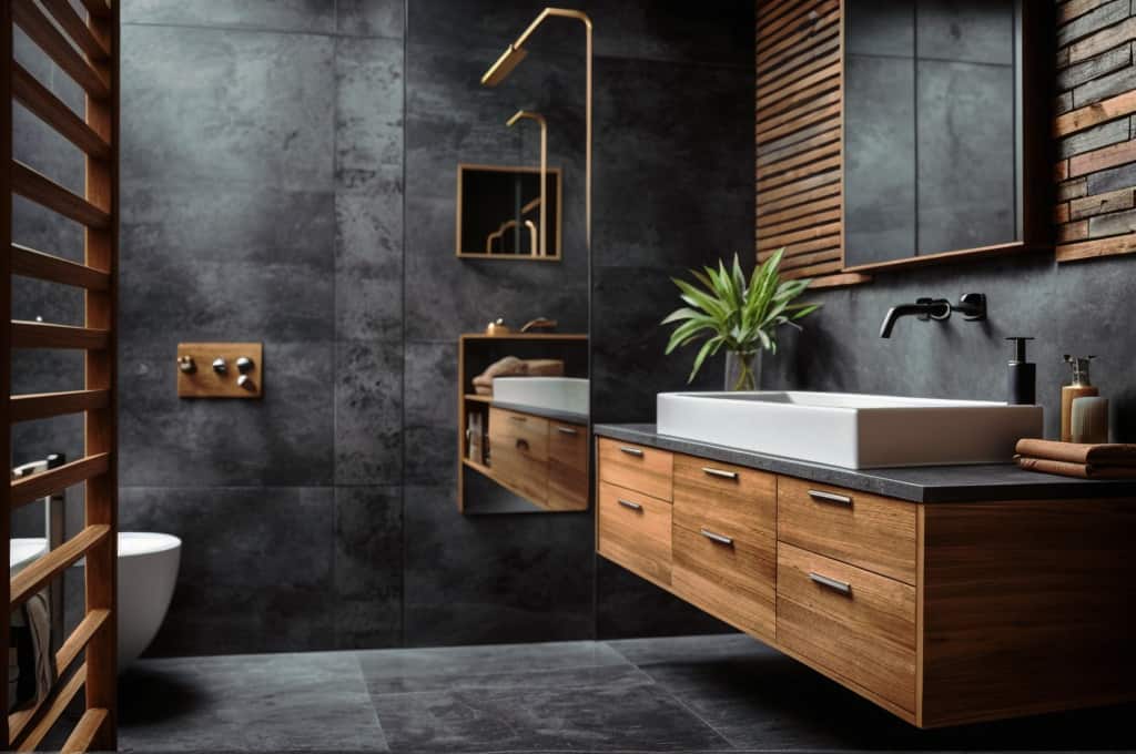
| Shade | Hex Code | CMYK Color Code (%) | RGB Color Code | Color |
| Dark Charcoal | #333333 | 0, 0, 0, 80 | 51, 51, 51 | |
| Rich Wood | #855E42 | 0, 30, 60, 48 | 133, 94, 66 |
Burnt Orange + Gray
This bold pairing creates a striking, sophisticated interior. Dark charcoal offers a dramatic contrast to the warmth of rich wood tones. Expert Tip: Use dark charcoal in textiles or wall paint, and balance it with rich wooden furniture or flooring for a luxurious, modern look.
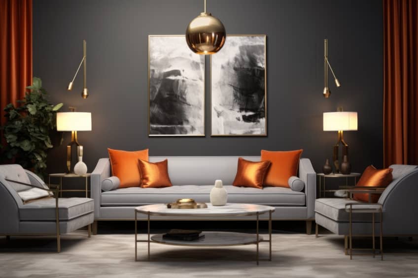
| Shade | Hex Code | CMYK Color Code (%) | RGB Color Code | Color |
| Burnt Orange | #CC5500 | 0, 50, 100, 20 | 204, 85, 0 | |
| Gray | #808080 | 0, 0, 0, 50 | 128, 128, 128 |
White + Tan + Gray
This trio offers a sleek, minimalist aesthetic. The combination of these neutral shades creates a serene and elegant space. Expert Tip: Layer different textures within this color palette, such as a tan leather sofa, white linen curtains, and a gray wool rug, to add depth and interest.
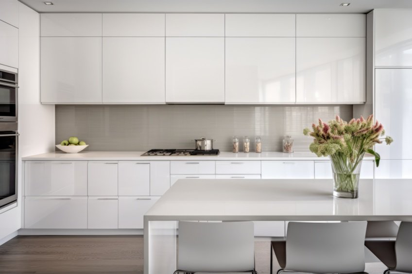
| Shade | Hex Code | CMYK Color Code (%) | RGB Color Code | Color |
| White | #FFFFFF | 0, 0, 0, 0 | 255, 255, 255 | |
| Tan | #D2B48C | 0, 14, 33, 18 | 210, 180, 140 | |
| Gray | #808080 | 0, 0, 0, 50 | 128, 128, 128 |
Green + Tan
Earthy and natural, this combination is soothing and grounded. Green brings freshness and vitality, while tan adds a warm, neutral balance. Expert Tip: Incorporate green through indoor plants and accent pieces, and use tan in larger furniture items for a harmonious, nature-inspired space.
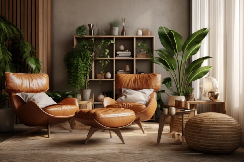
| Shade | Hex Code | CMYK Color Code (%) | RGB Color Code | Color |
| Green | #008000 | 100, 0, 100, 50 | 0, 128, 0 | |
| Tan | #D2B48C | 0, 14, 33, 18 | 210, 180, 140 |
Charcoal + Brown
This pairing is both modern and earthy. Charcoal adds sophistication, while brown brings a sense of warmth and comfort. Expert Tip: Charcoal works well for statement pieces like sofas or rugs, complemented by wooden brown furniture for a cozy yet contemporary feel.
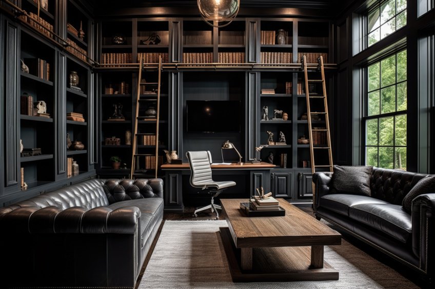
| Shade | Hex Code | CMYK Color Code (%) | RGB Color Code | Color |
| Charcoal | #36454F | 43, 34, 27, 69 | 54, 69, 79 | |
| Brown | #A52A2A | 0, 80, 75, 35 | 165, 42, 42 |
Gray + Brown + White
A classic, versatile palette that combines the best of cool and warm tones. Gray adds a sleek modernity, brown brings warmth, and white keeps the space light and airy. Expert Tip: Use white as the base color on walls, with gray and brown accents in furniture and decor to create a balanced, inviting environment.
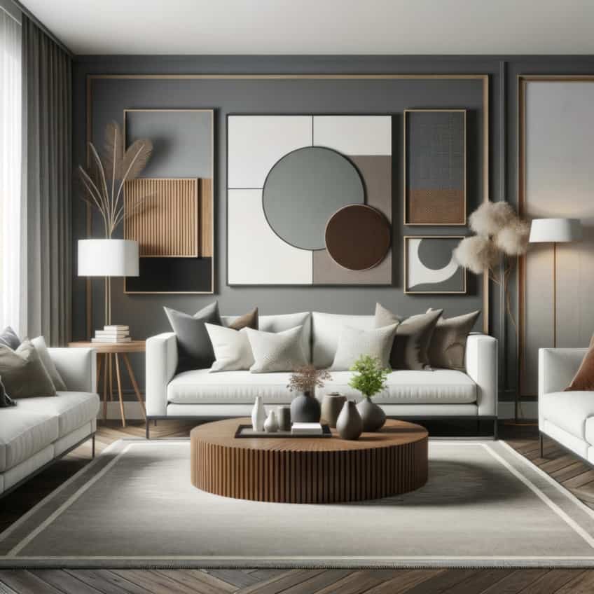
| Shade | Hex Code | CMYK Color Code (%) | RGB Color Code | Color |
| Gray | #808080 | 0, 0, 0, 50 | 128, 128, 128 | |
| Brown | #A52A2A | 0, 80, 75, 35 | 165, 42, 42 | |
| White | #FFFFFF | 0, 0, 0, 0 | 255, 255, 255 |
Orange + Brown
This vibrant and earthy combination is perfect for creating a cozy, inviting atmosphere. The warmth of orange pairs beautifully with the solidity of brown. Expert Tip: Use orange in small doses, like cushions or artwork, against a backdrop of brown furniture or wood accents.
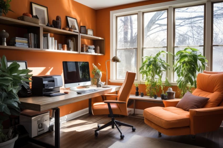
| Shade | Hex Code | CMYK Color Code (%) | RGB Color Code | Color |
| Orange | #FFA500 | 0, 35, 100, 0 | 255, 165, 0 | |
| Brown | #A52A2A | 0, 80, 75, 35 | 165, 42, 42 |
Warm Beige + White
A soothing and elegant pairing, warm beige and white create a soft, welcoming environment. This palette is perfect for creating a restful and serene space. Expert Tip: Use warm beige on walls and larger furniture items, with white accents in trim, bedding, or decorative pieces for a refined, understated elegance.
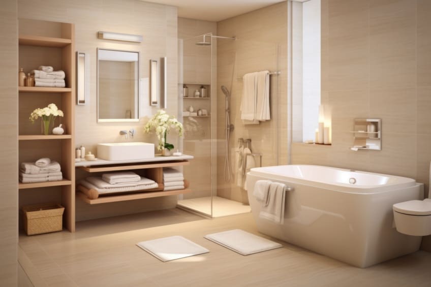
| Shade | Hex Code | CMYK Color Code (%) | RGB Color Code | Color |
| Warm Beige | #F5F5DC | 0, 0, 14, 4 | 245, 245, 220 | |
| White | #FFFFFF | 0, 0, 0, 0 | 255, 255, 255 |
Deep Red + Brown
This rich and luxurious combination creates a warm, inviting ambiance. Deep red adds a touch of drama and energy, while brown grounds the space. Expert Tip: Balance deep red walls or accent pieces with brown furniture and flooring to create a cohesive, yet bold interior.
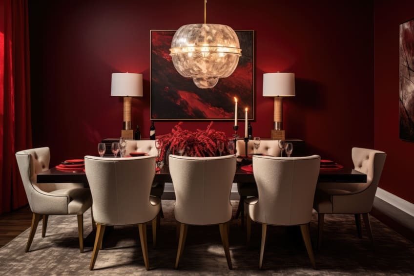
| Shade | Hex Code | CMYK Color Code (%) | RGB Color Code | Color |
| Deep Red | #8B0000 | 0, 100, 100, 45 | 139, 0, 0 | |
| Brown | #A52A2A | 0, 80, 75, 35 | 165, 42, 42 |
Green + Yellow + Beige
A lively and cheerful trio, this palette brings the brightness of yellow and the natural feel of green into a neutral beige setting. Expert Tip: Use yellow as an accent color in accessories or art, green in plants or textiles, and beige in larger furnishings for a balanced, harmonious look.
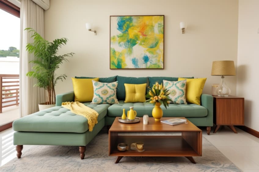
| Shade | Hex Code | CMYK Color Code (%) | RGB Color Code | Color |
| Green | #008000 | 100, 0, 100, 50 | 0, 128, 0 | |
| Yellow | #FFFF00 | 0, 0, 100, 0 | 255, 255, 0 | |
| Beige | #F5F5DC | 0, 0, 14, 4 | 245, 245, 220 |
Gray + Mushroom + Mahogany
This sophisticated palette combines the coolness of gray with the warmth of mushroom and the richness of mahogany. Expert Tip: Use gray as a base for walls or large furniture, accentuated with mushroom textiles and mahogany wood pieces for a luxurious, grounded feel.
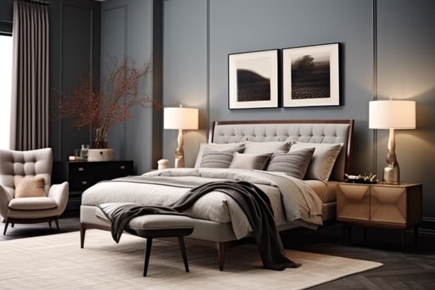
| Shade | Hex Code | CMYK Color Code (%) | RGB Color Code | Color |
| Gray | #808080 | 0, 0, 0, 50 | 128, 128, 128 | |
| Mushroom | #BDAE9D | 0, 10, 20, 26 | 189, 174, 157 | |
| Mahogany | #C04000 | 0, 73, 100, 25 | 192, 64, 0 |
Cream + Blue
This timeless combination offers a serene and classic look. Cream provides a soft backdrop, while blue adds a peaceful, calming element. Expert Tip: Incorporate blue in soft furnishings or wall art against cream walls or furniture for a soothing, elegant interior.
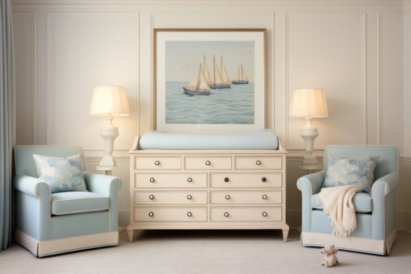
| Shade | Hex Code | CMYK Color Code (%) | RGB Color Code | Color |
| Cream | #FFFDD0 | 0, 0, 10, 0 | 255, 253, 208 | |
| Blue | #0000FF | 100, 100, 0, 0 | 0, 0, 255 |
Cream + White
A monochromatic palette that exudes simplicity and sophistication. Cream and white together create a clean, airy feel. Expert Tip: Play with different textures and shades within this palette to add visual interest and depth, such as cream wool throws on white linen sofas.
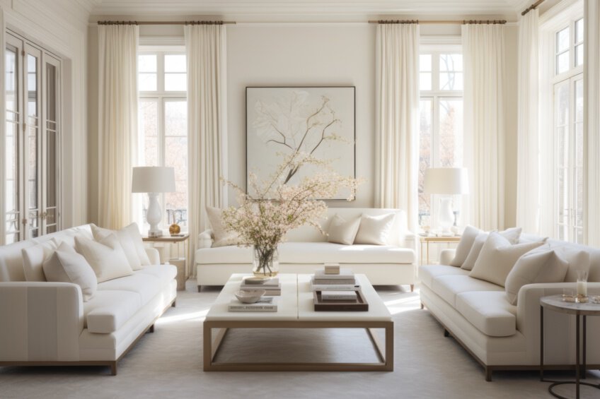
| Shade | Hex Code | CMYK Color Code (%) | RGB Color Code | Color |
| Cream | #FFFDD0 | 0, 0, 10, 0 | 255, 253, 208 | |
| White | #FFFFFF | 0, 0, 0, 0 | 255, 255, 255 |
Sage + Black + White
This modern palette combines the earthiness of sage with the boldness of black and the purity of white. Expert Tip: Use sage as the primary color in soft furnishings, complemented by black furniture and white accents for a chic, contemporary look.
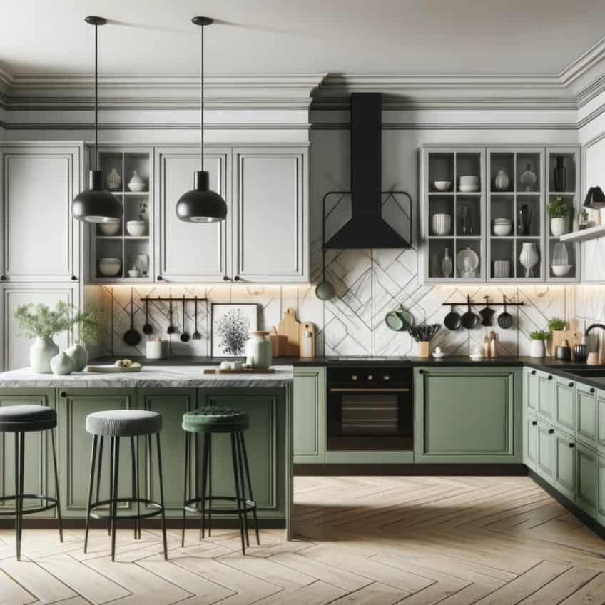
| Shade | Hex Code | CMYK Color Code (%) | RGB Color Code | Color |
| Sage | #9EA791 | 10, 0, 15, 35 | 158, 167, 145 | |
| Black | #000000 | 0, 0, 0, 100 | 0, 0, 0 | |
| White | #FFFFFF | 0, 0, 0, 0 | 255, 255, 255 |
Black + Wood
A dramatic and warm combination, black brings a modern edge, while wood adds natural warmth and texture. Expert Tip: Use black in smaller, strategic elements like picture frames or lamps, and let the natural beauty of wood dominate in larger pieces like flooring or furniture.
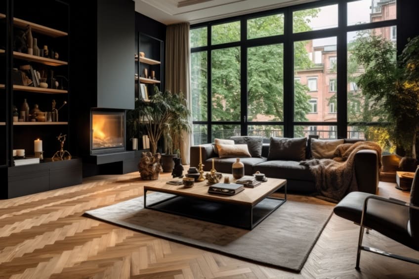
| Shade | Hex Code | CMYK Color Code (%) | RGB Color Code | Color |
| Black | #000000 | 0, 0, 0, 100 | 0, 0, 0 | |
| Wood | #A52A2A | 0, 80, 75, 35 | 165, 42, 42 |
Sage + Clementine + White
A fresh and vibrant palette, sage and clementine add a burst of energy to a white base. Expert Tip: Use clementine in accent pieces like cushions or artwork, sage in textiles, and keep the larger areas like walls and major furniture pieces white for a balanced, lively space.
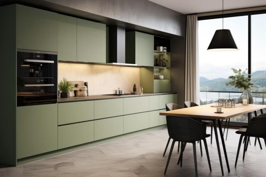
| Shade | Hex Code | CMYK Color Code (%) | RGB Color Code | Color |
| Sage | #9EA791 | 10, 0, 15, 35 | 158, 167, 145 | |
| Clementine | #FFA07A | 0, 37, 52, 0 | 255, 160, 122 | |
| White | #FFFFFF | 0, 0, 0, 0 | 255, 255, 255 |
Peach + Orange
A cheerful and warm palette, this combination is full of life and energy. Peach softens the boldness of orange, creating a playful yet sophisticated look. Expert Tip: Use peach as the dominant color in walls or large furniture, with orange accents in smaller decor items for a vibrant, yet not overwhelming, effect.
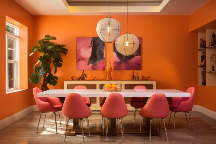
| Shade | Hex Code | CMYK Color Code (%) | RGB Color Code | Color |
| Peach | #FFE5B4 | 0, 10, 29, 0 | 255, 229, 180 | |
| Orange | #FFA500 | 0, 35, 100, 0 | 255, 165, 0 |
Gray + Burnt Orange
A chic and modern combination, gray offers a neutral canvas for the warmth and vibrancy of burnt orange. Expert Tip: Use burnt orange in key accent pieces like throw pillows or art against a backdrop of gray furniture and walls for a stylish, inviting space.

| Shade | Hex Code | CMYK Color Code (%) | RGB Color Code | Color |
| Gray | #808080 | 0, 0, 0, 50 | 128, 128, 128 | |
| Burnt Orange | #CC5500 | 0, 50, 100, 20 | 204, 85, 0 |
Terra Cotta + Muted Blue-Gray
This earthy yet airy pairing brings together the warmth of terra cotta with the soothing calm of muted blue-gray. Expert Tip: Incorporate terra cotta in flooring or accent walls, complemented by muted blue-gray in textiles or decor for a balanced, natural feel.
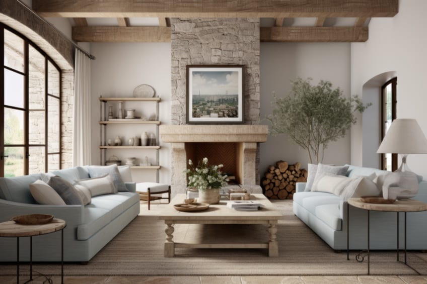
| Shade | Hex Code | CMYK Color Code (%) | RGB Color Code | Color |
| Terra Cotta | #E2725B | 0, 50, 60, 11 | 226, 114, 91 | |
| Muted Blue-Gray | #83A1CD | 36, 21, 0, 20 | 131, 161, 205 |
Taupe + Soft Blue
An elegant and understated combination, taupe’s neutrality is uplifted by the subtle serenity of soft blue. Expert Tip: Use taupe as the base color for walls or large furniture, accented with soft blue in art, cushions, or curtains for a tranquil, sophisticated space.
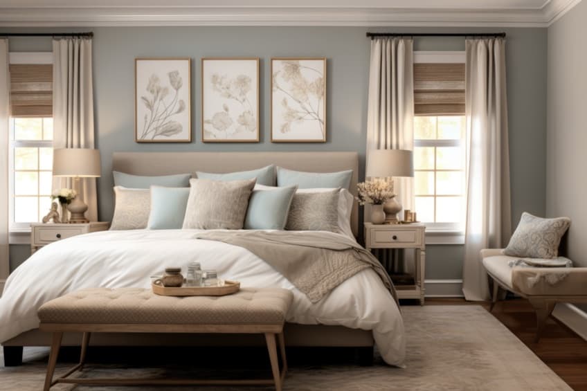
| Shade | Hex Code | CMYK Color Code (%) | RGB Color Code | Color |
| Cool Blue | #5D8AA8 | 50, 25, 0, 33 | 93, 138, 168 | |
| Beige | #F5F5DC | 0, 0, 14, 4 | 245, 245, 220 | |
| Brown | #A52A2A | 0, 80, 75, 35 | 165, 42, 42 |
Tips for Working With Earthy Tones in Your Home
Earth tones are relatively easy to work with when compared to other more vibrant colors in the home. However, some ideas can make it even easier, so here are a few to get you started, try them out the next time you are using an earth tone color scheme.
- When choosing the main color, consider a neutral earth tone, one that works well with almost everything. For example, a shade of beige with gray undertones.
- Make use of texture in a room by adding in other natural elements. For example, you can choose leather couches or wooden window blinds.
- Add textiles, this is also another way to include texture. For example, a beautiful rug or curtains.
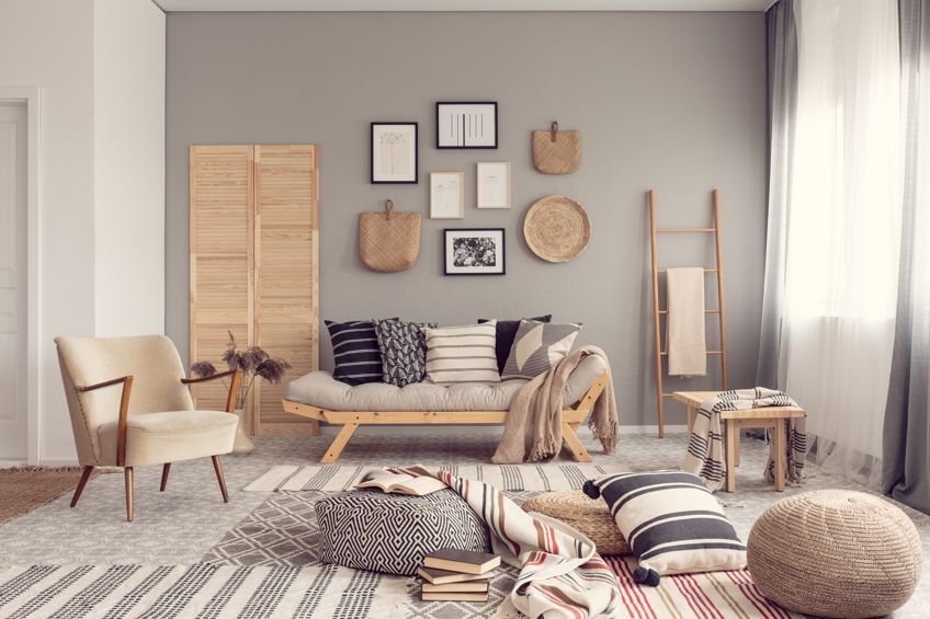
- Accessories can also have an earthy feel to them, for example, including a terra cotta vase or other ceramic items. You can also add in glassware of various natural colors.
- Use vases to bring in nature, by including plants and other greenery. Hanging plants are also a great idea.
- If you want artwork, you can choose something that is nature inspired. For example, a photograph of a forest or a painting of mountains. You can take these elements and create your design around them.
- Lighting in a room is important and can make a big difference. This is especially so with darker tones, so make sure you have enough natural light and other sources of light. Consider adding mirrors to help.
Most Popular Earth Tones and Shades
| Color Shade Name | Hex Code | RGB | CMYK (%) | Color Visualization |
| Beige | #F5F5DC | 245, 245, 220 | 0, 0, 10, 4 | |
| Taupe | #483C32 | 72, 60, 50 | 0, 17, 31, 72 | |
| Charcoal | #36454F | 54, 69, 79 | 32, 13, 0, 69 | |
| Olive Green | #708238 | 112, 130, 56 | 14, 0, 57, 49 | |
| Terracotta | #E2725B | 226, 114, 91 | 0, 50, 60, 11 | |
| Sage Green | #9EA791 | 158, 167, 145 | 5, 0, 13, 35 | |
| Burnt Orange | #CC5500 | 204, 85, 0 | 0, 58, 100, 20 | |
| Dusty Rose | #D7837F | 215, 131, 127 | 0, 39, 41, 16 | |
| Moss Green | #8A9A5B | 138, 154, 91 | 10, 0, 41, 40 | |
| Sienna | #A0522D | 160, 82, 45 | 0, 49, 72, 37 | |
| Chestnut | #954535 | 149, 69, 53 | 0, 54, 64, 42 | |
| Mahogany | #C04000 | 192, 64, 0 | 0, 67, 100, 25 | |
| Umber | #635147 | 99, 81, 71 | 0, 18, 28, 61 | |
| Sand | #C2B280 | 194, 178, 128 | 0, 8, 34, 24 | |
| Copper | #B87333 | 184, 115, 51 | 0, 38, 72, 28 | |
| Muted Blue-Gray | #83A1CD | 131, 161, 205 | 36, 21, 0, 20 | |
| Soft Blue | #778DA0 | 119, 141, 160 | 26, 12, 0, 37 | |
| Khaki | #F0E68C | 240, 230, 140 | 0, 4, 42, 6 | |
| Cool Gray | #8C92AC | 140, 146, 172 | 19, 15, 0, 33 | |
| Peach | #FFE5B4 | 255, 229, 180 | 0, 10, 29, 0 | |
| Muted Green | #737D6A | 115, 125, 106 | 8, 0, 15, 51 | |
| Warm Grey | #A8A495 | 168, 164, 149 | 0, 2, 11, 34 | |
| Deep Teal | #005B5C | 0, 91, 92 | 100, 1, 0, 64 | |
| Forest Green | #228B22 | 34, 139, 34 | 76, 0, 76, 45 | |
| Rust | #B7410E | 183, 65, 14 | 0, 64, 92, 28 |
The Naming of Earth Tones
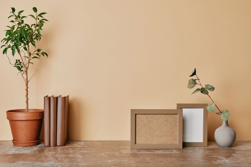
As you may expect, many earth-tone colors have characteristically earthy names. When taking inspiration from nature, we find ourselves with colors named after natural objects.
Nothing abstract would perfectly encapsulate charcoal gray, copper, turquoise, bronze, wheat, marigold, or honey. When we use these names, we can all immediately picture the perfect color, and that is the beauty of natural color names.
The Meaning of Earth Tones
Colors influence mood and behavior, with each hue holding specific meanings and potential psychological effects. Interior decorators leverage this to craft intentional color schemes. Colors can shape a room’s atmosphere and even prompt physical responses, like stimulating appetite. Their impact varies by individual and is crucial in fields beyond interior design, such as marketing and advertising.
Earthy colors are typically perceived as warm, welcoming, and comforting, with muted tones offering a calming presence. They’re versatile, pairing well with various colors, and often include shades of brown with warm undertones of red, yellow, or orange.
An earth tone color palette contains colors that bring us closer to a more natural look when designing with them. The colors are versatile and are a popular choice, so you can never go wrong when choosing an earth tone color scheme.
In 2005, Charlene completed her Wellness Diplomas in Therapeutic Aromatherapy and Reflexology from the International School of Reflexology and Meridian Therapy. She worked for a company offering corporate wellness programs for a couple of years, before opening up her own therapy practice. It was in 2015 that a friend, who was a digital marketer, asked her to join her company as a content creator, and this is where she found her excitement for writing.
Since joining the content writing world, she has gained a lot of experience over the years writing on a diverse selection of topics, from beauty, health, wellness, travel, and more. Due to various circumstances, she had to close her therapy practice and is now a full-time freelance writer. Being a creative person, she could not pass up the opportunity to contribute to the Art in Context team, where is was in her element, writing about a variety of art and craft topics. Contributing articles for over three years now, her knowledge in this area has grown, and she has gotten to explore her creativity and improve her research and writing skills.
Charlene Lewis has been working for artincontext.org since the relaunch in 2020. She is an experienced writer and mainly focuses on the topics of color theory, painting and drawing.
Learn more about Charlene Lewis and the Art in Context Team.
Cite this Article
Charlene, Lewis, “Earth Tone Color Palette – Creating and Using Earthy Colors.” Art in Context. July 29, 2022. URL: https://artincontext.org/earth-tone-color-palette/
Lewis, C. (2022, 29 July). Earth Tone Color Palette – Creating and Using Earthy Colors. Art in Context. https://artincontext.org/earth-tone-color-palette/
Lewis, Charlene. “Earth Tone Color Palette – Creating and Using Earthy Colors.” Art in Context, July 29, 2022. https://artincontext.org/earth-tone-color-palette/.


