Complementary Colors – Everything you Need to Know
Understanding color is not just a matter of black and white, the subject is a little more complex and involves a few terms you should become familiar with. Amongst these are the color wheel complementary colors, which can be used to create beautiful art and color combinations for interior design.
Table of Contents
What Are Complementary Colors?
A simple definition of complementary colors is that it involves two colors that are found on a color wheel, and both these colors are opposite one another. One of the main qualities of these colors is that they make each other stand out or appear brighter when placed next to each other. First, let us go through a brief introduction to color theory.
An Introduction to Complementary Color Theory
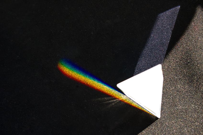
The entirety of color theory revolves around the color wheel, which was created by Sir Isaac Newton. He took the color spectrum and plotted all the colors out into the shape of a circle. Today, using the color wheel helps artists and designers choose reliable color combinations. The traditional colors used by painters involve the primary colors of red, yellow, and blue. Over the years, other modern color models have been developed, below are two of the more common ones.
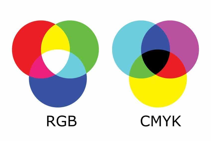
- RGB Color Model: This makes use of red, green, and blue light and is an additive color model, which means various proportions of colors are added to produce a particular color. This model is used to create computer graphics.
- CMYK Color Model: This uses cyan, magenta, yellow, as well as black, and is a subtractive model. This means that it uses pigments or inks to produce colors.
Before we move on, we should also go over a few terms, which can be helpful when dealing with colors. There are so many colors because there are various shades of color, tints, as well as saturation levels. These are some basic terms, to begin with.
- Hue: The hue is just another term used to describe a color, for example, blue and red are hues or colors.
- Tints: When dealing with paint colors, you then add white to lighten a mixture, this is then referred to as a tint.
- Shades: This is the opposite of tints and involves adding black to a mixture to darken it.
- Color saturation: This is how intense a color appears and how strong the color is. A higher saturation means the color is strong, while a lower saturation level means it is paler or less intense in color.
- Color value: The color value deals with the brightness of a color, the higher the color value, the brighter a color becomes.
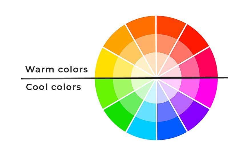
- Color Temperature: Colors can be warm and cold and are usually found on either side of the color wheel. Warm colors include reds, orange, and yellows, while cooler colors are blue, greens as well as purples.
As we carry on, we are going to be sticking with the more traditional color model, which uses the primary colors of red, blue, and yellow.
However, you will notice some tables that demonstrate the various colors will show you the hex code, which helps identify a color online, along with your RGB and CMYK color proportions.
Primary Complementary Color Examples
When looking at a color wheel with the primary colors, you will notice that they are positioned in a triangular formation if you had to draw lines between them. The secondary colors, which are green, purple, and orange and are a combination of your primary colors can also be found on the color wheel. You will notice that the primary and secondary colors face each other on opposite sides, which makes them complementary colors. Below are the complementary color examples.

| Shade | Hex Code | CMYK Color Code (%) | RGB Color Code | Color |
| Red | #ff0000 | 0, 100, 100, 0 | 255, 0, 0 | |
| Green | #00ff00 | 100, 0, 100, 0 | 0, 255, 0 |
Above, you have red as the primary color, so when looking at the color wheel, you will notice that green sits opposite red. These are then complementary colors. Below is blue, another primary color, with orange as its complement.
| Shade | Hex Code | CMYK Color Code (%) | RGB Color Code | Color |
| Blue | #0000ff | 100, 100, 0, 0 | 0, 0, 255 | |
| Orange | #ffa500 | 0, 35, 100, 0 | 255, 165, 0 |
Last, but not least is the primary color yellow. This means that the secondary color purple or violet will be located on the opposite side. Placing these colors next to each other, you will see how they make one another stand out.
| Shade | Hex Code | CMYK Color Code (%) | RGB Color Code | Color |
| Yellow | #ffff00 | 0, 0, 100, 0 | 255, 255, 0 | |
| Purple | #800080 | 0, 100, 0, 50 | 128, 0, 128 |
Intermediary Colors
These are your main and fundamental colors that all other colors come from. The next level of colors is your intermediary colors, which some also call tertiary colors. These are a combination and include primary as well as secondary colors.
- Red-orange
- Yellow-orange
- Blue-purple or violet
- Red-purple
- Yellow-green
- Blue-green
| Shade | Hex Code | CMYK Color Code (%) | RGB Color Code | Color |
| Red-Orange | #ff5349 | 0, 67, 71, 0 | 255, 83, 73 | |
| Yellow-Orange | #ffae42 | 0, 32, 74, 0 | 255, 174, 66 | |
| Blue-Purple | #8a2be2 | 39, 81, 0, 11 | 138, 43, 226 | |
| Red-Purple | #953553 | 0, 64, 44, 42 | 149, 53, 83 | |
| Yellow-Green | #9acd32 | 25, 0, 76, 20 | 154, 205, 50 | |
| Blue-Green | #0d98ba | 93, 18, 0, 27 | 13, 152, 186 |
Colors can then be divided into numerous colors and include various tints, shades, and saturation levels. No matter what the color is, the complementary color will always be the one opposite it. When placed next to each other, complementary colors enhance each other, meaning they make each other stand out more, and are colors that tend to attract attention. Artists and designers use these colors, particularly for this feature.
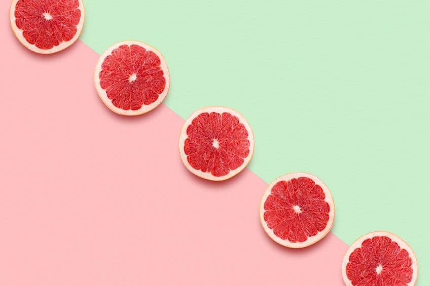
However, if used incorrectly, the colors can become overpowering and they can compete for attention, making them appear too bright. The trick is to select a dominant color you are going to work with and then include a complementary color that can be used as an accent color. In other words, you use any other colors besides the dominant color, in smaller quantities. This will create what you want by attracting attention and creating balance, which does not overwhelm the senses.
Besides placing these colors alongside each other, you can also mix them. When doing this, it means you are going to lose the hue as the colors cancel each other out. This is because if you combine all three of the primary colors, you will land up with a neutral gray or whitish color.
Other Color Combinations
The first color combination we will be dealing with is that of your split complementary colors. These work exactly like your complementary colors; they simply include three colors instead of two. It is very easy to identify these colors, all you have to do is select your main color, in this case, we are going for blue.

Once you find blue, you will know by now that the complementary color is orange. For split complementary colors in a traditional model, all you have to do is find the colors directly next to either side of orange. In the RGB model, it would be orange and a green-yellow as your split complementary colors. So, you can see, depending on what color model you use, the complementary colors can be different.
| Shade | Hex Code | CMYK Color Code (%) | RGB Color Code | Color |
| Yellow-Orange | #ffae42 | 0, 32, 74, 0 | 255, 174, 66 | |
| Blue | #0000ff | 100, 100, 0, 0 | 0, 0, 255 | |
| Red-Orange | #ff5349 | 0, 67, 71, 0 | 255, 83, 73 |
As you can see, the above table contains the traditional colors that are mainly used for painting. So, in this case, you have the blue color, and directly opposite you have orange as the complementary color. Next to the orange, are your split complementary shades. Below is an example of the RGB color model.
| Shade | Hex Code | CMYK Color Code (%) | RGB Color Code | Color |
| Orange | #ff8000 | 0, 50, 100, 0 | 255, 128, 0 | |
| Blue | #0000ff | 100, 100, 0, 0 | 0, 0, 255 | |
| Green-Yellow | #80ff00 | 50, 0, 100, 0 | 128, 255, 0 |
Besides complementary colors, there are a few other color combinations you can create by using the color wheel. Some of these combinations create contrast, similar to the complementary colors, while others form a more unified appearance.
- Analogous Colors: These are colors that are located close to each other or alongside one another when looking at a color wheel.
- Monochromatic Colors: This color combination uses a single color and then has variations of this same color.
- Triadic Colors: The triadic are evenly spaced colors on the color wheel and are in the shape of a triangle. Similar to this is the square color combination.
- Tetradic Colors: This type of color combination involves four colors or a double complementary set of colors in the shape of a rectangle.
A Brief History of Color
Way before the color theory, many philosophers made observations on how they perceived color. For example, the well-known philosopher, Aristotle, made observations on how when the light fell on another color, it took on a different hue. Even Leonardo da Vinci understood that certain colors harmonized better than others, however, a scientific explanation was still needed.
This is where Sir Isaac Newton comes in with his discovery of the spectrum of light and his way of visually displaying his idea in a circle form. Many experiments were being done concerning light and color during the 18 and 1900s. However, it was a certain British scientist, Benjamin Thompson, Count Rumford, who came up with the term we all use, complement. This term expresses how two colors, when they are mixed, create white.
He came up with a theory that specified that every color or hue has another color that works in perfect harmony with it, and this other color is known as its complementary color. Another researcher and poet, Johann Wolfgang von Goethe, expressed his own theories during the early 19th century.
His was a bit of a radical theory that contested Newton’s color spectrum ideas. He proposed that darkness is something more active than simply being a lack of light. He also explored the idea of how colors can affect emotions. During the same period, another researcher and physicist, Thomas Young, was developing theories concerning additive colors, which formed the basis of the RGB color model.
During all the research and discoveries, there was a bit of debate about various color models and the different colors involved.
This debate was settled by another German scientist, Hermann von Helmholtz, who proved that colors that were created by light were additive, while those colors which were created by pigments and ink, were subtractive, and did have different primary as well as complementary colors. It is safe to say, that all these discoveries also influenced the artists and how they used color. Below is a few examples of famous artists who used complementary colors to great effect.
- Self-Portrait (1889) by Vincent van Gogh: In this painting, you can see the use of the complementary colors of blue and orange.
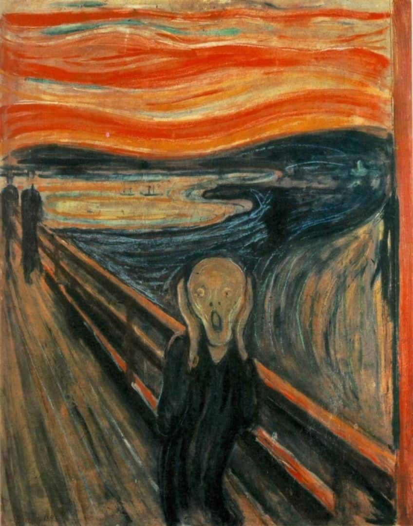
- The Scream (1893) by Edvard Munch: There is a skillful use of the contrasting colors green and red, as well as blue and orange.
- Four Dancers (1899) by Edgar Degas: The background in the painting is green, and then the red forms a beautiful contrast and focus point for the painting.
- Houses of Parliament (1904) by Claude Monet: There is the distinctive use of the complementary colors blue and orange.
- The Lute (1943) by Matisse: In this painting, you will notice the use of the complementary colors red and green.
Complementary Colors in Art and Interior Design
Gaining an understanding of complementary color theory can help an artist choose better colors that work and create the desired effect. The main benefits of complementary colors are providing contrast or creating neutral hues and shadows.
We have already mentioned that colors can also be explained as possessing color temperature. When dealing with complementary colors, there will always be a warm and cool color involved. This combination offers the highest contrast of colors.
This contrast brings with it an illusion, where the colors appear to be brighter when placed close next to each other.
Artists use complementary colors in many ways. The easiest example would be painting a sunset, where there are gradients of color from more vibrant orange colors to deeper blue colors. Also, if you have a paint color that seems a bit dull by itself, for example, when using red paint, use green paint next to it to liven it up.
Mixing complementary colors can also provide some wonderful results. If you have your main color, and you mix it with its complementary, you can create some effective shadows. By mixing in a small amount of a color’s complementary color, you can also make the main hue less vivid. When adding more of the complementary color, you are creating more of a neutral color.

For example, take red and green paint, by adding a little green to the red, it eventually becomes burnt sienna. Add in more of the green and it forms a much darker sienna, and if you added equal amounts, it would become a warm darkish-brown. You can then experiment further with this color by also adding in gray, black, or white.
Experiment with the colors and ideas and make sure to create swatches or a color palette as you go to see how complementary colors can play off each other. If you find yourself wondering what colors to mix, always refer back to the color wheel for inspiration.
Complementary Colors and Interior Design
When deciding on an interior design, you can use complementary colors to great effect. Various color wheel complementary colors work amazingly well together as they enhance each other’s appearance. For example, if you decide to go for a blue-themed room, a bit of orange can really stand out.

When using more than one color in a color scheme, it is best to decide on your main color and then use the other colors as accents. For example, painting the walls would be your main color, while cushions, throws, and furnishings will bring in the accent colors. This way, all the colors work harmoniously to create a balanced look that does not overpower the senses.
Hopefully, after going through this article, you now understand a bit more about complementary color theory. It is now up to you to go out and experiment with various ideas, whether it is painting or developing a color scheme for your home. Have fun, and do not be too afraid to try out new ideas.
Take a look at our “what are complementary colors?” webstory here!
Frequently Asked Questions
What Are Complementary Colors?
Complementary colors are color combinations that when placed alongside each other, help to create a contrast, and each color makes the other stand out. When you look at a color wheel, which displays all colors, you will find complementary colors on opposite sides
How Can You Use Complementary Colors in Art?
The whole idea of complementary colors is to create contrast. So, to do this, add small amounts of a color’s complement close by. Reduce the intensity of color by blending a tiny quantity of its color complement. You can also create some amazing neutral colors by blending two complementary colors, and then changing them by adding black, gray, or white.
What Are Some Complementary Color Examples?
When it comes to your traditional primary colors of blue, yellow, and red, the complementary colors are orange, purple or violet, and green respectively. When used together, they can create some amazing visual effects.
In 2005, Charlene completed her Wellness Diplomas in Therapeutic Aromatherapy and Reflexology from the International School of Reflexology and Meridian Therapy. She worked for a company offering corporate wellness programs for a couple of years, before opening up her own therapy practice. It was in 2015 that a friend, who was a digital marketer, asked her to join her company as a content creator, and this is where she found her excitement for writing.
Since joining the content writing world, she has gained a lot of experience over the years writing on a diverse selection of topics, from beauty, health, wellness, travel, and more. Due to various circumstances, she had to close her therapy practice and is now a full-time freelance writer. Being a creative person, she could not pass up the opportunity to contribute to the Art in Context team, where is was in her element, writing about a variety of art and craft topics. Contributing articles for over three years now, her knowledge in this area has grown, and she has gotten to explore her creativity and improve her research and writing skills.
Charlene Lewis has been working for artincontext.org since the relaunch in 2020. She is an experienced writer and mainly focuses on the topics of color theory, painting and drawing.
Learn more about Charlene Lewis and the Art in Context Team.
Cite this Article
Charlene, Lewis, “Complementary Colors – Everything you Need to Know.” Art in Context. June 17, 2022. URL: https://artincontext.org/complementary-colors/
Lewis, C. (2022, 17 June). Complementary Colors – Everything you Need to Know. Art in Context. https://artincontext.org/complementary-colors/
Lewis, Charlene. “Complementary Colors – Everything you Need to Know.” Art in Context, June 17, 2022. https://artincontext.org/complementary-colors/.


