Champagne Color – What Does the Color Champagne Look Like?
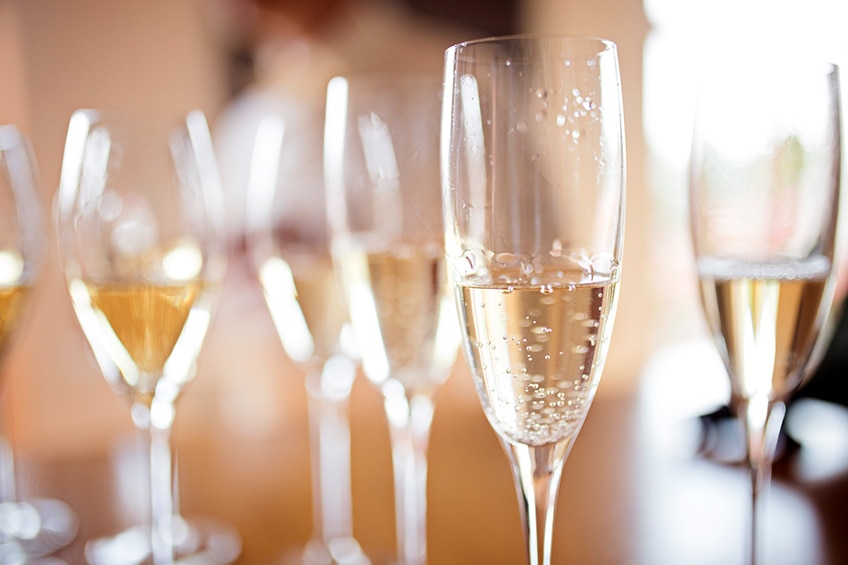
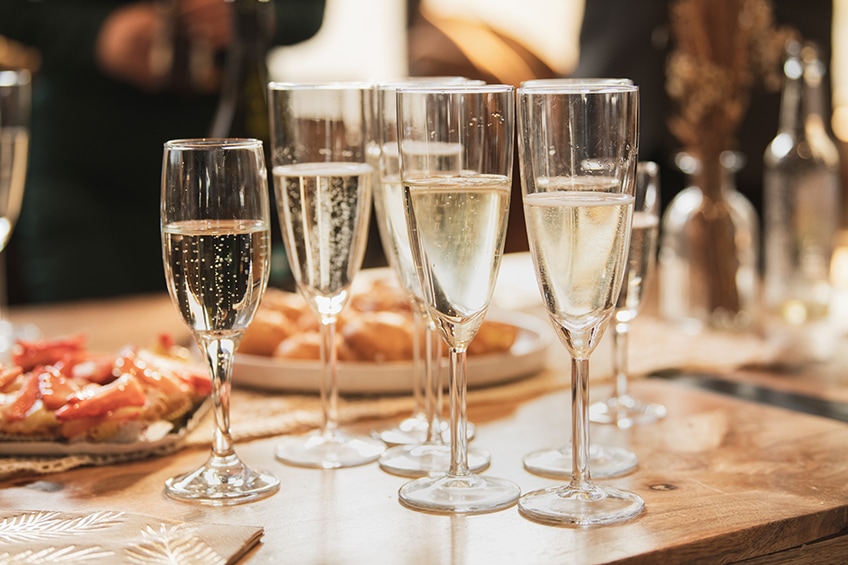
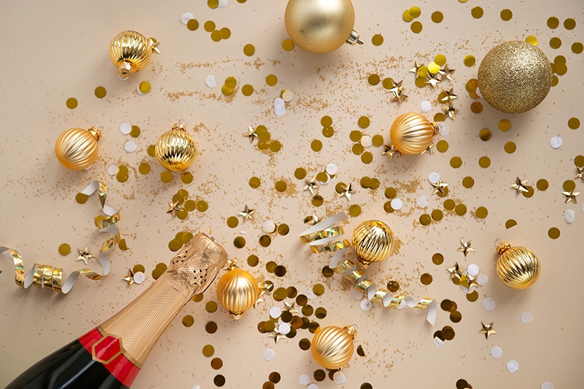
Many of us have, at one time or another, had a glass of champagne. Holding it up to the light, you can admire the bubbles and golden hue. Did you know there is also a champagne color, a shade that can be used in most designs and along with many other colors?
What Color Is Champagne?
The color champagne, derived from the alcoholic beverage, can be described as being a warm, soft orange or yellowish-orange and is very close to beige. There are various shades of champagne, as well as different web colors with the same name. As you can see below, you have a soft orange and a light grayish-orange. The champagne color also has other names like sunset or deep champagne.
The colors in the table below, are the closest web colors you get that represent the champagne color. Each of these colors has its own identifying hex code and color codes that can be used in web designs. The RGB color code is used to create web images, while the CMYK color code is used when you need to print something, as it tells you how much of different ink colors there are in each color. For example, how much cyan, magenta, yellow, and black is used to produce a specific color?
| Champagne Shade | Hex Code | CMYK Color Code (%) | RGB Color Code | Champagne Color |
| Champagne #1 | #fad6a5 | 0, 14, 34, 2 | 250, 214, 165 | |
| Champagne #2 | #f7e7ce | 0, 6, 17, 3 | 247, 231, 206 |
Champagne Color: A Brief History
The champagne color might not have the history behind it as some other primary colors, but it still has its place. The beverage and color are irrevocably intertwined with one another. Champagne is a registered title that comes from a region known as Champagne in the North East parts of France. This is the origin of sparkling wines and champagne.
The term “champagne” has been registered with the French Interindustry Champagne Committee or CIVC. This does help protect the brand and is, therefore, in principle, not an official color name. However, the term champagne has become quite popular and is used only to describe certain yellowish-orange colors. In most countries, it is illegal to label a product with the name champagne as the word has become the embodiment of success, luxury, and distinction, which makes it a valuable name that the French wish to protect.
The same rule is also used for certain wines like Bordeaux or Burgundy. Even describing a product by its color is frowned upon, which happened in around 2013 when Apple wanted to name their new iPhone color champagne. It is implied that if anybody uses the champagne name, it attracts all the benefits of that name, so it has become illegal to do so. You will most likely now find that your choice of color for the iPhone will now be gold. There was also some controversy with Yves Saint Laurent’s champagne perfume in 1993. The perfume name had to change and is now known as Yvresse.
Besides the bubbly beverage, champagne is also used to describe other things. For example, champagne has been used to describe various horse breeds. The coat of some horses look golden brown, and the term “champagne gene” is used to describe horses that possess a chestnut color. There is also a champagne finish that is used on automobiles and implies luxury. Staying with luxury products, you can also get evening gowns and lingerie in the champagne color.
Meaning of the Champagne Color
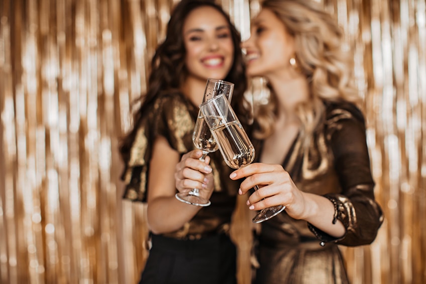
Champagne is always something you drink at celebrations like weddings or New Year, so the color is also associated with elegance, joy, prosperity, prestige, and sophistication. The color can also evoke feelings of friendliness, comfort, and fun.
| Aspect | Champagne Color Associations |
|---|---|
| Symbols | Celebration, Luxury, Elegance, Modesty |
| Effects | Inspires, Boosts, Enlivens, Can Threaten Simplicity |
| Color Psychology | Associated with love, class, and often used in happy contexts due to its association with the celebratory beverage |
| Positive | Sophistication, Warmth, Neutrality, Festivity |
| Negative | Can be perceived as pretentious or overly modest in some settings |
What Colors Make Champagne?
When mixing paints to achieve a particular color, you will need to experiment and play around with different proportions. As you blend colors, make sure to keep a color chart so that you can remember the proportions you used.
- To start from scratch, you need to create a yellow from red and green and then mix a small amount of this into some white.
- You can aim for a beige color, then add in a tiny amount of red to create a warmer and more orange tone. Only use very small amounts of red as you go.
- You can also start by mixing various proportions of yellow and orange, and then adding small amounts of this to white until you get a color close to champagne.
- Always mix the paints well before adding any other paint colors.
Shades of Champagne Color
There are a few shades of champagne colors from light champagne color to medium and dark shades. The original champagne color should be somewhere in the middle of all of this and leaning towards a golden and beige look. All three of these shades of champagne are colors that have been documented in The Dictionary of Color Names (1955) by authors Deane B. Judd and Kenneth L. Kellys.
| Color Shade Name | Hex Code | RGB | CMYK (%) | Color Visualization |
| Aesthetic Champagne | #F3E5CA | 243, 229, 202 | 0, 6, 17, 5 | |
| Antique Gold | #D4C19C | 212, 193, 156 | 0, 9, 26, 17 | |
| Beige Gold | #F2E2C9 | 242, 226, 201 | 0, 7, 17, 5 | |
| Biscuit | #DDB591 | 221, 181, 145 | 0, 18, 34, 13 | |
| Bubbles | #E7FEFF | 231, 254, 255 | 9, 0, 0, 0 | |
| Bubbly | #F6E4C6 | 246, 228, 198 | 0, 7, 20, 4 | |
| Caramel | #DFB28D | 223, 178, 141 | 0, 20, 37, 13 | |
| Cava | #F7E4CA | 247, 228, 202 | 0, 8, 18, 3 | |
| Champagne | #F7E7CE | 247, 231, 206 | 0, 6, 17, 3 | |
| Champagne Beige | #DBC4A0 | 219, 196, 160 | 0, 11, 27, 14 | |
| Champagne Blonde | #F0DAC1 | 240, 218, 193 | 0, 9, 20, 6 | |
| Champagne Blush | #E6C4B9 | 230, 196, 185 | 0, 15, 20, 10 | |
| Champagne Brown | #EAC396 | 234, 195, 150 | 0, 17, 36, 8 | |
| Champagne CMYK | #FFE6CB | 255, 230, 203 | 0, 10, 20, 0 | |
| Champagne Cream | #F8E9D6 | 248, 233, 214 | 0, 6, 14, 3 | |
| Champagne Elegance | #F8EEE0 | 248, 238, 224 | 0, 4, 10, 3 | |
| Champagne Frost | #E4D8C7 | 228, 216, 199 | 0, 5, 13, 11 | |
| Champagne Gold | #FAEEC8 | 250, 238, 200 | 0, 5, 20, 2 | |
| Champagne Ice | #f3e5dd | 243, 229, 221 | 0, 6, 9, 5 | |
| Champagne Ivory | #FFF8ED | 255, 248, 237 | 0, 3, 7, 0 | |
| Champagne Kiss | #e8e4e4 | 232, 228, 228 | 0, 2, 2, 9 | |
| Champagne Mauve | #E5C8B5 | 229, 200, 181 | 0, 13, 21, 10 | |
| Champagne Mist | #E8DACD | 232, 218, 205 | 0, 6, 12, 9 | |
| Champagne Pearl | #EADDC7 | 234, 221, 199 | 0, 6, 15, 8 | |
| Champagne Pink | #F8DECD | 248, 222, 205 | 0, 10, 17, 3 | |
| Champagne Rose | #DBBEBB | 219, 190, 187 | 0, 13, 15, 14 | |
| Champagne Shade | #fad6a5 | 250, 214, 165 | 0, 14, 34, 2 | |
| Champagne Silver | #DDD1C4 | 221, 209, 196 | 0, 5, 11, 13 | |
| Champagne White | #F4EFE5 | 244, 239, 229 | 0, 2, 6, 4 | |
| Chardonnay | #FFCD8C | 255, 205, 140 | 0, 20, 45, 0 | |
| Cream Puff | #FFF1D8 | 255, 241, 216 | 0, 5, 15, 0 | |
| Dark Champagne | #C2B280 | 194, 178, 128 | 0, 8, 34, 24 | |
| Dark Champagne Gold | #D7C69D | 215, 198, 157 | 0, 8, 27, 16 | |
| Deep Champagne | #FAD6A5 | 250, 214, 165 | 0, 14, 34, 2 | |
| Ivory | #fffff0 | 255, 255, 240 | 0, 0, 6, 0 | |
| Ivory Cream | #DAC0A7 | 218, 192, 167 | 0, 12, 23, 15 | |
| Ivory Pearl | #f6e8ca | 246, 232, 202 | 0, 6, 18, 4 | |
| Light Champagne | #FAECD7 | 250, 236, 215 | 0, 6, 14, 2 | |
| Light Champagne Gold | #FAF0D5 | 250, 240, 213 | 0, 4, 15, 2 | |
| Medium Champagne | #F3E5AB | 243, 229, 171 | 0, 6, 30, 5 | |
| Old Champagne | #f7e7ce | 247, 231, 206 | 0, 6, 17, 3 | |
| Pale Beige | #DED1B4 | 222, 209, 180 | 0, 6, 19, 13 | |
| Pale Champagne | #F9F0DF | 249, 240, 223 | 0, 4, 10, 2 | |
| Pale Gold | #E6BE8A | 230, 190, 138 | 0, 17, 40, 10 | |
| Pale Honey | #F6D7AB | 246, 215, 171 | 0, 13, 30, 4 | |
| Pastel Champagne | #FCF1DC | 252, 241, 220 | 0, 4, 13, 1 | |
| Pearl White | #F8F6F0 | 248, 246, 240 | 0, 1, 3, 3 | |
| Pink Champagne | #F1DDCF | 241, 221, 207 | 0, 8, 14, 5 | |
| Prosecco | #fad6a5 | 250, 214, 165 | 0, 14, 34, 2 | |
| Sand Beige | #ae9b7d | 174, 155, 125 | 0, 11, 28, 32 | |
| Sandstone | #786D5F | 120, 109, 95 | 0, 9, 21, 53 | |
| Soft Beige | #DDC7A0 | 221, 199, 160 | 0, 10, 28, 13 | |
| Sparkling Pink | #f5cee6 | 245, 206, 230 | 0, 16, 6, 4 | |
| Sparkling Wine | #efcf98 | 239, 207, 152 | 0, 13, 36, 6 | |
| Vanilla Cream | #F7E0D2 | 247, 224, 210 | 0, 9, 15, 3 | |
| Wine Yellow | #d7c485 | 215, 196, 133 | 0, 9, 38, 16 |
What Colors Go With Champagne?
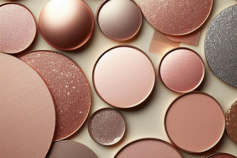
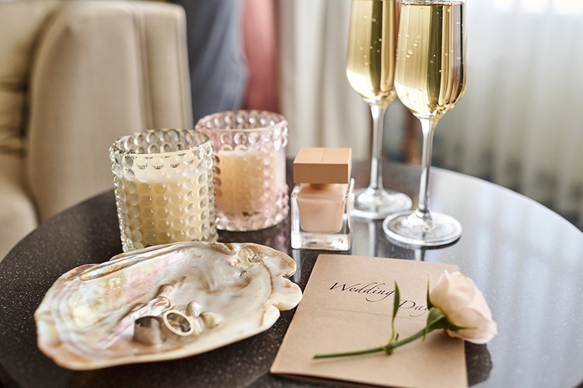
The champagne color can be considered a neutral hue, which makes it a good match for most colors. However, it can be used to help emphasize shades of orange and yellow. Champagne also works wonderfully with muted or pastel tones as well as more vibrant tones. Natural metallic colors like copper or bronze pair beautifully with the champagne color. Other neutral colors like white, ivory, and brown go well with champagne.
Looking at the color wheel, you can determine a few ideal color combinations. The color wheel visually displays colors, generally, having cool and warm colors on either side. So, you will have all your primary, secondary as well as tertiary or intermediate colors on the color wheel. Color combinations can be determined by the position of all these colors. Some color combinations are pleasing to look at, while others produce a striking contrast.
The monochromatic color combination is a variety of different shades of champagne, as in the shades described above. This means only a single color is used to create different shades, tones, and tints. Below are a few more ideas you can use for a champagne color palette.
Complementary Colors
The first color combination is your complementary colors. These are easy to work with and are easy to locate on the color wheel as they are simply opposite each other. When placed next to each other, the colors produce a contrast, helping each color stand out.
The champagne color will, therefore, have a soft blue as its complementary hue. You also do not have to stick to this particular shade of blue. For example, try pairing the champagne color with navy blue, which is quite a popular wedding color combination.
| Shade | Hex Code | CMYK Color Code (%) | RGB Color Code | Color |
| Champagne | #fad6a5 | 0, 14, 34, 2 | 250, 214, 165 | |
| Soft Blue | #a5c9fa | 34, 20, 0, 2 | 165, 201, 250 |
Analogous Colors
We have already mentioned that various shades of yellow and orange go well with champagne, and this is because it is another good color combination. All these shades, which also include red, sit on the same side of the color wheel, and all are close to one another.
Any color combination will produce a champagne color palette that is nice to look at and is not as striking as the complementary color combination. Again, other shades of color can be used, for example, darker orange colors and browns can also go with champagne.
| Shade | Hex Code | CMYK Color Code (%) | RGB Color Code | Color |
| Champagne | #fad6a5 | 0, 14, 34, 2 | 250, 214, 165 | |
| Soft Red | #faaca5 | 0, 31, 34, 2 | 250, 172, 165 | |
| Soft Yellow | #f4faa5 | 2, 0, 34, 2 | 244, 250, 165 |
Triadic Colors
Triadic colors also produce a color contrast when the various colors are placed next to each other. So, to avoid overwhelming viewers, it is recommended a main single color is chosen, while the other hues play more of a supporting role. As with all the other color combinations, you can experiment with darker or more vibrant shades of purple and green.
| Shade | Hex Code | CMYK Color Code (%) | RGB Color Code | Color |
| Champagne | #fad6a5 | 0, 14, 34, 2 | 250, 214, 165 | |
| Soft Violet | #d6a5fa | 14, 34, 0, 2 | 214, 165, 250 | |
| Soft Cyan | #a5fad6 | 34, 0, 14, 2 | 165, 250, 214 |
Champagne Color Palettes in the Home
As with beige, the champagne color can act as a neutral base, helping to create more light and producing a tranquil, warm, and welcoming atmosphere. The color works well with earth tones like chocolate brown and taupe, as well as other neutrals like white, black, and gray. Natural wood elements would add to the luxury feeling of a room. There are also contrasting colors like shades of blue and green that will also look amazing when paired with the champagne color.
The champagne color can be used as your main color and brings some color and energy into a room, unlike white. Champagne also works well with most colors, which you can use as accents in a room to bring in more interest and balance.
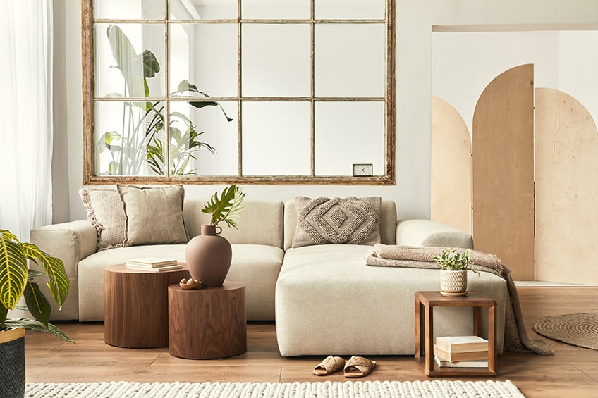
However, the champagne color can also be used as an accent color. This is easy to do, and you can always play around with different ideas. You can create an accent wall, or you can consider things like cabinets and countertops. Other smaller accessories can also be added, for example, lamps, throws, cushions, curtains, and furniture items. Below are a few more ideas for creating a champagne color palette.
Metallics and the Champagne Color
The champagne color is warm, meaning it has orange and yellow undertones. This means it will work wonderfully with metallics like copper, bronze, rose gold, or brass. Consider metallic fixtures in the bathroom and kitchen. In other spaces, consider chandeliers, lampstands, or a tabletop with a metallic paint finish.
Incorporating Texture
A neutral color like beige or champagne can help to create an environment that is calming and open. However, to create a more interesting space, you may want to consider adding different textures. This can also help to add depth to a space and can be as simple as using different paint finishes, for example, using a matte finish on the walls and a gloss finish on the ceiling. Another idea is to use wallpaper, which can also have a subtle pattern that does not overwhelm the space.
Creating a Layered Look
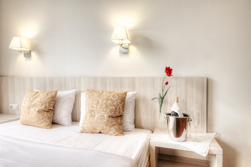
Again, this is a way to add more depth and interest to a space. A subtle layering of different tones can make a big difference. This is where you can use different colors like white and champagne or bring in different shades of champagne. The overall look should be harmonious, fresh, and warm.
Conclusion
The champagne color is such a warm and friendly color that can work on walls and furniture. Not only that, but it also goes with most colors, to create an interesting champagne color palette for any home.
Frequently Asked Questions
What Color Is Champagne?
Named after the bubbly alcoholic beverage, the color is a yellowish orange that is similar to the drink. What colors make champagne? So, the main colors that make up the champagne color would be yellow and orange which is very similar to beige.
What Colors Go With Champagne?
Champagne can be classed as a neutral color, so it can work well with most colors. Champagne does have warm undertones that go with other neutral colors like beige, gray, black, and white. Blues, greens, and shades of red like pink also work nicely with champagne.
Are Beige and Champagne the Same Color?
Beige and champagne might appear similar, but they are separate colors, each with its own identifying hex color codes. The champagne color tends to have warmer undertones, and along with beige, they can make a great analogous color combination, within a champagne color palette
In 2005, Charlene completed her Wellness Diplomas in Therapeutic Aromatherapy and Reflexology from the International School of Reflexology and Meridian Therapy. She worked for a company offering corporate wellness programs for a couple of years, before opening up her own therapy practice. It was in 2015 that a friend, who was a digital marketer, asked her to join her company as a content creator, and this is where she found her excitement for writing.
Since joining the content writing world, she has gained a lot of experience over the years writing on a diverse selection of topics, from beauty, health, wellness, travel, and more. Due to various circumstances, she had to close her therapy practice and is now a full-time freelance writer. Being a creative person, she could not pass up the opportunity to contribute to the Art in Context team, where is was in her element, writing about a variety of art and craft topics. Contributing articles for over three years now, her knowledge in this area has grown, and she has gotten to explore her creativity and improve her research and writing skills.
Charlene Lewis has been working for artincontext.org since the relaunch in 2020. She is an experienced writer and mainly focuses on the topics of color theory, painting and drawing.
Learn more about Charlene Lewis and the Art in Context Team.
Cite this Article
Charlene, Lewis, “Champagne Color – What Does the Color Champagne Look Like?.” Art in Context. December 28, 2022. URL: https://artincontext.org/champagne-color/
Lewis, C. (2022, 28 December). Champagne Color – What Does the Color Champagne Look Like?. Art in Context. https://artincontext.org/champagne-color/
Lewis, Charlene. “Champagne Color – What Does the Color Champagne Look Like?.” Art in Context, December 28, 2022. https://artincontext.org/champagne-color/.

