Intermediate Colors – In Between Hues
Welcome to the vibrant world of color theory, where hues blend and dance to create mesmerizing palettes! In this article, we’ll dive into the enchanting realm of intermediate colors, those magical blends that bridge the gap between primary and secondary colors. Get ready to explore the nuances, harmonies, and artistic possibilities that arise when colors come together in delightful combinations!
Key Takeaways
- Intermediate colors are made by mixing primary and secondary colors.
- They are essential for achieving color harmony and contrast in design.
- Six specific intermediate colors expand the basic color wheel.
Understanding Color Basics
In the realm of art and design, understanding color is foundational to developing artistic skills, whether in painting, digital art, or traditional art forms. Mastery of color manipulation stems from a solid grasp of primary and secondary colors and the theoretical models that explain their interactions. Intermediate colors play a crucial role in both art and design, serving to expand the basic palette of primary and secondary colors into a more nuanced spectrum.
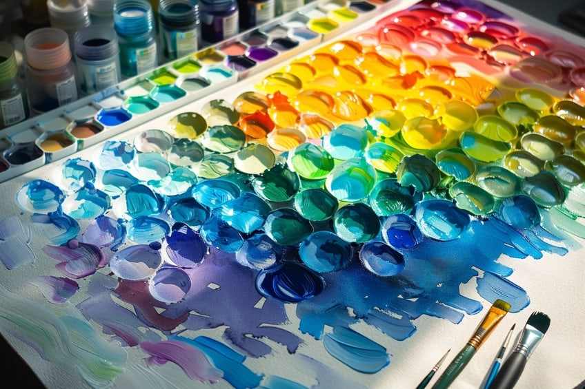
These colors are formed by mixing a primary color (red, blue, or yellow) with a neighboring secondary color (green, orange, or purple) on the color wheel. The resulting hues are rich and varied, offering artists and designers a broader range of shades to work with. Understanding intermediate colors is essential for anyone involved in color theory, as they are an integral part of the color wheel.
These intermediate, or tertiary, colors not only enrich visual creations but also facilitate color harmony and contrast in design projects.
Primary and Secondary Colors
Primary colors in art and design are typically considered to be red, yellow, and blue in the traditional RYB color model. These are the hues that cannot be created by mixing other colors together and are the cornerstone of color creation:
- Red
- Yellow
- Blue
In contrast, secondary colors are formed by mixing equal parts of two primary colors. The secondary hues on the RYB color wheel are:
- Orange: Mixing red and yellow
- Green: Mixing yellow and blue
- Violet (or purple): Mixing blue and red
These six basic colors are crucial for artists to create a diverse palette for their work, whether mixing pigments for paints or using inks in printing.
Color Theory and Models
Color theory is an umbrella term that encapsulates the various models and principles that illustrate how colors interact with each other and the effects they have when combined or used in proximity. There are several color models that are used to describe these interactions:
- RYB (Red, Yellow, Blue) model: Used primarily in traditional art, this subtractive color model is concerned with the mixing of paints, dyes, and pigments.
- RGB (Red, Green, Blue) model: This is an additive color model used predominantly in digital art and pertains to light sources, like those found in monitors and screens. Primary colors are red, green, and blue, and when combined, they create white light.
- CMYK (Cyan, Magenta, Yellow, Black) model: Another subtractive model often used in printing; it refers to the mixing of colored inks to achieve various hues.
The creation of colors through these models can be further appreciated on the color wheel, a tool developed by Sir Isaac Newton that visually displays the spectrum of visible colors and their relationships. This spectrum consists of wavelengths within the electromagnetic spectrum that are detectible by the photoreceptors in human eyes. Additive colors originate from light sources and are visible colors on the electromagnetic spectrum, while subtractive colors come from pigments or inks that absorb light.
Intermediate and Tertiary Colors
In the exploration of color theory, intermediate and tertiary colors play crucial roles in achieving depth and complexity in visual arts. This section examines their definitions, how they are created and utilized, as well as highlighting their distinctions.
Defining Intermediate Colors
Intermediate colors are obtained by mixing a primary color with a neighboring secondary color. This process results in hues such as yellow-orange, red-orange, red-purple, blue-purple, blue-green, and yellow-green. These colors are typically found between the primary and secondary colors on the color wheel, which serves as a useful reference tool for artists.
Creating and Using Intermediate Colors
When it comes to creating intermediate colors, the color mixing technique involves combining varying amounts of paint or pigments. For instance, to make yellow-orange, one would mix yellow (primary) with orange (secondary) paint. During this process, elements such as hue, tint (lightness), shade (darkness), tone (grayness), value, chroma, and saturation are considered to achieve the desired saturation and lightness for the intermediate color.
An example of intermediate color mixing would be blending yellow (primary) with orange (secondary) to get yellow-orange (intermediate). This showcases the delightful spectrum of hues that intermediate colors can create.
Artists incorporate these intermediate colors into their palettes to create intricate color combinations. These colors are often used for creating analogous color schemes, where colors next to each other on the wheel are paired, or for achieving the contrast found in complementary colors, where opposite hues on the wheel are used together.
What Is the Difference Between Intermediate and Tertiary Colors?
Intermediate colors should not be confused with tertiary colors, although the terms are sometimes used interchangeably. The main differentiation is in their balance and vibrancy. Intermediate colors reflect the dominance of their primary color parentage, lending them a more vivid appearance.
On the other hand, tertiary colors are composed of equal parts of two secondary colors, resulting in more neutral and balanced hues like slate, olive, and russet. Understanding these nuances is essential for artists who wish to manipulate color effectively in their work and achieve the intended visual and emotional impact.
What Are the Six Intermediate Colors?
Intermediate colors are created when primary colors are mixed with their adjacent secondary colors. These hues are vibrant and distinct from primary and secondary colors, enriching the color palette available to artists and designers.
Red-Orange
Red-orange is a warm, vivid color produced by mixing red with orange. This intermediate color is sometimes referred to as vermillion.
Yellow-Orange
Yellow-orange results from blending yellow with orange, producing a color akin to amber. This color is often seen in autumnal settings and can add a sense of warmth and coziness to designs.
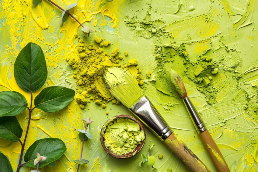
Yellow-Green
By combining yellow and green, the intermediate color yellow-green is made, also known as chartreuse. This color has a fresh, lively look that is reminiscent of spring foliage.
Blue-Green
Emerging from a mix of blue and green, blue-green is a cool tone intermediate color. Often associated with the color teal, it evokes the tranquility of oceans and lakes.
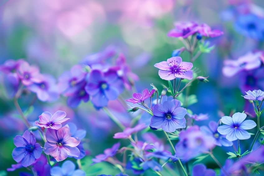
Blue-Violet
The combination of blue with violet creates blue-violet, a color that can also be described as periwinkle. It has a calming effect and is frequently used in soothing color schemes.
Red-Violet
The vibrant hue of red-violet, also known as magenta, is made by mixing red with violet. This intermediate color is rich and dynamic, adding a pop of energy to any palette where it’s used.
How Intermediate Colors Are Used
Intermediate colors play a significant role in various fields, enhancing visual interest and conveying specific moods or themes.
Art and Design
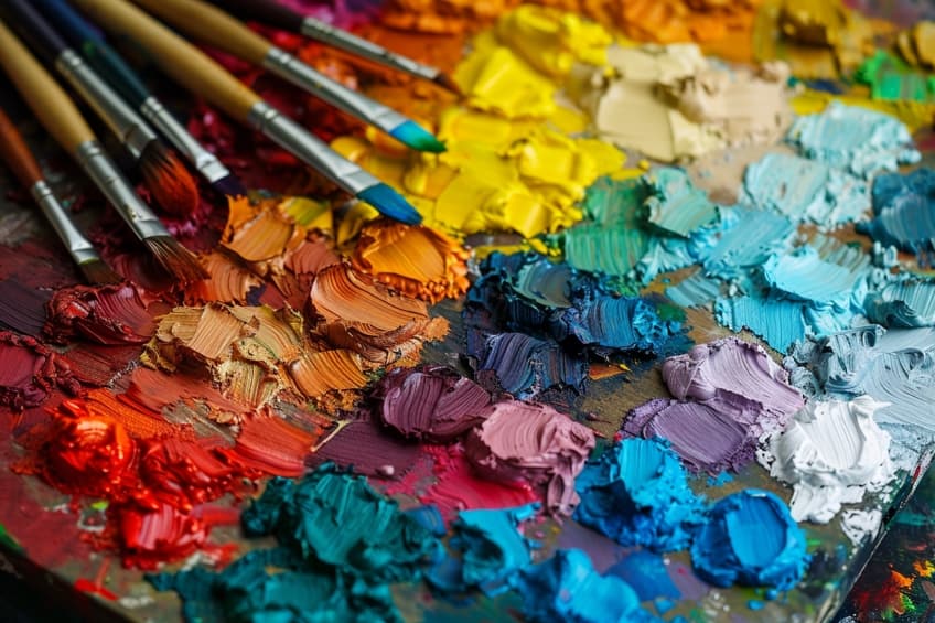
In art and design, intermediate colors are used to create depth and dimension within a piece. Artists often employ these colors to achieve a sense of realism by utilizing their ability to blend almost seamlessly between primary and secondary hues. In design, intermediate colors provide a broad palette for brand identity, allowing for unique color schemes that are both appealing and memorable.
Designers strategically use these colors to guide the viewer’s eye and establish visual hierarchy in their compositions.
- Color harmony: Incorporating intermediate colors can establish balance and harmony.
- Contrast: They are often set against complementary or analogous colors for visual impact.
- Mood: Specific intermediate colors, such as teal or amber, are chosen for the moods they evoke.
Practical Uses in Everyday Life
Intermediate colors are not just confined to creative fields; they are prevalent in everyday life and serve practical purposes. In interior design, they are chosen for their ability to create welcoming and vibrant spaces. In fashion, these colors provide a varied palette for seasonal trends, allowing for a mix-and-match approach that can personalize style. Moreover, in marketing and branding, intermediate colors are essential in distinguishing product lines and enhancing shelf appeal.
- Interior design: Color schemes with intermediate tones can make spaces appear larger or cozier.
- Fashion: They are integral to developing color trends and fashion forecasts.
- Marketing: Distinct intermediate colors can help a product stand out and appeal to target demographics.

As we conclude our colorful journey through intermediate colors, we can’t help but marvel at the endless possibilities they offer to artists, designers, and anyone with a passion for creativity. From subtle gradients to bold contrasts, these in-between hues add depth, harmony, and intrigue to our visual experiences. So go ahead, play with palettes, mix and match with confidence, and let the magic of intermediate colors inspire your next masterpiece!
Frequently Asked Questions
What Are the Examples of Intermediate Colors?
Intermediate colors, which can also be called tertiary colors, typically include hues like chartreuse, spring green, azure, violet, rose, and orange. These are the colors formed by mixing a primary color with a neighboring secondary color.
How Are Intermediate Colors Used in Drawing?
In drawing and painting, intermediate colors are vital for creating depth and realism. They are used to achieve gradients, shadows, and highlights that lend a three-dimensional appearance to two-dimensional artwork. Artists often mix intermediate colors to refine their work and convey a wider range of emotion and atmosphere.
What Is the Difference Between Intermediate and Tertiary Colors?
In the context of color theory, the terms intermediate and tertiary colors are frequently used interchangeably. Both refer to the same set of hues that result from the combination of a primary and secondary color in equal parts or a secondary color with another secondary color in different ratios.
How Do Intermediate Colors Relate to Secondary Colors?
Intermediate colors are directly derived from mixing a secondary color with a primary color. They fill the spaces between primary and secondary hues on a color wheel, thus completing a smooth transition across the spectrum and expanding the array of available colors.
Isabella studied at the University of Cape Town in South Africa and graduated with a Bachelor of Arts majoring in English Literature & Language and Psychology. Throughout her undergraduate years, she took Art History as an additional subject and absolutely loved it. Building on from her art history knowledge that began in high school, art has always been a particular area of fascination for her. From learning about artworks previously unknown to her, or sharpening her existing understanding of specific works, the ability to continue learning within this interesting sphere excites her greatly.
Her focal points of interest in art history encompass profiling specific artists and art movements, as it is these areas where she is able to really dig deep into the rich narrative of the art world. Additionally, she particularly enjoys exploring the different artistic styles of the 20th century, as well as the important impact that female artists have had on the development of art history.
Learn more about Isabella Meyer and the Art in Context Team.
Cite this Article
Isabella, Meyer, “Intermediate Colors – In Between Hues.” Art in Context. March 20, 2024. URL: https://artincontext.org/intermediate-colors/
Meyer, I. (2024, 20 March). Intermediate Colors – In Between Hues. Art in Context. https://artincontext.org/intermediate-colors/
Meyer, Isabella. “Intermediate Colors – In Between Hues.” Art in Context, March 20, 2024. https://artincontext.org/intermediate-colors/.


