What Colors Go With Red? – 17 Stylish Hues with Red
What colors go with red? In the realm of interior design, combining red with complementary colors can establish a harmonious and balanced aesthetic. Earthy tones like deep browns and warm beiges can elevate the natural ambiance, while dynamic contrasts such as scarlet or maroon inject a lively energy. Explore our curated list of 17 color combinations that seamlessly pair with various red hues in interior design. We’ll also provide you with tips and tricks on incorporating these red color combinations into your home!
Red Color Combinations
Exploring red color combinations opens up a dynamic spectrum of design possibilities. From the classic elegance of red and white to the fiery allure of red paired with gold or charcoal, these combinations evoke a range of emotions and aesthetics, allowing for versatile and impactful design choices in fashion, interiors, and visual arts. The vibrant nature of red seamlessly integrates with a myriad of tones, offering a palette that can convey both passion and sophistication with each carefully curated combination.
| Shade | Hex Code | CMYK Color Code (%) | RGB Color Code | Color |
| Pure Red | #FF0000 | 0, 100, 100, 0 | 255, 0, 0 | |
| Blood Red | #880808 | 0, 94, 94, 47 | 136, 8, 8 | |
| Bright Red | #EE4B2B | 0, 68, 82, 7 | 238, 75, 43 | |
| Burgundy | #800020 | 0, 100, 75, 50 | 128, 0, 32 | |
| Cherry | #D2042D | 0, 98, 79, 18 | 210, 4, 45 | |
| Crimson | #DC143C | 0, 91, 73, 14 | 220, 20, 60 | |
| Scarlet | #FF2400 | 0, 86, 100, 0 | 255, 36, 0 |
What Colors Go With Red?
Which colors complement red? The energizing properties of red make it an ideal choice for the kitchen, whether used subtly or as the dominant backdrop. Best suited for spaces aiming to exude energy, warmth, and invitation, red finds its place in rooms like the study, kitchen, and living room. It’s not just limited to walls; consider incorporating red in details such as baseboards, window frames, and front doors for added impact. Delve into specific shades of red paired with various colors, keeping color theory and connotations in mind, and experiment with these combinations to achieve the desired look for each room.
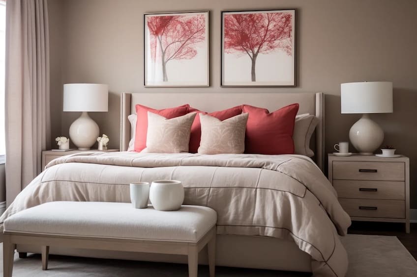
Soft Red and Greige
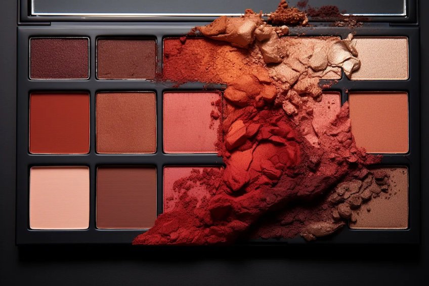
If earthy tones describe the interior of your dreams, yet you have a close connection with the color red, then this color combination is perfect for you. Greige is the perfect subtle neutral paint color for your walls that isn’t doesn’t have a distinctive warm or cool undertone, which is a good thing.
Opt for a soft red to go with the greige that also isn’t overly warm or cool, like the color below.
| Shade | Hex Code | CMYK Color Code (%) | RGB Color Code | Color |
| Soft Red | #C14B4B | 0, 61, 61, 24 | 193, 75, 75 | |
| Greige | #E0D8D6 | 0, 4, 4, 12 | 224, 216, 214 |
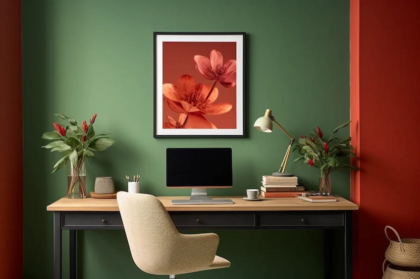
Red and Green
Green and red are an obvious match, seeing as green is the complementary color of red. It is important to note that these colors do not necessarily have to be implemented in their most saturated hues to be considered complementary. On the contrary, making use of more subtle hues of both of these colors makes for interesting and unexpected color combinations.
| Shade | Hex Code | CMYK Color Code (%) | RGB Color Code | Color |
| Brick Red | #B25444 | 0, 53, 62, 30 | 178, 84, 68 | |
| Forest Green | #475222 | 13, 0, 59, 68 | 71, 82, 34 |
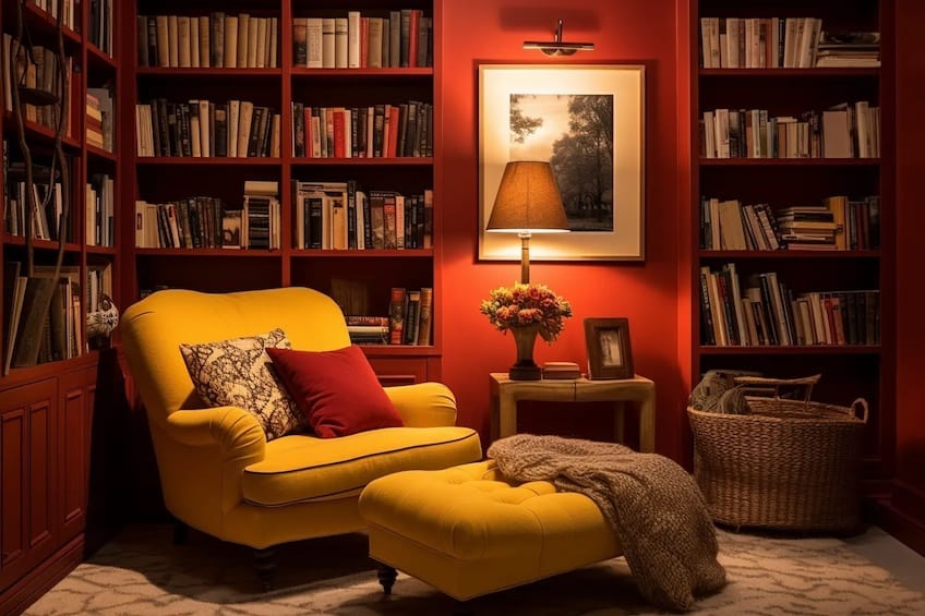
Red and Mustard
Combining a warm yellow, like mustard, with red results in a very warm and inviting atmosphere. This combination of colors works well in a living room setting, where red is used as the backdrop color and mustard is introduced through soft furnishings and décor elements.
The inverse can be a great color palette for a kitchen, as long as you keep in that red tends to trigger hunger, so this might not be the best option for serial dieters.
| Shade | Hex Code | CMYK Color Code (%) | RGB Color Code | Color |
| Cherry Red | #960000 | 0, 100, 100, 41 | 150, 0, 0 | |
| Mustard | #E6BA00 | 0, 19, 100, 10 | 230, 186, 0 |
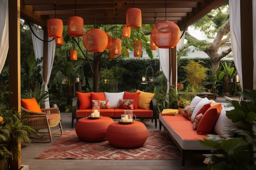
Red and Orange
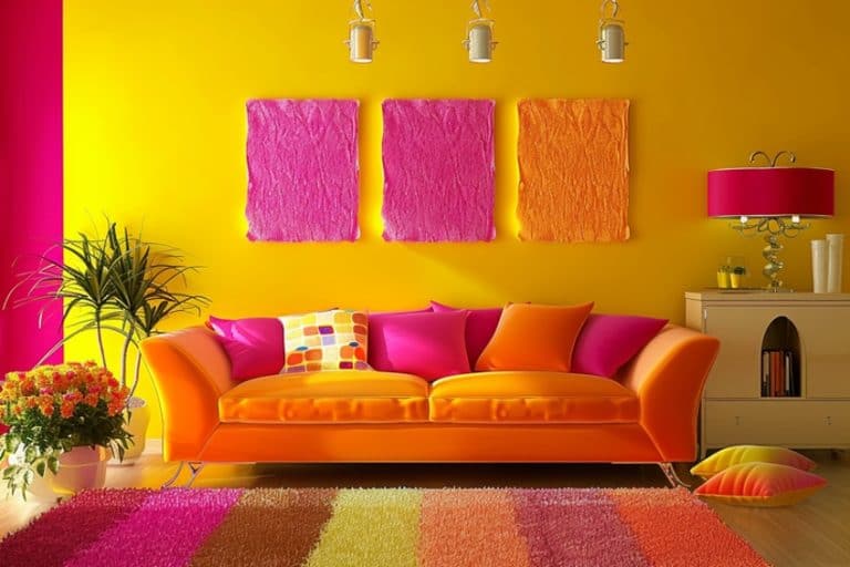
Orange is an analogous color of red, which means that it sits close to red on the color wheel, and both radiate warm undertones. This is a great combination if you want to make a statement while visually warming up a room. Stick with a neutral, white background and use these two colors through furniture and décor elements for that pop of color.
| Shade | Hex Code | CMYK Color Code (%) | RGB Color Code | Color |
| Pure Red | #FF0000 | 0, 100, 100, 0 | 255, 0, 0 | |
| Orange | #FF7401 | 0, 55, 100, 0 | 255, 116, 1 |
Red and Pink
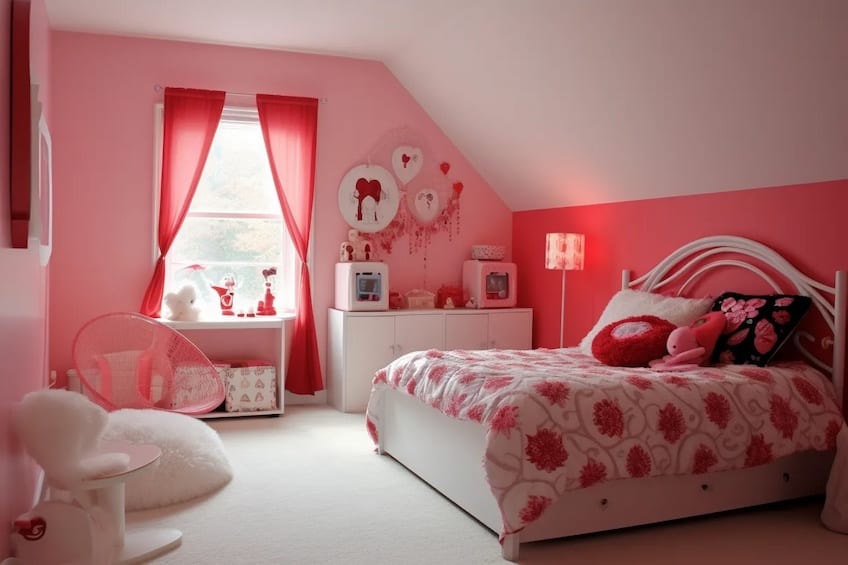
The combination of red and pink is often seen as a controversial color combination, as most people are prone to dislike seeing these two colors purposely used together. However, if the correct tones are used, red and pink can create a very energetic, soft, and warm environment. If you want to incorporate red differently into your interior, try combining very bright red furniture pieces against blush pink walls.
Don’t overdo it with the red in this case. Choose one or two big furniture pieces.
| Shade | Hex Code | CMYK Color Code (%) | RGB Color Code | Color |
| Pure Red | #FF0000 | 0, 100, 100, 0 | 255, 0, 0 | |
| Blush Pink | #FF9999 | 0, 40, 40, 0 | 255, 153, 153 |
Red and Blue
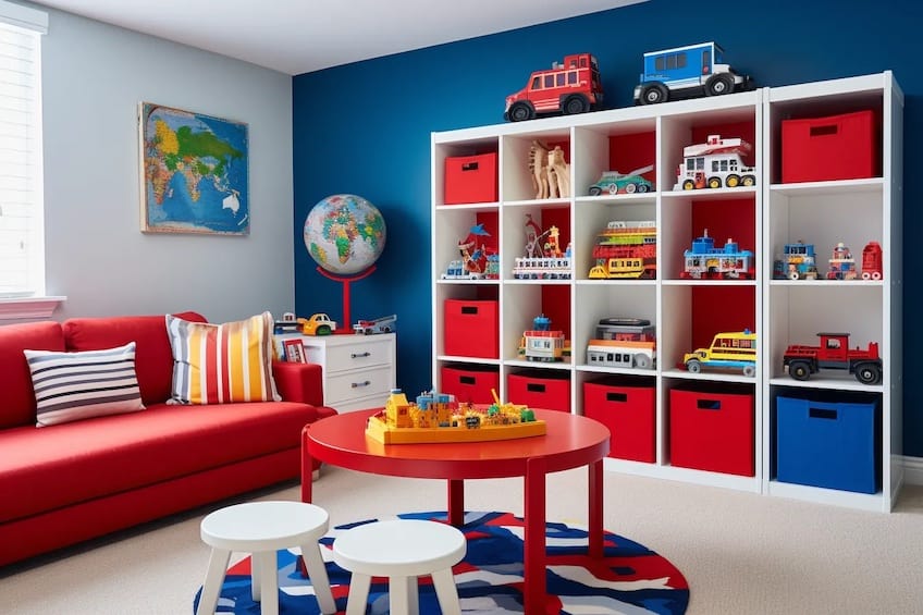
Another very classic color combination for red is navy blue. This is such a popular color combination among people that we can see this combination used regularly when it comes to country flags. Take note that although red and blue look great together, they are both primary colors, which means they can be particularly loud when used together. The solution to this is to make use of a neutral buffer color like white to break the visual harshness of these two colors when used together. Another option is to make use of one of these colors subtly in the form of textiles or small décor pieces.
| Shade | Hex Code | CMYK Color Code (%) | RGB Color Code | Color |
| Red | #FF0000 | 0, 100, 100, 0 | 255, 0, 0 | |
| Navy Blue | #002060 | 100, 67, 0, 62 | 0, 32, 96 |
Red, Black, and White
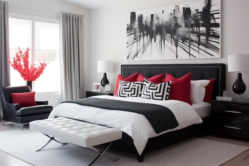
Red combined with black and white is such a timeless and classy color combination. There are many scenarios and rooms where this color combination can be implemented successfully, such as a dining room, kitchen, and formal living room.
Make use of black and white as your backdrop colors and introduce pops of red with your big furniture pieces.
| Shade | Hex Code | CMYK Color Code (%) | RGB Color Code | Color |
| Wine Red | #B90707 | 0, 69, 69, 27 | 185, 7, 7 | |
| Black | #000000 | 0, 0, 0, 100 | 0, 0, 0 | |
| White | #FFFFFF | 0, 0, 0, 0 | 255, 255, 255 |
Red and Cream
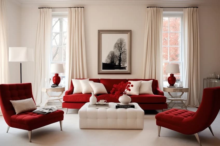
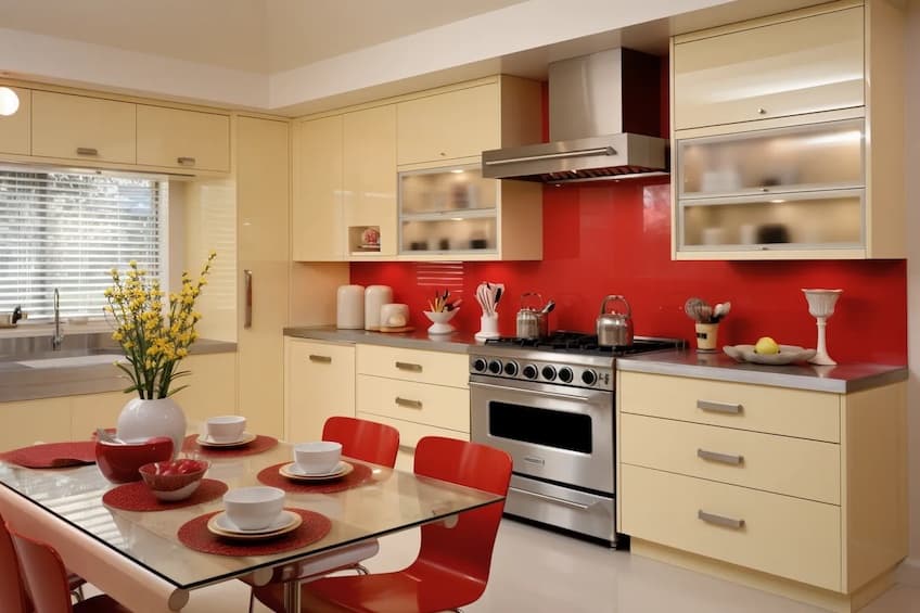
Pairing bright red with cream is a very contemporary way of introducing red in an interior setting. It is important to use cream instead of stark white, as white tends to be cooler-toned and can look very harsh against a bright color such as red. Cream warms up the color pallet and ties everything together beautifully. This color combination works well when red is used for a focal wall, with cream trims and window and door frames.
| Shade | Hex Code | CMYK Color Code (%) | RGB Color Code | Color |
| Bright Red | #E60000 | 0, 100, 100, 10 | 230, 0, 0 | |
| Cream | #E4E1D8 | 0, 1, 5, 11 | 228, 225, 216 |
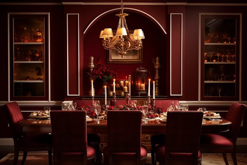
Burgundy and Gold
Burgundy’s deep richness, when paired with gold accents, brings a sense of opulence and sophistication to interior design. The combination adds warmth and a touch of luxury, making it perfect for creating a cozy, elegant ambiance in spaces where a sense of refinement is desired.
| Shade | Hex Code | CMYK Color Code (%) | RGB Color Code | Color |
| Burgundy | #800020 | 0, 100, 75, 50 | 128, 0, 32 | |
| Gold | #FFD700 | 0, 0, 100, 0 | 255, 215, 0 |
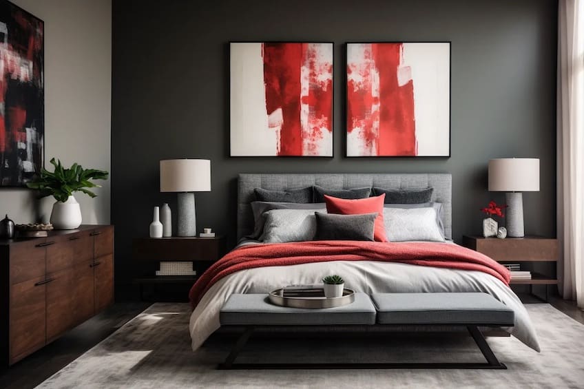
Cherry Red and Charcoal Gray
Cherry red, when combined with charcoal gray, strikes a balance between boldness and subtlety. The deep tones of both colors create a modern and cozy atmosphere, with the gray acting as a sophisticated backdrop that allows the cherry red to pop without overwhelming the space.
| Shade | Hex Code | CMYK Color Code (%) | RGB Color Code | Color |
| Cherry Red | #DE3163 | 0, 80, 45, 18 | 222, 49, 99 | |
| Charcoal Gray | #36454F | 60, 40, 35, 85 | 54, 69, 79 |
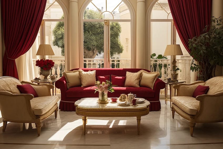
Crimson and Cream
The pairing of crimson and cream evokes a sense of luxury and timeless elegance. Crimson adds a touch of drama and passion, while cream provides a neutral and soothing backdrop. This combination is perfect for creating a sophisticated and inviting environment with a classic aesthetic.
| Shade | Hex Code | CMYK Color Code (%) | RGB Color Code | Color |
| Crimson | #DC143C | 0, 100, 70, 15 | 220, 20, 60 | |
| Cream | #FFFDD0 | 0, 0, 12, 0 | 255, 253, 208 |
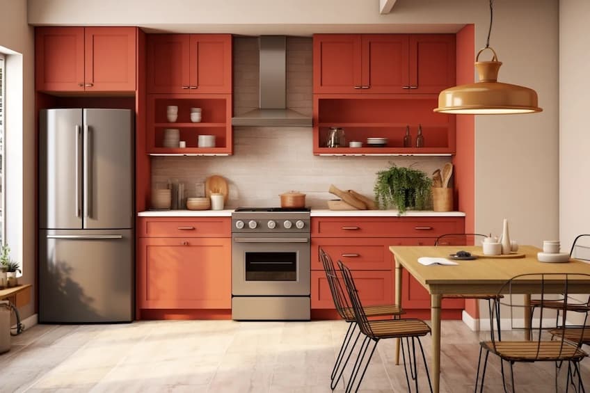
Rust Red and Beige
Rust red paired with beige creates a warm and earthy palette, reminiscent of autumnal hues. The combination is well-suited for spaces where a cozy and inviting atmosphere is desired. The rust red adds vibrancy, while beige provides a neutral base for a harmonious overall look.
| Shade | Hex Code | CMYK Color Code (%) | RGB Color Code | Color |
| Rust Red | #B7410E | 0, 67, 89, 28 | 183, 65, 14 | |
| Beige | #F5F5DC | 0, 0, 16, 4 | 245, 245, 220 |
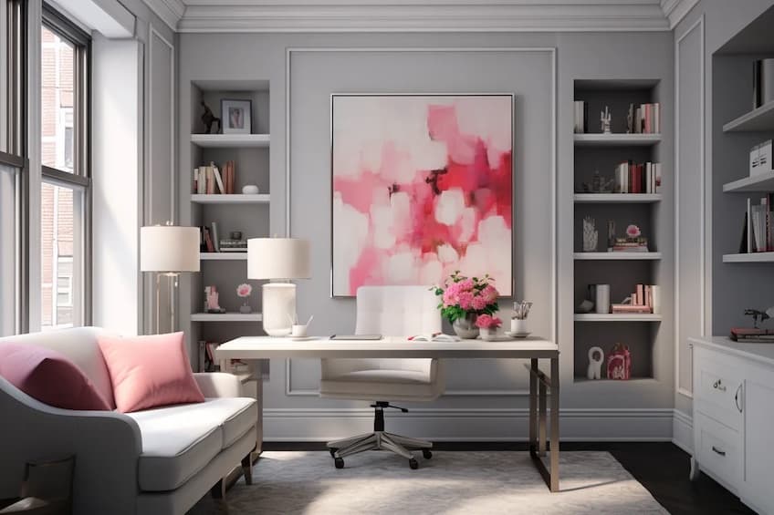
Rose Red and Soft Gray
Muted rose red paired with soft gray results in a delicate and calming color scheme. This combination is ideal for creating a serene and sophisticated environment. The soft gray acts as a soothing backdrop, allowing the rose red to add a subtle touch of warmth and femininity.
| Shade | Hex Code | CMYK Color Code (%) | RGB Color Code | Color |
| Rose Red | #C21E56 | 0, 80, 30, 20 | 194, 30, 86 | |
| Soft Gray | #B0C4DE | 34, 13, 0, 13 | 176, 196, 222 |
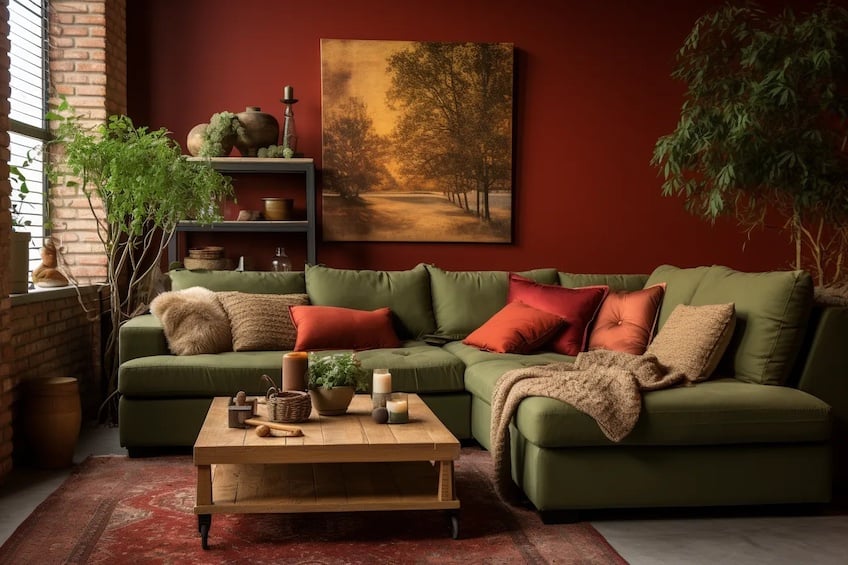
Brick Red and Olive Green
The combination of brick red and olive green brings forth an earthy and inviting palette. Brick red can be used for accent walls or furniture, while olive green introduces a touch of nature through decor elements. This pairing creates a cozy and balanced environment, particularly suitable for family rooms or dining areas.
| Shade | Hex Code | CMYK Color Code (%) | RGB Color Code | Color |
| Brick Red | #8B0000 | 0, 100, 100, 55 | 139, 0, 0 | |
| Olive Green | #808000 | 30, 0, 100, 50 | 128, 128, 0 |
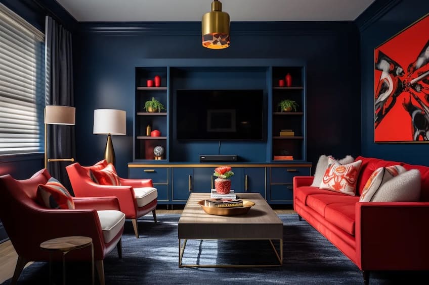
Tomato Red and Navy Blue
The vibrant energy of tomato red, coupled with the depth of navy blue, creates a striking and bold contrast. Navy can be used as the dominant color for walls or large furniture pieces, with tomato red incorporated in smaller decor items or upholstery. This combination is perfect for injecting energy and sophistication into entertainment or living spaces.
| Shade | Hex Code | CMYK Color Code (%) | RGB Color Code | Color |
| Tomato Red | #FF6347 | 0, 68, 76, 0 | 255, 99, 71 | |
| Navy Blue | #000080 | 100, 100, 0, 50 | 0, 0, 128 |
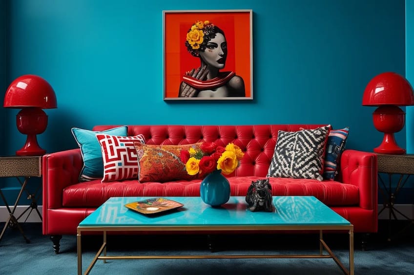
Ruby Red and Turquoise
Ruby red paired with turquoise creates a visually stimulating and energetic ambiance. Ruby red can be utilized for focal points, while turquoise adds a refreshing and vibrant contrast. This combination is well-suited for eclectic and lively spaces, adding personality and a sense of playfulness to any room.
| Shade | Hex Code | CMYK Color Code (%) | RGB Color Code | Color |
| Ruby Red | #E0115F | 0, 87, 38, 12 | 224, 17, 95 | |
| Turquoise | #40E0D0 | 65, 0, 27, 0 | 64, 224, 208 |
Cranberry Red and Mustard Yellow
The pairing of cranberry red and mustard yellow evokes warmth and vintage charm. Cranberry red can be introduced through textiles or accent walls, while mustard yellow adds a pop of color to furniture or decor. This combination is perfect for creating a cozy and inviting atmosphere, particularly in dining or living areas.
| Shade | Hex Code | CMYK Color Code (%) | RGB Color Code | Color |
| Cranberry Red | #DB143C | 0, 100, 70, 18 | 219, 20, 60 | |
| Mustard Yellow | #FFDB58 | 0, 5, 57, 0 | 255, 219, 88 |
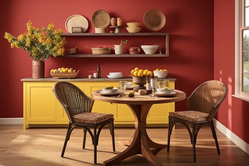
There are countless colors that go with red. With the knowledge of the color theory behind red together with its perceived connotations, hopefully, this inspires you to introduce red in any interior, whether it be to add some warmth with a muted red, or if you are feeling daring and want to make a statement with bright red.
Take a look at our “what colors go with red” webstory here!
Frequently Asked Questions
What Color Matches With Red?
There are a few colors that go well with red, especially when it comes to interior design. Among these are the following colors: forest green, mustard, orange, blush pink, navy blue, black, white, cream, and greige.
Can Red Be Used in a Minimalist Color Scheme?
Yes, red can be part of a minimalist palette. Pair it with neutral tones and clean lines for a modern and impactful design with a pop of color.
How Can You Use Red in a Contemporary Color Scheme?
Pair red with clean whites, sleek blacks, or shades of gray for a modern and sophisticated color palette that adds a touch of drama.
Kylie Deyzel is an interior designer and sustainability enthusiast from Cape Town, South Africa. She has a passion for writing and educating others on various interior design topics. Her favorite interior design topics include interior design theory, interior design history, and most of all: sustainable interior design.
She received her B-tech degree in interior design from the University of Johannesburg in 2018 and has worked at various interior design firms since and had a few of her own freelance interior design clients under her company name binnekant.
Learn more about the Art in Context Team.
Cite this Article
Kylie, Deyzel, “What Colors Go With Red? – 17 Stylish Hues with Red.” Art in Context. January 20, 2023. URL: https://artincontext.org/what-colors-go-with-red/
Deyzel, K. (2023, 20 January). What Colors Go With Red? – 17 Stylish Hues with Red. Art in Context. https://artincontext.org/what-colors-go-with-red/
Deyzel, Kylie. “What Colors Go With Red? – 17 Stylish Hues with Red.” Art in Context, January 20, 2023. https://artincontext.org/what-colors-go-with-red/.


