What Colors Go With Pink? – 10 Perfect Palette Pairings
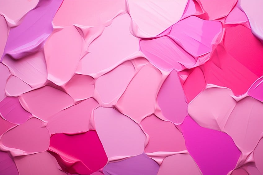
Selecting complementary colors for pink opens up a world of creative possibilities in interior design. The key is to experiment and find the perfect color harmony that resonates with the desired style and mood. In this article, we will show you what color combinations match best with pink, and how to use it in your home.
Pink Color Combinations
Finding colors that complement pink involves considering color theories and the color wheel. Pink, ranging from bright to muted, can be paired with various hues for different effects. In the majority of the combinations listed below, we will utilize true pink, a delicately soft shade, that isn’t overly warm or overly cool.
| Complementary Color of Pink | The complementary color for pink is green, especially a soft pastel green, creating a balanced look. |
| Split Complementary Colors of Pink | The split complementary colors of pink, are light pastel blue and green. |
| Monochromatic Colors of Pink | Monochromatic options include darker shades of pink, creating an unexpectedly beautiful combination. |
| Triadic Colors of Pink | Triadic colors with pink form soft, pleasing combinations at 60-degree angles. |
| Analogous Colors of Pink | Analogous colors produce pastel rainbows from dark peachy pink to cool purple-pink. |
What Colors Go With Pink?
Pink is a captivating color due to its ability to change meaning and evoke different feelings based on its color pairing. For instance, combining white with soft pink enhances feminine characteristics, while pairing hot pink with black creates a sense of seduction and eroticism. Designers often find pink challenging in design and decoration because it’s perceived as an “unnatural color.” However, in this article, we provide various guides on seamlessly incorporating pink into interior design.
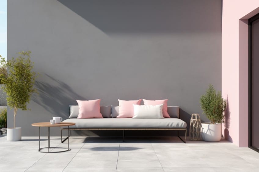
Pink and Gray
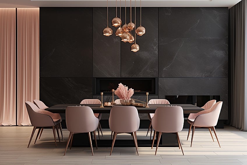
Pink and brown create a harmonious and balanced combination due to their contrasting yet complementary nature. The softness of pink complements the warmth of brown, resulting in a blend that is both visually appealing and versatile. This pairing is especially popular in interior design for its ability to evoke a sense of sophistication and coziness simultaneously.
| Shade | Hex Code | Color |
| Pink | #FFC0CB | |
| Gray | #808080 |
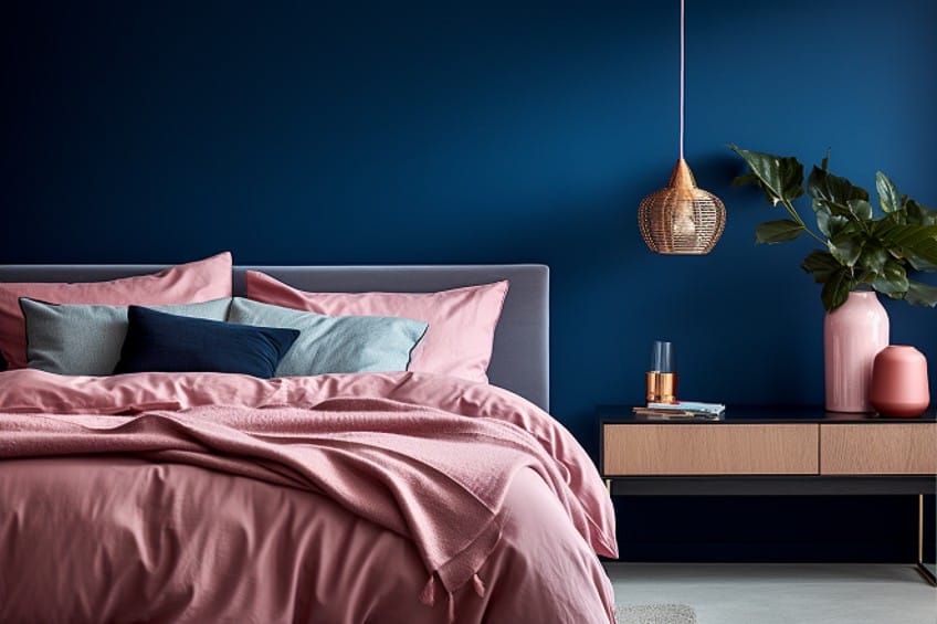
Pink and Navy Blue
A great contrast color for pink is navy blue. Pink and navy blue form a stylish and timeless color combination by juxtaposing the softness of pink with the richness of navy blue. The contrast creates a visually striking and balanced look, suitable for both casual and formal settings. This pairing is often favored for its ability to achieve a sophisticated and elegant aesthetic in fashion, home decor, and various design contexts.
| Shade | Hex Code | Color |
| Pink | #FFC0CB | |
| Navy Blue | #000080 |
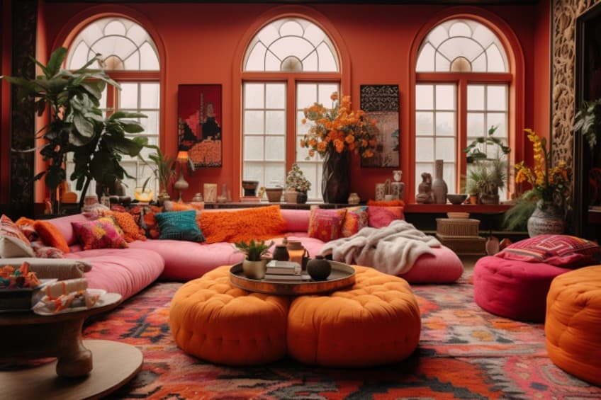
Pink and Orange
Orange may be your last consideration when faced with the question “what colors go with pink?”. The combination of pink and orange is a very controversial color combination. People tend to either love it or hate it. Contemporary designers seeking an edgy and vibrant aesthetic may boldly pair hot pink with tangerine orange, creating a statement with no neutral color in between. While this combination can make a loud impact, it may lead to quicker aesthetic fatigue.
| Shade | Hex Code | Color |
| Bright Orange | #FFA500 | |
| Hot Pink | #FA206E |
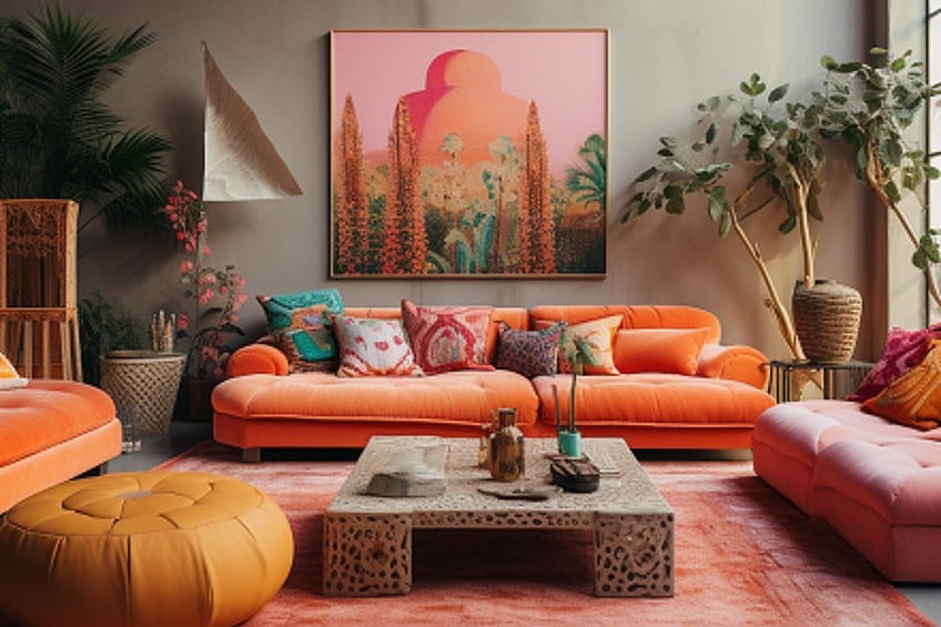
Fear not, when the right shades of this color combination are used, it can create an opposite effect to the above description. Switching the hot pink out for true pink, with bright orange furniture is such a good combination. The opposite also applies in that hot pink works well with muted orange as the backdrop.
| Shade | Hex Code | Color |
| Faded Orange | #F0A47D | |
| Hot Pink | #FA206E | |
| Pink | #FFC0CB | |
| Bright Orange | #FFA500 |
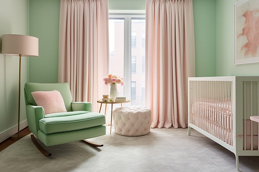
Pink and Mint Green
The combination of pink and mint green is a beloved choice in interior design as these colors form a delightful and refreshing color combination, blending the softness of pink with the cool, crisp tones of mint. This pairing exudes a playful and harmonious vibe, making it popular in various contexts, from fashion to home decor. The combination’s balance between warmth and coolness creates a visually pleasing and timeless appeal.
| Shade | Hex Code | Color |
| Pink | #FFC0CB | |
| Mint Green | #3EB489 |
Pink and White
Pink and white create a classic and timeless color combination that exudes elegance and simplicity. The softness of pink harmonizes seamlessly with the purity of white, producing a clean and sophisticated aesthetic. This versatile pairing is widely embraced in interior design and various creative endeavors for its ability to convey a sense of grace and understated beauty.
| Shade | Hex Code | Color |
| Pink | #FFC0CB | |
| White | #FFFFFF |
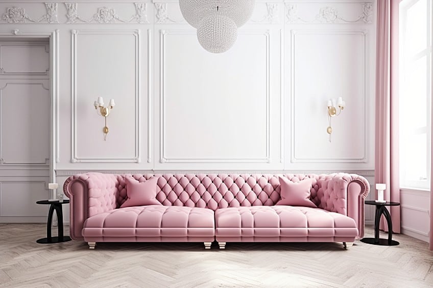
Pink and Gold
The combination of pink and gold forms a luxurious and harmonious pairing, blending the softness of pink with the opulence of gold. The warmth of pink enhances the richness of gold, creating a visually striking and elegant aesthetic. This classic combination is widely embraced in various contexts, from fashion to interior design, for its ability to convey a sense of sophistication and glamour.
| Shade | Hex Code | Color |
| Pink | #FFC0CB | |
| Gold | #FFBF00 |
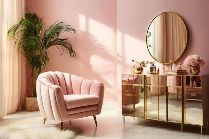
Pink and Lavender
Pink and lavender create a visually enchanting color combination that balances the softness of pink with the calming tones of lavender. The delicate and romantic qualities of both hues harmonize to evoke a sense of tranquility and elegance. This pairing is often favored in various design contexts, from fashion to interior decor, for its ability to convey a gentle and sophisticated aesthetic.
| Shade | Hex Code | Color |
| Pink | #FFC0CB | |
| Lavender | #E6E6FA |
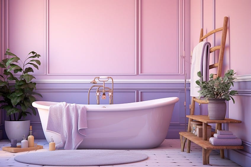
Pink and Charcoal Black
The combination of pink and charcoal black forms a chic and modern color pairing that achieves a striking contrast. The softness of pink beautifully complements the depth and sophistication of charcoal black, creating a visually appealing and balanced aesthetic. This combination is often embraced in fashion and design to evoke a contemporary and edgy style.
| Shade | Hex Code | Color |
| Pink | #FFC0CB | |
| Charcoal Black | #333333 |
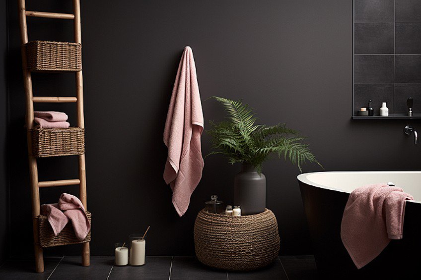
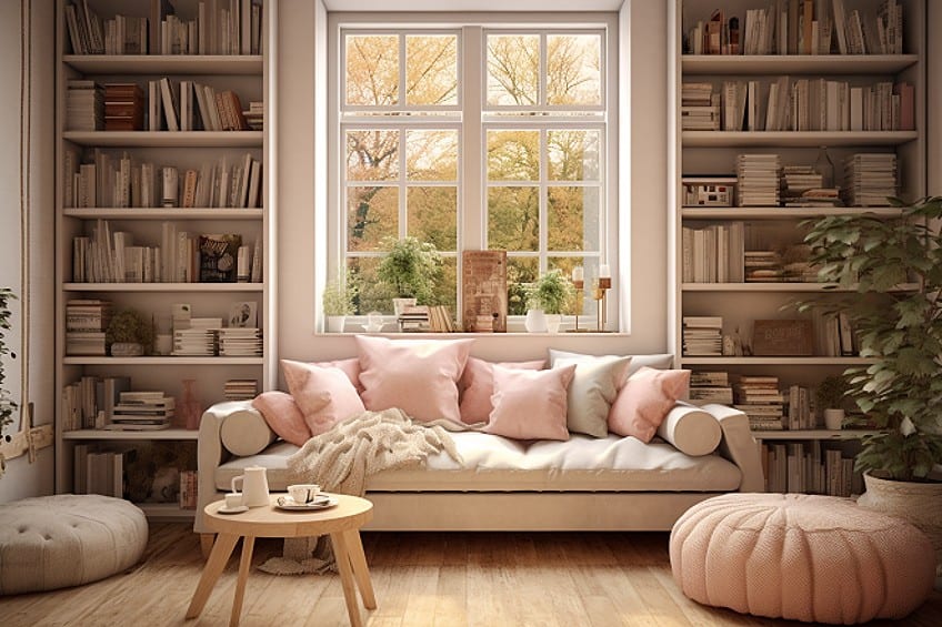
Pink and Beige
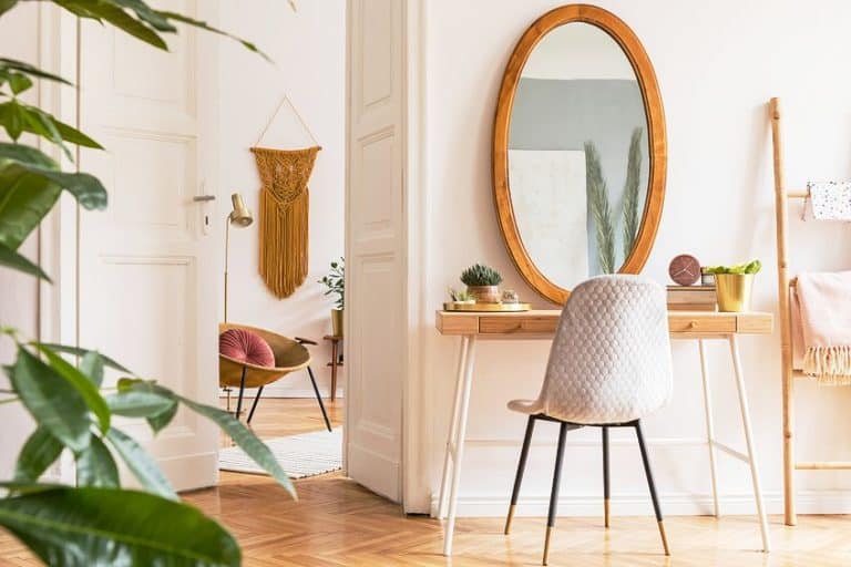
The blending of pink and beige forms a classic and timeless color combination, combining the softness of pink with the neutral elegance of beige. The warmth of pink enhances the sophistication of beige, creating a subtle and harmonious aesthetic. This versatile pairing is widely embraced in fashion and interior design for its ability to convey a sense of grace and understated beauty.
| Shade | Hex Code | Color |
| Pink | #FFC0CB | |
| Beige | #E8DCB5 |
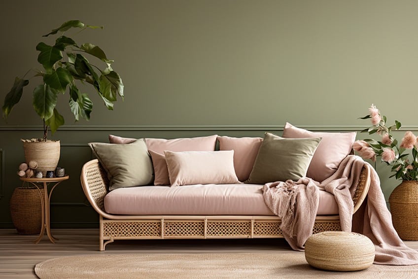
Pink and Olive Green
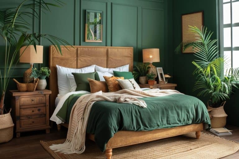
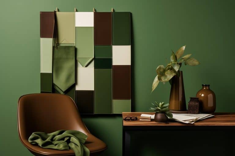
Pink and olive green create a sophisticated and earthy color combination that merges the vibrancy of pink with the natural tones of olive green. The warmth of pink complements the muted, organic shades of olive green, resulting in a harmonious and visually appealing palette. This pairing is often employed in various interior design contexts, offering a versatile and elegant option that combines vibrancy with understated earthiness.
| Shade | Hex code | Color |
| Pink | #FFC0CB | |
| Olive Green | #808000 |
The versatility of pink allows for a myriad of captivating color combinations, each evoking different moods and styles. Whether paired with the opulence of gold, the sophistication of charcoal black, the calming tones of lavender, or the earthy hues of olive green and beige, pink seamlessly integrates into diverse interior design schemes. These combinations offer designers a rich palette to play with. It may seem daunting color choice at first, but combining pink with the appropriate complementary color, can create a very balances space that is very pleasing to the eye.
Take a look at our colors that go with pink webstory here!
Frequently Asked Questions
What Colors Go With Pink?
Depending on the shade of pink used, there are various colors that go with pink. Black, forest green, and blue goes well with bright pink, whereas mint green and dark brown look great when combined with a soft rose pink.
What Colors Complement Pink in Home Decor?
In home decor, colors that complement pink well include soft neutrals such as white, gray, and beige for a balanced and sophisticated look. Additionally, metallics like gold or brass can add warmth, while navy blue, emerald green, and mustard yellow can create vibrant and stylish contrasts with various shades of pink.
How Can You Incorporate Pink into Your Wardrobe With Matching Colors?
Pink pairs well with neutral tones such as white, beige, and gray for a classic and elegant look. For bolder choices, consider combining pink with navy blue, olive green, or even mustard yellow to add a pop of color. Experiment with complementary colors to find a balance that suits your style and the occasion.
Kylie Deyzel is an interior designer and sustainability enthusiast from Cape Town, South Africa. She has a passion for writing and educating others on various interior design topics. Her favorite interior design topics include interior design theory, interior design history, and most of all: sustainable interior design.
She received her B-tech degree in interior design from the University of Johannesburg in 2018 and has worked at various interior design firms since and had a few of her own freelance interior design clients under her company name binnekant.
Learn more about the Art in Context Team.
Cite this Article
Kylie, Deyzel, “What Colors Go With Pink? – 10 Perfect Palette Pairings.” Art in Context. June 17, 2022. URL: https://artincontext.org/what-colors-go-with-pink/
Deyzel, K. (2022, 17 June). What Colors Go With Pink? – 10 Perfect Palette Pairings. Art in Context. https://artincontext.org/what-colors-go-with-pink/
Deyzel, Kylie. “What Colors Go With Pink? – 10 Perfect Palette Pairings.” Art in Context, June 17, 2022. https://artincontext.org/what-colors-go-with-pink/.


