Pastel Colors – The 31 Most Beautiful Pastel Color Palettes
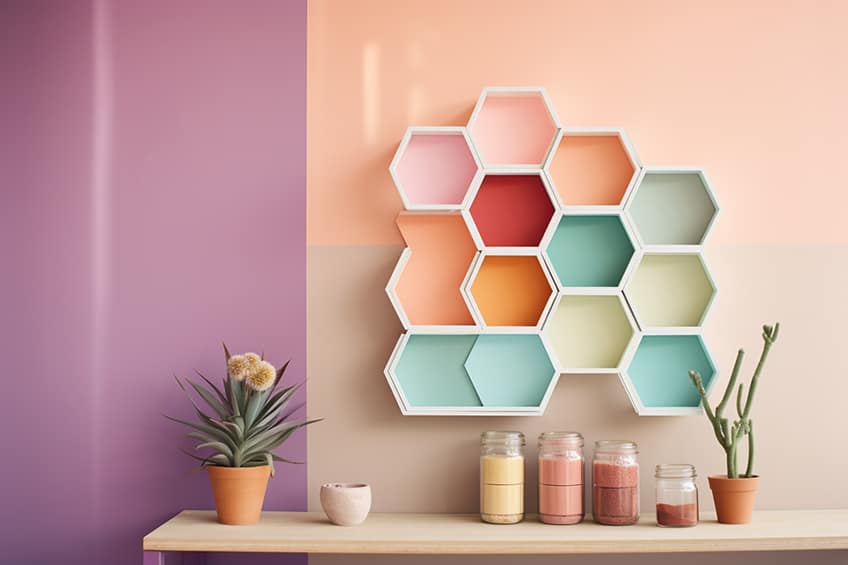
A pastel color palette can be seen as calming and generally pleasing to most of us. When using pastel colors, you cannot go wrong as they are quite versatile and are a softer version of their bolder and more vibrant counterparts. We have curated the most beautiful pastel color palettes for you.
What Are Pastel Colors?
Pastel colors are a softer and lighter version of the primary and secondary more vibrant colors. When looking into color theory, there are a few terms that are good know. However, it is also good to know that colors and how they interact with each other can be visually observed on the color wheel.
You can see pastel colors have both a low saturation and a high value or amount of light (luminance). So, pastel colors rely on all of these elements of color. You can create a pastel color palette by using the color wheel, but the color you choose must have an added luminance to fall in the “pastel color” category.
Our Curated 31 Pastel Color Palettes
Birthday Pastel Color Palette
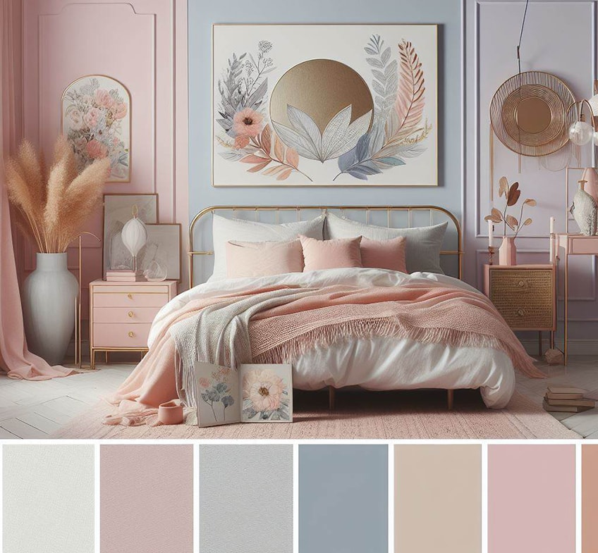
Bedroom Pastels
Pastel Rainbow Palette
Pastel Mint Green Palette
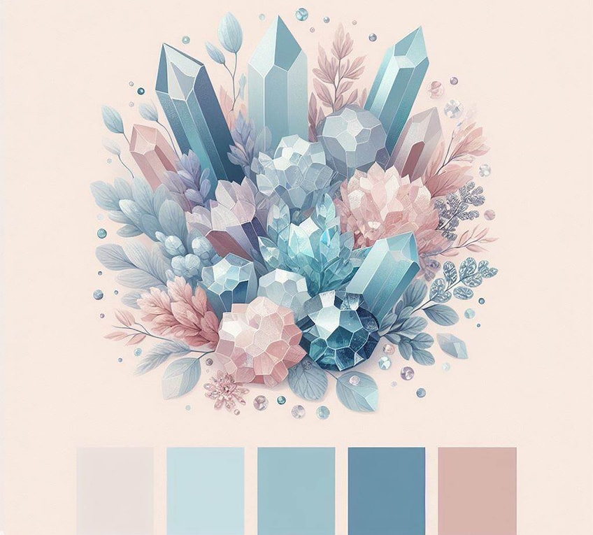
Crystal Pastels
Pastel Lavender Palette
Pastel Red Palette
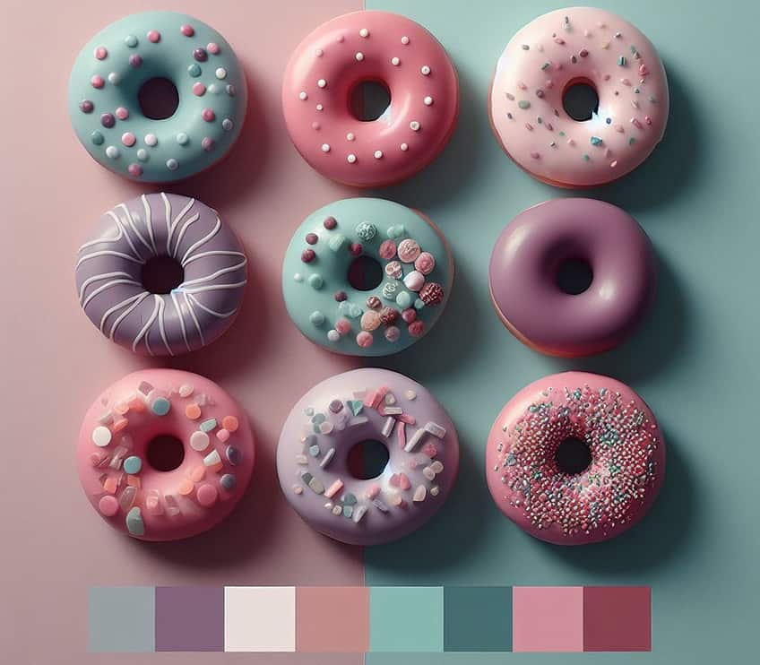
Donut Pastels
Pastel Brown Color Palette
Neutral Pastel Shades Palette
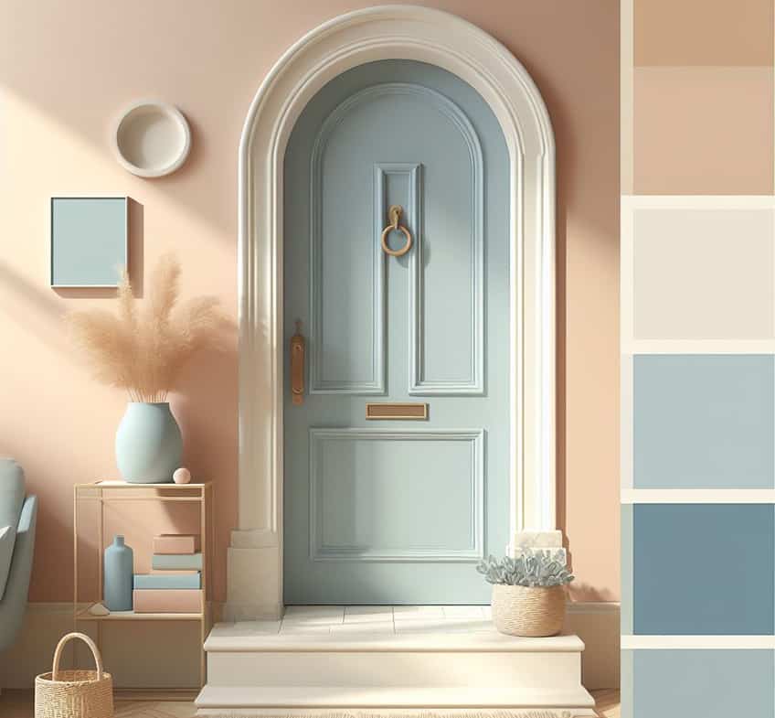
Entryway Pastels
Soft Pastel Tones Palette
Earthy Pastel Tones Palette
Mint Pastels
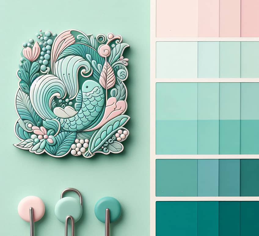
Gentle Nature Palette
Soft Pinks Palette
Pastel Fashion
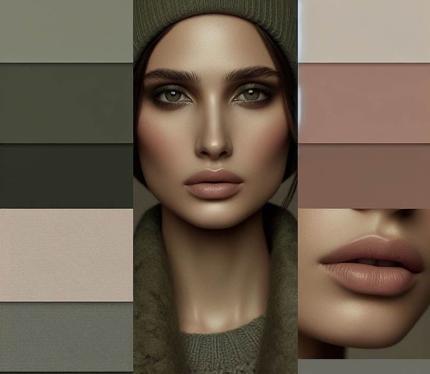
Serene Blues Palette
Green and Beyond Palette
Soft Pastels Palette
Sea Village Pastel Palette
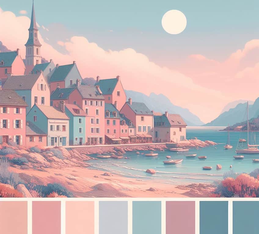
Cool Blues Palette
Soft Hues Palette
Light Pastels Palette
Sugar Pastels
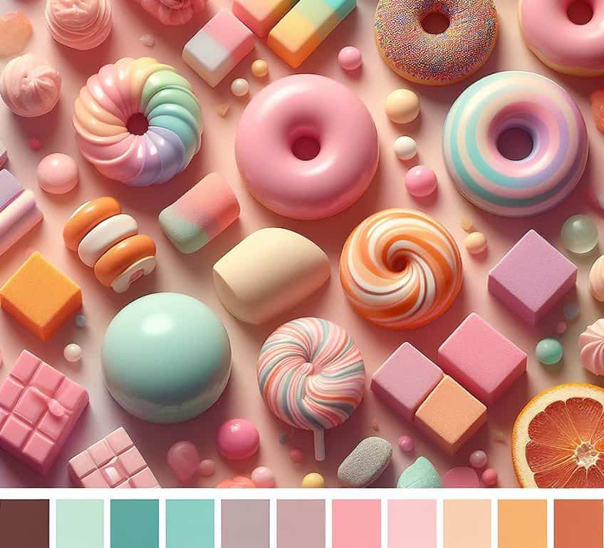
Soft Elegance Palette
Sunny Gradients
Vibrant Lavenders
Soft Purples
A Brief History of Pastel Colors
In history, the more vibrant colors like red, green, and blue have played big roles in fashion, religion, and art. The poor usually wore colors like gray or brown and undyed materials as color dye cost a lot of money and was, generally, only afforded by royalty and the rich.
During the 18th century in France, what is known as the Rococo style or Late Baroque style was made popular. This included using a pastel color palette, ornamental architecture, sculpted molding, and curved lines. This helped make pastel colors popular amongst the wealthier of the era.
Also, during this time, one of the famous mistresses of Louis XV and patron of the arts, Madame de Pompadour, was one who particularly liked pastel colors and went with the trend of the times. Later, Marie-Antoinette also favored pastel colors, especially the pastel pink color and blue pastel colors.
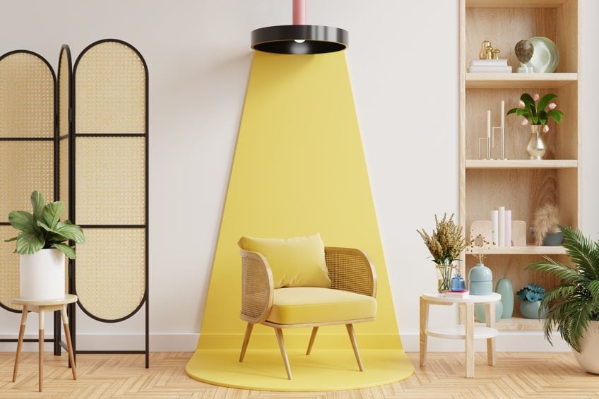
In the 19th century and during the Victorian period, there emerged a social trend amongst the working or middle class of Europe. This trend became known as “the holiday” and pastel colors played a pivotal role. The time is synonymous with softer shades of mint, pink, and lemon, which could be seen at beach resorts in Italy, France as well as England. Pastel beach huts could also be found on British beaches, like on Mersea Island, in Essex, or at the Norfolk town beach in Cromer.
The association between pastel colors and vacations or holidays continued into the next century, and even today, pastel colors can elicit that holiday feeling. Moving into the early 20th century, pastel colors were not only seen as feminine but were quite popular amongst male sportsmen, who wore pastel pink polo shirts as well as suits. During the time, this associated pastel colors with the college culture.
As trends come and go, pastel colors have also moved with the times. During the 80s, pastel colors became a trend in men’s fashion. This was visible in a popular television series known as Miami Vice, where pastel suits were worn by the main characters.
Today, a pastel color palette is used in many ways from fashion to advertising and web design. The color is easily associated with playfulness and positivity.
The Psychology of Pastel Colors
When you look at pastel colors, how does it make you feel? Since pastel colors are softer, they tend to be soothing to the eye and evoke a sense of calm and peacefulness. However, pastel colors can also be playful and romantic. The colors are easily associated with the spring season, which can bring about feelings of happiness and hope.

Pastels have a strong feminine, motherhood, and baby or young children connection. Pastel blues and pinks are popular at baby showers and as the color palette for babies and young children’s rooms. There are quite a few more associations or feelings that pastel colors call to mind.
- Growth
- Childhood
- Fun and laughter
- Joyfulness
- Cleanliness
- Freshness
- Soothing
- Relaxation
- Neutrality
- Optimism
Pastel colors also have a masculine association, as mentioned in the history section, and work especially well with darker navy or green colors. Since pastel colors are soothing, they have a strong connection to areas like doctors’ offices and hospitals. Pastel colors are wonderful to add to an interior design in your home, as they can help bring in a sense of calm yet can also add an uplifting feel to a room.
Pastel Color Codes
There are countless different pastel colors, so we have gathered some of the more popular of these colors for you. Below you will find a table that also provides the various pastel color codes like the pastel hex codes, which can help to identify a particular color name.
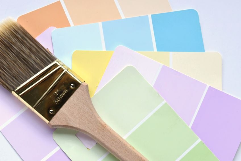
Millennial Pink
This pastel pink color was the color for Tumblr in 2010, a social platform for microblogging and social networking. The color then was known as Tumblr pink. This pastel pink color also became popular in fashion and many celebrities were wearing it, the color was even brought out on the runway for Gucci and other fashion brands.
| Pastel Color Name | Pastel Hex Codes | CMYK Pastel Color Code (%) | RGB Pastel Color Code | Pastel Color |
| Millennial Pink | #f3cfc6 | 0, 15, 19, 5 | 243, 207, 198 |
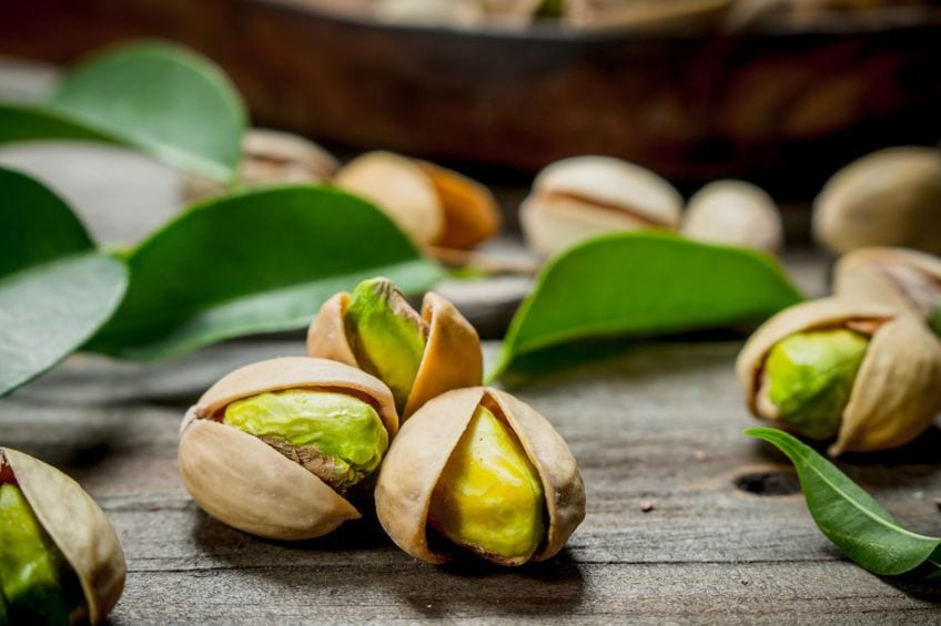
Pistachio Green
This green pastel color is named after the pistachio nut that has a similar yellow-green color. The color is linked to your green, so it has calming and soothing tendencies. The color is also refreshing and optimistic, with a softer appeal. The color can work well with other shades of green and blue, as well as light pastel purple for contrast.
| Pastel Color Name | Pastel Hex Codes | CMYK Pastel Color Code (%) | RGB Pastel Color Code | Pastel Color |
| Pistachio Green | #a9d39e | 20, 0, 25, 17 | 169, 211, 158 | |
| Light Pastel Purple | #c89ed3 | 5, 25, 0, 17 | 200, 158, 211 |
Pastel Yellow
This pastel color is sometimes described as “lemon.” However, two varieties of this color are used by those who design and develop websites. One is a more vibrant shade of yellow (lemon yellow), while the other, pastel yellow (lemon chiffon), is a much softer, extremely pale yellow variety.
| Pastel Color Name | Pastel Hex Codes | CMYK Pastel Color Code (%) | RGB Pastel Color Code | Pastel Color |
| Pastel Yellow | #fdfd96 | 0, 0, 41, 1 | 253, 253, 150 | |
| Chiffon Yellow | #fffacd | 0, 2, 20, 0 | 255, 250, 205 | |
| Lemon Yellow | #fff44f | 0, 4, 69, 0 | 255, 244, 79 |
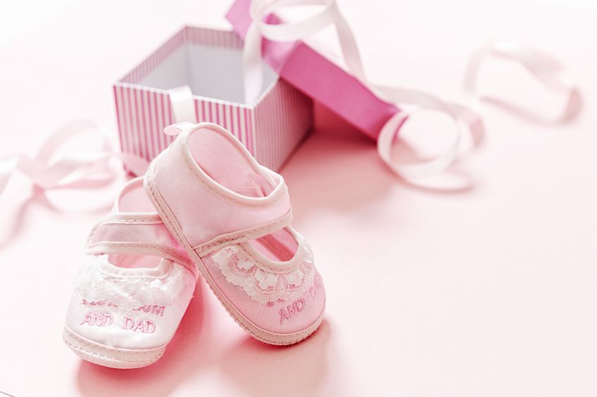
Baby Pink
This pastel pink color is traditionally associated with girls and babies. Baby pink is a popular baby room color and is the general color for baby girl clothes. The color is playful, kind, loving, feminine, playful, and sweet. The particular color below also has the name, Tea Rose.
| Pastel Color Name | Pastel Hex Codes | CMYK Pastel Color Code (%) | RGB Pastel Color Code | Pastel Color |
| Baby Pink | #f4c2c2 | 0, 20, 20, 4 | 244, 194, 194 |
Light Azure
Azure itself is a color that is found between cyan and blue when it comes to the visible spectrum of light. Often azure refers to the sky on a beautiful clear day. This variety of colors can be described as a soft pastel light blue.
This color will work perfectly as a complementary color to a soft orange.
| Pastel Color Name | Pastel Hex Codes | CMYK Pastel Color Code (%) | RGB Pastel Color Code | Pastel Color |
| Light Azure | #74bbfb | 54, 25, 0, 2 | 116, 187, 251 | |
| Soft Orange | #fbb474 | 0, 28, 54, 2 | 251, 180, 116 |
Baby Blue
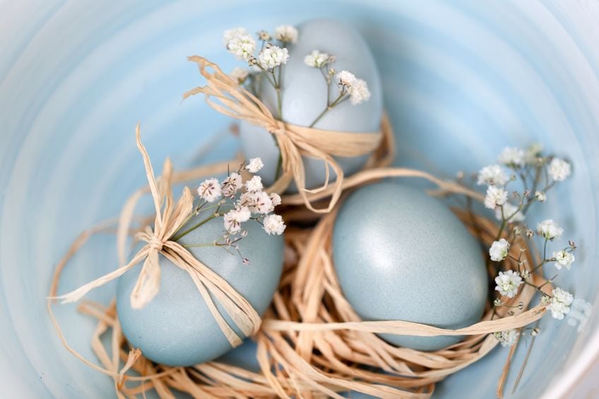
This color forms part of blue pastel colors, and like baby pink, it is associated with little boy’s and baby boy’s rooms, and clothes. The color name was first used to describe the color in the late 19th century and is thought to have originated as a description of a baby’s eyes when they are born.
| Pastel Color Name | Pastel Hex Codes | CMYK Pastel Color Code (%) | RGB Pastel Color Code | Pastel Color |
| Baby Blue | #89cff0 | 43, 14, 0, 6 | 137, 207, 240 |
Creamy Mint
Creamy mint is a pastel color that is a light green, with a yellow undertone. This color is also a paint color that was created for the brand Dunn-Edwards in 2006.
You can also get a mint cream color, this is a very different light shade of green, with a cyan or blueish undertone.
| Pastel Color Name | Pastel Hex Codes | CMYK Pastel Color Code (%) | RGB Pastel Color Code | Pastel Color |
| Creamy Mint | #c8f3cd | 18, 0, 16, 5 | 200, 243, 205 | |
| Mint Cream | #f5fffa | 4, 0, 2, 0 | 245, 255, 250 |
Peach
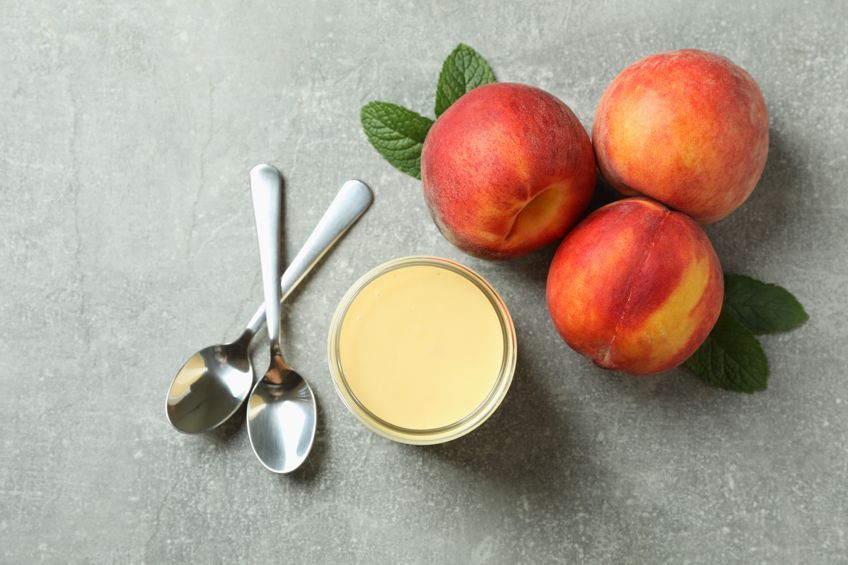
This color can be described as a lighter shade of orange, that got its name from the flesh of the fruit of the same name. The color can be comforting and joyful and works well with other shades of blue, mint green as well as gold. When paired with white, this also lends a softness to the overall look.
| Pastel Color Name | Pastel Hex Codes | CMYK Pastel Color Code (%) | RGB Pastel Color Code | Pastel Color |
| Peach | #ffe5b4 | 0, 10, 29, 0 | 255, 229, 180 |
Light Seafoam
This is another green pastel color that can be described as light green, with a blueish undertone. Easy to blend by mixing green, blue, and white, it produces a fresh and peaceful color that helps to create a calming atmosphere.
The color will work well in contrast to a light pastel purple or pink color.
| Pastel Color Name | Pastel Hex Codes | CMYK Pastel Color Code (%) | RGB Pastel Color Code | Pastel Color |
| Light Seafoam | #9fe2bf | 30, 0, 15, 11 | 159, 226, 191 |
Lavender
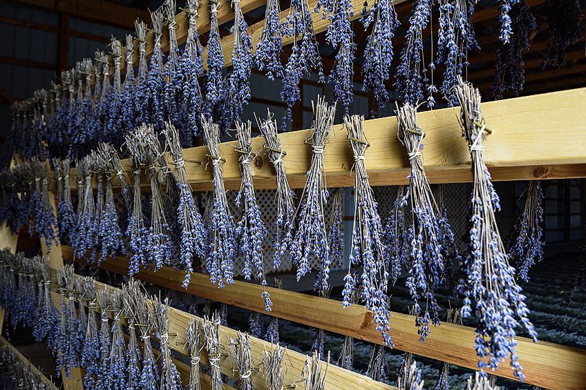
Lavender can be described as a desaturated violet color or a light pinkish-purple, that is reminiscent of the lavender flower. The color is associated with calmness, purity, cleanliness, and freshness, and is closely linked to creating a relaxing atmosphere.
| Pastel Color Name | Pastel Hex Codes | CMYK Pastel Color Code (%) | RGB Pastel Color Code | Pastel Color |
| Lavender | #967bb6 | 18, 32, 0, 29 | 150, 123, 182 |
Pastel Colors in Design
Solid pastel colors are timeless and can help to bring about a sense of fun, calm, and freshness to any design. Pastel colors have become popular throughout the design industry from creating interesting websites to branding color schemes, fashion, and interior design.
Mostly, pastel colors will bring a sense of peace, calm, and fun to any design element. Many of the more popular products and businesses that incorporate pastel colors include baby products, cosmetic products or services, weddings, and events, and sweet or dessert stores.
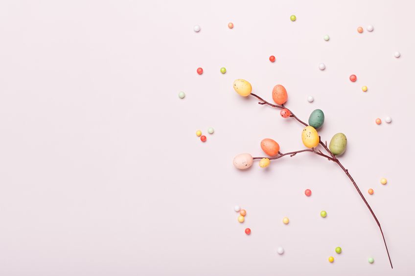
Since pastel colors provide a sense of cleanliness or freshness, it is a perfect fit for skincare products, cleaning products, fragrances, and health-related businesses. Also, the food industry can have great results using pastel colors, especially in dessert or sweet-related businesses. For example, what colors do you think of when considering the soft and sweet macrons?
Pastel colors are quite versatile and can work with most colors. Not only that, but it can also help to tone down otherwise overly bold and vibrant color combinations, making it more inviting and cheerful. Today, using pastel colors can also bring a certain contemporary feel to a design. Pastel colors can be extremely effective if used in color combinations, as a single pastel color will begin to look dull and lacks visual appeal.
This is the case for all design applications but let us take a look at a few color combinations that can work for interior design.
Pastel Color Combinations for Interior Design
When using a pastel color palette for your home, you are sure to create a stylish, relaxing, and inviting atmosphere. However, do not go overboard with incorporating pastel colors into a color scheme, as it can become boring or too pale.
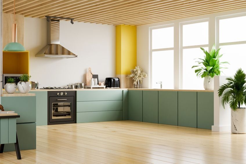
Some of the best colors that work together are your complementary colors. These would be the colors sitting opposite your primary and secondary colors on the color wheel. For example, blue pastel colors will work well with orange pastel colors, or pastel red colors will work well with green pastel colors. Your light pastel purple colors should work well with all the pastel yellow colors.
| Pastel Color Name | Pastel Hex Codes | CMYK Pastel Color Code (%) | RGB Pastel Color Code | Pastel Color |
| Pastel Light Blue | #89cff0 | 43, 14, 0, 6 | 137, 207, 240 | |
| Pastel Orange | #ffe5b4 | 0, 10, 29, 0 | 255, 229, 180 | |
| Pastel Red | #ff6961 | 0, 59, 62, 0 | 255, 105, 97 | |
| Green Pastel | #a9d39e | 20, 0, 25, 17 | 169, 211, 158 | |
| Light Pastel Purple | #c89ed3 | 5, 25, 0, 17 | 200, 158, 211 | |
| Pastel Yellow | #fdfd96 | 0, 0, 41, 1 | 253, 253, 150 |
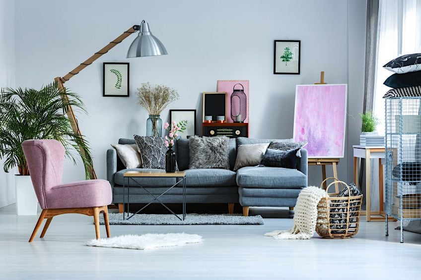
When designing an interior space with pastel colors, it can help to develop an area that is relaxing and provides an instant lift in mood. When combined with more vibrant colors like burnt orange or navy blue, it can help to lighten the mood and creates a more balanced color scheme. A pastel color scheme can work well in most rooms in the home but are best for bedrooms and bathrooms.
Patel colors also work great with all shades of gray, white, and other neutral colors. However, adding a brighter color as an accent can bring more life into a room. When using pastel colors, you can use them as your primary color for a room, which means you can paint all the walls in a room.
However, you can also use a pastel color as an accent wall. A pastel setting is great for adding white and dark furniture for added contrast. You could also use pastel colors to add color to a bit more neutral room by incorporating them into the furniture, curtains, and other accessories. Below is a handful of color combinations you can look into for your next decorating project.
Soft White, Pastel Yellow, and Lilac
Try using neutral or soft whites as your background. To do this, add in some gray furniture and include more accent colors like pastel yellow and lilac. Think of colorful lampshades, pillows, or a throw. Even some sunflowers can bring in a little yellow color. This can make a calming and inviting color scheme for a reading nook in the home. You could also use a pastel lilac as an accent wall in a living area, with other shades of purple and neutrals.
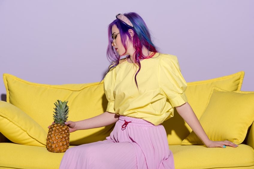
| Color Name | Hex Codes | CMYK l Color Code (%) | RGB Color Code | Color |
| Soft White | #fbfaf5 | 0, 0, 2, 2 | 251, 250, 245 | |
| Pastel Yellow | #fdfd96 | 0, 0, 41, 1 | 253, 253, 150 | |
| Lilac | #c8a2c8 | 0, 19, 0, 22 | 200, 162, 200 |
Pastel Pink and Shades of Blue
When decorating a room, try using a balanced combination of various shades of blue, and pastel pink, along with white, beige, or maybe cream. For example, use white as your main background color, with a cream couch and accents of pastel pink and shades of blue.
The accent colors can be many things, for example, a pastel pink bed throw and blue curtains or pillows.
| Color Name | Hex Codes | CMYK l Color Code (%) | RGB Color Code | Color |
| Light Pastel Pink | #ffeaea | 0, 8, 8, 0 | 255, 234, 234 | |
| Navy Blue | #000080 | 100, 100, 0, 50 | 0, 0, 128 | |
| Cream | #fffdd0 | 0, 1, 18, 0 | 255, 253, 208 |
Mix and Match Pastel Combination
Create a focal point of pastel color combinations, for example, a colorful headboard, then add more color using accessories like the pillows or a throw. Make sure to add texture and patterns to the look for a design with more depth. The headboard can be painted or use fabric as your canvas of choice for this effect. You could also add a light gray into the mix. This combination adds a fun and contemporary feel to the room. Gray and white are also great base colors to work from and adding pastel colors can add that bit of color and fun to a room.
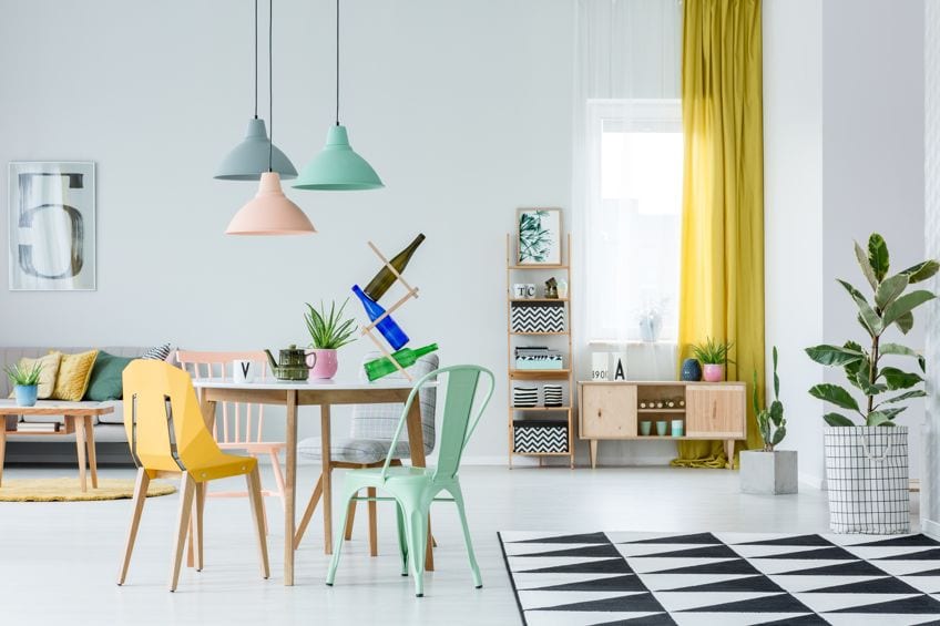
| Color Name | Hex Codes | CMYK l Color Code (%) | RGB Color Code | Color |
| Lemon Yellow | #fff44f | 0, 4, 69, 0 | 255, 244, 79 | |
| Baby Blue | #89cff0 | 43, 14, 0, 6 | 137, 207, 240 | |
| Light Pastel Pink | #ffeaea | 0, 8, 8, 0 | 255, 234, 234 | |
| Gray | #d3d3d3 | 0, 0, 0, 17 | 211, 211, 211 |
Over the years, color trends have gone from bright and bold to more soft and pastel color influences. To some, a pastel color palette might seem outdated, but now they have become more popular and contemporary, and are used by everyone from fashion designers to photographers, interior designers, and web designers.
Take a look at our pastel color palette webstory here!
In 2005, Charlene completed her Wellness Diplomas in Therapeutic Aromatherapy and Reflexology from the International School of Reflexology and Meridian Therapy. She worked for a company offering corporate wellness programs for a couple of years, before opening up her own therapy practice. It was in 2015 that a friend, who was a digital marketer, asked her to join her company as a content creator, and this is where she found her excitement for writing.
Since joining the content writing world, she has gained a lot of experience over the years writing on a diverse selection of topics, from beauty, health, wellness, travel, and more. Due to various circumstances, she had to close her therapy practice and is now a full-time freelance writer. Being a creative person, she could not pass up the opportunity to contribute to the Art in Context team, where is was in her element, writing about a variety of art and craft topics. Contributing articles for over three years now, her knowledge in this area has grown, and she has gotten to explore her creativity and improve her research and writing skills.
Charlene Lewis has been working for artincontext.org since the relaunch in 2020. She is an experienced writer and mainly focuses on the topics of color theory, painting and drawing.
Learn more about Charlene Lewis and the Art in Context Team.
Cite this Article
Charlene, Lewis, “Pastel Colors – The 31 Most Beautiful Pastel Color Palettes.” Art in Context. December 16, 2023. URL: https://artincontext.org/pastel-colors/
Lewis, C. (2023, 16 December). Pastel Colors – The 31 Most Beautiful Pastel Color Palettes. Art in Context. https://artincontext.org/pastel-colors/
Lewis, Charlene. “Pastel Colors – The 31 Most Beautiful Pastel Color Palettes.” Art in Context, December 16, 2023. https://artincontext.org/pastel-colors/.

