Shades of White – 100 White Tones With Color Codes
There are many different shades of white. Shades of white differ from regular color shades. Essentially, they are all the “white color”, but in varying hues and saturations. These hues include shades of white such as cream, ivory, or eggshell. Let’s explore our curated list of 100 different white shades, and images for each shade, including a description and the respective color codes.
Various Shades of White Names
Shades of white paint cannot be mixed from colors, thus making it colorless because it consists of all colors and does not have a specific or special wavelength of its own. It can be useful in design and marketing because it works perfectly to create contrast. The color white also creates room to connect other elements in your design space.
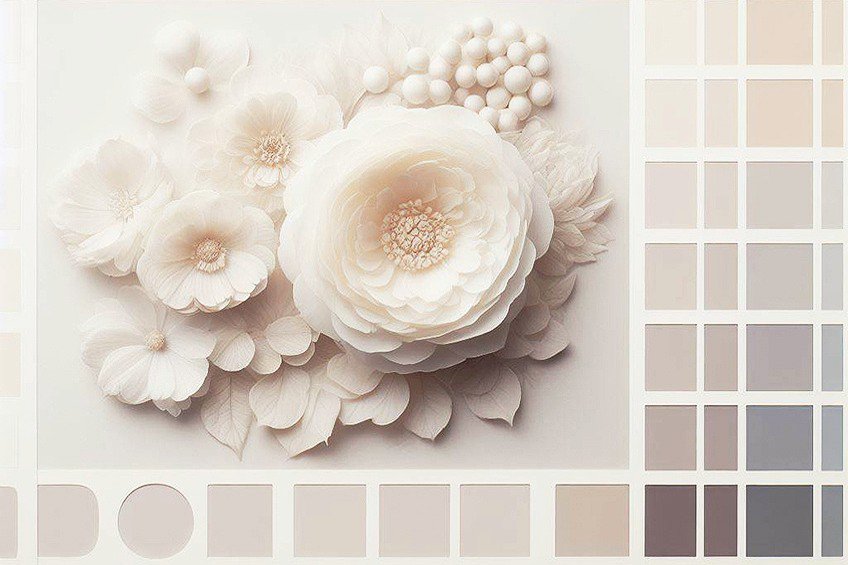
As an example, imagine a clear white document waiting to be filled with writing or designed elements, no matter how you use the different shades of white, you can’t go wrong! Many shades of white vary in range from the pure white color, depending on where it is used. This shade of white will appear differently on a wall as opposed to a screen. Below are different tables created with unique hex codes and shades of white names. Let’s take a look!
Abbey White
A soft, muted white with a hint of gray, resembling the aged walls of an ancient abbey.
| Hex: #EBE5D0 RGB: 235, 229, 208 CMYK: 0, 3, 11, 8 |
Alabaster
A pure, bright white, similar to the smooth and fine texture of alabaster stone.
| Hex: #EDEAE0 RGB: 237, 234, 224 CMYK: 0, 1, 5, 7 |
Albany Paint
A rich, deep hue that blends the sturdiness of gray with the warmth of beige.
| Hex: #EDF2F8 RGB: 237, 242, 248 CMYK: 4, 2, 0, 3 |
Alice Blue
A light and airy blue with a touch of silver, reminiscent of a serene sky.
| Hex: #F0F8FF RGB: 240, 248, 255 CMYK: 6, 3, 0, 0 |
Almond
A warm, nutty shade that combines the gentle brown of almond skin with a hint of creaminess.
| Hex: #EFDECD RGB: 239, 222, 205 CMYK: 0, 7, 14, 6 |
Antique White
A slightly off-white color, imbued with a touch of aged yellow, reminiscent of antique linen.
| Hex: #FAEBD7 RGB: 250, 235, 215 CMYK: 0, 6, 14, 2 |
Azure
A vibrant, sky-blue color, evoking images of a cloudless summer sky.
| Hex: #F0FFFF RGB: 240, 255, 255 CMYK: 6, 0, 0, 0 |
Baby Powder
A very light, almost translucent white, akin to the delicate softness of baby powder.
| Hex: #FEFEFA RGB: 254, 254, 250 CMYK: 0, 0, 2, 0 |
Beige
A neutral, sandy color that blends the simplicity of white with the warmth of light brown.
| Hex: #F5F5DC RGB: 245, 245, 220 CMYK: 0, 0, 10, 4 |
Bisque
A pale, creamy orange, much like the warm, comforting hue of a lobster bisque soup.
| Hex: #FFE4C4 RGB: 255, 228, 196 CMYK: 0, 11, 23, 0 |
Blanched Almond
A pale, creamy shade, lighter and softer than almond, like almonds with their skin removed.
| Hex: #FFEBCD RGB: 255, 235, 205 CMYK: 0, 8, 20, 0 |
Blond
A light, golden hue reminiscent of sun-bleached hair.
| Hex: #FAF0BE RGB: 250, 240, 190 CMYK: 0, 4, 24, 2 |
Bone
A natural, muted shade of off-white with a hint of yellow, similar to the color of animal bones.
| Hex: #E3DAC9 RGB: 227, 218, 201 CMYK: 0, 4, 11, 11 |
Bone White
A deeper version of bone, with more pronounced yellow undertones.
| Hex: #F9F6EE RGB: 249, 246, 238 CMYK: 0, 1, 4, 2 |
Bright White
A striking, brilliant white, radiating clarity and sharpness.
| Hex: #FBFBF9 RGB: 251, 251, 249 CMYK: 0, 0, 1, 2 |
Cake Batter
A rich, creamy yellow, resembling the inviting color of cake batter.
| Hex: #F0EDDB RGB: 240, 237, 219 CMYK: 0, 1, 9, 6 |
Carrara
An elegant, sophisticated white with subtle gray veins, much like Carrara marble.
| Hex: #E9E9E4 RGB: 233, 233, 228 CMYK: 0, 0, 2, 9 |
Catskill White
A soft, airy white with a touch of blue, reminiscent of a clear, open sky.
| Hex: #E8EAE6 RGB: 232, 234, 230 CMYK: 1, 0, 2, 8 |
Ceramic
A polished, slightly cool white, similar to the smooth surface of fine ceramic.
| Hex: #FCFFF9 RGB: 252, 255, 249 CMYK: 1, 0, 2, 0 |
Chalk White
A dusty, matte white, akin to the texture and softness of chalk.
| Hex: #FBFFFF RGB: 251, 255, 255 CMYK: 2, 0, 0, 0 |
Champagne
A luxurious, muted shade of beige with pinkish-gold undertones, like the bubbly drink.
| Hex: #F7E7CE RGB: 247, 231, 206 CMYK: 0, 6, 17, 3 |
Chiffon
A sheer, pale yellow, light and delicate like chiffon fabric.
| Hex: #FFFACD RGB: 255, 250, 205 CMYK: 0, 2, 20, 0 |
Coconut
A rich, creamy white, reminiscent of the fresh, milky interior of a coconut.
| Hex: #F0EDE5 RGB: 240, 237, 229 CMYK: 0, 1, 5, 6 |
Coconut Milk
A lighter, more diluted version of coconut, with a smooth, milky consistency.
| Hex: #FFF1E6 RGB: 255, 241, 230 CMYK: 0, 5, 10, 0 |
Cornsilk
A pale, sunny yellow, resembling the silky threads of fresh corn.
| Hex: #FFF8DC RGB: 255, 248, 220 CMYK: 0, 3, 14, 0 |
Cosmic Latte
A universal beige, with a slight golden undertone, like the average color of the cosmos.
| Hex: #FFF8E7 RGB: 255, 248, 231 CMYK: 0, 3, 9, 0 |
Cotton Ball
A fluffy, pure white, as soft and clean as a freshly plucked cotton ball.
| Hex: #F2F7FD RGB: 242, 247, 253 CMYK: 4, 2, 0, 1 |
Cotton Ridge
A crisp, linen white, with a hint of cool blue, like cotton under a clear sky.
| Hex: #F2EBDD RGB: 242, 235, 221 CMYK: 0, 3, 9, 5 |
Cream
A smooth, rich off-white, with a comforting warmth, like fresh cream.
| Hex: #FFFDD0 RGB: 255, 253, 208 CMYK: 0, 1, 18, 0 |
Daisy
A cheerful, bright white with sunny yellow undertones, like daisy petals.
| Hex: #FAFAFA RGB: 250, 250, 250 CMYK: 0, 0, 0, 2 |
Deutzia White
A crisp, garden white, with a faint green undertone, reminiscent of Deutzia flowers.
| Hex: #F7FCFE RGB: 247, 252, 254 CMYK: 3, 1, 0, 0 |
Dutch White
A cozy, buttery white, with a soft, inviting warmth.
| Hex: #EFDFBB RGB: 239, 223, 187 CMYK: 0, 7, 22, 6 |
Eggshell
A muted, creamy white, with a hint of sheen, like the surface of an eggshell.
| Hex: #F0EAD6 RGB: 240, 234, 214 CMYK: 0, 3, 11, 6 |
Fantasy
A whimsical, pale hue that blends the freshness of white with a magical hint of pink.
| Hex: #F8EEEC RGB: 248, 238, 236 CMYK: 0, 4, 5, 3 |
Feather White
A light, airy white, with the softness and delicacy of a bird’s feather.
| Hex: #E7EAE5 RGB: 231, 234, 229 CMYK: 1, 0, 2, 8 |
Flax
A natural, linen-like color, combining the simplicity of beige with a touch of golden warmth.
| Hex: #EEDC82 RGB: 238, 220, 130 CMYK: 0, 8, 45, 7 |
Floral White
A soft, creamy white, tinged with a hint of peach, like delicate flower petals.
| Hex: #FFFAF0 RGB: 255, 250, 240 CMYK: 0, 2, 6, 0 |
Frost
A crisp, cool white, with a subtle hint of blue, like a light frost.
| Hex: #F4F8FF RGB: 244, 248, 255 CMYK: 4, 3, 0, 0 |
Gainsboro
A light gray with a soothing, soft tone, reminiscent of stately Gainsborough portraits.
| Hex: #DCDCDC RGB: 220, 220, 220 CMYK: 0, 0, 0, 14 |
Ghost White
A faint, ethereal white with a hint of blue, elusive and almost transparent.
| Hex: #F8F8FF RGB: 248, 248, 255 CMYK: 3, 3, 0, 0 |
Grim White
A stark, intense white, with a no-nonsense, straightforward clarity.
| Hex: #F6F1F4 RGB: 246, 241, 244 CMYK: 0, 2, 1, 4 |
Honeydew
A light, refreshing greenish-white, sweet and subtle like the inside of a honeydew melon.
| Hex: #F0FFF0 RGB: 240, 255, 240 CMYK: 6, 0, 6, 0 |
Huntington White
A refined, sophisticated white with a hint of green, evoking a sense of tranquility.
| Hex: #F1F0E5 RGB: 241, 240, 229 CMYK: 0, 0, 5, 5 |
Indigo White
A unique, pale hue blending the purity of white with a whisper of deep indigo.
| Hex: #EBF6F7 RGB: 235, 246, 247 CMYK: 5, 0, 0, 3 |
Isabelline
A pale, greyish-yellow, subtle and understated, like a faded parchment.
| Hex: #F4F0EC RGB: 244, 240, 236 CMYK: 0, 2, 3, 4 |
Island Spice
A warm, beige-white, with a hint of spice, reminiscent of an island retreat.
| Hex: #FFFCEC RGB: 255, 252, 236 CMYK: 0, 1, 7, 0 |
Ivory
A smooth, off-white, with a slight touch of yellow, elegant and timeless like ivory carvings.
| Hex: #FFFFF0 RGB: 255, 255, 240 CMYK: 0, 0, 6, 0 |
Lace
A delicate, intricate white, with a soft, ornamental quality, like fine lacework.
| Hex: #F8F2ED RGB: 248, 242, 237 CMYK: 0, 2, 4, 3 |
Lavender Blush
A pale, soft pink with a hint of lavender, gentle and soothing.
| Hex: #FFF0F5 RGB: 255, 240, 245 CMYK: 0, 6, 4, 0 |
Lavender Web
A light, airy lavender, with a dreamy, whimsical quality.
| Hex: #EEEEFF RGB: 238, 238, 255 CMYK: 7, 7, 0, 0 |
Light Cyan
A soft, watery blue-green, tranquil and refreshing like a shallow tropical sea.
| Hex: #E0FFFF RGB: 224, 255, 255 CMYK: 12, 0, 0, 0 |
Light Goldenrod
A pale, sun-kissed yellow, gentle and warm like the first light of dawn.
| Hex: #FAFAD2 RGB: 250, 250, 210 CMYK: 0, 0, 16, 2 |
Light Yellow
A cheerful, sunny yellow, bright and uplifting like a summer day.
| Hex: #FFFFE0 RGB: 255, 255, 224 CMYK: 0, 0, 12, 0 |
Linen
A natural, beige-white, with the texture and warmth of linen fabric.
| Hex: #FAF0E6 RGB: 250, 240, 230 CMYK: 0, 4, 8, 2 |
Link Water
A soft, muted blue with a tranquil, flowing quality, like a gentle stream.
| Hex: #ECF3F9 RGB: 236, 243, 249 CMYK: 5, 2, 0, 2 |
Lychee Pulp
A delicate, pale pink, sweet and subtle, reminiscent of the inside of a lychee fruit.
| Hex: #F7F1DA RGB: 247, 241, 218 CMYK: 0, 2, 12, 3 |
Magnolia
A rich, creamy white with a hint of green, like the petals of a magnolia flower.
| Hex: #F8F4FF RGB: 248, 244, 255 CMYK: 3, 4, 0, 0 |
Meringue
A light, frothy white, sweet and airy like a perfectly whipped meringue.
| Hex: #F6EABE RGB: 246, 234, 190 CMYK: 0, 5, 23, 4 |
Milk
A pure, creamy white, wholesome and nourishing like fresh milk.
| Hex: #FDFFF5 RGB: 253, 255, 245 CMYK: 1, 0, 4, 0 |
Mint Cream
A refreshing, pale green, light and creamy like a mint dessert.
| Hex: #F5FFFA RGB: 245, 255, 250 CMYK: 4, 0, 2, 0 |
Misty Rose
A soft, muted pink, with a gentle, soothing quality, like a rose in the morning mist.
| Hex: #FFE4E1 RGB: 255, 228, 225 CMYK: 0, 11, 12, 0 |
Morning Breeze
A light, breezy blue, with a hint of freshness, like the sky at dawn.
| Hex: #F0EEE4 RGB: 240, 238, 228 CMYK: 0, 1, 5, 6 |
Morning Dew White
A fresh, clean white, with a subtle hint of cool blue, like morning dew.
| Hex: #C2D8D3 RGB: 194, 216, 211 CMYK: 10, 0, 2, 15 |
Natural White
A balanced, neutral white, neither too warm nor too cool, like natural light.
| Hex: #EEECE6 RGB: 238, 236, 230 CMYK: 0, 1, 3, 7 |
Navajo White
A warm, creamy white with a hint of orange, reminiscent of Southwestern art.
| Hex: #FFDEAD RGB: 255, 222, 173 CMYK: 0, 13, 32, 0 |
Nyanza
A pale, soft green, almost white, with a delicate, ethereal quality.
| Hex: #E9FFDB RGB: 233, 255, 219 CMYK: 9, 0, 14, 0 |
Oatmeal
A comforting, warm beige, with a natural, wholesome feel, like a bowl of oatmeal.
| Hex: #E0DCC8 RGB: 224, 220, 200 CMYK: 0, 2, 11, 12 |
Off White
A subtle, muted white, with a hint of beige, less stark than pure white.
| Hex: #FAF9F6 RGB: 250, 249, 246 CMYK: 0, 0, 2, 2 |
Old Lace
A delicate, antique white with a touch of cream, reminiscent of aged lace.
| Hex: #FDF5E6 RGB: 253, 245, 230 CMYK: 0, 3, 9, 1 |
Orange White
A very pale orange, with a soft, warm glow, like a hint of sunrise.
| Hex: #F8F9F5 RGB: 248, 249, 245 CMYK: 0, 0, 2, 2 |
Oyster White
A refined, subtle beige, with a hint of gray, like the inside of an oyster shell.
| Hex: #E3DFD2 RGB: 227, 223, 210 CMYK: 0, 2, 7, 11 |
Pale Spring Bud
A gentle, light green, with a hint of yellow, like new leaves in spring.
| Hex: #ECEBBD RGB: 236, 235, 189 CMYK: 0, 0, 20, 7 |
Papaya Whip
A soft, creamy orange, light and refreshing like a papaya dessert.
| Hex: #FFEFD5 RGB: 255, 239, 213 CMYK: 0, 6, 16, 0 |
Parchment Paper
A warm, off-white, with a hint of yellow, like aged parchment paper.
| Hex: #FBF5DF RGB: 251, 245, 223 CMYK: 0, 2, 11, 2 |
Pearl
A lustrous, soft white with a subtle sheen, elegant and timeless like a pearl.
| Hex: #FBFCF8 RGB: 251, 252, 248 CMYK: 0, 0, 2, 1 |
Photon White
A bright, intense white, with a futuristic, almost electric feel.
| Hex: #F8F8E8 RGB: 248, 248, 232 CMYK: 0, 0, 6, 3 |
Platinum
A sophisticated, silvery-white, with a hint of luxury and refinement.
| Hex: #E5E4E2 RGB: 229, 228, 226 CMYK: 0, 0, 1, 10 |
Polar Bear
A crisp, arctic white, pure and cool like a polar bear’s fur.
| Hex: #EAE9E0 RGB: 234, 233, 224 CMYK: 0, 0, 4, 8 |
Porcelain
A polished, elegant white with a smooth, refined finish, like fine porcelain.
| Hex: #FFFEFC RGB: 255, 254, 252 CMYK: 0, 0, 1, 0 |
Powdered Sugar
A sweet, delicate white, light and airy like powdered sugar.
| Hex: #FDFCFA RGB: 253, 252, 250 CMYK: 0, 0, 1, 1 |
Quarter Pearl Lusta
A soft, subdued white with a slight pearl-like sheen.
| Hex: #EEEBE3 RGB: 238, 235, 227 CMYK: 0, 1, 5, 7 |
Refined Mint
A sophisticated, pale green, cool and elegant like mint leaves.
| Hex: #F1F9EC RGB: 241, 249, 236 CMYK: 3, 0, 5, 2 |
Rice
A basic, staple white, clean and simple like a grain of rice.
| Hex: #FAF5EF RGB: 250, 245, 239 CMYK: 0, 2, 4, 2 |
Seashell
A very light, warm shade that has a hint of pink, reminiscent of the inside of a seashell.
| Hex: #FFF5EE RGB: 255, 245, 238 CMYK: 0, 4, 7, 0 |
Shiroi White
“Shiroi” means white in Japanese; this color is a pure, bright white, like fresh snow.
| Hex: #EBF5F0 RGB: 235, 245, 240 CMYK: 4, 0, 2, 4 |
Smoky White
A muted white with a subtle gray undertone, evoking the softness of smoke.
| Hex: #F0F0F0 RGB: 240, 240, 240 CMYK: 0, 0, 0, 6 |
Snow
A crisp, clean white, like freshly fallen snow under a clear sky.
| Hex: #FFFAFA RGB: 255, 250, 250 CMYK: 0, 2, 2, 0 |
Snow Drift
Slightly cooler than Snow, this color has a faint bluish tint, resembling snow in shadow.
| Hex: #F8FBF8 RGB: 248, 251, 248 CMYK: 1, 0, 1, 2 |
Soft Peach
A gentle, pale orange with a creamy, peachy tone, soft and soothing.
| Hex: #F6F1F4 RGB: 246, 241, 244 CMYK: 0, 2, 1, 4 |
Splendor
A vibrant, rich color that can vary but often suggests a radiant and luminous quality.
| Hex: #F3DECA RGB: 243, 222, 202 CMYK: 0, 9, 17, 5 |
Spring
A fresh, light green, reminiscent of new leaves and grass in the springtime.
| Hex: #F3F0E8 RGB: 243, 240, 232 CMYK: 0, 1, 5, 5 |
Timberwolf
A cool gray with a slight brownish tinge, like the fur of a timberwolf.
| Hex: #DBD7D2 RGB: 219, 215, 210 CMYK: 0, 2, 4, 14 |
Vanilla
A warm, creamy white, similar to vanilla ice cream, soft and inviting.
| Hex: #F3E5AB RGB: 243, 229, 171 CMYK: 0, 6, 30, 5 |
White Smoke
A very pale gray, almost white, like delicate wisps of smoke against a clear sky.
| Hex: #F5F5F5 RGB: 245, 245, 245 CMYK: 0, 0, 0, 4 |
White Solid
A straightforward, unadulterated white, with no hints of any other colors.
| Hex: #F4F5FA RGB: 244, 245, 250 CMYK: 2, 2, 0, 2 |
Winter Mood
A color that evokes the feeling of winter, possibly a cool blue or gray.
| Hex: #E2DED3 RGB: 226, 222, 211 CMYK: 0, 2, 7, 11 |
Winter Sky
A pale, cool blue, like the clear, crisp sky on a winter’s day.
| Hex: #F3F2ED RGB: 243, 242, 237 CMYK: 0, 0, 2, 5 |
Winter White
A soft, slightly off white, with a cool tone reminiscent of winter’s chill.
| Hex: #DFDFD5 RGB: 223, 223, 213 CMYK: 0, 0, 4, 13 |
Interior Design With Shades of White
Interior designers will be the first to tell you there are no shortcuts or simple methods when it comes to choosing between the different shades of white. It may be a versatile color that works well with other hues, but that still means you need to use the correct shades.
When deciding on the correct shades of white when it comes to designing an interior room, the room’s lighting must be considered.
Bright shades of white are ideal for darker rooms, and darker-toned white shades are ideal for rooms that have loads of natural light. Before going through the various shades of white names, try including the color bias in your choice, as this will affect the outcome. Bathrooms suit a clean and cool tone of white, whereas comfortable living rooms and bedrooms work well with a warmer tone of white.
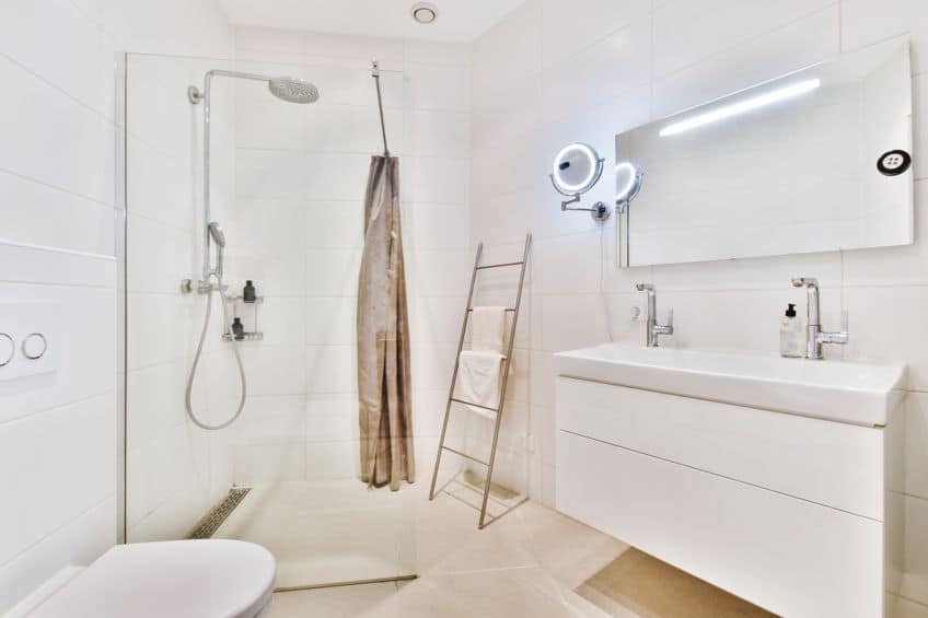
As you are learning, lighting plays an integral role in color presentation, and natural lighting is one factor. Many interior designers create spaces that are lit by LED lighting, and this does have an impact on your color choice. It is best to check the white undertone and how it will change under the influence of artificial indoor lighting.
Also, be aware of how the white color can reflect other colors.
For example, if you have magenta pink curtains, this will create a reflection on the white walls. A good way to see any color undertones, especially ones you may have missed, would be to hold a white printing paper alongside any shades of white paint you wish to use. Let us explore some ideas for different shades of white in your interior space:
- Create a tonal effect by layering various shades of white. Try using wallpaper or a stencil in a different shade of white.
- Dark shades of gray or black can help add contrast to your white room.
- Plants or accessories can help bring some color to an all-white, clinical or minimalist space.

- You can pair neutral colors with different shades of white for a warmer minimalist space.
- For a fresh and clean feel, an all-white kitchen can be a beautiful space. Use some red hanging light shades or a fruit bowl for a little bit of color.
- Shades of dark blue paired with different shades of white can help bring a fun sea-side or nautical theme to any room.
The History of the Color White
The history of the color white goes as far back as 400 BC when it was derived from lead. Many people became gravely ill due to the toxins found in the lead, which was only discontinued in the late 1700s, despite hundreds dying. White lead was also found in women’s makeup and beauty products, and not only in pigments used by artists.
Even though artists and other individuals were experiencing serious side effects, lead was only replaced with zinc white and titanium dioxide much later. In 1921, a more sustainable paint pigment was developed and it is used in 70 percent of the world’s white paint.
White paint contains white titanium oil and produces a prominent opacity and thermal stability, making it a far better, longer-lasting white paint option.

The titanium dioxide in white paint is also used to add whiteness and opacity to household products such as plastic containers, women’s makeup, food, sunblock, and toothpaste. Other places you can find traces are on the exterior of the Saturn V rocket, and it is used to make the white lines on a tennis court. Over the decades, the various off-white colors became trendy, and today we have thousands of different shades of white to choose from. As early as the 1930s, the use of beige alongside white was very popular, and again in the mid-1950s to 1975.
Shades of white can be found everywhere in nature and almost everywhere you look.
Some examples include snow, clouds, and flowers. Many cultures celebrate the color white and use the color white for spiritual and emotional meanings. China considers the shades of white to represent death and illness, while many western cultures will use white to signify purity and innocence – this is why brides wear white wedding dresses, and the robes are white in the Catholic faith. White and black colors are often characterized as opposites, good and evil, or day and night, similar to the Yin and Yang in Eastern cultures.
All the different shades of white are a perfect addition to any home, enabling you to create an atmosphere and influence mood. Even though white is not always considered to be a color, it plays a massive role in daily life. Hopefully, you can incorporate shades of white in your design palette.
Frequently Asked Questions
How Can I Incorporate Shades of White for Interior Design?
To incorporate different shades of white in your home, you should consider the lighting in the space and a few other elements. This versatile color combines very well with all colors. The different shades of white are thought to help evoke a sense of calm and openness as well as brightness and freshness. White provides a blank canvas for your space and it is a wonderful backdrop paired with accents of color accessories, furniture, and wall hangings.
Is Cream Considered a White Shade?
Most definitely! Cream is one of the many shades of white names. It is described as off-white and is an excellent partner to warm and neutral colors. The cream color contains a yellow undertone. Many people refer to all off-white tones as cream color.
In 2005, Charlene completed her Wellness Diplomas in Therapeutic Aromatherapy and Reflexology from the International School of Reflexology and Meridian Therapy. She worked for a company offering corporate wellness programs for a couple of years, before opening up her own therapy practice. It was in 2015 that a friend, who was a digital marketer, asked her to join her company as a content creator, and this is where she found her excitement for writing.
Since joining the content writing world, she has gained a lot of experience over the years writing on a diverse selection of topics, from beauty, health, wellness, travel, and more. Due to various circumstances, she had to close her therapy practice and is now a full-time freelance writer. Being a creative person, she could not pass up the opportunity to contribute to the Art in Context team, where is was in her element, writing about a variety of art and craft topics. Contributing articles for over three years now, her knowledge in this area has grown, and she has gotten to explore her creativity and improve her research and writing skills.
Charlene Lewis has been working for artincontext.org since the relaunch in 2020. She is an experienced writer and mainly focuses on the topics of color theory, painting and drawing.
Learn more about Charlene Lewis and the Art in Context Team.
Cite this Article
Charlene, Lewis, “Shades of White – 100 White Tones With Color Codes.” Art in Context. November 28, 2023. URL: https://artincontext.org/shades-of-white/
Lewis, C. (2023, 28 November). Shades of White – 100 White Tones With Color Codes. Art in Context. https://artincontext.org/shades-of-white/
Lewis, Charlene. “Shades of White – 100 White Tones With Color Codes.” Art in Context, November 28, 2023. https://artincontext.org/shades-of-white/.






I enjoyed this article so very much. I had gone to the local Lowe’s hardware store and asked for help getting some ceiling white to paint over a small area that became exposed after we changed a ceiling light. I had NO IDEA how many whites there were! Your article was very good and I really enjoyed reading about the history of paints. Thank you. Barbara