Pastel Red – Exploring the Pastel Red Color Palette
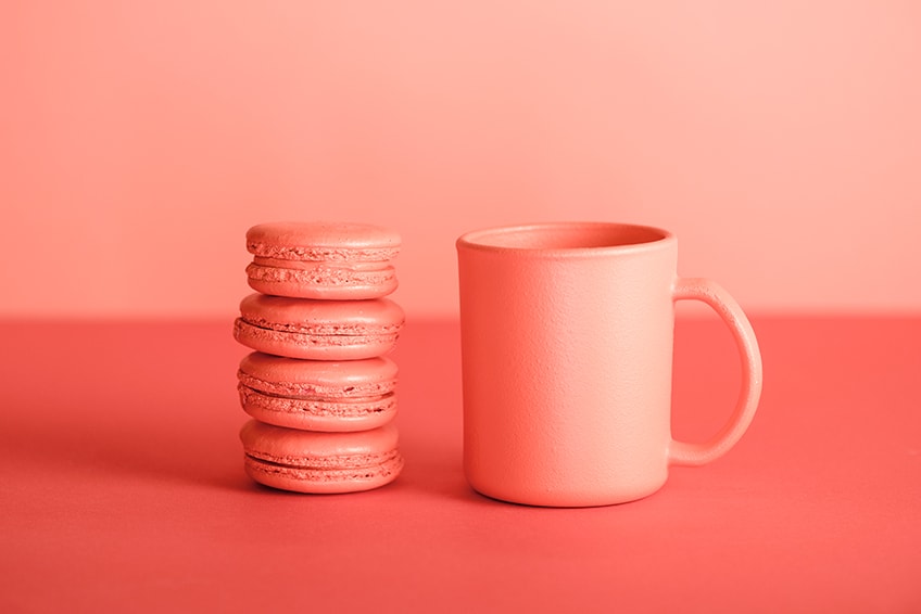
Pastel red: is this a color, or is it simply just pink? This might be what you are thinking, which is why pastel red often goes unnoticed. Pastel red is a color on its own, which does not venture into the pink category, but remains a lighter shade of red.
Table of Contents
What Is Pastel Red?
Pastel reds are a softer and more muted shade of the color red. Pastel red is maybe a little less common than other pastel colors like lavender or lilac, but it still has its place. The understated color has a low saturation, which makes it less vibrant. As seen below, the color has its own identifying hex code, which designers use to choose specific colors.
The low saturation of pastel red, and all pastel colors, is what makes it appear less bright and easier to look at. This effect is what makes it so popular among designers, who might be looking for a popular color but without its more aggressive nature. Images on not irritating to look at, because the colors are gentle and pleasing.

Sometimes, pastel red may be confused with pink or pastel pink, but as you can see in the table, these are two very different colors. The RGB color code is usually used for computer graphics and shows the differences in the amounts of red, green, and blue present in each hue. The CMYK color code is used for printing and shows how much ink of each color is used, which includes cyan, magenta, and yellow, in addition to black.
| Pastel Red Shade | Hex Code | CMYK Color Code (%) | RGB Color Code | Pastel Red Color |
| Pastel Red | #ff6961 | 0, 59, 62, 0 | 255, 105, 97 | |
| Pastel Pink | #ffd1dc | 0, 18, 14, 0 | 255, 209, 220 |
Pastel Red: A Brief History
The color red has a lengthier history, with red pigments being used since prehistoric art was discovered. However, the muted and softer red falls under pastels, which is a word that was first used around the mid-17th century, and these particular colors became popular with artists later in the 18th century. Originally, there were only pastels in red, white, and black. The pigments contained a binder and were in a stick form.
When the pastels were used, they produced art that was pale in color. In the 18th century, pastel portrait paintings were quite fashionable and were often combined with other painting techniques like gouache. Pastels were often used by artists like Jean-Baptiste Perronneau.
During this same time, a time known as the Rococo era, pastel colors were also popular in fashion, as well furniture. However, the more common pastel colors included pastel greens and blues. Pastels saw a resurgence in popularity during the 1980s are still well-liked today as they provide a soothing effect.
Meaning of the Pastel Red Color
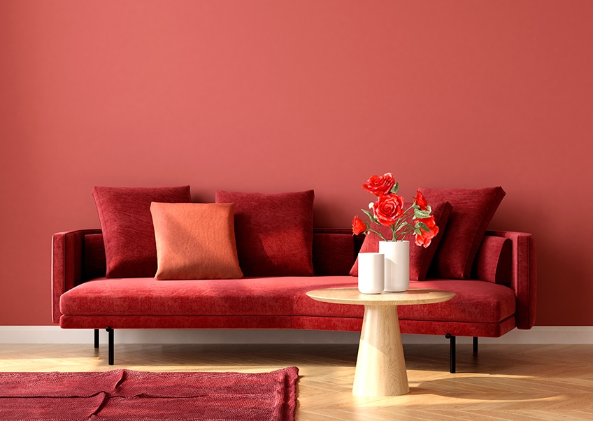
Pastel red is a softer hue of the intense red color and is associated more with romance and love instead of passion and energy. Pastel red is not as aggressive and vibrant and is gentler in its appearance and effects. As with most pastel colors, pastel red provides more of a calming and peaceful impression. Pastel colors also bring to mind relaxation as well as openness and are something that is associated with sanity. Pastel colors can also represent neutrality and can be uplifting.
Shades of Pastel Red
Pastel reds can come in a variety of shades, which all have different identifying hex codes and names. These muted shades include names like rose red, salmon, coral, Indian red, and cinnabar. Some are softer, while others have a bolder appearance, as seen below.
Cinnabar
Cinnabar is one of the bolder colors and is also known by the name vermilion. The cinnabar color has the boldness of orange, the warmth of red, and an earthiness that comes from its brown undertone. The name originally comes from a mineral, which, because of its color, was used as a pigment. However, the pigment was quite toxic.
| Pastel Red Shade | Hex Code | CMYK Color Code (%) | RGB Color Code | Pastel Red Color |
| Pastel Red | #ff6961 | 0, 59, 62, 0 | 255, 105, 97 | |
| Cinnabar | #e34234 | 0, 71, 77, 11 | 227, 66, 52 |

Indian Red
Also known as chestnut, Indian red can be described as a moderate red. When looking at the color, you will also notice warm and earthy tones. The paint pigment of the color was derived from ferric oxide and was produced in India.
| Pastel Red Shade | Hex Code | CMYK Color Code (%) | RGB Color Code | Pastel Red Color |
| Pastel Red | #ff6961 | 0, 59, 62, 0 | 255, 105, 97 | |
| Indian Red | #cd5c5c | 0, 55, 55, 20 | 205, 92, 92 |
Coral
Coral is more of a light pink orange that is feminine, energizing, and refreshing. The color name comes from the ocean invertebrates that are on the sea floor. The coral color name was first documented in the late 1900s.
| Pastel Red Shade | Hex Code | CMYK Color Code (%) | RGB Color Code | Pastel Red Color |
| Pastel Red | #ff6961 | 0, 59, 62, 0 | 255, 105, 97 | |
| Coral | #ff7f50 | 0, 50, 69, 0 | 255, 127, 80 |

Salmon
A beautiful soft red and can be described as being a pinkish color that has an orange undertone and is just slightly lighter than the coral color. The color is associated with hope, happiness, vitality, and health.
| Pastel Red Shade | Hex Code | CMYK Color Code (%) | RGB Color Code | Pastel Red Color |
| Pastel Red | #ff6961 | 0, 59, 62, 0 | 255, 105, 97 | |
| Salmon | #fa8072 | 0, 49, 54, 2 | 250, 128, 114 |
Rose Red
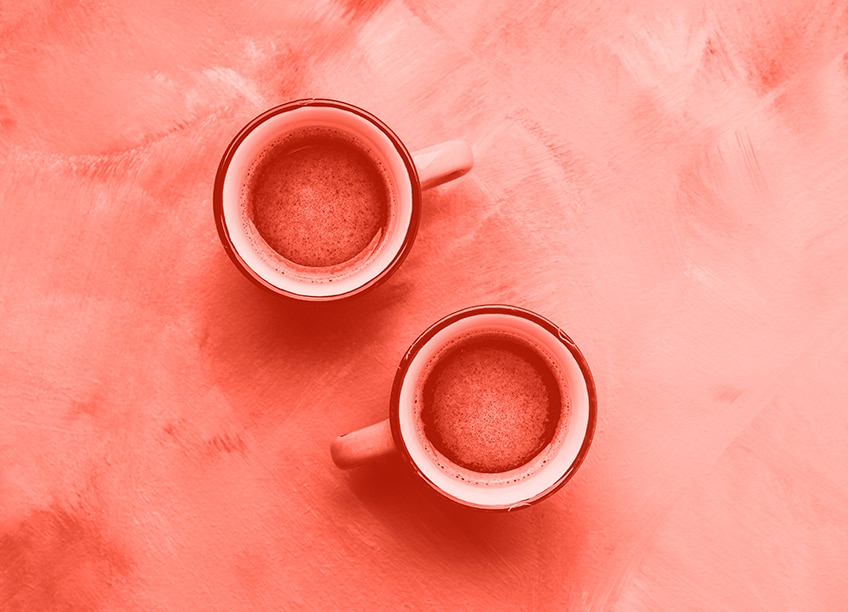
There seem to be many rose red colors available, the one below is a softer more desaturated red color. This color leans more toward a cooler red, as it contains a bit more blue in its composition. The color is that of romance, and if you can get roses in this particular shade, it will make the perfect Valentine’s gift.
| Pastel Red Shade | Hex Code | CMYK Color Code (%) | RGB Color Code | Pastel Red Color |
| Pastel Red | #ff6961 | 0, 59, 62, 0 | 255, 105, 97 | |
| Rose Red | #CD7687 | 0, 42, 34, 20 | 205, 118, 135 |
Pastel Red Color Combinations
What colors go with pastel red? This is quite easy to answer, as it can go with a variety of different colors from shades of pink, white, and cream to soft grays. Pastel red can also work well with other pastel colors but can also help to tone down bolder primary colors.
Pastel red is quite a bold color compared to other pastels, so if you are looking for something with this quality, but with a softer touch, then pastel red is perfect. To understand the best color combinations for pastel red, you need to look at color theory and bring in the color wheel. Here you will find the perfect color combinations and include some of the following.

Complementary Colors
When looking for something that offers the best contrast or helps the colors stand out, then complementary colors are a good choice. When it comes to our chosen pastel red, its complementary color is light cyan, which if you look at the color wheel, lies on the other side of the color wheel. Why not experiment with various shades of each color within a color scheme?
| Shade | Hex Code | CMYK Color Code (%) | RGB Color Code | Color |
| Pastel Red | #ff6961 | 0, 59, 62, 0 | 255, 105, 97 | |
| Light Cyan | #61f7ff | 62, 3, 0, 0 | 97, 247, 255 |
Analogous Colors
If you want to create a more harmonious look, then analogous colors that are positioned in the same area on the color wheel can make it happen. Shades of pink and orange fall into this category, as you can see below.
| Shade | Hex Code | CMYK Color Code (%) | RGB Color Code | Color |
| Pastel Red | #ff6961 | 0, 59, 62, 0 | 255, 105, 97 | |
| Light Pink | #ff61a8 | 0, 62, 34, 0 | 255, 97, 168 | |
| Light Orange | #ffb861 | 0, 28, 62, 0 | 255, 184, 97 |
Monochromatic Colors
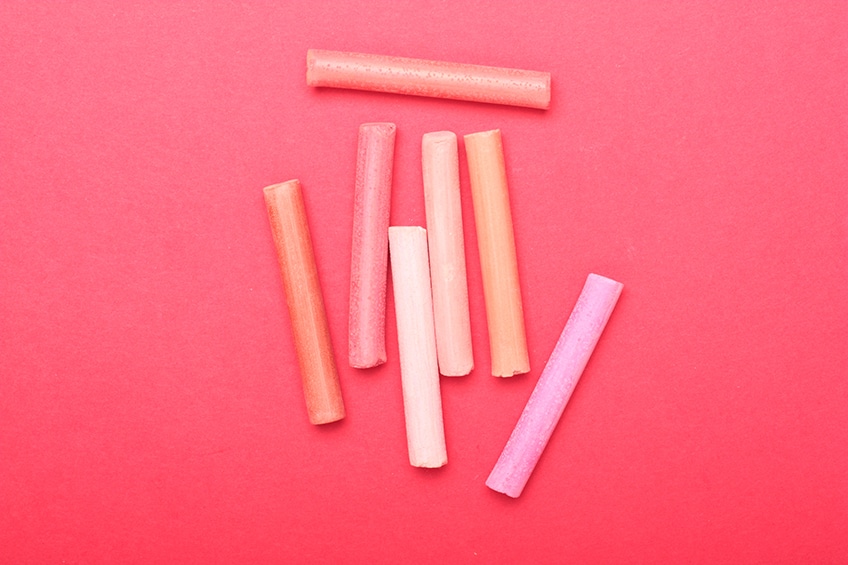
Various shades, tints, and tones of pastel red that are darker or more vibrant and lighter in color can form a monochromatic color scheme. This grouping of colors is extremely straightforward to use and is difficult to mess up.
| Shade | Hex Code | CMYK Color Code (%) | RGB Color Code | Color |
| Pastel Red | #ff6961 | 0, 59, 62, 0 | 255, 105, 97 | |
| Vibrant Red | #ff2015 | 0, 87, 92, 0 | 255, 32, 21 | |
| Pale Red | #ffb2ae | 0, 30, 32, 0 | 255, 178, 174 |
Triadic Colors
Three colors form a triangle shape on the color wheel. These colors form a contrast and create a vibrant and uplifting look. If combined correctly, it can create a balanced look that is pleasing in appearance.
| Shade | Hex Code | CMYK Color Code (%) | RGB Color Code | Color |
| Pastel Red | #ff6961 | 0, 59, 62, 0 | 255, 105, 97 | |
| Light Blue | #6961ff | 59, 62, 0, 0 | 105, 97, 255 | |
| Light Lime Green | #61ff69 | 62, 0, 59, 0 | 97, 255, 105 |
Pastel Red Aesthetics
When it comes to pastel red aesthetics, the color can be employed in a variety of ways. The pastel red color produces a calmer and less aggressive approach and is pleasing to look at, without being harsh and too in your face.
When using pastels, they can create designs that have a clean, soft, and peaceful look. You might consider pastels dull, but in the proper color combinations, you can create beautiful and lively designs. When used in designs, pastel red can be used as an accent color, but it can also feature as the main color. However, it is not recommended the hue is used for text color, as it is too light.
Pastel red is a color that can also help to improve appetite and adrenaline, so it is quite often used in restaurant menus and other design features. Pastel red is still vibrant but is less irritating to look at, which makes it a good color for websites, logos, all kinds of products, and packaging.

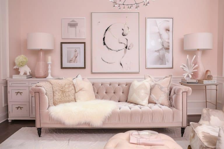
In fashion, pastel red is a color that does not demand attention but still draws interest. Wearing the color can induce feelings of springtime and femininity. Pastel red can also add that feminine touch to interior designs, mainly in living areas and bedrooms. For a minimalistic look, simply add pastel red or any pastel color as an accent color. For example, furniture in the color can add a more classic or retro feel to a space. You can also add pastel red in the form of accessories like cushions, rugs, throws, or art pieces.
How to Mix Pastel Red Paints
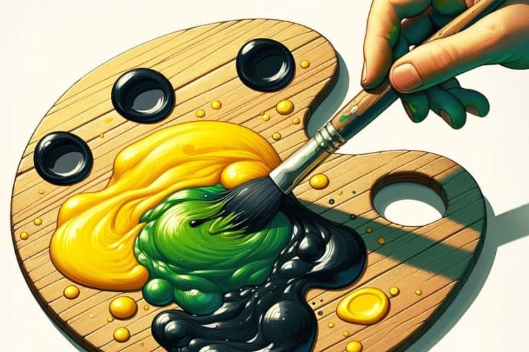
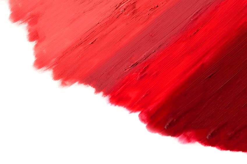
You might think creating pastel red is simply combining red and white. However, these two colors would create more of a pink color. So, instead of just using red and white, you should also include orange. Mix orange paint into a red base paint color, which will lighten the red without making it pink. To lighten the mix further, you can then add a small amount of white.
Conclusion
Now that you know pastel red is a color on its own and is not a shade of pink, you can take another look at it to see if it will be the color of choice in your next design project. Pastel red is a warm but soft shade of red that might just become your next favorite color.

Frequently Asked Questions
Is Pastel Red a Shade of Pink?
Paste red and pink are two separate colors. Pastel red is a softer and more muted shade of red with low saturation, that also has an orange undertone. Pink, on the other hand, is red with a little white put in to lighten it.
How Do You Mix Pastel Red Paint?
Pastel colors are usually made by mixing a little white into a color base. This creates a lighter shade of the original color. However, pastel red is a little different and can only be created by blending red and light orange.
What Is the Meaning of Pastel Red?
Red is a strong and intense color that is full of passion and energy. Pastel red is softer and more feminine, without the intenseness and aggressiveness of red. The muted color is gentler in appearance and has more of a connection with love and romance.
In 2005, Charlene completed her Wellness Diplomas in Therapeutic Aromatherapy and Reflexology from the International School of Reflexology and Meridian Therapy. She worked for a company offering corporate wellness programs for a couple of years, before opening up her own therapy practice. It was in 2015 that a friend, who was a digital marketer, asked her to join her company as a content creator, and this is where she found her excitement for writing.
Since joining the content writing world, she has gained a lot of experience over the years writing on a diverse selection of topics, from beauty, health, wellness, travel, and more. Due to various circumstances, she had to close her therapy practice and is now a full-time freelance writer. Being a creative person, she could not pass up the opportunity to contribute to the Art in Context team, where is was in her element, writing about a variety of art and craft topics. Contributing articles for over three years now, her knowledge in this area has grown, and she has gotten to explore her creativity and improve her research and writing skills.
Charlene Lewis has been working for artincontext.org since the relaunch in 2020. She is an experienced writer and mainly focuses on the topics of color theory, painting and drawing.
Learn more about Charlene Lewis and the Art in Context Team.
Cite this Article
Charlene, Lewis, “Pastel Red – Exploring the Pastel Red Color Palette.” Art in Context. December 24, 2022. URL: https://artincontext.org/pastel-red/
Lewis, C. (2022, 24 December). Pastel Red – Exploring the Pastel Red Color Palette. Art in Context. https://artincontext.org/pastel-red/
Lewis, Charlene. “Pastel Red – Exploring the Pastel Red Color Palette.” Art in Context, December 24, 2022. https://artincontext.org/pastel-red/.


