What Does Red and Pink Make? – Explore Warm Shades of Pink
Pink and red are very much alike, and it only takes a little experimenting to get the proper pink and red combination you are looking for. This can only help to expand your color palette, as red and pink mixed together can offer many variations. These variations can easily be used in paintings to create beautiful art pieces or in a website design to create an attractive website that appeals to viewers. So, what does red and pink make? The answer is quite simple but let us take you through the answer in a little more detail below!
What Does Red and Pink Make?
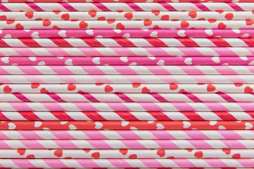
Red is a primary color, and pink is created from red by adding white. Pure red is vibrant and bold while pink is more of a gentle or subtle version of red. Pink and red combined will therefore create a slightly more interesting pinkish-red or light-red color.
| Shade | Hex Code | CMYK Color Code (%) | RGB Color Code | Color |
| Red | #ff0000 | 0, 100, 100, 0 | 255, 0, 0 | |
| Pink | #ffc0cb | 0, 25, 20, 0 | 255, 192, 203 | |
| Light Red | #ff6066 | 0, 62, 60, 0 | 255, 96, 102 |
Understanding Red and Pink As Colors
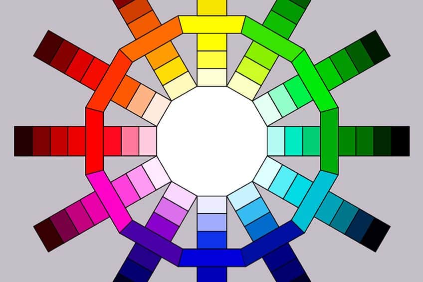
First, let us take a closer look at these colors individually. There is more than one color model to work from, and we will be discussing a few of them. However, for this section, we will stick with the traditional model that most of us learned at school. In this model, you have primary colors, which cannot be made by mixing any of the colors. These include red, yellow, and blue (RYB). When you mix these colors, you then create the secondary colors. These are green, orange, and purple.
You also have the tertiary colors, which are also known as intermediate colors which are a combination of primary and secondary colors.
All these colors are arranged on a color wheel, where you can see the position of all the colors and the potential color combinations. There are also different color terms in color theory, which help to explain the different color variations. Below you will find a few basic color terms.
- Hue: This is the term used for an actual color, many times, “color” and “hue” are used interchangeably.
- Saturation: The intensity of a color that is also often referred to as chroma. The purer a color, the more vivid and strong it is.
- Shades: When a color looks darker because black has been added.
- Tints: When a color looks lighter because white has been added.
- Tones: When gray is added to a pure color, creating a muted or duller color.
- Value: This involves the intensity of lightness as well as the darkness of a hue.
So, when you take a primary color like red and add white to it, it forms a tint of red, which can also be described as pink. Depending on how much red and white you add, it will produce a variety of shades and tints. Colors also have temperatures, which is often referred to as a color bias. Your main colors can be divided into warm and cool colors. Red is seen as a warm color, along with orange and yellow. So, pink is also a warm color.
Meaning of Red
Color meanings can vary according to cultural differences among other influences. In general, red is strong and passionate and is often seen as the color of love and romance. Red is a stimulating and energetic color that helps to motivate you to take action. It is also the color most often used to warn people of danger, as it grabs your attention. Other associations include courage, desire, and confidence.
Red also has a few negative associations, the most obvious being anger. Red can also be an aggressive and dominating color.
Meaning of Pink
Since pink is a version of red, it shares many characteristics, for example, red and pink are both colors associated with romance. The main difference is that red is more passionate, while pink is associated more with affection and friendship. It is also a color that represents compassion, and harmony and is a nurturing color. Pink also helps to evoke feelings of playfulness, comfort, hope, and warmth. Due to certain influences, pink is also seen as a feminine color.
Pink also has a few negative associations and can be seen as immature, having no confidence, and being timid.

Red and Pink Mixed Paint Colors
Experimenting with mixing colors can be a fun way to discover how colors work. The RYB color system used subtractive color mixing, meaning adding colors produces darker and darker colors until you have black. The colors you see are what is reflected, while any other color is absorbed. You can take pink paint and add some red paint, but it is easier to simply mix your own pink color. It is always best to add small amounts of red-to-white paint, until you have the shade of pink you want. You can then slowly add in more red.
To get a standard pink, you can mix 50 percent of red paint with 50 percent of white paint. This will create a lighter shade of red or a type of pastel red.
When mixing paints, it is also important to know your colors and paints. This is because when you mix colors, it can create a muddy brown color. This mainly happens when mixing all three primary colors. Even though red is a warm color, you can also get cool red paint colors that have a blue undertone, which is what can cause problems when mixed with another paint color that has yellow in it.

However, pink and red combined should not pose a problem like this, but it could affect the type of “light red” created. For example, if you use a cool red, the pink and red combined will create a cool color like raspberry pink. Also, it might be something to take note of when pairing with other colors.
Creating Lighter and Darker Shades
Once you have your basic pink, the more red you add, the more intense and the warmer the color will become. The more white you include, the softer and lighter the color will become. To make a darker version of the color, you can consider adding small amounts of black, which creates a color shade. Use it sparingly, as small amounts go a long way. For a less intense look, you can also try adding a navy blue to darken the color.
Meaning of Light Red
This color has more in common with pink than with red, as both are soft and warm versions of red. So, the pink and red combination also has associations of love, playfulness, compassion, romance, innocence, affection, and love. It is also a calmer color than red and also offers a sense of nurturing and comfort. As with pink, it can also be seen as an immature color that is not as confident as red.
So, this combination is a perfect choice for ideas or subjects that relate to love in an art or design project.
Understanding Red and Pink in Other Color Models
Next, we are going to look at another color model, one that is specifically used for graphic designs but is also found on your cellphone and television screen. It is different because, unlike with paint pigments, this model is the mixing of colors of light. This is known as the RGB color system and has different primary colors. These colors are red, green, and blue, while the secondary colors include cyan, magenta, and yellow. Below are the tertiary colors.

- Green and yellow
- Green and cyan
- Blue and cyan
- Blue and magenta
- Red and magenta
- Red and yellow
This system also uses additive color mixing, meaning that as you add color, the lighter it gets, and combining all three primary colors will form white light. The tertiary color, red-magenta, can be described as a deep pink. So, pink is made by mixing red light with magenta light, when overlapped, creates something similar to raspberry pink. If you look at the table below, you can see the RGB color codes, here you can see how much of each color is used.
The light red is an exact pink and red combination, with 100 percent red, 38 percent green, and 40 percent blue.
The raspberry pink uses 89 percent red, 31 percent green, and 60 percent blue. So, you can make a variety of similar, but different colors by changing the amount of each color used. You can also adjust things like saturation, or use different tones, tints, and shades.
| Shade | Hex Code | CMYK Color Code (%) | RGB Color Code | Color |
| Red | #ff0000 | 0, 100, 100, 0 | 255, 0, 0 | |
| Pink | #ffc0cb | 0, 25, 20, 0 | 255, 192, 203 | |
| Light Red | #ff6066 | 0, 62, 60, 0 | 255, 96, 102 | |
| Raspberry Pink | #e25098 | 0, 65, 33, 11 | 226, 80, 152 | |
| Rose Pink | #ffc0cb | 0, 25, 20, 0 | 255, 192, 203 |
Printing Color Model
When dealing with printing, you use another color model known as CMYK, which has cyan, magenta, and yellow as primary colors. The secondary colors here involve red, green, and blue, with similar tertiary colors to the RGB color model. Pink and red combined also produce the same results as the RGB color system.
Best Uses for Red and Pink in Art and Design
Whether it is red and pink mixed or a pairing of red and pink, both would look great together in designs. Both are warm and provide a positive feeling and when combined, there are many variations to choose from. In art, red draws your attention and is often a symbol of strength, love, energy, and power, but pink and red combined provide a softer look that can be used for similar or different purposes.
You can use light pink or raspberry pink to add to sunrises, sunsets, and flowers in landscape paintings, or you can use it to create a background or unusual underpainting.
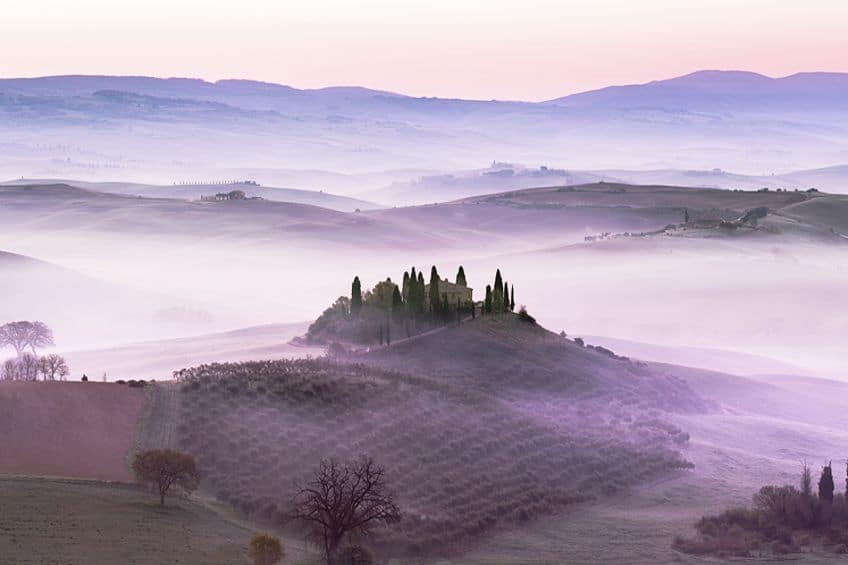
The color is also perfect for adding a bit of blush to a portrait painting. There are also many different shades of pink and red colored pencils, pens, and pastels, so you can create beautiful and unique drawings. Let us see what other uses there are for a red and pink combination.
Graphic Design and Branding
When it comes to choosing a color for your website or as a brand color, you need to consider if the shade of pink you choose is ideal for your clients. How does the color make them feel, or what message do you wish to convey? The pink and red combination can provide a variety of choices, but they all have a youthful, fun, and unique feel about them. The raspberry pink shade provides a more feminine appeal, so it could be a popular choice for girl’s toys. The color helps to communicate charm, approachability, and kindness, so it could also be a great color for beauty or health products.
You can also use the color in combination with others to create a more sophisticated look. Colors like gray, black, and darker shades of blue can produce a beautiful contrast.
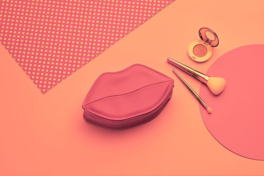
Make use of a single color for a monochromatic look and add various shades of pink together to create a playful and soft look. Brighter versions are more energetic, happy, and playful, and grab your attention, while darker shades will be more charming, contemplative, and elegant, but still striking and exciting. Whatever shade you choose, it is sure to create a distinctive and appealing look.
Fashion Design
A pink and red combination can create a more subtle and fun shade of pink like raspberry pink. This fun color can be worn as a beautiful and striking evening gown or to create a fun and elegant casual look, for example, a raspberry pink blouse with black or blue jeans. The red-pink color will always pair well with black and other neutrals like white, beige, and gray. However, you can also add more splashes of contrast with different shades of blue and green.
If you want a more stylish look, consider pairing it with gold and silver accents.

You can also use the red-pink or raspberry color as an accent. For example, shoes, handbags, or chunky jewelry can add a pop of dramatic color against white or neutral color choices. You can easily use this pink and red combination with other shades of pink to create a tonal or layered look.
Interior Design
You can even use the warm and vibrant raspberry-pink color in the home. However, if you do not want it to overwhelm the space, it is best to pair it with neutral colors for a more sophisticated and balanced look. Again, you can also choose lighter or darker versions of the color. Similar to other shades of pink, it is more romantic and feminine but can seem immature and overwhelming if overused.
The rich color can also be used with metallics like gold and silver and works wonderfully with dark woods. If you are going for a warm, cozy, and feminine look, then painting the walls can provide this.
Apply a darker shade to the walls and use lighter shades of the same color with accessories, textiles, and furniture to create a sense of depth. Also, consider patterned and plain colors to create more interest. However, if you are looking for a more subtle look, then simply add the color as an accessory.
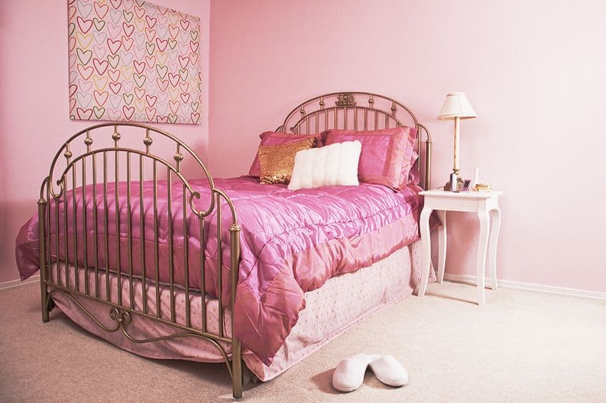
This can easily be done by including cushions, throws, drapes, and even furniture. The color can also work in every room of the home, especially if it is a neutral-based color scheme. In the bathroom, consider using the rich raspberry-pink color towels. In the kitchen, it can be the cabinets or kitchen accessories.
Pink and red combined creates a beautiful reddish-pink shade that can range from light red and raspberry pink to a softer shade of rose pink. The combination has the energy of red, combined with the soothing nature of pink, which makes it a feminine, youthful, and fun color. This might be exactly what you need if you are looking to create beautiful and unique designs.
Frequently Asked Questions
What Does Red and Pink Make?
Red is a primary hue, while pink is a softer version of red and is produced by adding white. So, red and pink mixed together should create a reddish-pink. By using different amounts of each color, you can also make a variety of different tones and shades, such as raspberry pink or rose pink.
Can You Use Red and Pink Together?
Yes, today this color combination is quite popular. When red and pink are paired, even though they are analogous colors, they do form a contrast that can be a bit overpowering. However, if used properly, it can also create a unique and striking look.
What Colors Go Well With Raspberry Pink?
The best colors to pair with raspberry pink will always be neutrals like white, black, beige, and gray. However, shades of green like teal, and various shades of blue will also go well with raspberry pink. Additionally, other pastel colors and various shades of pink will also go nicely with raspberry pink.
In 2005, Charlene completed her Wellness Diplomas in Therapeutic Aromatherapy and Reflexology from the International School of Reflexology and Meridian Therapy. She worked for a company offering corporate wellness programs for a couple of years, before opening up her own therapy practice. It was in 2015 that a friend, who was a digital marketer, asked her to join her company as a content creator, and this is where she found her excitement for writing.
Since joining the content writing world, she has gained a lot of experience over the years writing on a diverse selection of topics, from beauty, health, wellness, travel, and more. Due to various circumstances, she had to close her therapy practice and is now a full-time freelance writer. Being a creative person, she could not pass up the opportunity to contribute to the Art in Context team, where is was in her element, writing about a variety of art and craft topics. Contributing articles for over three years now, her knowledge in this area has grown, and she has gotten to explore her creativity and improve her research and writing skills.
Charlene Lewis has been working for artincontext.org since the relaunch in 2020. She is an experienced writer and mainly focuses on the topics of color theory, painting and drawing.
Learn more about Charlene Lewis and the Art in Context Team.
Cite this Article
Charlene, Lewis, “What Does Red and Pink Make? – Explore Warm Shades of Pink.” Art in Context. October 4, 2023. URL: https://artincontext.org/what-does-red-and-pink-make/
Lewis, C. (2023, 4 October). What Does Red and Pink Make? – Explore Warm Shades of Pink. Art in Context. https://artincontext.org/what-does-red-and-pink-make/
Lewis, Charlene. “What Does Red and Pink Make? – Explore Warm Shades of Pink.” Art in Context, October 4, 2023. https://artincontext.org/what-does-red-and-pink-make/.


