Monochromatic Art – A Look at Monochrome Art Throughout History
Colors carry significant meaning. In the hands of monochromatic artists, color can affect viewers and even alter the course of history. It’s no wonder then, that some artists have chosen to explore the possibilities of color through limitation. By focusing on one particular color, artists have opened portals into the depths of perception, either to point towards spirituality or nothingness.
Monochromatic Art and the Burden of Meaning
Monochromatic artwork limits itself to one color, including either white or black to manipulate tone. The monochromatic definition in art varies but the earliest images ever made on earth were of course monochrome as prehistoric paintings predated pigment technology.
Curiously, long after humans had developed a kaleidoscopic spectrum of colors, many artists continued to pick just one.
The History of Monochromatic Painting in Western Art
In the 12th century, an early monastic order known as the Cistercians began embracing a particular aesthetic prescribed by the head of their order, Bernard of Clairvaux. In 1134, he compiled one of the first legal documents on aesthetics stipulating that all decoration in his Cistercian monasteries would be done only in black and white.
Bernard of Clairvaux felt that color was superfluous and over-stimulated the senses. His monastery was intended as a tranquil space for monks to focus on prayer and meditation. For this reason, he ensured that the stained glass and illuminated manuscripts of the monastery were painted strictly in monochrome.
While the formal concept of monochrome painting was established for religious or monastic purposes, it caught on and eventually became a desirable art form. Aristocrats and nobles of the French royal family and the Burgundian families, clamored to be the first to commission works of art painted only in black and white.
Domenico Ghirlandaio’s St. Matthew and an Angel (ca. 1477) is one of the earliest known instances of black and white painting in Western art. It was made under the tutelage of Andrea Delverocchio who was the master of many Italian Renaissance artists including Leonardo Da Vinci. At least 16 of these studies survive and demonstrate how artists in the Renaissance used monochrome painting as an exploratory learning device.
The market and appreciation for monochrome paintings as finished products grew exponentially by the 1600s. The French gave this popular new art form the name “Grisaille”, derived from ‘gris’, the French word for gray. This monochromatic definition in art also referred to underpaintings or preliminary paintings as artists continued to use monochrome as a means of improving their technique, since painting in black and white altered the formal and spatial perception of an image.
Master Neo-Classical painter Jean Auguste Dominque Ingres made six different versions of his famous Odalisque (1814). The original color version of Odalisque was followed by the monochrome version Odalisque in Grisaille (1824-1834). Having begun the Grisaille version a decade later, he kept it in his studio for many years. This reduced version had been freed from many of the details of the first Odalisque. In this way, she became somewhat abstracted which revealed new facets of the image.
Whistler and the White Cube
Whilst many artists continue to innovate and indulge in figurative monochromatic painting, it was the Modernists who took Grisaille’s abstractive qualities to the next level. Painters had encountered an inevitable crisis about their ability to develop a modern language for painting.
In the rapidly changing modern world, artists chose to restrict their color palette in order to respond to the aesthetics of new media.
White has often been the visual cue for virtue, innocence, and purity. However, the history of art reveals sinister sides to this exalted color. Throughout history, white in art has carried hauntingly divisive and often oppressive ideologies. From the British Museum’s whitening of the once multicolored ancient Greek sculptures beginning on the 25th of September 1938, to Immanuel Kant’s theories of idyllic beauty in his Critique of Judgment (1724–1804).
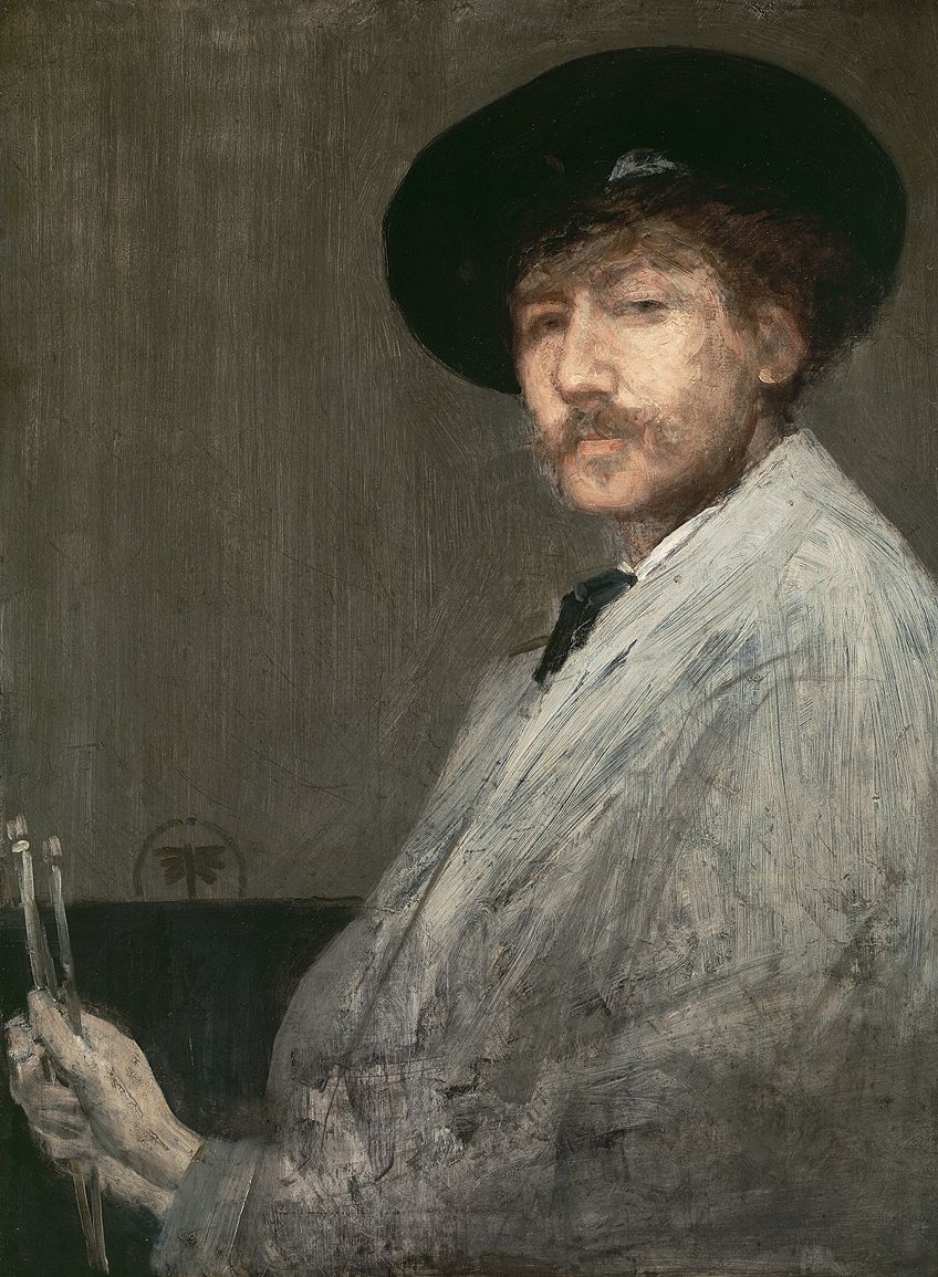
In 1883, Britain-based American artist J.M. Whistler followed suit with his exhibition A Masterpiece of Mischief. In it, he presented new pictures that he had produced during a visit to Venice. Whistler was well known for his exquisite paintings of the neo-Romantic era and his obsession with white.
His new works were white, monochrome, and mounted in white frames which Whistler himself had designed and hung on walls that were also white. The exhibition pioneered the white gallery space, which is now ubiquitous in the art world.
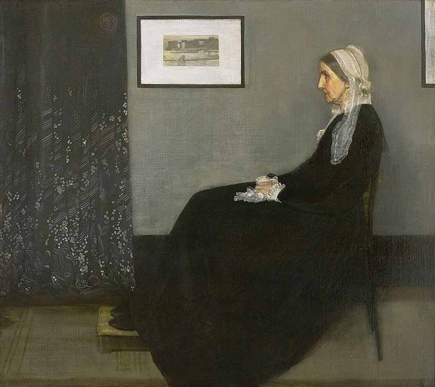
With his exhibition, Whistler solidified white as the austere and exclusive color of the artistic elite. The White Cube is elegant and pristine, but also sterile and unwelcoming. Nonetheless, the 20th-century modern art world embraced the aesthetic with monochromatic art examples of impenetrable white works and spaces that have changed the course of art history.
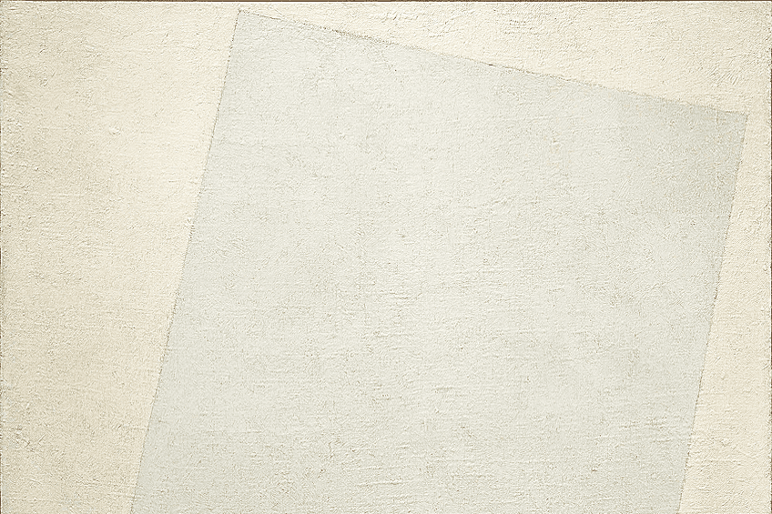
Kazimir Malevich’s White Suprematist Cross (1920-1921) came soon after the October Revolution.
The broad white cross on a white background taunting a world that was far from sterile and pure. Similarly, Barnett Newman’s Cathedra (1951) and Stations of the Cross (1958-66) surrender themselves to their own whiteness and the superior forces of nature and physics. The ephemeral clouds of color and varied fields became pure abstraction for the sake of abstraction.
Kazimir Malevich and the Black Square (1915)
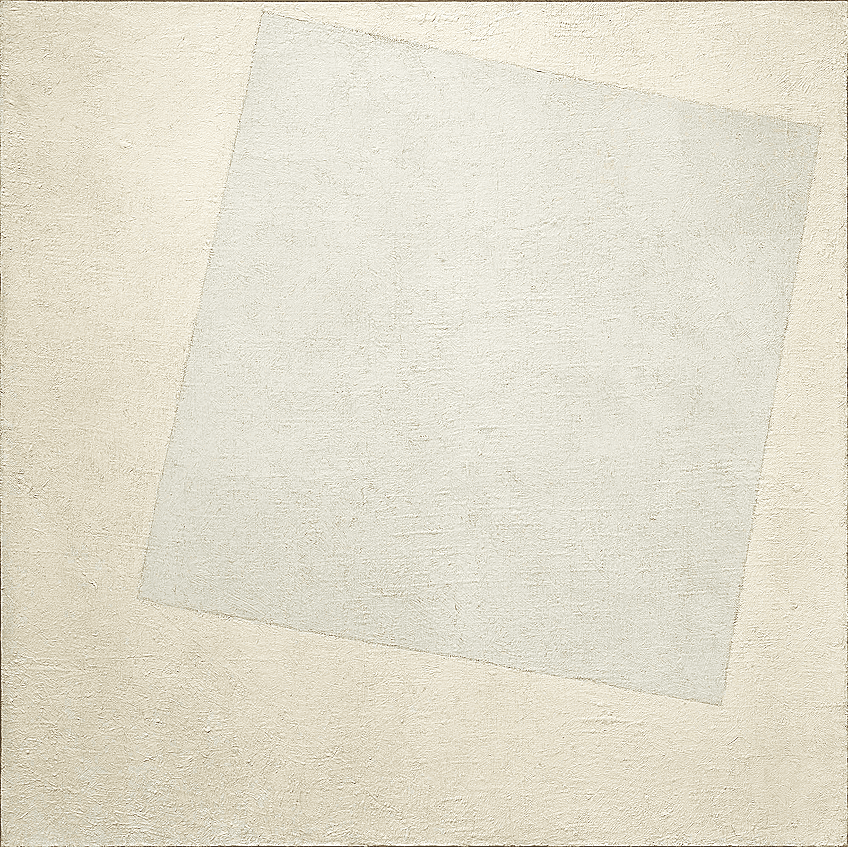
Suprematism was an influential Russian art movement that occurred from 1913 to the late 1920s. According to its founder Kazimir Malevich, who is considered the first Russian artist to create non-representational works of art, Suprematism represented “the supremacy of pure feeling or perception in the pictorial arts.”
With this genre, Malevich wanted to “free the painting from the burden of the object”. In the absence of subject matter, the viewer could focus on the monochromatic artwork’s formal issues such as shape, space, and color.
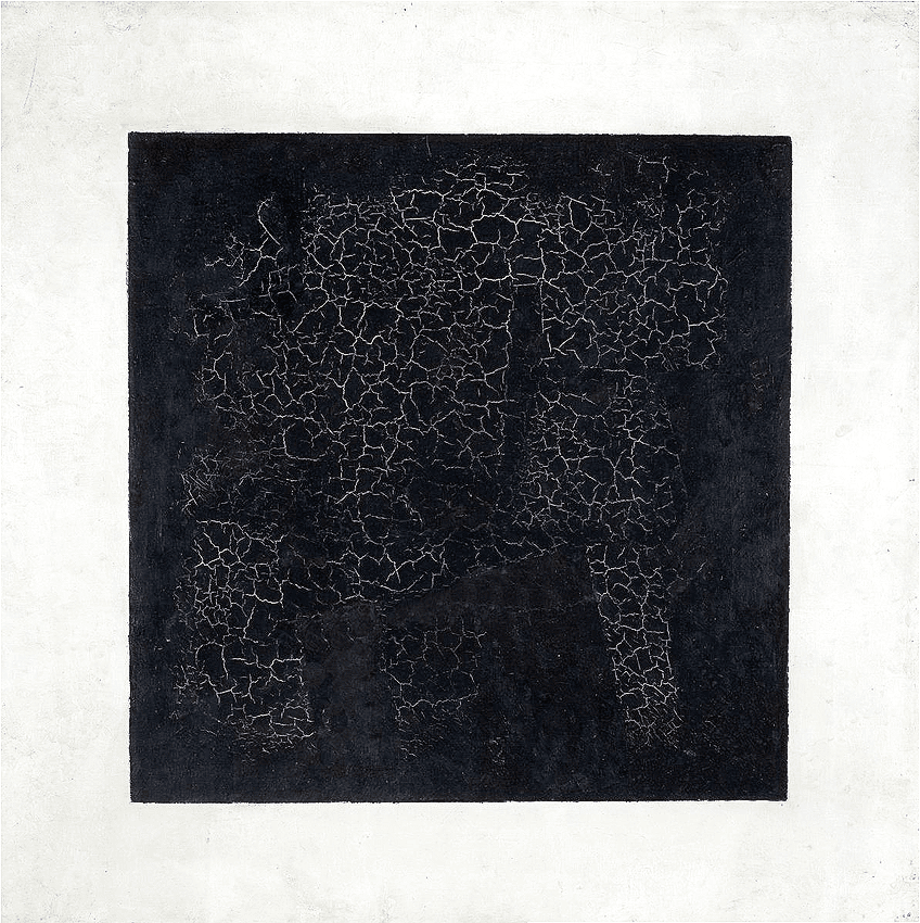
Malevich’s Black Square (c. 1915) was made in four versions and exhibited at the last group exhibition of Futurist painting in St Petersburg from 17 December 1915 to 17 January 1916. He hung his Black Square high up in the corner of the room and described it as “an icon for my time” referencing the orthodox tradition of hanging icons. He claimed that Black Square was a true realist painting because it was an actual black square, whereas most artworks were illusions of other things.
But Malevich’s Black Square turned out to have been playing a trick of its own. After analyzing the painting under x-ray, scientists discovered that underneath the black paint was a layer of text that reads: ‘Negroes battling in a cave’.
This was either a tribute to the 1897 work by French artist Alphonse Allais, which was also a black square entitled: ‘Negroes Fighting in a Cellar at Night’, or Paul Bilhaud’s Combat de Nègres dans un tunnel or Negroes fight in a tunnel (1882), thought to be the first of the black squares shown at the 1882 Incoherent Arts’ exhibition in Paris.
International Klein Blue
Yves Klein was an artist who had always been fascinated with freedom. Born in 1928 to a well-do-to-French family, his artistic practice became a way for him to explore what lay beyond the material world. At first, he was consumed by making monochrome art each of single blocks of various shades of red, dimmer red, yellow, brighter yellow, and so on.
But once he explored the color blue, Yves Klein fully devoted himself to paintings that did not just appear blue, but were also about blue.

Klein went on to invent his own hue of blue. He dedicated his series of identical paintings to blue. He endeavored to create an entire world based on his new color. He wanted it to emulate the blue of the sea, of the sky, and infinity. He christened his new paint “International Klein Blue”.
His monochrome paintings involved a meticulous treatment of the canvas. These were very thin weaved cotton skrim which was coated in milk after which the paint was evenly applied. The resultant textures on the canvasses are uniform yet uniquely intricate.
The paintings are so abstracted, they seem to have reverted back to nature. Yves Klein hoped the viewer would negate the need for meaning and simply experience the painting as they would experience a bright blue sky, which was why Klein called his pictures “open windows to freedom”.
Jackson Pollock and the Aims of the Age
While movements such as Group Zero and DeStijl would develop long after 1930s totalitarian communist Russia and the rise of Fascism in the West, by the end of the second world war in 1945 Abstraction would be brought to New York.
Artists sought to interpret the changing world around them through cosmic visions and spirituality. An emphasis was placed on individualistic expression that explored what freedom could be in these new post-war contexts. Abstract Expressionism, which emerged in the 1940s and 1950s, had an organic and psychological premise like the Expressionism style before it.
Jackson Pollock is one of the most well-known Abstract Expressionist painters. His technique, which he called ‘action painting’, consisted of splashing, throwing, and pouring paint onto the canvas which was often placed on the floor and stepped on.
His painting Number 32 (1950) consists of fluid strokes of liquified paint in black only. The painting was made in his New York state studio on a rolled-out canvas on the wooden floor. The painting read as a painting and nothing else because the painter forced the viewer to see the paint for what it was, giving more meaning to the materials and how they were treated. American critic and Jackson Pollock advocate Clement Greenberg suggested that Modernism was about using a discipline to criticize itself to harness its quintessential qualities.
Although the painting was intended to express freedom, it also exposes a sense of structure. The lighter lines are balanced by the bigger blobs and contribute to the visual harmony of the surface of the painting.
Pollock used a range of textures to create the composition by contrasting shiny areas of paint with dried, lumpy, and stained parts. His seemingly random alcoholic outputs often perplexed the public who were searching for meaning. He explained that he was painting “the aims of the age” and that he did not need to imitate nature because “I am nature”.
Post-Painterly Abstraction
By the end of the 1950s, art had left the realm of objecthood altogether. Performance, Pop, and Conceptual art was en vogue, and the Abstract Expressionist gestural dynamism of Pollock, Willem De Kooning, and Robert Motherwell was old news.
Once again, painting had to invent a new trick in order to keep up. The solution was once again related to restricted color palettes, but this time with a total abandonment of gesture.
Young conceptual artists like Joseph Kosuth would criticize Modernism for its self-indulgence challenging it to explore Conceptualism. Like classical painters, monochromatic artists continued to learn more about painting by reducing their palette. This resulted in further abstraction which could emphasize the painting’s objecthood to justify its form in conceptual terms.
Morris Louis was one of Greenberg’s selections of post-Painterly painters. His painting 7 Bronze (1958) is an example of the artist withholding the gesture beyond the implication of material. The artist simply applied various colors at the top of the canvas and let gravity do the rest. This resulted in a fluid downward stream of a muddy ochre color. There are no brush strokes and the artist has simply allowed the painting to become itself.
Post-Painterly Abstraction was a way of creating intentionally impersonal artworks in response to Abstract Expressionism. In order to limit expression, these artists experimented with limiting color.
The monochromatic, sometimes duo-chromatic paintings were often characterized by linear, geometric, arbitrary techniques. Clement Greenberg’s 1964 MoMA exhibition of Post-Painterly Abstraction, influenced what would come to be called Hard-Edge painting and Minimalism.
Minimalism and Frank Stella
Because it continued to look into itself, monochrome art retained the rawness of self-revelation and replication. Frank Stella who is known for his monochrome paintings famously said simply that a painting is a flat surface with paint on it and that “what you see is what you see”.
His paintings accentuate the sculptural form of the canvas and continue the long tradition of painters using painting to teach themselves more about painting.
Frank Stella is one of the first artists who can be identified as a Minimalist. Minimalism was at its height in the 1960s and 70s. It was a synthesis of the object-driven inclinations of Pop Art and the hard-edge inclinations of the Post-Painterly Abstractionists. Stella’s series of paintings, known as “The Black Paintings”, were made from cheap commercial paint and brushes.
In an attempt to explore its core, Stella would paint stripes onto a canvas and call it a day.
As in his painting Die Fahne Hoch (1959), Stella used the stretched canvas and its stretcher bars, as his starting point in the application of his signature strips of black paint. All of the cues in the painting, down to the width of the lines, were being taken from the structure of the canvas itself. In this way, Stella reinforced the objecthood of the painting. Yet again, the simplicity was illusive. Stella’s title, Die Fahne Hoch, translates as “Raise the Flag”, the German title of a Nazi anthem.
The Rothko Chapel (1965 – 1966)
While Conceptual and Pop artists attempted to separate art from the object, Abstract Expressionists and color field painters continued exploring painting through monochromatism. Rothko went a step further than Pollock and Stella by simultaneously conducting and concealing artistic gestures. His paintings highlighted the experience of the surface of the canvas through the artist’s light touch. Rothko’s paintings retain objecthood while offering a sense of the sublime.
“The Rothko Chapel” in Houston, Texas was originally commissioned as a Catholic Chapel, but it soon became a non-denominational Chapel, and could even operate as an atheist or agnostic Chapel.
The Chapel houses three large monochromatic purple-ish color field paintings. Their lack of religious imagery exposes a crisis in the language of traditional religious painting. The paintings make us think of Malevich and question whether something has been removed or obscured.
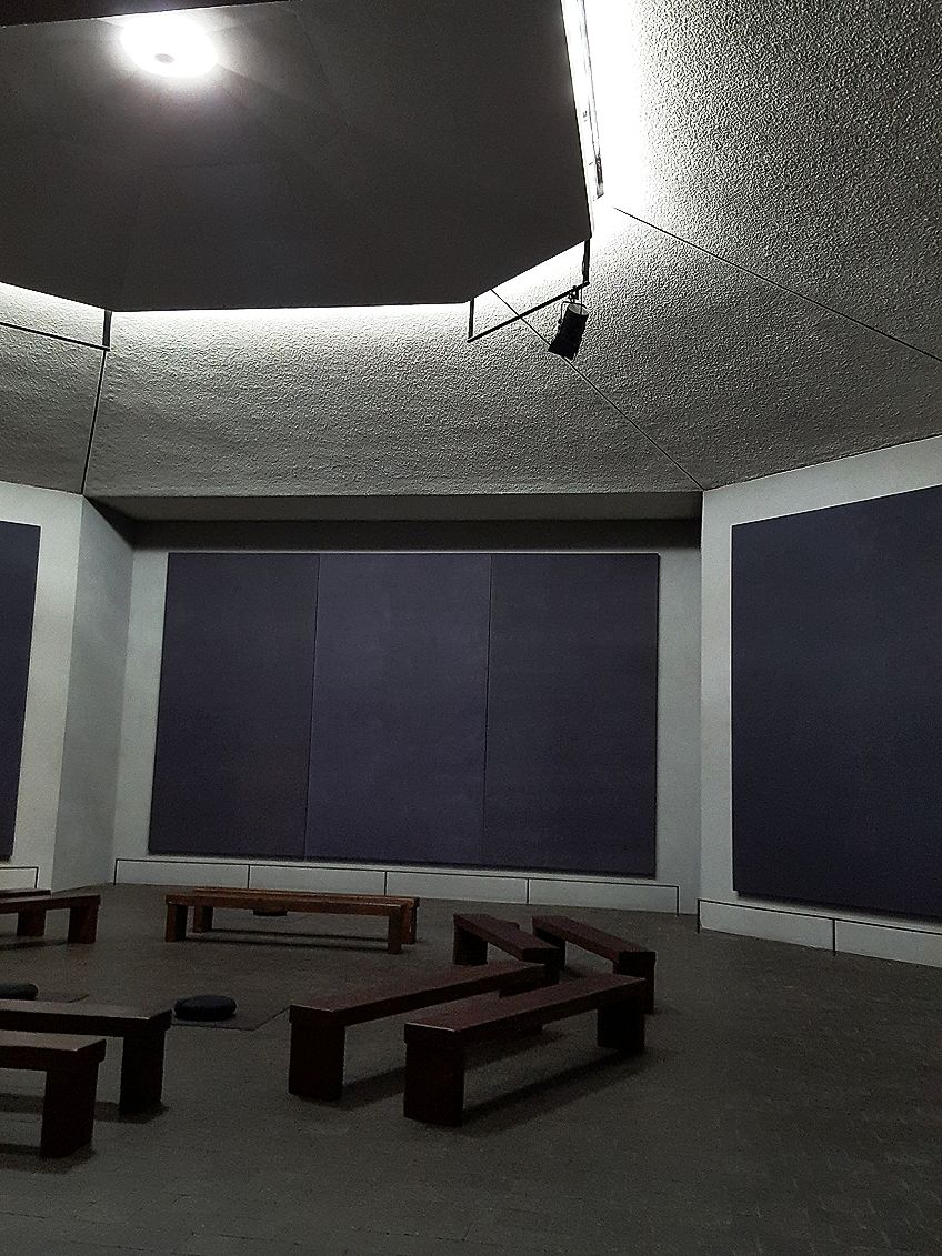
But the blackness is once again an illusion. The canvases actually consist of many layers of color. The light that pours in from the Chapel skylight makes the colors oscillate between purple, brown, and black. That the light makes the paintings appear different depending on the time of day has nothing to do with the paintings, which themselves stay the same. These paintings are allusions to God’s omnipresence, despite our vision of Him varying based on our vantage point.
The octagonal Chapel seems to have been influenced by Rothko’s Jewish upbringing. Hasidic Jews are not permitted to use God’s name. Orthodox Jews who do write the name of God, scratch or conceal it by writing “G-d”. The figurelessness and colorlessness of these paintings do two things: Rothko’s monochromatic paintings confronted spiritual ideas while at the same time acknowledging their unknowability.
For Rothko, painting was a spiritual practice as it had been for Pollock and many other monochromatic painters. His restrained use of color was a portal to the spiritual world.
Standing in the presence of these Rothko’s allows us to enter a state of meditation. While the earth moves around the sun, the light enters the Chapel from the ceiling, ebbing and flowing revealing hidden facets of the monumental paintings.
The Future of Monochromatic Art
Monochromatic art can be seen as the foundation of all art. Instead of succumbing to the passage of time, it continually resurrects itself and responds to new crises in painting, with itself. Monochromatic art continually offers us opportunities to consider what art is for and what it is capable of. It has proven itself as painting’s best response to advances in new media.
By stripping away the smoke and mirrors of technicolor realism, monochromatic art hints instead at what the art object and the artist’s intervention upon it actually means.
Of course, as photography has replaced many traditional media and monopolized monochromatic images, some artists continue to use painting as a response. Gerard Richter’s haunting paintings employ a hyperrealist blurring effect, which positions them somewhere between paintings and photographs. In a more abstracted painting Gray Mirror (1982), Richter simply painted a sheet of glass gray which transformed the glass into a mirror essentially harnessing an image of the viewer.
Even in the fast-paced world of digital and social media, monochromatic art keeps abreast by reinventing its age-old traditions. The Post-Minimalist prioritization of the artistic process and what we could now call the user experience has facilitated a shift from a focus on the object to a focus on engagement. Yayoi Kusama’s Infinity Net Series (1959-Present) at first seems like a simple post-Minimalist multitude of dots, but it has since become a viral sensation.
Thousands of people have snapped that coveted selfie in this artist’s made-up monochromatic environments. Kusama’s enigmatic creative process produces anything from dizzying monochromatic dots or swirls to monochromatic three-dimensional objects covered in soft protrusions. These works have taken the internet by storm and will surely inspire the next generation of artists to defy limitations.
Take a look at our monochrome art webstory here!
Frequently Asked Questions
Did Pablo Picasso Make Monochromatic Art?
Yes. The Blue Period is often named as part of Picasso’s foray into monochromatism. While it is true that many of the paintings were made in variations of blue, they often included other colors to balance the blueness. Monochromatic art examples can be seen in Picasso’s Cubist period. One of the best-known examples is Guernica (1935) which shares an almost identical technique with Picasso’s version of Las Meninas (1957) which was one of 44 paintings he made as homages to Diego Velasquez’s Las Meninas, some of which are in color, many of which are in black and white.
Is Monochromatic Art the Same as Minimalism?
No. It is possible to make minimalist art that is not monochromatic and it is possible to make monochromatic art that is not minimalistic. But like monochromatic art, Minimalism demands to be appreciated for its formal qualities and not its subject matter. It could be argued that Minimalism was a sculptural response to post-Painterly abstraction. Key artists like Donald Judd, Tony Smith, Sol Lewitt, Robert Morris, and Carl Andre took it upon themselves to emphasize the objecthood of art not through painting, but through objects themselves.
What Is Monochrome?
Monochrome basically means something is composed of one color. The monochromatic definition in art implies that the artwork uses one color only, often including white or black to manipulate the tone of the image.
What Does Duo-Tone Mean in Art?
Duo-tone artworks consist of two colors stead of one. Andy Warhol was known for black and red duo-tone.
Heidi Sincuba was the Head of Painting at Rhodes University from 2017 to 2020 and part of the first Artist Run Practice and Theory course at Konstfack in Stockholm, 2021. They completed their BFA at Artez Arnhem in the Netherlands, MFA at Goldsmiths University of London, and are currently a Ph.D. candidate at the University of Cape Town.
Heidi Sincuba’s own practice explores fugitivity through painting, drawing, text, textiles, performance, and installation. This praxis is founded on a conceptual intersection of biomythographic experimentation, existential automatism, and African ancestral knowledge systems. These methodologies of multiplicity result in a fluid and speculative aesthetic, continually manifesting and metamorphosing its material conditions.
Learn more about the Art in Context Team.
Cite this Article
Thembeka Heidi, Sincuba, “Monochromatic Art – A Look at Monochrome Art Throughout History.” Art in Context. March 22, 2022. URL: https://artincontext.org/monochromatic-art/
Sincuba, T. (2022, 22 March). Monochromatic Art – A Look at Monochrome Art Throughout History. Art in Context. https://artincontext.org/monochromatic-art/
Sincuba, Thembeka Heidi. “Monochromatic Art – A Look at Monochrome Art Throughout History.” Art in Context, March 22, 2022. https://artincontext.org/monochromatic-art/.


