Ochre Color – How to Create and Use an Ochre Color Palette
Some colors and color pigments have been used for countless years. The well-known colors are the earth tones like the ochre color, which comes in quite a few different shades. To get a little more insight into the ochre color, let us take a closer look.
Table of Contents
What Color Is Ochre?
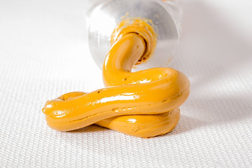
Various tones of red, brown, and yellow are produced by a mixture of clay and sand that contain iron oxide, also known as ferric oxide. A warm and earthy color, ochre can be described as being a yellowish-brown color.
However, some variants contain more hematite, which is chemically similar to what we know as rust, and this has more of a reddish undertone and is known as red ochre.
The naturally occurring yellow ochre contains hydrated iron oxide, when heated, water evaporates and produces the red ochre color. There are also various other shades of ochre that range from having more of a brown or golden undertone.
| Ochre Shade | Ochre Hex Code | CMYK Ochre Color Code (%) | RGB Ochre Color Code | Ochre Color |
| Ochre | #cc7722 | 0, 42, 83, 20 | 204, 119, 34 |
Ochre Color: A Brief History
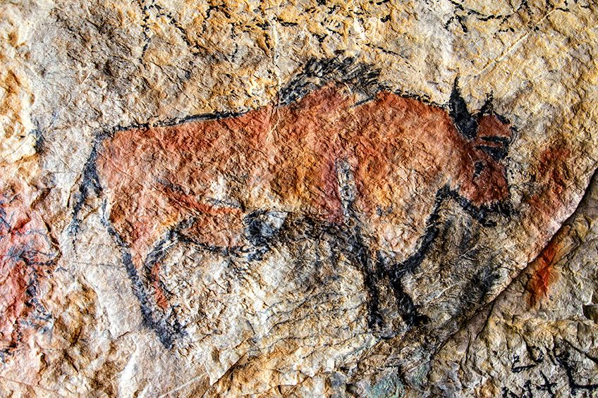
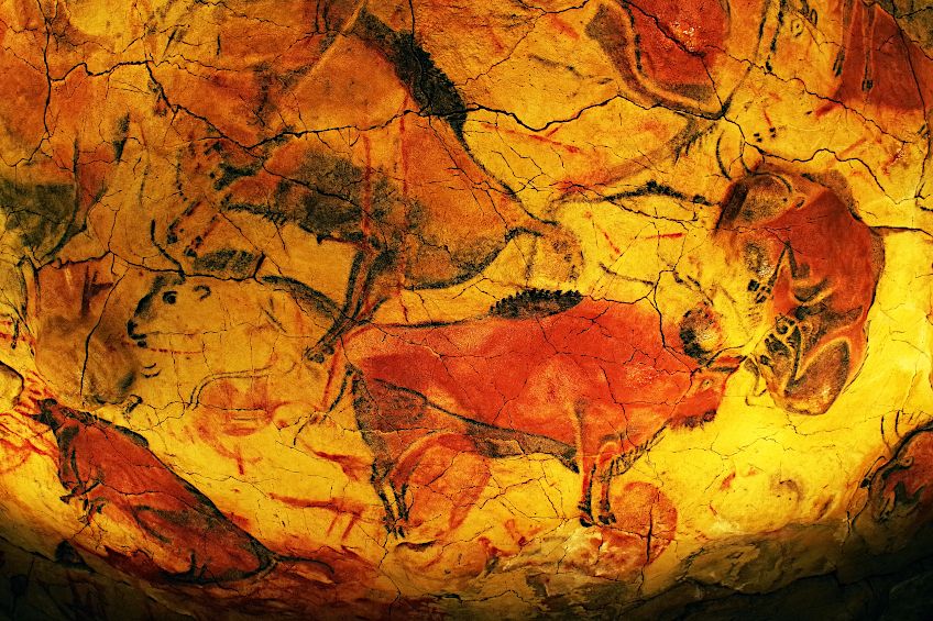
Ochre, one of the earliest pigments, has been found in ancient cave drawings and was originally derived from clay rich in minerals like umber, sienna, and ochre.
In the Blombos Cave of Cape Town, archaeologists discovered a primitive paint kit with tools for grinding ochre and bones into powder, an early form of paint used on skin, objects, and cave walls.
This pigment features prominently in cave paintings in Spain and France, dating back thousands of years.
The use of ochre extends to Australian Aboriginal art and African art, with Australia honoring Indigenous artists with the Red Ochre Award annually. Ancient Egyptians valued ochre as a symbol of life and eternity, incorporating it into cosmetics for rouge and lip gloss, as well as in tomb paintings.
In Newfoundland, Canada, the indigenous Beothuk people, once called “Red Indians” by early Europeans, adorned their bodies with red ochre grease. This practice echoes in many African cultures as well.
During the classical era, the prime source of red ochre was from the Pontine City of Sinope in Turkey, as noted by Pliny the Elder. This sought-after pigment was strictly controlled, expensive, and sealed for authenticity.
Romans utilized yellow ochre in their paintings to imitate gold, depict skin tones, and as a backdrop in wall paintings, with many Pompeii murals featuring it.
In the Renaissance, artists frequently used red ochre in various mediums including oil paintings, frescos, and tempera. Its compatibility with other colors allowed for a wide range of natural shades.
Rembrandt, for instance, incorporated ochre tones in his “Self Portrait” (1659), while Vermeer used it to tone backgrounds, as seen in “The Little Street” (1657–1658). Additionally, red ochre was a favored choice for the plaster walls of Tuscan buildings.
Today, many ochre pigments are made from synthetic iron oxide and can be found in oil paints and acrylic paint colors.
Meaning of the Ochre Color
We have already established that ochre is a warm and earthy color. Many believe that the ochre color represents vitality, life, fertility, and eternity. In cultures around the world, ochre was often used in rituals. Many cultures also associated the red ochre with blood, which symbolized the blood of prey during the hunt.
The yellow ochre has been compared to the golden glow of the sun and light, and so is vibrant and warm. The color has then been associated with many positive meanings like optimism, but it also has negative associations like cowardice. The color is attention-grabbing, but if you use it too much in anything it can become abrasive and thus it can cause irritation and fatigue.
Shades of Ochre
As with all colors, you have a large variety of different hues and tones. The various shades of ochre can range from a light brownish-yellow and darker brown to having a red, golden, or even purplish undertone. When it comes to authentic, real pigments, the color is present because of the iron oxide. However, you can find many more shades of ochre online, where there are programs, and you can make the slightest adjustments to achieve the color you want.
Below are a few shades of ochre, along with the color ochre hex codes, which are what you can use to identify a color online.
Yellow Ochre Color
The yellow ochre color is a natural pigment that occurs in nature and is made from clay, a hydrated type of iron oxide, which is called limonite, and other materials. The main color producing yellow ochre is limonite, which itself consists of several iron-containing minerals. The name originates from the Greek word ochros, which means yellow or pale yellow.
The yellow ochre has been used over the years as a pigment and dye, but today is also used in various other applications. For example, it is used as a cement additive and can also be used as a catalyst in various processes, which means it helps to increase the rate of a chemical reaction.
| Ochre Shade | Ochre Hex Code | CMYK Ochre Color Code (%) | RGB Ochre Color Code | Ochre Color |
| Yellow Ochre | #edb525 | 0, 24, 84, 7 | 237, 181, 37 |
Red Ochre Color
This red pigment was seen as a symbol of life by many ancient cultures and was often used as a coloring agent in Africa and other cultures. The main element that gives you the red color is made from hematite, which is formed from yellow ochre during natural weathering processes. The redder the pigment, the more hematite present. This can be accelerated in warmer and more tropical climates, which is why it can be more commonly found in coastal regions. Many cultures used the red ochre on their faces and body, for various purposes.
However, the red ochre is also ideal for protecting the skin from the sun and it can act as an insect repellent.
| Ochre Shade | Ochre Hex Code | CMYK Ochre Color Code (%) | RGB Ochre Color Code | Ochre Color |
| Red Ochre | #913831 | 0, 61, 66, 43 | 145, 56, 49 |
Brown Ochre Color
Brown ochre is derived similarly to the above variations as they all belong to the same natural ochre group. The type and intensity of color depend on the mineral content and degree of hydration and oxidation of the iron oxides present. So, when looking at brown ochre, it is dependent on how much manganese dioxide is present and is formed by partly hydrated iron oxide. The web color below, which is mentioned as a brown ochre, can be described as a shade of brown or dark orange.
| Ochre Shade | Ochre Hex Code | CMYK Ochre Color Code (%) | RGB Ochre Color Code | Ochre Color |
| Brown Ochre | #99632b | 0, 35, 72, 40 | 153, 99, 43 |

Burnt Ochre Color
The burnt ochre has more of a moderate red, whereas the red ochre is a dark variation. The burnt ochre is a mixture of orange and red and is considered to be more a part of the orange color family but closer to the red side of pure orange.
| Ochre Shade | Ochre Hex Code | CMYK Ochre Color Code (%) | RGB Ochre Color Code | Ochre Color |
| Burnt Ochre | #bb4f35 | 0, 58, 72, 27 | 187, 79, 53 |
Colors That Go With Ochre
All the ochre variations provide some beautiful natural earth tones. These colors usually work well with many colors, but might work best with colors like cool grays, purples, shades of red like burgundy, any shade of blue like teal, as well as other neutral and natural colors. It also depends on the shade of ochre; as we have learned, you can get some that are more yellow, red, or brown.
Whatever color you choose, you need to have a basic understanding of color theory to figure out the best colors that go with ochre.
You should familiarize yourself with the color wheel and how colors relate to one another. To create an ochre color palette, you will also need to learn about the various color schemes. Here are three of the more basic color ochre color palettes available. The table represents an example of your complementary colors for the ochre color.
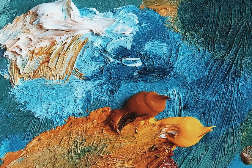
- Complementary colors: When looking at a color wheel, these colors are positioned on the opposite side of your chosen color.
- Monochromatic colors: Here you will take a single color like ochre and then use variations of this same color, creating various tints, shades, and tones.
- Analogous Colors: This is a grouping of colors that are found close together on the color wheel.
| Shade | Hex Code | CMYK Color Code (%) | RGB Color Code | Color |
| Ochre | #cc7722 | 0, 42, 83, 20 | 204, 119, 34 | |
| Strong Blue | #2277cc | 83, 42, 0, 20 | 34, 119, 204 |
How to Make Ochre Color With Acrylics
Ochre pigments are non-toxic and are used to make oil paints that tend to dry more quickly. The pigments also cover surface areas quite effectively. You can still get natural ochre pigments today, but the paints can differ due to the various pigments obtained from different areas. So, you are never assured of the exact color each time.
This is why there are also synthetic pigment options available, known as iron oxides, which offer no variations in color, so you are guaranteed the same color every time. The natural pigment paints can be identified by the color index name PY-43 found on the label.
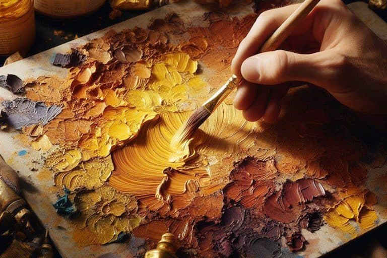
Artists that enjoy Plein air painting use the yellow ochre as a stain or background on the canvas.
This creates the perfect landscape color as it is already a natural color in nature. Ochre was also often used to paint flesh tones, and when combined with lead-white, you can produce a range of skin tones. However, how to make ochre colors yourself is the next question.
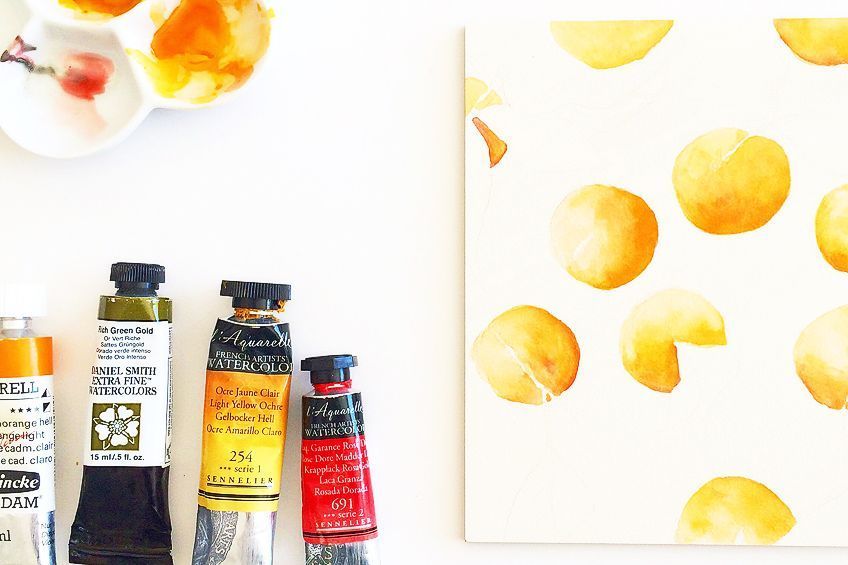
To make yellow ochre, you should have a yellow base like cadmium yellow, blue and red. Place some yellow onto your palette and then add a little red to help make the yellow warmer and a little darker. Then add a small amount of blue to darken it more and to desaturate the color. You can experiment with further adjustments until you have the color you need.
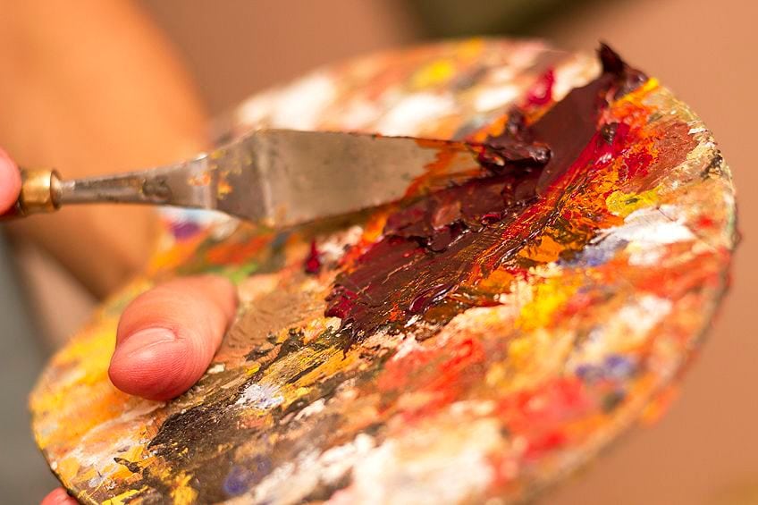
Another way to produce the ochre color is to use orange, green, and white. Take a tiny amount of each color and place it onto the palette separately. Take a small amount of orange and place it into a new spot, and then add a little green. This should make a shade of brown. You can then add a little white, and a little more orange. Again, experiment with the various paint colors until you reach a resemblance to yellow ochre.
Ochre Color Palettes for Interior Designs
Being a part of the group of earth colors along with sienna and umber, earth colors are quite versatile when used in all types of design. Yellow ochre is a more subdued color and less brilliant than yellow. The color followed a trend in the 1970s, along with colors like avocado green. The color has been used even further back, where ochre walls still line streets in Tuscany.
The rich color offers a cozy, yet sophisticated atmosphere, no matter what room you use it in, or whether it is a large or small space.
You will be adding a Tuscan appeal to your home if you use the ochre color on the walls. You can also bring in the ochre color by using accessories, for example, throw pillows or a plush rug. The ochre color is also ideal for heavy fabrics like brocade and velvet. You can also add in a piece of furniture, for example, a small cozy chair for the bedroom or a sofa for the living room area.
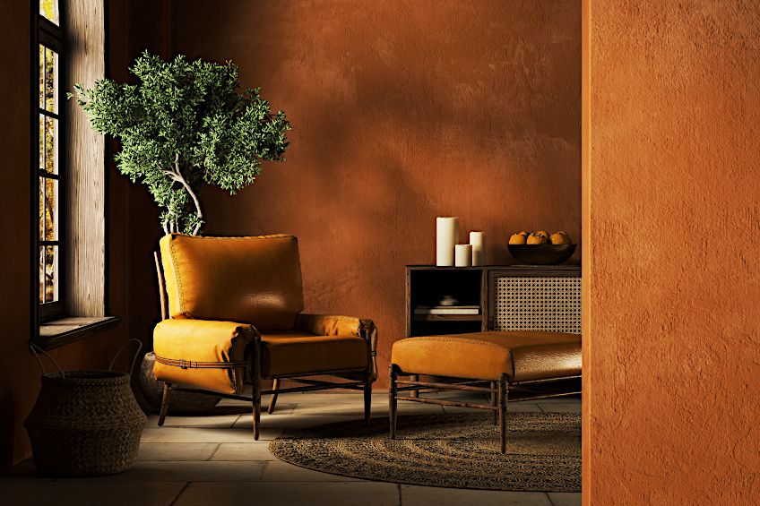
The more popular colors that go with ochre are gray and white, which form part of your neutral colors. Lighter gray colors will make the ochre color stand out more, while darker grays will subdue it. All shades of brown and black can also work with ochre. As mentioned, any shade of blue, but particularly teal is a great match for ochre. Shades of purple are particularly striking when used with yellow ochre. Always remember, to create an ochre color palette, it is best to follow the 60:30:10 rule. Select the main color and then incorporate the other two colors as your accent colors.
Ochre has been used for millennia as a pigment to paint with, whether it was for cave walls or on the body. Eventually, the ochre color became popular in design and can now often be found in various interior designs. Looking for an intriguing earth tone, the ochre color might just be what you are looking for.
Frequently Asked Questions
What Color Is Ochre?
The most common ochre color is a yellowish-brown color, however, there are quite a few shades of ochre. Depending on the mineral content and location, you can get various ochre tones from yellow to red, and brown, and some even have a purplish undertone.
What Colors Go With Ochre?
Ochre is considered an earth tone and can come in various tones, tints, and shades. The most popular color that goes with ochre is gray. However, all other neutral colors like white also work well with ochre. Shades of blue, as well as purple, are also on the list. Greens and yellow colors are also popular.
Are Ochre Colors a Popular Interior Design Choice?
Ochre is a color that has been around for thousands of years, as it is a wonderfully versatile and appealing color. Over the years, ochre has had its place in interior design, but in recent years, it does seem to have become even more of a popular choice.
In 2005, Charlene completed her Wellness Diplomas in Therapeutic Aromatherapy and Reflexology from the International School of Reflexology and Meridian Therapy. She worked for a company offering corporate wellness programs for a couple of years, before opening up her own therapy practice. It was in 2015 that a friend, who was a digital marketer, asked her to join her company as a content creator, and this is where she found her excitement for writing.
Since joining the content writing world, she has gained a lot of experience over the years writing on a diverse selection of topics, from beauty, health, wellness, travel, and more. Due to various circumstances, she had to close her therapy practice and is now a full-time freelance writer. Being a creative person, she could not pass up the opportunity to contribute to the Art in Context team, where is was in her element, writing about a variety of art and craft topics. Contributing articles for over three years now, her knowledge in this area has grown, and she has gotten to explore her creativity and improve her research and writing skills.
Charlene Lewis has been working for artincontext.org since the relaunch in 2020. She is an experienced writer and mainly focuses on the topics of color theory, painting and drawing.
Learn more about Charlene Lewis and the Art in Context Team.
Cite this Article
Charlene, Lewis, “Ochre Color – How to Create and Use an Ochre Color Palette.” Art in Context. October 4, 2022. URL: https://artincontext.org/ochre-color/
Lewis, C. (2022, 4 October). Ochre Color – How to Create and Use an Ochre Color Palette. Art in Context. https://artincontext.org/ochre-color/
Lewis, Charlene. “Ochre Color – How to Create and Use an Ochre Color Palette.” Art in Context, October 4, 2022. https://artincontext.org/ochre-color/.


