Scarlet Color – A Deep Dive Into the Beautiful Scarlet Red Shade
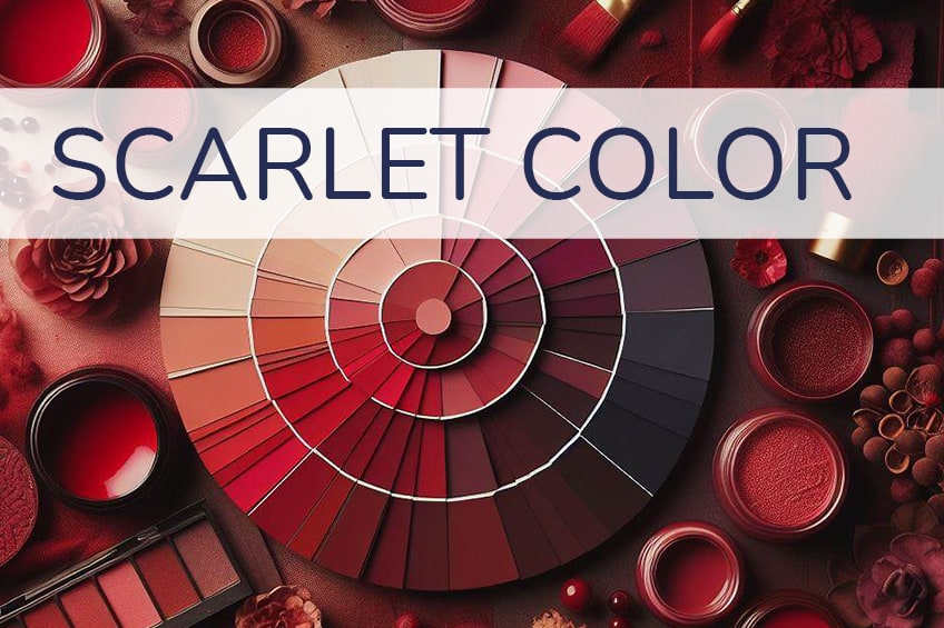
There are many amazing and bold shades of red, and one of these is scarlet red. If you want to find out a little more about the scarlet color, and how you can use it in your home, then you have come to the right place. We’ve curated 40+ shades of scarlet, including descriptions, tips on how to use them, and all color codes.
What Color Is Scarlet?
You can say scarlet red is also a shade of red, however, since there are so many shades and tones, we need to be a bit more specific. The scarlet color can be described as a bright, pure red with an orange undertone. When looking at the color spectrum, it sits somewhere between red and orange.
When working on graphics, the scarlet color can be identified by the below hex code. The other color codes in the table represent how much red or magenta and yellow are present when the colors are blended. The two scarlet color codes are RGB or red, green, and blue for graphics, while the other CMYK or cyan, magenta, yellow, and black is for printing purposes.
| Scarlet Shade | Scarlet Hex Code | CMYK Scarlet Color Code (%) | RGB Scarlet Color Code | Scarlet Color |
| Scarlet | #ff2400 | 0, 86, 100, 0 | 255, 36, 0 |
Different Scarlet Color Tones
There are many similar colors to scarlet, so there is a variety of hues you can choose from when designing your next project. Most of these colors are slight variations of the scarlet color, and each is represented by a unique hex code.
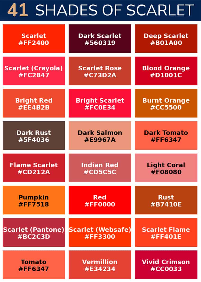
Scarlet
Scarlet is a vibrant, bright red color, symbolizing passion and intensity. It’s perfect for making a bold statement in design and fashion. Tip: Use Scarlet in accent pieces to energize a neutral space or in branding to capture attention.
| Hex: #FF2400 RGB: 255, 36, 0 CMYK: 0, 86, 100, 0 |
Dark Scarlet
Dark Scarlet is a deep, rich burgundy-red, exuding a sense of mystery and depth. Ideal for creating an elegant, sophisticated atmosphere. Tip: Works well in a study or a luxurious bedroom, paired with gold or dark wood for a regal feel.
| Hex: #560319 RGB: 86, 3, 25 CMYK: 0, 97, 71, 66 |
Deep Scarlet
Deep Scarlet is a more intense, slightly darker version of classic Scarlet, perfect for adding drama and warmth. It’s great for creating focal points in interior design or for rich, warm clothing.
| Hex: #B01A00 RGB: 176, 26, 0 CMYK: 0, 85, 100, 31 |
Pastel Scarlet
Pastel Scarlet is a softer, lighter variation of Scarlet, blending the intensity of red with a gentle, soothing vibe. Ideal for spaces that need a touch of warmth without overwhelming, like a cozy reading nook.
| Hex: #FC696D RGB: 252, 105, 109 CMYK: 0, 58, 57, 1 |
Medium Scarlet
Medium Scarlet is a balanced, vivid red, striking and lively. Perfect for design elements that need to stand out, such as statement furniture or bold graphic designs.
| Hex: #FC2847 RGB: 252, 40, 71 CMYK: 0, 84, 72, 1 |
Scarlet (Crayola)
Scarlet in Crayola is similar to Medium Scarlet, a bright and playful red. It’s great for creative projects or children’s spaces that require a fun, energetic color.
| Hex: #FC2847 RGB: 252, 40, 71 CMYK: 0, 84, 72, 1 |
Scarlet Rose
Scarlet Rose is a blend of red and rose, offering a romantic and slightly softer version of Scarlet. Ideal for floral arrangements, textiles, or as a wall color in a dining room for a warm, inviting ambiance.
| Hex: #C73D2A RGB: 199, 61, 42 CMYK: 0, 69, 79, 22 |
Blood Orange
Blood Orange is a deep, rich red-orange, evoking the color of its namesake fruit. It’s perfect for adding a vibrant, energetic touch to both fashion and interior design. Tip: Use it in a kitchen or dining area to stimulate appetite and conversation.
| Hex: #D1001C RGB: 209, 0, 28 CMYK: 0, 100, 87, 18 |
Blood Red
Blood Red is a dark, intense red, full of depth and richness. It’s ideal for creating an atmosphere of sophistication and power. Tip: Excellent for accent walls in spaces where you want to make a bold statement, like a home office.
| Hex: #660000 RGB: 102, 0, 0 CMYK: 0, 100, 100, 60 |
Boston University Scarlet
Boston University Scarlet is a classic, deep red, associated with the university. It’s great for adding a touch of tradition and formality to a space or attire, especially for alumni events or collegiate-themed rooms.
| Hex: #CC0000 RGB: 204, 0, 0 CMYK: 0, 100, 100, 20 |
Bright Red
Bright Red is a vivid, eye-catching red, full of energy and life. It’s perfect for drawing attention in marketing materials or as an accent color in interior design. Tip: Use it sparingly to create focal points in a minimalist setting.
| Hex: #EE4B2B RGB: 238, 75, 43 CMYK: 0, 68, 82, 7 |
Bright Scarlet
Bright Scarlet is an intensified version of Scarlet, more vivid and striking. Ideal for bold fashion statements or dynamic graphic designs that demand attention.
| Hex: #FC0E34 RGB: 252, 14, 52 CMYK: 0, 94, 79, 1 |
Burnt Orange
Burnt Orange is a rich, deep orange with a hint of red, evoking autumnal warmth. It’s great for creating a cozy, inviting atmosphere, particularly in living rooms or bedrooms. Tip: Pair with earthy greens for a natural, balanced look.
| Hex: #CC5500 RGB: 204, 85, 0 CMYK: 0, 58, 100, 20 |
Coral
Coral is a soft blend of pink and orange, bright yet soothing. Perfect for summer fashion, beach-themed decor, or a playful children’s room. Tip: Combine with light blues for a fresh, ocean-inspired palette.
| Hex: #FF7F50 RGB: 255, 127, 80 CMYK: 0, 50, 69, 0 |
Crimson
Crimson is a deep, vibrant red with a hint of blue, symbolizing luxury and sophistication. Ideal for formal wear or as an accent in a rich, opulent interior design scheme.
| Hex: #DC143C RGB: 220, 20, 60 CMYK: 0, 91, 73, 14 |
Dark Rust
Dark Rust is a dark, reddish-brown, resembling rusted iron. It’s perfect for industrial-themed spaces or to add a touch of vintage charm to a room. Tip: Works well with metallic accents for an industrial look.
| Hex: #5F4036 RGB: 95, 64, 54 CMYK: 0, 33, 43, 63 |
Dark Salmon
Dark Salmon is a muted, pinkish-orange, warm and inviting. It’s great for creating a soft, welcoming feel in a space, particularly in textiles and upholstery.
| Hex: #E9967A RGB: 233, 150, 122 CMYK: 0, 36, 48, 9 |
Dark Tomato
Dark Tomato is a deep, rich red with a hint of orange, reminiscent of ripe tomatoes. Ideal for adding a vibrant, appetizing touch to kitchen decor or dining spaces.
| Hex: #FF6347 RGB: 255, 99, 71 CMYK: 0, 61, 72, 0 |
Fire Brick
Fire Brick is a dark, muted red, conveying stability and strength. It’s perfect for creating a sense of grounding in a space, especially in flooring or brickwork.
| Hex: #B22222 RGB: 178, 34, 34 CMYK: 0, 81, 81, 30 |
Flame
Flame is a bright, fiery orange-red, energetic and dynamic. It’s great for spaces that aim to be lively and vibrant, like a modern kitchen or a creative studio. Tip: Use it to add a pop of color to a neutral palette.
| Hex: #E25822 RGB: 226, 88, 34 CMYK: 0, 61, 85, 11 |
Flame Scarlet
Flame Scarlet is a bright, intense red, reminiscent of a flame’s core. Ideal for fashion pieces that need to make a statement or for accent pieces in interior design that need a bold touch.
| Hex: #CD212A RGB: 205, 33, 42 CMYK: 0, 84, 80, 20 |
Indian Red
Indian Red is a deep, earthy red with a hint of brown, warm and natural. It’s perfect for adding a rustic touch to a space, particularly in textiles or pottery.
| Hex: #CD5C5C RGB: 205, 92, 92 CMYK: 0, 55, 55, 20 |
Light Coral
Light Coral is a soft, muted coral, gentle and soothing. Great for creating a tranquil, peaceful atmosphere in spaces like a spa or a serene bedroom.
| Hex: #F08080 RGB: 240, 128, 128 CMYK: 0, 47, 47, 6 |
Light Salmon
Light Salmon is a pale, soft orange-pink, offering a fresh, gentle touch. It’s ideal for airy, light-filled spaces that require a hint of color without overwhelming.
| Hex: #FFA07A RGB: 255, 160, 122 CMYK: 0, 37, 52, 0 |
Orange Red
Orange Red is a vibrant blend of red and orange, bright and energetic. Perfect for adding a lively touch to a space, especially in areas meant for activity and fun.
| Hex: #FF4500 RGB: 255, 69, 0 CMYK: 0, 73, 100, 0 |
Pumpkin
Pumpkin is a rich, warm orange, evoking the color of pumpkin flesh. It’s great for autumnal themes or to add warmth to a space, particularly in seasonal decor. Tip: Combine with earth tones for a cozy fall feel.
| Hex: #FF7518 RGB: 255, 117, 24 CMYK: 0, 54, 91, 0 |
Red
Red is a classic, bold red, symbolizing energy, passion, and action. It’s perfect for creating a focal point in any setting, from fashion to interior design. Tip: Use it in areas that require energy and vibrancy.
| Hex: #FF0000 RGB: 255, 0, 0 CMYK: 0, 100, 100, 0 |
Rust
Rust is a reddish-brown, mimicking the color of oxidized iron. Ideal for adding an earthy, grounded feel to a space, especially in combination with natural materials like wood or stone.
| Hex: #B7410E RGB: 183, 65, 14 CMYK: 0, 64, 92, 28 |
Safflower Scarlet
Safflower Scarlet is a bright, vivid red, reminiscent of the safflower plant. It’s great for adding a touch of natural vibrancy to a space, especially in floral arrangements or botanical prints.
| Hex: #E83929 RGB: 232, 57, 41 CMYK: 0, 75, 82, 9 |
Salmon
Salmon is a soft blend of pink and orange, gentle and inviting. Perfect for creating a warm, nurturing atmosphere in spaces like a living room or a nursery.
| Hex: #FA8072 RGB: 250, 128, 114 CMYK: 0, 49, 54, 2 |
Scarlet (Pantone)
Scarlet (Pantone) is a defined, branded shade of red with a slight pinkish undertone, vibrant and sophisticated. Ideal for design work where color consistency is key, such as in branding or product design.
| Hex: #BC2C3D RGB: 188, 44, 61 CMYK: 0, 77, 68, 26 |
Scarlet Flame
Scarlet Flame is an intense, fiery red, full of energy and passion. It’s great for dramatic accents in interior design or fashion, especially to create focal points.
| Hex: #FF401E RGB: 255, 64, 30 CMYK: 0, 75, 88, 0 |
Scarlet Lake
Scarlet Lake is a deep, muted shade of Scarlet, reminiscent of a tranquil lake at sunset. Ideal for adding depth and subtlety to a color palette, especially in painting or textile work.
| Hex: #A91A17 RGB: 169, 26, 23 CMYK: 0, 85, 86, 34 |
Scarlet Sage
Scarlet Sage is a unique, herb-inspired shade of red, offering a natural and earthy feel. It’s perfect for creating a rustic, organic ambiance in spaces like kitchens or dining rooms.
| Hex: #9D202F RGB: 157, 32, 47 CMYK: 0, 80, 70, 38 |
Tomato
Tomato is a bright, vegetable-inspired red, fresh and appetizing. Great for kitchen accents or dining areas to stimulate appetite and conversation. Tip: Combine with green hues for a fresh, garden-inspired look.
| Hex: #FF6347 RGB: 255, 99, 71 CMYK: 0, 61, 72, 0 |
Vermillion
Vermillion is a vibrant, orange-red, historically used in art and decoration. It’s perfect for adding a bold, artistic touch to any space or artwork.
| Hex: #E34234 RGB: 227, 66, 52 CMYK: 0, 71, 77, 11 |
Vivid Crimson
Vivid Crimson is a deep, intense red, full of drama and richness. Ideal for making a bold statement in fashion or interior design, especially in luxurious fabrics or wall coverings.
| Hex: #CC0033 RGB: 204, 0, 51 CMYK: 0, 100, 75, 20 |
Scarlet Brown
Scarlet Brown is a dark, earthy blend of red and brown, offering a sophisticated, grounded feel. It’s great for creating a sense of warmth and stability in a space.
| Hex: #34080E RGB: 52, 8, 14 CMYK: 0, 85, 73, 80 |
Scarlet Velvet
Scarlet Velvet is a luxurious, deep red, reminiscent of rich velvet fabric. Perfect for creating an opulent, sophisticated atmosphere, especially in formal living spaces or master bedrooms.
| Hex: #610706 RGB: 97, 7, 6 CMYK: 0, 93, 94, 62 |
Cinnabar
This color is also known as vermilion and can be described as bright red. In the past, the pigment color was extracted from a mineral known as cinnabar, which contains high amounts of mercury and sulfur, making it quite toxic. Natural vermilion was an expensive pigment and was often used on Roman wall paintings.
Thankfully, there is now a synthetic version, which is called cadmium red.
| Hex: #e34234 RGB: 0, 71, 77, 11 CMYK: 227, 66, 52 |
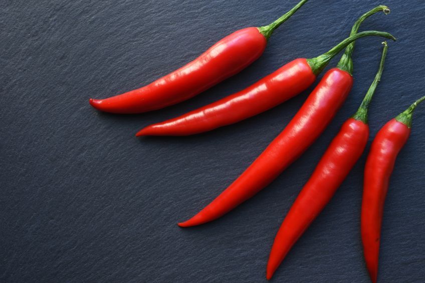
Chili Pepper
This color is slightly toned down, but it remains quite a vivid red, similar to the fruit it is named after. Chili pepper was named the color of the year in 2007 by Pantone. The color is energizing and eye-catching and could be a nice accent color in the kitchen.
| Hex: #e32227 RGB: 0, 85, 83, 11 CMYK: 227, 34, 39 |
Scarlet Color Combinations
The scarlet color can work well with a more neutral palette, including colors like beige or sand. However, there are various color combinations you can look out for that work best. These combinations are a part of color theory and involve the color wheel.
These can easily be determined by the many online tools available. However, the table offered below is an example of the complementary color for scarlet. When using color combinations in design, it is always about balance, and combining the colors wisely.
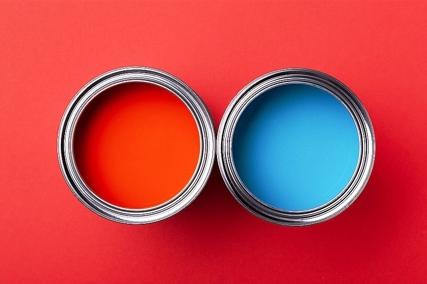
- Complementary colors: Colors on the color wheel that are on opposing sides and make each other stand out when placed side by side.
- Analogous colors: These are similar colors that are neighbors on the color wheel.
- Monochromatic colors: This type of color combination uses a variety of tones and shades of a single color.
- Triadic Colors : Three colors that stand out from each other and form an equal-sided triangle shape.
| Shade | Hex Code | CMYK Color Code (%) | RGB Color Code | Color |
| Scarlet | #ff2400 | 0, 86, 100, 0 | 255, 36, 0 | |
| Pure Cyan | #00dbff | 100, 14, 0, 0 | 0, 219, 255 |
Scarlet Color: A Brief History
There is a significant history behind red, and this includes the scarlet color. The bold scarlet red has been associated with power and riches since ancient times. Scarlet dyes were first mentioned many years ago in Persian as well as Assyrian writings and were sold under the name of Armenian Red. The color was then exported to Rome, where it became a mark of wealth and authority. The scarlet color was expensive as it was obtained with difficulty from small-scale insects known as kermes.
During the Middle Ages as well as the Renaissance period, scarlet was worn by Kings and the rich, as it was so expensive. The most luxurious color during this time was known as Venetian scarlet, which came from Venice. King Louis XIV wore scarlet heels, which were a symbol of his royalty.
The scarlet color has been the traditional color that cardinals in the Catholic church wear, as it represents the blood of Christ. You can see an example of this in the illuminated manuscript, Très Riches Heures du Duc de Berry (1412-1416), a document that contained prayers and illustrations done by the Limbourg brothers.
In Italy, during the Renaissance, the scarlet color was a symbol of nobility, as seen in the Portrait of a Young Man (1469) by Sandro Botticelli. Here is another example of a religious depiction using the vermilion pigment in the Assumption of the Virgin (1516-1518) by the Italian Renaissance artist Titian. You can see the Virgin Mary and two of the apostles wearing scarlet garments.

Scarlet has also been the traditional color for British nobility. Members of the House of Lords wore and still wear ceremonial gowns in red, but now there are also red benches everyone sits in. The red uniform was also taken up by the British army. Today, the scarlet color is also used in various cultures, especially for academic dress, for example, it is the dress in Britain for those who are awarded doctorates.
Scarlet Color Meaning
As we have learned, the scarlet color is closely associated with religion and wealth. Scarlet, along with other bold shades of red, are all associated with passion, heat, love, confidence, desire, strength, courage, and energy. The word “scarlet” is mentioned a few times in the Bible and is mostly associated with immorality, adultery, and sin. Red, in general, is a color that denotes caution and danger and acts as a warning.

However, it is also a powerful color that motivates and compels you to take action.
Creating Scarlet Acrylic Paint
The scarlet color was originally used as the vermilion pigment, which was made from a toxic mineral. Many Renaissance painters like Botticelli and Renoir used this together with what is known as red lake pigments made from iron oxide in their paintings. Then, in the 20th century, a synthetic pigment was produced known as cadmium red, which is made from selenium and cadmium sulfide.
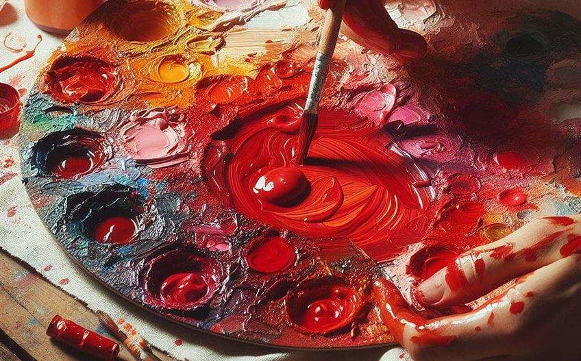
You have the option of purchasing cadmium red, cadmium red light, cadmium red medium, or cadmium red dark. The cadmium red can come in a range of orange-reds to purplish-red or brown. You could also try combining red and yellow, for example, crimson red and lemon yellow. Play around with the proportions to get the color you are looking for.
Using Scarlet Shades in Fashion
Scarlet is a powerful color in fashion that commands attention and exudes confidence. Its intensity can be harnessed to create looks that are both striking and sophisticated, making it a favorite for statement pieces and accents alike. Here are six compelling color combinations that showcase the versatility of scarlet in fashion:
- Scarlet and black for a classic, dramatic look that’s both bold and timeless.
- Scarlet and white for a crisp, clean contrast that truly pops.
- Scarlet and navy blue for a rich, preppy vibe with a touch of elegance.
- Scarlet and forest green for a complementary pairing that’s vibrant and earthy.
- Scarlet and gold for an opulent, luxurious ensemble that radiates warmth.
- Scarlet and denim blue for a casual yet eye-catching combination that’s effortlessly chic.

Can You Use the Scarlet Color in Designs?
The scarlet color meaning is dominant, passionate, strong, and energetic, and is often a popular color in fashion and design from lipsticks to shoes, clothing as well as eye-catching website designs. However, can you use scarlet in the home? In general, red helps to improve brain activity and can stimulate appetite, so it is a great color to add to the kitchen or dining room areas. Scarlet can also be romantic, so it can be an option for the bedroom.
As you can get different shades, the color can also work in other living areas.
Since it is stimulating and energizing, it might be a good color to add to an office space or work area. When combined correctly in a color scheme, scarlet can be an amazing color to use. Scarlet combines well with white and other more neutral tones like beige. However, you can also bring in shades of blue to add a pop of color. Other similar tones and shades can also create a warm and cozy space.
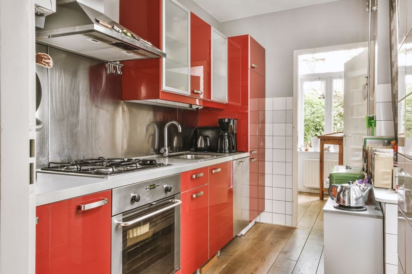
The best way to add the bold scarlet color is as a focal point or accent color. If you paint all the walls, it can make a space feel smaller than it is. Consider using it as an accent wall, with plenty of neutral colors to tone down the red color or patterned wallpaper. You can bring in the color through smaller accessories like cushions, lamps, wall art, and upholstery, amongst other items. If overused, scarlet red can easily dominate and take over the room. So, remember to rather use it sparingly.
With so many shades of red, it can be challenging to pick out one that suits your needs. However, if you are looking for a striking and dramatic color that can add a bit of spice to any design, you might want to consider scarlet red.
Frequently Asked Questions
What Color Is Scarlet?
Scarlet is a shade of red that is bright and has a slight orange undertone as it falls between orange and red on the color wheel. The color can be described as close to pure red; however, you can also get some varieties of this color that are just as bright or a little more toned down.
Is Scarlet a Cool or Warm Red?
In color theory, you have warm and cool colors. Those red colors that are located more toward the purple side of the color wheel are considered cool, while scarlet is closer to pure red, so it is naturally a warm color.
Is Scarlet Red the Same as Crimson?
Both these colors are shades of red, however, they are not the same color. Crimson is a deeper vivid red color that can have a slight bluish undertone, while scarlet is a bright red.
In 2005, Charlene completed her Wellness Diplomas in Therapeutic Aromatherapy and Reflexology from the International School of Reflexology and Meridian Therapy. She worked for a company offering corporate wellness programs for a couple of years, before opening up her own therapy practice. It was in 2015 that a friend, who was a digital marketer, asked her to join her company as a content creator, and this is where she found her excitement for writing.
Since joining the content writing world, she has gained a lot of experience over the years writing on a diverse selection of topics, from beauty, health, wellness, travel, and more. Due to various circumstances, she had to close her therapy practice and is now a full-time freelance writer. Being a creative person, she could not pass up the opportunity to contribute to the Art in Context team, where is was in her element, writing about a variety of art and craft topics. Contributing articles for over three years now, her knowledge in this area has grown, and she has gotten to explore her creativity and improve her research and writing skills.
Charlene Lewis has been working for artincontext.org since the relaunch in 2020. She is an experienced writer and mainly focuses on the topics of color theory, painting and drawing.
Learn more about Charlene Lewis and the Art in Context Team.
Cite this Article
Charlene, Lewis, “Scarlet Color – A Deep Dive Into the Beautiful Scarlet Red Shade.” Art in Context. November 29, 2022. URL: https://artincontext.org/scarlet-color/
Lewis, C. (2022, 29 November). Scarlet Color – A Deep Dive Into the Beautiful Scarlet Red Shade. Art in Context. https://artincontext.org/scarlet-color/
Lewis, Charlene. “Scarlet Color – A Deep Dive Into the Beautiful Scarlet Red Shade.” Art in Context, November 29, 2022. https://artincontext.org/scarlet-color/.


