Amber Color – Color Meaning, All 51 Shades and How to Use
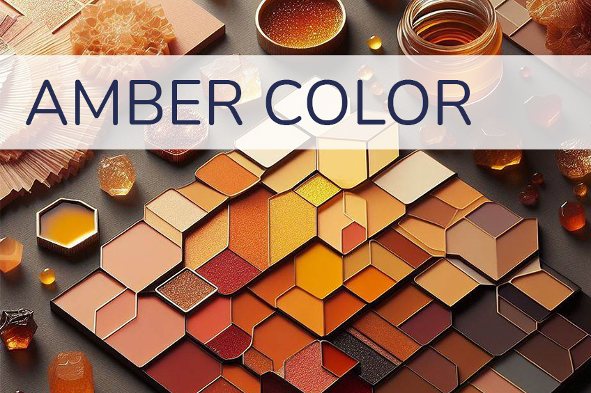
Amber is a popular girl’s name, but it is also a beautiful and warm color. The amber color can be used in a variety of ways in designs as there are many color combinations you can choose from. A happy and positive color, amber just might be what you are searching for.
What Color Is Amber?
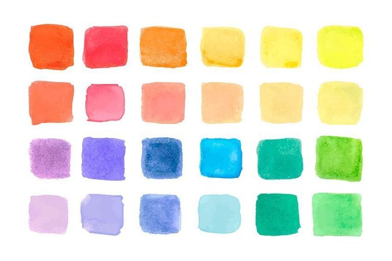
The amber color is a vibrant chroma color, meaning it has quite a strong and intense color. Is amber yellow or orange? You can find amber positioned on the color wheel, between orange and yellow. The color wheel is what you will use to help you determine how colors relate to one another and is a visual representation.
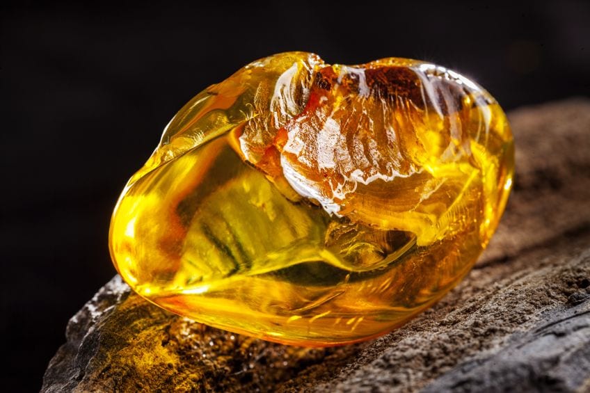
The word amber comes from the substance recognized as amber, which comes from fossilized tree resin. What does the color amber look like? The colors for amber range from yellow-orange to yellow-brown and a yellowish-red color. So, you can find many amber shades. Since amber is positioned between orange and yellow, it can appear as a darker shade of yellow. The warm undertones can give it a more golden look, and on occasion, it may even seem to have a brownish undertone.
| Amber Shade | Amber Hex Code | CMYK Amber Color Code (%) | RGB Amber Color Code | Amber Color |
| Amber | #ffbf00 | 0, 25, 100, 0 | 255, 191, 0 |
Amber Color Meaning
The amber color meaning is associated mostly with energy as it is a warm and vibrant color. Amber is a happy, friendly, and bold color, and can symbolize things like confidence, spontaneity, and vitality. Since amber is a warm color, it also radiates a sense of comfort and safety.
Since it is a shade of yellow, it also has many similar qualities and associations.
For example, both yellow and amber relate to sunshine, happiness, and wealth. The amber color can also bring to mind feelings of creativity, and intuition provides mental stimulation and helps to increase physical energy. The color can help to drive out negative feelings and can provide a sense of optimism instead.
| Category | Amber Color Associations |
|---|---|
| Symbols | Energy and dynamism, Balance and harmony, Warmth and comfort, Optimism and positivity |
| Effects | Uplifting mood, Encouraging creativity, Inspiring confidence, Comforting presence |
| Positive | Friendliness and approachability, Protective qualities, Encouragement of spontaneity, Promotion of joy and happiness |
| Negative | Overstimulation if used excessively, Perceived as outdated by some, Can be overwhelming in large amounts, May clash with certain color palettes |
Amber Color Psychology
Amber holds significant symbolism and associations in color psychology. It is believed to embody vitality, confidence, and safety, promoting these qualities to individuals. Throughout history, amber has been connected to magic and spirituality, mirroring the mystical properties associated with the resin itself.
In ancient Greek and Roman cultures, amber figurines were worn by women to enhance fertility, while some civilizations believed that animals’ souls transformed into amber after their demise. Given that tree resin often preserves insects, amber is closely tied to the natural world. Moreover, its resemblance to yellow associates it with sunshine, while its similarity to gold links it to wealth.
Shades Of Amber Color Scheme
We showcase you the most essential amber shades. Each shade is detailed with its corresponding color codes, ensuring you can capture the exact essence of amber for your design needs.
| Amber Shade Name | Hex Code | RGB | CMYK (%) | Color Visualization |
| Amber | #FFBF00 | 255, 191, 0 | 0, 25, 100, 0 | |
| Amber Brown | #A76D54 | 167, 109, 84 | 0, 35, 50, 35 | |
| Amber Gold | #C19552 | 193, 149, 82 | 0, 23, 58, 24 | |
| Amber Green | #9A803A | 154, 128, 58 | 0, 17, 62, 40 | |
| Amber Orange | #F2B046 | 242, 176, 70 | 0, 27, 71, 5 | |
| Amber Red | #CC310E | 204, 49, 14 | 0, 76, 93, 20 | |
| Amber Rose | #EB8B6E | 235, 139, 110 | 0, 41, 53, 8 | |
| Amber Tan | #957746 | 149, 119, 70 | 0, 20, 53, 42 | |
| Ambergris | #7C615C | 124, 97, 92 | 0, 22, 26, 51 | |
| Apricot | #FBCEB1 | 251, 206, 177 | 0, 18, 29, 2 | |
| Bronze | #CD7F32 | 205, 127, 50 | 0, 38, 76, 20 | |
| Burnt Amber | #8A3324 | 138, 51, 36 | 0, 63, 74, 46 | |
| Burnt Orange | #CC5500 | 204, 85, 0 | 0, 58, 100, 20 | |
| Burnt Sienna | #E97451 | 233, 116, 81 | 0, 50, 65, 9 | |
| Butterscotch | #E3963E | 227, 150, 62 | 0, 34, 73, 11 | |
| Caramel | #FFD59A | 255, 213, 154 | 0, 16, 40, 0 | |
| Champagne | #F7E7CE | 247, 231, 206 | 0, 6, 17, 3 | |
| Cherry | #D2042D | 210, 4, 45 | 0, 98, 79, 18 | |
| Citrine | #E4D00A | 228, 208, 10 | 0, 9, 96, 11 | |
| Cognac | #9A463D | 154, 70, 61 | 0, 55, 60, 40 | |
| Dark Amber | #D79334 | 215, 147, 52 | 0, 32, 76, 16 | |
| Ginger | #B06500 | 176, 101, 0 | 0, 43, 100, 31 | |
| Gingerbread | #8C4A2F | 140, 74, 47 | 0, 47, 66, 45 | |
| Gold Amber | #C19552 | 193, 149, 82 | 0, 23, 58, 24 | |
| Golden | #FFD700 | 255, 215, 0 | 0, 16, 100, 0 | |
| Golden Amber | #CD8223 | 205, 130, 35 | 0, 37, 83, 20 | |
| Golden Brown | #996515 | 153, 101, 21 | 0, 34, 86, 40 | |
| Goldenrod | #DAA520 | 218, 165, 32 | 0, 24, 85, 15 | |
| Honey | #EBA937 | 235, 169, 55 | 0, 28, 77, 8 | |
| Honey Amber | #A67447 | 166, 116, 71 | 0, 30, 57, 35 | |
| Lemon | #FFF700 | 255, 247, 0 | 0, 3, 100, 0 | |
| Light Amber Orange | #ED9A76 | 237, 154, 118 | 0, 35, 50, 7 | |
| Light Amberish | #FFA500 | 255, 165, 0 | 0, 35, 100, 0 | |
| Marigold | #EAA221 | 234, 162, 33 | 0, 31, 86, 8 | |
| Miel | #89743D | 137, 116, 61 | 0, 15, 55, 46 | |
| Mustard | #FFDB58 | 255, 219, 88 | 0, 14, 65, 0 | |
| Nutmeg | #83654E | 131, 101, 78 | 0, 23, 40, 49 | |
| Paprika | #990033 | 153, 0, 51 | 0, 100, 67, 40 | |
| Pumpkin | #FF7518 | 255, 117, 24 | 0, 54, 91, 0 | |
| Rich Amber | #B47543 | 180, 117, 67 | 0, 35, 63, 29 | |
| Rust | #B7410E | 183, 65, 14 | 0, 64, 92, 28 | |
| Saffron | #F4C430 | 244, 196, 48 | 0, 20, 80, 4 | |
| Sand Amber | #FCAF18 | 252, 175, 24 | 0, 31, 90, 1 | |
| Sienna | #A0522D | 160, 82, 45 | 0, 49, 72, 37 | |
| Sienna Amber | #BC7F3D | 188, 127, 61 | 0, 32, 68, 26 | |
| Tangerine | #F28500 | 242, 133, 0 | 0, 45, 100, 5 | |
| Tawny | #CD5700 | 205, 87, 0 | 0, 58, 100, 20 | |
| Toffee | #C86C1C | 200, 108, 28 | 0, 46, 86, 22 | |
| Topaz | #FFC87C | 255, 200, 124 | 0, 22, 51, 0 | |
| Walnut | #773F1A | 119, 63, 26 | 0, 47, 78, 53 |
Amber Color: A Brief History
The amber color is closely associated with the material amber, which dates back many years. The fossilized tree resin is considered one of the oldest types of gems, and when held up to the light, it produces the beautiful golden yellow color we are familiar with. The resin is used in many luxury items like jewelry and may have been used in ancient amulets as it was believed it contained healing powers.
The resin amber itself has been associated with spirituality, which can also be linked to the color as well. Ancient Romans and Greeks used amber to ensure fertility, and other cultures believed the souls of animals were captured in amber when they died.
The English name for the color amber, and not related to the resin, was initially recorded in the 1500s. The Amber Room, which was designated the “eighth wonder of the world” before its destruction, was found in the Catherine Palace, also known as Tsarskoye Selo. The palace was located in Pushkin, a town nearby Saint Petersburg in Russia.
One of the chambers was decorated with amber panels that also contained gold leaf, gemstones, and beautiful mirrors. With golden lighting, the room would have displayed the amber color beautifully. The room was a gift from Peter the Great in the early 18th century, which celebrated the peace between both Prussia and Russia. However, the palace was looted during the Second World War and the amber panels disappeared. In 2003, a replica was constructed, but the location of the original contents remains a mystery.

Moving on to some other interesting facts about amber, the color can be found alongside green and red in traffic lights. The color means a driver should slow down and wait. Some would say it is yellow, however, technically, and officially, it is classified as amber. The amber color is also the color for the signal lamps in automobiles.
Amber is also an unusual and uncommon eye color in humans. In theater, amber is a popular color for lighting, and is sometimes known as “bastard amber”. The amber color is also popular in sports, quite a few English football clubs like Hull City AFC don the amber colors, along with many other sports clubs around the world.
How to Mix Amber Colors With Acrylic Paint
The amber color can be used by artists to create many natural elements like leaves, sunsets, honey, gemstones, and flowers, amongst other ideas. Amber is an ideal color for any autumn-inspired concept, whether it is for a painting or any other design.
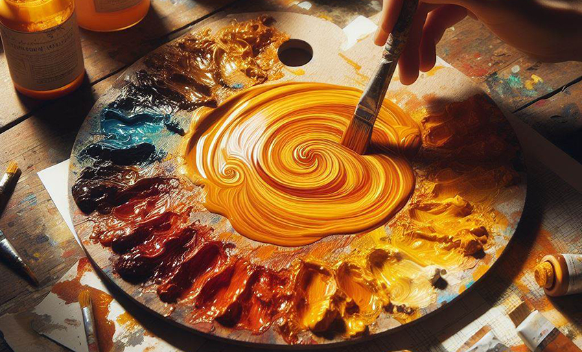
Since amber is a mixture of yellow and orange, there is more than one way to mix the color. The simplest way to mix amber is to place some yellow on your palette and then add in small amounts of red. Since there are different amber shades, you can experiment with various proportions until you find the color you need.
You can also try mixing the primary yellow color with an orange secondary color. Again, you can experiment with the ratios to find the proper color you are looking for. However, you should be able to get a yellowish-orange hue.
Amber in Fashion
In the fashion world, amber is celebrated for its warm, earthy tones that evoke a sense of energy and vitality. This inviting color can range from golden-yellow to deep orange-brown, offering a versatile palette for designers to work with.

Amber adds a touch of autumnal charm to any wardrobe, often used in accessories to provide a pop of color or in statement pieces that can stand as the focal point of an outfit. Its rich, natural hue pairs beautifully with a variety of colors and can convey everything from a bohemian ease to a sophisticated elegance, making it a perennial favorite in fashion circles.
Amber Color Palettes for the Home
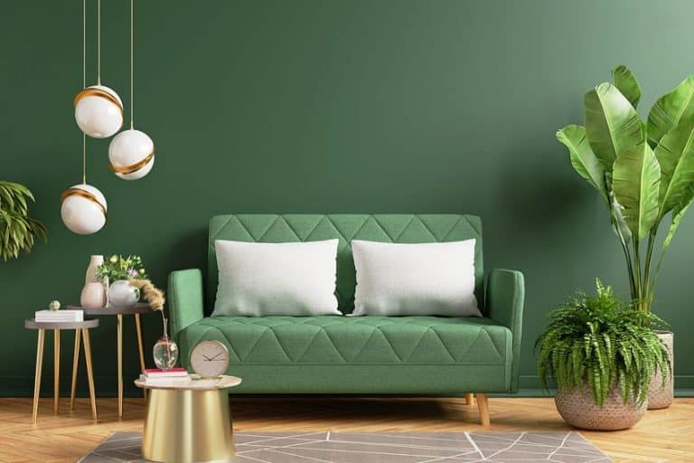
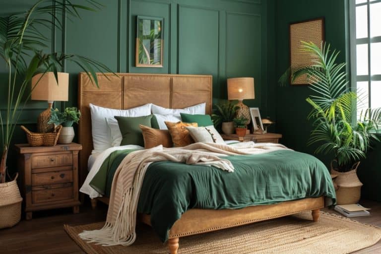
Amber is the perfect accent color, adding warmth to any room. Even though amber is a warm and welcoming color, it can become too much if overused. So, it is ideal to rather use the amber color as an accent. You can combine it with deeper brown, orange, and red colors to bring in a more autumn feel, or pair it alongside shades of green for a more natural appeal.
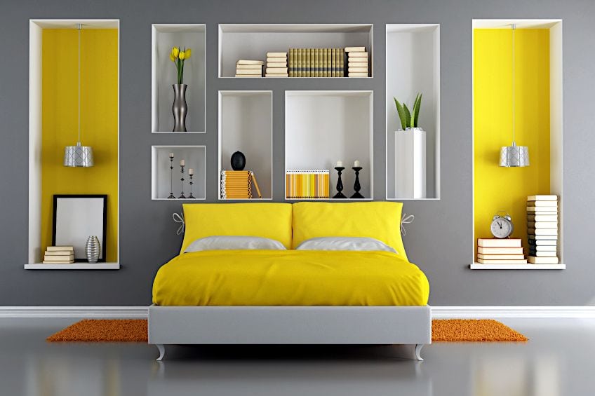
Of course, you can also incorporate various amber shades. The color can be used as an effective accent wall, or you can bring in the color using fabrics, cushions, throws, upholstery, and rugs. Amber colors will stand out against shades of blue, and both colors will work well with neutral colors like white, gray, and even black. Below is a simply stylish and dark color palette that can be brought into the bedroom, adding a calm and relaxed feel, but with the added warmth of amber.
| Amber Shade | Amber Hex Code | CMYK Amber Color Code (%) | RGB Amber Color Code | Amber Color |
| Shade of Black | #2c2b2c | 0, 2, 0, 83 | 44, 43, 44 | |
| Shade of Blue | #516582 | 38, 22, 0, 49 | 81, 101, 130 | |
| Shade of Gray | #a0a5a6 | 4, 1, 0, 35 | 160, 165, 166 | |
| Shade of Violet | #3e4371 | 45, 41, 0, 56 | 62, 67, 113 | |
| Dark Amber | #d6a02b | 0, 25, 80, 16 | 214, 160, 43 |
The amber color is a wonderfully warm and vibrant color that can easily be incorporated into a multitude of design ideas. The color works well with many colors and might just be the right color for your next design project.
Frequently Asked Questions
What Does the Color Amber Look Like?
Is amber yellow or orange? Amber can be described as a little of both, being more of a yellow-orange color since it can be found somewhere in between yellow and orange on the color wheel. There are also a few amber shades you can choose from that may contain various shades of orange, brown, and red.
What Does the Amber Color Symbolize?
Amber is a warm, friendly, and energetic color and has many characteristics of yellow. Amber is a positive color that provides a sense of security as it comforts, lifts, and inspires. However, the color can become too much if overused, causing irritability and frustration.
In 2005, Charlene completed her Wellness Diplomas in Therapeutic Aromatherapy and Reflexology from the International School of Reflexology and Meridian Therapy. She worked for a company offering corporate wellness programs for a couple of years, before opening up her own therapy practice. It was in 2015 that a friend, who was a digital marketer, asked her to join her company as a content creator, and this is where she found her excitement for writing.
Since joining the content writing world, she has gained a lot of experience over the years writing on a diverse selection of topics, from beauty, health, wellness, travel, and more. Due to various circumstances, she had to close her therapy practice and is now a full-time freelance writer. Being a creative person, she could not pass up the opportunity to contribute to the Art in Context team, where is was in her element, writing about a variety of art and craft topics. Contributing articles for over three years now, her knowledge in this area has grown, and she has gotten to explore her creativity and improve her research and writing skills.
Charlene Lewis has been working for artincontext.org since the relaunch in 2020. She is an experienced writer and mainly focuses on the topics of color theory, painting and drawing.
Learn more about Charlene Lewis and the Art in Context Team.
Cite this Article
Charlene, Lewis, “Amber Color – Color Meaning, All 51 Shades and How to Use.” Art in Context. October 6, 2022. URL: https://artincontext.org/amber-color/
Lewis, C. (2022, 6 October). Amber Color – Color Meaning, All 51 Shades and How to Use. Art in Context. https://artincontext.org/amber-color/
Lewis, Charlene. “Amber Color – Color Meaning, All 51 Shades and How to Use.” Art in Context, October 6, 2022. https://artincontext.org/amber-color/.


