Cerulean Blue – The Color of Serenity
There are so many shades of blue that it might seem overwhelming to choose just the right one for your project. There is sky blue, baby blue, and navy blue, among many others, but what color is cerulean? The name itself sounds intriguing, like something you might only hear as a description of the sky from some romantic poetry. To get better acquainted with cerulean blue, we will be discussing things like the different shades of cerulean blue and what colors go with cerulean blue, together with a few other interesting facts.
What Color Is Cerulean?
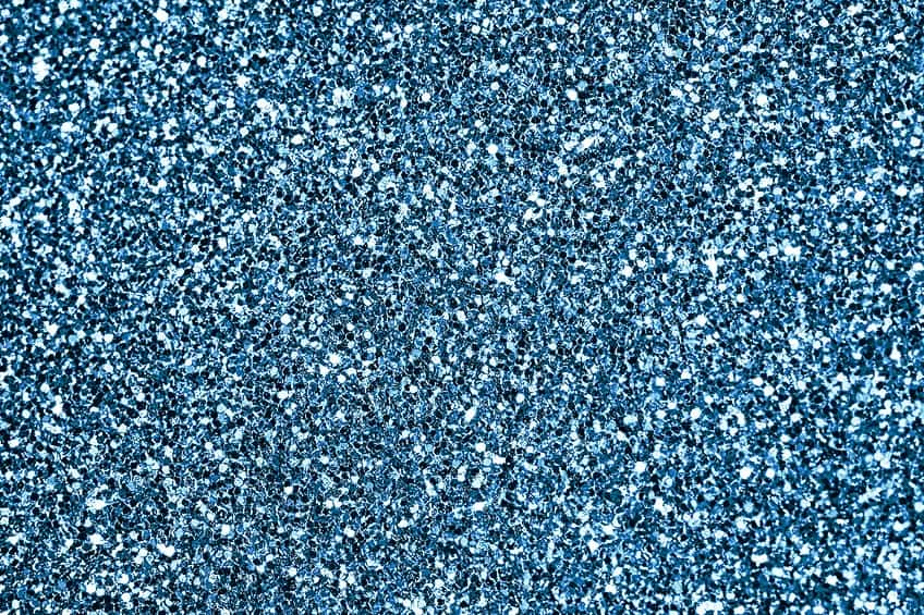
Cerulean blue is a color directly associated with a certain blue pigment that can be described as a vibrant, semi-transparent greenish blue. The color is also considered a cool blue, which is often used to paint the sky in art. If you look at cerulean blue in the table below, it can be described more as a strong blue, with an identifying hex code of #2a52be.
| Shade | Hex Code | CMYK Color Code (%) | RGB Color Code | Color |
| Cerulean | #2a52be | 78, 57, 0, 25 | 42, 82, 190 |
Meaning of Cerulean Blue
Cerulean is closely linked to the blue of the sky, which makes it a cool and calming color. The soothing color also evokes feelings of confidence, comfort, safety, and peace. Cerulean blue is a color that can remind you of times spent at the beach, or anywhere outdoors on a sunny day with clear skies. So, it is closely associated with being restful and enjoying relaxing moments.
Since it is such a relaxing color, it can help to reduce stress and aid in releasing tension.
Cerulean Blue: A Brief History
The word “cerulean” comes from “caeruleus”, which is a Latin word that means “blue”, “blue-green”, or “dark blue”. According to the Dictionary of Color (1930), by Maerz and Paul, the color name was first used in 1590. The blue pigment known as cerulean blue was originally synthesized in the early nineteenth century by a Swiss chemist by the name of Albrecht Höpfner.

The color was then known as “Höpfner” blue for a while when it was first used only for watercolors. Only later, when it became available as expensive oil paint, did the cerulean blue name become popular. The pigment color became very popular with many well-known artists, such as Claude Monet, Picasso, and Paul Signac, among others. The color was often used for painting skies, but also for other purposes. Here are two paintings by famous artists, who have used cerulean blue in their work.
La Gare Saint-Lazare (1877) by Claude Monet
| Artist | Claude Monet (1840 – 1926) |
| Date Completed | 1877 |
| Medium | Oil on canvas |
| Size (cm) | 75 x 105 |
| Gallery | Musée d’Orsay, Paris, France |
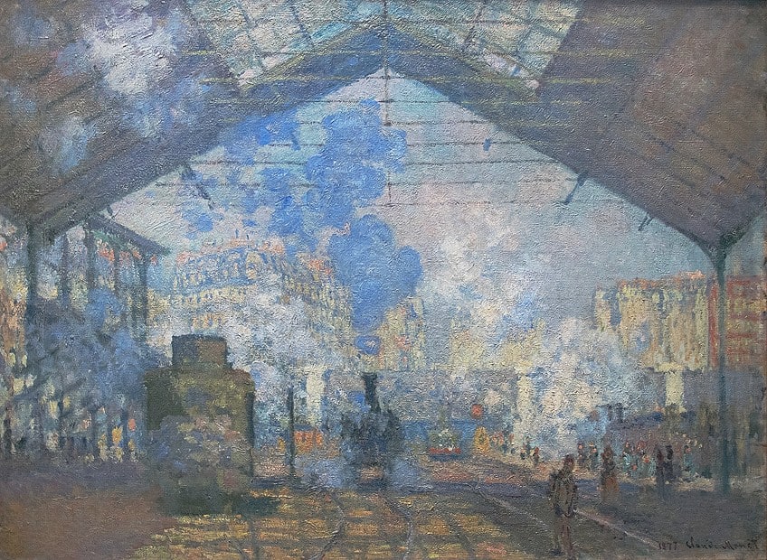
Cerulean blue pigment was added to Monet’s palette, which he used in his series of twelve paintings known as Gare Saint-Lazare (1877). The painting is of the hazy interior of a railway station, the series offering various viewpoints. The blue pigments identified in the painting include cerulean blue, cobalt, and some ultramarine. Cerulean blue was used in the station’s canopy and the puffs of smoke in the hazy scene.
The cerulean paint had only recently become available in tubes that were perfect for painting en plein air.
A Summer’s Day (1879) by Berthe Morisot
| Artist | Berthe Morisot (1841 – 1895) |
| Date Completed | 1879 |
| Medium | Oil on canvas |
| Size (cm) | 45.7 × 75.2 |
| Gallery | National Gallery, London, United Kingdom |

Berthe Morisot, a French Impressionist painter, created A Summer’s Day painting, which depicts two women sitting in a row boat. The painting contains cerulean blue as well as cobalt blue, and ultramarine. An interesting fact, cerulean blue was chosen as the United Nations emblem color, when it was formed just after the Second World War. Today, cerulean blue is still an expensive paint but remains popular with most artists.
In the year 2000, cerulean blue was nominated as the color of the year by Pantone. The color was chosen because it represented the millennium and induces a calm state of mind.
Different Shades of Cerulean Blue
Not only are there many types of blue, but there are also different varieties of cerulean blue. Azure blue can often be mistaken for cerulean, however, cerulean has more of a greenish undertone, while azure is a more vibrant shade that is closer to true blue. Crayola also has its version of cerulean, which when compared to our cerulean, is a much brighter blue that also has a more prominent greenish undertone. Cerulean frost is another Crayola color from their metallic Silver Swirl edition that was created in 1990. Pale cerulean is a softer shade of blue that is closer to sky blue. You also have vivid cerulean, and deep cerulean, among others.

| Shade | Hex Code | CMYK Color Code (%) | RGB Color Code | Color |
| Cerulean | #2a52be | 78, 57, 0, 25 | 42, 82, 190 | |
| Azure | #007fff | 100, 50, 0, 0 | 0, 127, 255 | |
| Crayola Cerulean | #1dacd6 | 86, 20, 0, 16 | 29, 172, 214 | |
| Cerulean Frost | #6d9bc3 | 44, 21, 0, 24 | 109, 155, 195 | |
| Pale Cerulean | #9bc4e2 | 31, 13, 0, 11 | 155, 196, 226 | |
| Vivid Cerulean | #00aaee | 100, 29, 0, 7 | 0, 170, 238 | |
| Deep Cerulean | #007bbb | 100, 34, 0, 27 | 0, 123, 187 |
What Colors Go With Cerulean Blue?
To create the best color combinations, you should have some knowledge of color theory and how colors interact with one another on the color wheel. The color wheel displays all the different colors in a wheel shape and contains all the primary, secondary, and tertiary or intermediate colors.
The various color combinations are formed by knowing where all these colors sit in relation to each other.
The easiest options that pair well with cerulean blue will be your neutral colors, such as white, black, gray, brown, and beige. One of the easier color combinations is the monochromatic color palette, which simply uses different shapes and tones or darker and lighter versions of cerulean blue. Below are a few more color combination ideas for cerulean blue.
Cerulean Blue Complementary Colors
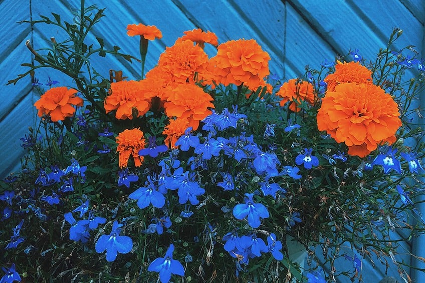
When taking the color wheel into account, colors that are found on opposing sides are known as complementary colors. So, cerulean blue will complement a strong orange. These colors stand out when laced next to each other, which is why pairing them should be done carefully. Too many of both colors will overwhelm the senses and create an overstimulating design. You can also use different shades of orange, as well as warm golden yellows or red to create a complementary color palette. Remember, you can also experiment with different saturations and tones of each color. For example, a darker shade of red like burgundy.
| Shade | Hex Code | CMYK Color Code (%) | RGB Color Code | Color |
| Cerulean | #2a52be | 78, 57, 0, 25 | 42, 82, 190 | |
| Strong Orange | #be962a | 0, 21, 78, 25 | 190, 150, 42 | |
| Gold | #ffd700 | 0, 16, 100, 0 | 255, 215, 0 | |
| Burgundy | #800020 | 0, 100, 75, 50 | 128, 0, 32 |
Cerulean Blue Analogous Colors
The colors that all fall alongside one another on the color wheel are known as analogous colors. All of these colors share certain traits and form a more harmonious color design. These colors can include other shades of blue, blue-green, and green when it comes to cerulean blue. For example, royal blue, teal, and mint green.
| Shade | Hex Code | CMYK Color Code (%) | RGB Color Code | Color |
| Cerulean | #2a52be | 78, 57, 0, 25 | 42, 82, 190 | |
| Royal Blue | #4169e1 | 71, 53, 0, 12 | 65, 105, 225 | |
| Teal | #009a9a | 100, 0, 0, 40 | 0, 154, 154 | |
| Mint Green | #3eb489 | 66, 0, 24, 29 | 62, 180, 137 |
Cerulean Blue Triadic Colors
This color combination involves three colors that are evenly spaced on the color wheel, and when you draw lines between them, they form a triangle shape. This is also a contrasting color combination, so it is best to pick your base color and use the other two colors as your accents.
| Shade | Hex Code | CMYK Color Code (%) | RGB Color Code | Color |
| Cerulean | #2a52be | 78, 57, 0, 25 | 42, 82, 190 | |
| Emerald Green | #50c878 | 60, 0, 40, 22 | 80, 200, 120 | |
| Strong Pink | #be2a52 | 0, 78, 57, 25 | 190, 42, 82 |
How to Mix Cerulean Blue Acrylic Paint
Originally, the cerulean pigment contained cobalt stannate, which creates a greenish-blue color and was used mainly for watercolors. The pigment creates a slightly chalky look with watercolors that dampened its appeal, which does not occur when used in oil paint. Today, the cerulean pigment is mainly cobalt chromate, which is a darker and more green color.
This particular cerulean pigment is used to create wonderful turquoise colors, which is why certain manufacturers name it “cobalt turquoise”.
Cerulean blue is most commonly used to create beautiful skies, as it is a bright blue that does not react with chemicals or light. It is an expensive paint color but remains popular with artists because of its low tinting strength. This makes it great for sea and sky landscapes, but also portraitures. This feature allows you to create various effects, as the color appears strong when first placed on the surface, but as you mix colors, it becomes weaker in intensity.
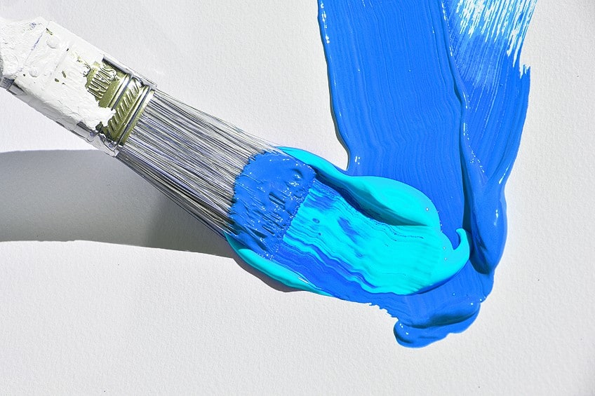
So, even if you can mix something that closely resembles cerulean blue, it might not react the same way you want it to. How to mix cerulean blue? If you are not too concerned about creating the perfect cerulean blue, you can use various blue pigments to create a blue that is close to cerulean.
This can include using cobalt blue, phthalo blue, or an ultramarine blue, to which you add white into the mix to create a cerulean tone.
How to Use Cerulean Blue
Cerulean blue is a great color to use if you are looking to convey a sense of professionalism and trustworthiness for your brand. It is also a popular color in the fashion and home interior industries. Cerulean blue can be worn by anybody and is one of the color trends for 2023.

Cerulean is a color that can help you to feel calm, happy, and confident, and there are many ways to wear the color as it is so versatile. You can get any type of outfit or accessory in cerulean blue, from dresses and skirts to shirts, shoes, handbags, and jackets. Cerulean also pairs wonderfully with most colors, from warm yellows and chocolate browns to pale grays, black, and white.
Cerulean Blue Interior Designs
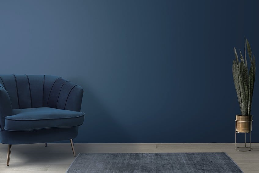
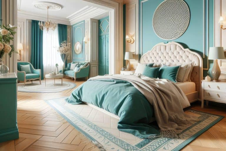
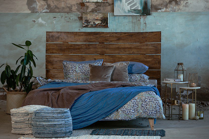
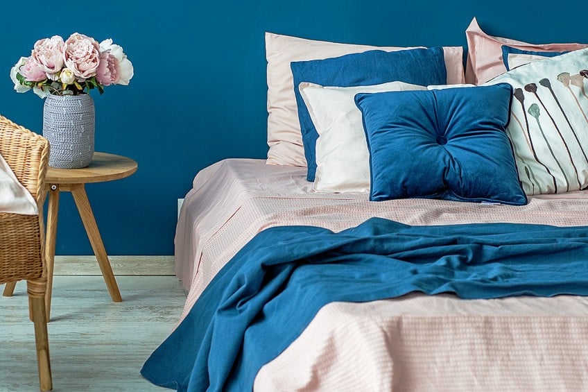
Cerulean blue is a vibrant and optimistic color that can easily be used in any room of the home. It is also quite versatile, able to work with many different colors, and can act as a perfect backdrop for pops of color. Cerulean blue can also be the option that adds that subtle hint of color to a neutral room.
You can use cerulean blue as your base color; however, the design and space need to pull off the energy of the color.
Otherwise, you run the risk of producing an overstimulating and overwhelming space. It is much easier to use cerulean as an accent color, for example, an accent wall, painting the kitchen cabinetry, or simply adding cushions or patterned rugs for a more subtle effect. Cerulean blue also works nicely with natural elements like stone, white painted and natural woodwork, and marble. Here are a few ideas for using cerulean blue in the home.
- If using cerulean seems challenging, start small and introduce the color through artwork or accessories. You can always increase as your taste changes.
- Layer different shades of blue, where cerulean will add more vibrancy to the look.
- Add neutral textured features with cerulean blue.
- Consider adding copper or brass touches with cerulean to add a bit of a luxury feel.
- To create a more inviting and appealing space, balance the cooler cerulean with warmer tones.

Even though cerulean blue can be a calming color, it also provides a sense of energy. So, if you are looking for a vibrant blue that can help to elevate a design, then cerulean blue might be what you are looking for. If you are an artist, you might want to consider getting a tube of cerulean blue the next time you need more paint – you never know the difference it can make!
Frequently Asked Questions
What Colors Go With Cerulean Blue?
Cerulean blue is a cool blue that has a greenish undertone and goes well with other shades of blue and green. The color also works well with neutral tones like white, gray, and black. To add contrast, different shades of orange, red, and yellow work well with cerulean blue.
What Does Cerulean Blue Mean?
Cerulean blue is a relaxing and calming color that can evoke a sense of peace. As with all shades of blue, it also evokes confidence and has a certain amount of vibrancy and energy. Cerulean is also a reference to the sky and the heavens.
Can You Mix Cerulean Blue Paint?
You can use a variety of blue paints, such as phthalo blue and white to get something close to cerulean blue. These can be used to produce some realistic and atmospheric effects. However, nothing beats the real cerulean blue paint with its vibrant, semi-transparent effects, and its low tinting strength.
In 2005, Charlene completed her Wellness Diplomas in Therapeutic Aromatherapy and Reflexology from the International School of Reflexology and Meridian Therapy. She worked for a company offering corporate wellness programs for a couple of years, before opening up her own therapy practice. It was in 2015 that a friend, who was a digital marketer, asked her to join her company as a content creator, and this is where she found her excitement for writing.
Since joining the content writing world, she has gained a lot of experience over the years writing on a diverse selection of topics, from beauty, health, wellness, travel, and more. Due to various circumstances, she had to close her therapy practice and is now a full-time freelance writer. Being a creative person, she could not pass up the opportunity to contribute to the Art in Context team, where is was in her element, writing about a variety of art and craft topics. Contributing articles for over three years now, her knowledge in this area has grown, and she has gotten to explore her creativity and improve her research and writing skills.
Charlene Lewis has been working for artincontext.org since the relaunch in 2020. She is an experienced writer and mainly focuses on the topics of color theory, painting and drawing.
Learn more about Charlene Lewis and the Art in Context Team.
Cite this Article
Charlene, Lewis, “Cerulean Blue – The Color of Serenity.” Art in Context. September 13, 2023. URL: https://artincontext.org/cerulean-blue/
Lewis, C. (2023, 13 September). Cerulean Blue – The Color of Serenity. Art in Context. https://artincontext.org/cerulean-blue/
Lewis, Charlene. “Cerulean Blue – The Color of Serenity.” Art in Context, September 13, 2023. https://artincontext.org/cerulean-blue/.


