Worst Color Combinations – 15 Color Combos That Clash
Welcome to the captivating world of interior design, where every stroke of color holds the potential to weave tales of beauty and harmony. As a seasoned design aficionado, I’ve ventured through countless palettes, navigating the delicate balance between elegance and chaos. Today, I invite you to explore with me the intriguing realm of the worst color combinations – a journey that promises both cautionary lessons and boundless inspiration.
15 Color Catastrophes: Combinations to Avoid at All Costs
In the vibrant tapestry of interior design, navigating through a palette fraught with pitfalls is an art form in itself. This article serves as a beacon of caution, illuminating the treacherous paths where hues collide and harmony unravels. From clashing contrasts to jarring clashes, this compendium offers a stark reminder of the perils lurking within the spectrum. Each entry serves as a testament to the power of color harmony, urging designers to tread with caution and embrace the transformative potential of informed choices.
Neon Green and Hot Pink
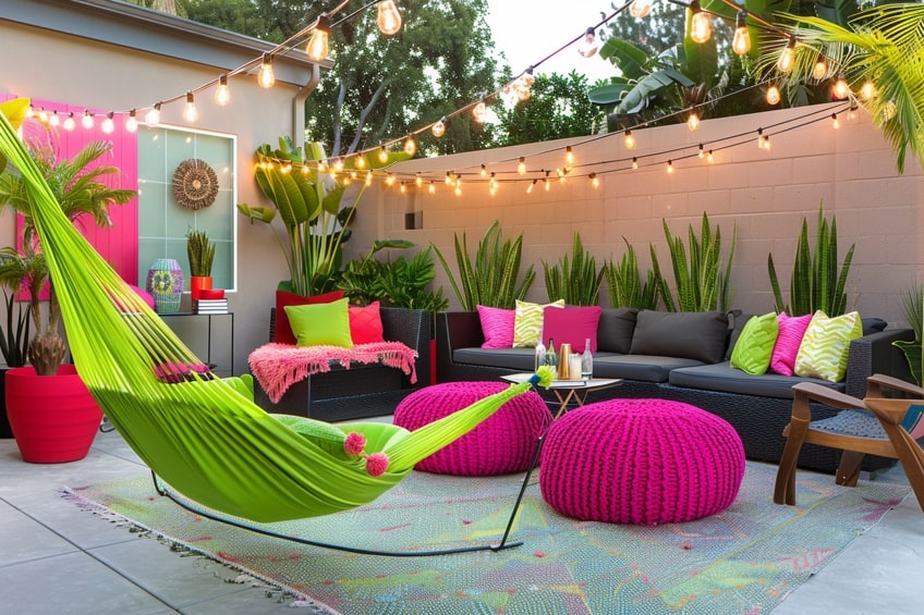
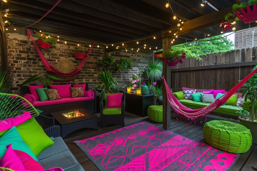
Neon green and hot pink, while vibrant individually, clash fiercely when paired together. The intense saturation of both colors creates visual chaos, overwhelming the senses and disrupting the balance of any space. As an interior design expert, I recommend using these colors sparingly as accents rather than dominant hues. Incorporating neutrals like white or gray can help tone down the intensity and create a more balanced composition.
| Shade | Hex Code | CMYK Color Code (%) | RGB Color Code | Color |
| Neon Green | #39FF14 | 72, 0, 100, 0 | 57, 255, 20 | |
| Hot Pink | #FF69B4 | 0, 82, 28, 0 | 255, 105, 180 |
Mustard Yellow and Olive Green
The combination of mustard yellow and olive green often lacks contrast and depth, resulting in a dull and uninspiring aesthetic. These muted tones can easily blend into one another, creating a monotonous and uninteresting atmosphere. To avoid this, I suggest incorporating pops of contrasting colors, such as navy blue or burnt orange, to add visual interest and dimension to the space.
| Shade | Hex Code | CMYK Color Code (%) | RGB Color Code | Color |
| Mustard Yellow | #FFDB58 | 0, 7, 68, 0 | 255, 219, 88 | |
| Olive Green | #808000 | 50, 0, 100, 50 | 128, 128, 0 |

Orange and Purple
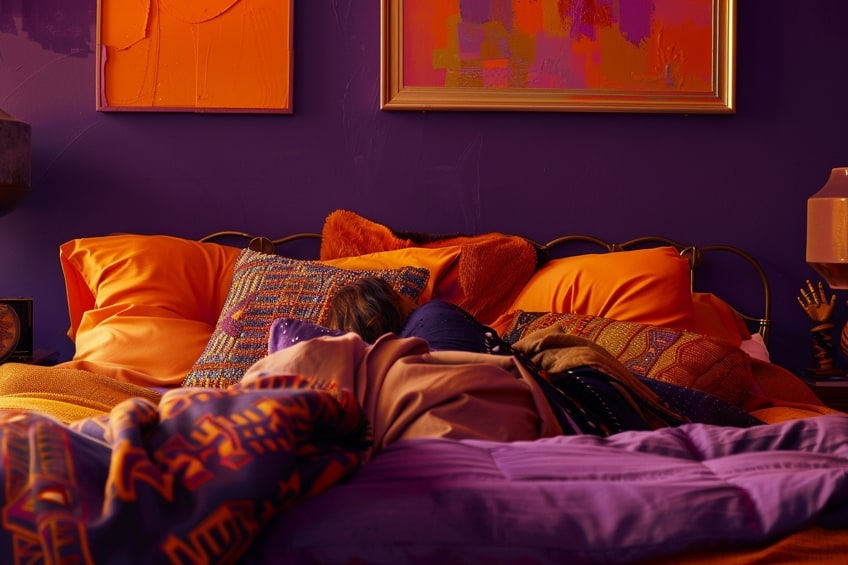
Orange and purple, while complementary on the color wheel, can be challenging to balance in interior design. The boldness of these hues can easily overpower a space, creating a sense of visual overload. As a seasoned interior designer, I recommend using these colors in moderation and balancing them with neutral tones like white or beige. Additionally, opting for lighter shades of orange and purple can help soften the contrast and create a more harmonious environment.
| Shade | Hex Code | CMYK Color Code (%) | RGB Color Code | Color |
| Orange | #FFA500 | 0, 50, 100, 0 | 255, 165, 0 | |
| Purple | #800080 | 0, 100, 0, 50 | 128, 0, 128 |
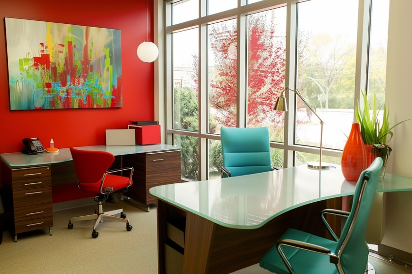
Bright Red and Turquoise
The combination of bright red and turquoise can evoke a sense of chaos and confusion due to their clashing vibrancy. These colors compete for attention rather than complementing each other, resulting in a disjointed and overwhelming visual experience. To mitigate this, I advise using these colors as accent pieces rather than primary elements in the design. Incorporating plenty of white or other neutral tones can help balance the intensity of these hues and create a more cohesive overall look.
| Shade | Hex Code | CMYK Color Code (%) | RGB Color Code | Color |
| Bright Red | #FF0000 | 0, 100, 100, 0 | 255, 0, 0 | |
| Turquoise | #40E0D0 | 50, 0, 16, 0 | 64, 224, 208 |
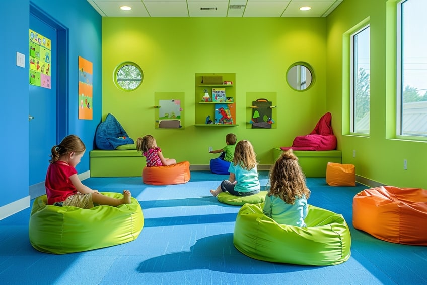
Lime Green and Electric Blue
Lime green and electric blue, both bold and attention-grabbing colors, can create a clash of energies when paired together. Their high saturation levels can overpower a space and create a jarring visual effect. As an expert in interior design, I recommend employing these colors strategically, utilizing them as accents rather than dominant shades. Incorporating natural elements such as wood or incorporating textures like woven fabrics can help soften the impact of these bright hues and create a more balanced atmosphere.
| Shade | Hex Code | CMYK Color Code (%) | RGB Color Code | Color |
| Lime Green | #32CD32 | 74, 0, 100, 19 | 50, 205, 50 | |
| Electric Blue | #7DF9FF | 59, 0, 3, 0 | 125, 249, 255 |
Brown and Gray
Brown and gray, while both neutral tones, can sometimes create a lackluster and uninspired color palette when used together. Their similar tonalities can blend into one another, resulting in a flat and monochromatic look. To avoid this, I recommend incorporating varying shades of brown and gray to add depth and dimension to the space. Additionally, introducing pops of contrasting colors or textures can help break up the monotony and create visual interest.
| Shade | Hex Code | CMYK Color Code (%) | RGB Color Code | Color |
| Brown | #A52A2A | 0, 58, 77, 34 | 165, 42, 42 | |
| Gray | #808080 | 0, 0, 0, 50 | 128, 128, 128 |
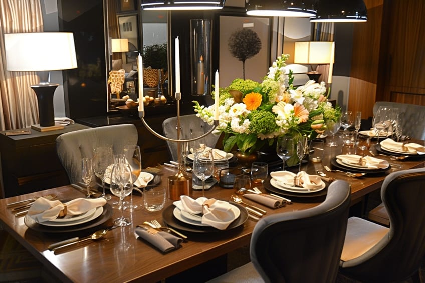
Navy Blue and Black
Navy blue and black, while both classic and sophisticated colors individually, can create a sense of heaviness and darkness when paired together. Their deep tones can absorb light and make a space feel smaller and more closed off. As a seasoned interior designer, I suggest using these colors sparingly and balancing them with lighter hues to prevent the space from feeling too dark and oppressive. Incorporating reflective surfaces like mirrors or metallic accents can also help bounce light around the room and create a brighter, more inviting atmosphere.
| Shade | Hex Code | CMYK Color Code (%) | RGB Color Code | Color |
| Navy Blue | #000080 | 100, 100, 0, 50 | 0, 0, 128 | |
| Black | #000000 | 0, 0, 0, 100 | 0, 0, 0 |

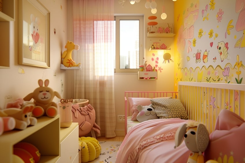
Baby Pink and Bright Yellow
The combination of baby pink and bright yellow can evoke a childlike and overly saccharine aesthetic when used together. Their contrasting tones can clash rather than complement each other, resulting in a disjointed and unbalanced look. To avoid this, I recommend using these colors in moderation and balancing them with neutral tones like white or gray. Incorporating softer shades of pink and yellow can also help create a more subtle and sophisticated color palette.
| Shade | Hex Code | CMYK Color Code (%) | RGB Color Code | Color |
| Baby Pink | #F4C2C2 | 0, 29, 23, 4 | 244, 194, 194 | |
| Bright Yellow | #FFD700 | 0, 0, 100, 0 | 255, 215, 0 |
Dark Brown and Dark Green
Pairing dark brown with dark green can often lead to a lack of contrast and visual interest in a space. These deep, earthy tones may blend together, creating a heavy and somber atmosphere. To prevent this, I recommend incorporating lighter shades of brown or green to add depth and variation to the color scheme. Additionally, introducing pops of contrasting colors such as cream or mustard yellow can help brighten the space and create a more dynamic visual impact.
| Shade | Hex Code | CMYK Color Code (%) | RGB Color Code | Color |
| Dark Brown | #654321 | 0, 36, 74, 60 | 101, 67, 33 | |
| Dark Green | #006400 | 100, 0, 100, 60 | 0, 100, 0 |
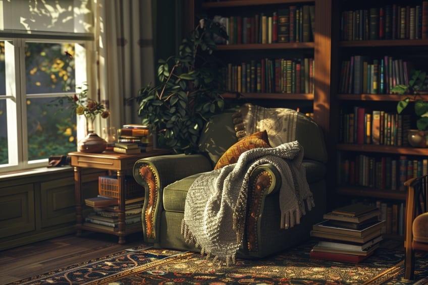
Pastel Pink and Pastel Yellow
While pastel pink and pastel yellow may seem like a charming combination, they can sometimes lack visual depth and sophistication when used together. Their soft and delicate hues may result in a space that feels overly sweet or juvenile. To elevate this pairing, I suggest incorporating richer accent colors such as navy blue or emerald green to add contrast and balance. Additionally, incorporating textures like velvet or metallic finishes can add a touch of luxury and sophistication to the space.
| Shade | Hex Code | CMYK Color Code (%) | RGB Color Code | Color |
| Pastel Pink | #FFD1DC | 0, 25, 10, 0 | 255, 209, 220 | |
| Pastel Yellow | #FFFF99 | 0, 0, 35, 0 | 255, 255, 153 |
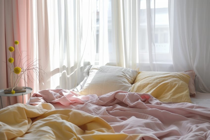
Burgundy and Forest Green
Burgundy and forest green, while both rich and elegant colors individually, can create a heavy and dated aesthetic when paired together. Their deep, saturated tones may overwhelm a space and make it feel dark and oppressive. To modernize this pairing, I recommend incorporating lighter, fresher hues such as blush pink or sage green to soften the contrast. Additionally, adding natural elements like wood or incorporating plenty of natural light can help lighten the mood and create a more inviting atmosphere.
| Shade | Hex Code | CMYK Color Code (%) | RGB Color Code | Color |
| Burgundy | #800020 | 0, 100, 75, 49 | 128, 0, 32 | |
| Forest Green | #228B22 | 94, 0, 100, 45 | 34, 139, 34 |
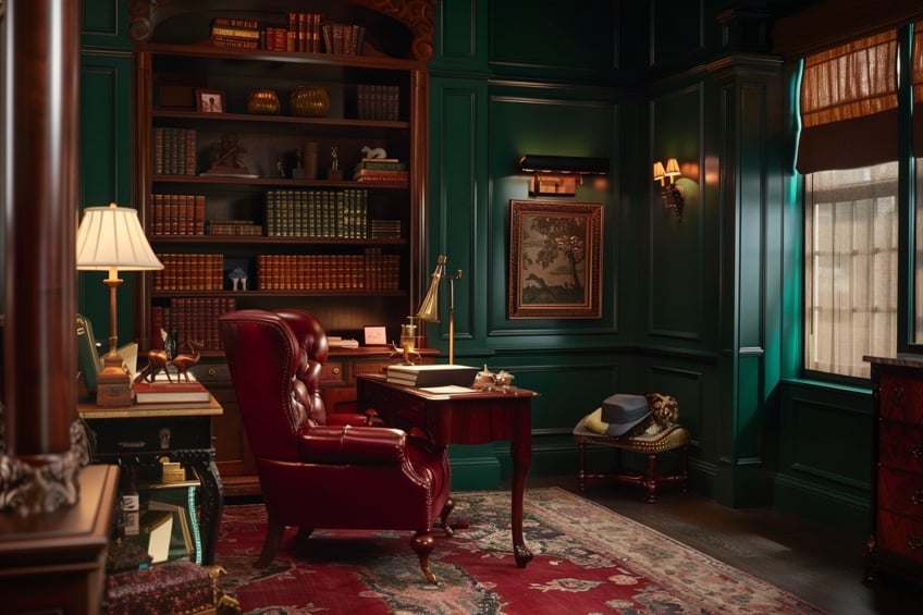
Lavender and Lime Green
The combination of lavender and lime green can create a clash of energies due to their contrasting undertones. Lavender has cool undertones, while lime green has warm undertones, resulting in a discordant visual effect. To harmonize this pairing, I recommend balancing the coolness of lavender with warmer neutral tones like beige or taupe. Additionally, incorporating plenty of white or light gray can help create a sense of cohesion and balance in the space.
| Shade | Hex Code | CMYK Color Code (%) | RGB Color Code | Color |
| Lavender | #E6E6FA | 8, 8, 0, 3 | 230, 230, 250 | |
| Lime Green | #32CD32 | 74, 0, 100, 19 | 50, 205, 50 |

Beige and Neon Orange
Beige and neon orange, while seemingly disparate, can clash due to their stark contrast in intensity and warmth. The muted neutrality of beige can often be overwhelmed by the boldness of neon orange, creating an unbalanced and chaotic visual experience. To navigate this combination, I recommend using neon orange as an accent color in small doses to add pops of vibrancy without overpowering the space. Pairing it with softer, more muted tones like cream or taupe can help temper its intensity and create a more harmonious color scheme.
| Shade | Hex Code | CMYK Color Code (%) | RGB Color Code | Color |
| Beige | #F5F5DC | 0, 0, 13, 4 | 245, 245, 220 | |
| Neon Orange | #FFA500 | 0, 50, 100, 0 | 255, 165, 0 |

Aqua and Coral
Aqua and coral, while both evocative of coastal themes and tropical vibes, can sometimes clash due to their competing undertones and saturation levels. Aqua leans towards cool tones, while coral tends to be warmer, creating a discordant contrast in the space. To reconcile this pairing, I advise balancing the coolness of aqua with warm neutral tones like beige or sandy hues. Incorporating natural textures such as rattan or driftwood can also help tie the colors together and evoke a cohesive coastal aesthetic.
| Shade | Hex Code | CMYK Color Code (%) | RGB Color Code | Color |
| Aqua | #00FFFF | 100, 0, 0, 0 | 0, 255, 255 | |
| Coral | #FF7F50 | 0, 50, 75, 0 | 255, 127, 80 |
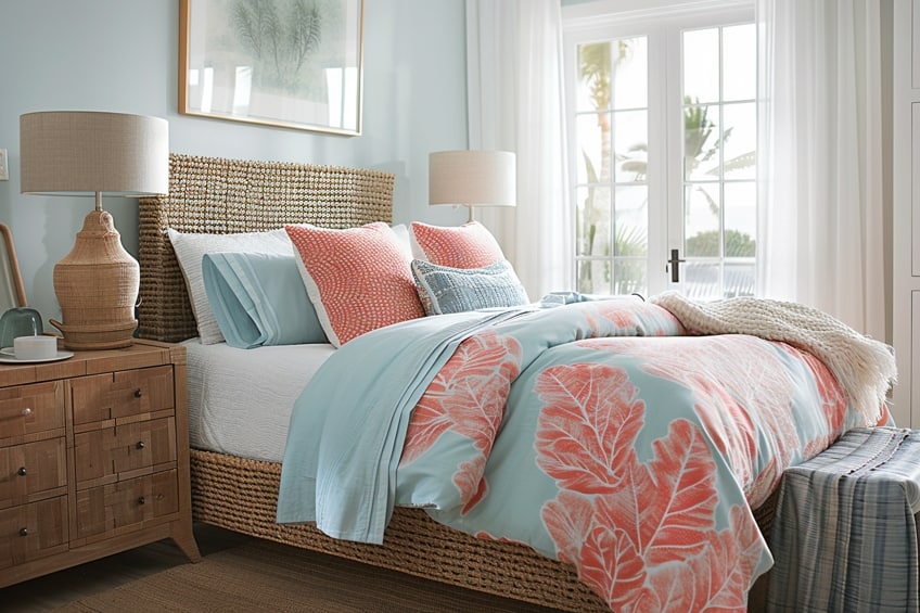
Mint Green and Lemon Yellow
Mint green and lemon yellow, while refreshing and cheerful individually, can create a clash of energies when combined due to their contrasting undertones and saturation levels. Mint green leans towards cool tones, while lemon yellow tends to be warmer, resulting in a visual disconnect. To harmonize this pairing, I recommend balancing the coolness of mint green with warm neutral tones like ivory or light gray. Incorporating natural elements such as wood or bamboo accents can also help bridge the gap between these contrasting colors and create a more cohesive color palette.
| Shade | Hex Code | CMYK Color Code (%) | RGB Color Code | Color |
| Mint Green | #98FF98 | 14, 0, 14, 0 | 152, 255, 152 | |
| Lemon Yellow | #FFF44F | 0, 2, 88, 0 | 255, 244, 79 |
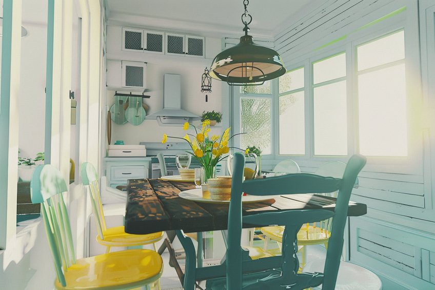
As we draw the curtains on this enlightening journey through the realm of the 15 worst color combinations, I’m filled with a profound sense of gratitude for the opportunity to share insights and wisdom with you. Through our exploration, we’ve uncovered the intricacies of color theory, empowering you, dear readers, to navigate the labyrinth of design with confidence and discernment. May this newfound knowledge serve as a guiding light, illuminating your path towards creating spaces that resonate with harmony, balance, and boundless creativity. Remember, in the tapestry of design, every color holds a story – let yours be one of elegance and brilliance.
Frequently Asked Questions
What Are Some Color Combinations to Avoid in Interior Design?
In my experience, there are several color combinations that I tend to avoid in interior design to ensure a cohesive and visually appealing space. One combination that often clashes is pairing colors that are opposite each other on the color wheel, such as red and green or orange and blue, as they can create too much contrast and feel jarring to the eye. Similarly, I steer clear of combining too many bold and saturated hues in one space, as this can lead to sensory overload and make the room feel chaotic rather than harmonious.
Why Are Certain Color Combinations Considered Worse for Design?
Certain color combinations are deemed worse for design because they can disrupt the balance and harmony of a space, impacting the overall aesthetic and mood. For example, combinations that lack contrast or have clashing undertones may create visual discord and make it difficult for the eyes to rest. Additionally, some combinations may evoke negative emotions or associations due to cultural or psychological factors, detracting from the intended atmosphere of the room.
How Can I Avoid Choosing Poor Color Combinations for My Home?
To avoid choosing unfavorable color combinations for my home, I take a thoughtful and deliberate approach to color selection. I start by considering the mood and atmosphere I want to create in each room, then explore color palettes that align with those goals. I also pay attention to the principles of color theory, ensuring that I select hues with complementary undertones and balanced contrasts. Additionally, I use swatches and samples to test potential combinations in different lighting conditions to see how they interact before making a final decision.
In 2005, Charlene completed her Wellness Diplomas in Therapeutic Aromatherapy and Reflexology from the International School of Reflexology and Meridian Therapy. She worked for a company offering corporate wellness programs for a couple of years, before opening up her own therapy practice. It was in 2015 that a friend, who was a digital marketer, asked her to join her company as a content creator, and this is where she found her excitement for writing.
Since joining the content writing world, she has gained a lot of experience over the years writing on a diverse selection of topics, from beauty, health, wellness, travel, and more. Due to various circumstances, she had to close her therapy practice and is now a full-time freelance writer. Being a creative person, she could not pass up the opportunity to contribute to the Art in Context team, where is was in her element, writing about a variety of art and craft topics. Contributing articles for over three years now, her knowledge in this area has grown, and she has gotten to explore her creativity and improve her research and writing skills.
Charlene Lewis has been working for artincontext.org since the relaunch in 2020. She is an experienced writer and mainly focuses on the topics of color theory, painting and drawing.
Learn more about Charlene Lewis and the Art in Context Team.
Cite this Article
Charlene, Lewis, “Worst Color Combinations – 15 Color Combos That Clash.” Art in Context. March 12, 2024. URL: https://artincontext.org/worst-color-combinations/
Lewis, C. (2024, 12 March). Worst Color Combinations – 15 Color Combos That Clash. Art in Context. https://artincontext.org/worst-color-combinations/
Lewis, Charlene. “Worst Color Combinations – 15 Color Combos That Clash.” Art in Context, March 12, 2024. https://artincontext.org/worst-color-combinations/.


