


What Colors Make Orange – Easy Mixing Guide for 25 Shades
Are you a budding artist trying to understand colors? Want to gain knowledge on how to make orange? There are many instances where you can apply this knowledge, from oil to watercolor painting, creating amazing frosting for cakes, or working with polymer clay. All follow the same simple rules when it comes to what colors make orange. However, as with all colors, there is not only one clear-cut color, but many shades of orange. We’ll show you how to easily mix your own orange shades for 25 different shades.
What Two Colors Make Orange?
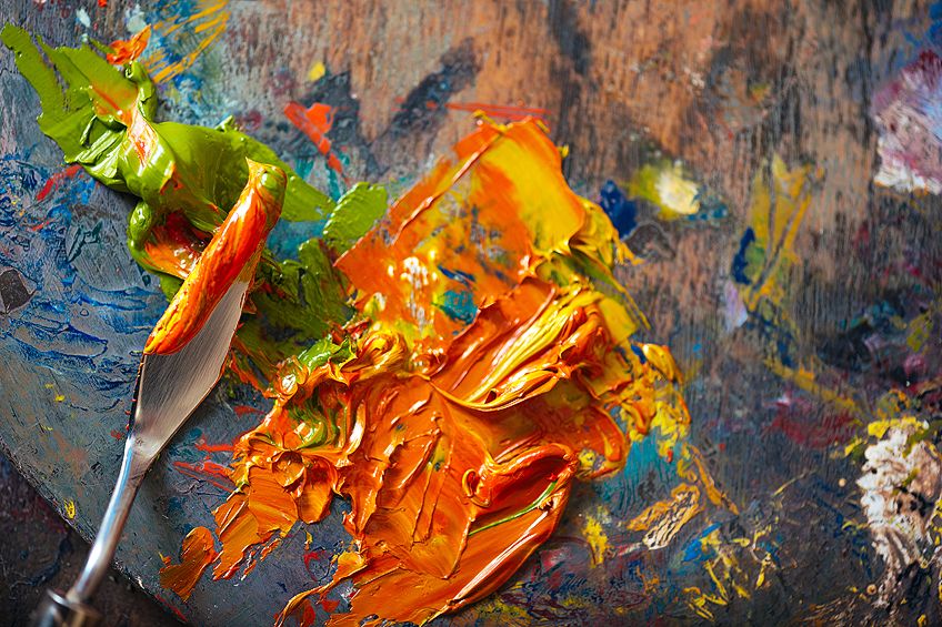
The very basics of how to make orange are simple. Since it is a secondary color, you need to combine the primary colors of yellow and red. When adding equal portions of these two colors, you will come out with a true orange. However, you can also produce a selection of shades of orange. Adding more yellow will naturally lighten the overall orange color and more red will darken it.

Two of the more basic color shades include yellow-orange, which incorporates two parts yellow with one part red. Red-orange uses two parts red and one part yellow, these shades are also known as tertiary colors. To get more possibilities, you can also use different forms of the basic red and yellow. For example, you can combine a lemon yellow with a cadmium red or deep red to get burnt orange.
You do not necessarily have to use the two primary colors. You can use other colors to create the primary colors. For example, you can combine red and green to create yellow or yellow and magenta to create red. You can even combine several colors to create orange if you do not have all the primary colors.
To create orange, combine red and green, which should give you yellow. You can then combine the yellow with more red to create orange. A color wheel will help you to understand how these colors work together more clearly.
Mixing Recipes for the 25 Most Popular Orange Shades
| Color Name | Mixing Recipe |
|---|---|
| Orange | 1 part red, 1 part yellow |
| Red-Orange | 2 parts red, 1 part yellow |
| Dark Orange | 2 parts red, 1 part yellow, <1 part black |
| Tomato | 4 parts red, 1 part orange |
| Coral | 2 parts orange, 1 part pink |
| Gold | 1 part yellow, 1 part orange, hint of brown |
| Light Salmon | 2 parts orange, 1 part pink, hint of white |
| Dark Salmon | 2 parts orange, 1 part red, hint of brown |
| Salmon | 2 parts orange, 1 part pink |
| Light Salmon | 2 parts orange, 1 part pink, hint of white |
| Coral | 2 parts orange, 1 part pink |
| Tomato | 3 parts red, 2 parts orange |
| Orange Red | 3 parts red, 1 part yellow |
| Dark Orange | 2 parts red, 1 part yellow, hint of black |
| Orange | 2 parts red, 1 part yellow |
| Peach Puff | 3 parts orange, 1 part white |
| Moccasin | 3 parts orange, 2 parts white |
| Papaya Whip | 4 parts orange, 1 part white |
| Bisque | 3 parts orange, 1 part white, hint of red |
| Navajo White | 4 parts orange, 1 part white, hint of yellow |
| Wheat | 3 parts orange, 2 parts white, hint of yellow |
| Burlywood | 3 parts orange, 1 part brown |
| Tan | 3 parts orange, 1 part brown, hint of white |
| Rosy Brown | 2 parts orange, 1 part red, hint of brown |
| Sandy Brown | 3 parts orange, 1 part brown, hint of yellow |
| Goldenrod | 3 parts yellow, 1 part orange, hint of brown |

Color Value
How to make dark orange? This describes the hue, shade, or tint of color. In other words, describing how dark or light the color appears to be. Creating lighter and darker shades will lend more dimension to a painting. When making the color orange darker, you can simply use a small amount of black. However, this can be tricky, because if you add too much, you will not be able to correct the mistake easily.
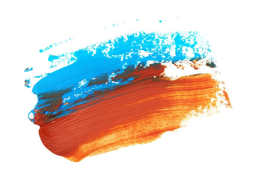
Some black colors have a green base, which can also create an unpleasant brownish orange. You could try using a complementary color like blue; however, it will depend on how much of each color you add and what form of each you use. A few examples of the different forms of blue include navy blue, cobalt blue, aquamarine, and ultramarine, amongst many more. Combining your basic complementary colors cancels each other out and you will be left with brown or a gray-brown chromatic neutral color. So, again, using small amounts can tone the orange down.
Experiment beforehand to see what colors you can achieve. You can also try combining darker tones of red to orange, which should also tone down the color, making it darker.
Color Bias: Creating Cool and Warmer Orange Colors
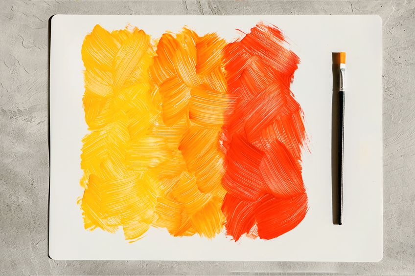
When looking at orange, how does the color make you feel? Blue is associated more with cooler colors, while reds, yellows, and orange are warmer colors. However, within your red and yellow range of colors, some lean more towards the cooler side as small amounts of blue are included, thus creating a more muted orange. The warmer colors of red and yellow will create a more vivid and brilliant orange.
Tips for Using Different Shades of Orange
Mixing and blending colors is a journey of discovery, you will need to experiment and learn as you progress. The most important thing is to have fun and remember to write down what you are doing so that you can follow the same process in the future. There are endless combinations and variations, so have fun while creating the different shades of orange and other colors.
- If you need to make an orange color appear brighter, a simple way to do this is to surround the orange color with shades of blue. Complementary colors can create a bold contrast.
- When painting, a cadmium orange might be the most intense orange color available.
- You do get cooler varieties of orange, so when muting the color rather use warmer reds and yellows, as they lean more towards orange as well as to each other.
- It is helpful to create a color chart for comparison and write down what you are doing so that you can replicate the process.
- Always add small amounts of color as you go. A little bit often goes a long way.
- Never overmix colors, as in most cases, it is difficult to fix.
- Add dark to light – it is easier to lighten a darker color than the other way around.
- When using paint pigments, make sure that it is a pure, single pigment to get the most intense colors.
- Try not to overwork an area, as this can damage the surface on which you are painting.
Frequently Asked Questions
What Two Colors Make Orange?
The main colors that produce orange are yellow and red. You can also use different hues or shades of each red or yellow color to create a variety of orange shades.
How to Make Red Orange?
This is a simple process of adding more of one color than another. Combine two parts red with one part yellow to create a red-orange color. Then, you can simply reverse the ratio to create a yellow-orange color. These are two of the more common tertiary orange colors. You can also add equal amounts of orange and red to create a red-orange.
How to Make Dark Orange?
Orange can be darkened by adding a warm blue or ultramarine color. You can also add black, but this can drastically alter the color appearance if too much is used. Also, adding too much blue color can create a brown or black appearance. This is because blue is a complementary color to orange – they sit opposite each other on the color wheel and cancel each other out, creating a monochromatic color.
How Do You Create a Bold Orange Color?
This deals with color bias or the temperature of a color. You have warmer and cooler colors. So, you can get cooler as well as warmer yellows and reds. By combining warmer colors, you can create a more vivid and bold orange color.
How Can You Make Orange Stand Out?
The color wheel is important in this instance. When looking at the colors, the complementary color (the color directly across from another) will create a contrast. Each color will stand out when placed adjacent to the other. For example, a red-orange will work well when adjacent to an indigo-blue color.

In 2005, Charlene completed her Wellness Diplomas in Therapeutic Aromatherapy and Reflexology from the International School of Reflexology and Meridian Therapy. She worked for a company offering corporate wellness programs for a couple of years, before opening up her own therapy practice. It was in 2015 that a friend, who was a digital marketer, asked her to join her company as a content creator, and this is where she found her excitement for writing.
Since joining the content writing world, she has gained a lot of experience over the years writing on a diverse selection of topics, from beauty, health, wellness, travel, and more. Due to various circumstances, she had to close her therapy practice and is now a full-time freelance writer. Being a creative person, she could not pass up the opportunity to contribute to the Art in Context team, where is was in her element, writing about a variety of art and craft topics. Contributing articles for over three years now, her knowledge in this area has grown, and she has gotten to explore her creativity and improve her research and writing skills.
Charlene Lewis has been working for artincontext.org since the relaunch in 2020. She is an experienced writer and mainly focuses on the topics of color theory, painting and drawing.
Learn more about Charlene Lewis and the Art in Context Team.
Cite this Article
Charlene, Lewis, “What Colors Make Orange – Easy Mixing Guide for 25 Shades.” Art in Context. June 24, 2021. URL: https://artincontext.org/what-colors-make-orange/
Lewis, C. (2021, 24 June). What Colors Make Orange – Easy Mixing Guide for 25 Shades. Art in Context. https://artincontext.org/what-colors-make-orange/
Lewis, Charlene. “What Colors Make Orange – Easy Mixing Guide for 25 Shades.” Art in Context, June 24, 2021. https://artincontext.org/what-colors-make-orange/.


Very helpful article, thank you for sharing this!