What Color Does Pink and Orange Make? – Shades of Peach
If you are an artist or designer, you might find it fun to play around with different colors. Pink and orange are both warm and happy colors to work with, so what do you think about pink and orange combined? If you are curious about mixing orange and pink, read further to discover the answer and more!
What Color Does Pink and Orange Make?
Pink and orange combined will create a peachy color. Pink is a softer shade of red, and if you rather take red and orange, you will create a red-orange, also known as vermillion. Since white has been added to the red, it will create a softer shade of vermillion, which can range from pink-orange to orange-pink.
Of course, it does depend on the type of pink and orange you use, which can then create variations of the peachy color.
Do pink and orange go together? Yes, depending on what you wish to achieve, pink and orange can work wonderfully together when mixed. In the table below, you can see a basic pink and pure orange you can find online. These combined form the peach displayed.

| Shade | Hex Code | CMYK Color Code (%) | RGB Color Code | Color |
| Pink | #ffc0cb | 0, 25, 20, 0 | 255, 192, 203 | |
| Orange | #ffa500 | 0, 35, 100, 0 | 255, 165, 0 | |
| Peach | #ffb366 | 0, 30, 60, 0 | 255, 179, 102 |
Mixing Results for Different Shades of Orange and Pink
| Pink Shade | Orange Shade | Mixed Color |
|---|---|---|
| #FFC0CB | #FFA500 | #ffb265 |
| #FFC0CB | #FF8C00 | #ffa665 |
| #FFC0CB | #FF7F50 | #ff9f8d |
| #FFC0CB | #FF6347 | #ff9189 |
| #FFC0CB | #FF4500 | #ff8265 |
| #FF69B4 | #FFA500 | #ff875a |
| #FF69B4 | #FF8C00 | #ff7a5a |
| #FF69B4 | #FF7F50 | #ff7482 |
| #FF69B4 | #FF6347 | #ff667d |
| #FF69B4 | #FF4500 | #ff575a |
| #FF1493 | #FFA500 | #ff5c49 |
| #FF1493 | #FF8C00 | #ff5049 |
| #FF1493 | #FF7F50 | #ff4971 |
| #FF1493 | #FF6347 | #ff3b6d |
| #FF1493 | #FF4500 | #ff2c49 |
| #DB7093 | #FFA500 | #ed8a49 |
| #DB7093 | #FF8C00 | #ed7e49 |
| #DB7093 | #FF7F50 | #ed7771 |
| #DB7093 | #FF6347 | #ed696d |
| #DB7093 | #FF4500 | #ed5a49 |
Understanding Pink and Orange As Colors
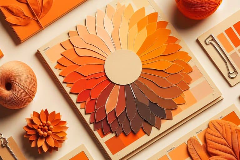
Most of us learned the traditional color model at school, where your primary colors are red, yellow, and blue. You can see these colors as well as the secondary and tertiary hues on the color wheel. In this model, the secondary colors, which are a combination of the primary colors, include orange, green, and purple.
The tertiary colors are a blend of the primary and secondary colors and include the following.

- Blue and purple
- Purple and red
- Green and blue
- Yellow and green
- Orange and yellow
There is one last combination, which is red and orange, which is what we are looking at in this article. The only difference is that red has a little white added to it, which makes it pink. This also means that you have created a tint of red. Other terms you might come across in color theory include some of the following.
- Shade: The opposite of a tint is a shade, which has black added to it.
- Tone: When gray has been combined with a pure hue, making it less vibrant.
- Chroma: This is the purity of a hue, which means a color with high chroma does not contain any gray, black, or white.
- Value: You can change the value of a color so it produces a darker or lighter hue.
- Saturation: When a color has a high intensity or brightness, it is highly saturated. Low saturation colors are dull and muted.
When working with pigments, which includes all physical mediums like paints, pencils, pastels, or printing ink, they all use subtractive color mixing. The color you observe is what is reflected off the surface, while the other colors have been absorbed. So, if you end up mixing all three of the primary color paints on your palette, you will create a neutral brownish-to-grayish color. This can also happen when combining complementary colors, or with colors that are on opposing sides of the color wheel. In color theory, there is also color bias. Each color there is, can either be warm or cool.
The cool colors include blue, green, and purple. Pink, being a shade of red, is a warm color, just like yellow and orange.
Meaning of Pink
Color meanings can be varied, as many things can influence a person, such as the community you live in, or maybe you had a bad experience and now associate it with a specific color. However, there are some general meanings in color psychology that many can relate to. Since pink is part of the red family, it has similar meanings. For example, red is often a color that has to do with romance, and so is the pink color. However, red is more passionate and fiery, while pink is subdued. Pink is also more youthful, compassionate, and playful.
The pink color can help to encourage and uplift, and similar to pastels, it is calming.

Meaning of Orange
Orange is a fun, encouraging, and uplifting color, full of enthusiasm and warmth. It is also associated with youth and is a color that helps to strengthen emotions. Orange is also seen as spontaneous and optimistic and can encourage creativity and communication. Negatively, if used improperly, it can be seen as domineering and can symbolize impatience and insincerity.
Mixing Orange and Pink Paint
Sticking with the traditional color model, what happens when mixing orange and pink paint? The simple way is to purchase a tube of pink and orange paint. However, you will have more control over your bending, if you stick to using the primary colors, which you can find in most paint kits. Pink is easy to make by simply adding red to some white paint. Keep adding a small amount of red to the white until you have the pink you want. Orange is also quite easy to produce as it is a combination of the primary colors red and yellow. You can also experiment with the ratios of red and yellow to see what variations of orange you can create.
Do pink and orange go together all the time? In other words, do you always get a peachy color when mixing pink and orange? We know that red and orange are both warm colors. However, if you mix your own pink using a cool red, it might affect the overall result.
For example, alizarin crimson is an example of a cool red, since it has a bluish undertone. You will then have blue, red, and yellow in the mixture, which can mute the resulting color, or even create a muddy brown color, depending on the ratios used. However, the simple red you get in a basic paint kit should be fine. You can also experiment with various types of orange and red to make pink, to see what happens.

You can even try making orange from pink. All you need to do is mix a pink color and then add this pink to more red paint, to create a more intense pink. Add yellow, which should produce an orange color. The ratios of paint used will determine the strength of the orange color. The best way to discover these things is to experiment and create a color palette, as you can stumble across some amazing blends without meaning to.
Creating Lighter and Darker Shades
Once you have your basic peach color, it might not be what you want. So, you can easily adjust the color by either adding more white paint to create an even lighter peachy version or adding small amounts of black to create a darker version. Remember to use black very sparingly as it will go a long way to darken a color. If black seems too much, consider using a darker orange, such as burnt orange, or magenta, which is a darker version of pink.
Meaning of Peach
Being a softer color, peach can be calming and shares many similar associations with pink and orange. The color remains vibrant and energetic, and it is a color that brings to mind joy and comfort. The stimulating color provides a sense of warmth and is also considered a more feminine color. Peach is also a dynamic and friendly color that can stimulate the appetite and help to improve energy levels.

As with orange, it can help stimulate conversation and is a great color to use in restaurants. On the downside, if overused, it can appear childish and irresponsible.
Understanding Pink and Orange in Other Color Models
Things work a little differently in other color models. The RGB color model is used when mixing colors using light. This can be seen on your computer laptop or cellphone screen. Here you will use additive color mixing, where color is created by mixing different color wavelengths. In this case, if you mix all primary colors, you will get white light. The primary colors include red, green, and blue, while the secondary colors include cyan, magenta, and yellow. For example, when you mix blue with green, you will create cyan.
The tertiary colors are created by blending the primary colors with the secondary colors. There are six tertiary colors:

- Red and yellow
- Red and magenta
- Blue and magenta
- Blue and cyan
- Green and cyan
- Green and yellow
So, in this system, orange (red and yellow) is a tertiary color. In the table below, we again have pink, orange, and peach. The orange is a pure color that has 100 percent red, 65 percent green, and zero blue. Pink also has 100 percent red, 75 percent green, and 80 percent blue. So, if you layer all these colors, you will get mostly red, 70 percent green, and less blue at 40 percent. This creates a type of peachy color.
You can also adjust the color by playing around with the saturation and brightness to create a different appearance. So, just as with painting, you can experiment with creating a variety of peach colors, as shown below.
| Shade | Hex Code | CMYK Color Code (%) | RGB Color Code | Color |
| Pink | #ffc0cb | 0, 25, 20, 0 | 255, 192, 203 | |
| Orange | #ffa500 | 0, 35, 100, 0 | 255, 165, 0 | |
| Peach | #ffb366 | 0, 30, 60, 0 | 255, 179, 102 | |
| Coral | #ff7f50 | 0, 50, 69, 0 | 255, 127, 80 | |
| Web Peach | #ffe5b4 | 0, 10, 29, 0 | 255, 229, 180 | |
| Peach Pink | #ff9a8a | 0, 40, 46, 0 | 255, 154, 138 | |
| Peach Orange | #ff775e | 0, 53, 63, 0 | 255, 119, 94 |
Printing Color Model
The color model used here is known as the CMYK system. Here cyan, magenta, and yellow are the primary hues, similar to the secondary colors for the RGB color model. The tertiary colors are the same as for the RGB color model. So, orange is again a tertiary color. However, when you blend all the primary colors here, you will create black. Pink and orange combined will again provide a peachy color.
Best Uses for Pink and Orange in Art and Design
You need color in art to help depict or describe an object, but color also helps to convey emotion and create different moods. Some colors have more of a history than others like pink, which only really came into the spotlight during the Renaissance in the 17th century. Orange, on the other hand, has been used by ancient civilizations, for example, the Egyptians used a type of mineral to produce orange paint that was used in tombs.
In art, orange conveys a sense of energy and enthusiasm.

Many have used orange to create clothing, fruit, backgrounds, and even skin color. Orange is also a great color for autumn and leaves, as you can find orange in nature and the changing seasons. The peach color has been used and is still a color that helps to portray landscapes, sunsets, portraits, and other types of art as well as design.
Graphic Design and Branding
Peach is a bright and warm option to consider for your branding options. Of course, it also depends on what message or feelings you wish to produce when people look at your website or logo. The peach color brings to mind things like summer days, warmth, fun, and the fruit itself. Here are a few ideas when using peach in a design.

- Blue and orange or peach are complementary colors, so form a high contrast, which can create a lively combination.
- Consider pairing peach with cream, which can also create a contrast. You can also play around with various intensities. Peach also works great with white.
- A great combination is mint, gold, and peach, which creates a more feminine and sophisticated look.
- Experiment with peach and use it in different elements of the design. It can look great as a background color or you can also use it as an accent for a more subtle addition.
- Pair peach with different colors to see what color combination works best.
Fashion Design
Peach has become a trending color that can easily be used in casual or formal outfits. Beautiful soft peach dresses are a popular wedding choice, but they can also be used for other formal wear. Even though peach is more of a feminine hue, it is also a popular shirt color for men. Peach works wonderfully with different shades of blue and green for contrast.
White also works wonderfully with peach, for example, consider a white blouse with peach slacks. Other neutrals like black and gray can also create a unique look.
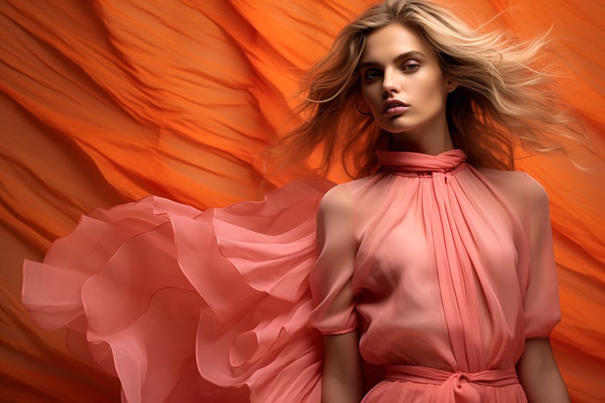
You can also use various shades of peach to create a look with more depth. Of course, the ideas are plentiful, and you can even accessorize with the color. Maybe add a peach-colored necklace, shoes, earrings, handbag, or hair clip. Peach-colored nails can also add a little warmth to a look.
Interior Designs
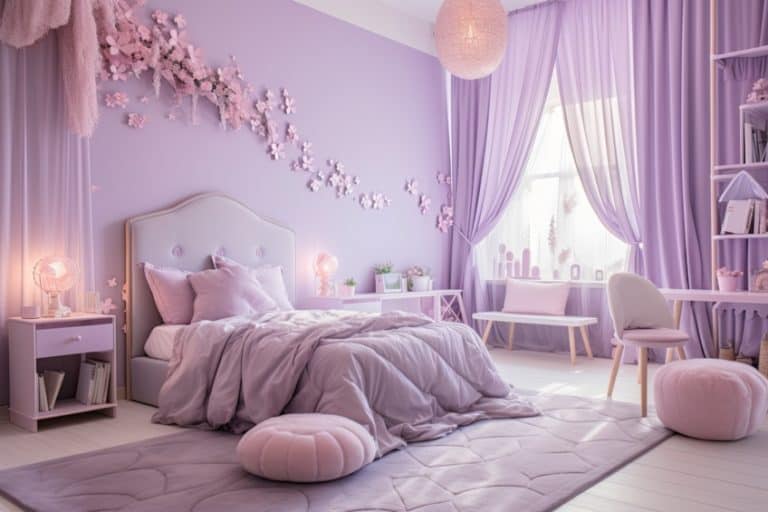
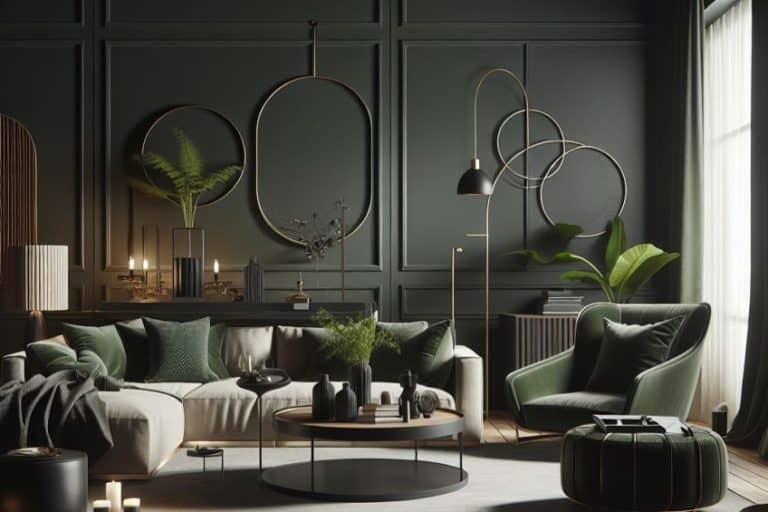
Peach is the perfect color to create a cozy, welcoming, and warm feeling. There are many variations of peach, so you can choose a lighter shade to use as a neutral or go darker and use it as an accent wall or use as an accent. You can use peach in any room of the home, depending on how much you love peach, it can be used as your main color, or you can bring it in more subtly. Accessorizing with peach is the easiest way to bring in any color. This can be a peach couch, chair, cushions, lampshade, or any number of other ideas.
If you are not happy with the look, you can easily change it again. Here are some tips for incorporating peach into your home.

- Gray is a popular neutral for interiors, but instead of pairing it with white, consider using peach for more warmth and color.
- Think about pairing peach and copper and other metallic elements, such as tables and lampstands.
- Use a soft peach color to bring warmth into the bedroom, which will still create a calming atmosphere, without being too energizing.
- You can pair peach with many colors, including different shades of blue or green, as well as red and yellow.
- Use peach to add a splash of color to a neutral theme color scheme.
- You can even use peach to transform home exteriors.
Mixing orange and pink can be an experiment in color blending, and you can create quite a few peach variations. These variations can easily be used whether you are planning to paint a room or design a website. The peach color can be subtle or more vibrant, reminding you of the juicy flesh of the fruit the color is named after. If you are looking to evoke feelings of comfort and happiness, then peach is the color for you!
Frequently Asked Questions
What Color Does Pink and Orange Make?
Whatever medium you use, when mixing orange and pink, you will come up with a type of peach color. The color can also be described as orange-pink or pink-orange, depending on how much of each color you use.
Do Pink and Orange Go Together?
Can you use pink and orange side-by-side? Both are warm colors and are found on the same side of the color wheel, so yes, they can be paired together in designs. If you like the energy and contrast, you can use more vibrant shades. However, using pastels or muted versions of each color are easier on the eye.
Is Peach a Popular Color?
The color peach has become a very popular color and is trending in 2023. Although not the official color of the year for 2023, peach is still growing to become one of the year’s most fashionable colors.
In 2005, Charlene completed her Wellness Diplomas in Therapeutic Aromatherapy and Reflexology from the International School of Reflexology and Meridian Therapy. She worked for a company offering corporate wellness programs for a couple of years, before opening up her own therapy practice. It was in 2015 that a friend, who was a digital marketer, asked her to join her company as a content creator, and this is where she found her excitement for writing.
Since joining the content writing world, she has gained a lot of experience over the years writing on a diverse selection of topics, from beauty, health, wellness, travel, and more. Due to various circumstances, she had to close her therapy practice and is now a full-time freelance writer. Being a creative person, she could not pass up the opportunity to contribute to the Art in Context team, where is was in her element, writing about a variety of art and craft topics. Contributing articles for over three years now, her knowledge in this area has grown, and she has gotten to explore her creativity and improve her research and writing skills.
Charlene Lewis has been working for artincontext.org since the relaunch in 2020. She is an experienced writer and mainly focuses on the topics of color theory, painting and drawing.
Learn more about Charlene Lewis and the Art in Context Team.
Cite this Article
Charlene, Lewis, “What Color Does Pink and Orange Make? – Shades of Peach.” Art in Context. October 3, 2023. URL: https://artincontext.org/what-color-does-pink-and-orange-make/
Lewis, C. (2023, 3 October). What Color Does Pink and Orange Make? – Shades of Peach. Art in Context. https://artincontext.org/what-color-does-pink-and-orange-make/
Lewis, Charlene. “What Color Does Pink and Orange Make? – Shades of Peach.” Art in Context, October 3, 2023. https://artincontext.org/what-color-does-pink-and-orange-make/.


