Pastel Green – Explore the Popular Springtime Shades of Green
When you consider pastel colors, the first two that come to mind are likely soft blue or pink. However, pastel green is just as appealing and may even be slightly more versatile. In this article, we are going to look at the meaning of pastel green and learn how to mix the perfect pastel green paint. So, read on to discover these details, as well as some other interesting facts about pastel green!
What Is Pastel Green?
Pastel green can be described as a softer shade of green that contains a slight yellowish undertone. This makes this shade of pastel green warm. However, depending on the undertone, pastel greens can also be cool. Our online version of pastel green has a yellowish undertone, and in the table below you can identify it by the pastel green hex code. All pastel colors have properties that include low saturation and a high value, which is seen as a softer version of the original pure color.
Saturation is the intensity of a hue, while value is how dark or light a color is.
In the table below, you can also see the breakdown of the composition of pastel green in different color models. The main use for the CMYK model is for printing, using ink colors. In this case, pastel green has equal amounts of cyan and yellow, with a low percentage of black. The RGB color model shows equal amounts of red and blue, with a slightly higher amount of green. This color model is what graphic designers would use. Of course, this can change according to the different shades of pastel green.
| Shade | Hex Code | CMYK Color Code (%) | RGB Color Code | Color |
| Pastel Green | #BEE5B0 | 17, 0, 23, 10 | 190, 229, 176 |
Pastel Green: A Brief History
Oil paints and watercolors have always been the more common painting materials throughout the years. However, there have been other art mediums that have also become popular. This is the case for the pastel medium, a powdered pigment that provides a softer shade when compared to oil paints. Pastels originated in the 16th century, but the use of pastels became popular during the 18th century, in what is known as the Rococo period.
Pastels were used in architecture, fashion, and even furniture, and it was fashionable among the wealthy during this period. For example, Marie Antoinette was known to favor pastel colors.

In the 1950s, and 1980s, pastel colors like pastel green, among others, again became quite popular as a fashion choice and with interior designs. If you have ever watched the show Miami Vice, you would have noticed the pastel trend. The trend again appeared in the 21st century, particularly in 2014. Since 2020, pastel green has become a particular favorite due to its soothing qualities.
Meaning of Pastel Green
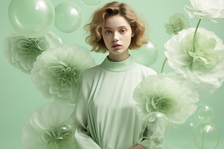
Since pastel green is part of the green family, it still has close ties to nature. Being a pastel color, its calming and soothing effects are even more pronounced. Pastel green can also symbolize balance, renewal, freshness, and harmony. Since it is closely associated with nature, the color strongly resonates with springtime. Since pastel green is a softer hue, it can also evoke a sense of romanticism. Unlike pastel blue and pink, pastel green tends to be more of a gender-neutral color.
Pastel green is also seen as an optimistic color that can also represent safety, tranquility, and good luck.
Pastel Green Shades
There are a few similar pastel green shades besides the one we have shown. As we have mentioned, some pastel green shades can have different undertones, for example, the mint color you can see in the table below. There is also a brighter and lighter seafoam green or how about a darker fern green? If you are looking to create a monochromatic color scheme, you can consider these or any one of the lighter or darker versions of pastel green.

| Shade | Hex Code | CMYK Color Code (%) | RGB Color Code | Color |
| Pastel Green | #77dd77 | 46, 0, 46, 13 | 119, 221, 119 | |
| Mint | #3eb489 | 66, 0, 24, 29 | 62, 180, 137 | |
| Seafoam Green | #98ff98 | 40, 0, 40, 0 | 152, 255, 152 | |
| Pistachio | #93c572 | 25, 0, 42, 23 | 147, 197, 114 | |
| Fern Green | #4f7942 | 35, 0, 45, 53 | 79, 121, 66 |
Best Pastel Green Color Combinations
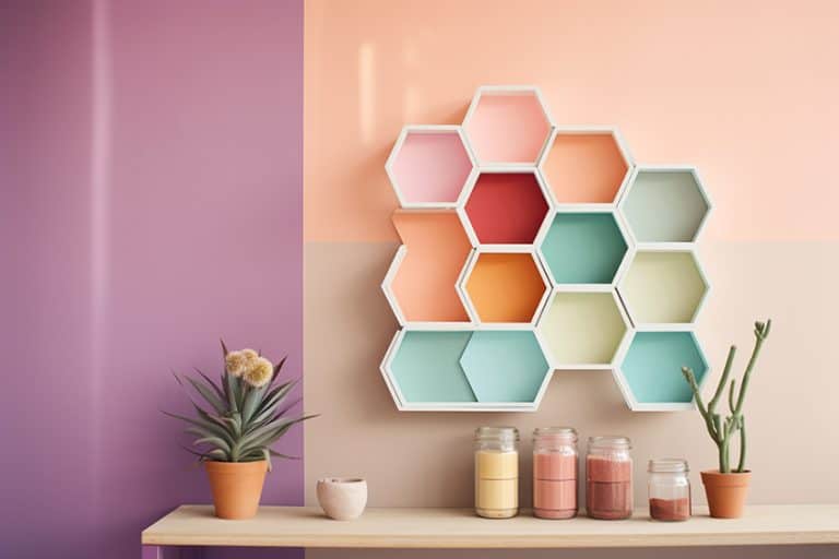
Pastel green can be paired with most colors; however, it does look its best alongside other pastel hues. Pastel green also works well with white, for a crisp clean look, and pairs well with other neutrals like soft gray, beige, and provides a strong contrast with black. To help you select ideal color combinations, you must understand color theory.
You will then discover the various color combinations, some of which are shown below, and understand more about how colors relate to each other.
Complementary Pastel Green Color Combinations
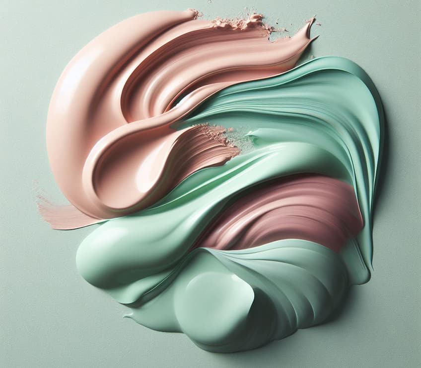
This color combination is quite easy to create, as you simply choose your color and then check to see what color is opposite it on the color wheel. The colors on either side of this complementary color can also be used and are called split complementary colors. These colors form a contrast and stand out in a design. You can also take the pastel green hex code and use it with a color tool that will determine the color combinations for you. So, if you take our chosen pastel green, the complementary color is soft magenta.
However, you can also use colors like dusty rose, lilac, or soft violet. Coral is another complementary color you can pair with pastel green.
| Shade | Hex Code | CMYK Color Code (%) | RGB Color Code | Color |
| Pastel Green | #77dd77 | 46, 0, 46, 13 | 119, 221, 119 | |
| Soft Magenta | #dd77dd | 0, 46, 0, 13 | 221, 119, 221 | |
| Dusty Rose | #b77b82 | 0, 33, 29, 28 | 183, 123, 130 | |
| Lilac | #c8a2c8 | 0, 19, 0, 22 | 200, 162, 200 | |
| Soft Violet | #aa77dd | 23, 46, 0, 13 | 170, 119, 221 | |
| Coral | #ff7f50 | 0, 50, 69, 0 | 255, 127, 80 |
Analogous Pastel Green Color Combinations
Neighboring colors on the color wheel help to create an analogous color palette. This type of combination is less contrasting and easier on the eyes. This is because the colors share similar traits. Our pastel green will work nicely with other soft shades of green. You might even consider a greenish-blue, such as teal.
| Shade | Hex Code | CMYK Color Code (%) | RGB Color Code | Color |
| Pastel Green | #77dd77 | 46, 0, 46, 13 | 119, 221, 119 | |
| Soft Green | #aadd77 | 23, 0, 46, 13 | 170, 221, 119 | |
| Soft Lime Green | #77ddaa | 46, 0, 23, 13 | 119, 221, 170 | |
| Teal | #008080 | 100, 0, 0, 50 | 0, 128, 128 |
Monochromatic Pastel Green Color Combinations
This is an easy color scheme to work with, as you only need a single color like pastel green. From this, you can then create many variations from pastel light green to pastel dark green. Using this type of color combination keeps things simple and helps to add depth and dimension to a pastel green color palette.
| Shade | Hex Code | CMYK Color Code (%) | RGB Color Code | Color |
| Pastel Green | #77dd77 | 46, 0, 46, 13 | 119, 221, 119 | |
| Pastel Light Green | #b4ecb4 | 24, 0, 24, 7 | 180, 236, 180 | |
| Moderate Pastel Green | #3ace3a | 72, 0, 72, 19 | 58, 206, 58 | |
| Pastel Dark Green | #155415 | 75, 0, 75, 67 | 21, 84, 21 |
Triadic Pastel Green Color Combinations
As the name implies, you can see the form of a triangle when connecting the colors on a color wheel. Like complementary colors, this color combination also offers contrast. So, it is best if you select a main color like pastel green, and use this for the majority of the design, while the other two colors play a more supporting role as accent colors.
Besides the softer rose and slate blue, you can also try stronger colors like navy. Softer shades of pink can also work together with a pastel green color palette.

| Shade | Hex Code | CMYK Color Code (%) | RGB Color Code | Color |
| Pastel Green | #77dd77 | 46, 0, 46, 13 | 119, 221, 119 | |
| Rose | #dd7777 | 0, 46, 46, 13 | 221, 119, 119 | |
| Soft Pink | #f472a3 | 0, 53, 33, 4 | 244, 114, 163 | |
| Slate Blue | #7777dd | 46, 46, 0, 13 | 119, 119, 221 | |
| Navy | #000080 | 100, 100, 0, 50 | 0, 0, 128 |
How to Mix Pastel Green Acrylic Paint
Pastel green is a lighter shade of green, so simply adding some white to green paint can provide a lighter version. However, if you want to start from the beginning, you will need blue and yellow paint, making sure these contain a greenish undertone to produce a vibrant green. For example, phthalo blue mixed with cadmium yellow light. Mix one part blue and one part yellow.
To lighten the color green you created, you can then add tiny amounts of white until you reach the pastel green color you are looking for. Make sure to create a color palette as you experiment to keep records of your color mixing experiments.

Using Pastel Green in Design
The pastel green colors muted appearance creates a visually pleasing image, which you can apply in larger amounts without becoming too overwhelming. Pastel green is a good option if you are looking to create a relaxing yet refreshing feel in a design.
Pastel Green in Graphic Designs
Green, including pastel green, is fresh and synonymous with all things natural. The pastel green color also provides a serene and calm feeling, which can be used by designers. Pastel green is a great choice if your business deals with eco-friendly or wellness products and services, as it helps to highlight this approach. The pastel green and other muted colors can also help to showcase a logo or brand name.

Experiment with the softer green color by blending with brighter accents to create a look that catches the eye.
Patel Green in Fashion
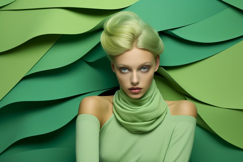
Pastels are soft and the gentle colors provide the ultimate feminine look. Pastel green is light, cool, and fresh and evokes feelings related to springtime. Pastel green and other muted colors are playful and are perfect for more casual wear. However, a soft pastel green jacket can add that touch of freshness to a clean white blouse and skirt or suit. Pastel green also works well with beige, or you can never go wrong with blue or white denim. If you decide on a pastel dress, consider a patterned jacket to create a more interesting look.
Pastel green does look good with other pastels; however, you can also use touches of bright colors. For example, consider white denim, a beige shirt, a pastel green coat, and a yellow handbag.

There are also pastel green fashion accessories you choose if you just want to add a touch of color. For example, pastel green shoes, earrings, jewelry, scarves, and handbags. A pastel green tie with a dark navy suit may be a good formal look for a man. Let us not forget the pastel green cosmetics like eyeshadow, lipstick, and nail polish that can add a touch of color to your look.
Pastel Green in Interior Design
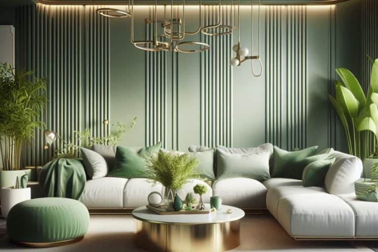
The soft pastel green is perfect for bedrooms; however, the color can also be used in most rooms in the home. The soft shade of green can easily be used as a neutral, meaning you can paint the walls and design a room around the color without it overwhelming the space. Again, pastel green works best with other pastels and neutrals, especially white and beige. You can also use pastel green as a subtle accent color, consider an accent wall, which can add a subtle variation to an otherwise neutral color room.
Pair it with natural wood elements, and shades of gray, and maybe include some earth tones for a calm and inviting living space.
In the kitchen, paint the cabinets pastel green, or in the bathroom add pastel green tiles. You can also bring pastel green in as accent color through accessories, such as cushions, patterned rugs, and artwork that provides a great source of color inspiration. In spaces like the kitchen, consider pastel green cups or appliances.
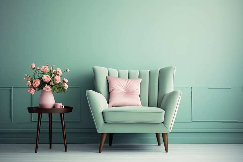
Mix pastel green with metallics like brass or gold, which can help to bring in warmth and add a touch of elegance. Pair pastel green with more vibrant colors, just remember to use the 60,30,10 rule when working with multiple colors that provide contrast. The brighter colors can add more interest and provide points of interest throughout the room.
If you are looking for a softer and more subtle color to add to your design, then pastel green might be what you are looking for. Not only does it provide a sense of calm, but it also has a clean and fresh look that you can use to create the perfect logo or stylish outfit. Pastel green is also a great choice for creating a tranquil and charming interior space.
Frequently Asked Questions
What Color Is Pastel Green?
Pastel green is a part of the green family and is a softer shade of green that has a low saturation and high color value. There are variations of pastel green that can have different undertones, for example, the pastel green hex code of #77dd77 offers a pastel green with a warmer yellowish undertone. This is different to other similar colors like mint green, which contains a cooler green undertone.
Can Pastel Green Be Used With Red?
Yes, you can pair pastel green with red and other colors like orange. However, the best options would be softer versions of these colors, such as rose or coral.
Are Pastel Colors Popular Today?
In recent years, pastel colors have seen a rise in popularity. Pastel green has especially become a trending color. This is seen in all areas of design, from websites to fashion outfits, and even interior design.
In 2005, Charlene completed her Wellness Diplomas in Therapeutic Aromatherapy and Reflexology from the International School of Reflexology and Meridian Therapy. She worked for a company offering corporate wellness programs for a couple of years, before opening up her own therapy practice. It was in 2015 that a friend, who was a digital marketer, asked her to join her company as a content creator, and this is where she found her excitement for writing.
Since joining the content writing world, she has gained a lot of experience over the years writing on a diverse selection of topics, from beauty, health, wellness, travel, and more. Due to various circumstances, she had to close her therapy practice and is now a full-time freelance writer. Being a creative person, she could not pass up the opportunity to contribute to the Art in Context team, where is was in her element, writing about a variety of art and craft topics. Contributing articles for over three years now, her knowledge in this area has grown, and she has gotten to explore her creativity and improve her research and writing skills.
Charlene Lewis has been working for artincontext.org since the relaunch in 2020. She is an experienced writer and mainly focuses on the topics of color theory, painting and drawing.
Learn more about Charlene Lewis and the Art in Context Team.
Cite this Article
Charlene, Lewis, “Pastel Green – Explore the Popular Springtime Shades of Green.” Art in Context. September 26, 2023. URL: https://artincontext.org/pastel-green/
Lewis, C. (2023, 26 September). Pastel Green – Explore the Popular Springtime Shades of Green. Art in Context. https://artincontext.org/pastel-green/
Lewis, Charlene. “Pastel Green – Explore the Popular Springtime Shades of Green.” Art in Context, September 26, 2023. https://artincontext.org/pastel-green/.


