What Does Red and Yellow Make? – With Mixing Recipes
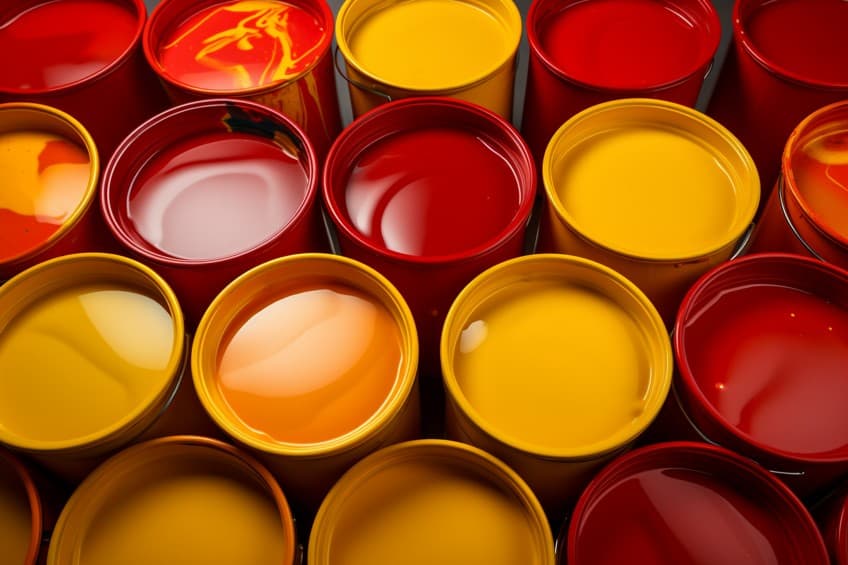
Red and yellow are both eye-catching and warm colors that are often seen in nature, especially during the fall season. Many flowers and animals also come in different shades of red and yellow. Separately, these colors have many uses, but have you ever considered yellow mixed with red? The result might be obvious to some but let us go into a little more detail to see what the correct answer is below!
What Do Red and Yellow Make?
The simple answer to this question is orange. If you mix 50 percent pure red, with 50 percent pure yellow, you will produce a vibrant and pure orange. However, as we delve a little deeper, you might find that some variations can occur when using different shades of red and yellow. Not only that, the ratios of each color can also affect the resulting color.

| Shade | Hex Code | CMYK Color Code (%) | RGB Color Code | Color |
| Red | #ff0000 | 0, 100, 100, 0 | 255, 0, 0 | |
| Yellow | #ffff00 | 0, 0, 100, 0 | 255, 255, 0 | |
| Orange | #ff8000 | 0, 50, 100, 0 | 255, 128, 0 |
Mixing Results for Different Shades of Yellow and Red
| Red Shade | Yellow Shade | Mixed Color |
|---|---|---|
| #FF0000 | #FFFF00 | #ff7f00 |
| #FF0000 | #CCCC00 | #e56600 |
| #FF0000 | #999900 | #cc4c00 |
| #FF0000 | #666600 | #b23300 |
| #CC0000 | #FFFF00 | #e57f00 |
| #CC0000 | #CCCC00 | #cc6600 |
| #CC0000 | #999900 | #b24c00 |
| #CC0000 | #666600 | #993300 |
| #990000 | #FFFF00 | #cc7f00 |
| #990000 | #CCCC00 | #b26600 |
| #990000 | #999900 | #994c00 |
| #990000 | #666600 | #7f3300 |
| #660000 | #FFFF00 | #b27f00 |
| #660000 | #CCCC00 | #996600 |
| #660000 | #999900 | #7f4c00 |
| #660000 | #666600 | #663300 |
| #330000 | #FFFF00 | #997f00 |
| #330000 | #CCCC00 | #7f6600 |
| #330000 | #999900 | #664c00 |
| #330000 | #666600 | #4c3300 |
Understanding Red and Yellow As Colors
Most of us have dealt with the basics of mixing paint colors at some point. This is where the RYB color model comes into play, and where color mixing begins. To start, there are the primary colors, which when mixed, create your secondary colors. Combining one color from both of these categories will then create an intermediate or tertiary color.
Mixing pure red, yellow, and blue colors, should create black. However, it is most often a grayish or brownish color, as many paints are not pure. So, you start with red, yellow, and blue. You will notice that both the colors we are discussing are primary colors.
So, yellow mixed with red will produce a secondary hue. In this case, it is orange. The other secondary hues include green and purple, while the intermediate hues are a combination of primary and secondary hues, for example, yellow-orange.
Both yellow and red are warm colors, along with orange, and are usually grouped together on the color wheel. On the other side of the color wheel, you will find cool colors, which include your shades of blue, green, and purple. This is where mixing paint colors can become a bit challenging. This is because some shades of red and yellow can have a cool bias, meaning that some reds can have a blue bias, while certain yellows can have a green bias.
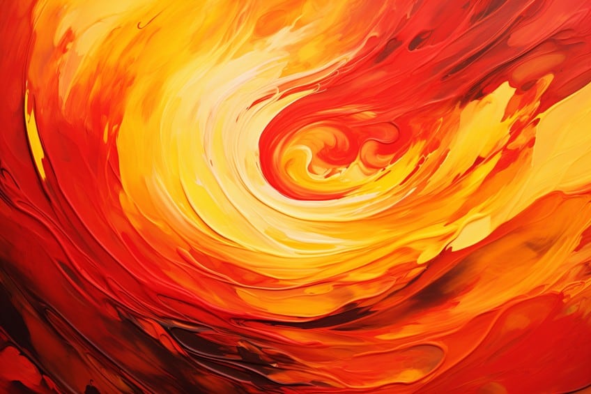
When purchasing paint colors, manufacturers have their own formulas, which can include different pigments. So, if you are expecting to create a vibrant orange, but instead, you come out with something darker and less vibrant, you might be wondering what is going on.
You are mixing all your primary colors because the red and yellow have a cool bias, meaning you are mixing red, yellow, and blue. For example, crimson red is a cool red, as it has a blue bias, while scarlet red has a yellow bias and is a warm red. So, if you are looking to create a bright orange, make sure to choose paints that have a warm bias.
Creating Lighter and Darker Shades
Once you have mixed orange, there are ways that you can adjust the color to make it lighter or darker. To make the orange color darker, you can first try adding more red to the mixture. However, you can also add in a black, just remember to be careful and use only small amounts. The term used for darkening a color with black is known as a shade.
To lighten the orange color, you can first try adding more yellow, which should provide a more vibrant and lighter color. You can also take some white and add it to the orange to lighten it, which is known as a tint.
| Shade | Hex Code | CMYK Color Code (%) | RGB Color Code | Color |
| Orange | #ff8000 | 0, 50, 100, 0 | 255, 128, 0 | |
| Dark Orange | #764c00 | 0, 36, 100, 54 | 118, 76, 0 | |
| Light Orange | #ffd589 | 0, 16, 46, 0 | 255, 213, 137 |
Meaning of Red
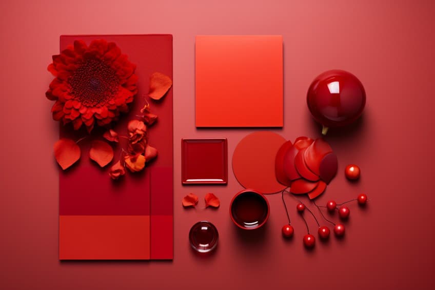
Colors have different meanings and associations all around the world. Generally, the red color in Western cultures is often associated with love and passion. Red is an energetic hue that draws attention and symbolizes action, courage, and strength. A stimulating color that also helps to motivate and instill confidence. In other cultures, it is known to be a happy color that is a symbol of luck.
Negatively, red can be intimidating and aggressive, a color that often symbolizes anger and danger.
Meaning of Yellow
Yellow is more of a happy color and is not as aggressive as red. Yellow also symbolizes positivity and enthusiasm and is a color that can aid in stimulating the body and mind. Yellow is a joyful and fun color that can also help to energize and inspire. A warming color, yellow helps to uplift and encourage. Yellow is also a confidence booster and can improve creativity. However, keep in mind that yellow might represent something different in other cultures.
For example, it can represent death in certain countries. Negatively, yellow can also symbolize caution and is often associated with cowardice.

Meaning of Orange
Being a blend of red and yellow, orange is also a warm, energetic, and stimulating color. Orange is also associated with positive things like youthfulness, enthusiasm, and optimism. It is also an uplifting color that helps to encourage creativity and communication. Again, orange can mean something totally different in another country, for example, in certain Middle Eastern cultures, orange is a symbol of mourning.
The orange color also has strong spiritual connections in many cultures. Negatively, orange can seem superficial, and intimidating, and can make you feel anxious if overused.

Understanding Red and Yellow in Other Color Models
You can create colors in different ways, such as paint colors that use the RYB color model. However, you also get colors on your computer screen. How do these colors mix and relate to one another? For starters, the colors on your computer screen use additive color mixing of colored lights. This means that specific colors are layered on top of each other to produce another color.
The RGB color model has different primaries, which are red, green, and blue. So, red is a primary color, but what about yellow?
Mixing red and green makes yellow, which is now a secondary color, along with magenta and cyan. Mixing all the primary colors will produce white light. Yellow mixed with red, in this case, will also produce a shade of orange.
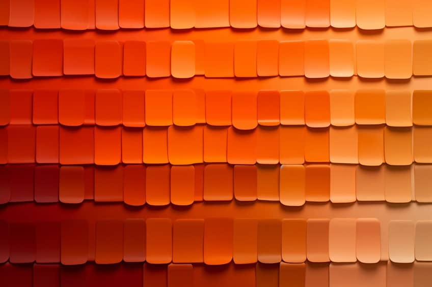
In the table below, you can see that the orange color is a blend of 100 percent red and 50 percent green. We have also added coral, which is a shade of orange. To create this color, 100 percent red is used with 50 percent green, and 31 percent blue.
| Shade | Hex Code | CMYK Color Code (%) | RGB Color Code | Color |
| Orange | #ff8000 | 0, 50, 100, 0 | 255, 128, 0 | |
| Coral | #ff7f50 | 0, 50, 69, 0 | 255, 127, 80 |
Best Uses for Red and Yellow in Art and Design
Artists can use red and yellow to make a variety of orange hues that can be used to create vibrant and exciting paintings. The various shades of orange can also be used as backgrounds or to help create skin tones, among other things. As a point of interest, Vincent Van Gogh is said to have used a lot of unique shades of orange in his paintings. Orange is a popular color that can be used in a wide variety of design types.
Graphic Design
Here, color plays an important role in evoking feelings and representing certain messages that carry over to a customer or client. As we have learned, orange can evoke feelings of excitement, fun, optimism, and energy, which is perfect for many brands. If you want to motivate, create excitement, or grab attention, orange is an ideal color. You can also match orange with other colors like blue or green to make it stand out even more.
A fun example that is aimed at the youth, is the American Nickelodeon television channel logo.

Fashion Design
Many shades of orange can be incorporated into an outfit. There are brighter oranges for those who want to make a statement and more subtle orange colors that provide more of a sophisticated and softer look. Orange is trending in the 2023 fall season, as it provides a warm and captivating look for the colder months.
You can go all out with an entire orange outfit, or if this is too much, consider adding touches of vibrant orange color. There are many ways to do this, for example, adding a pair of orange heels to an outfit, or slinging an orange handbag over your shoulder.
Orange can add a pop of color to an otherwise neutral outfit.

Interior Design
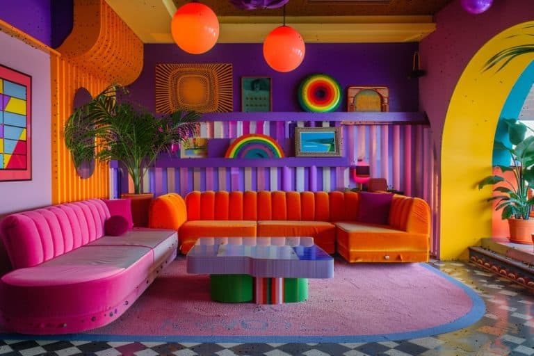
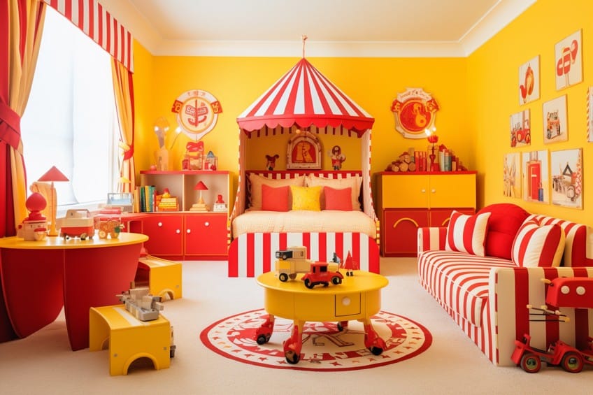
Orange, yellow, and red are all colors that can provide a sense of energy and warmth. Darker shades of orange can provide a more sophisticated and cozy feel, while brighter versions can add pops of color to a neutral color palette. When using orange to decorate the home, it is a good idea to use it wisely, as too much orange can easily overwhelm the senses.
Consider softer or deeper shades of orange for the walls, however, you can also consider a brighter shade as an accent wall. To create a more subtle look that still brings some excitement into a space, consider using orange as an accent. You can use it in cushions, furniture, upholstery, and other textiles, among many other ideas.
Since orange is an appetite stimulant, it is the perfect color for the kitchen and dining areas. You can go for vibrant colors in the living areas, however, deeper, and richer shades like terracotta or burnt orange can provide more of a sophisticated and cozy look.
Orange might not be the color of choice when it comes to the bathroom, but it can provide a welcoming feel. Consider using brighter shades as accents, paired with neutrals. Bathroom spaces are generally smaller, so consider choosing softer tones as darker ones can make the room feel smaller.
Softer shades of orange can also be used in the bedroom, preferably as an accent color combined with neutral colors like white. However, you can choose darker shades of orange, as long as the look does not become too stimulating.
Frequently Asked Questions
What Do Red and Yellow Make?
When mixing paints, red and yellow are both primary colors. So, yellow mixed with red will produce a secondary color, which is orange. Depending on the shade of red and yellow, you can produce a variety of orange tones and shades.
What Are the Different Shades of Orange?
There are numerous orange shades that range from light and brighter to darker versions. Some orange color name examples include coral, peach, saffron, burnt orange, pumpkin, goldenrod, and papaya whip, among many others.
What Colors Help to Make Orange Look Good?
Colors that form a contrast or make orange stand out include various shades of blue. You can also try using green, purple, and blue-green colors like turquoise.
In 2005, Charlene completed her Wellness Diplomas in Therapeutic Aromatherapy and Reflexology from the International School of Reflexology and Meridian Therapy. She worked for a company offering corporate wellness programs for a couple of years, before opening up her own therapy practice. It was in 2015 that a friend, who was a digital marketer, asked her to join her company as a content creator, and this is where she found her excitement for writing.
Since joining the content writing world, she has gained a lot of experience over the years writing on a diverse selection of topics, from beauty, health, wellness, travel, and more. Due to various circumstances, she had to close her therapy practice and is now a full-time freelance writer. Being a creative person, she could not pass up the opportunity to contribute to the Art in Context team, where is was in her element, writing about a variety of art and craft topics. Contributing articles for over three years now, her knowledge in this area has grown, and she has gotten to explore her creativity and improve her research and writing skills.
Charlene Lewis has been working for artincontext.org since the relaunch in 2020. She is an experienced writer and mainly focuses on the topics of color theory, painting and drawing.
Learn more about Charlene Lewis and the Art in Context Team.
Cite this Article
Charlene, Lewis, “What Does Red and Yellow Make? – With Mixing Recipes.” Art in Context. December 8, 2023. URL: https://artincontext.org/what-does-red-and-yellow-make/
Lewis, C. (2023, 8 December). What Does Red and Yellow Make? – With Mixing Recipes. Art in Context. https://artincontext.org/what-does-red-and-yellow-make/
Lewis, Charlene. “What Does Red and Yellow Make? – With Mixing Recipes.” Art in Context, December 8, 2023. https://artincontext.org/what-does-red-and-yellow-make/.


