


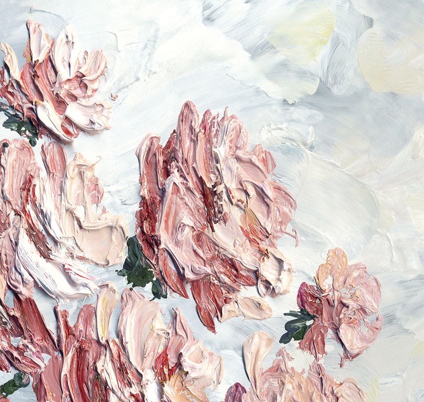
What Colors Make Pink? – Easy Recipes for 25 Pink Shades
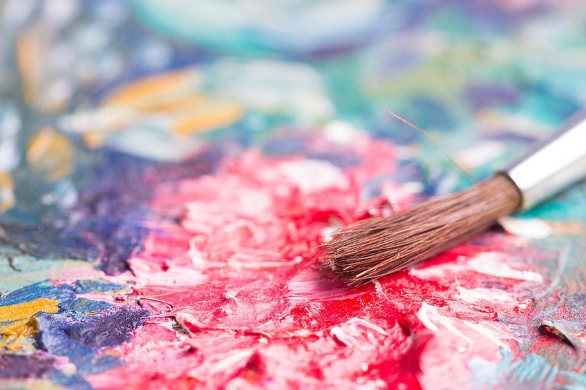
Pink is one of the most vibrant and stunning shades that we can use in our art. Many people may believe that pink is a simple color to make, but there are so many different shades of pink, and each has a slightly different composition. In this article, we will give you a step-by-step tutorial for mixing various shades of pink. From light peaches to deep and dark magentas, pink has an amazing amount of variation to offer.
What Colors Make Pink?
True pink is a mixture of red and white, but when it comes to mixing other shades of pink, you need to consider adjusting your ratios, using different shades of red, and including other colors like yellow or blue.

The first thing you need to consider is what your base color is. For pink, the base color is red. The shade of red you choose as the base for your pink is one of the most influential factors in determining your pink shade.
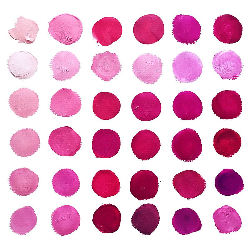
Mixing Recipes for The 25 Most Popular Pink Color Shades
| Color Name | Mixing Recipe (in parts) |
|---|---|
| Pink | 1 part Cadmium Red, 2 parts Titanium White |
| Light Pink | 1 part Cadmium Red, 3 parts Titanium White |
| Hot Pink | 1 part Quinacridone Magenta, 1 part Titanium White |
| Deep Pink | 2 parts Quinacridone Magenta, <1 part Titanium White |
| Pale Violet Red | 1 part Alizarin Crimson, 1 part Cobalt Violet, 2 parts Titanium White |
| Medium Violet Red | 2 parts Alizarin Crimson, 1 part Ultramarine Blue, <1 part Titanium White |
| Pale Red-Violet | 1 part Alizarin Crimson, 1 part Cobalt Violet, 3 parts Titanium White |
| Lavender Blush | 1 part Ultramarine Blue, 1 part Quinacridone Magenta, 5 parts Titanium White |
| Magenta | 1 part Quinacridone Magenta, 1 part Dioxazine Purple |
| Razzle Dazzle Rose | 2 parts Quinacridone Magenta, 1 part Dioxazine Purple, <1 part Titanium White |
| Rose | 2 parts Quinacridone Magenta, <1 part Ultramarine Blue |
| Deep Pink | 3 parts Quinacridone Magenta, <1 part Ultramarine Blue, <1 part Titanium White |
| Pink Flamingo | 1 part Quinacridone Magenta, 2 parts Titanium White, <1 part Hansa Yellow |
| Pink Lace | 1 part Alizarin Crimson, 4 parts Titanium White |
| Pink | 1 part Cadmium Red, 2 parts Titanium White |
| Tea Rose | 1 part Cadmium Red, 2 parts Titanium White, <1 part Yellow Ochre |
| Hot Pink | 2 parts Quinacridone Magenta, 1 part Titanium White |
| Light Pink | 1 part Cadmium Red, 3 parts Titanium White |
| Pink | 1 part Cadmium Red, 2 parts Titanium White |
| Pale Violet Red | 1 part Alizarin Crimson, 1 part Cobalt Violet, 2 parts Titanium White |
| Brilliant Rose | 2 parts Quinacridone Magenta, 1 part Titanium White |
| Deep Pink | 3 parts Quinacridone Magenta, <1 part Ultramarine Blue |
| Carnation Pink | 1 part Cadmium Red Light, 2 parts Titanium White |
| Ultra Pink | 1 part Quinacridone Magenta, <1 part Titanium White |
| Super Pink | 1 part Permanent Rose, 2 parts Titanium White |
| Baby Pink | 1 part Permanent Rose, 3 parts Titanium White |
Navigating the Color Bias
Color bias refers to the relative temperature of different colors, depending on their relationship to others on the color wheel. Warm reds tend to lean more towards orange because they have a touch of yellow in them. Cool reds, in contrast, tend to lean towards purple because they contain a small amount of blue. The relative warmth of your red will strongly determine your pink shade.
Warm shades of red, like Venetian, cadmium, and scarlet red, when mixed with white, will produce pink shades closer to oranges like coral and peach. In contrast, cooler red shades like alizarin crimson, vermilion, and carnelian red, will result in a pink that is a little closer to purple like hot pink and magenta. Here is a list of red shades from warm to cool:
- Coquelicot red
- Light red
- Scarlet
- Venetian red
- Cadmium red
- Carnelion red
- Vermilion
- Alizarin crimson
- Magenta
How to Make Pink with Different Shades of White
The type of white paint used—zinc white or titanium white—alongside red affects the transparency and opaqueness of the resulting pink hues. Zinc white yields more translucent pinks, while titanium white creates more opaque pinks. Both whites lighten the red but can also dull the vibrancy.
Experimenting with Pink Hues:
Materials Needed: Paper, various red shades, zinc white, titanium white, lemon yellow
Step 1: Paint squares with pure red shades
Step 2: Mix reds with zinc white and fill in squares to observe transparency
Step 3: Mix reds with titanium white and compare opacity to zinc white pinks
Learning: Both types of white lighten red, but can also dull the brightness
How to Make Different Hues of Pink
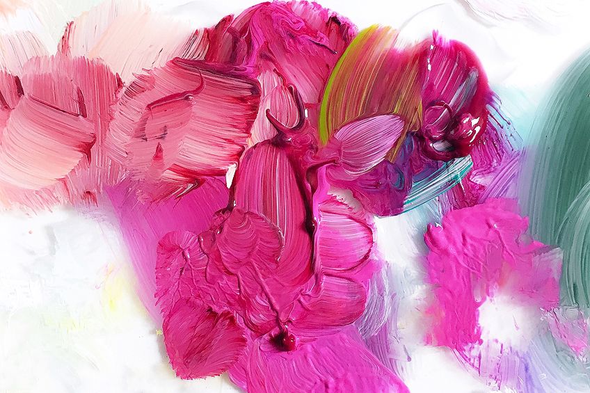
When it comes to creating a design or a painting with a particular color, it is always a good idea to have a pallet of different hues. Once you have your ideal shade of pink color, you will need to create several hue variations to create depth and dimension. If you are painting a delicate rose, you will need some darker and lighter shades of your pink hue to add shadows and highlights. Realistic paintings require depth and dimension that you can achieve with tints, muted shades, and shadows.

Muting Pink Shades
Very often, you do not want to use the brightest pink shades in your painting or design. It is sometimes necessary to mute your bright pink hues to add variety and depth to your designs. Typically, to mute a color, you must combine it with a little bit of its complement.
The complement for pink is green-yellow, and adding a small amount of this shade will mute the brightest pink shade. The exact shade of green-yellow depends on the particular pink hue you want to mute, as each will be slightly different.
The best way to figure out how to mute your pink shade is to experiment.
How to Make Dark Pink
The easiest method for making dark pink is to alter the ratio of your pink mixture. You can make your pink a little darker by adding a touch more of your red hue. We suggest caution when using this method, as a touch of red can quickly make your pink significantly darker. If you want to make a very dark plum pink, you can try adding a touch of black or a little bit of purple.
What Colors Make Light Pink?
It may now seem obvious that to make a lighter pink, you simply need to increase the amount of white in your mixture. However, you may want to know how to make pink without white. You can use a light-yellow shade, like cadmium lemon yellow, with your red to make pink. If you are not too concerned with how to make pink without white, you can also use a combination of white and light yellow to make a peachy pink.
Yellow is a bright color, and it will prevent the white from dulling your pink colors. If you try this exercise yourself, you will notice that the pinks created with this mixture will be closer to peach and coral shades. Even the red hues that lean more towards purple will become slightly more peachy when mixed with a white-yellow combination. This exercise is a wonderful way for you to begin experimenting with color bias.
Tips on How to Use Pink in your Artworks
There is a reason why pink is used everywhere in advertisement and marketing. Pink is a bold and eye-catching color, which makes it ideal for making a statement in your paintings or designs. You can use each different pink hue to create a variety of impressions. Light pink can communicate youth, innocence, and sweetness, while darker pinks hint at love, passion, and excitement.

Playfulness with Pink
Using pink with orange or red, which are analogous colors, can create a playful atmosphere in art without being overpowering. For a bright and vibrant effect, combine bright hot pink with deep red, and for a less intense but still lively feel, pair pink with a lighter orange or yellow.
Pink and Contrasting Colors
Pink’s inherent brightness can be amplified by pairing it with darker colors that recede visually, such as black, dark purple, or blue. This contrast makes pink stand out more, appearing to advance, while the darker shades give the illusion of depth.
For instance, a pink background with a black border will make the pink seem more prominent, as though it’s extending forward, while dark backgrounds outlined in pink create a sense of retreat from the viewer.
Using Pink with Neutral Colors
When pairing pink with neutrals for an elegant color scheme, opt for softer, lighter pinks like baby or blush pink rather than bright pinks like hot or fuchsia, which can clash with neutral browns and greys. Lighter pinks harmonize with neutrals to create a balanced, vintage-modern look.
Emotional Impact of Pink Shades:
- Darker pinks (magenta, hot pink) convey love, passion, and energy
- Lighter pinks (baby, pastel) are perceived as more childlike and sweet
- Important to choose the right shade of pink to match the intended emotional response
Frequently Asked Questions
How to Make Pink?
Creating pure pink shades is very easy. All you need is a nice bright red and some white. Pure pink is a fifty-fifty combination of red and pink, and you can use different ratios to alter your pink shade. To make darker pink shades, you can use a little more red and less white. If you want to know how to make light pink, you can simply use more white than red.
How to Make Pink Without White?
While it is not traditional, it is possible to make pink without using a white shade. You can mix your red with a small amount of very light yellow to make a more peachy pink hue.

In 2005, Charlene completed her Wellness Diplomas in Therapeutic Aromatherapy and Reflexology from the International School of Reflexology and Meridian Therapy. She worked for a company offering corporate wellness programs for a couple of years, before opening up her own therapy practice. It was in 2015 that a friend, who was a digital marketer, asked her to join her company as a content creator, and this is where she found her excitement for writing.
Since joining the content writing world, she has gained a lot of experience over the years writing on a diverse selection of topics, from beauty, health, wellness, travel, and more. Due to various circumstances, she had to close her therapy practice and is now a full-time freelance writer. Being a creative person, she could not pass up the opportunity to contribute to the Art in Context team, where is was in her element, writing about a variety of art and craft topics. Contributing articles for over three years now, her knowledge in this area has grown, and she has gotten to explore her creativity and improve her research and writing skills.
Charlene Lewis has been working for artincontext.org since the relaunch in 2020. She is an experienced writer and mainly focuses on the topics of color theory, painting and drawing.
Learn more about Charlene Lewis and the Art in Context Team.
Cite this Article
Charlene, Lewis, “What Colors Make Pink? – Easy Recipes for 25 Pink Shades.” Art in Context. April 13, 2021. URL: https://artincontext.org/what-colors-make-pink/
Lewis, C. (2021, 13 April). What Colors Make Pink? – Easy Recipes for 25 Pink Shades. Art in Context. https://artincontext.org/what-colors-make-pink/
Lewis, Charlene. “What Colors Make Pink? – Easy Recipes for 25 Pink Shades.” Art in Context, April 13, 2021. https://artincontext.org/what-colors-make-pink/.


