


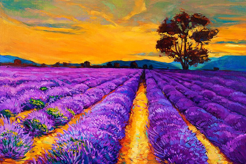
What Colors Make Purple? – Mixing Recipes for 25 Purple Shades
Whether you are a seasoned painter or new to the game, knowing how to mix paint colors is an essential skill. Purple is a wonderfully diverse color that has been long-loved by royalty around the world. There is also a great deal of variation in the shades of purple, so learning how to mix the perfect shade can take some work. In this article, we break down all the things you need to know to create any shade of purple you desire.
What Colors Make Purple?
In Short, blending red with blue forms the base for purple. The specific shade achieved is dictated by the proportions of each color used: a higher ratio of red yields a purple with a reddish tint, while increasing the blue results in a purple with a bluish cast.
To create various shades of purple, mix blue and red and adjust the hue by adding white, yellow, or gray for lighter purples, or black for darker tones.

How to Mix Different Shades of Purple?
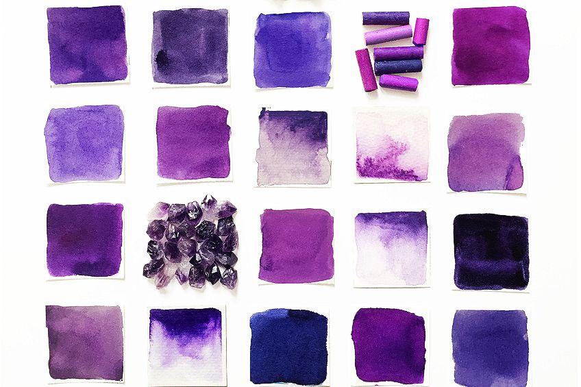
We’ve curated the mixing recipes for the 25 most popular shades of purple:
| Color Name | Hex Code | Mixing Recipe |
|---|---|---|
| Lavender | #E6E6FA | 1 part ultramarine blue, 1 part alizarin crimson, 2 parts white |
| Lilac | #C8A2C8 | 1 part ultramarine blue, 1 part permanent rose, 2 parts white |
| Plum | #8E4585 | 1 part ultramarine blue, 1 part alizarin crimson, <1 part white |
| Violet | #8F00FF | 1 part ultramarine blue, 1 part dioxazine purple |
| Amethyst | #9966CC | 1 part ultramarine blue, 1 part quinacridone magenta, 1 part white |
| Orchid | #DA70D6 | 1 part ultramarine blue, 1 part permanent rose, 1 part white |
| Mauve | #E0B0FF | 1 part ultramarine blue, 1 part alizarin crimson, 3 parts white |
| Royal Purple | #7851A9 | 2 parts ultramarine blue, 1 part alizarin crimson |
| Eggplant | #614051 | 1 part ultramarine blue, 1 part burnt umber, <1 part alizarin crimson |
| Grape | #6F2DA8 | 1 part ultramarine blue, 1 part dioxazine purple, <1 part white |
| Byzantine | #BD33A4 | 1 part ultramarine blue, 2 parts quinacridone magenta |
| Mulberry | #C54B8C | 1 part ultramarine blue, 2 parts alizarin crimson, 1 part white |
| Heliotrope | #DF73FF | 1 part ultramarine blue, 1 part permanent rose, 2 parts white |
| Thistle | #D8BFD8 | 1 part ultramarine blue, 1 part alizarin crimson, 4 parts white |
| Wine | #722F37 | 1 part ultramarine blue, 2 parts alizarin crimson, <1 part burnt umber |
| Magenta | #FF00FF | 1 part ultramarine blue, 2 parts quinacridone magenta |
| Indigo | #4B0082 | 2 parts ultramarine blue, 1 part alizarin crimson, <1 part black |
| Periwinkle | #CCCCFF | 1 part ultramarine blue, 1 part alizarin crimson, 5 parts white |
| Sangria | #92000A | 1 part ultramarine blue, 3 parts alizarin crimson, <1 part burnt sienna |
| Fuchsia | #FF00FF | 1 part ultramarine blue, 2 parts permanent rose |
| Lavender Blush | #FFF0F5 | 1 part ultramarine blue, 1 part alizarin crimson, 6 parts white |
| Persian Blue | #1C39BB | 2 parts ultramarine blue, 1 part quinacridone magenta, <1 part white |
| Iris | #5A4FCF | 2 parts ultramarine blue, 1 part alizarin crimson |
| Heather | #B57EDC | 1 part ultramarine blue, 1 part quinacridone magenta, 2 parts white |
| Wisteria | #C9A0DC | 1 part ultramarine blue, 1 part permanent rose, 3 parts white |
Purple Color Mixing Basics
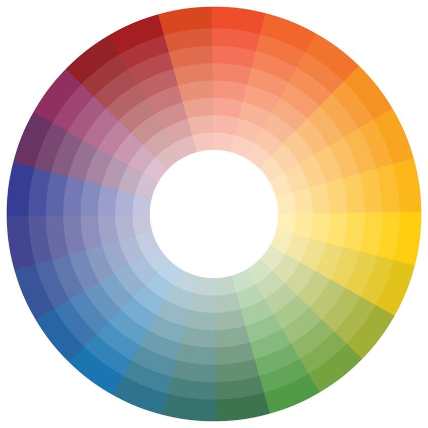
Mixing purple requires considering the desired outcome, such as a bright violet or a muted aubergine, and whether highlight or shadow shades are needed. Purple, a secondary color, is made by combining primary red and blue. For beginners, a color mixing chart can be useful to understand how mixing two colors on opposite sides of the color wheel creates the intermediate color.
Color mixing complexity increases with the consideration of color temperature. Blues and greens are categorized as cool, while oranges and reds are warm.
Reds with a hint of blue are cooler and lean towards purple, whereas reds with a touch of yellow are warmer and lean towards orange. This characteristic is known as color bias. The color bias and temperature of red and blue paints directly affect the resulting purple shade, making an understanding of these concepts essential for precise color mixing.
Navigating the Color Bias to Mix Purple Colors
Mixing the perfect purple color is not as simple as combining the closest blue and red. If you have a collection of paints in your studio, try gathering all of your red and blue colors together. You will see that there is great shade variation in both colors. So yes, blue and red will make purple, but the purple shade depends heavily on the types of blue and red you use.
Purple is a secondary color, and to create vivid secondary colors, you must use only two primary shades. If you use a warm red that contains a little yellow, and a cool blue that also has some yellow, you are mixing together all three primary colors. A combination of all three of these will result in a muddy shade of purple that is closer to brown.
So the bottom line is, to create a vibrant purple color, you need to use a warm blue and a cool red.
Adjusting the Temperature of Your Purple Shades
While we are on color temperature, we should discuss creating warmer and cooler shades of purple. Whether you are painting a field of purple tulips or decadent silken robes, a range of purple hues will lend more realism to your composition. Adjusting the temperature of your purple shades is one way you can begin building a purple pallet.
Throughout the rest of this article, we will be using pure purple as a base color. This pure purple is a combination of alizarin crimson and ultramarine blue.
Making Cooler Purple Colors
The simplest way to cool down your purple color is to add more blue. The most important thing to consider if you choose this method is which blue to use. It is always best to use the same blue you used to make the original purple color. It needs to be a warm blue, or you will make your purple shade muddy.
It is also good practice to only add a small amount of blue to your purple at a time. A small amount of paint can drastically change the color, and if you add too much blue too quickly, you may have to add more red as well to bring it back to your perfect shade.
Making Warmer Purple Colors
It may seem obvious now, but to make a warmer purple, the best way is to add a little more red. You should definitely use the same red you used to make your base purple, and this red should be cooler, or else your purple will become muddy. Once again, if you are adding red to your purple shade, start by adding a small amount and keep adding gradually until you are happy with the hue.
Muting Bright Pure Purple Colors with Complementary Hues
Muting vibrant purple to achieve realistic tones in painting is essential, as pure purple can be too intense. To mute purple, add a small amount of its complementary color, which is yellow, found directly opposite purple on the color wheel.
The temperature of the yellow used affects the result; a warmer yellow creates a warm-muted purple, while a cooler yellow like cadmium lemon will cool down the purple. Understanding the nuances of the color wheel and color theory is key to effectively mixing and muting colors for your artwork.
Creating Purple Tints and Shades
If you are looking to mix a dark purple color or a light purple, it is time to consider tints and shades. Dark purple colors and lighter shades of purple are essential for creating depth and dimension in your paintings. As you now know, adjusting colors is a little complicated, and the same goes for creating tints and shades.
How to Make Light Purple Tints
To capture light effects or depth in painting, you’ll often need to lighten dark natural purple hues. The simplest method is to mix in small amounts of white, which creates lighter tints without changing the original purple color. Alternatively, adding light yellow can both lighten and slightly mute the purple, offering a way to achieve a softer tinted hue.
The best yellows we can suggest are cadmium lemon yellow and cadmium yellow. Cadmium lemon yellow will make your purple hue much lighter than cadmium yellow. The method you choose to use to create purple tints is personal preference, and it may take some experimentation to get the perfect shade.
How to Make Dark Purple Shades
Darkening purple shades is crucial for adding shadows and dimension in art, and while black can be used, it’s not always ideal due to its often greenish undertone when mixed with white. A better choice is burnt umber, a dark reddish-brown, which deepens purple hues and adds warmth.
Alternatively, a combination of phthalo green and alizarin crimson can create a very dark black, which, when mixed with purple, yields an extremely dark variation of the color, likely the darkest mix you can achieve on your own.
Our Tips for Making Purple
- Intensity Modulation Control the intensity of your purple by altering its saturation. To dial down the intensity for a subdued shade like mauve, incorporate more white. For a vibrant, eye-catching purple, limit the addition of white or black to keep the color’s saturation high.
- Light and Shade Dynamics Determine the lightness or darkness— the value—of your purple. Adding white creates lighter tints ideal for shades like periwinkle, while black deepens the color into darker shades akin to deep violet.
- Selecting the Base Color The choice of hue, the purest form of color, is crucial. Your purple’s warmth or coolness is contingent on the red and blue hues you use. A red with yellow undertones will yield a warmer purple, whereas a blue with cooler undertones will result in a cooler purple.
We’ve created a web story of our Top 5 Purple colors and how to mix them.
Frequently Asked Questions
How Do You Mix a Vibrant Purple?
A vibrant, pure purple is probably one of the easier purple shades to mix on your own. All you need are equal amounts of pure red and pure blue paint. You can lighten or darken this shade by adding white or darker pigments like burnt umber. Knowing the basics of color theory and color bias will help you to mix any shade of purple you need.
What Kind of Blue Do You Need to Make Purple?
According to color theory, you need to use a blue that has a color bias towards purple already. Warm blues like ultramarine or indanthrone blue are perfect for creating a crisp and bright purple shade.

In 2005, Charlene completed her Wellness Diplomas in Therapeutic Aromatherapy and Reflexology from the International School of Reflexology and Meridian Therapy. She worked for a company offering corporate wellness programs for a couple of years, before opening up her own therapy practice. It was in 2015 that a friend, who was a digital marketer, asked her to join her company as a content creator, and this is where she found her excitement for writing.
Since joining the content writing world, she has gained a lot of experience over the years writing on a diverse selection of topics, from beauty, health, wellness, travel, and more. Due to various circumstances, she had to close her therapy practice and is now a full-time freelance writer. Being a creative person, she could not pass up the opportunity to contribute to the Art in Context team, where is was in her element, writing about a variety of art and craft topics. Contributing articles for over three years now, her knowledge in this area has grown, and she has gotten to explore her creativity and improve her research and writing skills.
Charlene Lewis has been working for artincontext.org since the relaunch in 2020. She is an experienced writer and mainly focuses on the topics of color theory, painting and drawing.
Learn more about Charlene Lewis and the Art in Context Team.
Cite this Article
Charlene, Lewis, “What Colors Make Purple? – Mixing Recipes for 25 Purple Shades.” Art in Context. April 5, 2021. URL: https://artincontext.org/what-colors-make-purple/
Lewis, C. (2021, 5 April). What Colors Make Purple? – Mixing Recipes for 25 Purple Shades. Art in Context. https://artincontext.org/what-colors-make-purple/
Lewis, Charlene. “What Colors Make Purple? – Mixing Recipes for 25 Purple Shades.” Art in Context, April 5, 2021. https://artincontext.org/what-colors-make-purple/.


