What Colors Make Red – Guide for Mixing Shades of Red
Red is such a vibrant and bold color that it is no surprise that it is one of the most popular colors among artists of all kinds. Although red is a primary color, which according to traditional color theory means you cannot mix true red, there are various tricks that you can use to create a variety of different red hues. After reading this guide, you will know how to mix red shades and where and how to use them in your creations.
The Color Red in A Nutshell
Red is a primary color in both the RGB color model for light and the traditional RYB color model for pigments, which means it cannot be created by mixing other colors.
But you can mix 1 Part Magenta and 1 Part Yellow to get some sort of a reddish coral tone.

However, red can be mixed with other colors to create a wide range of hues, such as purples, oranges, and pinks, depending on the colors it is combined with.
How to Mix Different Shades of Red
Whether you want to mix a light red, a crimson, red, or a pale red, we have you covered with our mixing recipes:
| Red Color Shade | Color Recipe |
|---|---|
| Cherry Red | 1 part Black + 2 parts Red |
| Crimson | 1 part Blue + 2 parts Red |
| Hibiscus | 1 part Violet + 2 parts Red |
| Ruby Red | 1 part Black + 2 parts Red |
| Indian Red | 1 part White + 1 part Blue + 2 parts Red |
| Mahogany | 1 part Blue + 2 parts Red |
| Raspberry Red | 1 part Magenta + 2 parts Red |
| Strawberry Red | 1 part Orange + 1 part White + 2 parts Red |
| Candy Apple Red | 1 part Orange + 2 parts Red |
| Fire Engine Red | 3 parts Bright Red + 1 part Yellow |
| Scarlet | 2 parts Red + 1 part Orange |
| Burgundy | 2 parts Dark Red + 1 part Black |
| Maroon | 2 parts Red + 1 part Brown |
| Coral Red | 2 parts Red + 1 part Pink |
| Brick Red | 2 parts Red + 1 part Brown + 1 part Grey |
| Wine Red | 2 parts Dark Red + 1 part Purple |

Understanding Color Theory
Many of us learned all about the basics of color theory in school as children, but why not revisit it quickly? To mix any color, we first need to know how all the colors relate to each other. Below is the basic color wheel, featuring the primary, secondary, and tertiary shades. You can also find color wheels that feature only the primary colors, but we have chosen this one because it best represents the family of colors.
The color wheel represents all the different variations of color on the spectrum of visible light.
This tertiary color wheel represents 12 colors. You will see that you can use all three of the primary shades in different combinations to create the three secondary shades. You can also see that you can mix the tertiary hues by combining one secondary and one primary color.
One of the most important things to consider when mixing colors is that combining all three primary shades is likely to create a brownish shade. As such, when mixing tertiary hues, it is best to use one of the primary shades within the secondary hue rather than the one you have not used. Sticking to this rule will ensure that your mixed colors remain crisp and bright.
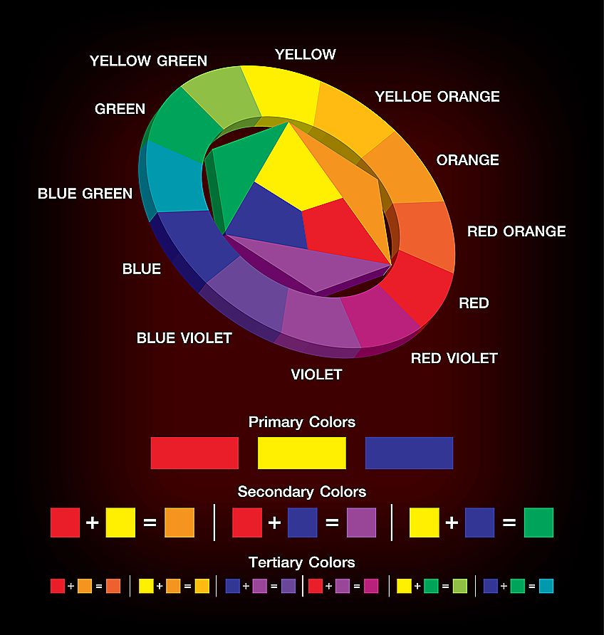
You will notice that there are colors that sit directly across from each other on this color wheel. These colors, like red and green, are said to complement each other. In other words, using these two colors side by side will make each appear brighter and bolder.
We need to draw your attention to one more thing on this color wheel. You will notice the wide variety within the tertiary and secondary shades. Purples range from deep blueish purples to brighter and pinker hues. This variety is due to color bias. The color bias concerns which colors underlie certain shades. For example, the deeper and cooler purples have a little more blue in the mix, while the brighter and warmer purples lean towards red.
When it comes to mixing different shades of red, understanding the color bias is essential, so let us take a closer look.
How the Color Bias Affects Red Shades
Not only can you see color bias in tertiary and secondary hues, but it is also evident in the primary shades. The biggest element of color bias is color temperature. Colors can either be very warm, like a bright red or very cool, like an aquamarine blue. Creating different shades of red involves adjusting the temperature of your red by adding warmer or cooler colors.
A bright and true red is very warm, but a red that leans more towards orange appears even hotter. The combination of the warm red with an equally warm yellow makes for a hot and fiery red hue. These warm red tones are often associated with the glowing embers of a fire or a burning sunset.
In contrast, you can get red hues that are much cooler, leaning far more towards purple than orange. You can achieve these cooler reds by simply adding a touch of blue. Blue is the coolest shade on the color wheel, so you can cool down any shade by adding a little blue. Cool reds like maroon and aubergine shades are less hot and firey and make us think of autumn leaves and cozy weather.
You can see that temperature is an essential consideration when mixing different shades of red. To evoke the perfect emotional reaction in your art, you must understand the effect of temperature.
Tips on How to Adjust Your Red Color Mixes
Using Yellow to Make Reds Warmer
With our knowledge of color theory, we know that mixing all three primary shades will make a dull and brownish tertiary shade. Following this, when we want to make a red shade warmer by adding yellow, we need to use a yellow that does not contain any blue. If we use a cooler yellow that leans towards green, we will make a muddy red.
Cadmium red is the base shade for all the experiments that follow.
Cadmium Yellow
Cadmium yellow is a very warm yellow with undertones of red. As a result, it is the perfect shade for creating a vibrant, fiery red. You can experiment with different combinations yourself. Begin by grabbing a piece of paper, your paintbrush, and your paints. If you like, you can draw a number of squares. Fill the first square with pure cadmium red. Begin gradually adding a touch of cadmium yellow to the red until you have filled all of the squares.
You will see that cadmium yellow, although warm, is quite a light yellow. As a result, mixing it with cadmium red will make a warm but lighter red hue.
Yellow Ochre
If the light warm red from cadmium yellow is not what you are looking for, you can try using a little yellow ochre. Yellow ochre is a much darker yellow shade, but it is still warm. The combination of yellow ochre and cadmium red is a lovely deep and warm red hue.
Using Blue to Make Reds Cooler
In much the same way as we chose cadmium yellow because it lacked any blue, we are choosing blues that lack any yellow. We have two options for creating warm reds, one that is a little lighter and one that is darker.
Ultramarine Blue
Ultramarine blue is a fairly warm blue, meaning that it already contains a little red. As a result, we are not risking any yellow creeping into our cool red hue. Ultramarine is also quite a dark blue hue, and you can use it to mix a lovely deep shade of cool red.
You can follow the basic outline of the previous exercise for making a red cooler. Draw out your squares, and gather together your paints and a brush.
When making cadmium red cooler by adding ultramarine blue, it is important that you do not add too much blue too quickly. You only need a touch of blue to cool the red. Just a touch too much blue, and you will have a purple on your hands.
Cerulean Blue
Cerulean blue is a lovely shade of light blue, similar to cornflower blue. Cerulean blue is a fantastic way to make a light and cool red shade. When adding cerulean blue to cadmium red, you do not need to be quite as careful as with ultramarine blue. The color is much lighter, so you can add a little more. Try adding different amounts to see what color suits you best.
How to Make Muted Shades of Red
Although bright red is lovely and warm, it can sometimes be a little too bold for your work. There will be times where you need a whole pallet of different red hues to create depth and variety in your work. If, for example, you are painting a rose, you will need more than a single shade of red. In addition to your main red shade, you will need more muted hues for the shadows and lighter shades for the highlights.
To mute any color, you typically use its complement.
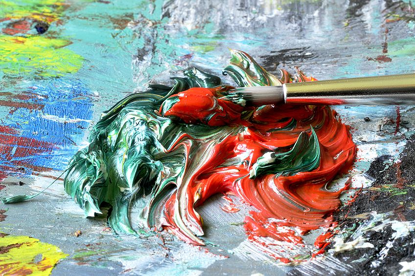
The complement for red is green. It may seem relatively simple, but each unique shade of red has its unique green complement. The green you choose to use depends on how light or dark you want your muted red. Green mutes red because the mixture contains all three primary colors. The result is a red hue that is slightly more brown, and much less bright and vivid.
Muting Red with Forest Green
For a lighter muted green, we suggest using a touch of forest green. Forest green is a nice light shade. When you mix forest green with cadmium red, you will make the red a little less bright and slightly more brown.
Muting Red with Phthalo Green
For a darker muted red, the perfect shade is phthalo green. Phthalo green is a very dark and very cool green hue. The muted red you will get when you add phthalo green will be a dark, brownish purple, perfect for the darkest shadows.
Creating Red Tints and Shades
Muted Hues:
- Use as shadow hues
- Mix a small amount of black with red (use sparingly due to black’s strength)
Red Tints:
- Option 1: Add white to red for a pinker shade (may slightly dull the color)
- Option 2: Add a touch of very light yellow to red for a peachy, vibrant shade
Whether you want to represent the heat of a burning fire, or the warmth of an autumn evening, there is the perfect red shade for you. In this article, we have explored the different meanings of red, how to make different red shades, and how to make your red pop.
Frequently Asked Questions
Is It Possible to Mix Red?
Yes, it is! There are two different color theories that you can use to mix red. With the basic color theory that we all know and love, red is a primary shade and so we can only really alter the shade of red by adding other colors. If you consider the CMY model, however, you can mix red with yellow and magenta.
What Two Colors Can Make the Color Red?
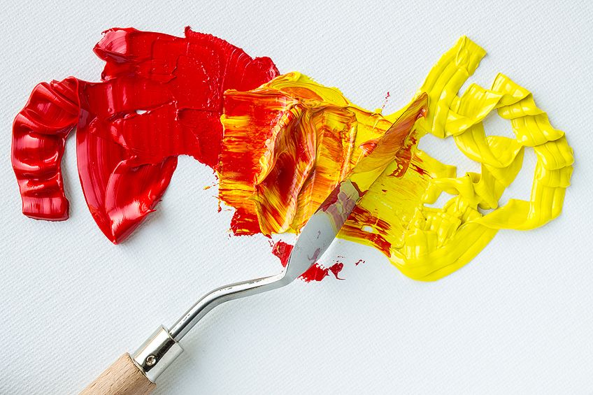
You can make a pure red shade with yellow and magenta. The ratio of each that you use will determine the exact shade of red, and you can alter this shade further by adding a variety of different colors.
What Colors Work Well with Dark Red?
Dark red is a fantastic color to use in your art, and many colors work well alongside it. Green is always a great option alongside red shades and particularly dark green hues like army green. You can also use neutral colors like grey and beige to make your dark red pop.

In 2005, Charlene completed her Wellness Diplomas in Therapeutic Aromatherapy and Reflexology from the International School of Reflexology and Meridian Therapy. She worked for a company offering corporate wellness programs for a couple of years, before opening up her own therapy practice. It was in 2015 that a friend, who was a digital marketer, asked her to join her company as a content creator, and this is where she found her excitement for writing.
Since joining the content writing world, she has gained a lot of experience over the years writing on a diverse selection of topics, from beauty, health, wellness, travel, and more. Due to various circumstances, she had to close her therapy practice and is now a full-time freelance writer. Being a creative person, she could not pass up the opportunity to contribute to the Art in Context team, where is was in her element, writing about a variety of art and craft topics. Contributing articles for over three years now, her knowledge in this area has grown, and she has gotten to explore her creativity and improve her research and writing skills.
Charlene Lewis has been working for artincontext.org since the relaunch in 2020. She is an experienced writer and mainly focuses on the topics of color theory, painting and drawing.
Learn more about Charlene Lewis and the Art in Context Team.