Shades of Nude Color – 50+ Shades to Discover
The color nude can be considered a calm or passive color that does not stand out, and it will harmoniously pair with most colors. However, there are many shades of the nude color to choose from, with each one providing something a little different. To help you get a better overview, we have curated more than 50 shades of nude for you, including description, visuals, a downloadable color chart and all color codes to start just right away.
What Are Nude Colors?
Before we get into the various shades of nude color, let us have a look at the definition of a particular color that has been named “nude”. When searching for graphic colors online, there are specific color codes you can look out for. In this case, the nude color is identified by its hex code, #e3bc9a. In the description for this color, it is defined as a soft orange. However, the nude color can also be described as a shade of brown, meaning it is a mixture of brown and white that can be mistaken for light beige. Since the nude color has an orange-brown undertone, it is considered warm. Warm colors are all found on one side of the color wheel and include orange, red, and yellow shades.
Nude can also be considered a neutral color like white, black, and beige, which means that it can easily work well with most other colors.
The nude color can be seen as a gentle, yet elegant color that is quite delicate and can add a certain softness to different color palettes. Many associate nudes with beige tones and a natural skin tone, however, there are many different shades of nude color. So, you can change the look to a slightly lighter or darker and bolder appearance if you want to. The table below not only displays the nude color and its hex code but also provides other color codes that show you the composition of the color nude, which can be used for graphic designs and printing. These codes are important if you are a professional designer and work closely with different colors.
| Shade | Hex Code | CMYK Color Code (%) | RGB Color Code | Color |
| Nude | #e3bc9a | 0, 17, 32, 11 | 227, 188, 154 |
Shades of Nude Color
As we have learned, the nude color comes in a wide variety of shades and tones that include light nude colors as well as dark nude colors. So, there is quite a wide range, which makes it easier for you to choose the perfect color for your project from darker more dramatic options to paler and more subtle choices. Below, we are going to briefly go through a few of the more popular shades of the nude color.
Nude
Nude is a warm, inviting shade that mimics the natural tones of human skin. Perfect for creating a subtle, understated elegance in design and fashion.
| Hex: #E3BC9A RGB: 227, 188, 154 CMYK: 0, 17, 32, 11 |
Nude Brown
A deeper, earthier tone, Nude Brown conveys stability and grounding. Its richness makes it a favorite in interior design and apparel.
| Hex: #bc9e82 RGB: 188, 158, 130 CMYK: 0, 16, 31, 26 |
Pink Nude
Pink Nude blends the softness of pink with the neutrality of nude, creating a calming, sophisticated atmosphere.
| Hex: #ddc0b4 RGB: 221, 192, 180 CMYK: 0, 13, 19, 13 |
Dark Nude
Robust and versatile, Dark Nude offers a pronounced statement while maintaining neutrality, adding depth and warmth to spaces.
| Hex: #ccb3a3 RGB: 204, 179, 163 CMYK: 0, 12, 20, 20 |
Light Nude
Airy and delicate, Light Nude brightens spaces without overwhelming, ideal for a light, serene environment.
| Hex: #e6ddd8 RGB: 230, 221, 216 CMYK: 0, 4, 6, 10 |
Almond
Almond is reminiscent of the nut’s natural, subtle brown hue, evoking a sense of wholesomeness and earthiness.
| Hex: #EADDCA RGB: 234, 221, 202 CMYK: 0, 5, 13, 8 |
Almond Milk
A softer, creamier variant, Almond Milk provides a comforting and soothing presence in any palette.
| Hex: #F3E5AB RGB: 243, 229, 171 CMYK: 5, 5, 34, 0 |
Beige
Beige is the epitome of simplicity and versatility, offering a neutral canvas that pairs well with almost any color.
| Hex: #F5F5DC RGB: 245, 245, 220 CMYK: 2, 2, 15, 4 |
Blush
Blush is a gentle pink with a hint of warmth, perfect for adding a soft, romantic touch to designs and fashion.
| Hex: #FE828C RGB: 254, 130, 140 CMYK: 0, 49, 45, 0 |
Buff
Buff is a light, sandy tan, neutral yet warm, great for creating a cozy and welcoming atmosphere.
| Hex: #F0DC82 RGB: 240, 220, 130 CMYK: 6, 8, 55, 0 |
Caffè Latte
Caffè Latte is as comforting as the drink, blending brown and beige for a warm, inviting feel.
| Hex: #A67B5B RGB: 166,123,91 CMYK: 23, 43, 62, 16 |
Camel
A rich, golden brown, Camel exudes sophistication and timeless style, often used in fashion for its elegant appeal.
| Hex: #C19A6B RGB: 193, 154, 107 CMYK: 18, 31, 63, 24 |
Chai Tea
Chai Tea is a spicy, warm brown, reminiscent of the beverage, perfect for creating a cozy, inviting space.
| Hex: #BD8D46 RGB: 189,141,70 CMYK: 27, 47, 85, 9 |
Champagne
An elegant, celebratory color, Champagne sparkles with soft, golden hues, perfect for luxurious and festive designs.
| Hex: #F7E7CE RGB: 247, 231, 206 CMYK: 2, 6, 16, 0 |
Choco Chips
Like the beloved treat, Choco Chips is a playful, versatile brown, adding a touch of sweetness to any palette.
| Hex: #3F2A2B RGB: 63,42,43 CMYK: 0, 33, 32, 75 |
Cinnamon
Cinnamon is a warm, spicy shade that brings a touch of exotic flair and warmth to any design.
| Hex: #D2691E RGB: 210, 105, 30 CMYK: 0, 50, 86, 18 |
Cinnamon Roll
This color mirrors the sweet pastry, combining creamy and spicy tones for a comforting and appetizing appeal.
| Hex: #8A4B08 RGB: 138,75,8 CMYK: 27, 58, 100, 22 |
Cookie Dough
Cookie Dough is a soft, warm beige, evoking a sense of nostalgia and comfort, ideal for relaxed and inviting spaces.
| Hex: #CDB79E RGB: 205, 183, 158 CMYK: 9, 19, 36, 20 |
Coral
Coral is a vibrant blend of pink and orange, bursting with life and energy, perfect for lively and dynamic designs.
| Hex: #FF7F50 RGB: 255, 127, 80 CMYK: 0, 50, 69, 0 |
Cotton Candy
A whimsical, sweet pink, Cotton Candy evokes joy and playfulness, perfect for youthful and light-hearted themes.
| Hex: #FCA2CC RGB: 252, 162, 204 CMYK: 0, 36, 19, 1 |
Dusty Rose
Dusty Rose is a muted, sophisticated pink, bringing an element of vintage elegance to any application.
| Hex: #DCAE96 RGB: 220, 174, 150 CMYK: 0, 21, 32, 14 |
Espresso Shot
Dark and intense, Espresso Shot is a deep brown with a hint of mystery, ideal for adding richness and depth.
| Hex: #4B3832 RGB: 75, 56, 50 CMYK: 0, 25, 33, 71 |
Fawn
Fawn is a soft, light brown with a natural, calming presence, akin to the animal’s gentle demeanor.
| Hex: #E5AA70 RGB: 229, 170, 112 CMYK: 8, 28, 56, 0 |
Frosted Toffee
Frosted Toffee is a sweet, golden brown, reminiscent of the candy, and perfect for adding a touch of warmth.
| Hex: #DFD4C7 RGB: 223, 212, 199 CMYK: 0, 5, 11, 13 |
Ginger
Ginger is a vibrant, spicy orange-brown, adding energy and zest to designs, much like the root itself.
| Hex: #B06500 RGB: 176, 101, 0 CMYK: 18, 52, 100, 31 |
Golden Waffle
A warm, inviting golden hue, Golden Waffle is both comforting and appetizing, suitable for a variety of creative uses.
| Hex: #F7B71D RGB: 247,183,29 CMYK: 0, 26, 98, 3 |
Hazel
Hazel is a rich, nutty brown, versatile and warm, often used to add depth and natural elegance.
| Hex: #8E7618 RGB: 142, 118, 24 CMYK: 0, 17, 83, 44 |
Ivory
Ivory, a soft white with a hint of warmth, exudes elegance and purity, perfect for classic and refined themes.
| Hex: #FFFFF0 RGB: 255, 255, 240 CMYK: 0, 0, 6, 0 |
Khaki
Khaki is a sturdy, reliable tan, often associated with durability and versatility in fashion and design.
| Hex: #C3B091 RGB: 195, 176, 145 CMYK: 18, 28, 45, 24 |
Latte
Latte combines creamy whites with a hint of coffee brown, creating a warm, inviting hue.
| Hex: #bdab98 RGB: 189, 171, 152 CMYK: 0, 10, 20, 26 |
Meringue Rosette
This color is a delicate, frothy pink, reminiscent of the dessert, ideal for sweet and romantic designs.
| Hex: #F8E0E7 RGB: 248, 224 231 CMYK: 0, 10, 7, 3 |
Mocha
Mocha is a rich, dark brown with undertones of coffee, perfect for adding depth and sophistication.
| Hex: #bea493 RGB: 190, 164, 147 CMYK: 0, 14, 23, 25 |
Nude Beige
A classic, understated beige, Nude Beige offers a clean, minimalist backdrop for a variety of design applications.
| Hex: #cab9a7 RGB: 202, 185, 167 CMYK: 0, 8, 17, 21 |
Nut Pudding
Nut Pudding is a warm, creamy brown, evoking a sense of comfort and homeliness, perfect for cozy settings.
| Hex: #97694F RGB: 151,105,79 CMYK: 20, 47, 63, 15 |
Oatmeal
Oatmeal is a comforting, soft grey-brown, reminiscent of the hearty breakfast, ideal for creating a soothing environment.
| Hex: #E0DCC8 RGB: 224, 220, 200 CMYK: 0, 2, 11, 12 |
Peach
Peach is a soft, fruity orange-pink, fresh and invigorating, perfect for adding a playful, summery vibe.
| Hex: #FFE5B4 RGB: 255, 229, 180 CMYK: 0, 10, 29, 0 |
Pecan Pie
Pecan Pie is a deep, rich brown with golden undertones, evoking warmth and indulgence, ideal for luxurious designs.
| Hex: #E1C699 RGB: 225, 198 153 CMYK: 0, 12, 32, 12 |
Pink Marshmallow
A fluffy, light pink, Pink Marshmallow is sweet and delicate, perfect for dreamy, whimsical themes.
| Hex: #FFC5C5 RGB: 255, 197 197 CMYK: 0, 23, 23, 0 |
Roasted Cocoa
Roasted Cocoa is a deep, dark brown, rich and robust, ideal for adding a strong, grounding element.
| Hex: #6F4E37 RGB: 111,78,55 CMYK: 40, 56, 83, 48 |
Rosewood
Rosewood is a deep, warm red-brown, sophisticated and luxurious, often used in elegant and classic designs.
| Hex: #65000b RGB: 101, 0, 11 CMYK: 0, 100, 89, 60 |
Rust
Rust is a rich, earthy red-orange, vibrant and full of character, great for adding a bold, natural touch.
| Hex: #b7410e RGB: 183, 65, 14 CMYK: 0, 64, 92, 28 |
Salmon
Salmon is a soft, pinkish-orange, fresh and lively, perfect for invigorating and cheerful designs.
| Hex: #fa8072 RGB: 250, 128, 114 CMYK: 0, 49, 54, 2 |
Salted Caramel
A delicious blend of golden brown and soft amber, Salted Caramel is both comforting and indulgent.
| Hex: #FFB347 RGB: 255,179,71 CMYK: 0, 34, 72, 0 |
Sand
Sand is a light, neutral beige, reminiscent of the beach, offering a calm, grounding effect.
| Hex: #C2B280 RGB: 194, 178, 128 CMYK: 18, 25, 51, 24 |
Sepia
Sepia is a warm, rich brown, often associated with nostalgia and history, perfect for vintage-inspired themes.
| Hex: #704214 RGB: 112, 66, 20 CMYK: 35, 58, 98, 47 |
Spiced Cappuccino
Spiced Cappuccino is a warm, inviting blend of coffee and spice tones, ideal for creating a cozy, welcoming atmosphere.
| Hex: #8C6338 RGB: 140,99,56 CMYK: 46, 64, 87, 33 |
Stone
Stone is a solid, reliable grey, embodying strength and stability, perfect for modern and minimalist designs.
| Hex: #888c8d RGB: 136, 140, 141 CMYK: 4, 0, 0, 45 |
Tan
Tan is a warm, medium brown, versatile and earthy, a staple in design for its natural, grounding effect.
| Hex: #D2B48C RGB: 210, 180, 140 CMYK: 13, 28, 50, 18 |
Taupe
Taupe is a sophisticated blend of grey and brown, offering a muted elegance ideal for a range of applications.
| Hex: #483C32 RGB: 72, 60, 50 CMYK: 0, 17, 31, 72 |
Tawny
Tawny is a warm, orange-brown, reminiscent of autumn leaves, perfect for creating a cozy, inviting feel.
| Hex: #CD5700 RGB: 205, 87, 0 CMYK: 0, 58, 100, 20 |
Terracotta
Terracotta is a rich, earthy red, evoking the warmth and natural beauty of clay, ideal for rustic and warm themes.
| Hex: #E2725B RGB: 226, 114, 91 CMYK: 0, 50, 60, 11 |
Toffee Peach
Toffee Peach is a sweet, golden orange, combining the warmth of toffee with the freshness of peach.
| Hex: #FFCBA4 RGB: 255, 203, 164 CMYK: 0, 20, 36, 0 |
Vanilla Custard
Vanilla Custard is a soft, creamy yellow, warm and comforting, perfect for creating a gentle, inviting ambiance.
| Hex: #F3D9A9 RGB: 243, 217, 169 CMYK: 5, 12, 38, 0 |
Warm Praline
Warm Praline is a rich, golden brown, evocative of the candy, perfect for adding warmth and sweetness.
| Hex: #D4AF37 RGB: 212,175,55 CMYK: 0, 18, 74, 17 |
Wheat
Wheat is a soft, natural yellow-brown, reminiscent of fields of grain, ideal for creating a sense of openness and tranquility.
| Hex: #F5DEB3 RGB: 245, 222, 179 CMYK: 6, 8, 31, 0 |
Wildflower Honey
Wildflower Honey is a sweet, golden yellow, bright and inviting, perfect for adding a touch of sunshine and joy.
| Hex: #FFE699 RGB: 255, 230, 153 CMYK: 0, 10, 40, 0 |
Brief History: Nude Color
The main idea or thought that comes to mind when considering the nude color is skin tone, which brings us to how the name came about. Originally, the name was used as a description for Caucasian people in Western Europe. The term “nude” comes from the French word, meaning “naked”. The term was originally used to describe certain colorless fabrics, which were made to appear like skin. During the 1920s and 1930s, the color name “nude” was used to describe women’s undergarments, which is still in use today.
In the past, nude was a definition of a color that was described as being pale pink, with yellow undertones, and was only associated with Caucasian skin tones. However, this association with skin color has changed over the years, and the term “nude” now refers to all types of skin tones.
This change has only occurred over more recent years. One of the more prominent figures, Michell Obama, brought attention to the nude color in 2010. There was some controversy when she attended a state dinner wearing a “nude strapless gown”. Being an African American, this raised questions about the meaning of the color nude, when it is compared to the wearer’s skin tone. There have also been other occasions where the subject has been brought to light. To also help change the perception of the meaning of nude, which is orientated to Caucasian skin, the Merriam-Webster dictionary amended its definition in 2015.
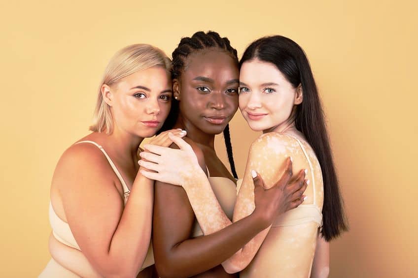
It now states that nude is a color that represents or matches the person’s skin tone, making the definition more inclusive. This change was in response to a student social media campaign, known as #nudeawakening. The description of the color nude has since changed, now you will see other varieties like champagne sand and light beige. Nude is now available in a wide group of nude shades, with no particular single description. Various brands now have a variety of “nude” products for every skin tone.
Besides beauty brands, the various shades of nude have also become popular in fashion and interior design.
Meaning of Nude Colors
The color nude is seen as pleasing to look at, comforting, peaceful, and warm. It is also associated with relaxation, elegance, sophistication, and modesty. According to color psychology, nude is a color that implies security and is often appreciated as a practical and commonplace color that offers authenticity and dependability. The color represents a longing for order, consistency, and balance. Because the color nude is seen as comforting, it also has associations with family.
People who like nude colors can be seen as caring, sensitive, modest, friendly, and open to collaboration. However, the color nude can also be seen as dull if overused.
What Colors Make Nude Acrylic Paint?
When painting a nude color, it is often used to provide different skin tones. This can be challenging, as there are a variety of skin tones, making it difficult to achieve a lifelike appearance without it becoming flat or dull. First, you will need to determine if the skin color is light, medium, or dark, which is the easy part. The challenge is when you need to decide on the undertones. You should try to experiment and create a color palette of the different shades before you attempt your actual art piece. Also, take note that acrylic paint will dry a little darker, so you will need to take this into account and mix something slightly lighter.
If you already have a grasp on color theory, you will know what happens if you mix all three primary colors.
Just to recap, if you mix equal amounts of red, blue, and yellow paint, which are the primary colors, you will create a dark muddy brown color. Every skin color tends to contain slight undertones of red, blue, and yellow. However, you will find that they are in different ratios, which is where your experimentation comes in. Once you have played around with mixing colors, you can begin to combine the primary colors in different ratios. If you begin with a darker version, you can easily add more yellow, or even white to lighten it. To gain a nude color or any skin tone, you will have to keep refining the initial primary color mix until you reach the desired result.
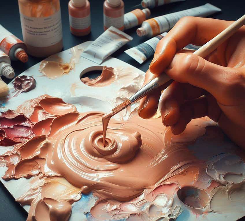
You should also know that there are different types of blue, red, and yellow paints that each have different compositions. This could also affect the final paint color, so make sure to check the types of pigments in the paint when you purchase them. You also do not have to mix all three paint colors, you can choose something like orange and violet, which together contain all three primary colors. First, take some white paint, and to this, mix in equal parts of orange and violet, and see how close to the nude color you can get.
If you are not too picky about the shade of nude, another method is to choose a brown paint color and simply add white to it.
Nude Color Shades in Fashion
The nude color provides a modest, yet sophisticated and practical look that is also feminine, warm, and delicate. Nude is an especially popular choice for summer and spring color palettes and works wonderfully together with gold accessories. You create any type of look from more casual to work wear and more formal outfits. For example, combine a nude top with a denim skirt or jeans, or create an all-nude look with a dress, coat, and nude-colored shoes.
Other neutrals like white and black can also add to the elegant look of an outfit. There is no combination that will not work, even including contrasting accent colors, such as blue or green to bring a little spark to the outfit.
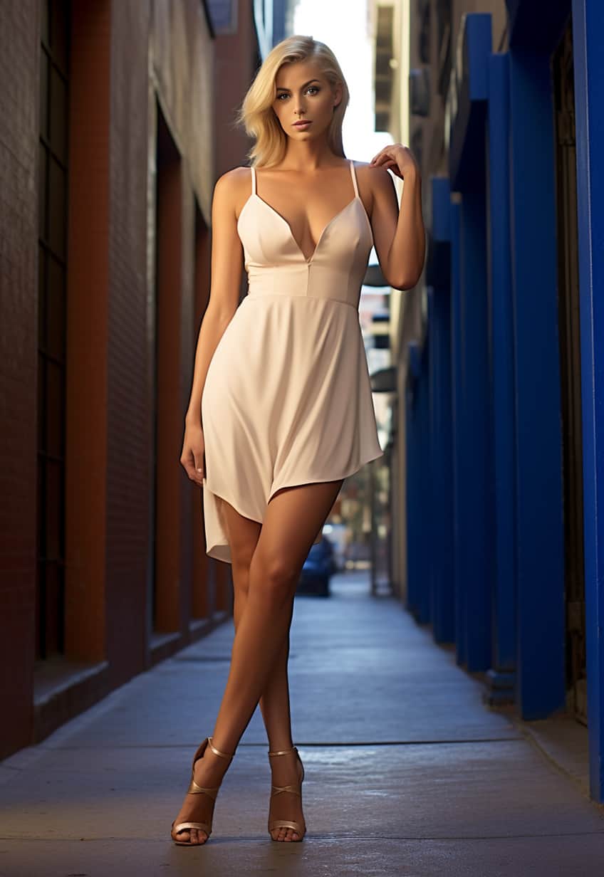
You can also add other nude-colored accessories like handbags, gloves, or scarves. The color nude can also be worn successfully by men, consider nude-colored slacks, shirts, or jackets. Combine different shades of nude to create a layered effect. Styling an elegant nude outfit is so simple, anybody can do it.
Nude Colors in the Beauty Industry
In the cosmetics industry, the nude color has been redefined and now represents a wide range of tones and shades that fit all skin types. You will see the term “nude” for colors, however, there are other names you might often see that represent nude, including pale beige and champagne sand.
Nude make-up, such as lipstick, eyeshadow, and nail polish can be worn for any occasion, from weddings to casual everyday looks.
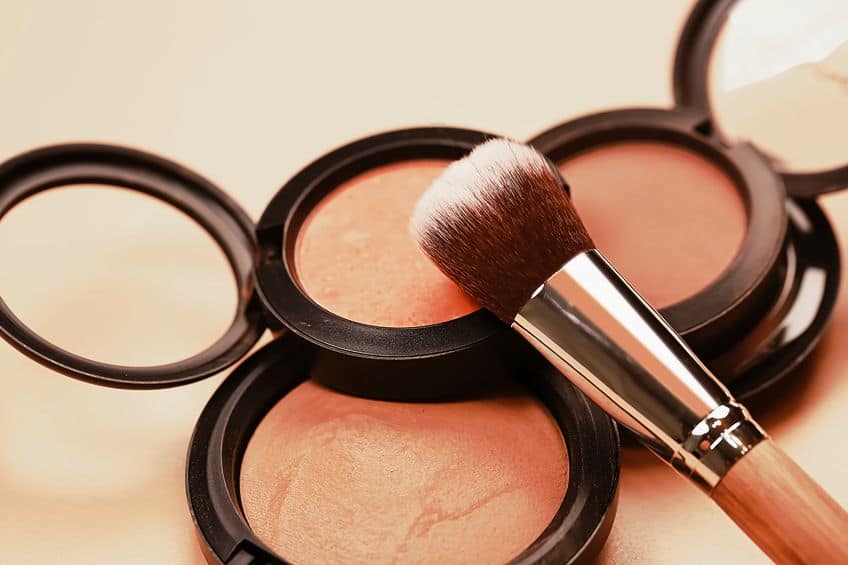
The nude shades not only provide a sophisticated look, but they are also so simple to create. Nude nail polish is also ideal as a neutral backdrop for nail art or leave it simple with a white-tipped French manicure. The color will never go out of style, and you can match the nude color nail polish with any outfit, whether it is casual or formal.
Nude Color Interior Designs
The many shades of nude colors can offer a calming, warm, and welcoming atmosphere to any room in the home. The nude color is also versatile as an interior color, as it can fit any style from shabby chic to modern. The color nude can work beautifully as your base color, which can include any lighter or darker shade.
Nude color wallpaper can also be used to create that warm and comforting feel, but with other neutral colors and patterns, it helps to create more depth and interest.
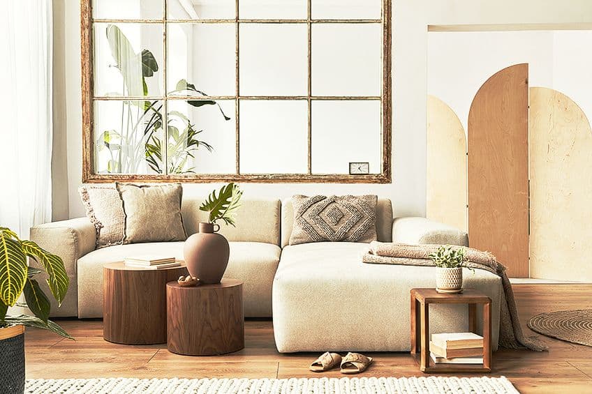
If the walls are not painted nude, you can also use the color to complement other color palettes by adding various elements, such as curtains, throws, pottery, or art pieces. When combining other colors with nude, the best options would be to use other neutrals, Such as white, black, tan, beige, gray, or other shades of nude. Similar color tones like gold rose, or copper can all look beautiful with a nude color palette.
Nude and Textures
When deciding on décor, it is always a good idea to add textures to the look, as it adds more interest and diversity. You can bring in materials like suede, leather, velvet, or knitted items. All of this helps to improve the whole warm look and feel of a room.
Nude and Natural Elements
Natural elements work wonderfully with nude colors and also provide more texture to the décor. This can be leather, wood, or natural fibers like linen or cotton. You can also consider wicker, straw, and ceramics in a nude color. Many of these items are close to a nude color but also consider using nude tones for the leather furniture or wood elements.
Colors Paired With Nude
You can stick with neutral schemes and different shades, however, if you want to go a bit further, you can add touches of color. Greenery is not only a natural element but also complements nude shades. You can also bring in accent colors with accessories so if it does not work, you can easily make changes. For example, light blue cushions or a patterned rug.
If you wish to keep the look more cohesive, colors like mustard yellow, coral, or dusty rose can help to create a more harmonious color palette.
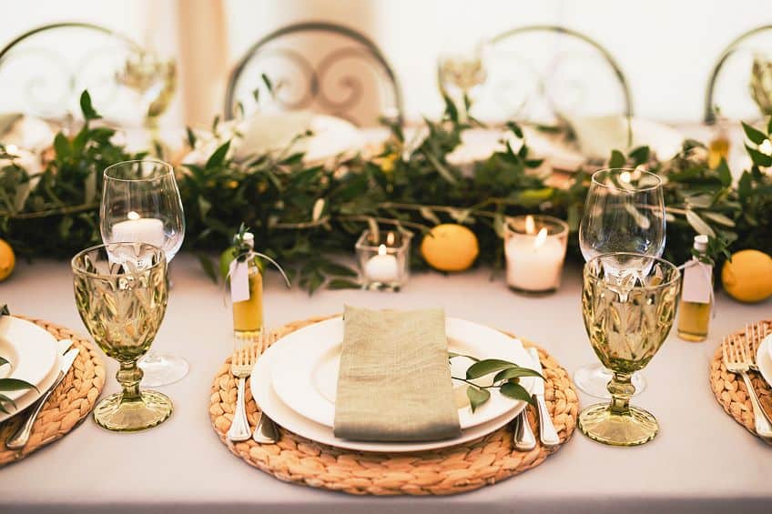
The color nude is extremely versatile, comforting, and flattering, whether you use it to create clothing outfits or as an interior design color scheme. Just remember that there are many different shades of the nude color, so you should be able to find one that best suits your purpose. Overall, nude colors offer a subtle and natural look that is effortless to create yet remains elegant.
Frequently Asked Questions
What Are Nude Colors?
Nude colors can be described as being a shade of brown with added white and are often mistaken for a beige color. The nude color refers to the skin tone, which was originally only for Caucasian people. However, the nude color now signifies a range of tones and shades that encompasses all races.
What Colors Make Nude?
If you would like to mix a nude paint color, you will need all three primary colors and some white paint. You will need to experiment with the combination of red, yellow, blue, and white to create a specific shade of nude.
How Many Shades of the Nude Color Are There?
There used to be only one main shade of nude, but you can thankfully get over 50 shades of nude, ranging from light to dark nude, now! Other nude colors include pink nude, nude brown, mocha, and champagne, amongst many others.
In 2005, Charlene completed her Wellness Diplomas in Therapeutic Aromatherapy and Reflexology from the International School of Reflexology and Meridian Therapy. She worked for a company offering corporate wellness programs for a couple of years, before opening up her own therapy practice. It was in 2015 that a friend, who was a digital marketer, asked her to join her company as a content creator, and this is where she found her excitement for writing.
Since joining the content writing world, she has gained a lot of experience over the years writing on a diverse selection of topics, from beauty, health, wellness, travel, and more. Due to various circumstances, she had to close her therapy practice and is now a full-time freelance writer. Being a creative person, she could not pass up the opportunity to contribute to the Art in Context team, where is was in her element, writing about a variety of art and craft topics. Contributing articles for over three years now, her knowledge in this area has grown, and she has gotten to explore her creativity and improve her research and writing skills.
Charlene Lewis has been working for artincontext.org since the relaunch in 2020. She is an experienced writer and mainly focuses on the topics of color theory, painting and drawing.
Learn more about Charlene Lewis and the Art in Context Team.
Cite this Article
Charlene, Lewis, “Shades of Nude Color – 50+ Shades to Discover.” Art in Context. August 14, 2023. URL: https://artincontext.org/shades-of-nude-color/
Lewis, C. (2023, 14 August). Shades of Nude Color – 50+ Shades to Discover. Art in Context. https://artincontext.org/shades-of-nude-color/
Lewis, Charlene. “Shades of Nude Color – 50+ Shades to Discover.” Art in Context, August 14, 2023. https://artincontext.org/shades-of-nude-color/.


