What Color Goes With Bronze? – Colors That Complement Bronze
Bronze, along with copper and gold, has become a popular way to bring warm metallic colors into the home. Bronze and other metallic materials and paint also bring in some shine, elegance, and modernism into a space. To help create a more harmonious look in the home, let us examine some of the colors that go with bronze.
What Color Goes With Bronze?
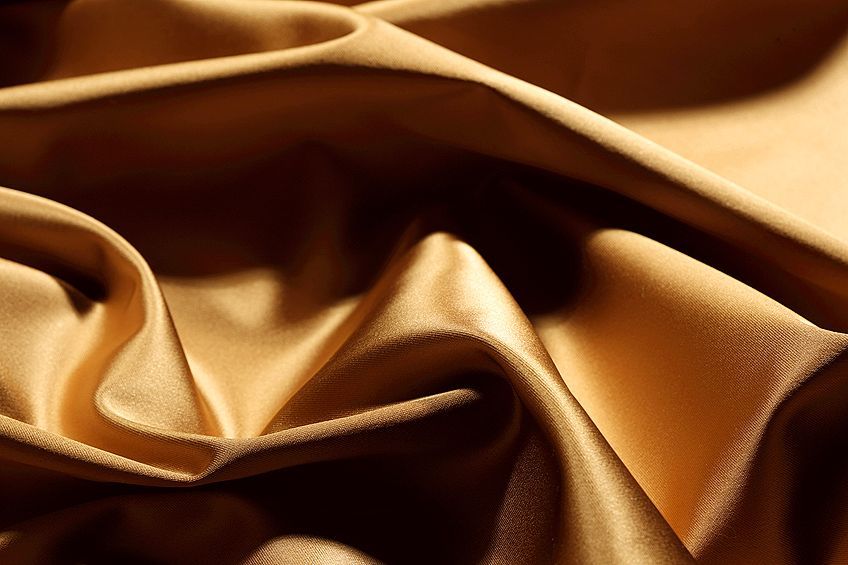
Unlike copper, bronze is a duller metallic shade that can be described as being a brownish-orange color. However, along with copper and gold, bronze is also a warm color. This means it falls in the same family as all your red, yellow, and orange colors that represent warmth when considering color theory.
The metal bronze is a wonderful idea for fittings and fixtures around the home and might be a better choice that is slightly less flashy than gold. Also, when compared to brass and copper, bronze metal tends to be more durable and is more resistant to corrosion. This means bronze might be a better option for use in areas that will be exposed to moisture, such as, in the bathroom and kitchen areas.
| Bronze Shade | Bronze Hex Code | CMYK Bronze Color Code (%) | RGB Bronze Color Code | Bronze Color |
| Bronze | #cd7f32 | 0, 38, 76, 20 | 205, 127, 50 |
Color Combinations for Bronze
The bronze color falls part of the orange family, and, as color theory goes, there are a few ideal color combinations you can consider. The color wheel, which represents all colors visually within a circle form, can help you determine these color combinations.
Colors That Complement Bronze
The first color combination is known as a complimentary color, which are colors that are arranged on either side of the color wheel. When placed side-by-side, the colors tend to stand out, which can also be described as contrasting colors. The color bronze, which is a shade of orange, therefore, has steel blue as its complementary color.
However, other colors that complement bronze can include a range of shades of blue as well as green or even purple.
| Shade | Hex Code | CMYK Color Code (%) | RGB Color Code | Color |
| Bronze | #cd7f32 | 0, 38, 76, 20 | 205, 127, 50 | |
| Steel Blue | #3280cd | 76, 38, 0, 20 | 50, 128, 205 |
Analogous Bronze Color Combinations
All colors that fall on the same side of the color wheel, like orange, yellow, and red shades all fall into the analogous color category. There is no major contrast with these colors, and they tend to be more comfortable to look at. Analogous colors are also more likely to work well together.
| Shade | Hex Code | CMYK Color Code (%) | RGB Color Code | Color |
| Bronze | #cd7f32 | 0, 38, 76, 20 | 205, 127, 50 | |
| Red | #cd3233 | 0, 76, 75, 20 | 205, 50, 51 | |
| Yellow | #cdcd32 | 0, 0, 76, 20 | 205, 205, 50 |
Triadic Bronze Color Combinations
Triadic colors are another color combination that stands out and creates a contrast. As the name implies, you have three colors in the color combination.
All three colors form a triangle shape that has equal sides on the color wheel.
| Shade | Hex Code | CMYK Color Code (%) | RGB Color Code | Color |
| Bronze | #cd7f32 | 0, 38, 76, 20 | 205, 127, 50 | |
| Violet | #7f32cd | 38, 76, 0, 20 | 127, 50, 205 | |
| Cyan-Lime Green | #32cd7f | 76, 0, 38, 20 | 50, 205, 127 |
Monochromatic Bronze Color Combinations
This color combination is also pleasant to look at and the colors do not pop out at you. Monochromatic colors are from a single color, and other shades are different shades and tones of the same color.
| Shade | Hex Code | CMYK Color Code (%) | RGB Color Code | Color |
| Bronze | #cd7f32 | 0, 38, 76, 20 | 205, 127, 50 | |
| Dark Orange | #905923 | 0, 38, 76, 44 | 144, 89, 35 | |
| Soft Orange | #dca570 | 0, 25, 49, 14 | 220, 165, 112 |
Four Color Combinations
When it gets to four colors or more in a design, it can get a bit tricky as they can become overwhelming. So, you need to ensure everything goes well together. However, four color combinations can create amazing design palettes that are vibrant and stand out. These colors can be in the form of a rectangle or an even-sided square on the color wheel.
These are also known as tetradic colors.
| Shade | Hex Code | CMYK Color Code (%) | RGB Color Code | Color |
| Bronze | #cd7f32 | 0, 38, 76, 20 | 205, 127, 50 | |
| Steel Blue | #3280cd | 76, 38, 0, 20 | 50, 128, 205 | |
| Cyan-Lime Green | #32cd7f | 76, 0, 38, 20 | 50, 205, 127 | |
| Pink | #cd3280 | 0, 76, 38, 20 | 205, 50, 128 |
How to Use a Bronze Color Palette in the Home
We are discussing the bronze color; however, the metal material can come in a variety of finishes and shades as well. There is oil-rubbed satin, brushed bronze, Venetian bronze, and aged bronze. The metal is used mainly for fixtures, but it can also be incorporated into a variety of décor items and styles. You can choose a style that is modern or industrial, or you can go for a more antique look.
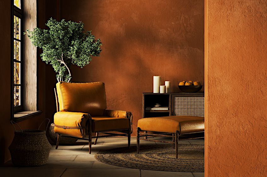
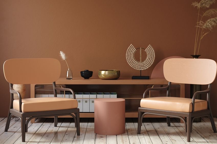
Bronze accessories can add a unique look, and fixtures are durable, easy to look after, and they last a long time. Bronze fixtures can also be the focal point in a room, making a statement and adding warmth and color to a more neutral color scheme. Bronze can also be brought in to decorate walls and ceilings, providing a unique formal design style. Wallpaper designs are especially popular in this case. If painting a ceiling, bring in other lighter neutral colors to create a more harmonious look. You can even think of using bronze windows and doors, which create a distinctive, yet timeless look.
In the Kitchen
Warm and metallic colors like bronze, help to bring in a welcoming feeling. These colors can be brought into the kitchen in a variety of ways from handles to faucets, lighting, backsplashes, and other accessories.
Bronze in the Bathroom
You can give the bathroom a more rustic appeal by bringing in bronze, for example, the faucets. You can also see how to bring in a wood element, and maybe combine the bronze with other metals. If you are going for something completely different, consider a bronze bathtub.
Not only does this add a touch of luxury, but the bronze also retains heat for longer, and do not worry, it will not rust.
Living Areas
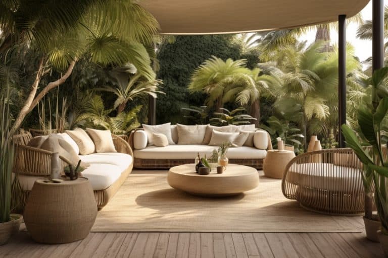
Bronze can be ideal for use as hanging light fixtures or as a lamp stand, as the color is not too shiny like copper can be. You can even consider, if you have the opportunity, creating a bronze spiral staircase. This would be an ideal focal point in the room. You can also use bronze tables and chairs, or bronze mirror frames.
Favorite Color Combinations for Bronze
Bronze is a stylish and warm addition to any home and can easily work with warm as well as cool paint color schemes. However, one of the best colors that go with bronze includes white, beige, greige, and gray colors. White and bronze look especially good in the bathroom or kitchen, for a clean and minimalistic look. The white allows the bronze to stand out in attention-grabbing accent pieces. Below are a few more favorite combinations and colors that complement bronze.
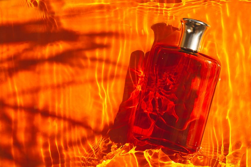
Bronze and Black
Black is another neutral color, and it goes well with bronze for a sophisticated style. However, unlike white, black provides more of an edge with bronze as it is a bold color combination.
A black background or accent wall can make a nice contrast for any bronze fixtures you wish to bring into a room.
| Shade | Hex Code | CMYK Color Code (%) | RGB Color Code | Color |
| Bronze | #cd7f32 | 0, 38, 76, 20 | 205, 127, 50 | |
| Black | #000000 | 0, 0, 0, 100 | 0, 0, 0 |
Bronze and Brown
Again, brown is a neutral color that can pair with bronze if you choose the proper shade of brown. The colors are very similar; however, any bronze material will have a more metallic look that is brighter. The brown you choose should be somewhere in-between a lighter and darker shade of brown, for example, chocolate brown. Bronze can be added as an accent color to liven up a neutral color design. Bronze could also be your base color, to which you can bring in layers of brown tones to create a more subtle look.
| Shade | Hex Code | CMYK Color Code (%) | RGB Color Code | Color |
| Bronze | #cd7f32 | 0, 38, 76, 20 | 205, 127, 50 | |
| Brown | #d2691e | 0, 50, 86, 18 | 210, 105, 30 |
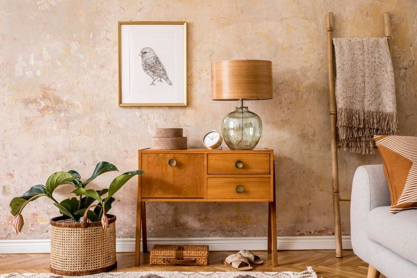
Bronze and Dark Green
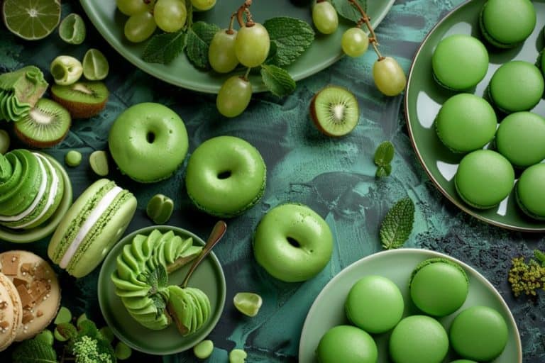
Dark colors are becoming more popular and darker green in particular pairs well with bronze. The bronze color will create a nice contrast against the dark green, similar to the black and bronze mentioned above. If you choose bronze as your main color, you can then include rich and dark green textiles. Some examples include midnight green or forest green.
Bronze and dark green work because bronze is warm and inviting, while green provides coolness, and the contrast this forms is harmonious. Consider a dark green accent wall with bronze light stands.
| Shade | Hex Code | CMYK Color Code (%) | RGB Color Code | Color |
| Bronze | #cd7f32 | 0, 38, 76, 20 | 205, 127, 50 | |
| Midnight Green | #004953 | 100, 12, 0, 67 | 0, 73, 83 |
Bronze and Navy Blue
Navy blue, like dark green, offers a warm and cool contrast in colors. If you want to create a lighter mood, you can try using a lighter blue instead, along with white and other lighter neutral shades. Navy color walls are quite popular, and to this, you can then add bronze lamp stands, mirror frames, and other accessories. Wooden furniture can also add to the sophisticated look of this color combination
| Shade | Hex Code | CMYK Color Code (%) | RGB Color Code | Color |
| Bronze | #cd7f32 | 0, 38, 76, 20 | 205, 127, 50 | |
| Navy Blue | #000080 | 100, 100, 0, 50 | 0, 0, 128 |
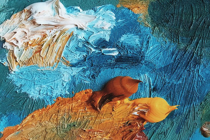
Bronze and Burgundy
Both burgundy and bronze are warm colors, but with different undertones that come through. When pairing these colors, it does create a type of festive look, because it is often used during the holiday season. However, you can still use this combination in the home in general to create an elegant and intimate space. Consider painting the walls a rich burgundy color, and again bring in the bronze through light fittings and other accessories. To create an even more luxurious feel, include soft, darker neutral shades in the fabrics.
Otherwise, you can use cream with bronze and burgundy to create more of a contrast.
| Shade | Hex Code | CMYK Color Code (%) | RGB Color Code | Color |
| Bronze | #cd7f32 | 0, 38, 76, 20 | 205, 127, 50 | |
| Burgundy | #800020 | 0, 100, 75, 50 | 128, 0, 32 |
Bronze and Purple
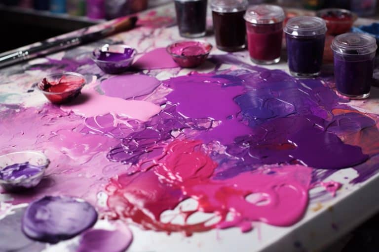
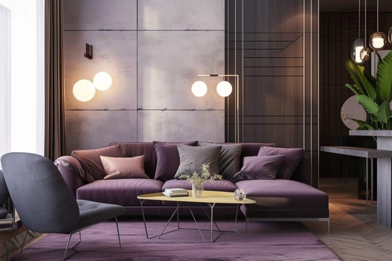
Deeper purples, like burgundy, can also go with bronze and can add a certain dramatic effect to a color scheme. Purple is associated with luxury and royalty and could become a little too much if used with shinier metals like gold or copper. Bronze is more of a dull metal and offers a more muted metallic option for fittings and fixtures. This helps to create a more subtle luxurious effect.
Purple is created by a mixture of blue as well as red, which are cool and warm colors. Purple, in general, is considered a cool color. However, including bronze can help to warm up the room without disturbing the balance.
| Shade | Hex Code | CMYK Color Code (%) | RGB Color Code | Color |
| Bronze | #cd7f32 | 0, 38, 76, 20 | 205, 127, 50 | |
| Purple | #800080 | 0, 100, 0, 50 | 128, 0, 128 |
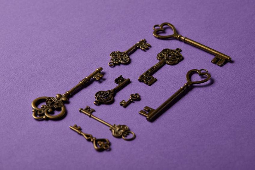
Bronze may seem to be one of the more challenging hues to work with when creating color schemes in the home, but if you choose colors wisely, you can create something unique and appealing. The proper colors that complement bronze can help to produce some beautiful contrasts.
Frequently Asked Questions
What Color Goes With Bronze?
Bronze is a metal that is not as shiny as copper or brass and can be described as being a dull shade of brownish-orange. When looking at the bronze color, you have a shade of orange and a warm color that has many contrasting color combination options.
What Is Oil-Rubbed Bronze?
When it comes to bronze material or metal, there are different finishes available. One of these is oil-rubber bronze, which is simply a chemical finish that when applied to fixtures, imitates the color of real aging bronze.
What Are the Best Colors That Complement Bronze?
There are quite a few colors that work well with bronze, for example, neutral colors like white, beige, cream, black, gray, and brown. However, shades of blue and green are colors that complement bronze and make it stand out.
In 2005, Charlene completed her Wellness Diplomas in Therapeutic Aromatherapy and Reflexology from the International School of Reflexology and Meridian Therapy. She worked for a company offering corporate wellness programs for a couple of years, before opening up her own therapy practice. It was in 2015 that a friend, who was a digital marketer, asked her to join her company as a content creator, and this is where she found her excitement for writing.
Since joining the content writing world, she has gained a lot of experience over the years writing on a diverse selection of topics, from beauty, health, wellness, travel, and more. Due to various circumstances, she had to close her therapy practice and is now a full-time freelance writer. Being a creative person, she could not pass up the opportunity to contribute to the Art in Context team, where is was in her element, writing about a variety of art and craft topics. Contributing articles for over three years now, her knowledge in this area has grown, and she has gotten to explore her creativity and improve her research and writing skills.
Charlene Lewis has been working for artincontext.org since the relaunch in 2020. She is an experienced writer and mainly focuses on the topics of color theory, painting and drawing.
Learn more about Charlene Lewis and the Art in Context Team.
Cite this Article
Charlene, Lewis, “What Color Goes With Bronze? – Colors That Complement Bronze.” Art in Context. November 24, 2022. URL: https://artincontext.org/what-color-goes-with-bronze/
Lewis, C. (2022, 24 November). What Color Goes With Bronze? – Colors That Complement Bronze. Art in Context. https://artincontext.org/what-color-goes-with-bronze/
Lewis, Charlene. “What Color Goes With Bronze? – Colors That Complement Bronze.” Art in Context, November 24, 2022. https://artincontext.org/what-color-goes-with-bronze/.


