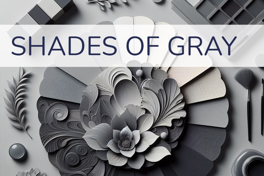
Shades of Gray Color – 90 Curated Grayish Tones to Explore
Gray is not something most people would choose as their favorite color. Categorized as being somewhere in-between white and black, there is a lot more to this color than meets the eye. For one, you do not only have a single gray color but there are many types of gray, from light gray to dark gray colors. We have curated over 90 gray shades for you, including visuals, descriptions and color codes.
Shades of Gray
Below are our curated 90+ shades of gray with their gray color names. Each of these colors can be identified online by using a gray hex code. The hex code is a simple representation of the different colors involved in creating a specific color. The tables below also show your RGB and printing codes for easy reference.
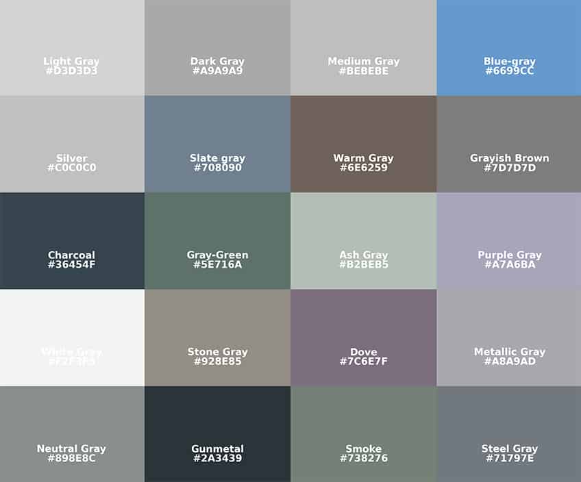
Abbey
Abbey is a deep, muted gray with subtle blue undertones, reminiscent of a cloudy twilight sky. Its depth offers a sense of calmness and stability.
| Hex: #494F55 RGB: 73, 79, 85 CMYK: 14, 7, 0, 87 |
Aluminium
Aluminium is a sleek, metallic silver that shines with the brightness of polished metal. It’s modern and industrial, evoking a futuristic feel.
| Hex: #888B8D RGB: 136, 139, 141 CMYK: 4, 1, 0, 45 |
Amethyst Gray
Amethyst Gray combines the stability of gray with the serenity of a soft purple. It has a mystical and gentle presence, perfect for peaceful settings.
| Hex: #66606D RGB: 102, 96, 109 CMYK: 6, 12, 0, 57 |
Anchor
Anchor is a strong, dominant gray. It’s as deep and reliable as its namesake, suggesting stability and security.
| Hex: #41424C RGB: 65, 66, 76 CMYK: 14, 13, 0, 70 |
Arsenic
Arsenic is a dark, mysterious gray with a hint of green. It’s enigmatic and slightly ominous, perfect for creating a moody atmosphere.
| Hex: #3C4748 RGB: 60, 71, 72 CMYK: 17, 1, 0, 72 |
Ash Gray
Ash Gray is a light, soft gray that resembles the pale remnants of a fire. It’s unobtrusive and harmonious, providing a neutral backdrop.
| Hex: #B2BEB5 RGB: 178, 190, 181 CMYK: 6, 0, 5, 25 |
Battleship Gray
Battleship Gray is a strong, solid gray reminiscent of naval ships. It’s robust and commanding, perfect for making a bold statement.
| Hex: #848482 RGB: 132, 132, 130 CMYK: 0, 0, 2, 48 |
Blackstrap Molasses
Blackstrap Molasses is a rich, deep brown with black undertones, like the syrup it’s named after. It’s warm and enveloping, perfect for cozy spaces.
| Hex: #2B2523 RGB: 43, 37, 35 CMYK: 0, 14, 19, 83 |
Blue Gray
Blue Gray is a cool, calming color that blends the tranquility of blue with the neutrality of gray. It’s versatile and soothing, ideal for serene environments.
| Hex: #98AFC7 RGB: 152, 175, 199 CMYK: 24, 12, 0, 22 |
Bright White
Bright White is a pure, radiant white. It’s crisp and clean, offering a sense of clarity and openness.
| Hex: #FBFBF9 RGB: 251, 251, 249 CMYK: 0, 0, 1, 2 |
Cadet Gray
Cadet Gray is a muted blue-gray that evokes the feel of a military uniform. It’s disciplined and understated, yet striking.
| Hex: #91A3B0 RGB: 145, 163, 176 CMYK: 18, 7, 0, 31 |
Carbon Gray
Carbon Gray is a deep, dark gray with a robust and industrial feel. It’s reminiscent of carbon steel, strong and impactful.
| Hex: #625D5D RGB: 98, 93, 93 CMYK: 0, 5, 5, 62 |
Carrara
Carrara is a soft, elegant gray with hints of blue, resembling the prestigious Carrara marble. It’s sophisticated and timeless.
| Hex: #E9E9E4 RGB: 233, 233, 228 CMYK: 0, 0, 2, 9 |
Cement Gray
Cement Gray is a solid, mid-tone gray that captures the essence of raw cement. It’s urban and contemporary, perfect for modern designs.
| Hex: #868A81 RGB: 134, 138, 129 CMYK: 3, 0, 7, 46 |
Charcoal
Charcoal is a dark, intense gray with a hint of black, like the charred remains of a fire. It’s dramatic and powerful, ideal for creating depth.
| Hex: #36454F RGB: 54, 69, 79 CMYK: 32, 13, 0, 69 |
Chrome
Chrome is a shiny, metallic gray that mimics the polished surface of chrome. It’s sleek and reflective, exuding a high-tech vibe.
| Hex: #D7DDE4 RGB: 215, 221, 228 CMYK: 6, 3, 0, 11 |
Cinereous
Cinereous is a soft, warm gray tinged with red, resembling the color of ash. It’s subtle and earthy, evoking a sense of natural elegance.
| Hex: #98817B RGB: 152, 129, 123 CMYK: 0, 15, 19, 40 |
Cloud
Cloud is a light, airy gray that captures the essence of a cloudy sky. It’s ethereal and calming, perfect for creating a tranquil space.
| Hex: #C5C6D0 RGB: 197, 198, 208 CMYK: 5, 5, 0, 18 |
Cool Gray
Cool Gray is a neutral, medium gray that strikes a balance between warmth and coolness. It’s versatile and modern, suitable for any setting.
| Hex: #9090C0 RGB: 144, 144, 192 CMYK: 25, 25, 0, 25 |
Dark Charcoal
Dark Charcoal is an intense, deep gray with an almost black tone. It exudes a sense of mystery and depth, perfect for a sophisticated look.
| Hex: #343432 RGB: 52, 52, 50 CMYK: 0, 0, 4, 80 |
Dark Gray
Dark Gray is a classic, deep gray, strong and unyielding. It’s timeless and practical, ideal for a range of design needs.
| Hex: #323232 RGB: 50, 50, 50 CMYK: 0, 0, 0, 80 |
Dark Liver
Dark Liver is a deep brownish-gray, reminiscent of the natural color of liver. It’s earthy and rich, with a sense of organic warmth.
| Hex: #4D4646 RGB: 76, 70, 70 CMYK: 0, 8, 8, 70 |
Davys Gray
Davys Gray is a muted, neutral gray with a subtle green undertone. It’s understated and versatile, blending seamlessly into various settings.
| Hex: #555555 RGB: 85, 85, 85 CMYK: 0, 0, 0, 67 |
Dim Gray
Dim Gray is a medium-dark gray with a low lightness. It’s unobtrusive and modern, offering a sleek and contemporary feel.
| Hex: #696969 RGB: 105, 105, 105 CMYK: 0, 0, 0, 59 |
Dorian Gray
Dorian Gray is a timeless, medium gray, embodying elegance and sophistication. It’s versatile, fitting seamlessly into both modern and classic designs.
| Hex: #ACA79E RGB: 172, 167, 158 CMYK: 0, 3, 8, 33 |
Dull Gray
Dull Gray is a flat, medium-light gray lacking in brightness. It’s subtle and unassuming, perfect for creating a neutral backdrop.
| Hex: #8B837E RGB: 139, 131, 126 CMYK: 0, 6, 9, 45 |
Dusty Gray
Dusty Gray is a soft, light gray with a hint of earthiness, as though covered in a fine dust. It’s gentle and soothing, ideal for a calm setting.
| Hex: #B19CA2 RGB: 177, 156, 162 CMYK: 0, 12, 8, 31 |
Eclipse
Eclipse is a deep, dark gray that mimics the shadowy darkness of a lunar eclipse. It’s mysterious and alluring, perfect for creating a dramatic effect.
| Hex: #373737 RGB: 55, 55, 55 CMYK: 0, 0, 0, 78 |
Faux-Favy’s Gray
Faux-Favy’s Gray is a unique blend of gray, mimicking the classic Favy’s gray but with a modern twist. It’s versatile and adaptable to various styles.
| Hex: #4D4C5C RGB: 77, 76, 92 CMYK: 16, 17, 0, 64 |
Fedora
Fedora is a warm, medium-dark gray, reminiscent of the felt hats it’s named after. It’s classic and stylish, with a hint of vintage charm.
| Hex: #655967 RGB: 101, 89, 103 CMYK: 2, 14, 0, 80 |
Gainsboro
Gainsboro is a light gray that radiates a soft, silvery sheen. It’s unobtrusive and elegant, providing a gentle, sophisticated backdrop.
| Hex: #DCDCDC RGB: 220, 220, 220 CMYK: 0, 0, 0, 14 |
Granite
Granite is a dark, grainy gray, similar to the stone it’s named after. It’s solid and enduring, reflecting the rugged beauty of natural granite.
| Hex: #676767 RGB: 103, 103, 103 CMYK: 0, 0, 0, 60 |
Granite Gray
Granite Gray is a medium to dark gray, echoing the versatile and timeless nature of granite rock. It’s reliable and practical for various applications.
| Hex: #666362 RGB: 102, 99, 98 CMYK: 0, 3, 4, 60 |
Graphite
Graphite is a deep, dark gray with a hint of blue, resembling the mineral graphite. It’s strong and striking, ideal for making a bold statement.
| Hex: #251607 RGB: 37, 22, 7 CMYK: 0, 41, 81, 85 |
Gray Dolphin
Gray Dolphin is a medium-light gray with a playful, aquatic feel, reminiscent of the color of dolphins. It’s friendly and approachable, suitable for relaxed spaces.
| Hex: #5C5858 RGB: 92, 88, 88 CMYK: 0, 4, 4, 64 |
Gray Goose
Gray Goose is a light, silvery gray, evoking the sleek feathers of a goose. It’s gentle and soothing, perfect for a peaceful ambiance.
| Hex: #D1D0CE RGB: 209, 208, 206 CMYK: 0, 0, 1, 18 |
Gray Web
Gray Web is a medium gray, representing the color of the World Wide Web. It’s modern and connected, symbolizing the digital era.
| Hex: #808080 RGB: 128, 128, 128 CMYK: 0, 0, 0, 50 |
Gray Wolf
Gray Wolf is a strong, medium-dark gray, embodying the wild and natural essence of a wolf. It’s powerful and untamed, ideal for an impactful design.
| Hex: #504A4B RGB: 80, 74, 75 CMYK: 0, 7, 6, 69 |
Gray X 11
Gray X 11 (listed twice) is a standard medium gray, versatile and neutral. It’s balanced and adaptable, suitable for both modern and traditional styles.
| Hex: #B6B6B4 RGB: 182, 182, 180 CMYK: 0, 0, 1, 29 |
Gray X 11
| Hex: #BEBEBE RGB: 190, 190, 190 CMYK: 0, 0, 0, 25 |
Gray-Green
Gray-Green is a subtle mix of gray with green undertones. It’s natural and calming, reflecting the colors of a misty forest.
| Hex: #5E716A RGB: 94, 113, 106 CMYK: 17, 0, 6, 56 |
Gunmetal Gray
Gunmetal Gray is a dark gray with a bluish tint, resembling the color of gunmetal. It’s strong and impactful, perfect for a sleek, modern look.
| Hex: #2A3439 RGB: 42, 52, 57 CMYK: 26, 9, 0, 78 |
Heavy Gray
Heavy Gray is a deep, intense gray that feels weighty and substantial. It’s solid and reliable, ideal for grounding a design scheme.
| Hex: #0D0D0D RGB: 13, 13, 13 CMYK: 0, 0, 0, 95 |
Iridium
Iridium is a unique, metallic gray with a slight bluish tint, reflecting the rare metal. It’s futuristic and high-tech, suitable for innovative designs.
| Hex: #3D3C3A RGB: 61, 60, 58 CMYK: 0, 2, 5, 76 |
Iron
Iron is a strong, dark gray, evocative of the metal. It’s industrial and robust, perfect for a bold, grounded look.
| Hex: #61666A RGB: 97, 102, 106 CMYK: 8, 4, 0, 58 |
Lavender Gray
Lavender Gray is a soft, gentle gray with a hint of lavender. It’s romantic and delicate, ideal for a serene and soothing atmosphere.
| Hex: #C4C3D0 RGB: 196, 195, 208 CMYK: 6, 6, 0, 18 |
Light Gray
Light Gray is a pale, unobtrusive gray. It’s easy and light, providing a clean and airy feel to any space.
| Hex: #D3D3D3 RGB: 211, 211, 211 CMYK: 0, 0, 0, 17 |
Light Slate Gray
Light Slate Gray is a medium-light gray with a hint of blue. It’s reflective of slate rock, versatile and timeless.
| Hex: #778899 RGB: 119, 136, 153 CMYK: 22, 11, 0, 40 |
Manatee
Manatee is a medium gray with a bluish tint, soft and calming like the gentle sea creature it’s named after.
| Hex: #9AA2A4 RGB: 154, 162, 164 CMYK: 6, 1, 0, 36 |
Marengo
Marengo is a dark, charcoal gray with a hint of blue. It’s sophisticated and deep, perfect for creating a sense of depth.
| Hex: #4C5866 RGB: 76, 88, 102 CMYK: 25, 14, 0, 60 |
Matte Gray
Matte Gray is a subdued, flat gray without any shine. It’s understated and modern, perfect for creating a sleek, contemporary look.
| Hex: #A5A5A8 RGB: 165, 165, 168 CMYK: 2, 2, 0, 34 |
Monsoon
Monsoon is a deep, moody blue-gray, reminiscent of stormy skies. It’s dramatic and intense, ideal for creating an atmospheric and brooding ambiance.
| Hex: #787276 RGB: 120, 114, 118 CMYK: 0, 5, 2, 53 |
Mulled Wine
Mulled Wine is a rich, deep red with warm, brown undertones. It evokes the coziness and warmth of spiced wine in winter.
| Hex: #594D5B RGB: 89, 77, 91 CMYK: 2, 15, 0, 64 |
Nickel
Nickel is a medium gray with a metallic sheen, similar to the metal it’s named after. It’s practical and unassuming, yet holds a subtle industrial edge.
| Hex: #6A6E6A RGB: 106, 110, 106 CMYK: 4, 0, 4, 57 |
Off White
Off White is a soft, muted cream, less stark than pure white. It’s warm and inviting, offering a gentle alternative to brighter whites.
| Hex: #FAF9F6 RGB: 250, 249, 246 CMYK: 0, 0, 2, 2 |
Old Gray
Old Gray is a classic, time-worn gray with a sense of history and permanence. It’s nostalgic and comfortable, perfect for vintage or rustic themes.
| Hex: #989692 RGB: 152, 150, 146 CMYK: 0, 1, 4, 40 |
Onyx
Onyx (listed twice) is a deep, dark black with a slight gray undertone, like the precious stone. It’s powerful and sophisticated, ideal for creating depth and contrast.
| Hex: #3C3C3C RGB: 60, 60, 60 CMYK: 0, 0, 0, 76 |
Onyx
| Hex: #3C3C3C RGB: 60, 60, 60 CMYK: 0, 0, 0, 76 |
Pale Silver
Pale Silver is a very light gray with a silvery sheen, exuding elegance and a subtle glamor. It’s delicate and light, ideal for a chic, refined look.
| Hex: #C9C0BB RGB: 201, 192, 187 CMYK: 0, 4, 7, 21 |
Pastel Gray
Pastel Gray is a soft, muted gray with a hint of warmth. It’s gentle and soothing, perfect for creating a calm, restful atmosphere.
| Hex: #CCCDC6 RGB: 204, 205, 198 CMYK: 0, 0, 3, 20 |
Payne’s Gray
Payne’s Gray is a dark blue-gray, more intense and moody than typical grays. It’s deep and sophisticated, suitable for a bold, artistic statement.
| Hex: #40404F RGB: 64, 64, 79 CMYK: 19, 19, 0, 69 |
Platinum
Platinum is a light metallic gray with a prestigious and luxurious feel, reminiscent of the precious metal. It’s sleek and high-end, perfect for sophisticated designs.
| Hex: #E5E4E2 RGB: 229, 228, 226 CMYK: 0, 0, 1, 10 |
Porcelain
Porcelain is a very light, almost translucent white, evoking the smooth and delicate surface of porcelain. It’s refined and elegant, suitable for a pristine, clean look.
| Hex: #FFFEFC RGB: 255, 254, 252 CMYK: 0, 0, 1, 0 |
Quick Silver
Quick Silver is a bright, metallic gray with a lively and dynamic feel. It’s flashy and futuristic, ideal for a vibrant, high-energy space.
| Hex: #A6A6A6 RGB: 166, 166, 166 CMYK: 0, 0, 0, 35 |
Rhythm
Rhythm is a soft, muted blue with gray undertones, calming and rhythmic like a gentle melody. It’s harmonious and balanced, perfect for peaceful environments.
| Hex: #696880 RGB: 105, 104, 128 CMYK: 18, 19, 0, 50 |
Rocket Metallic – A Warm Gray
| Hex: #8A7F8D RGB: 138, 127, 141 CMYK: 2, 10, 0, 45 |
Roman Silver
Roman Silver is a medium gray with a hint of blue, noble and classic like ancient Roman architecture. It’s dignified and timeless, ideal for a sophisticated look.
| Hex: #7B8593 RGB: 123, 133, 147 CMYK: 16, 10, 0, 42 |
Rose Quartz
Rose Quartz is a soft, pale pink with a gentle, soothing presence. It’s romantic and tender, perfect for creating a soft, nurturing environment.
| Hex: #AA98A9 RGB: 170, 152, 169 CMYK: 0, 11, 1, 33 |
Rustic Gray
Rustic Gray is a warm, earthy gray with brown undertones. It’s reminiscent of aged wood and rustic settings, ideal for a cozy, natural feel.
| Hex: #A5A7A4 RGB: 165, 167, 164 CMYK: 1, 0, 2, 35 |
Santa’s Gray
Santa’s Gray is a cheerful, light gray with a hint of red, merry and bright. It’s playful and festive, perfect for joyful and spirited spaces.
| Hex: #9897A9 RGB: 152, 151, 169 CMYK: 10, 11, 0, 34 |
Shadow
Shadow is a deep, dark gray, like the densest part of a shadow. It’s mysterious and elusive, ideal for creating a sense of intrigue.
| Hex: #7B7A72 RGB: 123, 122, 114 CMYK: 0, 1, 7, 52 |
Silk Gray
Silk Gray is a smooth, light gray with a hint of softness, like delicate silk. It’s elegant and refined, perfect for a luxurious touch.
| Hex: #B6B3A8 RGB: 182, 179, 168 CMYK: 0, 2, 8, 29 |
Silver
Silver is a bright, metallic gray, reflective and shiny like polished silver. It’s glamorous and modern, suitable for a sleek, contemporary look.
| Hex: #C0C0C0 RGB: 192, 192, 192 CMYK: 0, 0, 0, 25 |
Silver Chalice
Silver Chalice is a medium gray, balanced and steady, like the metal of a chalice. It’s dependable and unpretentious, ideal for a stable, grounded feel.
| Hex: #ACACAC RGB: 172, 172, 172 CMYK: 0, 0, 0, 33 |
Silver Metallic
Silver Metallic is a shiny, bright gray, like sparkling metal. It’s lively and dynamic, perfect for adding a touch of modern brilliance.
| Hex: #AAA9AD RGB: 170, 169, 173 CMYK: 2, 2, 0, 32 |
Silver Pink
Silver Pink is a soft, muted pink with a hint of gray. It’s delicate and subtle, perfect for a gentle, understated elegance.
| Hex: #C4AEAD RGB: 196, 174, 173 CMYK: 0, 11, 12, 23 |
Silver Sand
Silver Sand is a light, pale gray with a sandy texture. It’s soft and unobtrusive, ideal for creating a serene and tranquil ambiance.
| Hex: #BFC1C2 RGB: 191, 193, 194 CMYK: 2, 1, 0, 24 |
Slate Gray
Slate Gray is a medium-dark gray with blue undertones, sturdy and reliable like slate rock. It’s classic and versatile, suitable for various applications.
| Hex: #708090 RGB: 112, 128, 144 CMYK: 22, 11, 0, 44 |
Smoky White
Smoky White is a soft, muted white with a hint of gray, like smoke. It’s subtle and sophisticated, perfect for a refined, understated look.
| Hex: #F0F0F0 RGB: 240, 240, 240 CMYK: 0, 0, 0, 6 |
Sombre Gray
Sombre Gray is a deep, dark gray, solemn and introspective. It’s powerful and intense, ideal for creating a mood of seriousness and depth.
| Hex: #111016 RGB: 17, 16, 22 CMYK: 23, 27, 0, 91 |
Sonic Silver
Sonic Silver is a bright, energetic gray with a futuristic vibe. It’s dynamic and modern, perfect for spaces that need a touch of vibrancy.
| Hex: #757575 RGB: 117, 117, 117 CMYK: 0, 0, 0, 54 |
Spanish Gray
Spanish Gray is a medium-light gray that evokes the classic, timeless feel of old Spanish architecture. It’s elegant and subtly romantic.
| Hex: #989898 RGB: 152, 152, 152 CMYK: 0, 0, 0, 40 |
Stone Gray
Stone Gray is a solid, earthy gray, reminiscent of natural stone. It’s dependable and grounded, perfect for creating a sense of stability.
| Hex: #928E85 RGB: 146, 142, 133 CMYK: 0, 3, 9, 43 |
Storm Sky
Storm Sky is a dark, brooding blue-gray, evocative of a turbulent, storm-filled sky. It’s dramatic and intense, ideal for creating a mood of anticipation.
| Hex: #807C7D RGB: 128, 124, 125 CMYK: 0, 30, 2, 50 |
Taupe
Taupe is a warm, medium-dark gray with brown undertones. It’s versatile and understated, easily adaptable to various design styles.
| Hex: #483C32 RGB: 72, 60, 50 CMYK: 0, 17, 31, 72 |
Taupe Gray
Taupe Gray is a muted, medium gray blended with brown. It’s warm and unassuming, perfect for a subtle, sophisticated look.
| Hex: #8B8589 RGB: 139, 133, 137 CMYK: 0, 4, 1, 45 |
Timberwolf
Timberwolf is a light, warm gray, reminiscent of the fur of a timber wolf. It’s natural and unobtrusive, ideal for a soft, welcoming feel.
| Hex: #DBD7D2 RGB: 219, 215, 210 CMYK: 0, 2, 4, 14 |
Vampire Gray
Vampire Gray (listed twice) is a deep, dark gray with a hint of mystique. It’s bold and enigmatic, suitable for creating an air of mystery and sophistication.
| Hex: #565051 RGB: 86, 80, 81 CMYK: 0, 7, 6, 66 |
Vampire Gray
| Hex: #514B4C RGB: 81, 75, 76 CMYK: 0, 7, 6, 68 |
Warm Gray
Warm Gray is a comforting, medium gray with a hint of brown. It’s inviting and soothing, perfect for creating a cozy atmosphere.
| Hex: #6E6259 RGB: 110, 98, 89 CMYK: 0, 11, 19, 57 |
White Smoke
White Smoke is a very light gray, almost white, like delicate smoke wisps. It’s airy and ethereal, ideal for a light, open space.
| Hex: #F5F5F5 RGB: 245, 245, 245 CMYK: 0, 0, 0, 4 |
Window Gray
Window Gray is a medium-light gray that suggests the color of a rain-washed window. It’s clean and refreshing, perfect for a serene environment.
| Hex: #989EA1 RGB: 152, 158, 161 CMYK: 6, 2, 0, 37 |
Winter Sky
Winter Sky is a pale, cool gray that captures the crisp, clear essence of a winter’s sky. It’s serene and tranquil, ideal for a peaceful setting.
| Hex: #F3F2ED RGB: 243, 242, 237 CMYK: 0, 0, 2, 5 |
Xanadu
Xanadu is a deep, muted green-gray, named after the mythical city. It’s mysterious and alluring, perfect for creating a sense of hidden depths.
| Hex: #738678 RGB: 115, 134, 120 CMYK: 14, 0, 10, 47 |
Zombie Gray
Zombie Gray is a medium-dark gray with a slightly eerie, undead feel. It’s unique and unconventional, suitable for edgy, avant-garde designs.
| Hex: #63645E RGB: 99, 100, 94 CMYK: 1, 0, 6, 61 |
Shades of Gray Color: A Brief History
The name “gray” first appeared in English in the seventh century. It has two spellings: “gray” in European English and “grey” in American English since the early 19th century. In the Middle Ages, gray, the color of undyed wool, was common in peasants’ clothing, symbolizing poverty and humility. Franciscan friars, known as “gray friars,” wore gray, linking it with religious humility.
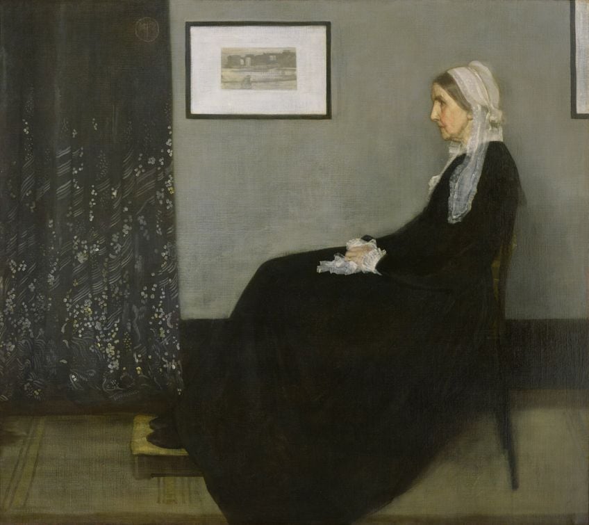
During the Renaissance, gray gained popularity in fashion and art. It complemented the dominant black and white colors, with artists like Rembrandt and El Greco using it in backgrounds and skin tones. James McNeill Whistler’s famous “Arrangement in Gray and Black No.1” (1871), also known as “Whistler’s Mother,” features gray prominently. The painting technique “grisaille” involved a white and gray base, sometimes left as-is for a sculpted effect.
British artist William Payne accidentally created “Payne’s gray,” a dark blue-gray, by mixing Prussian blue, yellow ochre, and crimson lake. In the 18th and 19th centuries, gray became fashionable for both men’s and women’s clothing. Business suits, especially in London and Paris, frequently used gray.
During the American Civil War, the Confederate army wore gray uniforms for camouflage, a practice adopted by other armies, including Germany in both World Wars. Their “Field Gray” was a grayish-green, hard to spot at a distance.
In the early 20th century, gray symbolized industrialization and war. Pablo Picasso’s “Guernica” (1937), inspired by the Spanish Civil War, used gray to depict the horrors of war. Post-World War II, gray suits became a symbol of status in society and business, evolving from the formal frock coat to the less formal English-style drape suit.
The Meaning of Different Shades of Gray
All colors have meaning, and gray is no exception. Shades of gray are mostly identified with uncertainty or indecisiveness, indifference, neutrality, boredom, old age, humility, depression, loss, and modesty. Unfortunately, the color is not a favorite of many, and only about one percent admit that gray is their favorite color. The saying, “it is a gray area”, is used to describe situations where the solution or answer is not clear.
This might look like it is mainly associated with negative things, but there is humility and also balance. The color is in-between black and white, offering a kind of balance. Various types of gray can be successfully used as graphics or fonts in online designs that appeal to and attract an audience. For example, the company Apple uses gray to great effect in their advertising and products. A gray color palette is also popular when designing interiors as it is a neutral color that can work well with many other colors, creating a soothing and inviting environment.
Where Does Gray Fit Into Color Theory?
Describing colors can seem like a challenging and complicated matter. However, there are tools like the color wheel, which help us identify colors and how they interact with each other. The color wheel is simply a circular visual interpretation of the various colors.
The three main terms that pop up when describing color theory include hue, chroma, saturation, and color value.
- Hue: This is just another word for your actual color like green, red, or blue.
- Chroma: The chroma is how pure the color is, for example, a color with a high chroma will have no gray, white or black added to it.
- Saturation: The saturation of a color is how strong or weak a color appears.
- Color Value: The color value can be described as how light a color is, or how dark. A high color value means the color is lighter.
Gray is seen as a neutral color and as with all neutral colors, it can technically not be found on the color wheel. Your other neutral colors are white, black, and a few shades of brown. Your basic gray is a mixture of your neutral colors white and black. Your white color is a pure color, meaning you cannot mix any color to get white. However, black can be blended and this is where you get your various shades of gray.
This is where you can get warm or cool gray colors, also known as color temperature. On the color wheel, you should notice that your red, orange, and yellow colors are on one side, and your green and blues are on the other side. These form your warm and cool colors, like red, for example, represents heat and warm colors, while blue represents cold, ice, and cool colors.
Connected to these colors are your meanings, red being energetic, while blue represents more of a calming effect. Since the black in gray can be manipulated by adding different colors, it all depends on how the colors are mixed to form warm and cool shades of gray. A neutral gray has no added color.
The different shades of gray are not only created with paints, as today we also have computers, graphics, and printing. To differentiate, people developed various models to work from to create and identify the correct colors. For example, painters use the RBY or red, blue, and yellow model, while the RGB model, which represents your red, green, and blue colors, is for your computers and televisions.
When it comes to printing, the CMYK color model is used, which uses the colors cyan, magenta, yellow, and black to create all other colors. For example, gray is obtained by combining the same amount of cyan, magenta, as well as yellow.
Painting With Shades of Gray Color
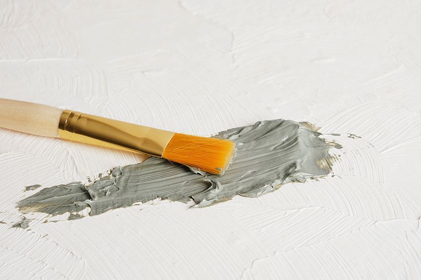
The various shades of gray have been mainly created by blending black and white paint in different quantities. Then by adding a little red or a small amount of blue, you could make the color warmer or cooler. So, when dealing with black and white, you can manipulate the black to create your warmer or cooler gray colors.
- Create a black by blending blue and brown, using darker colors. For example, dark umber and indigo blue.
- By adding a little more blue, you create a cooler black color. This also works the other way around, by adding in more umber, it creates a warmer black.
- You then add in small amounts of white to get your shades of gray.
- You can also change the mixture by using various shades of blue and brown. For example, try using Prussian blue mixed with burnt umber.

Gray can also be created by combining your complementary colors. These are colors on a color wheel, which are found opposite one another. Below are some ideas for creating various shades of gray. You can experiment with all the primary colors and cool and warm colors to create an extensive gray color palette.
- Create a green using ultramarine blue and lemon yellow then add a small amount of cadmium red, which will come up as a greenish-gray. Lighten the color by adding in a small amount of white.
- Combine cadmium red and yellow, then add ultramarine blue. Add a little white to show off the gray color.
- Combine alizarin and ultramarine blue to create a violet color, then add a little azo yellow to create a mauve-gray. Mix in a little white to lighten and highlight the gray color.
When painting, it will be up to you to decide whether you need to use warm or cool gray colors. The decision will rely heavily on what you are painting. Of course, you can also use both warm and cool grays in a single painting. In certain instances, the decision to use a certain color is natural, for example, if you are painting in shadows, this will naturally be a cooler shade of gray. Warmer grays can then be used to create more contrast within a painting.
Remember, that when you are experimenting with creating various shades of gray, you should create and document the gray color palette so you can create the same color again.
Design and Shades of Gray
When considering shades of gray for a website, you can make it look great by using contrasting colors. This can create a beautifully modern and sophisticated look. Gray can be an extremely understated color, sitting in the background. You may not even realize gray is a big part of a design. Some big companies that incorporate a gray color palette into their design include Facebook and YouTube. Even though these companies are associated with other colors like blue and red, gray also plays a dominant role in the design, however at more subtle levels.

If you look closely, you will notice that many websites use gray for the text or backgrounds, from light gray to darker gray colors. Solid black is avoided as a background with lighter text as it can cause blurring in people with astigmatism, an eye disorder suffered by quite a large percentage of the population. Another term for this is known as “halation,” which refers to the “halo” effect the image produces. Using a shade of gray instead of black produces less strain on the eye and reading is easier.
Now that we have discovered that gray plays a major role in website design, we are now going to find out how gray and interior design work together.
Interior Design Gray Color Palettes
Gray has become extremely popular as it is so versatile and can be used with many other colors and accessories as it provides a sense of balance. You may think gray is a cool color, but we have learned you can get warmer gray colors as well.
Various shades of gray work extremely well with white and other neutrals. When choosing a warmer gray, these pair best with natural elements like wood and stone. Darker gray colors can be more intense and sophisticated, while light gray provides more of a soothing and welcoming effect.

Another reason for the popularity of gray is that it can be used in any room of the house. You can also paint the outside of the house gray. When painting or decorating a room, it is also important to check how much light enters the room. Does the sunshine enter a room or does it remain quite dark and cool throughout the day? If it is a dark room, you might want to go for a warmer gray color as a cool gray will make the room feel even colder.
When painting walls, you can create a more sophisticated and luxurious look by using gray paint that is glossy or has a semi-gloss finish. Shades of gray color are also a good idea for open spaces and areas like hallways and provide a neutral zone that can lead to other rooms. Sherwin-Williams and Benjamin Moore are both popular brands that offer a variety of different types of gray.
The color gray is perfect to experiment with, and you cannot go wrong with a gray color palette in your home. There are many shades of gray that you can use, both warm and cool, making it a versatile color that works well with most colors.
Take a look at our gray color palette webstory here!
In 2005, Charlene completed her Wellness Diplomas in Therapeutic Aromatherapy and Reflexology from the International School of Reflexology and Meridian Therapy. She worked for a company offering corporate wellness programs for a couple of years, before opening up her own therapy practice. It was in 2015 that a friend, who was a digital marketer, asked her to join her company as a content creator, and this is where she found her excitement for writing.
Since joining the content writing world, she has gained a lot of experience over the years writing on a diverse selection of topics, from beauty, health, wellness, travel, and more. Due to various circumstances, she had to close her therapy practice and is now a full-time freelance writer. Being a creative person, she could not pass up the opportunity to contribute to the Art in Context team, where is was in her element, writing about a variety of art and craft topics. Contributing articles for over three years now, her knowledge in this area has grown, and she has gotten to explore her creativity and improve her research and writing skills.
Charlene Lewis has been working for artincontext.org since the relaunch in 2020. She is an experienced writer and mainly focuses on the topics of color theory, painting and drawing.
Learn more about Charlene Lewis and the Art in Context Team.
Cite this Article
Charlene, Lewis, “Shades of Gray Color – 90 Curated Grayish Tones to Explore.” Art in Context. November 29, 2022. URL: https://artincontext.org/shades-of-gray-color/
Lewis, C. (2022, 29 November). Shades of Gray Color – 90 Curated Grayish Tones to Explore. Art in Context. https://artincontext.org/shades-of-gray-color/
Lewis, Charlene. “Shades of Gray Color – 90 Curated Grayish Tones to Explore.” Art in Context, November 29, 2022. https://artincontext.org/shades-of-gray-color/.


